Sleek Charts and Graphs Mobile Apps featuring Statistics
We are surrounded by a huge amount of information traffic that sometimes is difficult to comprehend in its pristine form. In order to skillfully interpret quite boring statistics designers to employ verily unique methods that generally involve simple but effective presentation instruments such as tables, charts and graphs.
The latter two are a lifebuoy for mobile applications that are also rich in content, whether it is a traditional analytic assistant or simple weather forecast add-on. They are the most suitable graphical tools for such small layouts simply because they don’t take up much space and able to briefly communicate data.
We have rounded up a list of striking mobile app interfaces that employ diagrammatic representation of statistical data and feature various neat charts and graphs.
Statistics Mobile Apps
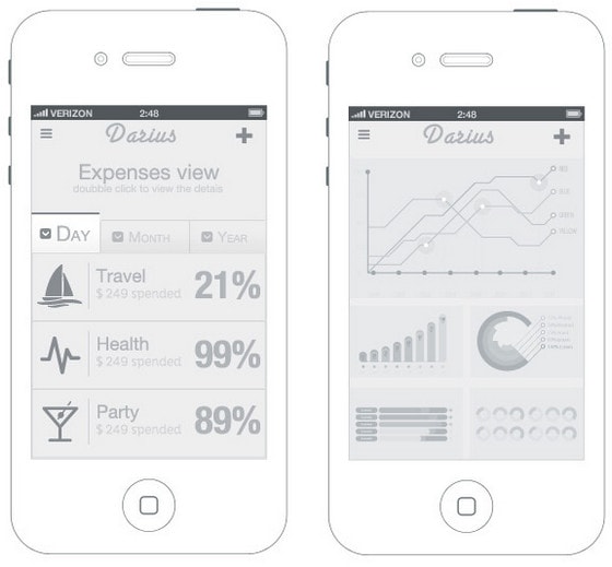
Darius App by FunkTheHype. The designer ably combines sharp-cut lines, relatively huge type and smooth graphics in order to provide customers with a fresh and refined design. A pastel grey color palette makes the layout look soft, and at the same time a bit illegible because of a lack of stark contrast between background and foreground elements that slightly destroys distinctness.
Temperature Screen by UNKL is also based on a scanty coloring and overall minimal approach. The skillful combination of regular white and gentle blue gives the app a delicate feeling while a tiny graph leaves a lot of room and air.
With Postcards Email Builder you can create and edit email templates online without any coding skills! Includes more than 100 components to help you create custom emails templates faster than ever before.
Free Email BuilderFree Email Templates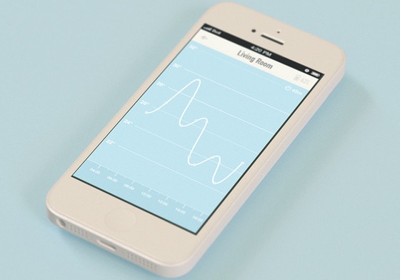
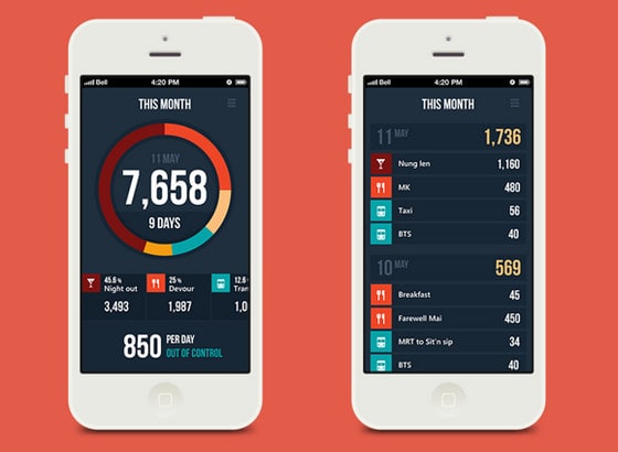
App by Wiktor Nowak allows tracking your expenses, visually demonstrating key aspects with a help of a huge colorful pie chart that occupies most of the screen.
![]()
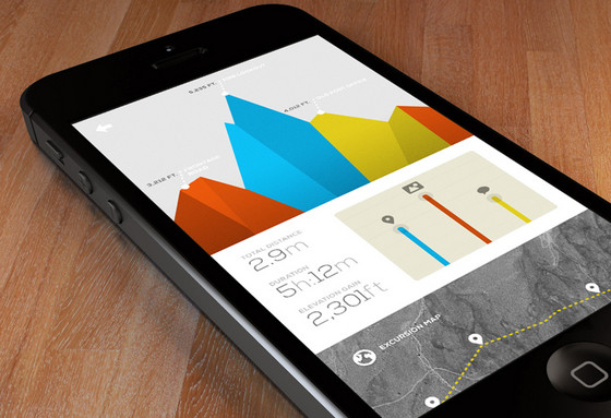
Excursion Stats by Marcus Edvalson – The app efficiently demonstrates statistics by means of a garish coloring that easily stands out from a clean grey background, area chart with a polygonal touch that brings a lovely 3-dimensional appeal, and crisp typography that accurately sets figures apart.
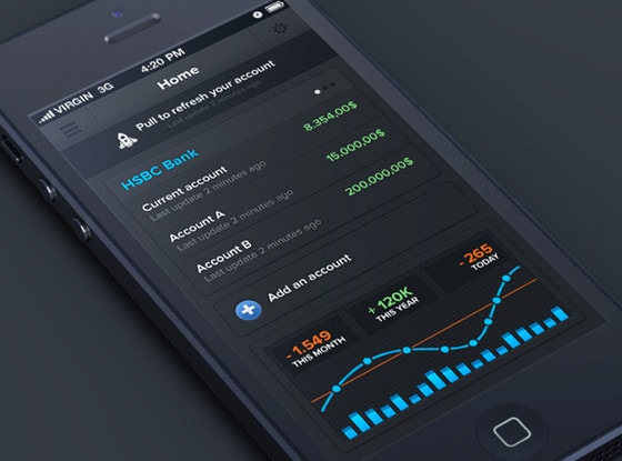
Banking iPhone app by Anthony Aubertin is supposed to showcase statistics about your money. The designer wonderfully matches sleek dark background with gaudy colors that aimed to neatly emphasize figures. A contrasting blue-tone immediately draws the eye to graph on the bottom.
My Diet Diary by André Oliveira has a definitely optimistic vibe despite of being diet-related and using red as a core color. Such an optimistic atmosphere is mainly achieved by a kaleidoscope of bright colors that are placed on a light clean background.
With Pulsetic you’ll be instantly notified the moment your website, API, or server becomes unavailable. Monitor uptime from multiple global locations and respond to incidents before your users are affected.
Create beautiful status pages in minutes to keep customers informed during outages and build trust with transparent communication.
Start Monitoring for Free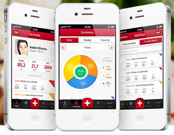
Expenses manager app by DSEEER Kate. The designer capably mixes together typography and muted complementary color palette, making charts and tables look distinctive and subtle. Although each screen has a quite content intensive layout, contrast between background and foreground as well as a lot of whitespace saves the app from being messy and unreadable.
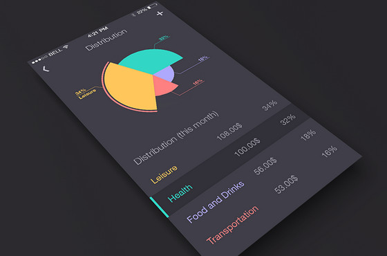
EM by Seven gives a comprehensive overview of statistics, demonstrating data both via traditional table and visually-pleasant variegated pie chart. A range of colors perfectly complements the pristine dark background.
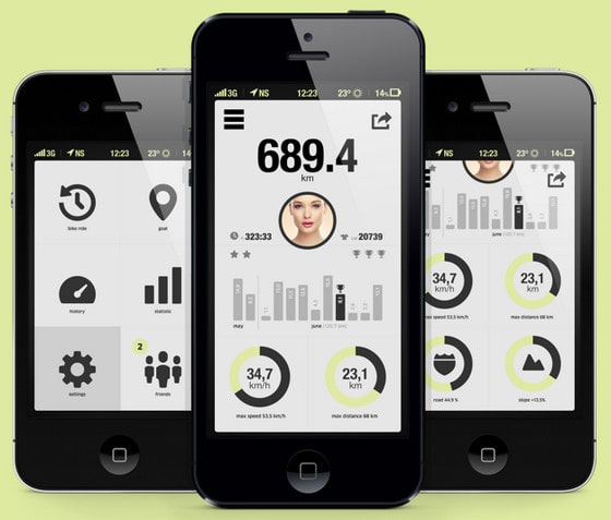
Bicycle app. The designer uses a conventional approach of using dark simple icons against a soft light background that never gets old and easily recreates a powerful contrast. The app represents data via neat clean bicolor doughnut and bar charts.
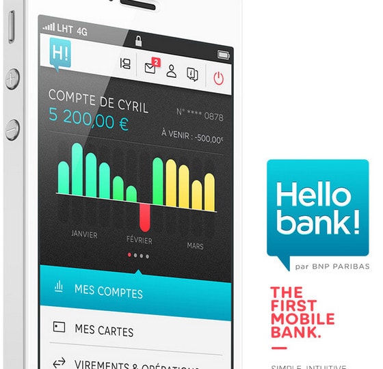
HELLO BANK! IPHONE APP includes a vibrant and rather funny bar chart that easily gives a notion about your account status, and effectively visualizes data.
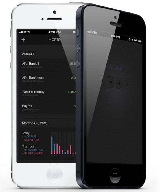
MyBank by Dis Bazgutdinov is another sophisticated app that helps to interact with your bank account. Unlike the previous example, this app has a strong and serious businesslike atmosphere mainly due to its interface that is based on a dark background and subdued coloring.
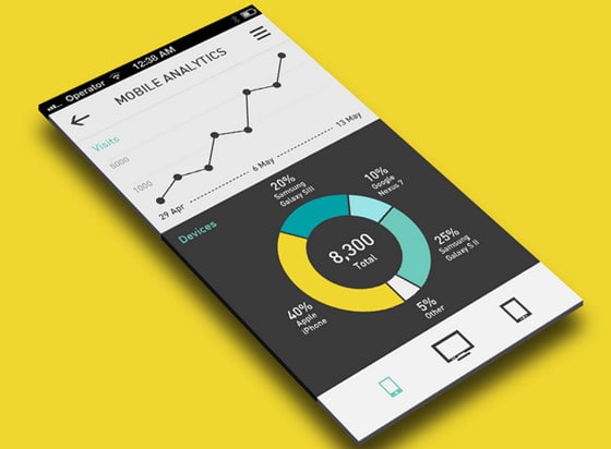
Analytics App by eyal zuri is an ambitious concept that includes several graphical instruments to display data. The designer plays on a contrast in order to naturally differentiate one functional block from another.
Fairshare Web App by Simon Phillips has a bright and cheerful UI that is imbued with elegance and positive emotions. Light background fits quite well with motley bar chart made in a nifty flat style.
Some new features for Mr Mood by 1Button. The app is aimed to keep up your spirits that is why it has a bright and energetic interface with lovely smiles. It also provides an owner with a couple of data visualization tools such as a jolly vibrant bar chart that takes up the whole space.
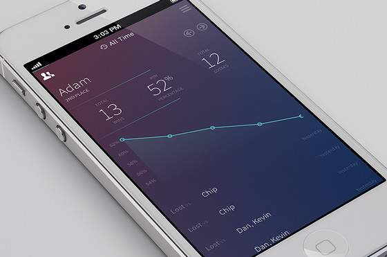
Tally Up by Adam Becker is marked by an exquisite gradient background that makes every foreground element to pop up. An ultra-narrow font in conjunction with a subtle line chart ably enhances beauty of a design.
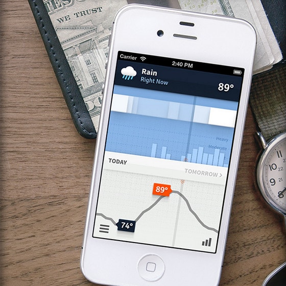
Weathertron by Ryan Lucas. Although the app is expected to familiarize users with weather forecast, it has a rather strong analytic atmosphere. An interface demonstrates data – that is statistically aggregated and weighted – by means of various sleek charts.
Tiny green app by Darina Matvienko looks soft and smooth chiefly due to employment of muted color scheme. Main layout is well-structured, and looks clear.
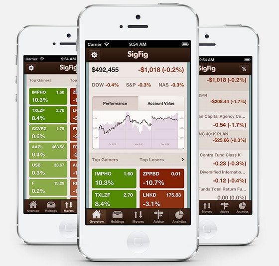
SigFig has a definitely content heavy interface that provides users with an in-depth and comprehensive data-driven management tool. Despite of being information overloaded, each screen looks well-balanced and properly-organized.
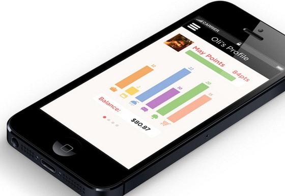
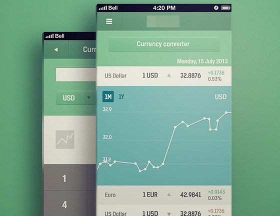
iPhone app in progress by Chris. This app concept is based on a well-tried stripe layout that serves as a good base for showcasing information via small graphs. A huge type and bright colors immediately set apart essential points.
Life minimal app by Budi Tanrim is a fresh take on a minimal approach. The designer employs soft one-color backgrounds in cooperation with flat graphics and neat charts to craft an elegant design.
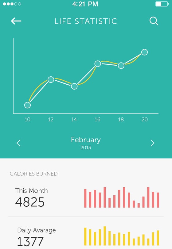
iOS app by Vidas Bučinskas has a simple and intelligible UI. It features a relatively huge line graph that immediately focuses attention on relationships between the data.
Reflection
Compelling pie and bar charts, as well as polished line graphs, are widely-used visual mediums in various mobile apps that intend to demonstrate data in a convenient and unobtrusive manner. Being quite compact, visually-pleasing and eye-catching, they are able to effectively and succinctly display necessary information.