Design Tips for Mobile Checkout Screens
Designing your site for a better conversion rate is a guaranteed way to increase sales. But you also need to consider general UX principles for your online shop, and this goes double for mobile users.
The majority of Internet traffic is now dominated by mobile. In 2017 the estimated total for mobile users across the whole Internet hit around 52%. If you aren’t optimizing for mobile then you’re doing ecommerce wrong.
I’ve curated some design ideas to help you clean up that checkout page. These tips may not apply the same to every shop, and the differences hinge on the type of products you sell.
Although if you’re serious about increasing conversions this guide is your first step to a larger mobile customer base.
Easy Editing Options
The entire flow from product page to checkout should feel incredibly simple. This means when visitors tap that “checkout” CTA they should have easy access to edit their order if needed.
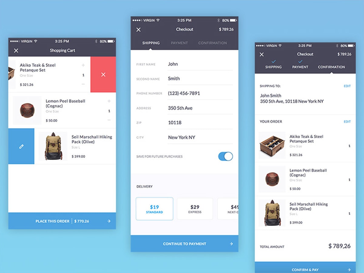
Try to offer an editable shopping cart where the buyer can change quantity, size, color, style, whatever. All of that should ideally be within reach from just a few taps.
With Postcards Email Builder you can create and edit email templates online without any coding skills! Includes more than 100 components to help you create custom emails templates faster than ever before.
Free Email BuilderFree Email TemplatesDon’t add resistance to the checkout or make it tougher than it needs to be. There’s a lot going on in the buyer’s mind and you want to reduce resistance to basically zero.
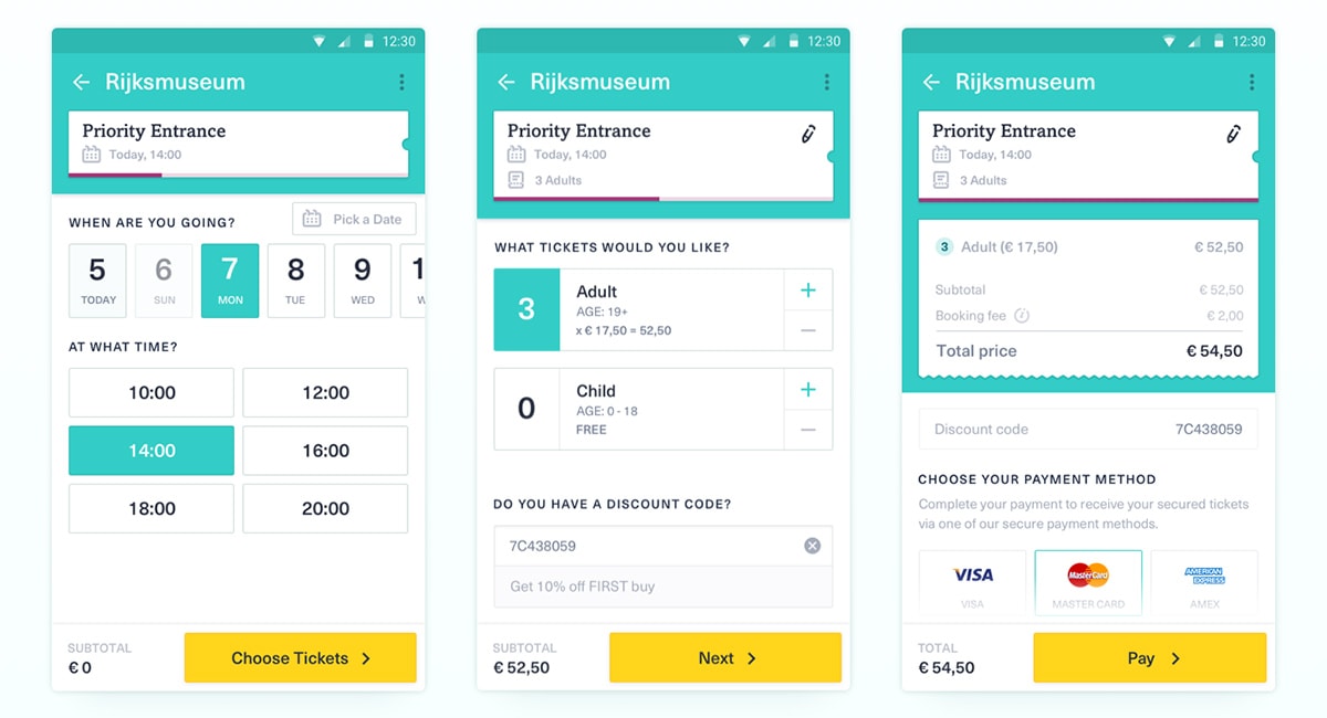
Take a peek at this example design from Yummygum. It’s for a ticket checkout page and the buyer can easily increase or decrease the total number of tickets, along with the dates and times of the order.
Note how the interface elements feel designed for tapping. They use large squares and colorful highlights to denote microinteractions. Perfect for mobile.
You can find another example in this shopping cart UI designed by Olia Gozha.
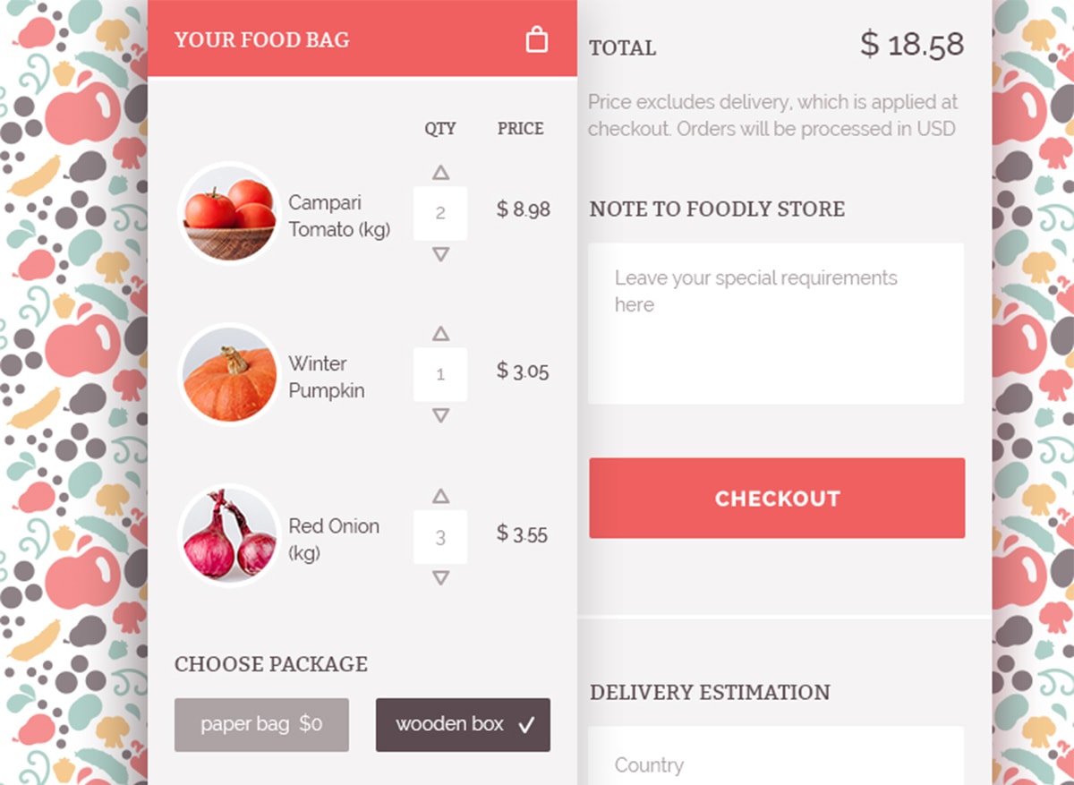
Again the interface references the total item quantity before checkout. Arrow icons make this super clear and they feel tappable too.
Think about what properties your customers may want to change before buying. Show them everything before the final checkout and give them full access to edit their order.
With Startup App and Slides App you can build unlimited websites using the online website editor which includes ready-made designed and coded elements, templates and themes.
Try Startup App Try Slides AppOther ProductsThis creates a psychology of building trust and ensuring that they really want to purchase.
Link Payment Methods
Handling payment on a desktop or laptop is simple. You can usually just grab your credit card and punch in the numbers.
But smartphones are not so easy.
Mobile keyboards are great, but they do not compare to a full desktop keyboard. You need to make the payment process simple & ideally streamlined to just a few taps.
How can you do this? By linking payments and saving them in the customer’s account.
Whenever they buy something ask if they want to save the payment method for future purchases. You can then create a screen that lets the buyer choose between credit cards, PayPal accounts, or whatever payment methods they’ve used in the past.
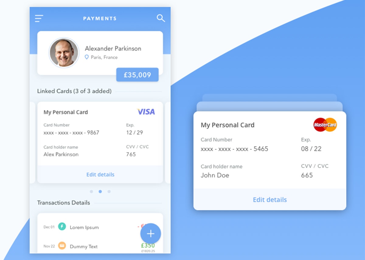
With this type of interface, simpler is better. But you may also want to share details about the payment method just to confirm it’s the right one.
Take for example this design by Vishnu Prasad. It showcases exactly how the checkout screen might look with a saved credit card number.
I don’t like how the data is just in plain view, that’s my only qualm with this UI. I’d design it to be hidden by default and a single tap would show/hide. But the main point is that the buyer can check their details before purchasing.
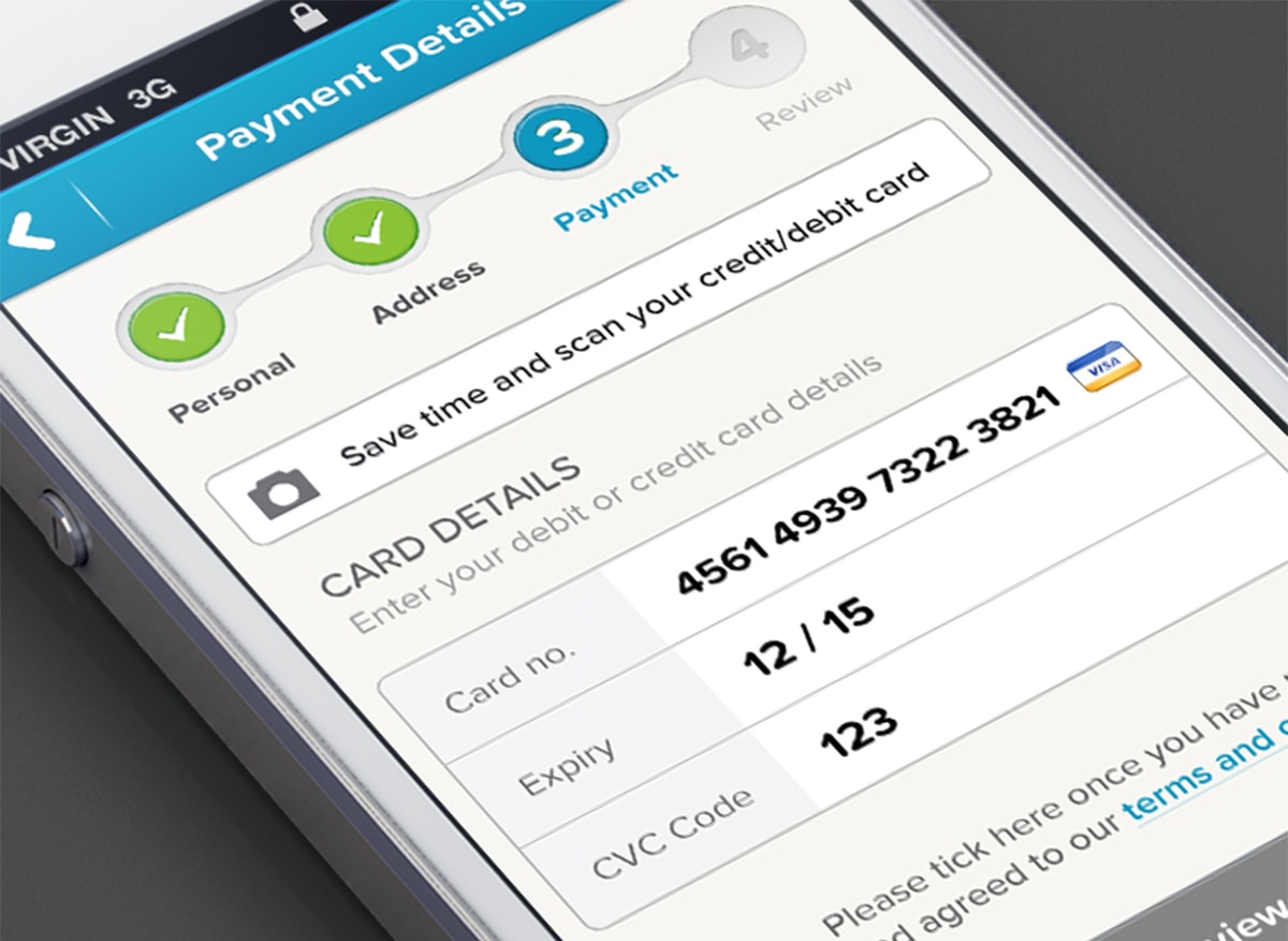
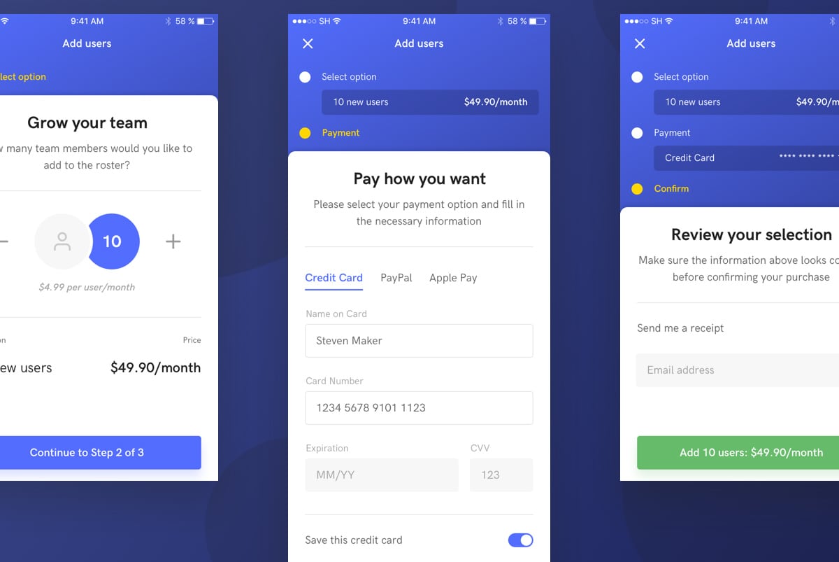
Not every buyer will want to do this. You’ll still need a secure form to take credit card info. This example by Murat Mutlu is a pretty clear mobile checkout UI with just enough fields to complete the process.
I actually like this style with the progress steps because it reduces the total number of fields on one page.
It’s actually a great trend for UX too & we should look into it a little further.
Use A Step-By-Step Checkout Flow
Whether you use tabs, breadcrumbs, or circular links, all of them can work as progress steps.
These help guide the user through the checkout process telling them exactly when they’ll be done with everything. It may not seem like much, but optimizing the process of your checkout page is huge.
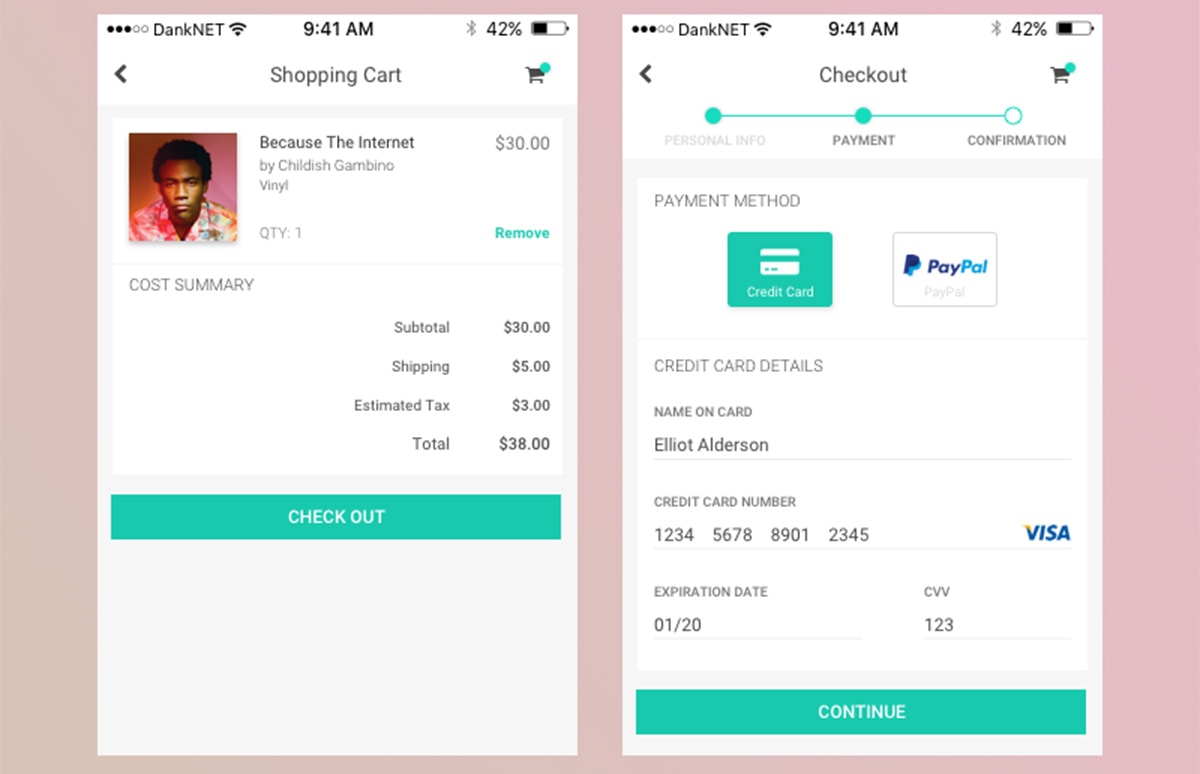
Take a look over this checkout UI with a fantastic progress step.
The CTA buttons change based on the page so it helps the user move through the entire checkout naturally.
Plus each progress step gets a check mark once it’s completed, a visual cue letting the buyer know they’re one step closer to completion. But you can signal this with icons, highlighted text, darkened backgrounds, or filled-in bubbles like the other example above.
Designer Steven Hanley has another cool UI which relies on the simplicity of dots and hidden page elements.
These hidden sections contain prior info for the checkout process. Once completed they auto-hide like an accordion menu.
With this technique you can run a very specific type of UI/UX effect. But the overall checkout process is improved through the same end goal: clarifying each step of the buyer’s journey.
Try looking over a bunch of progress bar designs to see which ones you like best.
I always recommend this even for desktop-style ecommerce checkouts because they can make a big difference. You just need to find a progress style that can match your mobile interface.
Give A Final Purchase Overview
There’s often some hesitation in the buyer’s mind before they click that final “purchase” button.
You can put their mind at ease by offering one final confirmation screen with a full summary of their order. This is especially handy on mobile where the browser doesn’t have easy tabs, there’s no mouse, and it’s tougher to review the order with the small screen.
It’s actually pretty simple to design this final checkout screen.
All you need to do is list the total order with line item prices, shipping, taxes, and the total fee. You might also include the estimated shipping date and other details pertinent to product delivery.
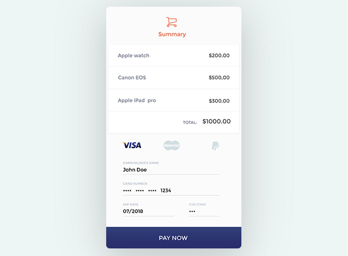
Designoholic made this sweet design showing how you can summarize all the products in one page.
It’s certainly not a perfect design but it proves that minimalism can work well for these mobile checkout summary pages.
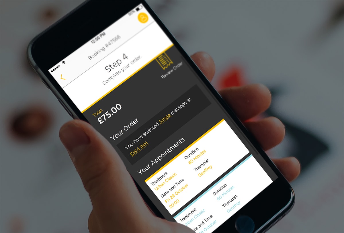
The same can be done for non-physical products like digital downloads or appointments too.
On a scheduling page you might finalize the order by showing the scheduled time, date, location, and other related info. This design by Tom Gamblin does it well.
You first need to know what type of info your buyers wanna see. Put yourself in their position and think about what you can show them on the final checkout page to put their mind at ease.
If they feel comfortable and secure with the purchase then they’ll be much more inclined to tap that final purchase button without hesitation.
Moving Forward
If you’ve never designed for mobile screens then you’ll be entering brand new territory with these trends. But don’t let this scare you away!
With all of these tips at your disposal you should have no problem designing a mobile checkout page that’s intuitive, encouraging, and likely to convert.


 siter.io
 pulsetic.com
 static.app
 mailpost.io