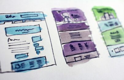
How to Create Responsive Search Forms: Design Tips & Trends
Every modern website should use a responsive layout. This makes it easier to browse on any device but it makes the page trickier to design.
The beloved search field is one example of a tricky page element. With responsive layouts on the rise web designers have new trends for search forms making them both accessible and stylish.
Let’s take a look at some examples of search form trends on the web. These should help you plan your own search UIs and give you some ideas for your next project launch.
By far the most common search feature is the dropdown form. This can be fixed with a link inside a nav bar that toggles the search on & off.
Since many websites use fixed navigation it’s easier to keep the search field visible everywhere.
But even with a static navbar you’ll find this dropdown search feature to be incredibly practical. There just isn’t much room elsewhere on a responsive page to squeeze a search form without hurting the main content.
With Postcards Email Builder you can create and edit email templates online without any coding skills! Includes more than 100 components to help you create custom emails templates faster than ever before.
Free Email BuilderFree Email Templates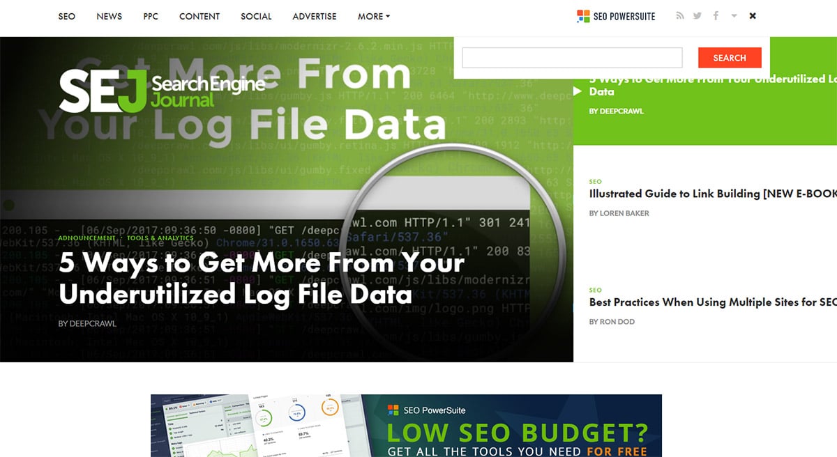
Search Engine Journal does this right with a quick & easy dropdown search field in the top-right corner. It relies on a small magnifying glass icon which should be universal to everyone.
Once the field is displayed it’ll automatically change the magnifying glass into an “X”. It’s a good way to clarify the user experience so people know they can close the field at any time.
Not to mention the SEJ design is fantastic and it blends perfectly with the layout on all devices.
Problogger is another nice example that does things a bit differently between desktop & mobile.
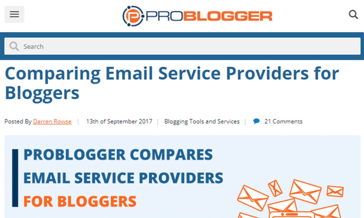
When you’re browsing on a smaller screen you get the typical magnifying glass with the dropdown field.
But desktop users have more space in the navbar which encourages a fully-functional working search field. Pretty cool!
With Pulsetic you’ll be instantly notified the moment your website, API, or server becomes unavailable. Monitor uptime from multiple global locations and respond to incidents before your users are affected.
Create beautiful status pages in minutes to keep customers informed during outages and build trust with transparent communication.
Start Monitoring for FreeYou might try this if you have enough space in the nav for a complete form.
Another site following this same technique is Skinny Ties.
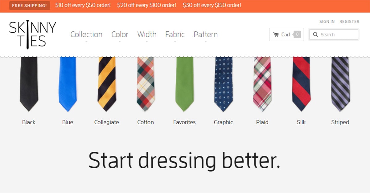
Notice how their default search field is much smaller than other links in the nav. This way it doesn’t take up much space and it can stay visible even on smaller devices.
Fullscreen Modal
If you don’t like the dropdown effect you can try using a modal window instead.
On the surface this might look similar since it’s connected to a search icon. But instead of the form dropping down from the navbar it’ll appear over the page in a modal window.
You can see a clean example of this on Full Home Living where the search modal overtakes the entire screen.
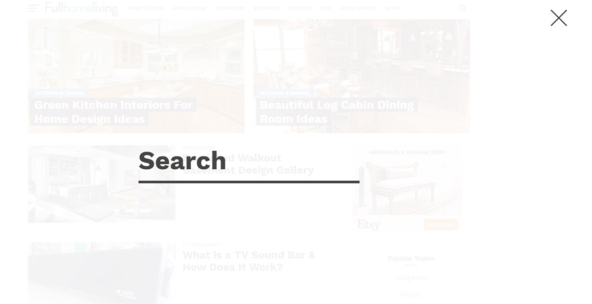
This grabs attention and draws the user’s focus right towards the form. It’s designed to be fully responsive and easy to use since the modal can be closed with a single tap.
Only downside is this can feel a little “too much” if you don’t want a plain screen overlay with just a search field.
If you’re daring enough to add more content you can try building a search modal like Comedy Central has on their site.
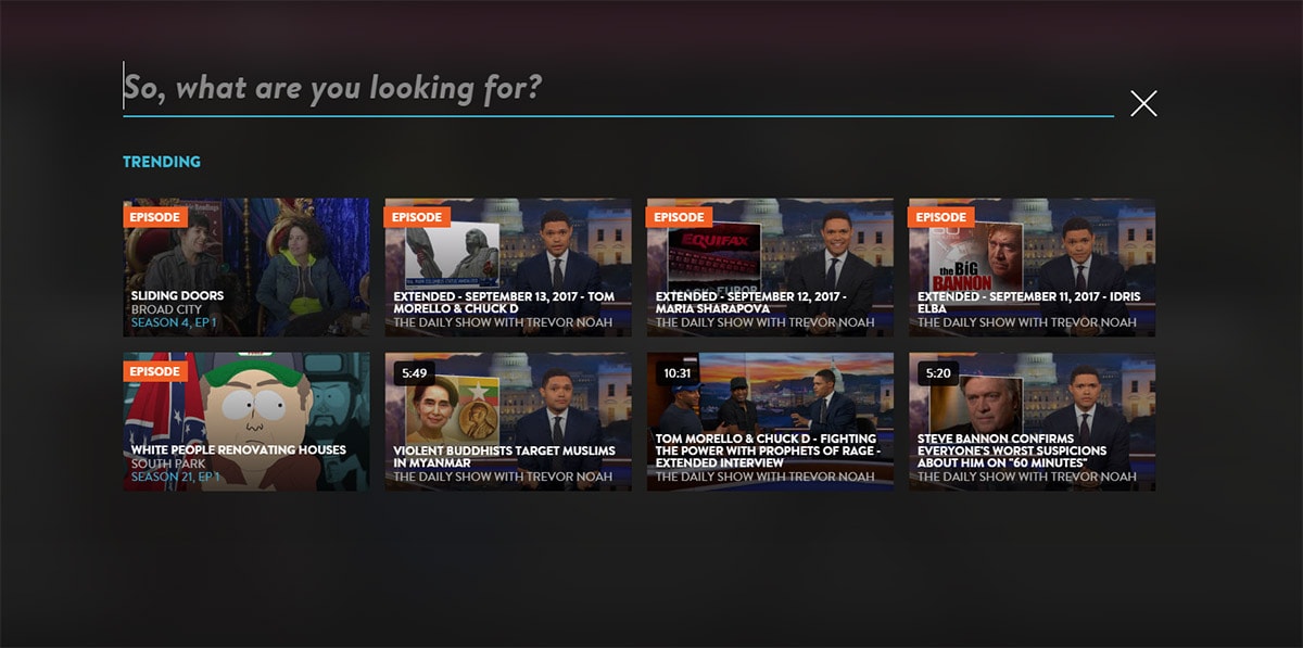
This also takes over the entire page but includes extra links to their newest shows & premieres.
If you have new posts, hot categories, or breaking news this would be a great way to showcase extra links on the page.
Fullscreen modals work well but you have to pay attention to the user experience. Make sure the modal works on all devices and that users can easily close the modal without difficulty.
Inline Responsive Inputs
Dynamic inline forms offer a hybrid of hidden search fields along with dropdown menus.
With an inline search form you can place the search toggle into your navigation but display it inline rather than beneath the navigation. We have this effect here on Designmodo and it’s a popular choice for many blogs.
For example check out the Cartoon Brew design with their inline search field. Their navigation has a magnifying glass in clear view but the form doesn’t appear until it’s toggled.
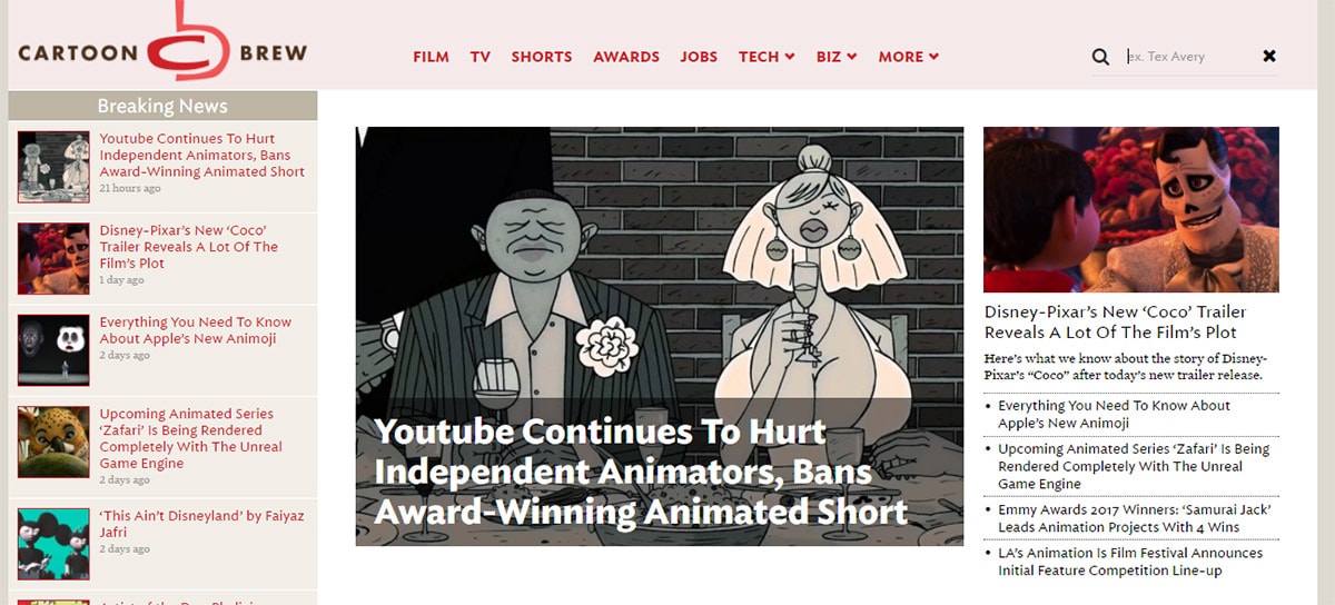
It appears inline with the nav links so this doesn’t take up much space. Responsive devices need to handle search differently so in smaller browsers it just appears in the dropdown sliding nav.
But you can tackle inline search fields by hiding them away inside your navigation too. DualShockers has a fantastic sliding menu that runs on all screen sizes.
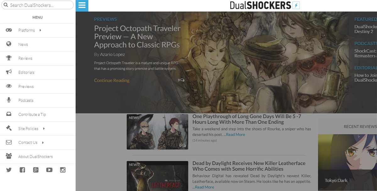
This nav toggles all the menu links along with a search form right at the top. It’s easy to access and built right into the navigation, same UI for all devices.
If you like the hamburger sliding menu then this can work really well.
But to follow this technique properly you’ll have to keep the hamburger menu as your default for all screens.
Certainly not a bad idea but it may not be what you’re looking for.
The better way to design inline forms is following the Cartoon Brew style or the style we use here on Designmodo.
Full-size Stretchable Forms
I don’t see this search design often but it certainly works well if your layout can adapt.
With stretchable search forms you can design the entire form to fit your layout at 100% width. From there you can adjust the field to squeeze into smaller spaces, even down small enough to work well on smartphones.
With this technique the search field is always visible and just shrinks smaller as needed. Authentic Jobs is one awesome example of this trend in action.
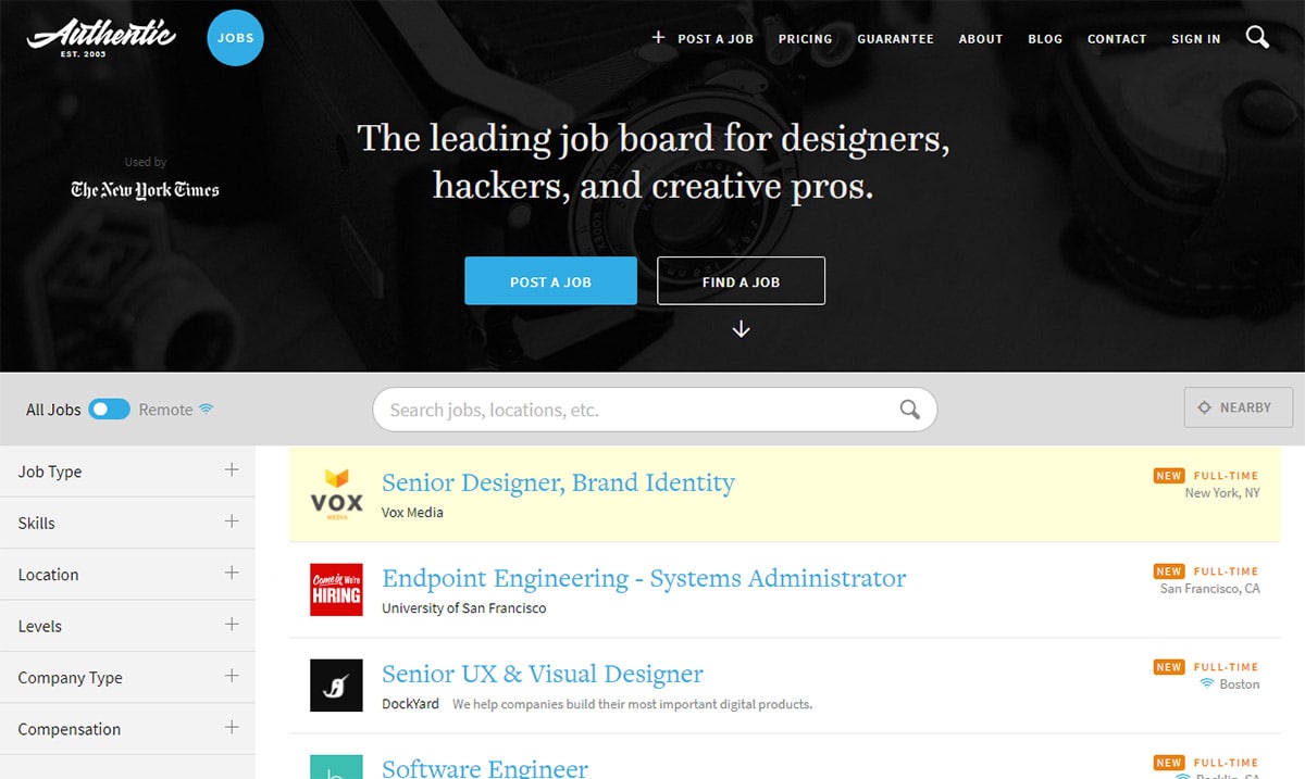
If you visit the site and resize your browser you’ll see how the other page elements rearrange themselves too. The layout is meant to be flexible so that everything is still visible, it’s just compacted into the design.
Search forms are a staple for many websites and if you need yours visible try following this stretchy form technique.
Or you can try combining the dropdown form trend along with this stretchable form UI to create a hidden field that overtakes the page.
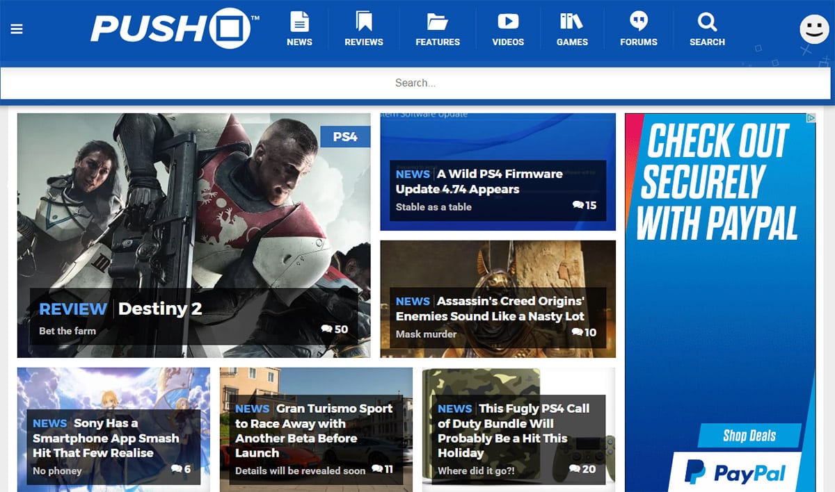
Push Square uses this effect with their search form pinned right to the top of the page.
Clicking the magnifying glass toggles the search form and by default it spans 100% of the page width. Doesn’t matter if you’re on a 1920px desktop or a 320px smartphone, this search field adjusts to fit your screen properly.
Designing Your Search Forms
The best solution for responsive search is often based on the project. Some navigation menus just don’t have room for inline search fields and they’ll need to be hidden off-screen.
If you aren’t sure how to move forward try browsing other websites for design inspiration and studying their search forms.
Take notes about which search features you like and which could fit your project the best. Test a few of your favorites through trial & error to see which responsive search UIs offers the best experience.