Best Free Web Icon Packs to Download
There are certain things in user interfaces that are eternal. Whatever the trend is — skeuomorphic, minimal, flat — designers will adapt to the current situation. One of the integral bricks of any good design is icons.
As a clear graphical representation, an icon naturally bridges the gap between the web application and user. You do not need words — an icon can say everything for you. Whether it is just a minimal line style pictogram like Icons from Swifticons or lavish and bright pictograms like one from Material Icons Bundle by Iconshock most likely, your users will receive the proper message.
300+ Free Tech & Activities Icons from Swifticons
Material Icons Bundle
![]()
Good user experience requires a well-thought-out selection of icons. Depending on chosen style, theme and goal, icons can be solid or outlined, monochrome or colorful, minimalistic or highly-detailed, static or dynamic. Let’s consider some of these stylistic choices more thoroughly.
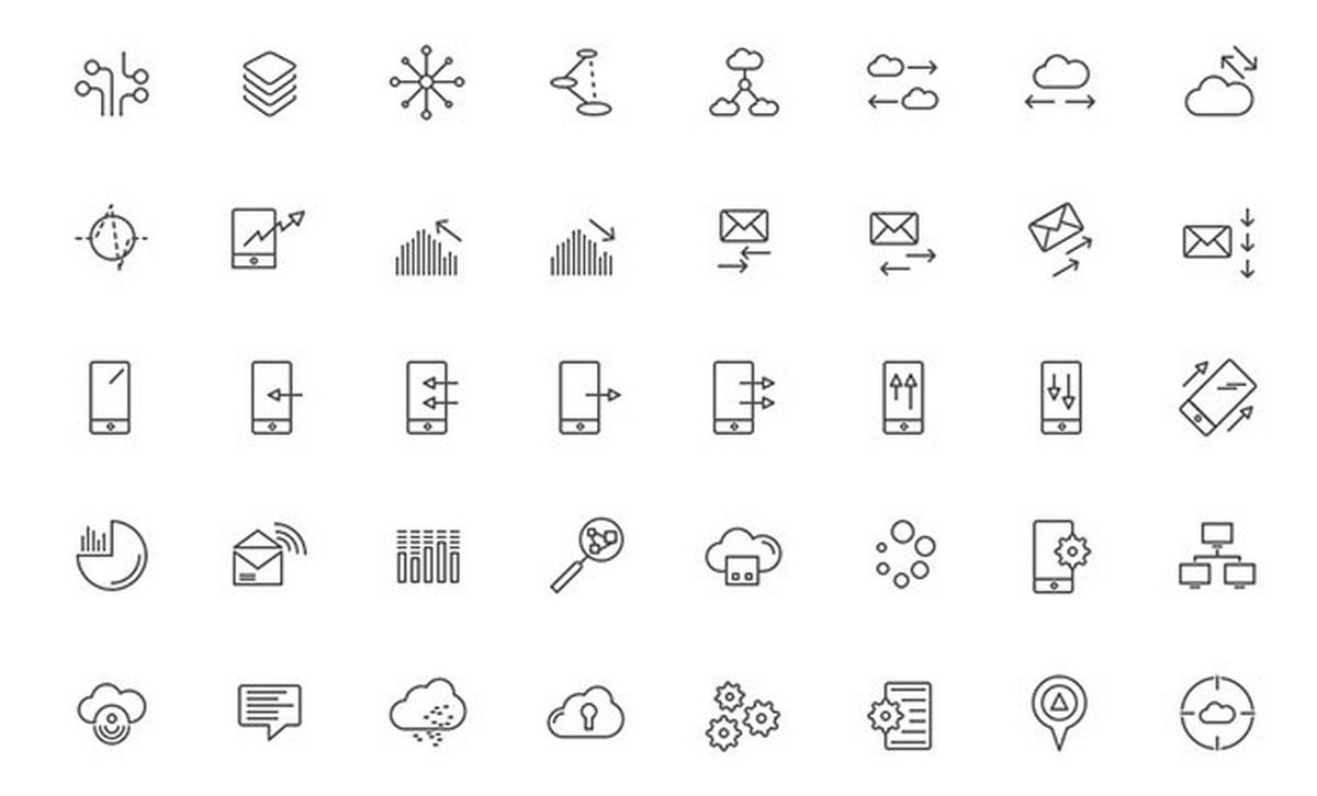
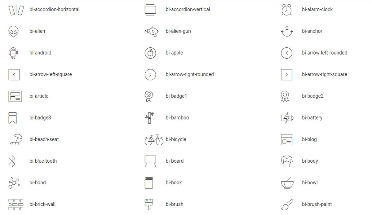
Line Icons
Linecons – Free Vector Icons Pack
Linecons is a set of remarkable free vector icons. The set contains 48 fully scalable vector icons in outline styles. You can use these icons when creating web and mobile interfaces. They will suit any site theme or design.
With Postcards Email Builder you can create and edit email templates online without any coding skills! Includes more than 100 components to help you create custom emails templates faster than ever before.
Free Email BuilderFree Email Templates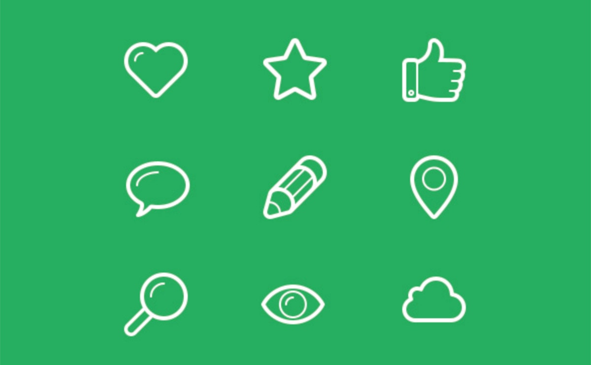
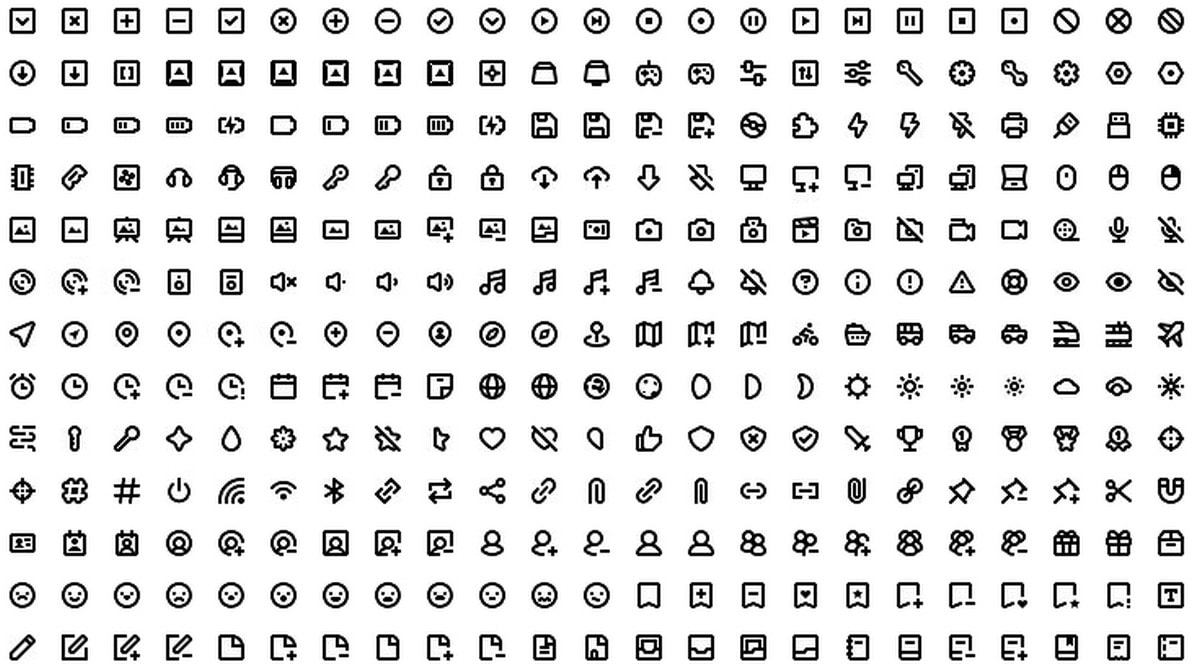
We begin with the most popular style of the several years – hole icons. They are everywhere. Websites, dashboards and mobile applications are populated with outlined graphics. To get started in this way, take a look at Mmmicons by Mint. Covering 500 assorted items presented in different styles, the bundle is enormous.
Mmmicons by Mint
Prometheus Free Icon Set by Taras Shypka is a unique take on a classic line style interpretation. While symbols are made with the help of basic lines and space (or negative space), they are also spiced up with tiny colorful shifted shadows giving each item an offbeat look.
Prometheus Free Icon Set by Taras Shypka
![]()
Solid and Monochrome Icons
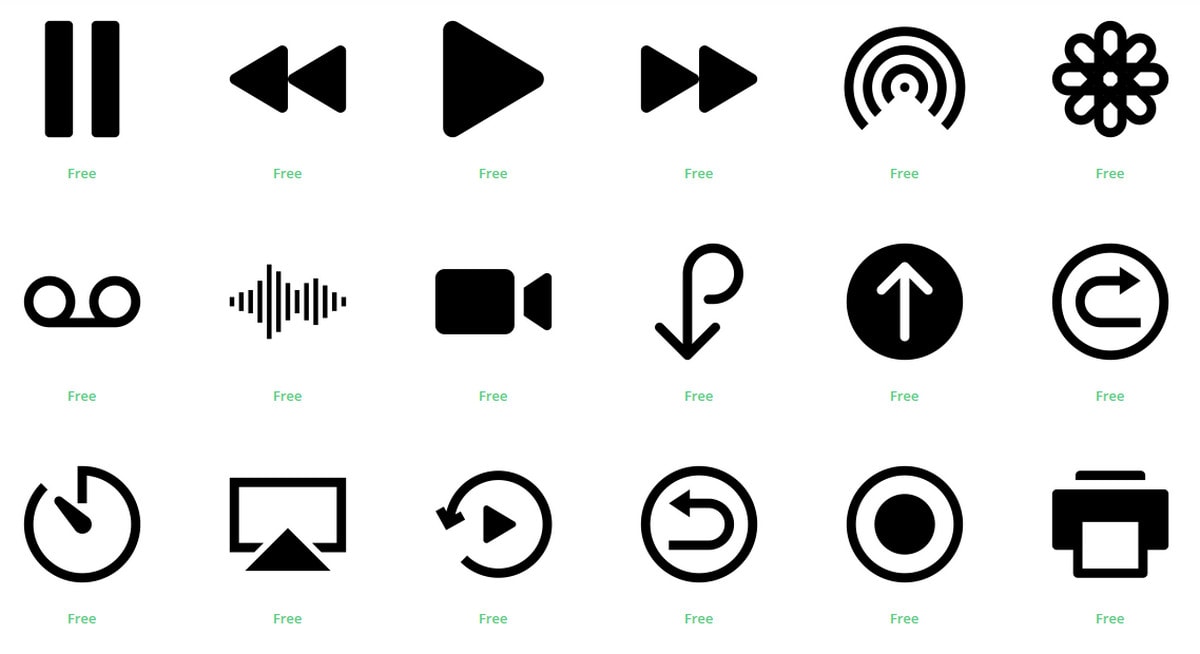
Unlike outlined icons, solid icons are a better alternative when it comes to interfaces with poor contrast or lots of content. Being visually heavy, they easily catch the eye. Also, they are great for modifications since solid shapes are easier to manipulate. Take a look at IOS 11 UI Elements Vol 1 by Jemis Mali and Interface Icons.
IOS 11 UI Elements Vol 1
The freebie by Jemis Mali comes in two separate volumes, yet bundle nicely. Together they embrace all the elements that are necessary for the iOS-based interfaces, ensuring that users can seamlessly navigate and interact with the system. Among these elements, search icons play a crucial role, serving as intuitive gateways for users to access information quickly and efficiently.
With Pulsetic you’ll be instantly notified the moment your website, API, or server becomes unavailable. Monitor uptime from multiple global locations and respond to incidents before your users are affected.
Create beautiful status pages in minutes to keep customers informed during outages and build trust with transparent communication.
Start Monitoring for FreePack by EverydayTemplate has more than 200 icons presented in two styles, thick outline and solid. Each item is available in three basic formats — AI, EPS and PNG.
Interface Icons
![]()
Colorful Icons
Colorful icons never get old. Depending on tones and shades that dominate this year, designers create their freebies. For example, Dusk UI Icons and The Color Icons Set benefit from the trendy soft pastel palette that is just gorgeous.
Dusk UI Icons
![]()
Dusk UI is more sophisticated and intricate than the Icon Set by Pixeden that takes on a modest minimalistic approach. It is also playful and cheerful whereas the second one is businesslike and modest.
The Color Icons Set
![]()
Social Media Icons and Radical Science Icons employ a traditional bright coloring yet with some twist.
![]()
Pack by IconBunny will please you with 14 stylistic choices including both colorful and monochrome variants. Each icon is delivered in three formats — CDR, EPS, and PNG.
Icons in the pack by InvisionApp have a lovely artistic vibe looking pretty much like tiny illustrations. The artist has prepared the freebies in six formats — AI, EPS, JPG, PDF, PNG and SVG — and three stylistic options — filled, flat and outlined.
Radical Science Icons
![]()
Animated Icons
Animated icons take a special place in our collection. Slowly but surely we are getting used to dynamic elements in interfaces, such as hover effects, parallax and animated icons. The small bundle by Icons8 is for a non-static dogma. There are 60 dynamic items in an elegant line style that are ideal for building material-inspired designs.
The small bundle by Icons8
![]()
As a rule, the first formats that come to mind are PNG, AI, PSD, EPS and Sketch. However, there are two more choices that are not only relevant but also more suitable for many projects. These are SVG and WOFF or TTF.
SVG Icons
Although SVG dates to 2000, only recently did it become popular, thanks to its ability to scale to any size without losing quality. Being an XML-based format, it can be easily searched, indexed, compressed and even animated. Consider:
- Simple Icons: The bundle focuses on brands. Here you can find a ton of famous logotypes made in crisp solid shapes.
- Feather Icons: The pack features assorted icons that look refined and subtle.
- Evil Icons: It is a collection of line SVG icons that are multi-purposeful. Although it is rather small, yet it can be used via Rails, Sprockets, Node.js, Gulp, Grunt and CDN.
Simple Icons
![]()
Feather Icons
![]()
Evil Icons
![]()
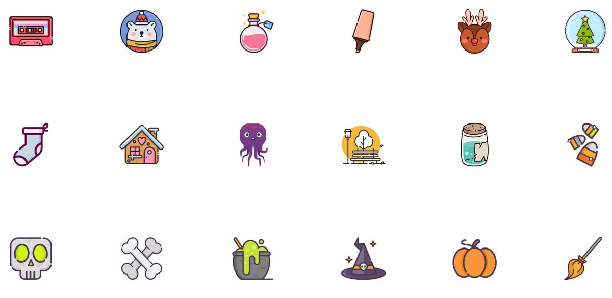
Unlike previous sets that boast more fragile, clean aesthetics, PathLove is a selection of bright, cartoonish icons. They are funny, playful and just adorable.
PathLove
Icon Fonts
Icon fonts are great for numerous reasons. First, you can set styles using CSS without Photoshop or any other image editing software. The graphics will look great on any device of any size. It is an elegant way to incorporate iconography. Though the solution is limited by a lack of variety and stylistic choices. But, for numerous projects, that is sufficient. There are several web fonts on our list.
Fontisto
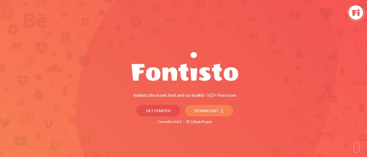
Fontisto is a professional web font that covers such categories as accessibility, currencies, payment, transportation, e-commerce and others. There are more than 500 characters.
Jam
![]()
Jam is another web font with a huge collection of pixel-perfect icons. It has 422 items made in a subtle design. It is divided into such groups as web, directions, video/audio, text and social.
Bicon and Devicons are less impressive sets of icons, yet still, they are helpful. Both freebies include around 200 items. Whereas Devicons is a bit trivial, Bicon has some interesting symbols inside like ufo, tree, video cam, etc.
Bicon
Devicons
Icons are not as limited as several years ago. We have plenty of choices. There are different formats, different sizes, different styles and different themes; they are even presented in two states, static and dynamic. Without a doubt, iconography has become more flexible, adaptive, versatile and sophisticated.
Tell us which format you prefer to use. What style is your favorite? Have you ever created interfaces without icons?