Use Color Accessibility Tools to Improve Your Website Design
Did you know that more than 4 percent of the population is color blind? Different variations of color blindness and other sight impairments can impact the readability and usability of your website.
It’s up to you to ensure that your design is accessible to all users, no matter how they see color.
And it’s easier than you might think with the right set of tools.
What is Accessibility?

There are numerous accessibility checks and standards when it comes to website design, with the overall goal being to provide a website design that any user can understand with ease.
Accessibility concerns range from anything to audio, navigation and feedback, text properties and color. The latter is what we’ll focus on here, because it can be one of the easiest things to identify early in the design process and correct before problems arise.
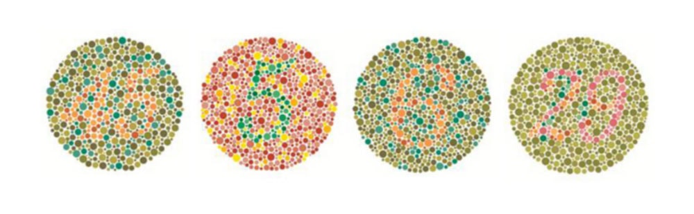
Different variations of vision impairments, including color blindness are the top concern when it comes to a visual medium, such as a website. According to Colour Blind Awareness, 1 in 12 men and 1 in 200 women worldwide have some form of color vision deficiency.
With Postcards Email Builder you can create and edit email templates online without any coding skills! Includes more than 100 components to help you create custom emails templates faster than ever before.
Free Email BuilderFree Email TemplatesYou can see a comparison of how different types of color vision look here, with explanations about each type.
Accessibility Guidelines and Standards
When it comes to color and accessibility, the top concern is contrast.
That includes contrast of colors in the foreground and background, contrast of colors for text (including weight and size) and contrast of colors for all user interface elements.
There’s a document outlining best practices for web accessibility, including color. The Web Contact Accessibility Guidelines (WCAG) is in version 2.1, and covers everything you need to help make a website more accessible. You can learn more about these guidelines here.
When it comes to color, this is the recommendation: “Color is not used as the only visual means of conveying information, indicating an action, prompting a response, or distinguishing a visual element.”
Color accessibility best practices:
- Provide sufficient contrast between the background and foreground; this applies to elements of any type that relate to one another
- Use color and something else to convey information
- Make sure that interactive elements and navigation are identifiable (subtle color changes to hover states alone are not enough)
- Make sure that form labels have a color that’s easy to read; apply this to errors and feedback as well
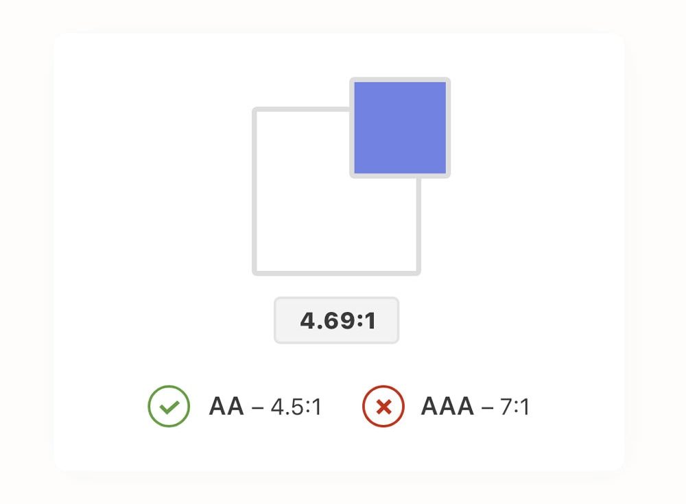
- Text and interactive elements should have a contrast ratio of at least 4.5 to 1.
10 Color Accessibility Tools
There are plenty of great tools available to help you check everything from contrast to color combinations to building a palette that is as accessible as possible.
With Pulsetic you’ll be instantly notified the moment your website, API, or server becomes unavailable. Monitor uptime from multiple global locations and respond to incidents before your users are affected.
Create beautiful status pages in minutes to keep customers informed during outages and build trust with transparent communication.
Start Monitoring for FreeHere are a few that are exceptionally helpful.
WebAIM Color Contrast Checker
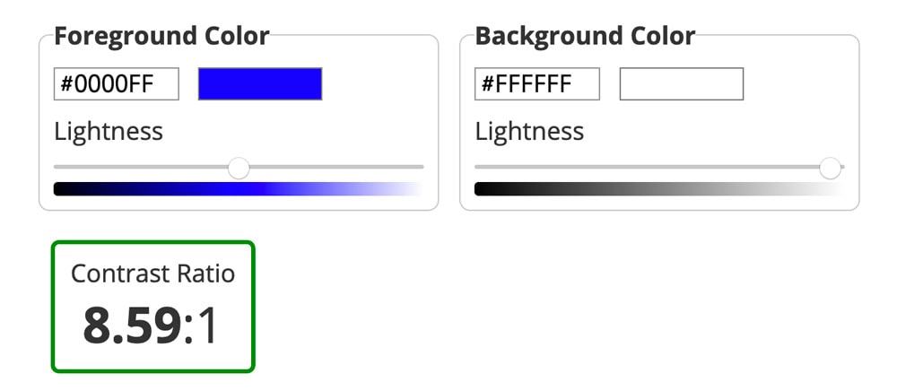
WebAIM Color Contrast Checker checks the contrast ration between background and foreground colors. Aim for a ratio of 4.5:1 or higher.
Colorable
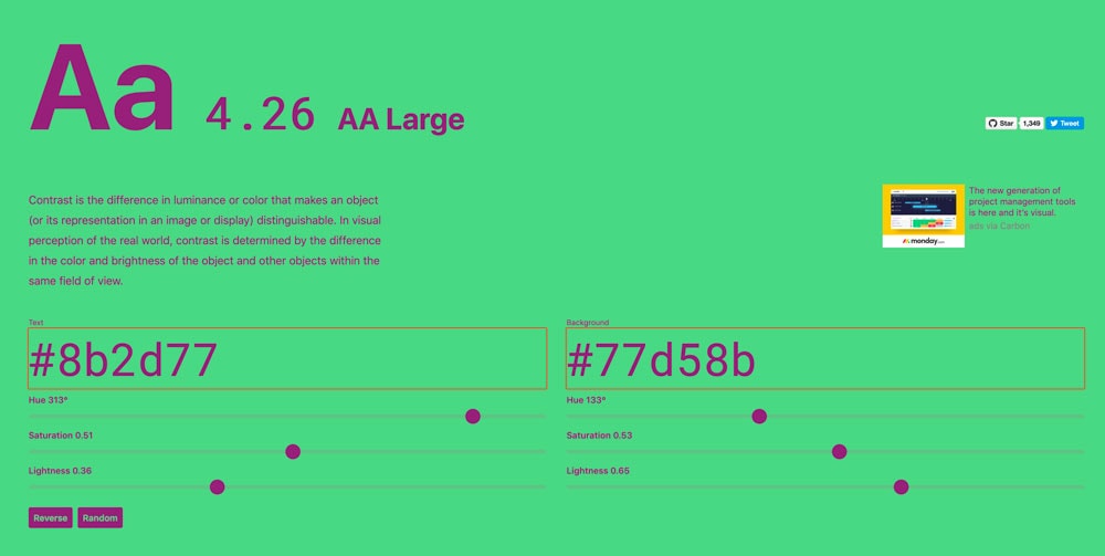
Colorable tests contrast using the difference in luminance that makes each color distinguishable. It uses more than just the base hue but also takes brightness and surrounding objects into consideration.
Color Safe
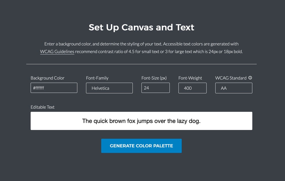
Color Safe helps you create accessible color palettes based on the WCAG guidelines. These palettes ensure that you use proper background and contrast ratios for optimum readability.
Web Accessibility Guidelines
Web Accessibility Guidelines has a color contrast cool that shows different colors on different backgrounds that ensure content is easy to read. Use it to create background and text options that are clear and understandable.
Stark
Stark is an Adobe XD and Sketch plugin that you can use to test accessibility as you work on designs. Test contrast, run a color blindness simulation or even get color suggestions for improvement.
Colors for All
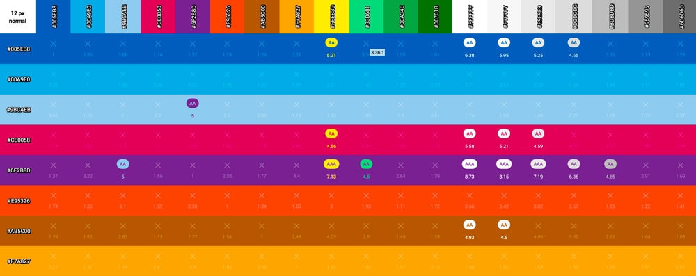
Colors for All is a giant visual chart of colors in a grid that shows pings for combinations that meet WCAG standards.
Color Blind Web Page Filter
Toptal Color Blind Web Page Filter lets you put in a URL, set a vision filter, and see what the page looks like. This can be a great test to help you visualize how accessible a design is.
Color Review
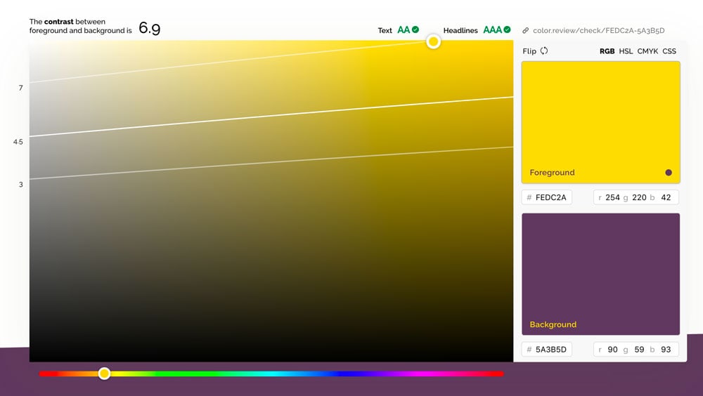
Color Review is an app with swatch and eyedropper tools to help you check color contrast. You can also use it in browser. Flip through random colors for an example of what difficult reading looks like.
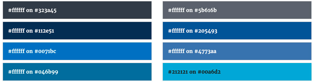
Colors
Colors includes 90 combinations of color pairs for accessible website design. Each combination shows a size guideline and ratio, so you know how well each pair performs. This is a great place to start if you are looking to create accessible color palettes.
Contrast Grid
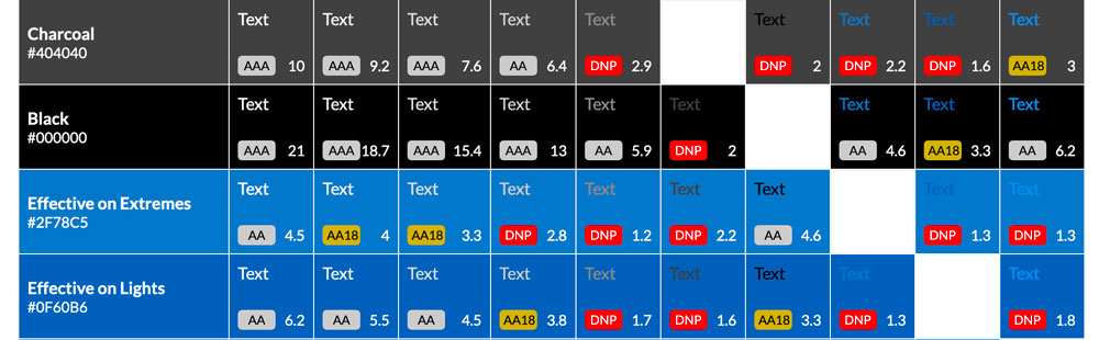
Contrast Grid allows you to test foreground and background combinations for compliance with WCAG minimum contrast requirements. You can enter any colors you want to create a grid for your design options.
Conclusion
When it comes to designing a website, accessibility is important. Even if you have perfect color vision, you want to step back and think about the design from the perspective of someone who does not.
Accessibility should be a conversation that you have about every new website design project. What good is creating a stunning website if a fraction of users can’t see it?