Best Status Page Examples: Advanced Customization, Design, and Incident Reports
Expect companies to embrace transparency in platforms to reinforce relationships with the digital crowd and improve their positions in the market this year. Information such as system metrics, incident data, maintenance calendars, and even the status of the hosting provider comes to the forefront because visitors who are already accustomed to getting answers to questions immediately require it.
While a decade ago, communicating this type of data was a true nightmare that put a lot of pressure on incident management teams with effort, money, and time; today it is a clean and elegant solution that is available to everybody with a public status page.
If you have questions about what that is and how it should be implemented on your website, you are not alone. Many are unaware of this component despite its being an essential unit of web platforms. It’s time to embrace this established standard because the landscape of the competition and market has changed due to the rise of the SaaS industry.
Follow our guide to stay on track. We will dive into the essentials of this vital component and disclose valuable hints from real-life status page examples and best practices shared by professionals on how to introduce it in your project.
What Is a Website Status Page?
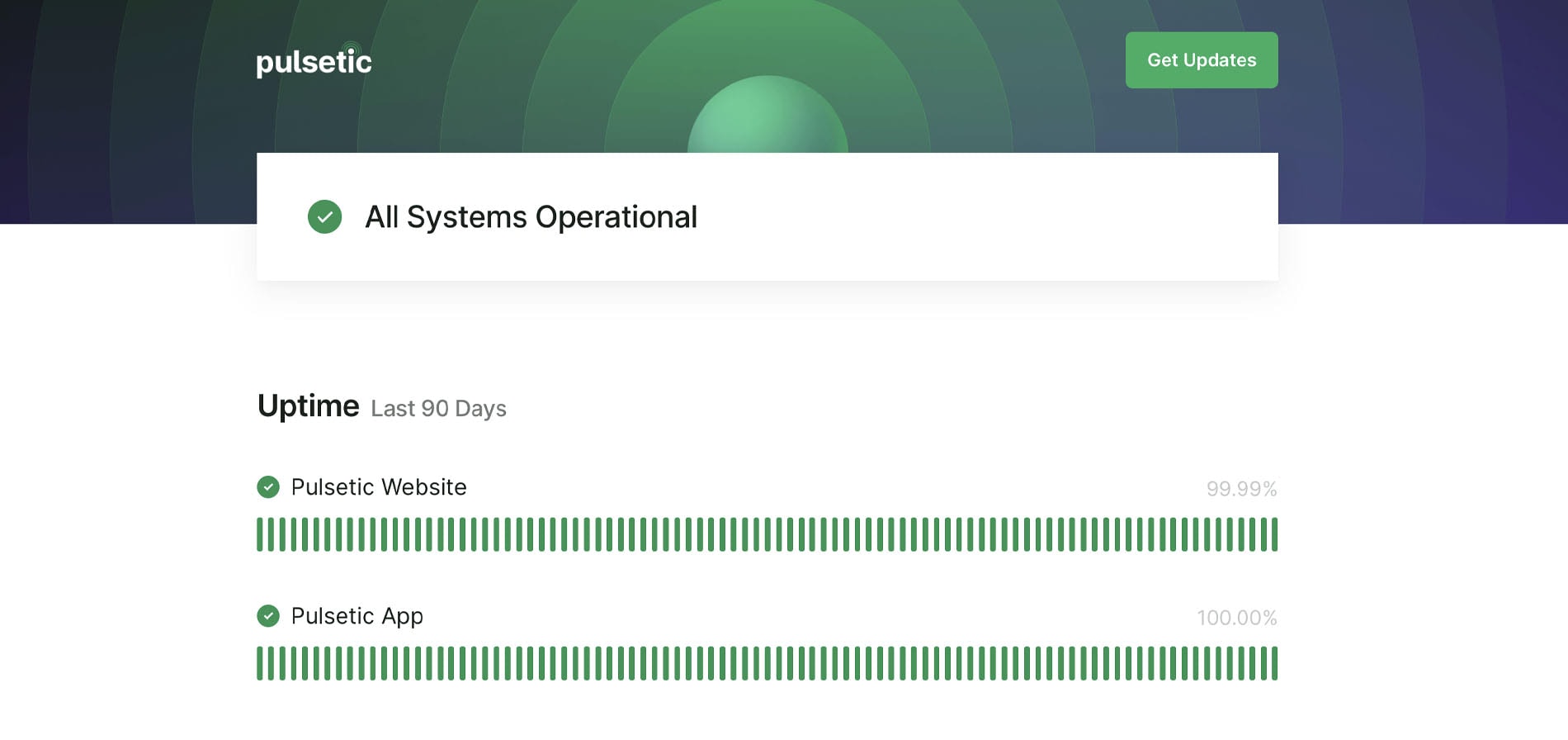
A website status page is a regular web page that does not differ at its core from any other page on the website other than it has one specific goal. The status page is designed to inform and educate visitors about the system’s current health and provide an overall view of the current operational status at any given time.
It is widely used by SaaS companies that need to keep updated their clientele and prospects about the current situation on the platform not to lose any precious leads or loyal customers due to confusion or overwhelming that may occur during outages, incidents, scheduled events, and maintenance events done to check or improve the system.
With Postcards Email Builder you can create and edit email templates online without any coding skills! Includes more than 100 components to help you create custom emails templates faster than ever before.
Free Email BuilderFree Email TemplatesIt may feature all sorts of information that the team considers vital for the readers to keep them on track, thereby maintaining their trust and loyalty. For instance:
- The operational status of components is crucial for users to stay in the game. These can be a functionality that a user faces directly or a feature that affects the service.
- API that the user may interact with.
- The current working condition of the system.
- Response time.
- Uptime and downtime.
- Security errors.
- SSL certificate status.
- Regions checks.
- Incident history with the resolution status and in-depth report of what was done to fix the problem.
- Planned maintenance
- Current and upcoming incidents.
- Known issues.
- Report on new features.
- List of services.
- Subscription form to let visitors sign into the email list to get regular updates on the current situation.
It is important to note that not all these components should be displayed at once. Even though the content is a king, overwhelming readers with information that does not provide value leads to drastic outcomes and nullifies all the advantages of this approach.
Therefore, it is highly recommended to choose data that makes sense to your target audience and take baby steps with displaying information by sticking to formatting tools like a table or visual units like graphs and charts to organize information into logical divisions that are easily discernable, and comprehendible.
Last but not least, some information should be allocated on the so-called private status page. It is used to educate the departments, including developers and marketing staff, about the situation through a private channel.
Why Is a Status Page Important?
For many small and mid-sized organizations and solo entrepreneurs, status pages sound like a waste of time, money, and effort, looking much like a modern whim that big companies try to impose on everyone else.
In fact, more than 60% of online shoppers will ditch the platform if they find it unreliable, obscure, and ambiguous. This mood raises the importance of using this communication tool in every business conducted in the digital expanses regardless of the niche, target audience, age, and scale.
Besides, it offers a range of profound benefits that may take any company to the next level, to say nothing about maintaining and reinforcing its current position in the market.
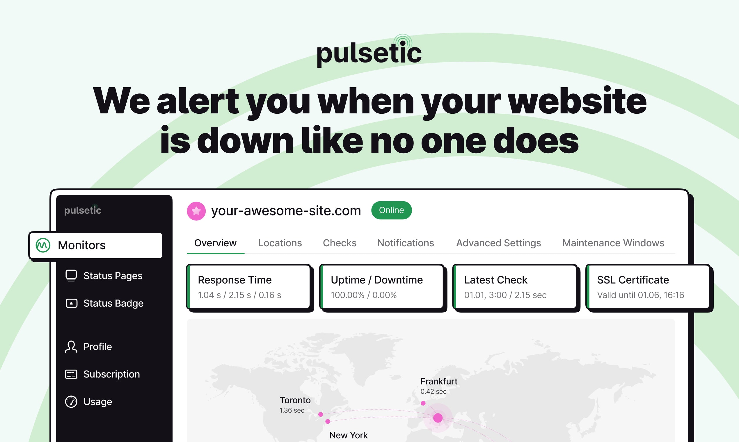
With Pulsetic you’ll be instantly notified the moment your website, API, or server becomes unavailable. Monitor uptime from multiple global locations and respond to incidents before your users are affected.
Create beautiful status pages in minutes to keep customers informed during outages and build trust with transparent communication.
Start Monitoring for FreeLet us consider the advantages that the public status page offers:
- It serves as a source of helpful information that provides much-needed transparency.
- It nurtures relationships between the company and its clientele.
- It is the easiest and most accessible form of customer communication done automatically.
- It lets reach a massive audience without wasting a bulk of the money, time, and effort on other means of communication like messages on social media platforms.
- It builds trust and increases loyalty to the services.
- It keeps the target market and passers-by in the loop, educating them on what is happening on the resolution front.
- It informs about the level of impact any incident has on the system and platform, increasing the brand’s credibility.
- It offers alerts for downtime that help the company act on time.
- It lets development and marketing teams focus on resolution avoiding all hustle and bustle of dealing with communication silos.
- It is a part of building an intuitive service.
- It acts as a centralized hub for all communications whose location is widely-known and can be accessed at any time.
- It may provide a facility or support to its users with specific features.
- It helps users to make an informed decision.
- It reduces the amount of time you are spending on support and communication.
- It reduces the pressure on your support team.
- It provides a better problem-solving environment.
- It helps to avoid crisis communication.
- It helps to retain customers.
- It lowers the customer cost of acquisition because superior customer care increases customer satisfaction with the product, platform, and brand.
- It escalates profit: according to recent studies, increasing customer retention rate leads to profit growth by at least 25%.
- It minimizes frustration, confusion, and mistrust.
- It boosts brand equity and improves brand identity assisting companies in their battle against competition.
- It helps the company concentrate on what matters and channel all efforts in the right direction, avoiding confusion and distraction, and contributing to an enjoyable user experience across all platform sections.
Snippet from infographic “Website credibility factors.”
Pitfalls of Custom Website Status Pages
Status pages are nothing new for internet users. They have been for a long time in the digital expanses. As proof, they have already carved their niche and got their place in the web industry’s vocabulary. Not only are users perfectly aware of them, but most importantly, they refer to them in times of need and uncertain situations.
Status pages offer businesses a whole range of advantages. However, what about pitfalls and shortcomings? It is vital to understand the weaknesses of the solution to make the right decision. Therefore, let’s consider the most popular drawbacks and obstacles that companies need to overcome and downsize to unlock the potential of the status page.
Coping with the solution on your own
If you choose an open-source solution, you need to host and maintain it yourself. This scenario can cause some additional pitfalls.
For instance, you may face problems with managing the host on your own, thereby wasting your precious time on constant tracking of the page and regular monitoring of the system to double-check the effectiveness of the open-source solution. Even if you decide on getting the special department on board, this brings extra expenses that may shutter your business plan and marketing strategy.
Dealing with updates through emails or SMS
Open-source projects are unlikely to have all the basic functionality you might need to automate this process. For instance, most of them do not have the infrastructure that powers subscription and notification delivery that you might find in premium approaches.
Managing email, SMS, or API involves lots of coding work you need to do regularly. That means you need to establish and run this type of communication with the visitors and clients on your own. At a minimum, you need to build the subscription form, integrate it with the mailing service, and create digital newsletters every time the problem occurs. That may become a true challenge for some solo entrepreneurs and small companies.
No freedom with premium solutions
While premium solutions save the company from the hustle and bustle of back-end work relevant to open-source solutions, they still have some serious shortcomings. One of such drawbacks is that they have a closed system, so you do not have a chance to interfere with the code and infrastructure to extend the service’s functionality.
You cannot add new features to adapt the system to your specific needs. Even though some platforms have API that can be used to improve a solution somehow, there is still no vast flexibility that is crucial for serious developer teams.
Tricky Setup
Not all premium solutions are the same. Some target professional developers’ teams, making the integration process and benefiting from the platform’s features quite tricky and challenging. Therefore, non-tech-savvy entrepreneurs may find configuring the system and setting up a comfortable environment onerous.
What Makes a Good Status Page?
To create an effective status page, start with the right solution. The best thing is that there is no one way to bring it to life. Go for open-source if you are eager to bury your nose in coding and monitoring tools. Alternatively, go for premium solutions and delegate this task to the product created by a team of professionals.
Both approaches have their own merits. Open-source projects are free and provide some flexibility for developers; whereas premium solutions do all the heavy lifting, giving teams some free time that can be used to improve service, marketing campaigns, brand identity, and other essential components.
Both categories are teeming with solutions. Suppose you demand a reliable partner. In that case, the premium sector has more to offer, from substantial multifunctional services with a comprehensive list of tools to monitor the system’s health to a cluster of platforms that prioritize essential features and provide efficient solutions to small- and mid-sized companies across the Globe.
Consider Pulsetic, the popular tool in this niche, and its package of features and benefits:
- It combines incident management, uptime monitoring, and status pages under one roof – everything your startup may need.
- It has numerous data centers around the World to localize outages effectively.
- It sends instant alerts via various channels, including emails, SMS, Telegram, Slack, and even phone calls.
- It has a collection of regularly-updated vigilantly-designed templates that meet all the current standards and serve as a solid foundation to create a status page that perfectly blends into the platform’s environment.
- It is easy to manage. The interface is intuitive and made with non-tech-savvy entrepreneurs in mind. Plus, their YouTube video explains the basics and teaches how to create a status page for a website.
G2 reviewers have awarded Pulsetic an impressive 4.8-star rating, highlighting its standout performance in comparison to its competitors.
With such a partner, your company will be safe and sound and get a solid chance to move forward without compromising relationships with the clients and prospects.
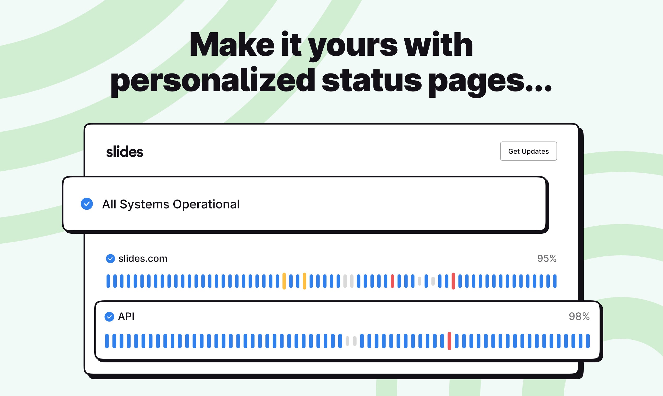
Securing the right solution for your web project is just a half of the battle. The rest lies in creating the page that will deliver a great user experience and display all vital information like the platform’s health, uptime, or scheduled maintenance events in a pleasant and understandable manner. Here, best practices and tips shared by professionals come in handy.
Best Practices for Creating Effective Status Pages
Consider these tips and best practices to develop effective status pages:
- Turn the status page into a roadmap that navigates users through the obstacles that may suddenly occur during their interaction with the service.
- Set the guideline for the conversation with clients and visitors during an outage.
- Create a protocol of actions for the worst-case outage you could have.
- Make it an integral part of your incident management system.
- Host your status page on other infrastructure because whatever dreadful may happen with your platform, server, and hosting provider, the status page needs to work like a clock.
- Remember that people who visit your website are likely to know that you are down, so provide them with content that will ease their pain and eliminate frustration and confusion. Think through the data. Note that some of it may go to the private page.
- Show genuine empathy for affected users.
- Reassure visitors that you are taking the issue seriously.
- Send an alert when traffic spikes on your status page.
- When the accident is handled, reach out to all customers who might have been affected. Some marketers suggest sending apologetic notes with incentives like discounts or promo codes.
- Publish detailed post-incident reviews to show the work of your team.
- If you have impressive numbers about your performance and support team, share them with the others. This way, you will quantify the brand, which leads to a better reputation.
- Inform everyone, including key stakeholders, customers, marketing departments, and support team, in advance of any risk of downtime. However, do not overdo it, especially with clients. If you use email as a channel for communication, make sure you do not bombard them with updates every minute.
- Do not fool yourself. If something is wrong with the status page, for example, it has an uncomfortable reading path or looks messy, you need to address this issue without compromises.
- Add the language selector if you serve a target audience from various countries.
- Include a pop-up subscription form and a link to point people to support agents.
- Use graphics, visual instruments, and illustrations to make the boring data look enjoyable.
- Use the same theme to tie the status page with the platform.
- Add navigation and link to the main page.
- Place a link to the status page on the homepage, preferably in the footer section.
Inspiring Status Page Examples
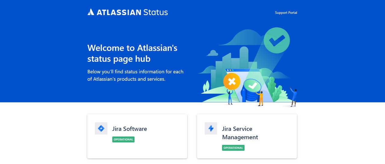
When it comes to compelling examples of status pages, the first thing that springs to mind is Atlassian and their page that describes the health of the huge multifunctional platform.
Do not expect to find in-depth information about every end-user feature and product. The team has prioritized operational status information for Atlassian products, including Jira, Bitbucket, and Trello. Still, they did it smartly by eliminating possible clutter and dividing data into small digestible portions.
The main page of their status page includes a list of products. Each product has a visible representation of its health status so that users can scan the page and quickly get the situation. For instance, green means that the system works fine, whereas yellow hints about an active incident whose resolution is still in progress.
Each block links to its corresponding status page, where online visitors may dive a little bit deeper into the problem, updates, historical uptime of APIs, and history of past incidents. Last but not least, each section has a subscription form and form to report a problem.
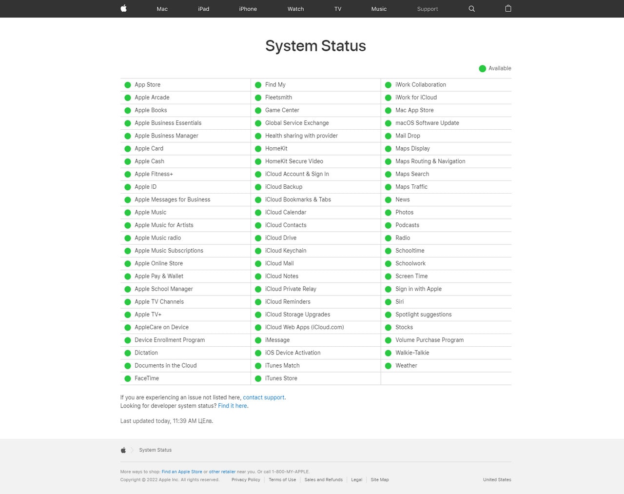
If Atlassian’s way of displaying the system’s health feels like too much for your small local company, you may get some great insights on how to do it from Apple and their sleek, neat, compact, and straight-to-the-point status page.
The company stays true to its principles; therefore, its system health page looks much like any other page on its website. It has general navigation on the top and an additional menu with crucial links in the footer featuring design solutions that customers are familiar with. All their products are listed and broken into the three-column structure and sorted alphabetically to make it easier for customers to locate the required service or feature.
Unlike Atlassian, Apple’s incident management team does not go into details about incidents: they display a list of products and their operational statuses. Plus, there is a link to contact the support team and visit the page with developer system status, where users may get more exhaustive information.
Apple, much like Atlassian, has a vast portfolio of products, but it sticks to an overly minimized approach that works great for its audience.
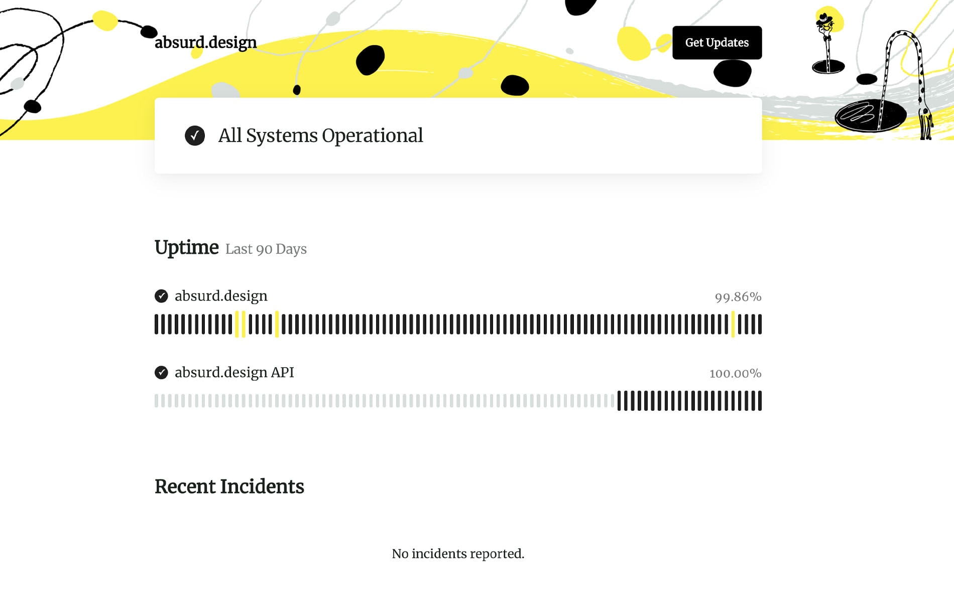
The status page on Absurd Design falls into the minimal approach category. It is an excellent example for artists and creative entrepreneurs who highlight or sell their goods like UI packs, icons, illustrations, web templates, or plugins online.
The page prominently communicates the system’s current status and features a traditional linear uptime graph with data for the last 90 days and recent incidents. Plus, there is a link to get updates.
That is all the target audience may need when interacting with this platform.
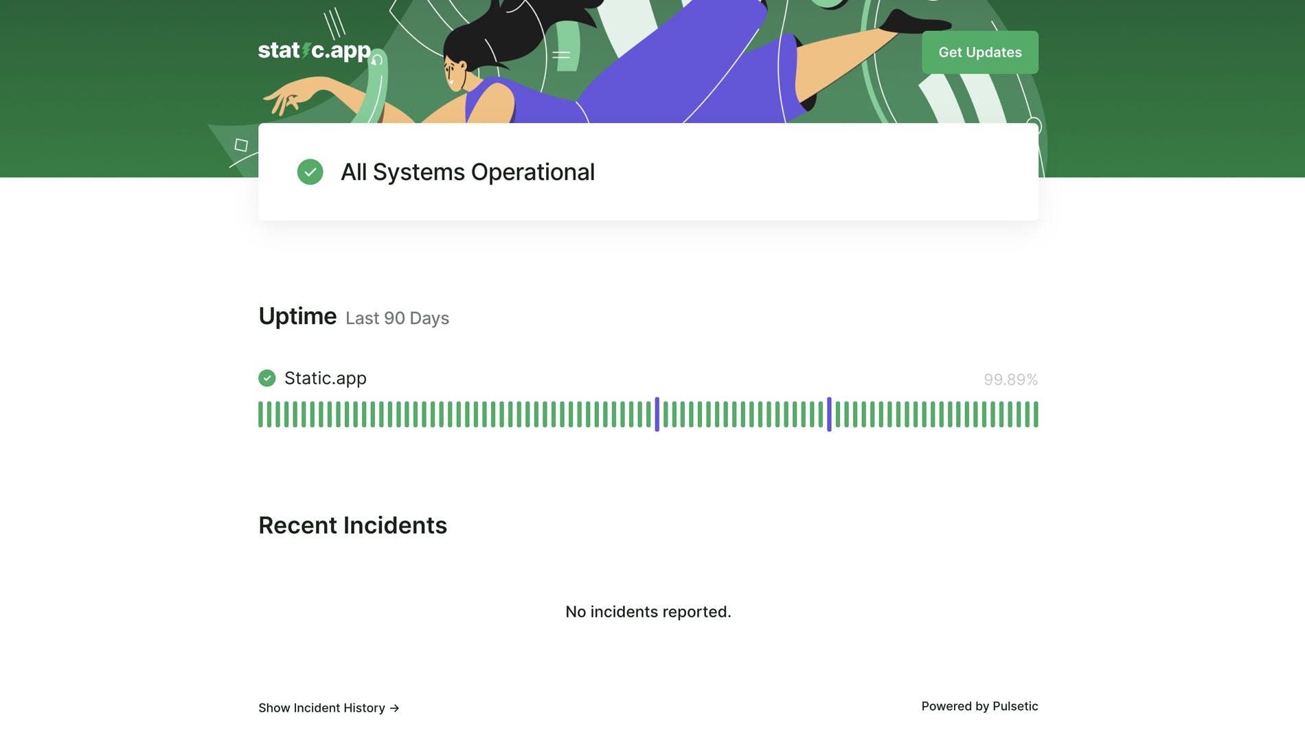
Talk about simplicity and minimalism; the team behind Static App nailed it. The public status page of Static App feels unconstrained and pleasant. It uncovers only relevant information focusing visitors’ attention on crucial details of the system. It includes an uptime graph that shows data for the last three months, recent incidents, a link to another page that comprises the history of incidents with detailed descriptions, and a tool to get updates.
The design is minimal yet coherent with the rest of the platform featuring beautiful illustrations on the top and relying on beautiful coloring and a generous amount of whitespace to structure and organize information.
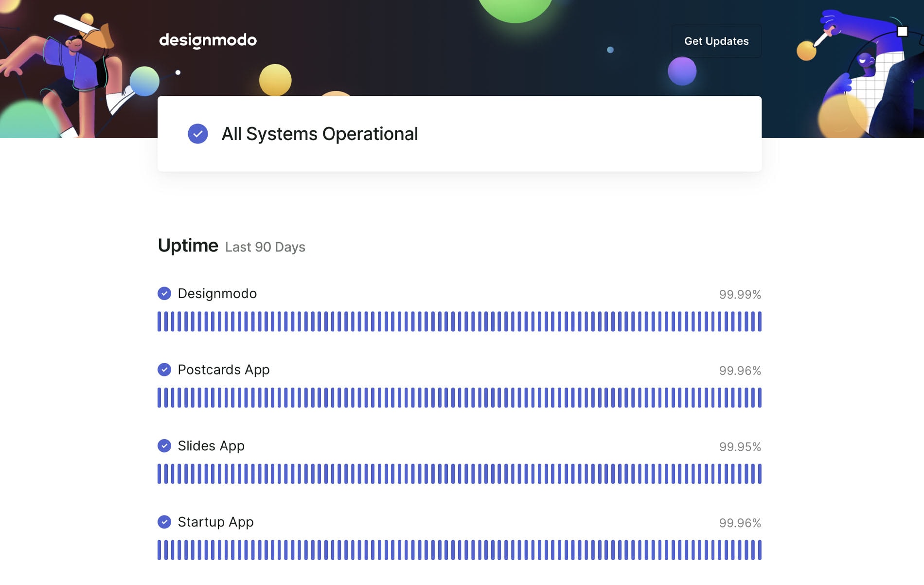
The status page on Designmodo occupies the middle ground providing an excellent example of a system health page for many startups and small businesses, including those that are outside tech niches. It takes the best from the two worlds presented by Atlassian and Apple and shows the simple way to enjoy the benefits of the transparent incident management system. What have they done and included?
- Announced the system’s overall status (whether all products are operational or not) right at the top.
- Listed all their products. Even though there are just four of them, each one is presented on the page with its corresponding status and uptime graph.
- Used colorful indicators to notify about “the health” of each product.
- Show only crucial content: uptime for the last three months, recent incidents, and link to the history section where customers and passers-by may familiarize themselves with more detailed information about each incident.
- Added an option to get updates through an email showing it in the most viewed spot, the header.
- Implemented an illustrative approach to tie this page with the others and set up an eye-pleasing comfortable environment for visitors, making the user experience enjoyable.
In a word, the status page is simple yet informative and effective.
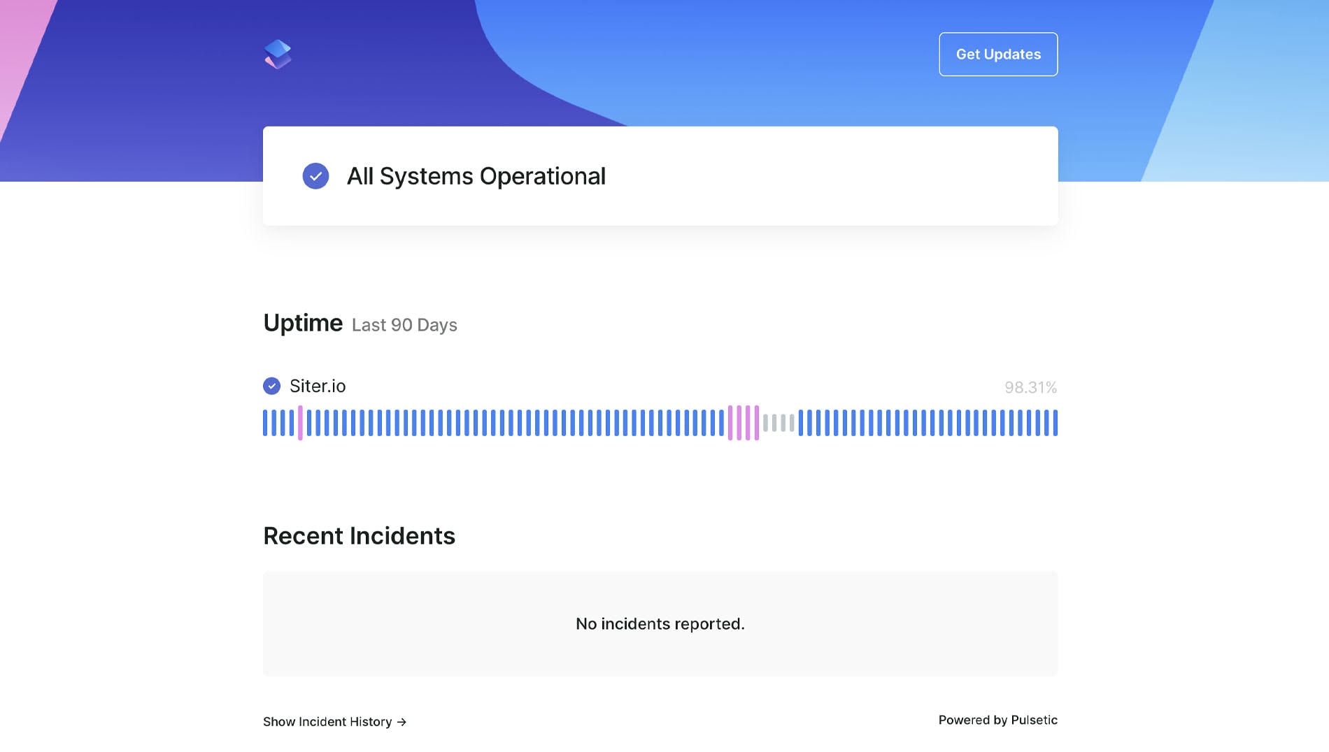
Siter’s team follows the example provided by Designmodo by sticking to a sleek, clean, minimal yet informative approach. They show everyone that even if you have just one product or service, you still need to inform your loyal clients about its system health.
They have created a pleasant setting for online visitors by using basic visual instruments like linear graphs and well-established color identification. You will see uptime history for the last 90 days, with each day represented in the corresponding color, a description of recent incidents, and links to a history block with more detailed information on the case.
Again, there is a subscription option right in the header for those clients who want to stay updated.
Last but not least, the team has customized the design to match their homepage and branding, thereby providing a seamless transition from any page on their website to the status page.
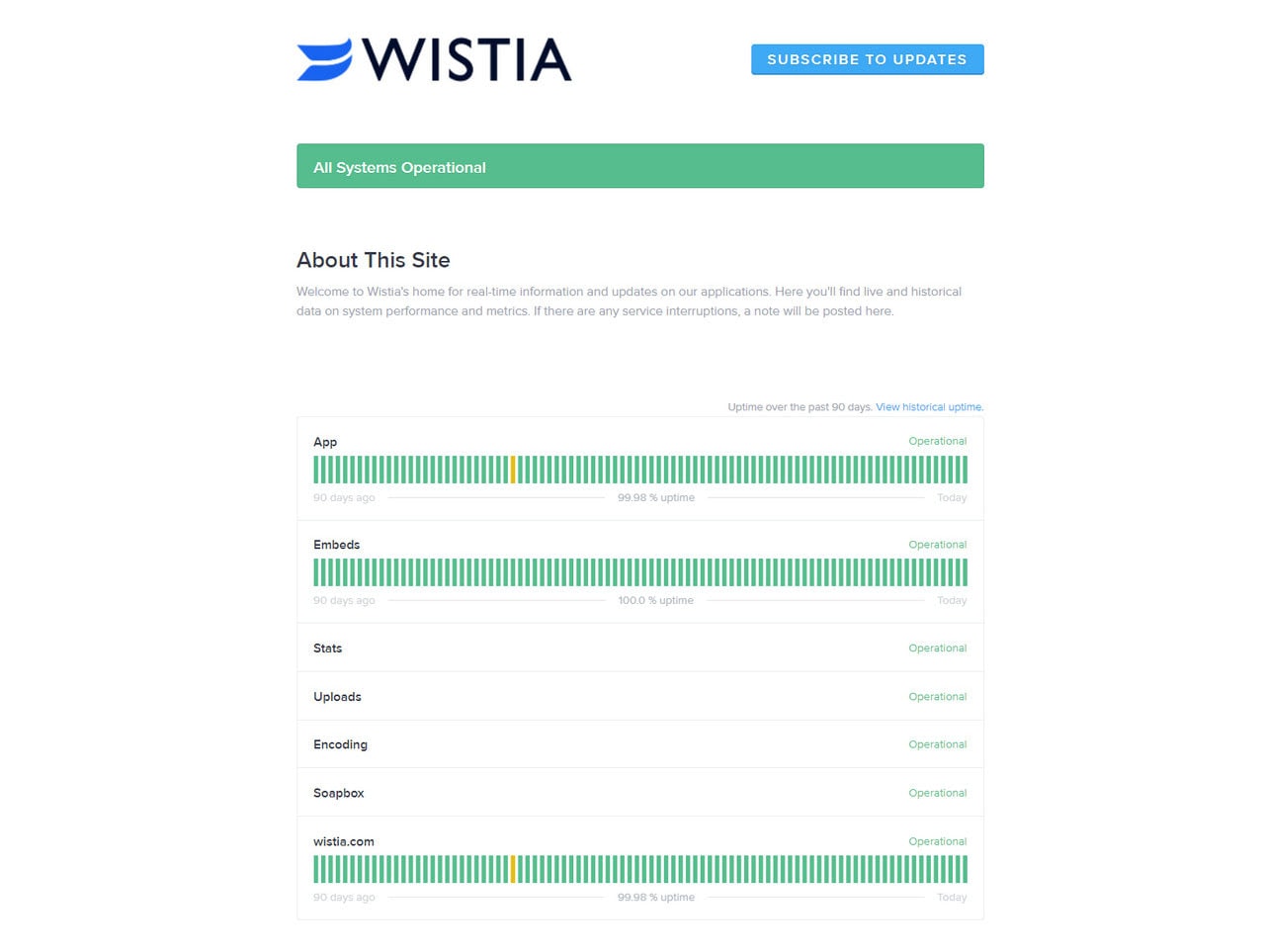
If you seek a comprehensive example of a status page that covers a lot of information at once, you need to check out Wistia.
The team of this video hosting platform has decided to show not only the operational status of the App, embeds, uploads, encoding, and soapbox for the last 90 days but also system metrics. For instance, the page covers video startup time, player buffering video heatmaps, page render time, and processing wait time using graphs and charts, thereby turning exploration of this boring data into an enjoyable pastime.
Visitors may also find history with past incidents and a substantial eye-catching button for signing up for updates.
While this approach seems a bit overwhelming, in fact, this content is crucial for the target audience.
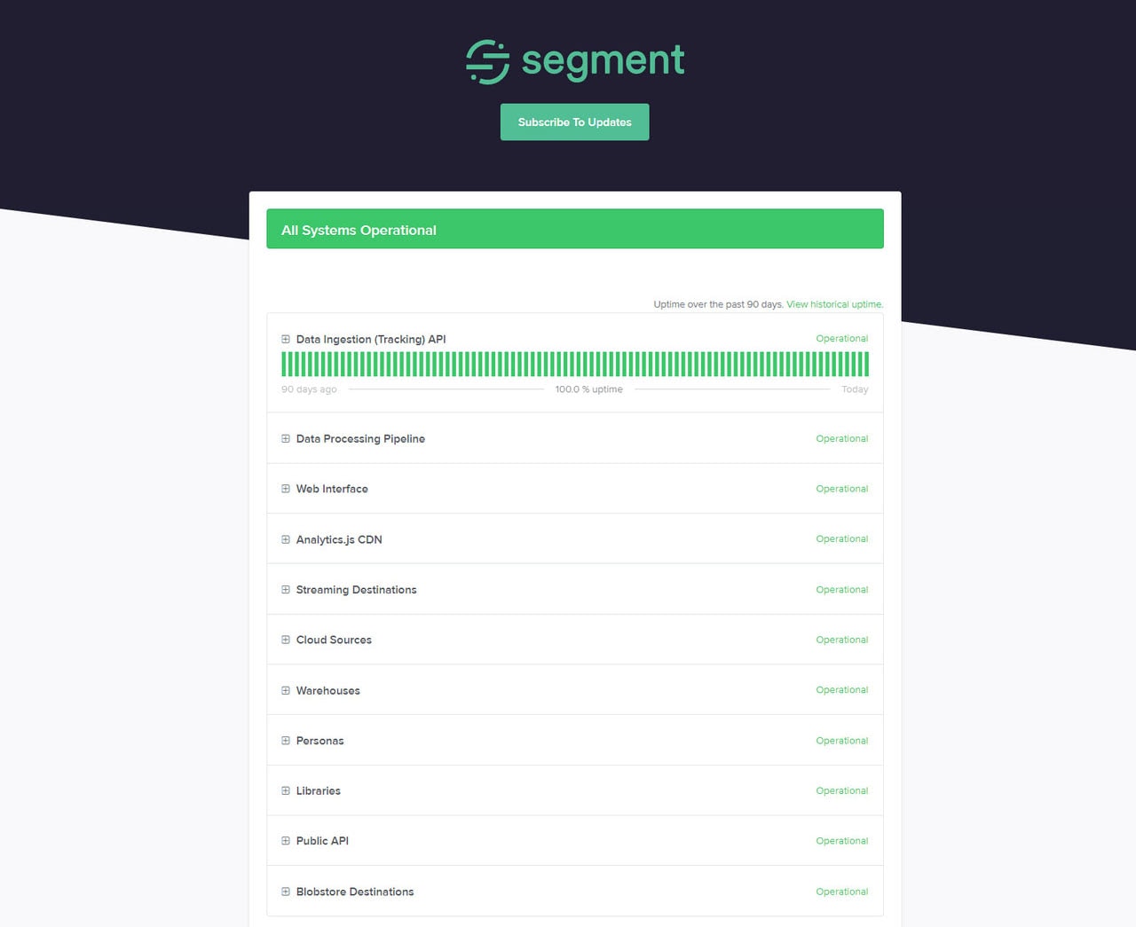
This is another fantastic example of a status page with comprehensive coverage of the system’s health. While some platforms do not need such detailed reports, Segment is one of those companies whose customers find this data valuable and crucial to stay loyal to this vendor.
The team displays the system operational status, uptime over the past three months with a link to view the historical uptime, services, and features grouped into logical blocks, system metrics such as tracking API latency, profile API response time, Total Delivery Rate, API Success Rate (past hour), API Success Rate (past week), and some others.
The best thing is that the page stays clean and neat despite such a massive amount of information. Thanks to visualization tools and well-applied formatting rules, visitors enjoy a great user experience.
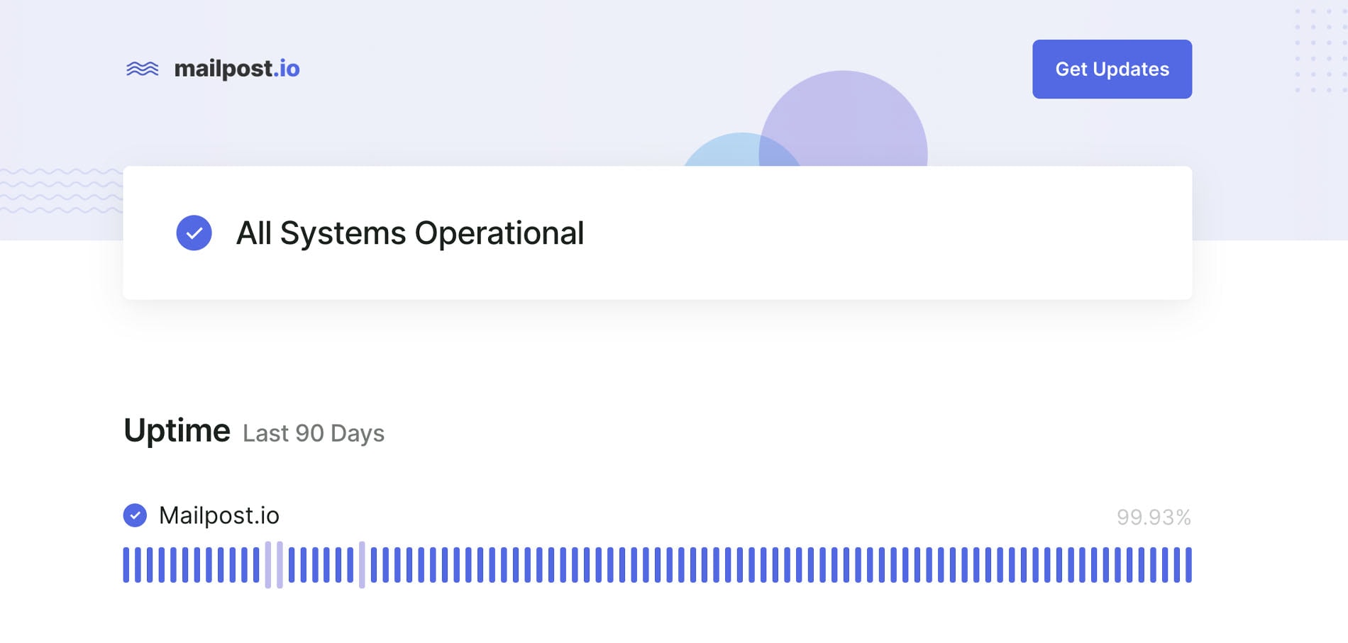
Status page by Mailpost
Mailpost is a popular online platform for sending email marketing campaigns quickly and efficiently whose team prioritizes cost-effective and time-efficient solutions and serves small and mid-sized businesses by getting straight to the point.
This ideology can be seen on their status page as well. It is compact and minimal, with a scarce amount of information that is just enough to inform the clients and visitors about the system’s general health to retain them in the cycle.
The page features an uptime graph, history of recent incidents, overall operational status, and a pop-up subscription form. As for design and user experience, they both meet current standards providing visitors with excellent interaction with the system.
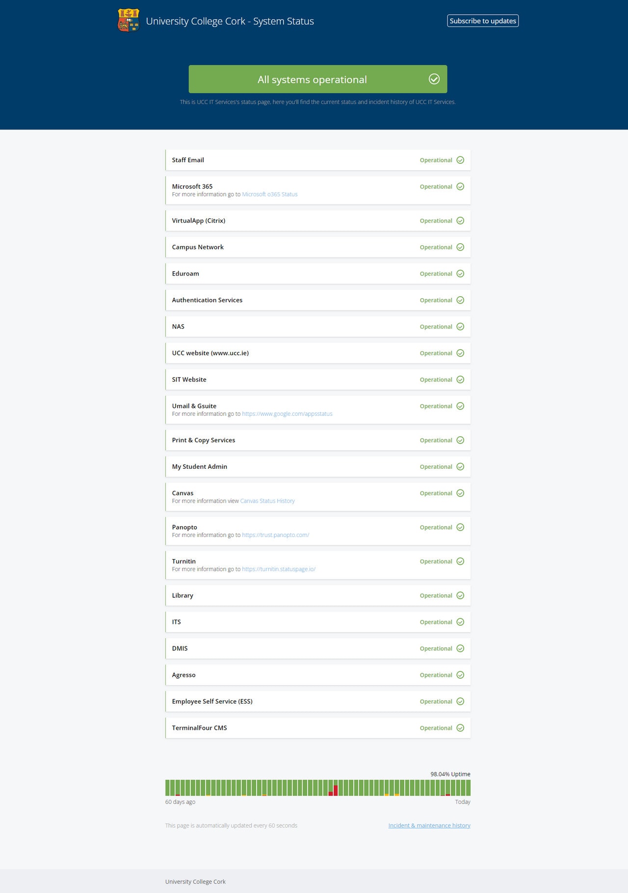
Status page by University College Cork
Gone are days when only SaaS companies, marketplaces, organizations, and conglomerates with a vast product portfolio were interested in such approaches; today, even the high-school establishments keep track of things to adapt to current standards. The National University of Ireland is an excellent example of implementing a status page with comprehensive coverage of the system’s health.
The team has decided to show the current status of all services, incidents, maintenance history of UCC IT Services, and a list of components and tools relevant to students and staff like Microsoft Office, Campus network, Umail, Gsuite, and others with their corresponding operational status. On top of that, they have added a subscription form.
As for the design of the page, it is in accord with the main website to keep the user experience consistent across all channels and pages.
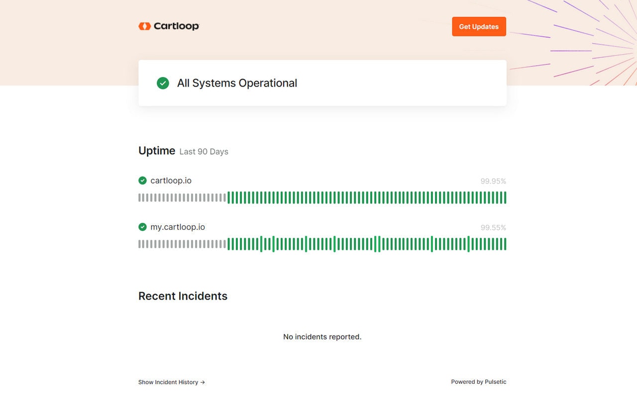
Status page by Cartloop
The team behind Cartloop keeps it easy to grasp all crucial information about the platform’s health at first glance. The team has ditched all clutter and focused only on essential information showing such content as the system operation status, uptime, and history of incidents.
As for design, they have completely removed the footer and kept only their logo image in the header, along with a button to subscribe to updates and illustration that hints at the overall atmosphere on the platform.
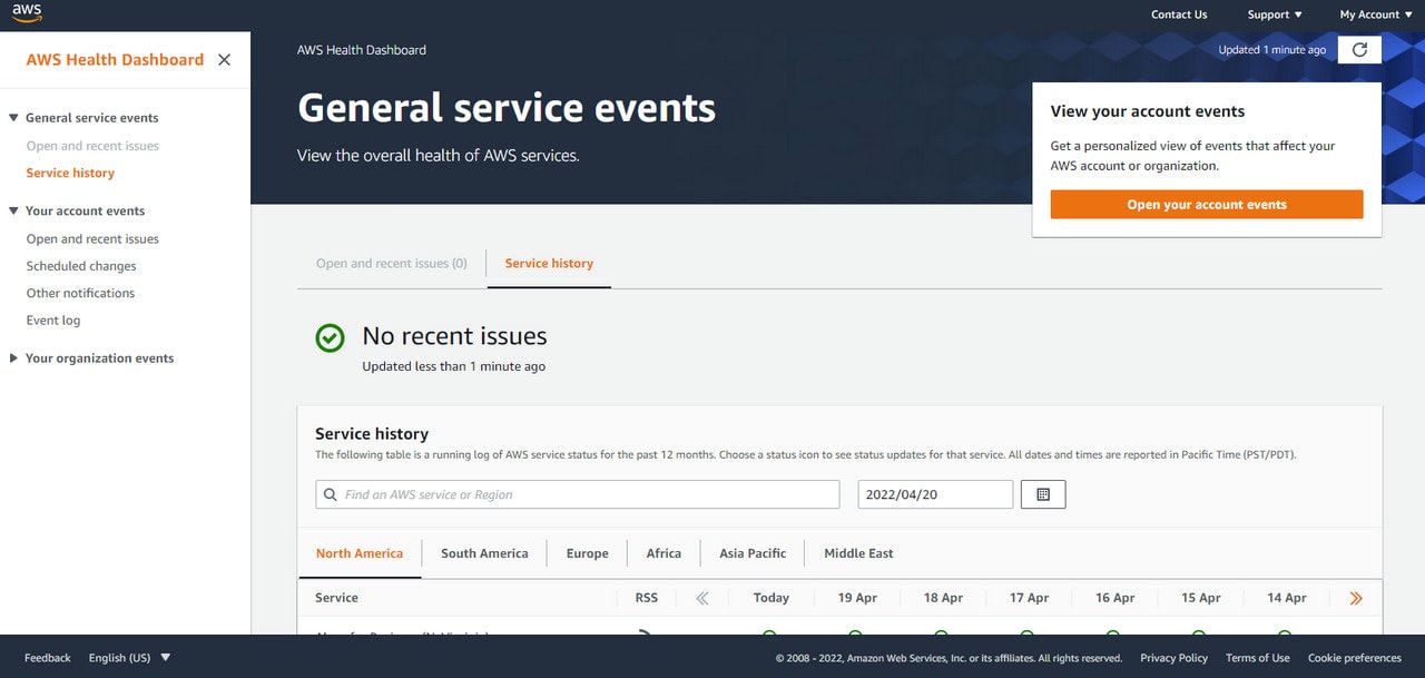
Status page by Amazon
Finally, the status page on Amazon goes in no comparison with the examples featured above. It has one of the most comprehensive, detailed, and most extensive status pages that we have ever seen.
What’s more, it is not a single page; it is a dashboard with various widgets and design instruments like tabs and tables that create order out of chaos serving this bulk of data efficiently. The layout is split into two. The left sidebar lists service events, user’s account events, and organization events. The right sidebar contains open and recent issues, service history, and operational status of features or products.
What’s more, the visitors can navigate through a running log of AWS service status for the past 12 months with the help of a key-based search and date-based filter.
As for design, to make this dashboard a part of the platform, the team has employed the same design principles adding the iconic logotype, header with helpful navigation, and footer with a language switcher.
Conclusion
According to recent studies, only 10% of customers agree that digital platforms and services provide an excellent customer user experience; however, ironically, over 50% of companies believe they meet the needs and expectations of their target audience. Due to such misunderstanding and misjudgment of the situation, many businesses hit the brick wall of failure.
SaaS companies, digital marketplaces, and numerous popular platforms “have raised the bar” for online communication and interaction with the clientele, turning some exclusive features like public status pages into the essential elements of the system. Sadly, many startups and small businesses are not ready to follow this lead and enforce these changes.
However, as practice shows, regardless of the sector (B2C or B2B), it is highly recommended that the organizations comply with these new-founded standards to keep their relationships with the customers transparent and trustworthy.
More so, the public status pages can be easily incorporated into the system. Numerous open-source and premium solutions help to do this. On top of that, the web is teeming with real-life status page examples that offer insights on what solution to use to satisfy the requirements of the company’s scale as well as meet the expectations of niche and target audience, thereby securing its position in the market.


