11 Web Design Trends for 2016
Are you ready for 2016? Let’s bring on the web design trends.
The new year will come with plenty of new techniques and trends, but the dominant theme is likely to be a continuation of things we have started to see at the end of 2015. More video, vertical patterns, Material Design-inspired interfaces and slide-style sites will grow in popularity.
And it’s not hard for you to make the most of these concepts. Here, we’ll ring in the new year with 11 web design trends (and plenty of great examples) that designers will be seeing a lot of in 2016. (Make sure to click the links as well and play around with some of these sites to really get a feel for them. Many of the trends are just as much in the user interface as the visuals.)
2016 Web Design Trends
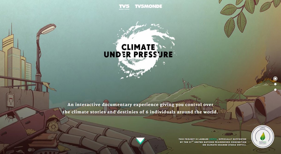
Vertical Patterns and Scrolling
A bigger leaning toward mobile – with some thinking mobile traffic could equal desktop traffic this year – means more sites are being designed with vertical user flows.
A few years ago, we were all debating the end of the scroll in web design only to find it roaring back as an important interaction tool. Smaller screens lead users to scroll more and designers to create user interfaces that are much more vertical in nature.
With Postcards Email Builder you can create and edit email templates online without any coding skills! Includes more than 100 components to help you create custom emails templates faster than ever before.
Free Email BuilderFree Email Templates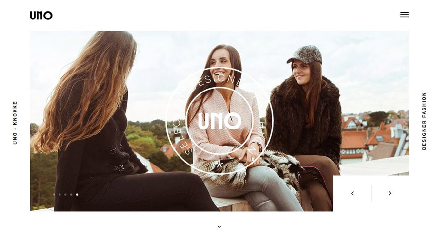
More Card-Style Interfaces
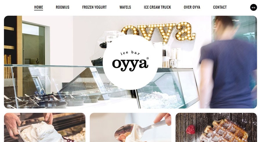
One of the biggest elements to spring from Material Design has been the emergence of card-style interfaces. They are in everything from apps to websites to printed pieces. Cards are fun to create, keep information organized in a user-friendly container and are engaging for users. The other bonus is that they work almost seamlessly across devices because cards can “stack” across or down the screen (or both).
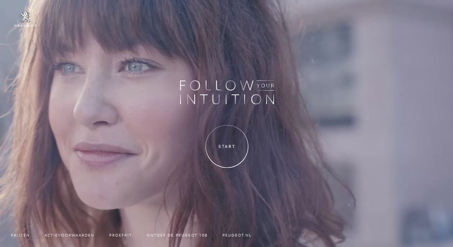
Hero Video Headers (Think Movie-Style Sites)
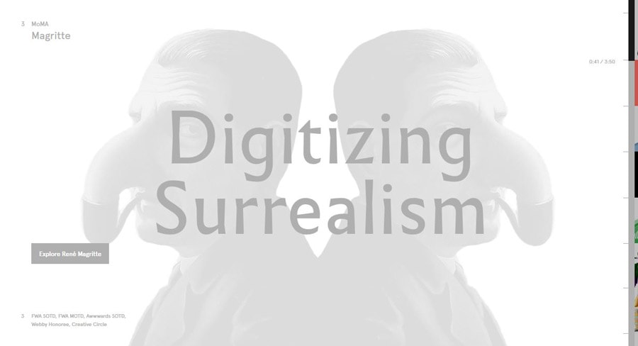
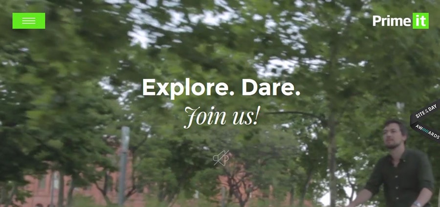
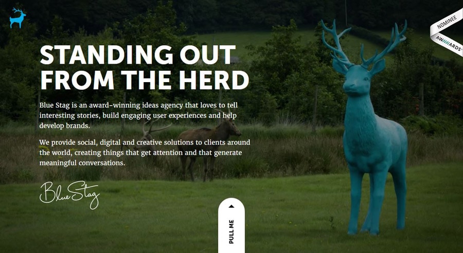
Websites design is going to the movies. Higher speed Internet connections and better video plugin integration is making it easier for more websites to include an immersive movie-style experience. Video clips are growing from small snippets to almost full-length preview clips. The images are sharp, crisp and in high definition, creating a video experience online that is new to users, but familiar from other devices, such as televisions.
With Startup App and Slides App you can build unlimited websites using the online website editor which includes ready-made designed and coded elements, templates and themes.
Try Startup App Try Slides AppOther ProductsTiny Animations
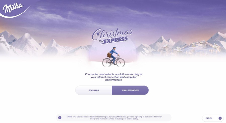
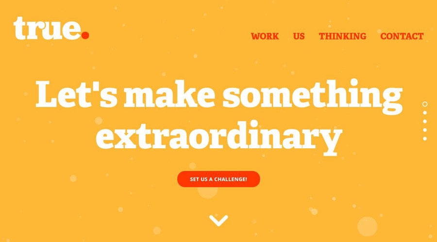
Animation has been one of the “it” trends of 2015. From hero-style animations that lead off a site design to those tiny divots that you almost miss, moving elements are everywhere. And they will continue to grow in popularity, even as they decrease in size. Animated user interface elements are a fun way to help engage users, give them something while they wait for content to load and provide an element of surprise.
The most important factor when it comes to animation is to make sure it serves a purpose: Why are you creating the effect and what exactly is it supposed to do?
Focus on Interactions
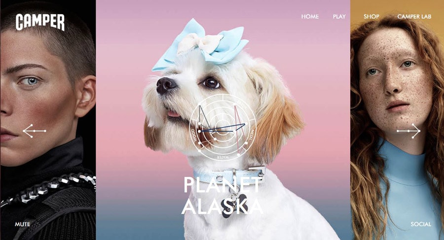
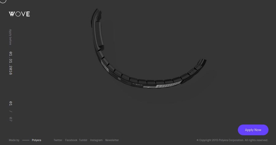
Going hand-in-hand with animation is interaction. As the staple of apps and mobile interfaces, interactions create links between users and devices. Good interactions are often small – even micro in nature – and provide value to the user. From the simplest of alarms to a text message to a blip that it is your turn in a game, these small interactions shape how people interact with devices (and how loyal they are to associated websites and apps).
Even More Beautiful Typography
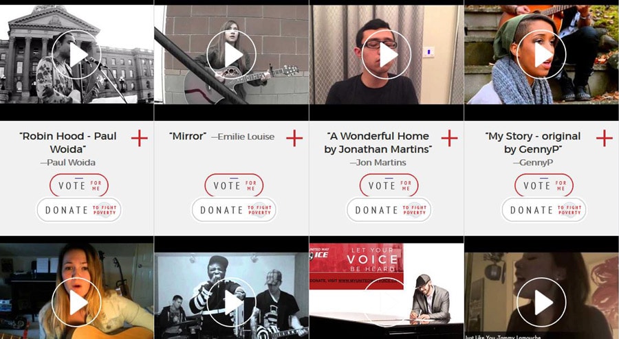
Streamlined interfaces have paved the way for the emergence of beautiful typography. (As has the addition of more usable web type tools such as Google Fonts and Adobe Typekit as mainstream options for creating expansive type libraries online.)
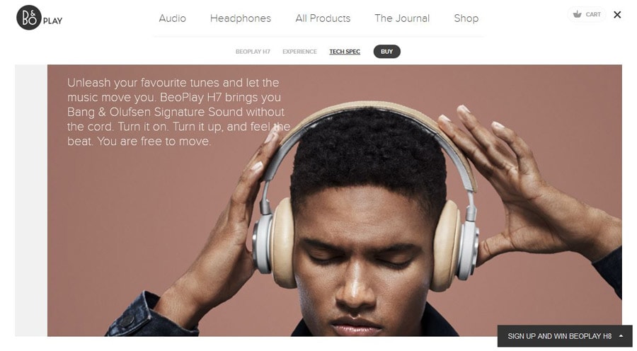
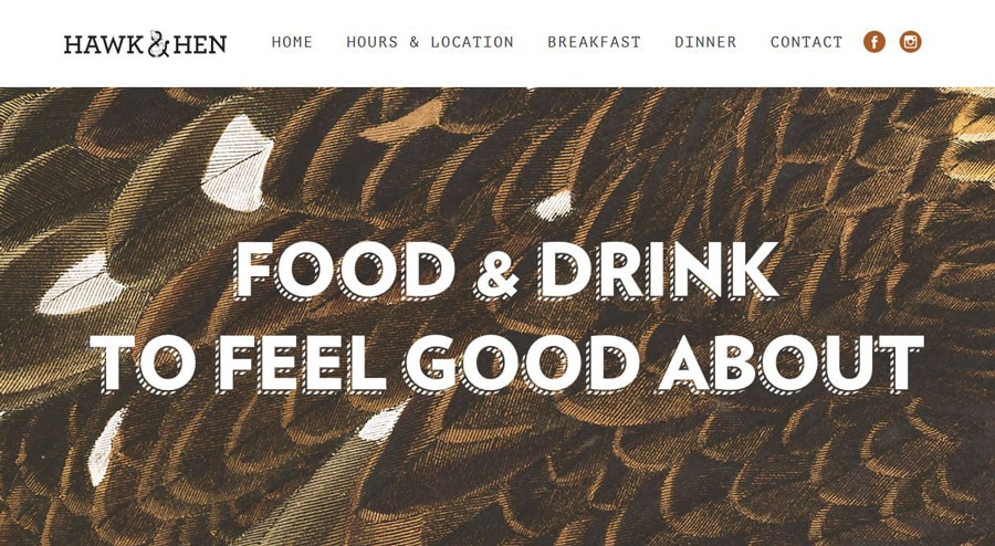
Big, bold typefaces will continue to rule because they work well with other trendy elements. This simple concept of lettering gives more room to other elements, while communicating the message with a highly readable display. The must-try trick is a simple pairing of a readable typeface and fun novelty option.
Illustrations and Sketches
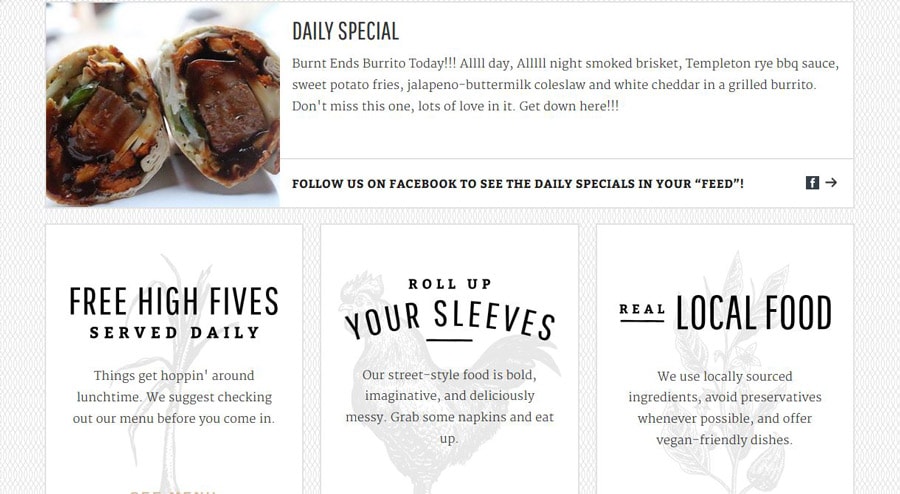
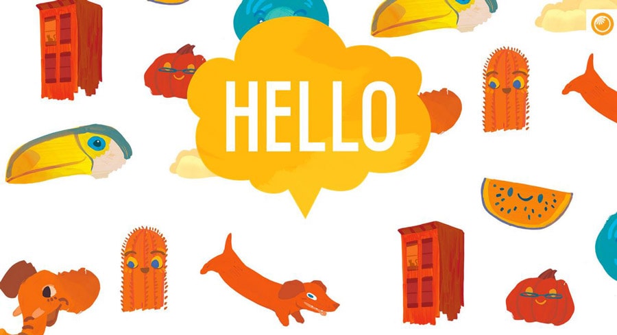
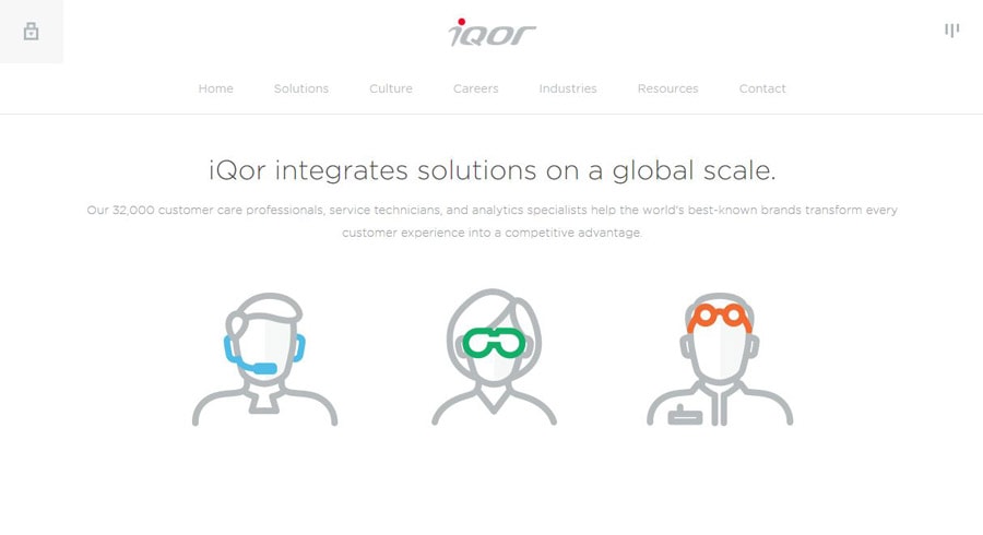
Illustrations and sketches bring a fun element of whimsy to a site design. They can work for sites of all types and aren’t just for children anymore. The illustration style has also started to grow in popularity when it comes to some of the smaller pieces of website design as well, such as icons and other user interface elements. What’s nice about this trend is that illustrations make a site feel a little more personal. Because an illustration or sketch style icon appears to be hand-drawn, it looks and feels personal for users. That can go a long way into creating a connection with them.
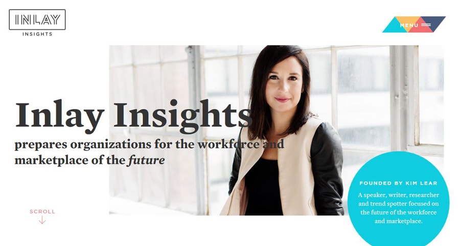
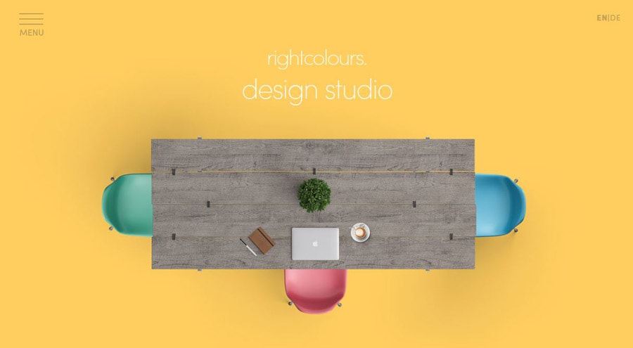
Bolder, Brighter Color (With an 80s Vibe)
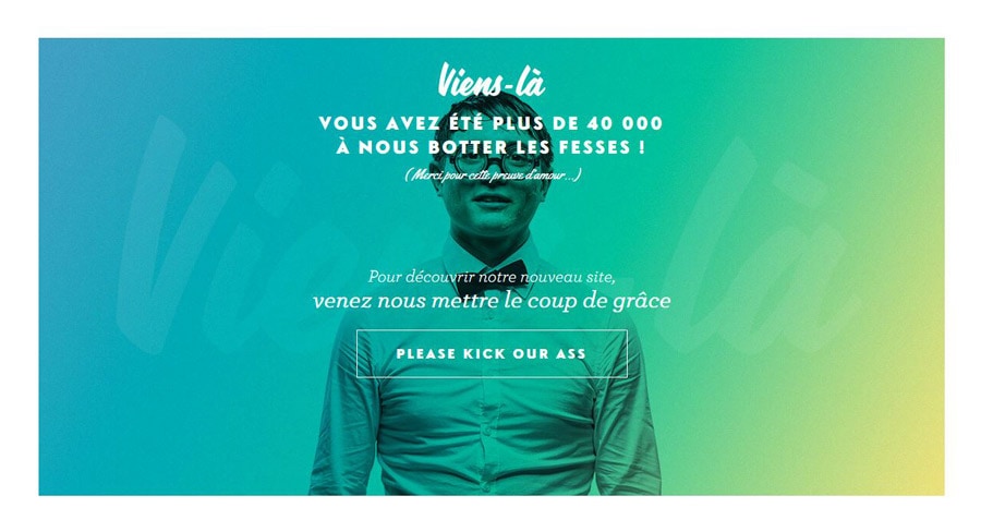
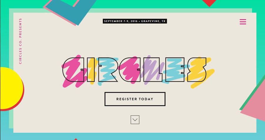
Big, bright color really started to emerge with the flat design trend and has continued to gain momentum. Google’s Material Design documentation furthers that conversation. And just take a look around Dribbble, where color is everywhere. These are key indicators that color will stay big in the coming year. Some of the change to the big color trend is in the type of colors used. While 2015 used more monotone big color designs, usage is starting to shift to larger and brighter color palettes with an almost 1980s vibe to them.
More Hamburgers and Iconography
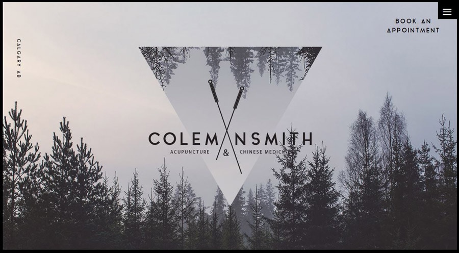
Icons, icons, icons! From the debated hamburger icon to divots through design projects, iconography is big. More designers are releasing fun UI and icon kits that are easy to use, making icons easier than ever to work with. (And pretty affordable.) One of the other big things designers are experimenting with is oversized icons thanks to SVG formats.
Reality-Imagination Blur
Is that site real or animated? Is the path predetermined or can I make choices along the way? The next step of gamification and design is emerging with a blurred line between what’s real and what’s created (or imaginary) in web design projects. And the results are pretty stunning.
From virtual reality to websites that let you make choices to find new content, this type of customization is personal and users seem to really like it. This trend also includes creating imagery that looks real, but you know that it is not.
Websites with Slides
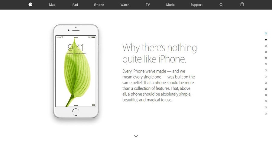
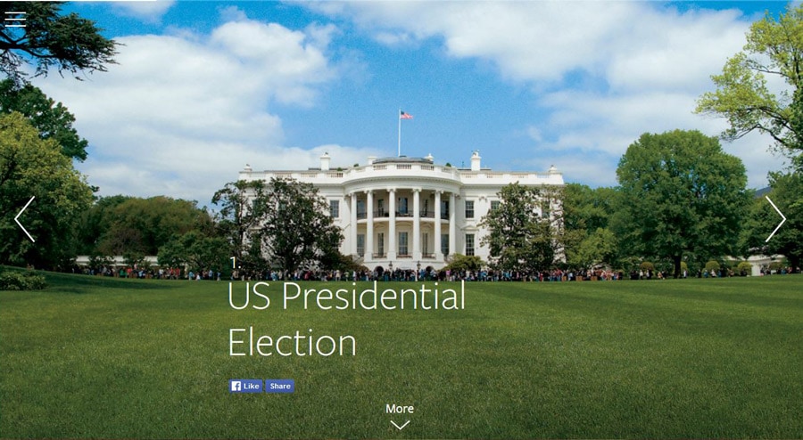
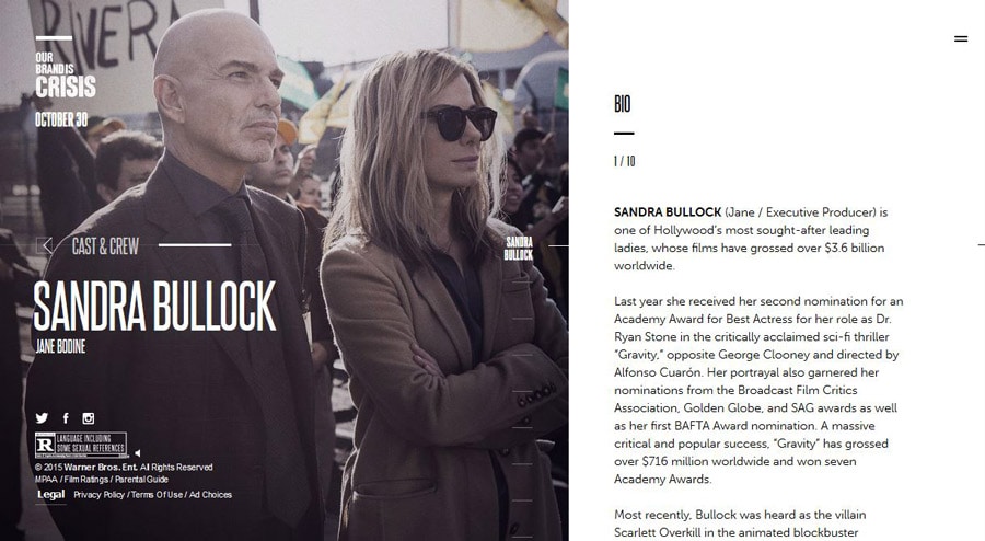
First there were sliders, so that websites could move images within a frame to showcase content. The next part of that evolution includes full-screen slides. Each slide refreshes the entire screen with new content; it can work with a click, scroll or timed effect. Users can navigate forward and backward for an experience that is almost physical. Expect to see plenty – and we mean a lot – of sites using this concept in the coming months.
Conclusion
Looking through the examples above it’s easy to see that there’s not just one web design trend that designers will focus on in the coming year. It’s a combination (and culmination) of multiple trends from the past few years. Look even closer and you’ll see that many of these sites use multiple trending elements from this list to create interactive and engaging websites.
What trends are you most excited about in 2016? Are there any we missed on this list? Join the conversation in the comments below.
