Bootstrap 4 Tutorial: Create a One-Page Template
Bootstrap 4 is here and there are plenty of changes and new features.
Today you will learn how easy it is to create a one-page HTML responsive template using Bootstrap 4. At the end of this Bootstrap 4 tutorial, you will understand how to set it up as well as how to use some of the new features in Bootstrap 4.

In this article, you’ll learn about:
- Downloading the Bootstrap Files
- Setting up necessary files
- Basic mark-up
- Working with grids
- Jumbotron
- Some typography classes
- Cards
- Bootstrap 4 enhanced tooltips
- Table inverse class
- Basic forms
Also, you can watch the video version of this tutorial on YouTube:
Before begin, make sure to have a code editor such as Sublime text or Notepad++ and some working knowledge of HTML and CSS.
With Postcards Email Builder you can create and edit email templates online without any coding skills! Includes more than 100 components to help you create custom emails templates faster than ever before.
Free Email BuilderFree Email TemplatesLooking for a Bootstrap online builder?
- 👉 Try our Bootstrap Builder and create unlimited projects for unlimited clients.
- 👉 Start to build a website using our Bootstrap Templates.
Resources you need to complete this tutorial:
- min.css
- css (we need to create this blank stylesheet inside the css folder)
- min.js
- jQuery via Google’s Hosted library
- min.js
- Lato, Open Sans and Raleway Google Fonts
- Font Awesome (CDN)
- A few images (You can download all of the images I used)
Folder Structure
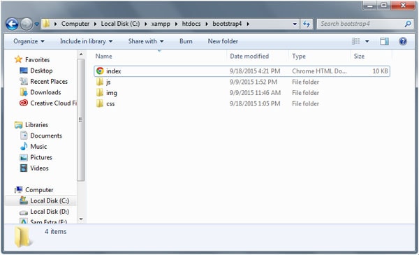
For this tutorial, our folder structure will consist of three folders and one HTML file:
- html – serve as the main file for all markup
- img folder – for images
- css folder – for style sheets (CSS)
- js folder – for JavaScript
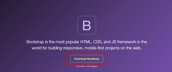
Downloading Bootstrap 4
There are two versions available for download: Bootstrap compiled version and Bootstrap source files.
However, the compiled version is not yet available at the time of writing. You can download the Bootstrap source files here.
With Pulsetic you’ll be instantly notified the moment your website, API, or server becomes unavailable. Monitor uptime from multiple global locations and respond to incidents before your users are affected.
Create beautiful status pages in minutes to keep customers informed during outages and build trust with transparent communication.
Start Monitoring for FreeSet Up Necessary Files
For this tutorial, we will focus on picking up the necessary files that we need for our one-page responsive template.
Note: I will create a separate tutorial in the near future on how to set up and use Bootstrap 4 Alpha via SASS.
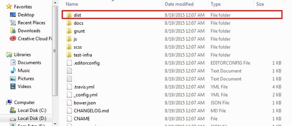
Once downloaded, unzip the Bootstrap source files and copy the following files inside the dist folder. You can get these files inside the css and js folder upon opening the dist folder.
- min.css
- min.js
In addition, we need to download tether.min.js file or use its CDN version from their website for us to be able to use tooltips in Bootstrap 4 Alpha. Place this file inside the js folder of our project.
Basic Markup
Our HTML document will begin with the HTML5 <!DOCTYPE> to specify which language and version our document is using. Then on our <head> section we can place all of our CSS, JavaScripts and fonts/images links. For performance purposes, you may wish to place the JavaScript files at the bottom of the document (just before the closing </body> tag).
<!-- DOCTYPE -->
<!DOCTYPE html>
<html lang="en">
<head>
<title>Boostrap 4 - Tutorial</title>
<!-- Required meta tags always come first -->
<meta charset="utf-8">
<meta name="author" content="Sam Norton">
<!-- Bootstrap CSS -->
<link rel="stylesheet" href="css/bootstrap.min.css">
<link rel="stylesheet" href="css/custom.css">
<!-- Fonts -->
<link href='https://fonts.googleapis.com/css?family=Lato:400,700,900,300' rel='stylesheet' type='text/css'>
<link href='https://fonts.googleapis.com/css?family=Open+Sans:400,300,300italic,400italic,600,600italic,700,700italic,800,800italic' rel='stylesheet' type='text/css'>
<link href='https://fonts.googleapis.com/css?family=Raleway:400,300,600,700,900' rel='stylesheet' type='text/css'>
<link rel="stylesheet" href="https://maxcdn.bootstrapcdn.com/font-awesome/4.4.0/css/font-awesome.min.css">
</head>
We may also add the following code to force Internet Explorer to render to its rendering mode and the meta viewport property for responsive view.
<meta name="viewport" content="width=device-width, initial-scale=1">
<meta http-equiv="x-ua-compatible" content="ie=edge">
To start, we will use the template below as our starting HTML for our one-page responsive template. Notice that I’ve added some hosted library links such as Font Awesome and Google Fonts.
<!-- DOCTYPE -->
<!DOCTYPE html>
<html lang="en">
<head>
<title>Boostrap 4 - Tutorial</title>
<!-- Required meta tags always come first -->
<meta charset="utf-8">
<meta name="author" content="Sam Norton">
<meta name="viewport" content="width=device-width, initial-scale=1">
<meta http-equiv="x-ua-compatible" content="ie=edge">
<!-- Bootstrap CSS -->
<link rel="stylesheet" href="css/bootstrap.min.css">
<link rel="stylesheet" href="css/custom.css">
<!-- Fonts -->
<link href='https://fonts.googleapis.com/css?family=Lato:400,700,900,300' rel='stylesheet' type='text/css'>
<link href='https://fonts.googleapis.com/css?family=Open+Sans:400,300,300italic,400italic,600,600italic,700,700italic,800,800italic' rel='stylesheet' type='text/css'>
<link href='https://fonts.googleapis.com/css?family=Raleway:400,300,600,700,900' rel='stylesheet' type='text/css'>
<link rel="stylesheet" href="https://maxcdn.bootstrapcdn.com/font-awesome/4.4.0/css/font-awesome.min.css">
</head>
<body>
<!---CONTENT HERE-->
<!-- JavaScripts -->
<script src="https://ajax.googleapis.com/ajax/libs/jquery/2.1.4/jquery.min.js"></script>
<script src="js/bootstrap.min.js"></script>
<script src="js/tether.min.js"></script>
</body>
</html>
Working with Grids
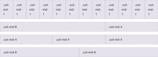
The Bootstrap 4 grid system can have 12 columns and you can choose which column scale you want to display on different viewport sizes. Check out the Bootstrap 4 medium grid below with classes.
We will not be talking much about the grid system in depth in this tutorial, however we will go straight on the column scale that we’re going to use on our one-page template.
Let’s first wrap everything inside a div wrapper class and then divide each part of our documents via section tag and place classes specifically for each.
<!--wrapper start-->
<div class="wrapper" id="wrapper">
<!--header section-->
<header>
</header>
<!--about us section-->
<section class="aboutus" id="aboutus">
</section>
<!--features section-->
<section class="features" id="features">
</section>
<!--contact us section-->
<section class="contact" id="contact">
</section>
<!--footer section-->
<section class="footer" id="footer">
</div>
</section>
</div>
<!--wrapper end-->
Next, we will add the bootstrap’s container class to wrap elements and contain its grid system. We will be using a fixed container. This means that as the viewport changes, its width remains intact until it meets certain breakpoints.
Note that we will not put a container div on the header section as we want it to expand all throughout the browser size. Let’s do that now.
<!--wrapper start-->
<div class="wrapper" id="wrapper">
<!--header section-->
<header>
</header>
<!--about us section-->
<section class="aboutus" id="aboutus">
<div class="container">
</div>
</section>
<!--features section-->
<section class="features" id="features">
<div class="container">
</div>
</section>
<!--contact us section-->
<section class="contact" id="contact">
<div class="container">
</div>
</section>
<!--footer section-->
<section class="footer" id="footer">
<div class="container">
</div>
</div>
</section>
</div>
<!--wrapper end-->
To continue, we need to add rows and columns inside container divs. The basic purpose of rows is to wrap up column while column contains the content. Let’s start adding rows and columns with some additional classes. Do not worry about these classes, we will talk more about them later.
<!--wrapper start-->
<div class="wrapper" id="wrapper">
<!--header section-->
<header>
</header>
<!--about us section-->
<section class="aboutus" id="aboutus">
<div class="container">
<div class="row">
<div class="col-lg-12">
</div>
</div>
<div class="row">
<div class="col-md-3">
</div>
<div class="col-md-3">
</div>
<div class="col-md-3">
</div>
<div class="col-md-3">
</div>
</div>
</div>
</section>
<!--features section-->
<section class="features" id="features">
<div class="container">
<div class="row">
<div class="col-md-6">
</div>
</div>
<div class="row">
<div class="col-md-6">
</div>
</div>
</div>
</section>
<!--contact us section-->
<section class="contact" id="contact">
<div class="container">
<div class="row">
<div class="col-lg-12">
</div>
</div>
</div>
</section>
<!--footer section-->
<section class="footer" id="footer">
<div class="container">
<div class="row">
<div class="col-lg-12">
</div>
</div>
</div>
</div>
</section>
</div>
<!--wrapper end-->
Using Jumbotron
Jumbotron draws marketing messages and calls to action. Bootstrap Jumbotron (formerly hero unit) is a large banner like section with large text, light gray background wrap with box that has a border radius in it.
To create a Jumbotron, you need to add the jumbotron class to a div element and then add header tags to it. On our template, we’re going to use jumbotron class but we’ll customize how it looks. To make it a more modern template, we’re going to use jumbotron to create a parallax displacement effect. Add the code below inside the header section.
Note: We’ve also added a jumbotron-fluid class to make it fluidly responsive.
<!--header section-->
<header>
<div class="jumbotron jumbotron-fluid" id="banner">
<div class="parallax text-center" style="background-image: url(img/cover.jpg);">
<div class="parallax-pattern-overlay">
<div class="container text-center" style="height:580px;padding-top:170px;">
<a href="#"><img id="site-title" src="img/logo.png" alt="logo"/></a>
<h2 class="display-2">Boostrap 4 Alpha is here!</h2>
<h3 class="learn">Wanna know how to use it?</h3>
</div>
</div>
</div>
</header>
Basic Typography Classes
Bootstrap has special classes for displaying headings that designed to stand out more than the normal headings. Basically, there are four size/class display headings:
- display-1
- display-2
- display-3
- display-4
A larger number means bigger text size. In our example above (header section), we’ve used display-2 inside the h2 tag these will render the text on second size level.
Now, let’s add the following code to our About Us section:
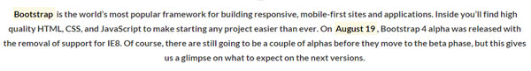
<div class="heading text-center">
<img class="dividerline" src="img/sep.png" alt="">
<h2>About Boostrap 4 Alpha</h2>
<img class="dividerline" src="img/sep.png" alt="">
<h3><mark>Bootstrap</mark> is the world’s most popular framework for building responsive, mobile-first sites and applications. Inside you’ll find high quality HTML, CSS, and JavaScript to make starting any project easier than ever. On <mark>August 19</mark>, Bootstrap 4 alpha was released with the removal of support for IE8. Of course, there are still going to be a couple of alphas before they move to the beta phase, but this gives us a glimpse on what to expect on the next versions.</h3>
</div>
There’s nothing special in this code; I just added a div with classes along with images and header tags inside but notice the <mark> tag. This is an HTML5 element to represents text as marked or highlighted to emphasize a word or a sentence. Basically Bootstrap also has its own rendering on this element. See the image below.
We will discuss typography classes more in a separate article.
Creating Cards
Cards are new components in Boostrap 4 Alpha. Cards work as a container with light styles in replaced with wells, panels and thumbnails. It supports a variety of style options such as alignment, colors, headings and more.
To create a card, simply add the card and card-block classes to a div. For its title add card-title class and card-text for its regular text.
Copy and paste and paste the code below to your markup inside the About Us section.
<div class="row">
<div class="col-md-3">
<div class="card">
<img class="card-img-top" src="img/card1.jpg" alt="Card image cap">
<div class="card-block">
<h4 class="card-title">This is Card #1</h4>
Some quick example text to build on the card title and make up the bulk of the card's content.
<a href="https://v4-alpha.getbootstrap.com/components/card/" class="btn btn-primary">Learn More</a>
</div>
</div>
</div>
<div class="col-md-3">
<div class="card card-inverse card-primary text-center">
<img class="card-img-top" src="img/card2.jpg" alt="Card image cap">
<div class="card-block">
<h4 class="card-title">This is Card #2</h4>
Some quick example text to build on the card title and make up the bulk of the card's content.
<a href="https://v4-alpha.getbootstrap.com/components/card/" class="btn btn-primary">Learn More</a>
</div>
</div>
</div>
<div class="col-md-3">
<div class="card card-inverse card-success text-center">
<img class="card-img-top" src="img/card3.jpg" alt="Card image cap">
<div class="card-block">
<h4 class="card-title">This is Card #3</h4>
Some quick example text to build on the card title and make up the bulk of the card's content.
<a href="https://v4-alpha.getbootstrap.com/components/card/" class="btn btn-primary">Learn More</a>
</div>
</div>
</div>
<div class="col-md-3">
<div class="card card-inverse card-info text-center">
<img class="card-img-top" src="img/card4.jpg" alt="Card image cap">
<div class="card-block">
<h4 class="card-title">This is Card #4</h4>
Some quick example text to build on the card title and make up the bulk of the card's content.
<a href="https://v4-alpha.getbootstrap.com/components/card/" class="btn btn-primary">Learn More</a>
</div>
</div>
</div>
</div>
Adding Tooltips
Bootstrap 4 Alpha requires a third-party library called tether to enable tooltips. To use tooltips simply include tether.min.js just before the bootstrap.js file.
To use tooltip via tether simply create a link the attribute data-toggle=”tooltip” and then include your text tooltip inside the title attribute. Check out the sample code below.
<a href="#" data-toggle="tooltip" title="This is a tooltip">Bootstrap 4 alpha</a>
On the example above we’ve used anchor tags but tooltips is not limited only on this. You can also use it inside buttons and divs. To initialize all tooltips on a page you need to add a JavaScript code below the tether.min.js source link to select tooltips by their data-toggle attribute.
You can simply use the following code.
<script type="text/javascript">
$(function () {
  $('[data-toggle="tooltip"]').tooltip()
})
</script>
Let’s see it in action in our features section. Copy and paste the code below inside the col-lg-12 class.
<div class="heading text-center">
<img class="dividerline" src="img/sep.png" alt="">
<h2>Enhanced Features</h2>
<img class="dividerline" src="img/sep.png" alt="">
<h3><a href="#" data-toggle="tooltip" title="This is a tooltip">Bootstrap 4 alpha</a> has a new prefix <a href="#" data-toggle="tooltip" title="Make all backgrounds black!">–inverse</a> class that gives a background to the table itself. Another cool thing about this is the improve tooltips and popovers which help a lot of developers when it comes to ease of use. Thanks to <a href="#" data-toggle="tooltip" title="Tether is a JavaScript library for efficiently making an absolutely positioned element stay next to another element on the page. For example, you might want a tooltip or dialog to open, and remain, next to the relevant item on the page.">Tether</a> , a third party library it has improved. </h3>
</div>
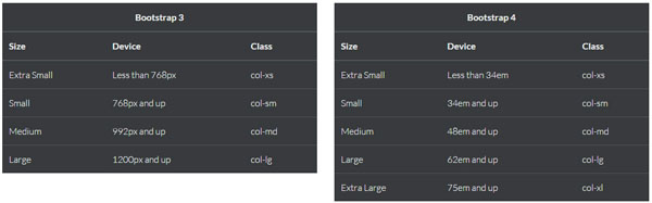
Table Class Prefix “Inverse”
Bootstrap 4 Alpha has added a new prefix –inverse class that inverts the color of the table itself.
Add the class table-inverse to enable this feature.
Let’s see in action. Copy the code below inside the features section right after the code above.
<div class="row">
<div class="col-md-6">
<table class="table table-inverse">
<thead>
<tr>
<th colspan="3" class="text-center">Bootstrap 3</th>
</tr>
<tr>
<th>Size</th>
<th>Device</th>
<th>Class</th>
</tr>
</thead>
<tbody>
<tr>
<td>Extra Small</td>
<td>Less than 768px</td>
<td>col-xs</td>
</tr>
<tr>
<td>Small</td>
<td>768px and up</td>
<td>col-sm</td>
</tr>
<tr>
<td>Medium</td>
<td>992px and up</td>
<td>col-md</td>
</tr>
<tr>
<td>Large</td>
<td>1200px and up</td>
<td>col-lg</td>
</tr>
</tbody>
</table>
</div>
<div class="col-md-6">
<table class="table table-inverse">
<thead>
<tr>
<th colspan="3" class="text-center">Bootstrap 4</th>
</tr>
<tr>
<th>Size</th>
<th>Device</th>
<th>Class</th>
</tr>
</thead>
<tbody>
<tr>
<td>Extra Small</td>
<td>Less than 34em</td>
<td>col-xs</td>
</tr>
<tr>
<td>Small</td>
<td>34em and up</td>
<td>col-sm</td>
</tr>
<tr>
<td>Medium</td>
<td>48em and up</td>
<td>col-md</td>
</tr>
<tr>
<td>Large</td>
<td>62em and up</td>
<td>col-lg</td>
</tr>
<tr>
<td>Extra Large</td>
<td>75em and up</td>
<td>col-xl</td>
</tr>
</tbody>
</table>
</div>
</div>
As you can see there is nothing special here just a regular table but Bootstrap 4 will handle the styles. See the image below.
Bootstrap 4 Forms
Bootstrap 4 Forms are responsive that stacked vertically on viewports by default using the display: block and width: 100% styles. These gives the user a better look on all viewports, but can still be customized.
To use Bootstrap’s Form, simply add the form-control class on all of the field sets such as input, text-area and so on. You also need to add <fieldset> tag along with the form-group class inside it.
Let’s see this in action. Replace the code you’ve set on the contact us section with the code below.
<!--Contact Us-->
<section class="contact" id="contact">
<div class="container">
<div class="row">
<div class="col-lg-12">
<div class="heading">
<img class="dividerline" src="img/sep.png" alt="">
<h2>Contact Us</h2>
<img class="dividerline" src="img/sep.png" alt="">
<h3>Feel free to reach out for any questions!
</h3>
</div>
</div>
</div>
</div>
<div class="container mx-width">
<div class="row">
<div class="done">
<div class="alert alert-success">
<button type="button" class="close" data-dismiss="alert">×</button>
Your message has been sent. Thank you!
</div>
</div>
<div class="col-md-12">
<form>
<fieldset class="form-group">
<input type="text" class="form-control" id="Name" placeholder="Name">
</fieldset>
<fieldset class="form-group">
<input type="email" class="form-control" id="Email" placeholder="Email">
</fieldset>
<fieldset class="form-group">
<textarea class="form-control" rows="3" placeholder="Message"></textarea>
</fieldset>
<button type="submit" class="contact submit">Submit</button>
</form>
</div>
</div>
</div>
</section>
Notice that I’ve also added some support class alert-success to notify the user that the form was successfully submitted.
Bootstrap 3 offers a dozen reusable glyphicons components which can be used for different purposes. For Bootstrap 4 Alpha this feature was dropped. For our footer section we’re going to include Font-Awesome (https://fortawesome.github.io/Font-Awesome/ ) icon classes for our social media icons. Copy the code below in your footer section.
<ul>
<li><a href="#"><i class="fa fa-facebook"></i></a></li>
<li><a href="#"><i class="fa fa-twitter"></i></a></li>
<li><a href="#"><i class="fa fa-linkedin"></i></a></li>
<li><a href="#"><i class="fa fa-pinterest"></i></a></li>
</ul>
© 2015 - Designmodo.com
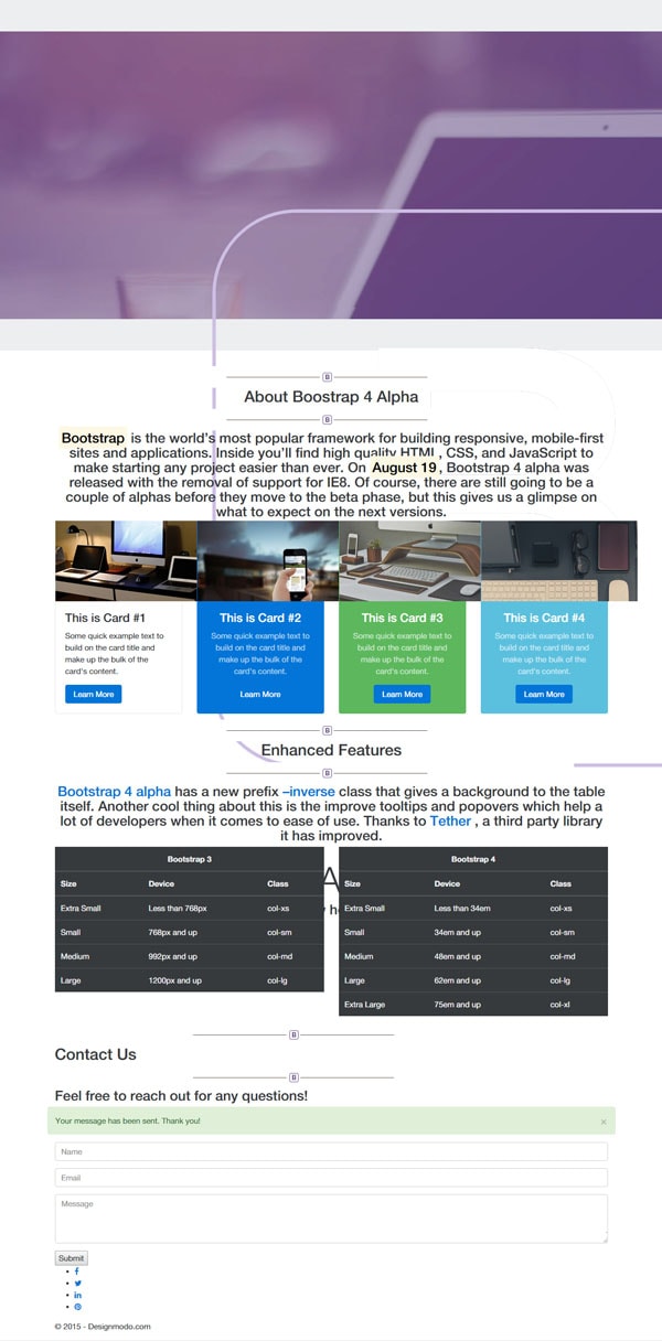
With all of the code we’ve written so far, you will have exactly the same output as the image below.
Customizing Styles
Now that we have everything set up on our HTML, we need to customize our styles to make our one- page template look awesome. Open up the custom.css and add the general styles below for our basic elements and classes.
body {
    font-family:'Lato', sans-serif;
    font-size:1em;
    color:#777;
    font-weight:300;
    line-height:1.7;
    overflow-x:hidden;
}

h1,h2,h3,h4,h5,h6 {
    color:#333;
    line-height:1.4;
    font-weight:700;
}

.mx-width {
    max-width:960px;
    margin:0 auto;
}

a,a:hover {
    color:#563d7c;
    text-decoration:none;
}

img{
  width:100%;
  max-width: 100%;
  height:auto;
}

.card-img-top{
  width:100%;
  height:auto;
}

header {
    padding-bottom:50px;
}

.display-2 {
    font-family:'Lato';
    font-size:60px;
    line-height:1;
    font-weight:300;
    color:#fff
}

.learn {
    font-family:'Lato';
    font-size:27px;
    line-height:1.4;
    font-weight:300;
    color:#fff;
}

.jumbotron-fluid {
    padding:0;
}
Next, we will set up some styles for our parallax effect via parallax and parallax-pattern-overlay class.
.parallax {
    text-align:center;
    background-position:center center;
    background-repeat:no-repeat;
    background-size:cover;
    background-attachment:fixed!important;
    overflow:hidden;
}

.parallax-pattern-overlay {
    background-image:url(../img/pattern.png);
    background-repeat:repeat;
}
For our heading class we need to set up a specific maximum width of 960px and then give each header tags some font-size and some more styles to emphasize each.
.heading {
    padding-bottom:15px;
    text-align:center;
    max-width:960px;
    margin:0 auto;
    padding-top:80px;
}

.heading h2 {
    font-weight:600;
    font-family:'Raleway';
    font-size:40px;
    color:#333;
    margin:0;
    padding:5px;
}

.heading h3 {
    font-size:1em;
    line-height:1.7;
}

#site-title {
    max-width:150px;
}
Next, let’s add some styles to our forms. The Bootstrap default forms will have a normal amount of padding and a nice border radius but for our one-page responsive template we’re going to apply a flat design concept. Copy and paste the styles below.
input.form-control {
    background:#fff;
    border:solid 1px #ddd;
    color:#000;
    padding:15px 30px;
    margin-right:3%;
    margin-bottom:30px;
    outline:none;
    border-radius: 0;
}

textarea.form-control {
    background:#fff;
    color:#000;
    border:solid 1px #ddd;
    padding:15px 30px;
    margin-bottom:40px;
    outline:none;
    height:200px;
    border-radius: 0;
}

button.contact.submit {
    background:#333;
    font-family:'Lato',sans-serif;
    color:#fff;
    font-size:1em;
    font-weight:400;
    text-align:center;
    margin:0;
    border:none!important;
    border-radius:3px;
    padding:15px 45px;
}

button.contact.submit:hover {
    background:#563d7c;
}

.form-control:focus{
    border-color: #563d7c;
    outline: 0;
}

.done {
    display:none;
}
Afterward, let’s add styles to the footer. We will set up a nice background color light violet and give some styles for our footer text and icons. Nothing special here.
.footer {
    background:#563d7c;
    margin-top:120px;
    position:relative
}

.footer .container {
    padding:60px 0 20px;
}

.footer ul {
    margin:0 auto;
    margin-bottom:30px;
    margin-top:10px;
    text-align:center;
    list-style-type:none;
    padding-left:0;
}

.footer ul li {
	text-align:center;
    display:inline-block;
    background:rgba(0,0,0,0.2);
    color:#fff;
    line-height:45px;
    margin:0 4px;
    width:45px!important;
    height:45px!important;
    -webkit-border-radius:3px;
    border-radius:3px;
}

.footer ul li:hover {
    background:#2a2a2a;
}

.footer ul li:hover	a {
    color:#fff;
}

.footer ul li a {
    color:#fff;
    width:42px!important;
    height:42px!important;
}

.footer ul li a i {
    line-height:45px;
    color:#fff;
}

.footer p {
    color:#fff;
    font-size:.9em;
    line-height:24px;
    font-weight:300;
    text-align:center;
    text-transform:uppercase;
}

.footer a,.footer a:hover {
    color:#fff;
}
As a final touch, customize some elements on 768px viewport via media queries specifically with some of our columns sizes to make it look good on this screen size.
@media screen and (max-width:768px) {

input.contact.col-md-6{
    width:40.5%;
    margin: 15px 15px 0 58px;
}

textarea.contact.col-md-12 {
     margin: 15px 15px 0 58px;
}

button#submit.contact.submit{
    margin: 15px 15px 0 42px;
}

}
Conclusion
There you have it! Feel free to customize the design or the code that we set up above.
Remember that at the time of this article, the first alpha version of Bootstrap 4 was just released — that means there might be few alpha series in the near future so it’s good to check out their official website once in a while.
If you want to learn more about Bootstrap 4, you can always refer to the documentation here.
Check out the Bootstrap 4 template.
Did you learn a lot from this tutorial? Leave a comment below and let us know what you think.