Making for a Delightful User Flow: Checkout Process
There is a lot of talk out there on the interwebz about great user experience. But what does it all mean? What makes an experience great? In the recent, the new buzzword is actually ‘delightful’ and that is the type of experience or emotion you should strive for. In this post, I will go over one delightful user flow that is just spectacular to give you a tangible example of what you should strive for.
What does delight have to do with user flow?
First things first, let me talk about the word delightful. I actually love using it, as it is so much more specific and concrete then the word great. What delight evokes is the feelings of joy, ease and even fun. Great on the other hand is in fact does sound more powerful then delightful but I feel it has become so vague and interchangeable within other usability or design jargon that it just lost its power.
There is also a lot of talk on the interwebz about doing this or that, improving one thing or another on one’s website or page but it is often out of context. What about the overall user flow? You know what I’m talking about, right? The journey you would like your customers to make from point A – the point in which they enter your website – to point B – the point you want them to accomplish. Let’s talk about the big picture today.
Vsco does it well
This post has been inspired by the checkout process on Vsco’s website. From the moment I entered their website to the point I checked out the item I was blown away. Now, I am a user experience designer, which means I pay attention to websites so much more then most others. But, the whole experience was just so refreshing; it felt like they really thought everything through. I can only image how a non-user-experience person would feel going through the process themselves. So, without further chitchatting, let’s go over what it is that Vsco actually does, and does well.
The first impression
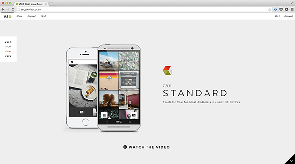
When you first enter any of Vsco’s landing pages you will be blow away by stunning visual design. Their design team knows exactly how to attract and grab your attention as their website is so clean and their pages very well throughout.
With Postcards Email Builder you can create and edit email templates online without any coding skills! Includes more than 100 components to help you create custom emails templates faster than ever before.
Free Email BuilderFree Email TemplatesIf you take a look at the image above you can see that the attention is given to the app and the value proposition is so well defined. (The value proposition is incredible pictures, by the way.)
Scrolling through the pages
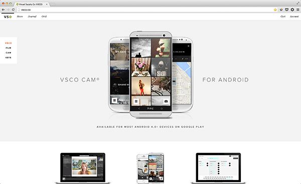
As you scroll through any of their pages, whether it be their Vsco Cam app, their new home page which features their Android app or even their landing page for Vsco Keys – the pages all tell a great story. The design is consistent through out with blissful white space, which emphasizes the few images or headlines their sections have. It is just very well packaged together.
Let’s buy something
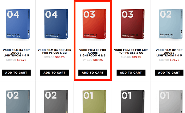
What specifically inspired this post is the checkout process that Vsco has. If you head over to their store you have a variety of different items you could purchase. Of course, the UX of the page is wonderful as well. The hover effect on the items is fantastic; it clearly lets you see what you are looking at and gives you a very obvious and prominent call to action to add the said item to cart. Talk about delightful and throughout experience.
Finally buying something
For the sake of this walkthrough let’s say I’d like to buy Vsco Keys. I click to add the item to my cart and I get this awesome overlay of my now filled cart. Let’s talk about this shopping cart in greater detail.
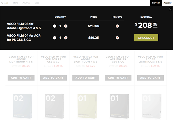
There is so little it in, it literally just tells me what I have in it, how much it costs and there is also a bold button, which tells me what to do next – to checkout. Why is this important? Because Vsco rethought the shopping cart to be very much minimal and only filled with essential information one might need and nothing else. This right there, is a delightful experience because I know what is in my cart which is clear as day, I am not bombarded will useless clutter like any other ecommerce website and it was unexpected but pleasant surprise. The shopping cart experience is obviously most important so the cart itself is so bold and in my face, not hidden away somewhere.
With Startup App and Slides App you can build unlimited websites using the online website editor which includes ready-made designed and coded elements, templates and themes.
Try Startup App Try Slides AppOther ProductsChecking out
Now that I selected my item to purchase, it is time for me to checkout. I click the green checkout button where the overlay slides down to ask me very boldly whether or not I have an account. Now, they key take away here is that first, I still know what the call to action is – to answer this question – and second, I was not redirected, the flow is the same and more importantly, it is still in tact. It is like they are trying to make my life easier.
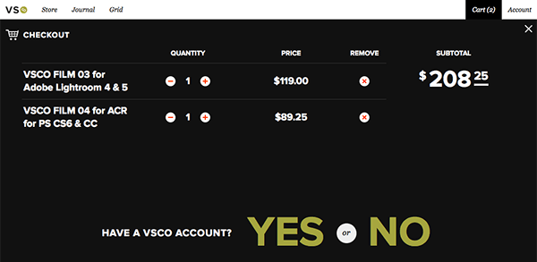
For those who have an account
If you have an account, you obviously click the giant yes where you are prompted to log in. Once again, we are not leaving this page it is all happening right there and there.
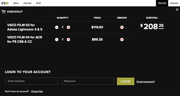
For those who need to create an account
If you don’t have an account this is not the end of the world. You obviously clicked the big no from the previous questions. You are then given a few standard account creation fields to fill in.
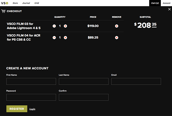
Once you have registered you are prompted to provide billing and shipping information. There are two things I just love on this page. First, is the big, very big PayPal logo; I’ve noticed way too many companies hide the option to pay via PayPal – whether intentionally or not – but not Vsco. The second thing is the bold and red order total at the bottom. It is very different then the black checkout layover so there is no way you could miss it. It provides you with the order summary where you can just go ahead and place your order.
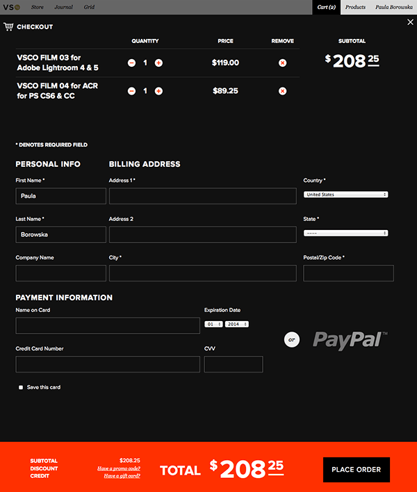
In summary
I hope you don’t think I am trying to make an unnecessarily big deal out of something so simple as an easy checkout process. My point is this: why are so many website claiming they have great user experience in place yet they fall very short?
What Vsco did to their shopping cart and checkout is simply spot on delightful, amazing and sexy. We need many more experiences out there like that. And of course there are, I just wanted to use Vsco as a solid example so that you can clearly see what I mean by a delightful user experience. I hope your take away is this: making things easy, seamless and pleasant for your customers makes for delightful experiences.

