A Simple Guide to Creating iOS7 Style Icons
With the recently launched iOS7 many websites and apps have been busy redesigning to match the newly set flat and thin iOS7 design style. Icons can be a tricky thing to get done right – especially if we are talking about a whole set. Additionally, having line iconography is another challenge in itself.
Here is a quick guide I have gathered for you about a simple process you can follow to create iOS7 inspirited icons.
What are your goals?
First things first, are you designing an app icon or an icon set to use within your app (by app I also mean it could be a website)? For the sake of this guide it really does not matter. This is because either way you should follow all the steps I will be talking about. Now that this is clear and out of the way, let’s focus on the first thing you should be doing which is research.
Research what others are doing
One of the fundamental activities you’ll have to preform is research. I think this is more obvious then tedious as you should always start any project with research. However, when it comes to icons there are specific things you would want to look up.
![]()
With Postcards Email Builder you can create and edit email templates online without any coding skills! Includes more than 100 components to help you create custom emails templates faster than ever before.
Free Email BuilderFree Email TemplatesFirst, go check out what other people are doing. This will get you an idea what the current trends are – which are the do’s and don’t of those trends too. Most importantly, however, this should get you inspired! Looking at amazing iconography fellow designers are doing should spark creativity within and then allow you to get great ideas when you are ready to sketch them.
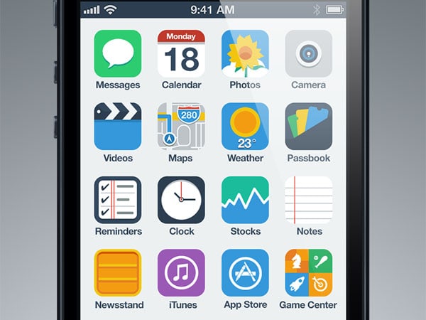
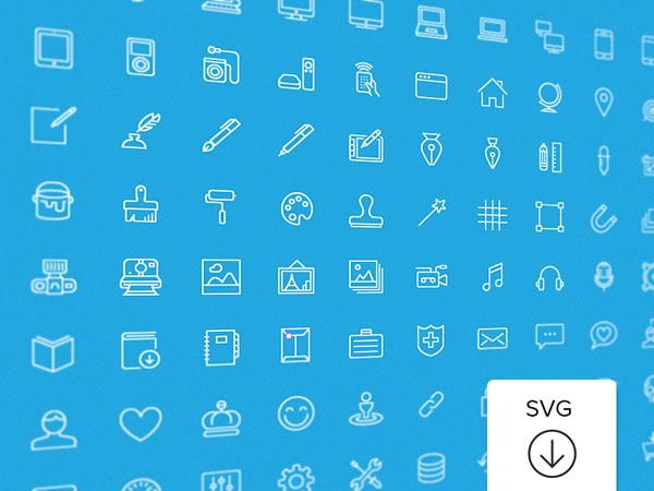
Because this guide is specific to iOS7 a good idea would be to see what Apple is doing too. Check out their icons – whether this be home app icons like Messages or icons with an app like the ones used in their Clock app. Checkout Apple’s guidelines on designing for iOS7 so you know exactly what they themselves are recommending you do.
![]()
Go sketch something
Now that you have a pretty good idea what others are up to and are feeling pretty damn inspired it is time to put your ideas down on paper. Sketching too is fundamental in the creative creating process as it allows you to think through ideas and for your brain to quickly brainstorm new ones as you go. While you are creating simple drafts and have them out in front of you all at ones this will help to guide you in the right direction.
![]()
![]()
With Pulsetic you’ll be instantly notified the moment your website, API, or server becomes unavailable. Monitor uptime from multiple global locations and respond to incidents before your users are affected.
Create beautiful status pages in minutes to keep customers informed during outages and build trust with transparent communication.
Start Monitoring for FreeOne of the keys of sketching is not to have a lot of things but a variety of things instead. Just because you have a hundred sketches of the same thing does not help you at all. Having three different concepts though is so much more useful and insightful. As long as you keep your sketches varied you’ll do just fine. Having a wide range of idea will help you pick the right type of icon and see which direction it is you should go after. Additionally, just seeing the different sketches will also help you see the bad ones more easily. This is extremely helpful when you may not be sure what the right direction is per se but you can definitely tell which is something that you don’t actually want to pursue.
Create the actual icons
With all the sketching you just did I’m sure you – or your team – have some favorites. Whether you’ve picked out the exact icon you are after or a few contenders it is now time to actually make them. The first thing you should figure out is your grid. If you are creating a home icon you should follow the new iOS7 guide provided by Apple. You can find a PSD template easily on the web.
![]()
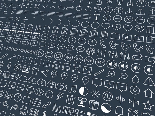
What I’d suggest you do is just create the various icons to the grid as best as you can but create the icons first in general. You can then come back later to fix them and unify the icons, you will end up tweaking them anyways. I found this to be much more efficient for myself. Once you’ve made them all, you can come back and make sure that they all align to the gird, that they all follow the same style – do they have square edges or rounded corners? At the same time you’ll want to make sure that the icons fit the style of the design you are creating them for; do the icons fit the design of the app? Does the home icon represent the app’s design?
Embellish the icon design
I want to talk a little bit about the iOS7 design style. I understand that iOS7 calls for thin line icon design. That is not necessary the case, especially for home icons. There are plenty of icons out there, which do not do thin lines but are actually filled in graphic and yet they fit in very well with the overall style of iOS7. I don’t think thin lines are for everybody and it is okay for you not to use them especially if your own product’s design does not align with or even use thin lines. I just wanted to throw that out there.
![]()
Conclusion
Creating iOS7 icons is not rocket science. I would go about them just like any other type of design or icon for that matter. The most important aspect that makes for iOS7 is the style, which can be easily achieved if you follow Apple’s footsteps. One thing about the new design style is that designing for iOS7 is much easier than designing inline with skeuomorphism.
I’d love to see what icons you have made so far – or after reading this post – with iOS7 in min! Share some links in the comments.
