Trend Breakdown: New Ways to Use the Hamburger Icon
Meant to be really simple, functional, intuitive and memorable like any “road sign,” the hamburger menu icon stole the show last year and became an integral element of any modern website and mobile app design, though it has been with us for more than 30 years.
Created by the talented and amazing Norm Cox for the first graphical user interface, Xerox Star, it naturally mimics the look of a menu list, ideally suits devices with small screens and is an ideal fit for websites where visuals are important and navigation should stand aside. It proves to be a quite efficient and viable solution that meets the requirements of the modern world.
As with any detail of UI, the hamburger icon itself can be impacted by demands of each project, and can include variances. For example, Dan Davies presents a fresh solution by using cutlery for constructing an icon, or Timothy Deegan offers a yummy realistic version.
Depending on the project and theme, the hamburger icon can take different forms that complement the design or become a distinctive feature of its own.
Today’s collection includes 20 different inventive variations of the hamburger menu icon.
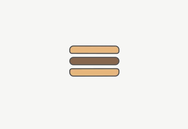
![]()
With Postcards Email Builder you can create and edit email templates online without any coding skills! Includes more than 100 components to help you create custom emails templates faster than ever before.
Free Email BuilderFree Email TemplatesHamburger Menu Icon by Dave Gamez is a refreshing, artistic take that radiates of warm energy right away. Cartoon style adds playfulness and positive emotions to communication and makes it appropriate for numerous illustrated UIs.
![]()
Wave Menu Icon by Matt Walker boasts of a sea vibe well-suited to various maritime projects. Blue as a core color and outline style with a generous amount of white space separate the design from others.
Hamburger Icon by Vanessa Grass
![]()
Clean, vibrant and ingenious realization allow this design be work as a menu icon or as a traditional hamburger icon. While in the first case, an interface gets a nice artistic zest, then in the second one, it gets a suitable detail that mirrors the meaning and ideally blends in.
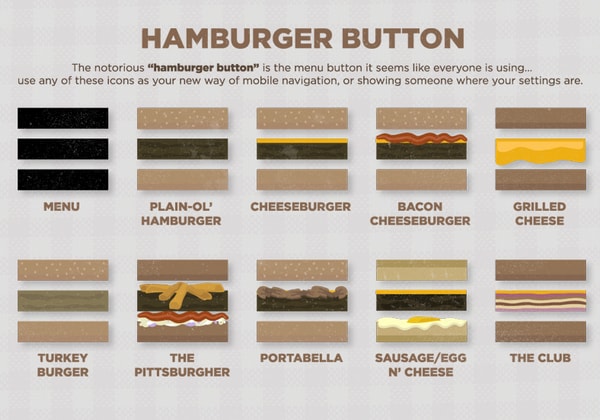
The designer offers 10 interesting versions of hamburger buttons that are crafted with soul. The series embraces various types of burgers, one with cheese, bacon, turkey and others. If you have a website or mobile app navigation dedicated to the sandwich restaurant then they certainly come in handy. They so visually interesting that they could find a place in almost any theme.
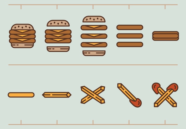
Burger To Fries by Ryan Doggendorf
With Startup App and Slides App you can build unlimited websites using the online website editor which includes ready-made designed and coded elements, templates and themes.
Try Startup App Try Slides AppOther ProductsThe project features a more realistic vector illustration of hamburger button where the close button is realized as fries in “X” shape with or without sauce. Much like the previous example, this is an artistic and inventive solution that can add an exotic touch to a design.
Star Wars
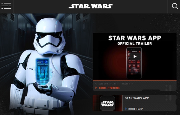
The official website of Star Wars comprises an interesting hamburger icon that has a twist. Each line is divided into two parts so as to obtain a vector reflection of light saber, a characteristic attribute of a franchise. The solution reinforces the general feeling and strengthens the brand.
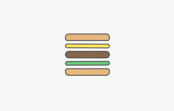
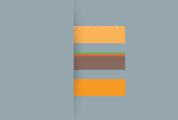
Burger menu 2 by Peeter Tvauri is another beautifully illustrated version of a hamburger menu icon. The key feature lies in tje choice of colors that mimic integral parts of the sandwich, such as the sliced bun and cooked ground meat.
MOARRRR Hamburgers! by Kylie Timpani
The series exhibits different variants of hamburgers that are realized with the help of line style. There is double meat hamburger, hamburger with cheese and salad, 100 patty hamburger, hamburger with cheese/salad, open-faced hamburger and some more. Find the perfect match for your neat, flat style interface that add piquancy and “taste.”
![]()
The artist demonstrates three funny versions of hamburger button: classic, cheeseburger and hot dog. Each one is based on one or two-tone color scheme that makes it suitable for various tiny interfaces. Here color creates the right feel for a sandwich.
Hamburgers by Ragnar Vorel
The artist offers a small animation that includes only one menu icon yet several smooth transitions that accompany transformation to a regular “X” shaped close button. There are special effects assigned to the mouse hover and click events.
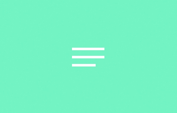
Minimalistic Hamburger Icon
![]()
Minimalistic Hamburger Icon (Sketch and AE files attached) by Mahdi Al-Farra instantly gives you a sense of a hamburger button. Unlike the majority of examples above, this sample demonstrates skillful manipulations with a weight rather than color. Top and bottom lines are bolder than the middle, and create the right feel. The artist has aced the task.
Menu icon animation — Ninja Burger by Andrew Kovardakov breaks away from basic hamburger buttons and offers an interesting and out-of-the-way solution with mysterious and engaging feeling. Here, each line is a vectorized ninja.
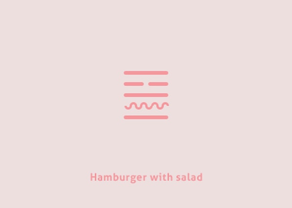
Burger Menu by Peeter Tvauri is a sterling fancy illustration of a hamburger with cheese and salad. It can add a zest to any boring UI or make a contribution to the restaurant-related website.
What is the Hamburger Icon?
![]()
It is an article where you can find interesting arguments about the trendy menu icon. It is marked by image that features three options of hamburger button. The first is a top-notch flat illustration, the second is colorized three-line icon and the third one is a monochromatic version of the second sample that is a popular choice among designers.
The gif shows tiny smooth transitions between the initial state of this minimalistic and elegant icon and its final state. Since the animation begins with a bottom line, it is shorter than the others.
Hamburger Menu by Liam Spradlin radiates a retro vibe, since it looks like a set of school tabs for books. The realization is bold and rough. Such icon easily strikes an eye. However, it could be difficult to find a suitable environment for it.
![]()
Up to now we have considered icons separately, yet they perfectly collaborate with words, especially when this word is “menu.” Although it may seem redundant, together they look refined and exquisite. The more so ultra-thin type and 1px wide lines, that are used in this case, fit together like pieces of the puzzle.
Open / Close by Armantas Zvirgzdas
![]()
The project proves that hamburger icon can look more vivid, distinctive and eye-catching when it is enclosed in a frame. This is a great choice for small devices where the square area is more suitable and comfortable for touch navigation.
The designer displays a simple, sleek three-line icon that undergoes various metamorphoses, transforming into a “close” or “arrow” button. The animation includes several solutions that can come in handy for projects.
Conclusion
Although it may seem that a detail as tiny as the hamburger menu icon does not need to undergo changes, but with a little imagination it can turn into a distinguished and exceptional element. Especially when designers start to play with its meaning and try to use artistic ways to make it more unconventional and attention-grabbing.


