Knobs and Dials in Mobile App Interfaces
Initially belonging to the world of electronic devices, knobs and dials slowly but surely have transitioned into modern application UI. Such an outcome is not accidental; knobs and dials are intended to suit the needs both of simple users and programs for many years. Not taking too much space – vital for mobile devices – they easily provide customers with full set of parameters and data. Having innate touch-friendly appearance, they readily add versatility, make control experience a piece of cake, give UI an aesthetically pleasing look and allow for a feeling of real-life tuning.
In the list below you will find fresh examples of mobile application interfaces that beautifully incorporate knobs and dials. Since in this article we consider only push-on knobs, with a circular shape, it is a good opportunity to examine different effects and styles of the same functional component.
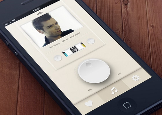
Braun radio app by Nicklas Alejandro beautifully incorporates sweet, creamy colors that make the UI look soft and gentle. The volume knob with a sleek gradient and subtle shadow perfectly stands out.
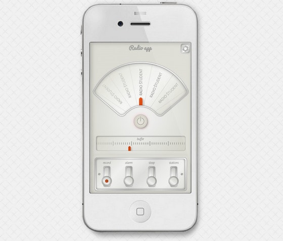
Radio app for iPhone by Sebastian Žetko has a gentle retro vibe that is supported by specific color scheme, subtle cursive font, slightly rough execution of controllers and smooth glassy-like dashboard.
With Postcards Email Builder you can create and edit email templates online without any coding skills! Includes more than 100 components to help you create custom emails templates faster than ever before.
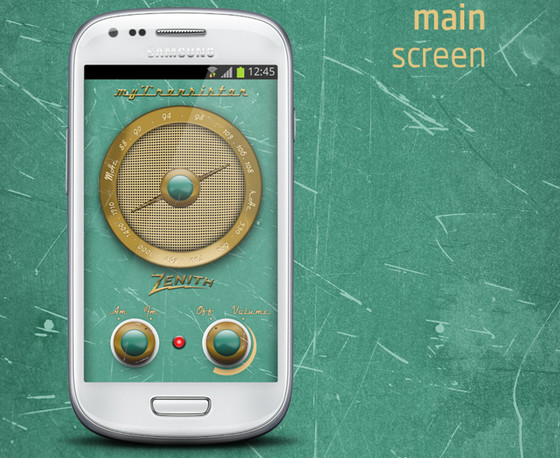
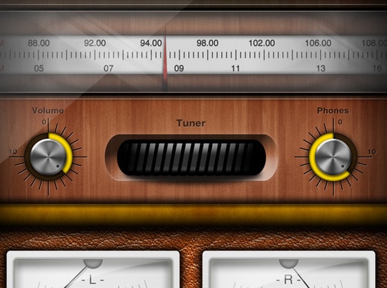
Free Email BuilderFree Email TemplatesMyTransistor by Alejandro Rao also goes for an engrossing, vintage-style look complete with retro knobs with slight steampunk touch, heavily scratched, green polished background and eye-catching dial inspired by an old radio.
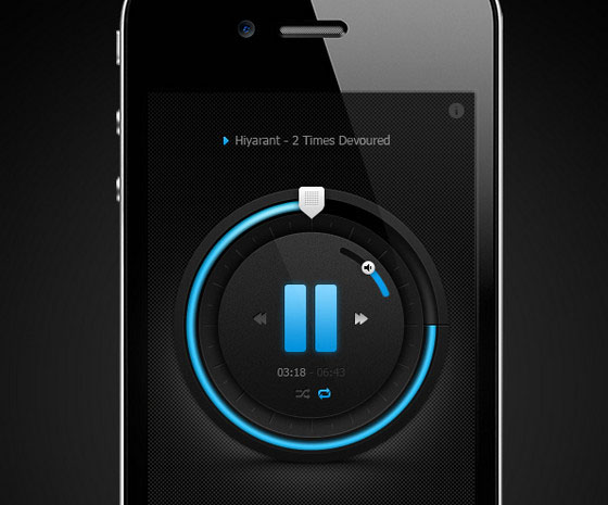
Music iOS app by Sylvester Wilmott is the exact opposite of the previous example. It instantly captivates users with a modern, sophisticated, up-to-date look, skillfully embodying skeuomorphism.
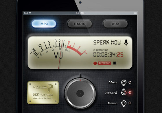
Music player and voice recorder interface by Zsolt Baritz strongly relies on realistic approach, incorporating textures, glossy effects and typography. The central knob, several switches and dial look absolutely fantastic.
Mixer elements by Uriel Albarran O. has a sleek, accurate dark outward. The major knob takes up almost all free space in order to make the user experience pleasant and comfortable.
With Startup App and Slides App you can build unlimited websites using the online website editor which includes ready-made designed and coded elements, templates and themes.
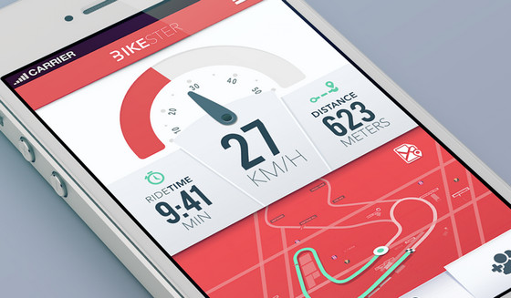
Try Startup App Try Slides AppOther ProductsBikester mine v.2 by Michael Sambora has a truly busy interface that makes app to excel from others. The designer does a great job of combining together red, green and white, effectively organizing a bunch of valuable data.
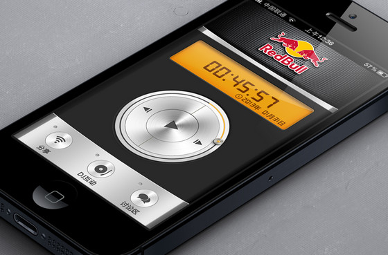
Radio by Terrence leverages customary metallic knobs and flat panels. Neat crisp icons, terminal font and dynamic texture on a header add extra flair to the UI.
Close Up by arjun/aj is a polished radio application that has sleek, elegant appearance. Moderate knob with colorful loading bar is the only one that visually stands out; the rest graphical elements are flat and built into the background.
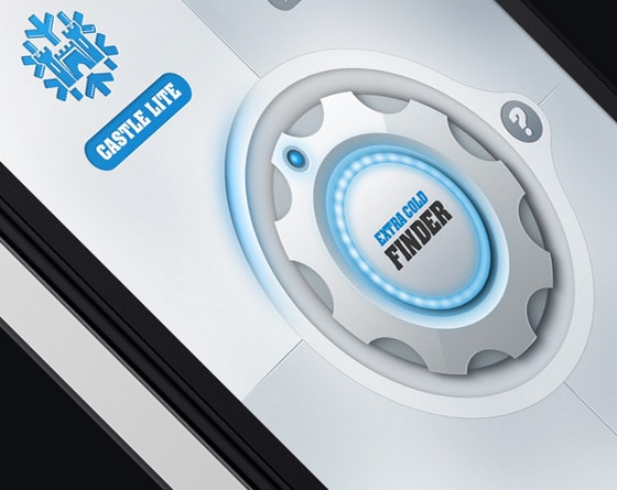
Extra Cold Finder iOS by Emile Rohlandt has lively frosty vibe thanks to predominant chilly blue and light grey colors, with a smooth glossy knob and bold casual type.
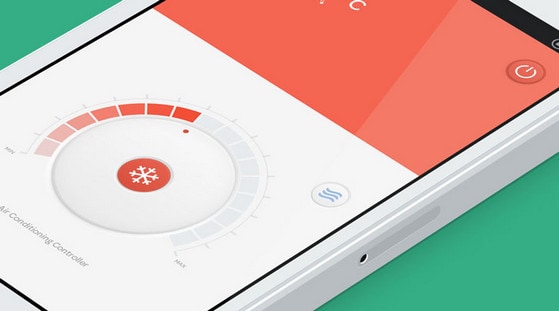
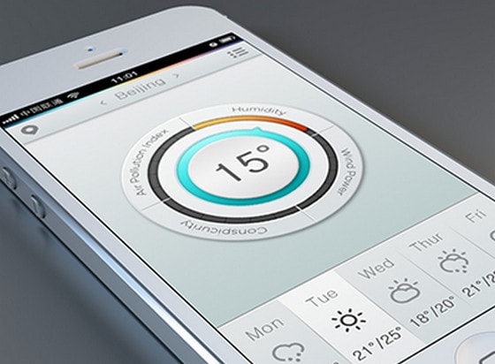
Air conditioning controller by Kingyo xie is a modern take on simplistic design. Coral and white are well suited to each other. Clear, slightly convex knob with subtle progress bar immediately grabs a user’s attention.
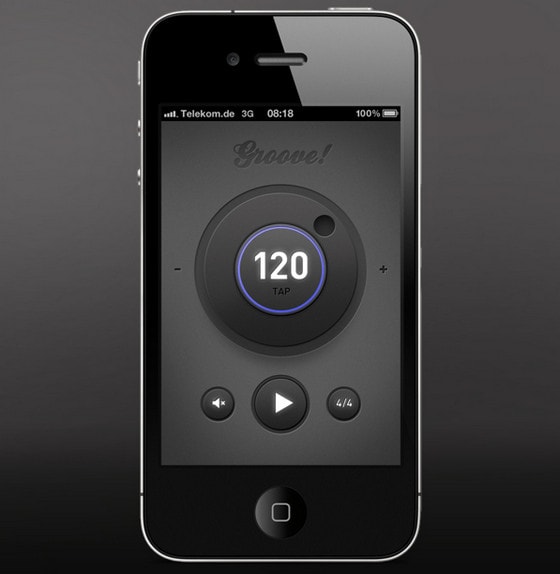
Groove! Simple metronome App by Tom Reinert has smooth, dark, slightly noised interface with wonderful injections of vibrant blue colors.
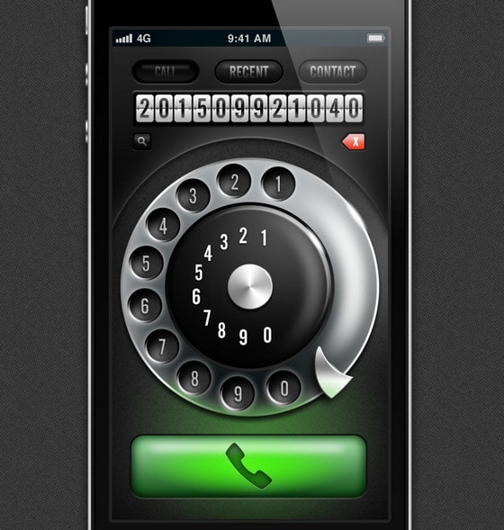
Retro Caller by Zsolt Baritz exhibits an old, analog phone interface with amazing, ably executed metallic dial, which gives the app its retro appeal.
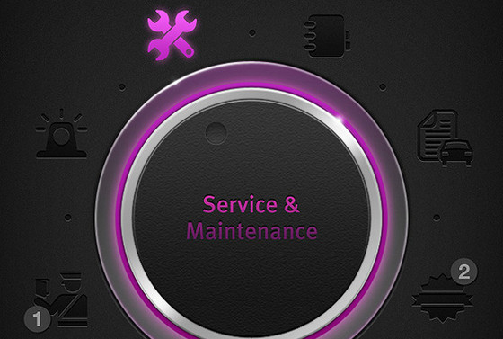
Infiniti iPhone App by Muhsin Abdul Sathar opts to use only two colors, discreet black and vivid violet. The first is responsible for all graphical elements; the second is used to highlight the knob, font and set icons apart.
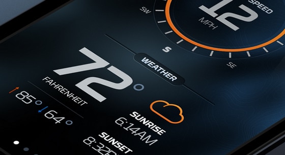
SeaStatus iOS App by Ian Mesa captivates with its neat, advanced execution of vibrant refined speedometer, elegant typography and flat style.
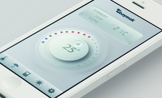
Gas combi remote control app by Ali O. İş has clean and clear interface with a slight chill feeling that is achieved mainly due to cold colors and a lot of free space. Subtle shadows and sleek gradients give the knob a refined three-dimensional feel.
Celia’s Weather by Celia Sun has a beautiful circular vibe. Weather application UI, with rigorous, monochromatic icons and font, is ably diluted with bright colors.
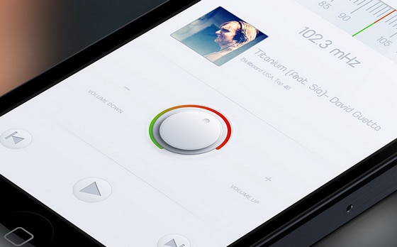
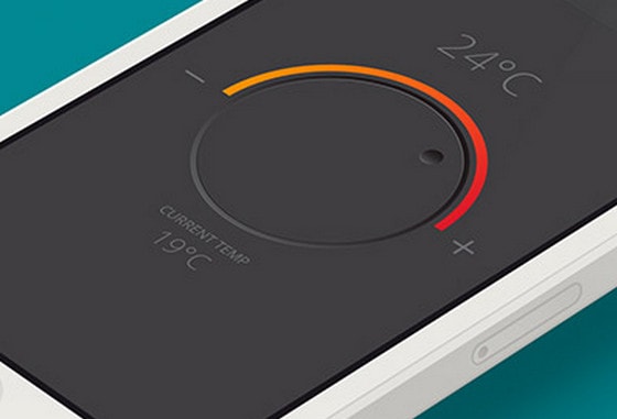
Remote by Caspian Ievers gets its modern, delicate look mostly from minimal style. The designer uses only central part of a screen, representing a huge bulged-in knob with a colorful circular bar.
Old Futuristic Radio by Tobia Crivellari has authentic skeuomorphic design with a lot of realistic controllers.
Music Player App by Emile Rohlandt is another great example of stylish, minimal, dark UI that is accompanied by a shiny neon-like progress bar.
Music Player App by Revival Pixel has a wonderful golden touch. Extensive equalizer, player controllers, and even metallic knobs have a warm, goldenrod shade.
![]()
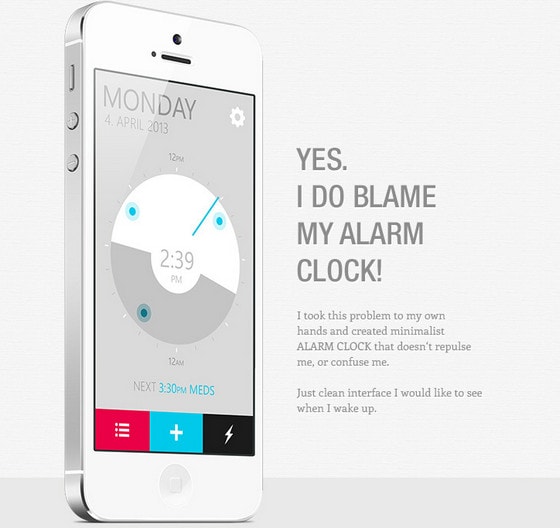
Alarm Clock App by Samuel Bednár embraces powerful aesthetic of the metro style, skillfully incorporating plain graphics and flat navigation items.
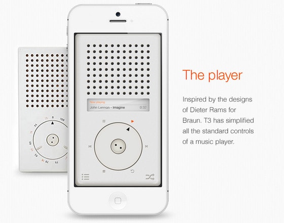
T3 Player App closes out the roundup with its realistic approach and organized design that is spiced up with a smooth, clean, minimal knob.
Reflection
Knobs and dials on various music players or applications allow users to manipulate range of parameters. They easily provide much greater control and provide a handy user experience. Moreover, they naturally complement any interface design and have stylish and modern look.
Share your opinion with us. Have you encountered other great examples of knobs and dials in app interfaces? Do you find them useful and handy? Why or why not?