How to Create Vector Textures in Adobe Photoshop and Illustrator
For some time, textures have been an important part of graphic design, but the process for creating them is not always that clear. This ultimately led you on a hunt to find the ones that were free and tasteful – since not every texture out there will be suitable for the task you want to achieve.
This tutorial will help you learn, step by step, what you need to know in order to create your own texture that you can later use on future projects.
Why Vector Based? (Pros and Cons)
The first question that you might ask is ”Why vector?” The short answer (PROS):
- Scalability: You will be able to upscale and downscale your final texture to almost any percentage (which is probably the most attractive feature of going fully vector)
- Ease of editing: With just one file, you will have the ability to modify it (in terms of color, density, roughness, etc.) and save it as multiple files so that you can have various versions based on that original file
- Adhering to the current flat style (it’s not my definition of the style but merely the name that caught on the design community): You will have a simple design enhancement (based on one color – compared to some raster textures out there) that can bring more to your flat-style inspired creations
The main con of using vector based textures is slow system response time: If you start using heavy textures (with lots of small pieces) and scale them up, your computer might start running slow, because all that data can impact the performance of your processor, but again, this situation only appears when you go crazy and texturize the heck out of your Illustrator file.
Now that you’ve seen why going vector could be more appropriate, let’s start looking at the actual process.
For this tutorial, I will use the concept of an old hardcover book, because of its grained/fiberly feel which gives us a lot of space for trying out different settings once it’s handed over into Adobe Illustrator to be vectorized.
With Postcards Email Builder you can create and edit email templates online without any coding skills! Includes more than 100 components to help you create custom emails templates faster than ever before.
Free Email BuilderFree Email TemplatesStep 1: Tools and Resources
Because our textures will rely on transforming and transferring real (physical) imagery into digital ones, we will need the following:
TOOLS
- Decent printer capable of scanning images at 600 dpi: This is a must as we will want to get the highest resolution possible when scanning our resources
- Adobe software products – Photoshop and Illustrator: We will need both to first process the scanned resource in PS and then move it in Illustrator in order to flip it from a raster format into vector (in my case I will be using CS6)
RESOURCES
- Hardcover books: To use as an example for texture purposes
A you can see, the “ingredients” are simple but that doesn’t mean that our final product won’t look as good as all the other examples we might have seen and used.
Step 2: Start Scanning
Pick a book, or a couple of them, and scan the actual cover. I’m using an HP Photosmart C4780; you will each have different printers but most of them will basically have the possibility of opting for the same settings:
- Scan Picture vs Scan Document: To be honest, I have yet to see any huge difference in the case of book covers, so we can basically use either (try both out and if you see any visible differences in terms of quality depending on your scanner; pick the better one).
- Color Output Type: You should see options – Color, Grayscale and Black and White – we will process the image in PS you can leave it on COLOR.
- File Type: Different formats such as Bitmap, Tiff, Jpeg, PNG, etc. While Jpeg is one of the most common formats used, it is basically a lossy compression for digital images, which in terms of quality means it won’t get you the best looking imagery; the Tiff format will get you the best imagery because it won’t sacrifice pixels in order to obtain a small file size. For our purposes, save the scanned resource as a Tiff file.
- Output Resolution: Set to at least 600.
- Scan With Higher Bit Depths: If you have this option (under advanced picture settings for HP owners) you will get a higher quality product by turning it on.
Quick tip: You can find more about the best formats to use when scanning by reading this great article (https://www.scantips.com/basics09.html). Also, if your book will end up keeping the scanner’s top tray open, either try to put a t-shirt or something over it so that outside light won’t get through.
Step 3: Importing and Adjusting in Photoshop
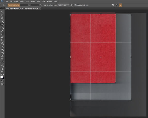
The first thing you should do when importing a scanned file in Photoshop is crop to remove the space left unoccupied on the scanner’s flatbed. Select the Crop Tool (C) and Unconstrained in the top left dropdown box so that you can fit the document to the dimensions of the actual book cover (in my case the red one you see below).
With Pulsetic you’ll be instantly notified the moment your website, API, or server becomes unavailable. Monitor uptime from multiple global locations and respond to incidents before your users are affected.
Create beautiful status pages in minutes to keep customers informed during outages and build trust with transparent communication.
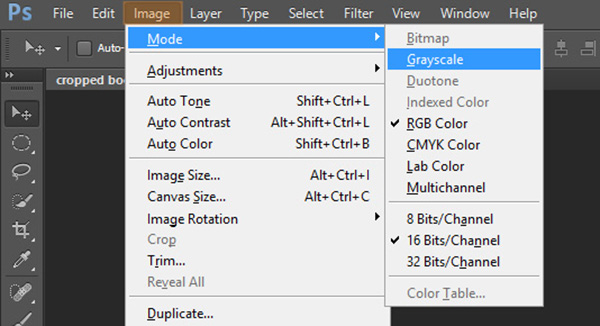
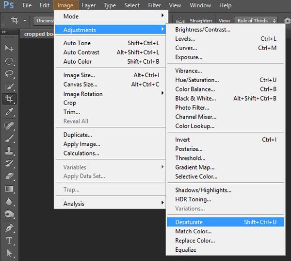
Start Monitoring for FreeOnce you’ve cropped the file, convert the color to grayscale. Go to Image>Mode>Grayscale or Image>Adjustments> Desaturate (both produce the same result).
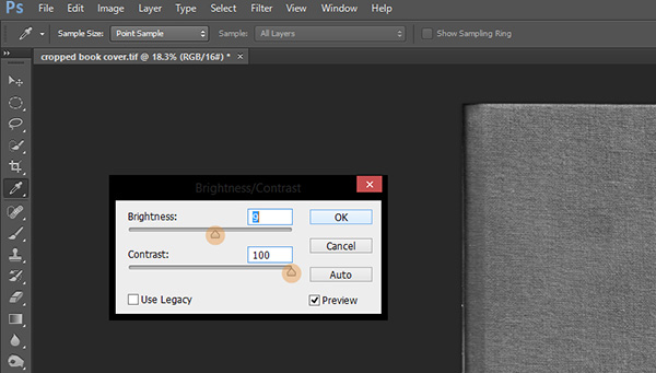
Now that we have the book cover in grayscale, bump up the brightness and contrast so that we can better see the differences in the irregularity of the surface (those fibers I told you about). Go to Image>Adjustments>Brightness/Contrast and play with values so that you get more profound shadows.
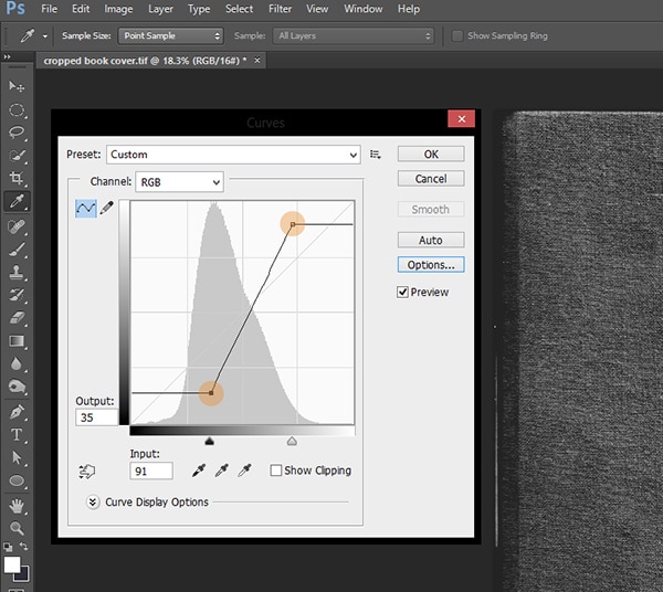
Also, depending on your cover, you can also play with:
- Levels (Image>Adjustments>Levels): To get darker shadows
- Curves (Image>Adjustments>Curves): Which gives you a more interesting balance between light and shadows
Once we’ve obtained good contrast, we will save it as a Tiff with a different name (mine is cropped book cover – desaturated) and import it in Illustrator.
Step 4: Importing and Vectorizing in Illustrator
Right click on the previously saved file, and select Open with>Adobe Illustrator. The program should launch and you will have an artboard with the scanned resource both the same size. In case you want to create a new document in Ai and place the image afterwards, make sure that you have the Align New Objects to Pixel Grid unchecked as this might lead to a longer process of generating the actual vector texture.
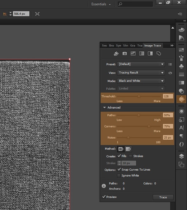
Now that you have your scanned texture in Illustrator, make sure you have the Image Trace window open. Go to Window>Image Trace and it should pop up in the right side toolbar. With the image selected, click on the Trace icon and a new menu will appear.
Quick tip: Depending on the size of your image, Illustrator might warn you that it needs to rasterize the file. If it does ask you, click OK.
I will briefly go through some of the options so that you can understand how to better adjust the way the tracing is done.
- Preset: Illustrator comes with some preloaded presets that you can use, but you can also add to them as you find one that might suit more projects.
- View: As described on the official Adobe webpage, this option specifies the view of the traced object. A tracing object is made up of two components: the original source image and the tracing result (which is the vector artwork). You can choose to view the tracing result, source image, outlines, and other options. Click the eye icon to overlay the selected view over the source image – fairly understandable.
- Mode: Specifies the color mode for the tracing results – select Black and White.
- Threshold: The value controls the way black and white tracing results are generated from the original image – while a lower value will reveal more white pixels, a higher one will cover them up with more black giving you the option to play around.
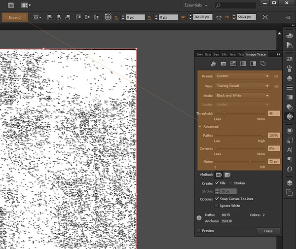
- Paths: Controls the distance between the traced shape and the original pixel shape. Lower values create a tighter path fitting, while higher values create a looser path fitting – in my specific case, I’ve noticed that by going with a higher value of 100, I actually got a more interesting texture than with a lower one, so you should always play with the values to see what works best for your image.
- Corners: Affects the way corners take form. For example, if you want a rougher feel to your trace you should go with higher values, but if you want a softer feel you should stick with lower values – in my case I went with a value of 0 (none).
- Noise: Higher values reduce the number of ignored pixels (that get cut out), while lower values reveal a higher number of pixels – so if you want more details, go with a lower value.
These are the basic settings that you should take in account when creating the vector trace of your texture. When playing with values, don’t forget to check on the Preview box so that you can actually see the transformations in real time.
When you have something that you feel is right for your project, click the Expand button located on the top tool bar.
Step 5: Cleaning Up Our Vector Texture
Now that we have a vectorized texture, we need to get rid of all that white. (This is probably the easiest part of the process.)
First, select the entire group, right click on it and select Ungroup. Everything should be selectable as individual objects. Select all the white parts. Do this by selecting just one white object, and then by going to Select>Same>Fill Color and then just delete them using DEL.
Now, the entire texture should be grouped as one object so that when we copy and apply it, we get the entire texture, not just a part of it.
Step 6: Applying the Newly Created Texture
Now that you’ve created your texture you might ask how you actually use it. When using it as a background, you just copy+paste and align it to get the effect you desire. But when you want to add it to an object, you will have to make a clipping mask and apply it to the actual texture. To do this, copy the object to which you want to apply the texture and paste it above. Then select both the texture and duplicate object and right click>Make Clipping Mask. You might want to group the clipped texture with the object underneath it so that if you move it around you’ll have them both rearranged at the same time.
Also, you can play around with the color and blending mods so that you get the desired effect.
That’s it!
If you followed the steps above correctly, you should have a cool texture that you can use with any vector or raster project.