Vibrant Status Indicators – Mobile App Interfaces with Loading and Progress Bars
According to surveys, people want progress indicators, especially when it comes to various digital applications. Full understanding of the current situation or running process is truly vital for us. In addition, they are really powerful tools when we need to be patient; vibrant joyful aesthetically pleasing completeness bars will definitely brighten up our seconds of waiting.
Into the bargain, progress bars are basic components of different multimedia players that allow users not only keep up with a stream, but also to control it, providing an opportunity to go back or forward. Graphical representation of progress status is truly crucial for increasing people engagement as well as building an excellent computer-human interface.
In a collection below we have listed fantastic examples of mobile applications that feature various progress and loading bars.
Mobile Interfaces with Loading and Progress Bars
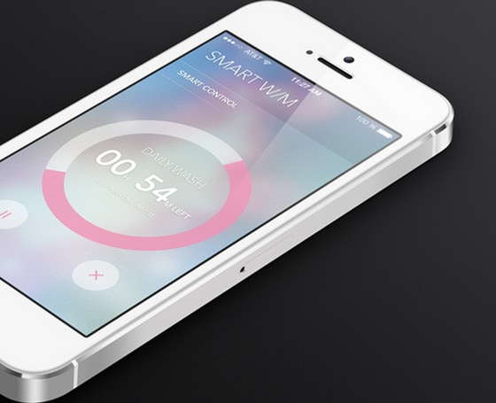
Smart washer app UI by Hyelim Choi has strong blurred vibe mainly due to refined background. Slightly transparent components, white type and injection of pale pink color add to app warmth and femininity.
dB-METER by Miguel Pires. Bright central illustration of meter skillfully breaks the monotony of dark solid color background. Subtle grooves and accurate execution make UI look truly sophisticated.
With Postcards Email Builder you can create and edit email templates online without any coding skills! Includes more than 100 components to help you create custom emails templates faster than ever before.
Free Email BuilderFree Email Templates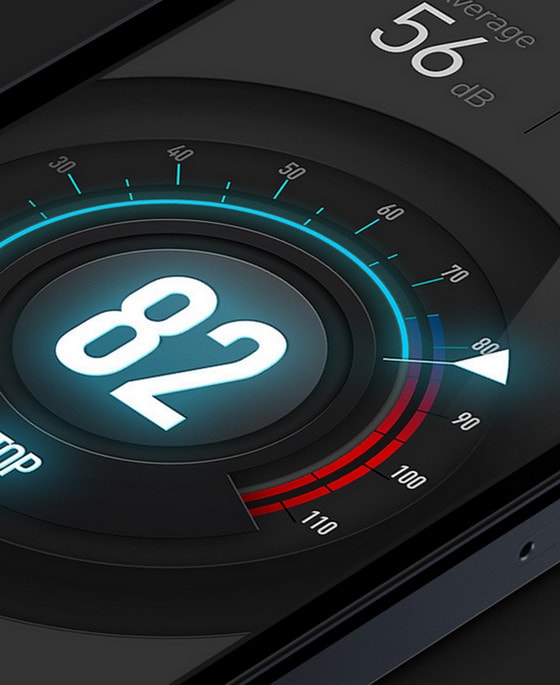
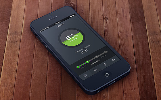
Charging Animation by Corey Lui looks neat and eye-catching with lovely realistic appeal. Vibrating greenish animation for demonstrating charging process simply grabs all the attention.
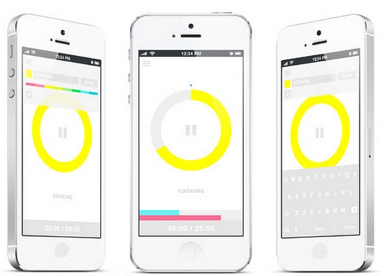
iOS7 design practice by Muhammad Farhan clearly states the philosophy of flat style, utilizing plane graphics, muted colors and narrow font. Huge circular tracker bar takes the whole central part of an interface, making data look distinctive.
TICKER by breezy invokes warm and amiable feelings basically through vibrant optimistic color palette. Pure white background in conjunction with flat components gives an app clean and airy outward.
Music app by Andrew Fuller features standard music player with noisy grey background and bright controls, with orange as a core color for emphasizing. Subtle shadows and gradients make buttons look nicely bulging.
With Startup App and Slides App you can build unlimited websites using the online website editor which includes ready-made designed and coded elements, templates and themes.
Try Startup App Try Slides AppOther Products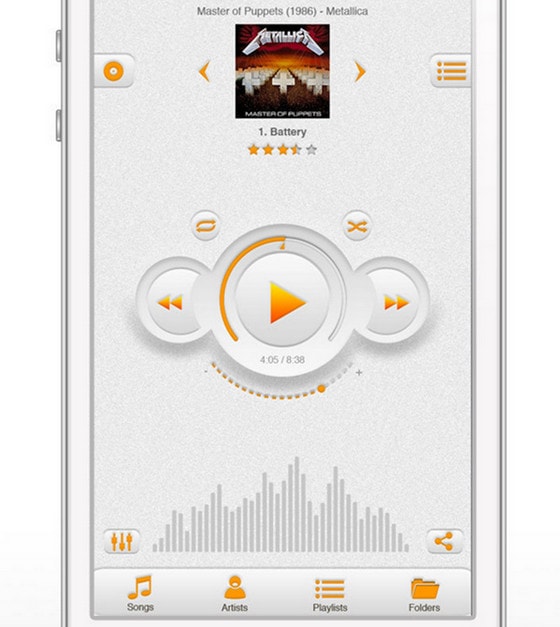
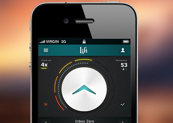
Lift: Early Concepts by Leigh Taylor are based on a dark color palette that is beautifully diluted with glaring colors. An elegant, circular loading bar utilizes intermittent and dotted lines to display a process status.
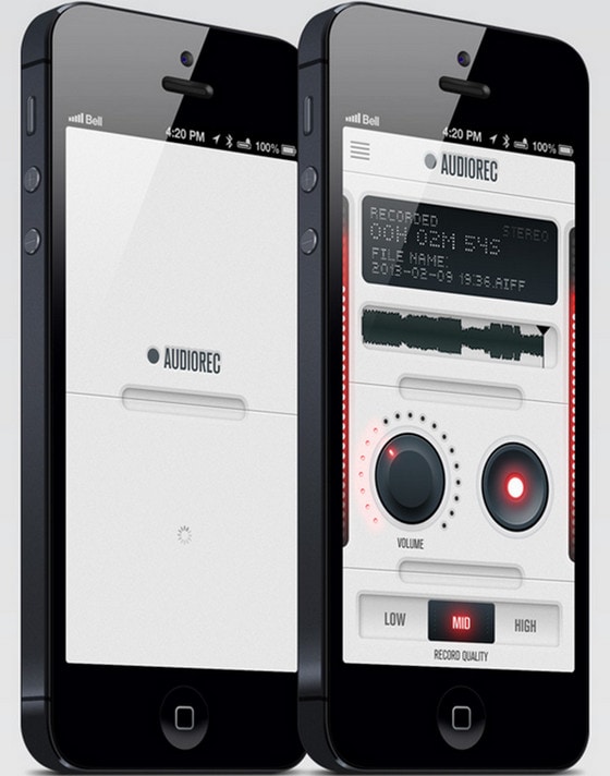
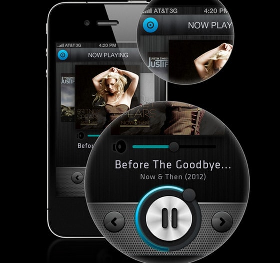
AudioRec UI by Miguel Pires is a refreshing take on a skeuomorphic approach, where vibrant luminescent indicators have been represented on both sides, and volume knob is spiced up with beautiful dotted touch.
MusicPlayer App Conceptional by Maximilian has rather flat appeal with enormously huge circle-shaped progress bar on the center, which as well serves as a border for images of album covers.
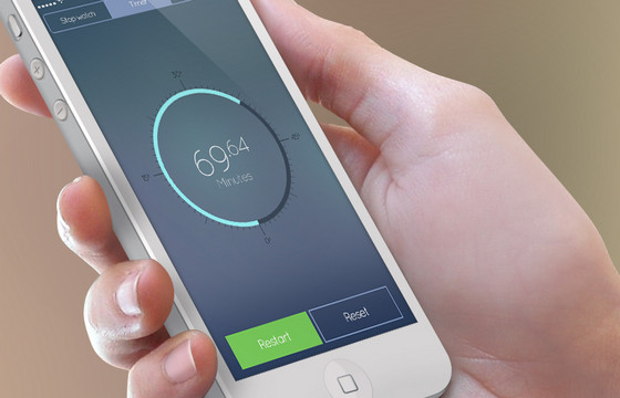
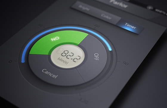
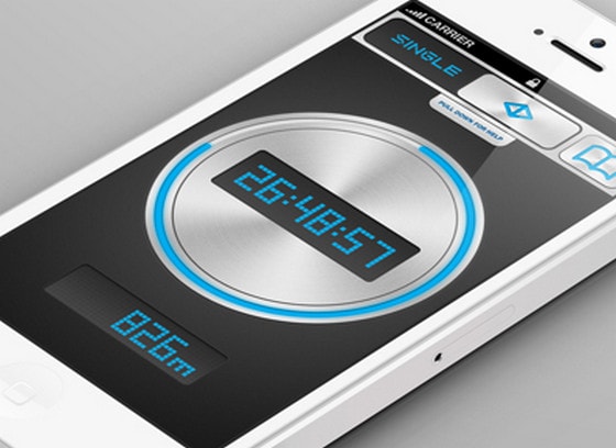
Timer by MVBen. Designer does a really good job of implementing realistic approach, making central control panel similar to real life buttons. Exquisite gradient-themed bluish bar nicely stands out on dark background.
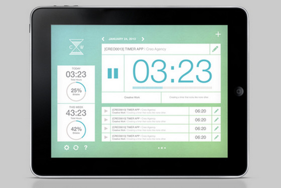
Statistics Screen by Karol Ortyl utilizes dashboard-like bar and additional text to indicate state. Clean light gray background ably collaborates with flat graphics.
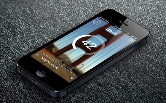
Dash iOS App by Patrick N. Lewis. Designer ably leverages full-screen photo background, casual type and ordinary white embellishments. Circular loading bar along with semi-transparent components looks simply elegant and refined.
Another iPhone app by Corey Lui mainly utilizes bi-color palette (including customary light grey and bright green colors) that gives interface clear and organized appearance.
Dario – app design by Morning. Designer ably leverages dark color scheme, subtle gradients and delicate textures. Shiny, excessively huge, circular green bar is placed in a heart of a screen in order to instantly demonstrate necessary information.
CLOCKWORK Timer App by Ryan Littrell has a wonderful touch of Metro 8 style. Huge rectangular blocks with clean white backgrounds, pale blue, slim type and neatly arranged data give app organized look.
iPhone Music Player App Concept by Kiran has a texture-driven interface made in dark color. Dark bulging knobs, metallic buttons and backlight of controls with slight neon effect add to UI a bit of brutality.
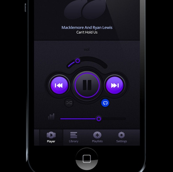
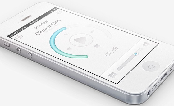
Player UI Concept has an amazing musical vibe. Violet and blue goes perfectly well with dark, almost black graphics and background. Glossy touches and subtle gradients make buttons look pretty nice.
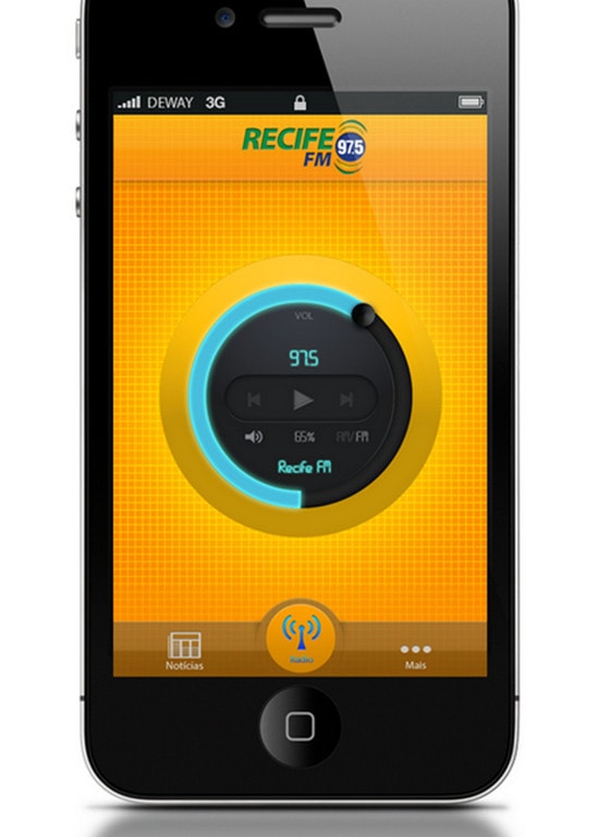
Recife FM by Lucas Ramos is full of positive and good mood. Bright orange canvas, light explicit grid and circular music command center bring optimism and cheerfulness to interface.
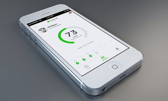
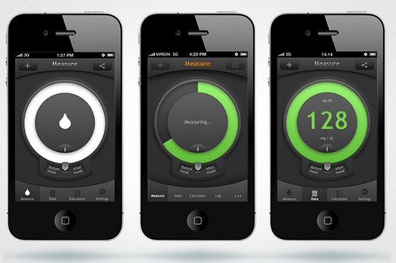
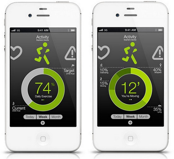
Vital Watcher / App. Being a beautifully and neatly executed monitoring system, app includes basic intuitive icons and symbols that have a lively green touch.
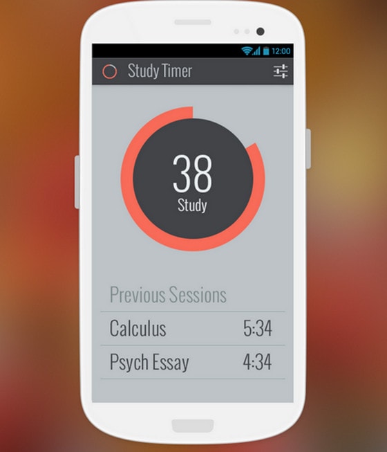
Study Timer by Suhaila Baheyeldin is marked by trendy and sophisticated flat style. Predominant grey color palette along with coral and large narrow type make app looks uncluttered and modest.
MeloMe Music Player App by BLASTAROCKS looks light, clean and truly pleasant. Light background, light buttons, light gray lettering are what gives the interface a unique polished look. Smooth and glossy loading bar easily grabs attention.
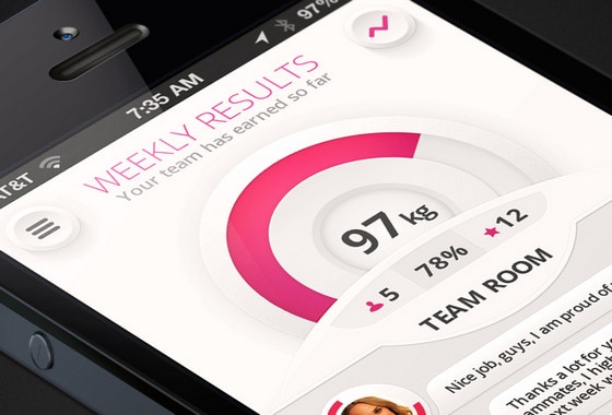
Weight Loss App Design by Nikita Abramenkov highlights clean and quite balanced combination between functionality and design. Pink and white beautifully complement each other, while dark type makes content distinctive and quite readable.
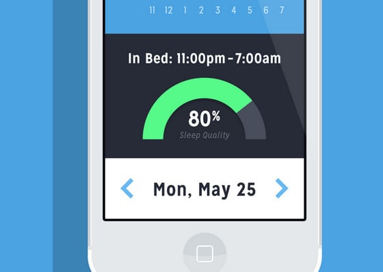
Sleeply App by Jeff Rauch features lovely stats page made in flat style, depicting bold neat arc that is aimed to inform owner about his sleep quality.
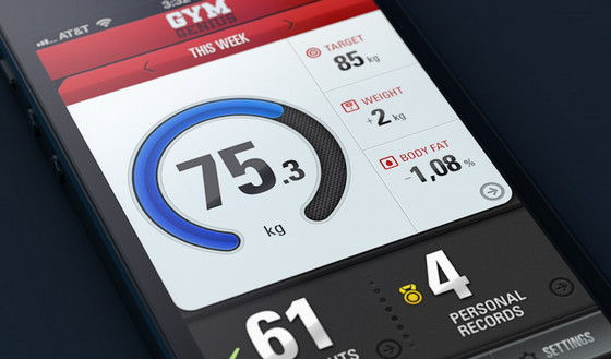
Gym Genius app UI by Artua has pretty strong UI with a lot of glossy elements and gradients. Circular progress bar instantly draws attention to itself.
Sprinter App by Oktafian Angga Nugraha has wonderful conventional metallic vibe with a bunch of shiny controls and skillful injections of calm blue color. Terminal like fonts add extra flair and make UI look completed.
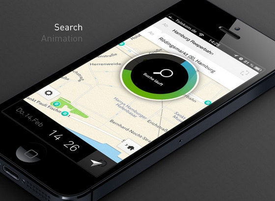
Nextr app public transportation guidance by Martin Oberhäuser portrays nice circular search icon with completeness tracker that is supplied by vivid, gradient-themed animation.
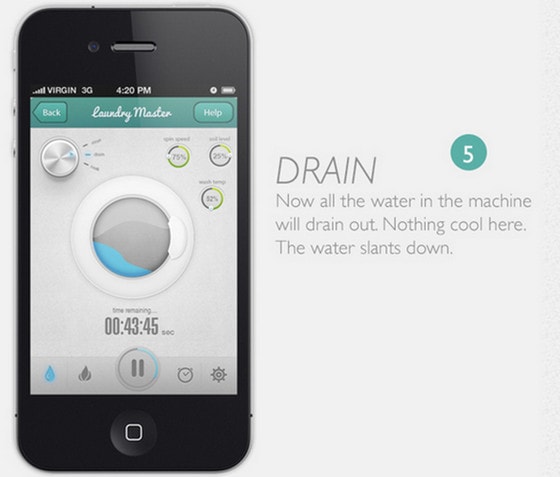
Laundry Master App – iOS by Zahir Ramos adopts the unconventional approach of demonstrating progress, leveraging realistic and fully animated indicator, which resembles a part of a washing machine.
Reflection
Being a perfect graphical demonstration of what is going on, progress and loading bars are one of the most important and integral components of a lot of applications. They are aimed to encourage people to stay when it seems that nothing happens and give extra functionality.
It is your turn to share with us your thoughts. Do you find progress bars useful and helpful? Can they really force people to stay? Do you know any other good examples?