After an App Redesign, Skype Gets a New Logo
Do you wonder how Fluent, Microsoft’s new design language, will look in real life? Look no further than Skype, Microsoft’s chat app. It’s got a new logo and the bubbles are gone. Well sort of, because you’ll still find the bubble around the S, but not on the full Skype logo with the cloudy outline. The font from the wordmark is also replaced with Microsoft’s corporate typeface.
The New Skype Logo
Is the new logo better? Well, the old logo had a distinguishable (atrocious) style and a unique font that you’d associate it with Skype without a second thought. While it looked dated, it was a great ambassador for Skype. Well, at least until WhatsApp, Snapchat, Messenger and the others stole the top spots.
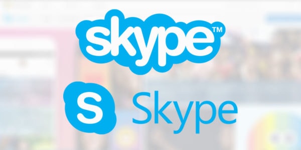
The new logo feels fresh but it strips out any trace of individuality. It’s just another “Microsoft Product” with a barebone wordmark. If this was the idea, then they’ve managed to do just that. But, in my opinion, the logo and the font combination doesn’t work well together. It feels like two different things put together just for the sake of being put together.
Redesigned Skype App
If you think that the logo redesign is drastic, then take a look at the app. The new Snapchat app … errr, updated Skype, feels like everything else except Skype. Gone is the blue we’ve got accustomed to. Now, Skype will ask you to choose between a black and white, stricter color theme, or a colorful color scheme. Don’t worry, you can change the colors later, and you can even add color accents to the black and white scheme.
Messaging
The new Skype is still focused on messaging. The new messaging interface includes three tabs: find, chat and capture. You’ll use find to search through a conversation. You can also use it to search for images, plane tickets, etc. Obviously, you won’t do that.
With Postcards Email Builder you can create and edit email templates online without any coding skills! Includes more than 100 components to help you create custom emails templates faster than ever before.
Free Email BuilderFree Email Templates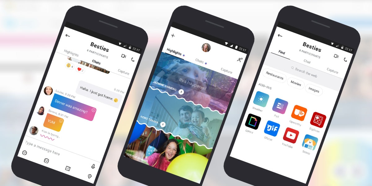
The chat section provides the typical conversation you’d expect with various options for emoji and pictures, and of course GIFs.
The next section, Capture, will allow anyone to capture pictures and photos in an instant, and, of course, edit them with various emojis and stickers and the rest. Why would you do that in Skype? Read further?.
Highlights, Microsoft’s Take on Snapchat Stories
https://www.youtube.com/watch?list=PLaLRbjVhH6kJyDzo1_aFwpumdgsQaHsol&v=qItfRVJFljM
The new Highlights feature will let you capture pictures and videos, and personalize them with various emoji, text and drawings. Then, your contacts are expected to react to them using their own suite of emojis and comments. And they can do that for seven days. After that, your highlight will disappear.
Yep, it’s Microsoft interpretation of Snapchat stories. And if you weren’t sufficiently annoyed by this feature on Messenger, Instagram or WhatsApp, then you now have a new platform joining this questionable trend.
Hello Bot
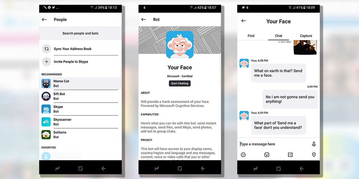
The new app puts a lot of emphasis on bots. It’s easier to uncover new bots. The problem is that bots are still dumb or impolite and not as useful as everybody expected them to be. Of course, you can add bots to your conversations, and, if this isn’t enough, Giphy or YouTube add-ins.
With Startup App and Slides App you can build unlimited websites using the online website editor which includes ready-made designed and coded elements, templates and themes.
Try Startup App Try Slides AppOther ProductsVideo Calls With “Built-In Throwing Emoticons Feature”
Thankfully, you can still have video calls on Skype. But the next time you’re having an interview on Skype, or anything business related, you should be strong enough and resist any primal instinct you may have on throwing emoticons at people. (Yep, that’s a new feature.)
Skype for Business, or Skype for Fun?
The new Skype is a lot younger and energetic. It’s no longer the strict app that you’d typically use for job interviews. It’s playful and trendy. It’s the opposite of what the new logo suggests. So, did Microsoft fail with the new logo or with the new Skype app? Let’s wait for the desktop version. Then we’ll know for sure.
