The Peak Point of eCommerce and SaaS – the Credit Card Payment Form If you’re selling something online, you know it’s not the easiest thing to do. You need to find a prospective customer, present your product in a good …
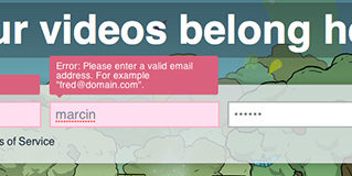
A typical sign-up form contains a couple of form fields (it seems like the most popular number nowadays is 3: e-mail, password and a peculiar “repeat password”) and a button. Is there anything to design in this minimalistic structure? Isn’t …
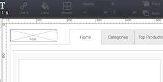
A couple of years ago I realised that a lot of my IT, non-designer, friends were using the names of my beloved design deliverables synonymously. They assumed that a wireframe, prototype and mockup are exactly the same thing – a …
I have a small theory that I’d like to share with you – great typography equals design maturity. Web designers, until a couple of years ago, weren’t paying nearly enough attention to typography. When the whole field matured – typography …
In this article Marcin Treder of UXPin – The UX Design App explains the principles of optimizing design process and spreading a design-centered culture across the organization. If you want to learn more on theory and practice of delivering remarkable …
Navigation is among the most important pieces of every single website. No content would be reachable without properly designed navigation that answers the questions “where am I?” and “where can I go from here?”. We got used to either a …
This episode is special as instead of going through web and mobile apps Marcin explains the meanders of Google Glass Design – the first meaningful wearable computer. 1. Glass? Why should I care? When I heard about the Google Glass …
Three years have passed since Ethan Marcotte coined the term “Responsive Web Design”. Once a revolutionary fresh idea, has in the year 2013 been transformed into a commodity. Responsive Web Design (RWD) is not a trend anymore, it’s the reality …
A couple of years ago I saw Twitter’s form validation for the first time and I was absolutely amazed. User Interface nerds among you probably know what I’m talking about. At the time we were almost jumping with excitement. The …
Welcome to the last part of our course on wireframing and documenting design. Hope you’ve enjoyed the course – I’m looking forward to hearing your feedback. Today, to sum up the course and finish it on a playful note, we’ll …
We live in a mobile decade. No questions here. According to Business Insider already more smartphones than PCs are sold annually. By the end of 2015, most probably, there will be more smartphones in use than, so-called, feature phones (or …
This is the third part of our online course on wireframing and creating design documentation efficiently. In the first part you learnt what the difference between common design deliverables is: wireframes, mockups and prototypes. In the second part you had …
Welcome to the second part of our online course on wireframing and creating design documentation. Hope you enjoyed the first part and you now deeply understand the difference between the common deliverables of the User Experience Design Process: wireframes, prototypes …