The Ultimate UX Design of Form Validation
A couple of years ago I saw Twitter’s form validation for the first time and I was absolutely amazed. User Interface nerds among you probably know what I’m talking about. At the time we were almost jumping with excitement.
The discrete charm of well-designed form validation in Twitter’s forms was absolutely seductive. Informative error messages popped out right when I’d made an error, immediately eliminating irritation. “Inline validation” helped me understand what was going on right away. I could feel that this simple form was trying to have an actual conversation with me. That was a revelation! At the end, I didn’t have to wait for a reload of the whole page to check if the form was filled in with the right data.
This experience completely changed my approach to the design of forms. It helped me understand that form validations are meant to have conversations with users and guide them through the difficult times of errors and uncertainty.
The term “form validation” might need a little bit of clarification. Form validation is the technical process where a web-form checks if the information provided by a user is correct. The output of this process is emotional rather than technical. The form either points out that the user made an error, or assures that the provided data is accurate. To give you an example: if a user provides the data in a form field labeled “email address” the form should check if the provided text is in the right format ([email protected]) and if this e-mail address isn’t already registered.
Generally speaking, there are two types of form validation:
- After submit validation – when the user provides all the data and submits the form, usually by hitting the button, the information is sent to the server and validated. The response of the “validator” is sent back to the user’s computer and it’s visualized as either a confirmation message (“everything went fine!”) or a set of error messages.
- Inline validation – validation messages are shown immediately after the user types in data to form fields. Usually, information is shown next to the fields and encourages the user to take immediate action.
Importance of Form Validation
Form validation is at the center of communication during the most important processes of interaction between the web/mobile visitor and the interface. Its importance exceeds its size and perceived simplicity. Don’t believe me? Consider when you can typically encounter form validation:
With Postcards Email Builder you can create and edit email templates online without any coding skills! Includes more than 100 components to help you create custom emails templates faster than ever before.
Free Email BuilderFree Email Templates- Sign-up/sign-in forms
- Shopping cart – check-out forms
- Newsletter forms
That’s a bunch of important moments in your interface life-span, right? The business side of your endeavor probably hangs on this.
Let’s compare the online to the offline world. This always puts things into a familiar perspective. Let me make a simple analogy: form validation is the equivalent of having a conversation with a salesman right before a purchase – when everything is still on a knife’s edge. If the salesman is impolite and refuses to provide any assistance, you’ll certainly leave the shop without completing your purchase. If the salesman is professional, polite and helpful – you’ll reach for your wallet.
Most form validations are as rude as the rudest salesman. Forms with error messages such as “Database error!”, “Wrong e-mail!” not only fail in terms of savoir-vivre – they usually result in a high drop-out rate.
Poor communication leads to poor business results and there is plenty of proof for that. Research conducted by Luke Wroblewski clearly shows that using properly designed inline form validation might make a tremendous difference:
“When compared to our control version, the inline validation form with the best performance showed compelling improvements across all the data we measured. Specifically, we saw:
- a 22% increase in success rates,
- a 22% decrease in errors made,
- a 31% increase in satisfaction rating,
- a 42% decrease in completion times, and
- a 47% decrease in the number of eye fixations.
This shouldn’t be ignored. Designing form validation in the right way might have a huge impact on your business!
And this is the point when we leave theory and jump into practice. Let’s see what the best players in the field designed and then we’ll learn how to step-by-step design perfect form validation.
Excited?
With Pulsetic you’ll be instantly notified the moment your website, API, or server becomes unavailable. Monitor uptime from multiple global locations and respond to incidents before your users are affected.
Create beautiful status pages in minutes to keep customers informed during outages and build trust with transparent communication.
Start Monitoring for FreeEach example used below can be uploaded directly to UXPin – The UX Design App as a reusable wireframe template.
Avoid confusion
Generally speaking there are four important elements that good form validation consists of:
- Right time of informing about problems/success
- Right place for validation messages
- Right color
- Clear language
All these factors have one clear goal: to avoid confusion. Confusion is the arch-enemy of conversion. If you don’t want to risk a sky-rocketing drop-out rate, create validation that eliminates any risk of your customers being confused. That’s the road to a high conversion rate.
Right time
As we could see in the example of Luke Wroblewski’s research – the right time to inform about the success/failure of provided data is right after the user has submitted the information. Inline form validation that immediately informs users about the correctness of provided data results in an increase in the conversion rate.
Twitter is an obvious example here. They did a great job of avoiding user confusion.
On the screen below you can see that I’m trying to register with an e-mail address that was already used. The form informs me that I should stop right at the second step and consider some back-up options, so I won’t be disappointed with the final result. A classic “after submit” validation would wait for me to fill in the whole form, reload the page and then it would let me know that something was wrong.
Twitter chooses a better time to stop me – there’s no doubt about that. The immediate response of the form saves me a massive loss of time (yes, today even 3 minutes is a massive loss).
And what’s even more amazing – Twitter is actually trying to have a conversation in this critical moment of our acquaintance. Thanks to inline validation, they can immediately offer me some options. Perhaps I’m the owner of the account registered with the e-mail and I just wanted to log in? Who knows – maybe I’ve just forgot the password?
This is not only great form validation, which adds a lot to the conversion rate; it’s also a top-notch customer service.
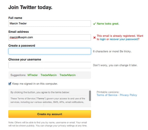
Twitter Form Validation – Error Message
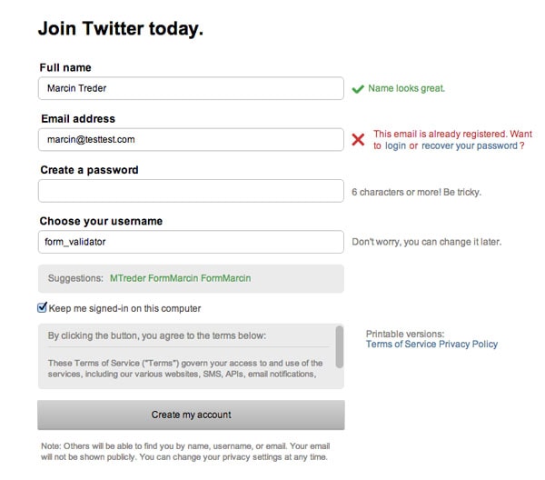
Twitter Form Validation – Error Message – Upload Wireframing Template to UXPin
Right place
The place of the validation message is as important as the right time of showing it. On the discussed Twitter example – if the message wasn’t next to the field, but placed somewhere below, I wouldn’t manage to notice it quickly. If I didn’t notice it…well, that would just be confusing and dangerously close to forcing me to leave the form without finishing the process.
When you’re wondering what place to choose for your validation messages, follow this rule of thumb – always place the message in the context of action. If you want to inform the user about an error occurring in a particular field – show it next to the field. If the error is general (e.g. a problem with sending data to the server) and there wasn’t a reload of the page – show the message next to the submit button, if there was a reload of the page – show it at the top of the page.
Take a look at the example below. Light CMS shows error messages next to each field. That’s really easy to notice and understand.
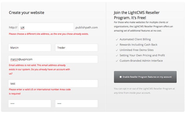
Light CMS Form Validation – Error Message
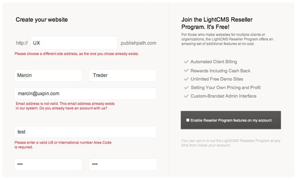
Light CMS Form Validation – Upload Wireframing Template to UXPin
Etsy’s form is also a great example of well placed validation messages. In this case I also really like the construction of the form and the visualization of error messages. The clear division into sections (Sign Up Using Facebook, the main sign-up form) provides clear guidance through the sign-up process.
Error messages have a lovely visualization – with a red border around form fields and red message boxes – the intention of the communication couldn’t be clearer.
That’s a good attempt at eliminating confusion from the form.
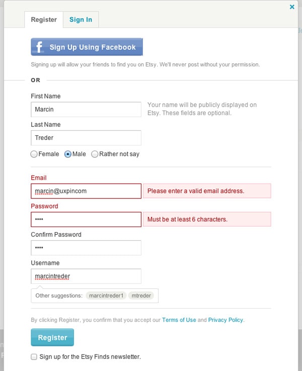
Etsy Form Validation – Error Message
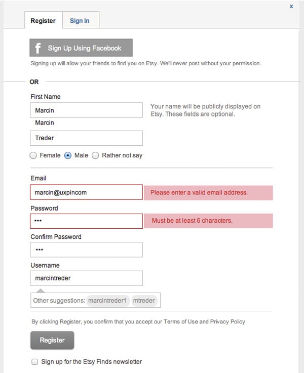
Etsy Form Validation – Upload Wireframing Template to UXPin
If the construction of the form doesn’t give you too much space for a clear error message, follow the example of Vimeo.

Vimeo Form Validation – Error Message
Vimeo, using tooltips pointing at specific form fields with errors, avoids lots of confusion. The color-based correlation is also helpful. A red error message corresponds with a red background and red border of a field with errors.
Error messages are placed in the context of action (in this case an error) and that’s the foundation of clear communication.
Of course the problem here is the “after submit validation” which makes people wait till the validation of the form is done on the server. However, in the case of such a short form, I wouldn’t expect it to be a critical design error.

Vimeo Form Validation – Upload Wireframing Template to UXPin
Right color
Color – is easy as 1, 2, 3 – red is for errors, blue for information, yellow for warnings, green for the confirmation of success. This color system is the most intuitive you can imagine. At least part of it (red & yellow focus attention and raise blood pressure) is backed up by evolution and the whole system of color – meaning is present e.g. on the roads. Don’t confuse it and you’ll be ok.
On all the examples above we’ve seen this rule in action. Let’s review a couple more interesting solutions, so you’ll have plenty of inspiration.
Again Twitter rules when it comes to proper form validation. Confirmation messages are extremely clear with the green color and the little “check” icons add to the overall greatness.
Pay attention also to the password field. The green indicator inside the field shows how safe your password is. Now that’s a home run. Love it!
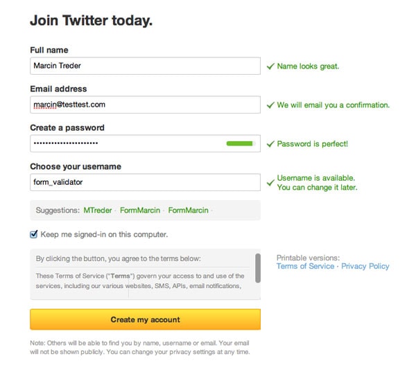
Twitter Form Validation – Confirmation Message
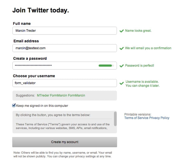
Twitter Form Validation – Upload Wireframing Template to UXPin
Pinterest is also an interesting example of the smart usage of color in validation messages. With a red box around the whole field, the danger of an error is emphasized. The addition of neatly done inline validation makes it a truly anti-confusion solution.
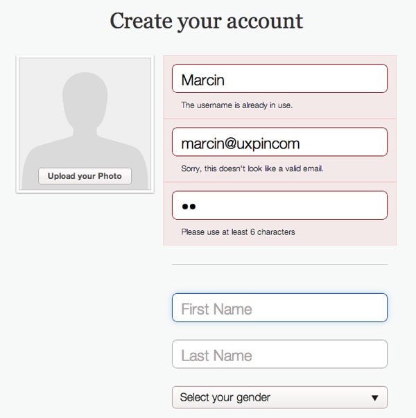
Pinterest Form Validation – Error Message
Take also a close look at the construction of the form. Six fields are visually divided into two sections. One is all about logging in to the service and it’s somehow formal. The other is personal – First Name, Last Name and Gender. The division makes a lot of sense because your last name and gender aren’t obligatory.
However, not indicating that some fields are obligatory and some aren’t, is on the verge of being a dark pattern. People might feel tricked into filling in their last name and gender (which might be used for advertisement targeting reasons).
I can see their very efficient strategy of gaining data, but I would be very careful with such practices. Usually, I recommend asking users for non-obligatory data after the sign-up process.
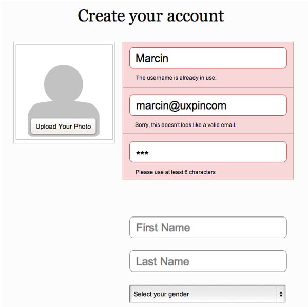
Pinterest Form Validation – Upload Wireframing Template to UXPin
Right language
Finally – language – that’s the tough one. I spent hours looking for examples worth mentioning and didn’t find anything that was perfect.
A validation message should clearly state:
– What happened
– What’s the next step the user should take to succeed (this doesn’t necessarily apply to the confirmation of success messages)
And should always avoid using technical jargon.
The rules are simple, but somehow they are very easy to ignore. A typical error might state that “the email is invalid” without telling the customer why it’s invalid (a typo? Is it occupied?). This brings confusion on board. A risky business.
Of course, again, Twitter is an example of the usage of clear and crispy language. When they say that your e-mail address is OK, they use a confirmation message to say “we’ll e-mail you confirmation”. If the e-mail is already registered, they give you the option to log in, or recover your password. If you manage to create a perfectly safe password, Twitter will tell you “perfect password!”.
Now isn’t that nice? It’s all about having an ordinary conversation.
Delicious makes lots of mistakes in their form and its validation, but they handle the language side in an interesting way.
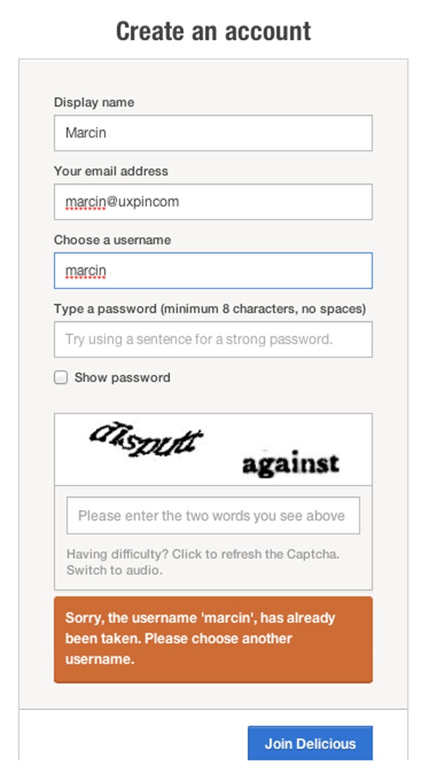
Delicious Form Validation – Error Message
First of all, and I absolutely love it, they added a little info to the password field “Try using a sentence for a strong password.” Isn’t that helpful? I’ve been waiting to see something like that for a long time. It makes a lot of sense when it comes to the safety of a password. Much more than requiring people to type a capital letter and a number.
Secondly, Delicious beautifully inform about an error with choosing a username:
1) “Sorry, the username ‘marcin’, has already been taken” – clear information about what happened.
2) “Please choose another username” – clear call to action
However, they lack a back-up option. Perhaps I just forgot that I had an account?
Anyway, Delicious broke the rules of right time, right place and color… but, thanks to the right language, their form is still rather usable. This is how important language is.
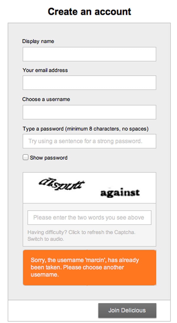
Delicious Form Validation – Upload Wireframing Template to UXPin
Sum up
We’ve seen some great work on form validation, but we haven’t seen perfection yet. This is something that we’ll build on our own to demonstrate how easy it is to follow the four rules of designing the right form validation:
- Right time of informing about problems/success
- Right place for validation messages
- Right color
- Clear language
Time for a step-by-step tutorial!
By following our 4 simple rules mentioned above, we’ll create perfect form validation. Form validation that will minimize the risk of losing a customer on the way to the ultimate goal of the service.
Just to prove my point, I’ll design a form with a section of additional, non-obligatory, information. Something similar to Pinterest’s form. As I said, usually I wouldn’t recommend doing it that way, but if you really must, there’s a couple of things you can do to make it easier for people.
1. Structure & Header
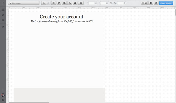
I’ll start with the structure of the form and a header. The structure is really easy. The white part is devoted to obligatory fields, the gray part to non-obligatory, additional information.
I’ll just draw simple boxes, to fix the space and give my design a structure.
Then I’ll add a header – something very plain, putting persuasive information into the sub-headline. Again – I’m looking for an anti-confusion solution.
2. Form Fields
In the next step, I’ll add form fields and labels. Since I’m strongly against labels inside the fields (very confusing, if you start to write something inside the field, stop for a couple of minutes and then want to start again… there’s no indicator of what you should write in the field), I’ll place them above the form fields.
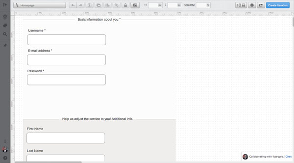
Additionally, I’ve added two sub-headers that explain what types of information need to be provided in each section.
3. Form field Information
Form field information is something that’s often omitted, but in reality it’s very helpful as a start of the conversation with users. By using one or a maximum of two sentences, you can explain some risky things like “why do you need my e-mail?” and build basic trust.
I’ll add information next to almost all the fields:
- Username – “It’s the name other members of XYZ will see. You’ll also use it to log in.”
- E-mail address – “We’ll send you a confirmation message and use your e-mail for basic communication. Don’t expect spam :)”
- Password – “To increase safety – use a whole sentence. Easy to remember – hard to break!”
- First Name – “We’ll be able to call you by your real name in our communication!”
- Gender – “It’ll let us adjust the service here and there a little bit!”
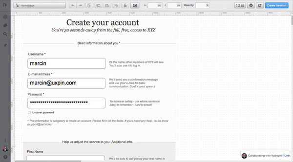
This additional information might not be critical, but it’s the starting point of a “relationship”. It’s better to say more, than to confuse users.
4. Error messages
When it comes to error messages, we need to really carefully consider all of our rules.
- The right time to show the message is right after the error is spotted. We’re going to design for inline validation.
- The right place is next to the field – so I’m going to replace additional information next to the field with an error message
- The right color is of course red and I’m going to put a robust box underneath the whole field with an error
- Clear non-technical language – no “database error” etc.
Take a look at the result:
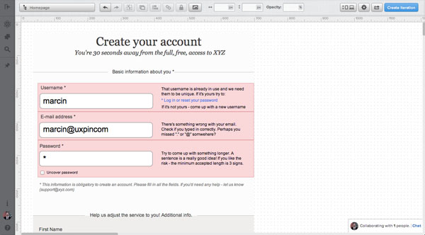
I’d like my error messages to “explain” and “guide” people through the process. I’m trying hard not to leave any doubt, which can result in leaving the form without correcting the data. Here’s the full text:
– Username error – “That username is already in use and we need them to be unique. If it’s yours try to:
* Log in or reset your password
If it’s not yours – “come up with a new username”
– E-mail error – “There’s something wrong with your email. Check if you typed it in correctly. Perhaps you missed “.” or “@” somewhere?”
– Password error – “Try to come up with something longer. A sentence is a really good idea! If you like the risk – the minimum accepted length is 3 signs.”
Can you see the pattern in these error messages? I’m stating clearly that there was a problem and immediately I’m coming up with a solution.
5. Confirmation messages
And finally – confirmation messages. These are a pure pleasure to design. Since they pop out right after typing text into the fields, I’ve decided to come up with a more subtle solution. I don’t want people to stop on the confirmation message. They should scan it quickly and go to another field feeling good about the previous step.
No heavy colorful boxes, not long sentences – just a quick confirmation.
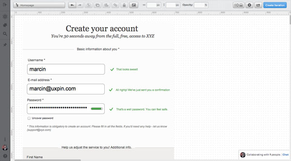
And that’s it! Easy as 1, 2, 3. Form validation aligned with our four rules. It didn’t hurt, did it?
