Guide to Bootstrap Columns: Examples, Tutorials, and Tricks
Twelve Bootstrap columns, five breakpoints, and Flexbox are what underlies the iconic boilerplate’s bootstrap grid system. There are a dozen predefined classes, yet, these three stand behind the flexibility of the layout. They build a concrete foundation with responsive behavior for mobile-friendliness. As a result, developers can construct websites that look and function on different devices.
Read about Bootstrap buttons, Bootstrap grid, Bootstrap navbar, and Bootstrap modal.
Looking for a Bootstrap online builder?
- 👉 Try our Bootstrap Builder and create unlimited projects for unlimited clients.
- 👉 Start to build a website using our Bootstrap Templates.
Bootstrap columns do not come without a little help from rows and containers that hold everything together. The basic structure of every Bootstrap-powered website includes this quintessential trio. Columns break everything into digestible pieces creating order out of chaos.
Bootstrap Columns Fundamentals
First things first, understanding the fundamentals of Bootstrap columns is necessary to handle the framework properly. A dozen classes and utilities give you freedom of action. You can create any structure you want without drastic changes in the code.
- Containers are must-haves. Use traditional .containerclass to create a layout with a responsive width or .container-fluid class to create a full-width structure on all devices regardless of dimension.
- Rows are must-haves. They are wrappers for all your experiments with column organization. The immediate children of rows are columns. Rows and columns are inseparable.
- You can change the column width depending on the screen size.
- Columns can be reordered. You can change their position depending on the device.
- Columns wrap and stack automatically.
- You can use less than 12 columns in a row. Conversely, you can have more than 12 columns in a row, and the Bootstrap will deal with that on its own.
- Columns can be broken into rows and columns. Nesting is a common thing.
- Bootstrap 4 introduces auto-layout columns. Therefore, columns can “grow” and “shrink” on their own.
- Ems or rems define the sizes of columns, thereby making them flexible. Note, pxs define breakpoints.
Dig a little deeper to refresh your memory about basic classes that are used for columns to create structures without any modifications in CSS files.
With Postcards Email Builder you can create and edit email templates online without any coding skills! Includes more than 100 components to help you create custom emails templates faster than ever before.
Free Email BuilderFree Email Templates- The column’s declaration indicates the number of columns that you want to merge. Thus, .col-4 means creating an area that occupies four columns.
- In the fourth version, you are not obliged to specify the width of the column, since Flexbox does all the heavy lifting. Use .col class to create auto-layout columns. Note, you can mix and match it with classes that define the exact number of columns to merge (for example, .col-6).
- Use col-{breakpoint}-auto (for example, .col-lg-auto) to create columns whose width will be set by the content inside.
- Use traditional .col-* class to set the column width on the specific screen size.
o .col- are for devices whose screen is less than 576px;o .col-sm- are for devices whose screen is between 576px and 767px;o .col-md- are for devices whose screen is between 768px and 991px;o .col-lg- are for devices whose screen is between 992px and 1199px;o .col-xl- are for devices whose screen is greater than 1200px. Use .w-100 class to break columns to a new line, thereby creating a multirow structure. Note, these lines will not have spaces between them. Use flexbox to align columns. You can go for.align-items-start, .align-items-center, align-self-start, and others. The same goes to horizontal alignment: use flexbox to your advantage.
- Use .no-gutters class in a row to ditch all the gutters between the columns.
- Use .offset-*-* classes to move the column to the left.
- Use .mr-auto class to force sibling columns to move away from each other.
Reorder Bootstrap Columns
Bootstrap columns can be reordered depending on screen size. Moreover, with the fourth version, this process becomes elegant and hassle-free, thanks to Flexbox.
Several predefined classes allow changing the order of columns. First, you need to use .order class that is fully responsive. You can use breakpoints to set the order like this:
.order-sm-2.order-md-12
The line above means that the column will be the second one on small devices and the last one on the mid-sized devices. You can put any number from 0 to 12. Note, there are also two specific classes such as .order-first and .order-last. They do what they say.
Alternatively, for reordering, you can use baseline direction utilities inherent to Flexbox such as.flex-column-reverse.
Center Bootstrap Columns
Centering Bootstrap columns is easier in the fourth version, again thanks to Flexbox. All you need to do is to apply .justify-content-center class to the row.
As for centering the content inside the column, you can use a Flexbox class .align-self-center.
With Pulsetic you’ll be instantly notified the moment your website, API, or server becomes unavailable. Monitor uptime from multiple global locations and respond to incidents before your users are affected.
Create beautiful status pages in minutes to keep customers informed during outages and build trust with transparent communication.
Start Monitoring for FreeDifferent Layouts Made with Bootstrap Columns
We have compiled a collection of free themes and layouts that show the potential that is hidden inside this integral detail of the framework.
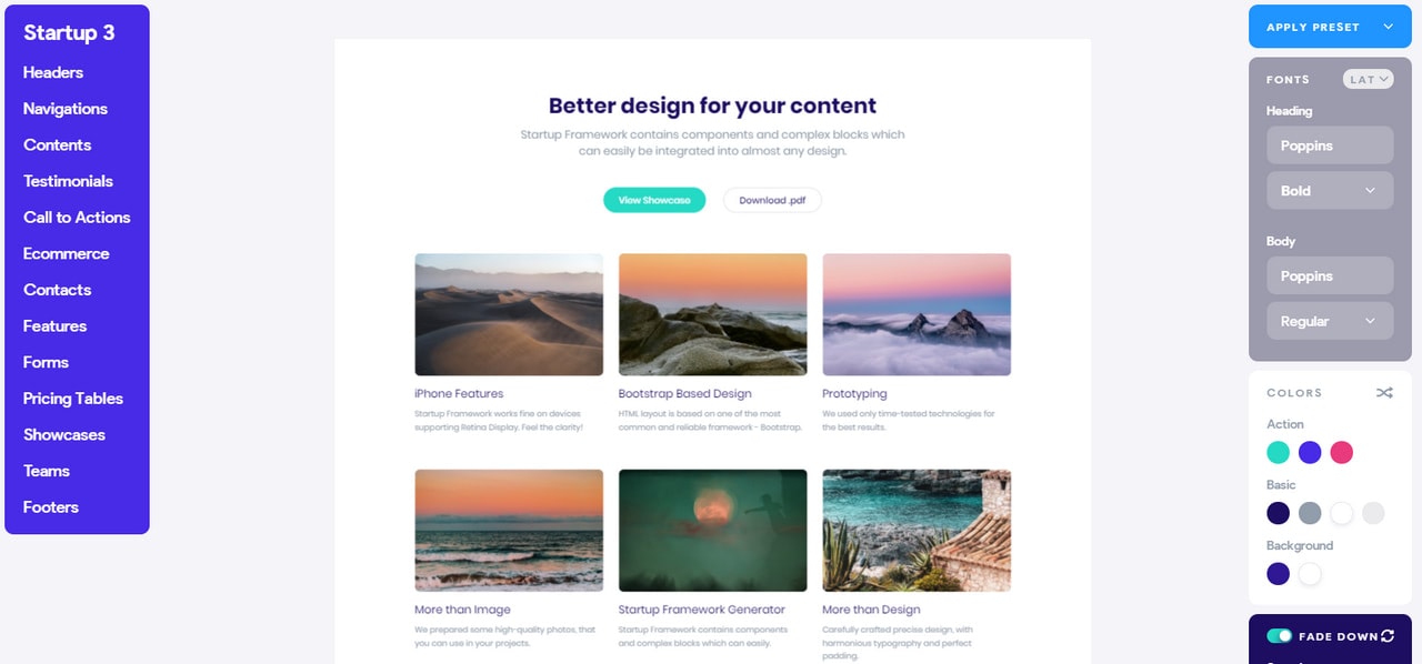
Showcase by Startup
Showcase by Startup is an elegant HTML/CSS theme. It dishes up a bunch of content in a well-organized manner offering an eye-pleasing aesthetics. Here the layout has three equal columns and several rows. Each cell perfectly accommodates both visual and textual material serving as a perfect base for displaying portfolio pieces, blog posts, etc. If you want to modify the template, for example, change color or font, all you need to do is to use options panel on the left. There are standard settings that allow editing the appearance of the theme without modifying the code.
What’s more, the Bootstrap builder is packed with solutions where Bootstrap columns run the show. There is a businesslike “Our team” block and, compact yet informative, pricing table that are available for free.
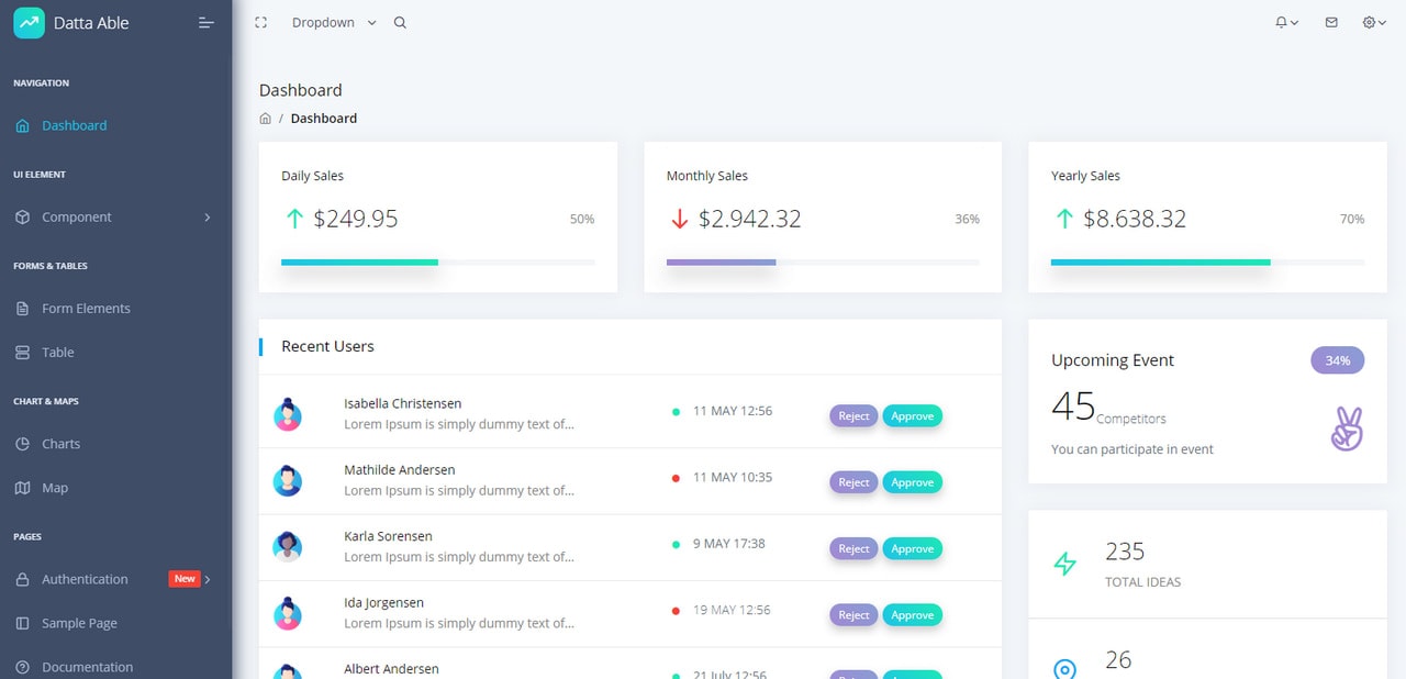
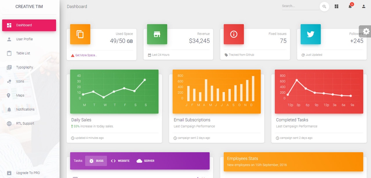
Datta Able Bootstrap 4
Datta Able is a sterling admin panel that shows how to get the most out of Bootstrap columns. Here you can see a traditional left-sided layout where the right part accommodates the entire content. The latter features nesting with a varied positioning and width of the columns. Depending on screen size, the layout will shrink and change the order of blocks.
Unlike Showcase by Startup, Datta Able is a Bootstrap template that comes alone. If you want to customize it, you need to mess around with HTML, CSS, and JavaScript.
Material Dashboard
Material Dashboard is another admin template that easily handles the complexity of the structure. Much like in the previous example, the theme has two regular columns where the first one holds the navigation, and second contains content. The latter is presented as a perfectly organized grid. The key feature of this solution is Material Design principles that can be seen in every pixel.
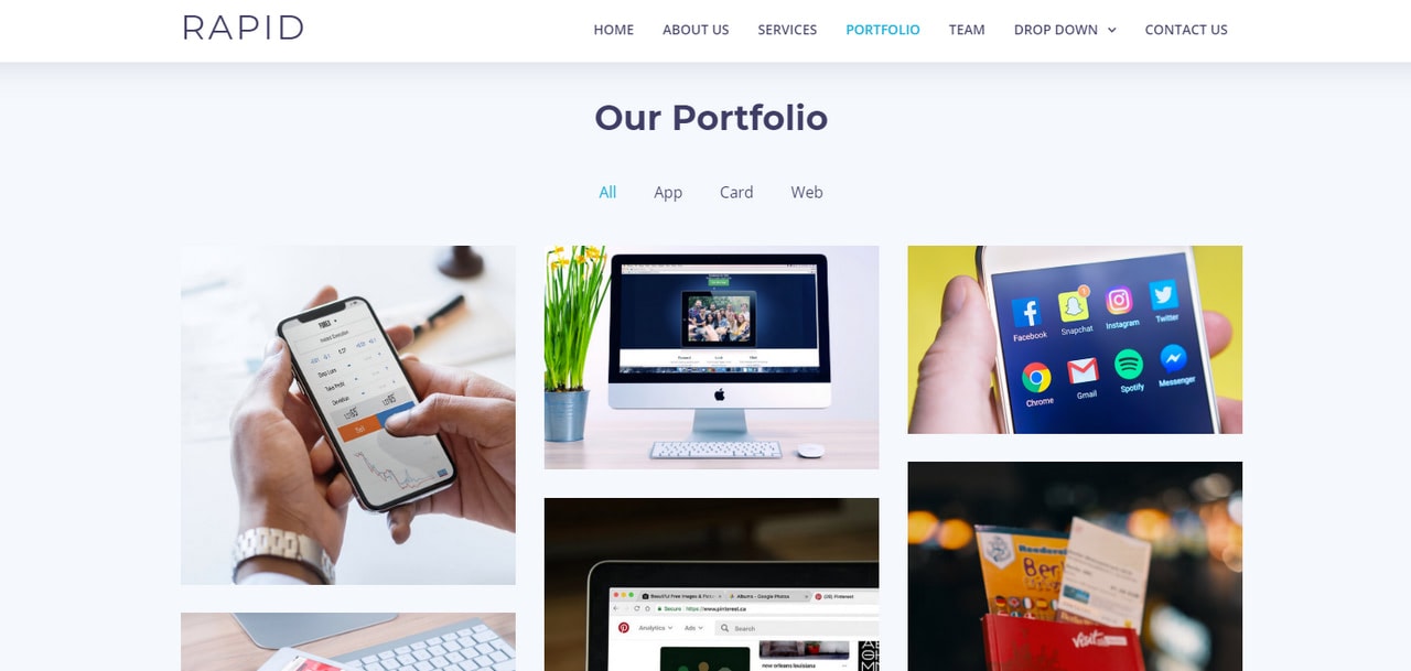
Let’s move from admin dashboards to regular websites. Take a look at Rapid.
Rapid is a sleek and modern one-page multipurpose business template. It covers all the primary areas, including a portfolio for exhibiting work. Here you can see various types of layouts based on one, two, and three-column skeletons.

The Event template has mastered Bootstrap columns as well. Almost every other section is based on a grid system. There are two-, three-, and four-column layouts that efficiently accommodate the content. You can break it into pieces and use them in your projects to solve trivial issues.
Last, But Not Least
Without a doubt, the most popular area of putting Bootstrap columns in action is a portfolio that could not survive without a well-thought-out grid. Nevertheless, there are some other types of websites where this baseline component plays first fiddle; and, one of them is e-commerce.
Consider the Bootstrap eCommerce Template. This clean and neat theme has a five-column structure that is necessary to display products to potential customers without overwhelming them. The idea is simple, yet it does the trick.
Conclusion
Bootstrap columns set the stage for the entire content. They are invisible, but you can not survive without them. While container and row perform a shaping role, columns create the whole structure, skillfully organizing and ordering various pieces of content. With Bootstrap 4, you can play with columns by applying predefined classes and utilities that are sprinkled with Flexbox magic.