The Inspiration Behind Brutalism in Web Design
A stripped-down internet inspired by architecture of the 90s.
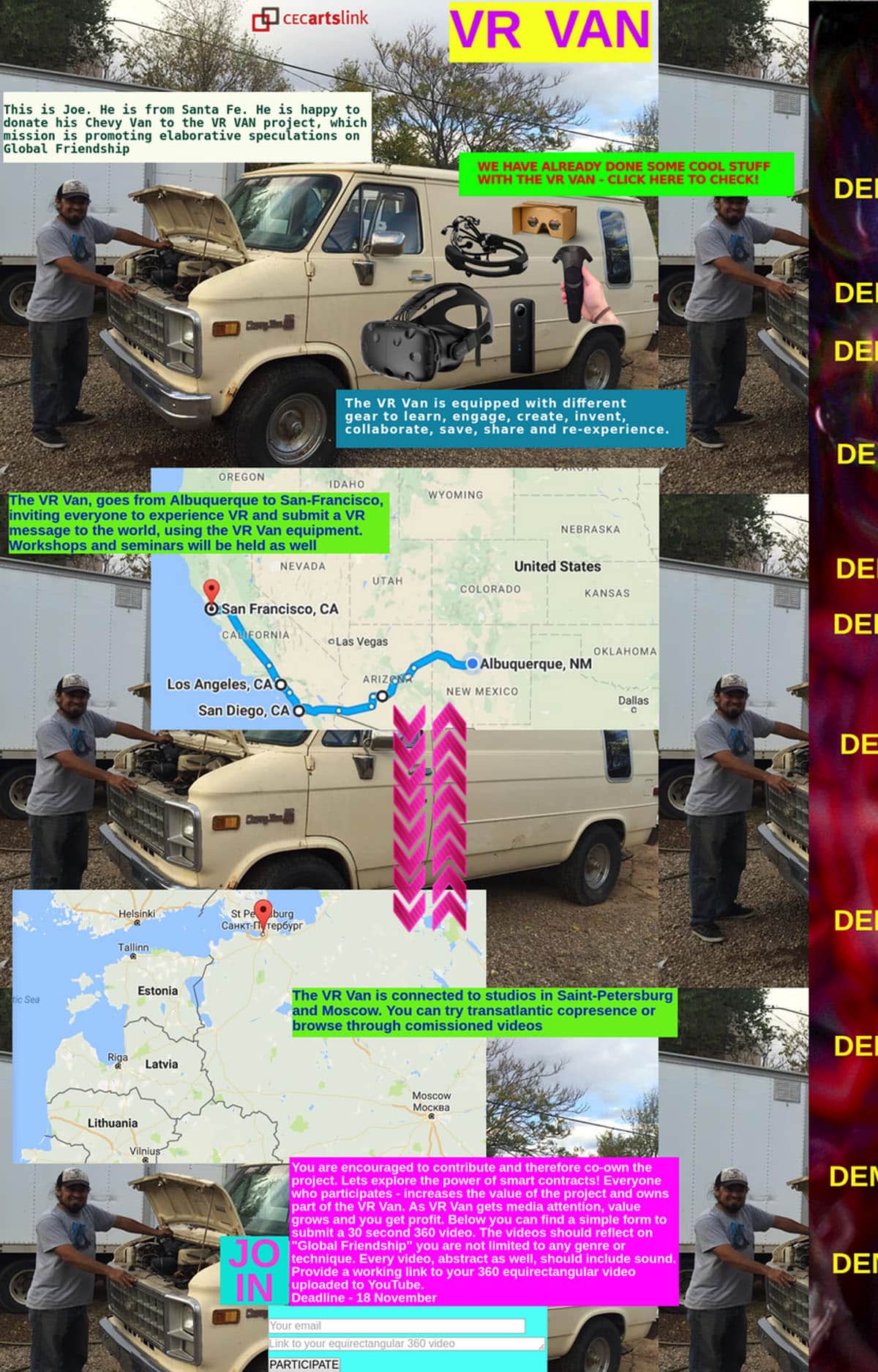
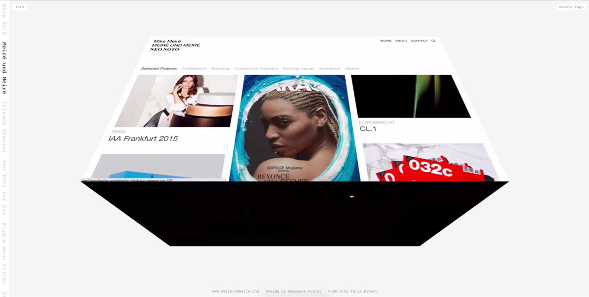
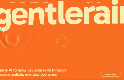
Brutalism in web design, in its most basic form, incorporates stark colors, bold and unforgiving shapes and layouts, and typography that is often clumsy and oversized. By now, we have all experienced some form of the brutalism web design trend that has gained traction over the past year or so. Even Bloomberg has adopted the style in its own way.
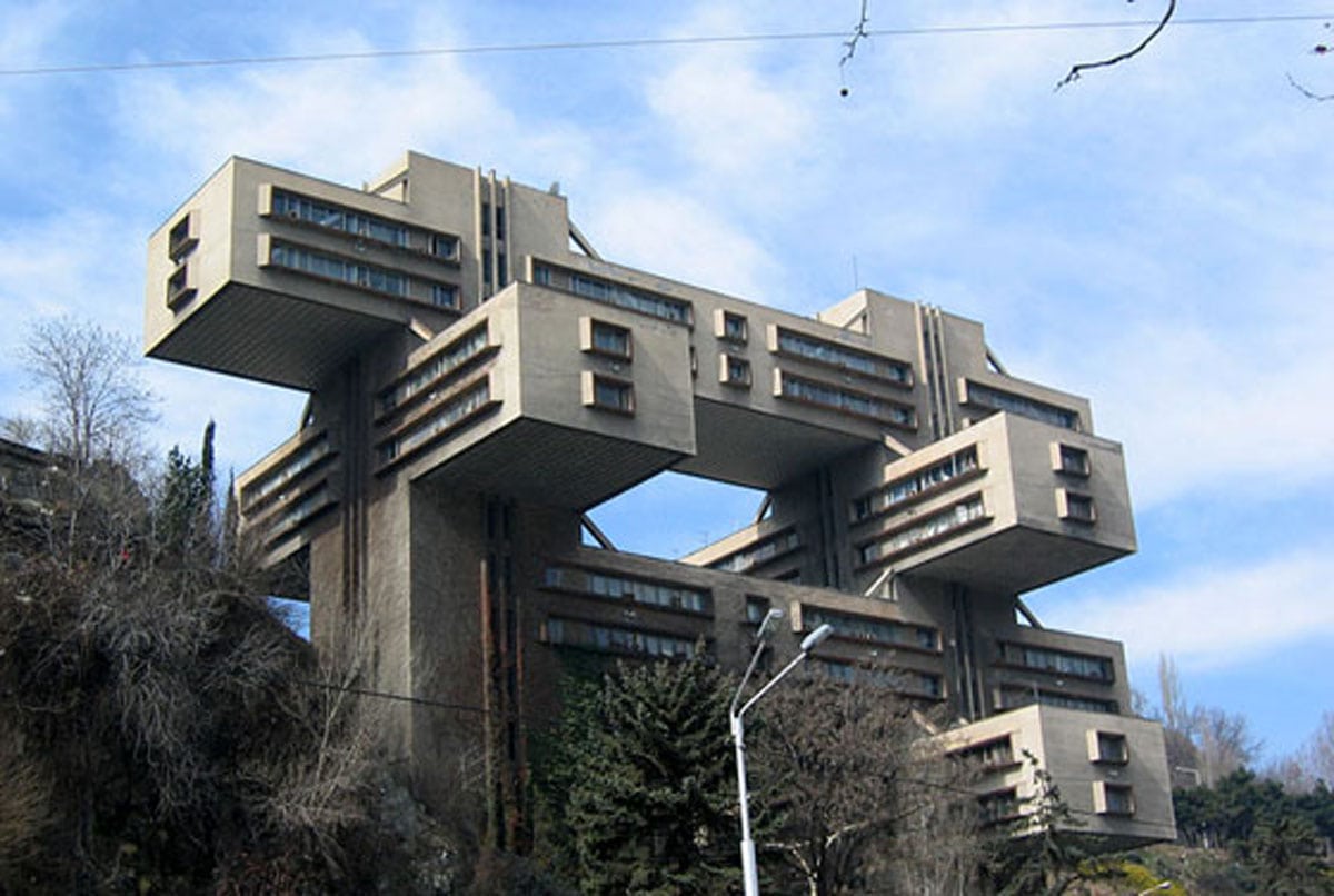
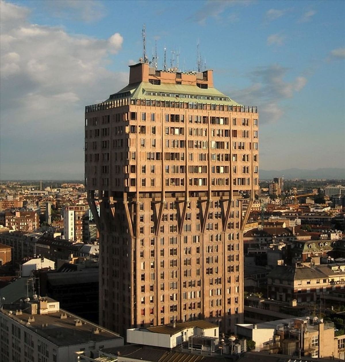
But where does this design style come from? The inspiration for such comes from a number of aspects, not least architecture. This architectural trend was prominent during the mid-1900s and utilized concrete to produce often harsh and imposing structures.
In this article, we are going to look at aspects of the brutalism trend in architecture that have inspired the web design trend that has achieved prominence today.
Colors
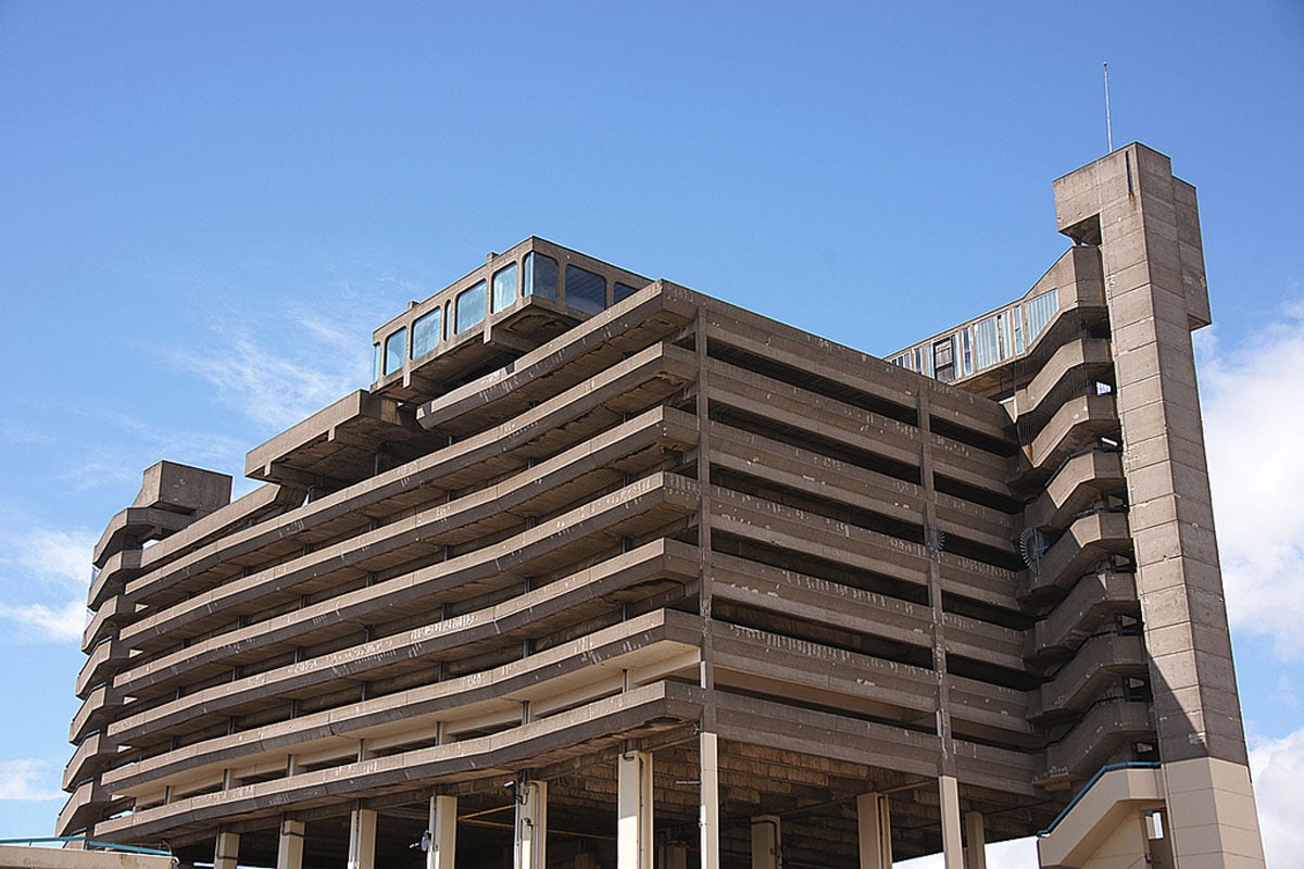
The dull, grey colors associated so often with concrete are one of the reasons the architectural trend was so controversial. The dark tones were often considered cold and austere. The revival of such a trend in web design has prompted some designers to use similar tones and palettes, particularly with their use of imagery.
With Postcards Email Builder you can create and edit email templates online without any coding skills! Includes more than 100 components to help you create custom emails templates faster than ever before.
Free Email BuilderFree Email Templates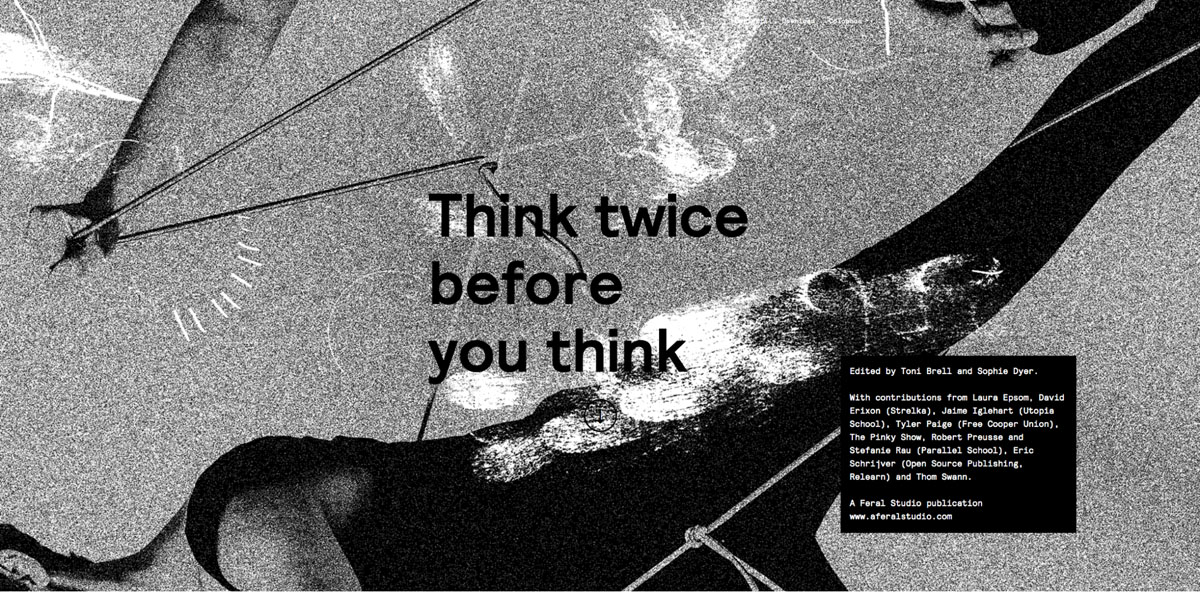
Shapes
A similar response has come in web design with regard to the shapes found in typical brutalist architecture.
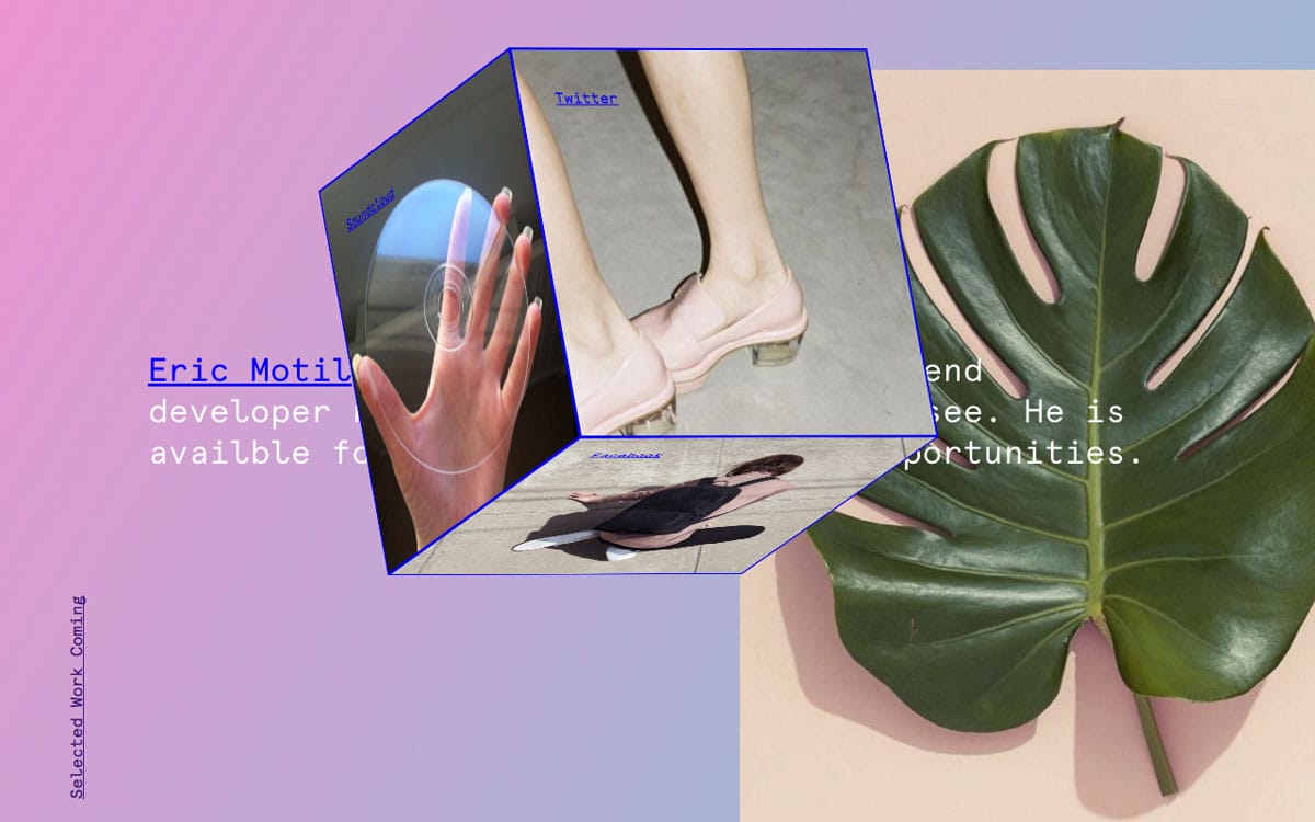
The bold use of shapes has clearly translated to the web design trend, with designers implementing similar instances to create impact, depth, and attention. The shapes are often incredibly unique and new. Concrete was able to open up a new option for architects in its ability to be crafted into almost any shape imaginable. Many sites use these unique and bold shapes in their three-dimensional form to further the brutalist impression.
Proportion & Scale
The imposing nature of brutalist buildings has had a clear translation to the proportion and scale of elements within the web design trend. These buildings are often excessively large and the often sinister impression is only furthered by the lack of color. The buildings often have little in the way of resolving their blandness and bluntness, whereas a traditional building may use curves or ornate features to do so.
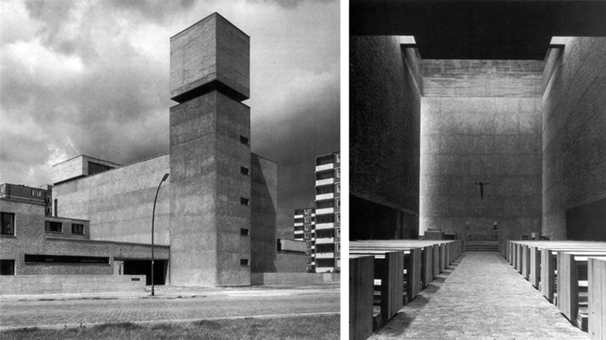
The web design trend has incorporated this concept of epic proportion and scale, often emphasising particular elements including typography and imagery, with little regard for readability or even visual attractiveness.
With Pulsetic you’ll be instantly notified the moment your website, API, or server becomes unavailable. Monitor uptime from multiple global locations and respond to incidents before your users are affected.
Create beautiful status pages in minutes to keep customers informed during outages and build trust with transparent communication.
Start Monitoring for Free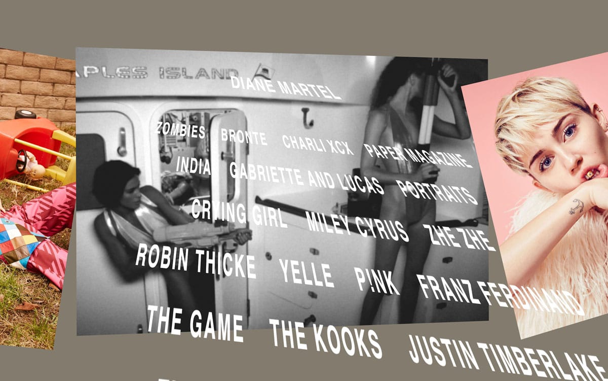
Imposition
A similar concept is that of imposition. Brutalist buildings impose themselves on the landscape with little subtlety. They do very much the opposite of today’s architectural trends, whereby buildings are often designed to blend in with their surroundings, or use an abundance of glass to reflect the sky.
Websites following this trend do much the same, imposing themselves on the visitor with great visual impact and abnormal layouts and color combinations to draw attention. Many of the type and elements are often purposely superfluous, and implemented purely with visual impact and stylisation in mind.
This was similarly the case in many famous examples of brutalist architecture, where the new-found possibilities with concrete would tempt the architects to attempt new shapes, structures, and decoration.
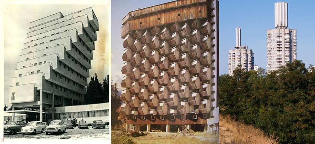
These designs would often comprise of forms which were not particularly designed with the end-user in mind, but more with the visual impact being the main consideration.
At this point, the brutalist design trend seems to be gaining more and more traction as designers realise its unique characteristics, particularly for more visual websites such as art galleries or music labels. More subtle implementations can certainly be achieved to great effect without considerable negative effects on the user experience and end user.
What do you think of the brutalist design trend, both in architecture and web design? Is it a fad, or something designers should embrace as a serious design movement?
