11 Necessary Website Pages To Include In Your Website
Designing a website without a clear structure is like building a house without a floor plan. Nothing makes sense, users get lost, and search engines do, too.
Even though every website’s structure is same, your business is unique, which means it shouldn’t be a copy-paste job. Your website pages should be based on your goals, audience, and what you want people to do when they land on your site. When a user is browsing through your website, can they find everything they should know about your business?
In this guide, I’ll cover the essential website pages every site needs, plus tips to help you build a strong website foundation that supports both user experience and SEO. But before we dive in, one quick thing:
Website Pages Are Not The Same As Blog Posts
This is a common point of confusion, so let’s clear it up first. Website pages and blog posts are not interchangeable, and you shouldn’t do this. And yes, you need both but they serve different purposes and appear in different parts of your site.
Website pages are your static, foundational pages. These display timeless information about your business, such as:
- What it’s about? (Home page)
- Your products/services (Product/services page or shop page)
- Who you are? (About page)
- How can someone contact you? (Contact page)
For example, if you run a photography business, your portfolio page will display your work, contact page will include contact details, and home page will be about you. The content on website pages doesn’t change often and is designed to guide visitors through your brand and help them take action.
With Postcards Email Builder you can create and edit email templates online without any coding skills! Includes more than 100 components to help you create custom emails templates faster than ever before.
Free Email BuilderFree Email Templates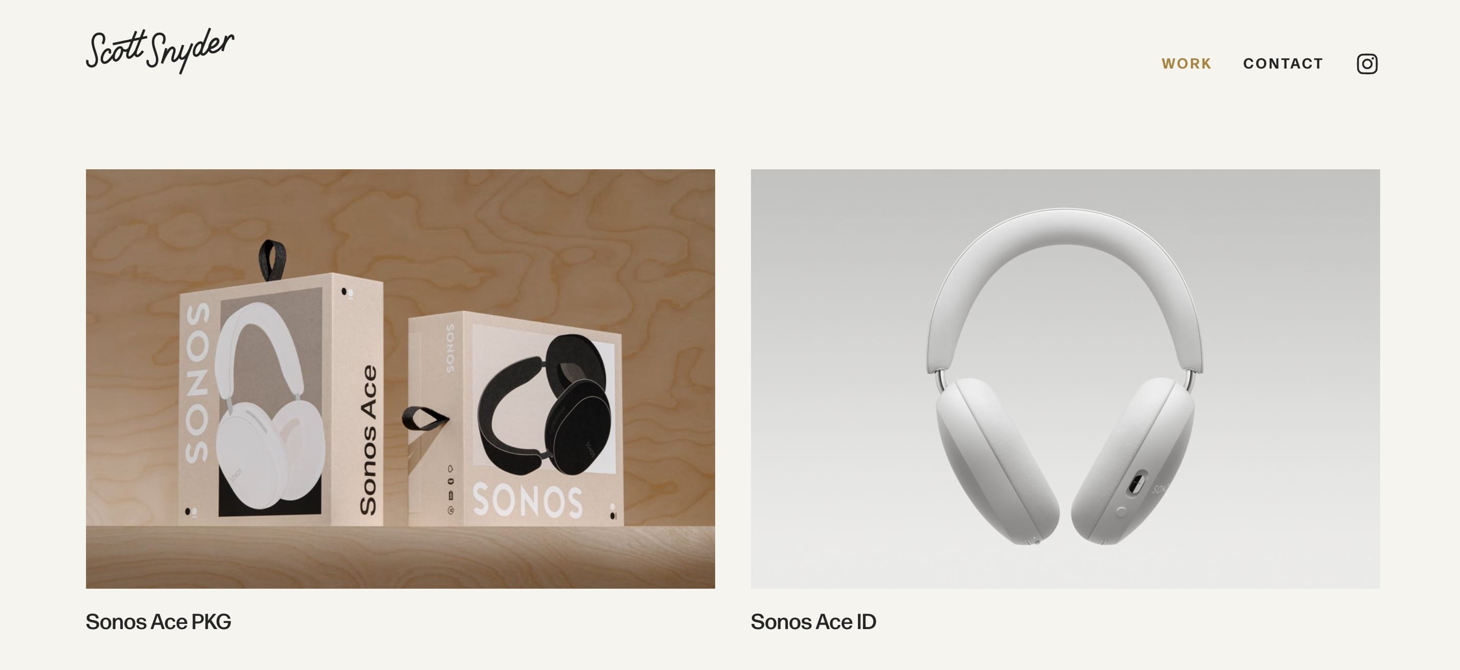
Scott Snyder portfolio page example
Whereas blog posts, are time-stamped pieces of content that you publish regularly. They might include how-to articles, opinion pieces, case studies, or news updates. If you’re that same photographer, you’ll publish blog posts like “How to Pose for Your First Photoshoot.” These posts help attract traffic, build trust, and showcase your expertise over time.
Both are important, and knowing their contribution will help you decide which one you need:
- Blog posts bring people to your site through search and social.
- Website pages help them understand what you do and why they should work with you.
You’ll also find yourself publishing blog posts more often than pages. But when it comes to your website’s structure, pages are more critical. They form the main navigation and define the user experience. If your core pages are missing or poorly structured, visitors and search engines will get lost.
So, the first step is to plan your core website pages:
6 Core Pages Every Website Should Have
While planning your website structure, focus on your visitor. Research and understand:
- Who is your target audience?
- What are their pain points?
- Why are they looking for a solution?
- What do you offer to solve their problems?
- How do you solve them better than your competitors?
- Why should they choose you over your competitors?
Once you’ve collected the data, plan your site pages to present this information effectively. Start with some mandatory pages: the Homepage, Contact page, About page, Error page, Legal page, and Sitemap page.
1. Homepage
If there’s only one page your website must have, let it be the homepage.
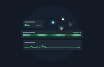
With Pulsetic you’ll be instantly notified the moment your website, API, or server becomes unavailable. Monitor uptime from multiple global locations and respond to incidents before your users are affected.
Create beautiful status pages in minutes to keep customers informed during outages and build trust with transparent communication.
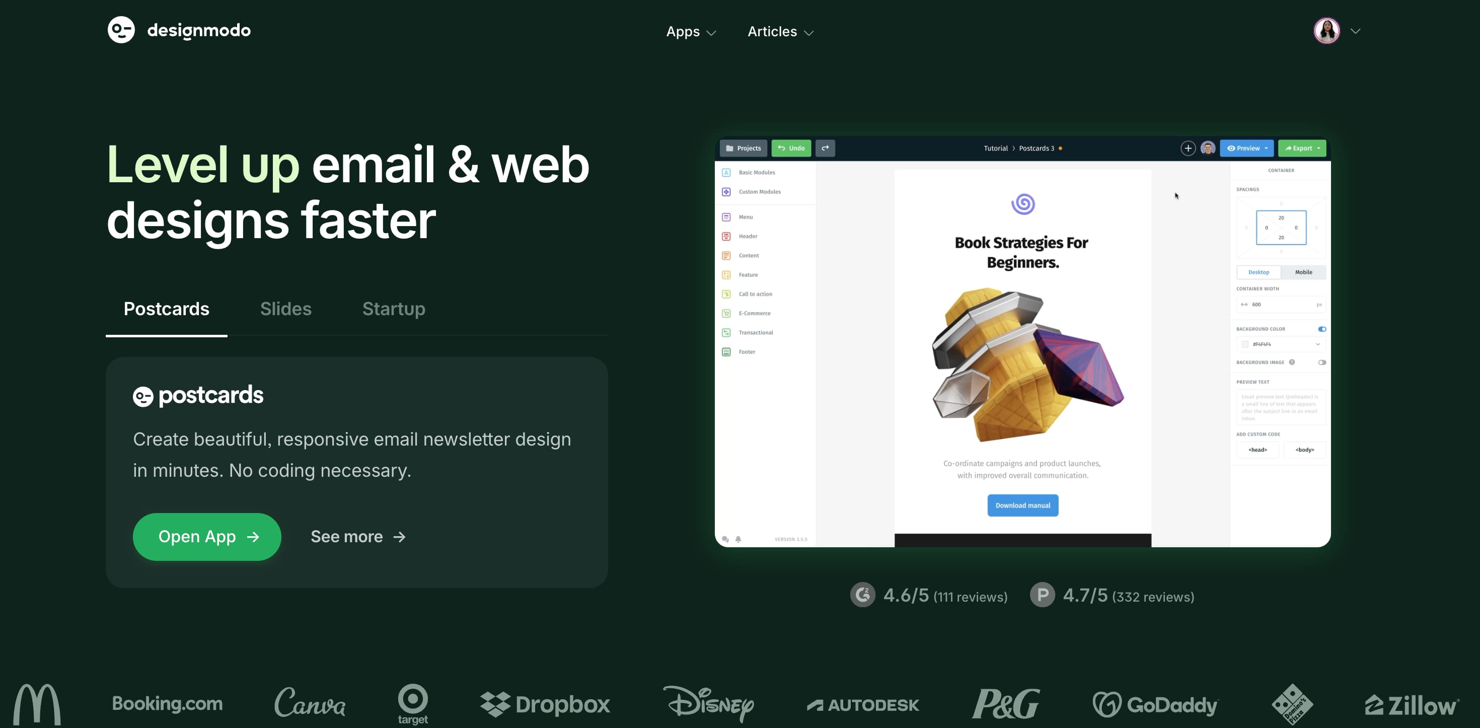
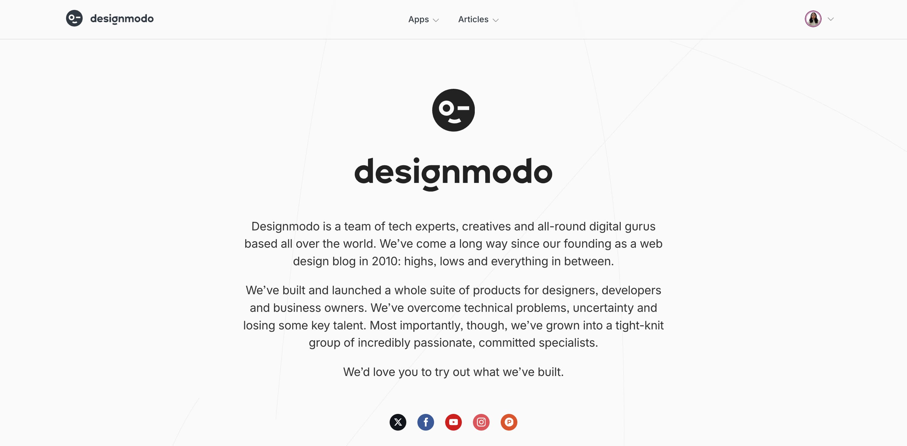
Start Monitoring for FreeYour home page is the face of your brand and probably the first impression most users will have, so it needs equal attention and planning. The hero section (the first screen that appears when you navigate to a website) should tell what your entire website is about. For example, when you go to Designmodo’s home page, you immediately know that we’re all about our three flagship products: Postcards, Slides, and Startup.
You’ll also notice credibility factors such as G2 ratings, review count, and brand logos because we want to position ourselves as a credible and reliable web design and email builder platform. When you scroll further, you find more information about our products with links that take you to dedicated product pages. Our home page is a type of navigation page, one that acts as a hub of all the crucial links we want you to see.
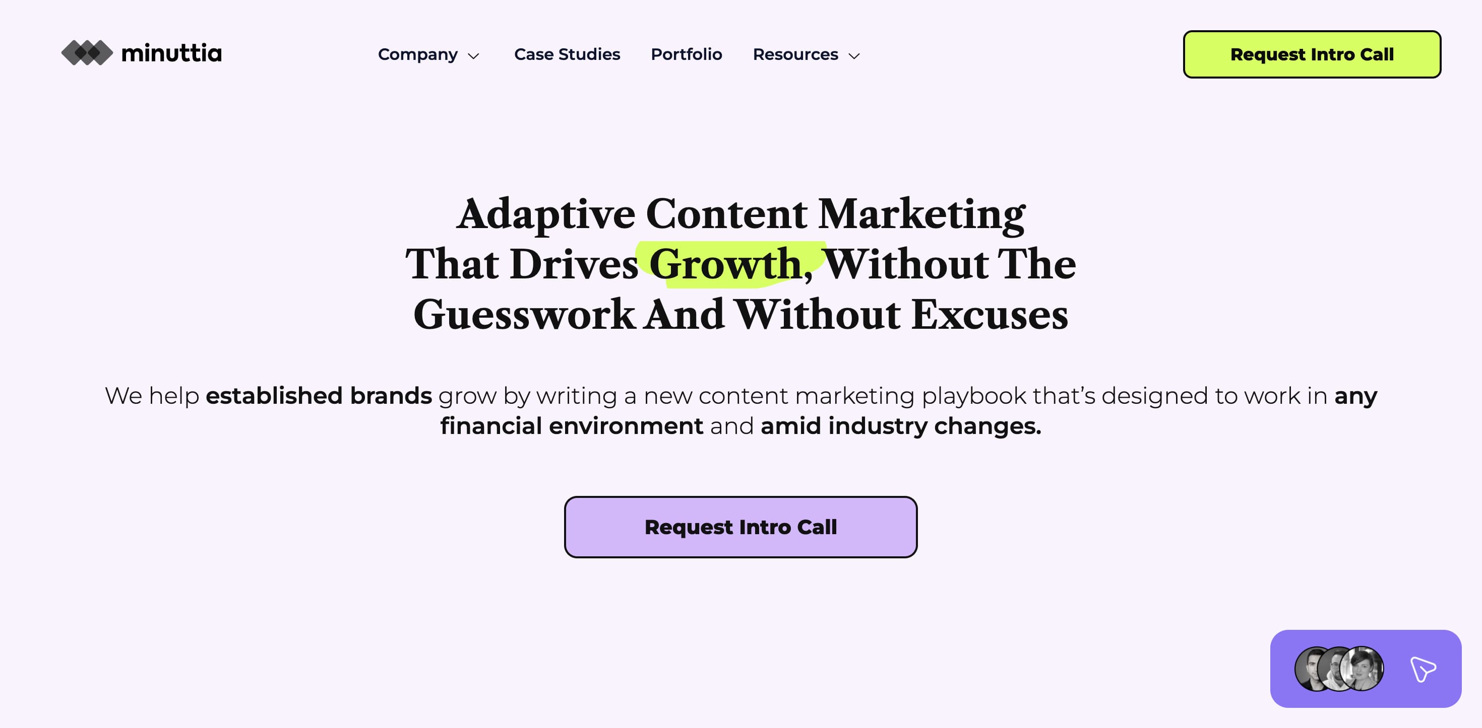
Another type is a regular home page that uncovers the reader’s pain points effectively. Minuttia’s home page is an example of a well-researched home page that clearly shows they know about their reader more than anyone.
A home page is often confused with a landing page, but they serve different goals. A homepage welcomes all types of visitors and guides them through your site. A landing page is designed for a single, focused action—usually tied to a campaign such as converting a user to sign up for a free trial, join your email list, or buy a product.
There’s so much you can do with your home page which also makes it difficult to keep it effective and focused. To help, we’ve compiled a checklist:
- Use your hero section to answers three questions instantly: Who are you? What do you offer? Why should I care?
- Test your homepage layout, button sizes, loading speed, and headline readability for responsiveness before anything else.
- Avoid stock images. Use visuals that reinforce your value prop or reflect your target audience. Tip: Adding videos in the hero section is a great way to increase page time and optimize website performance.
- Add social proof above the fold if possible. This helps build immeditate trust when users are skeptical.
A good homepage doesn’t reveal everything upfront. Even though it acts like a table of contents, its job isn’t to tell the whole story—it’s to spark interest. It should give just enough to represent the brand, get the message across, and encourage visitors to explore further.
2. About Page
Most website owners confuse their about page as a place to introduce themselves. But isn’t an about page a place to talk about themselves? Sure, it is but when users are navigating through a website, they’re more concerned about whether they should trust you. They’re looking for your about page because the other pages (homepage and landing pages) haven’t addressed their concerns effectively.
Is this brand trustworthy? Do I resonate with its values and missions? What do others think about this brand? – these are the common questions users have when they’re looking for your about page.
So, before anything else, your about page should position you as a credible brand. Based on how well you’ve optimized your other pages, you’d want to adjust. And even if you’ve done a good job, do it well here as well as some users may skip straight to your about page.
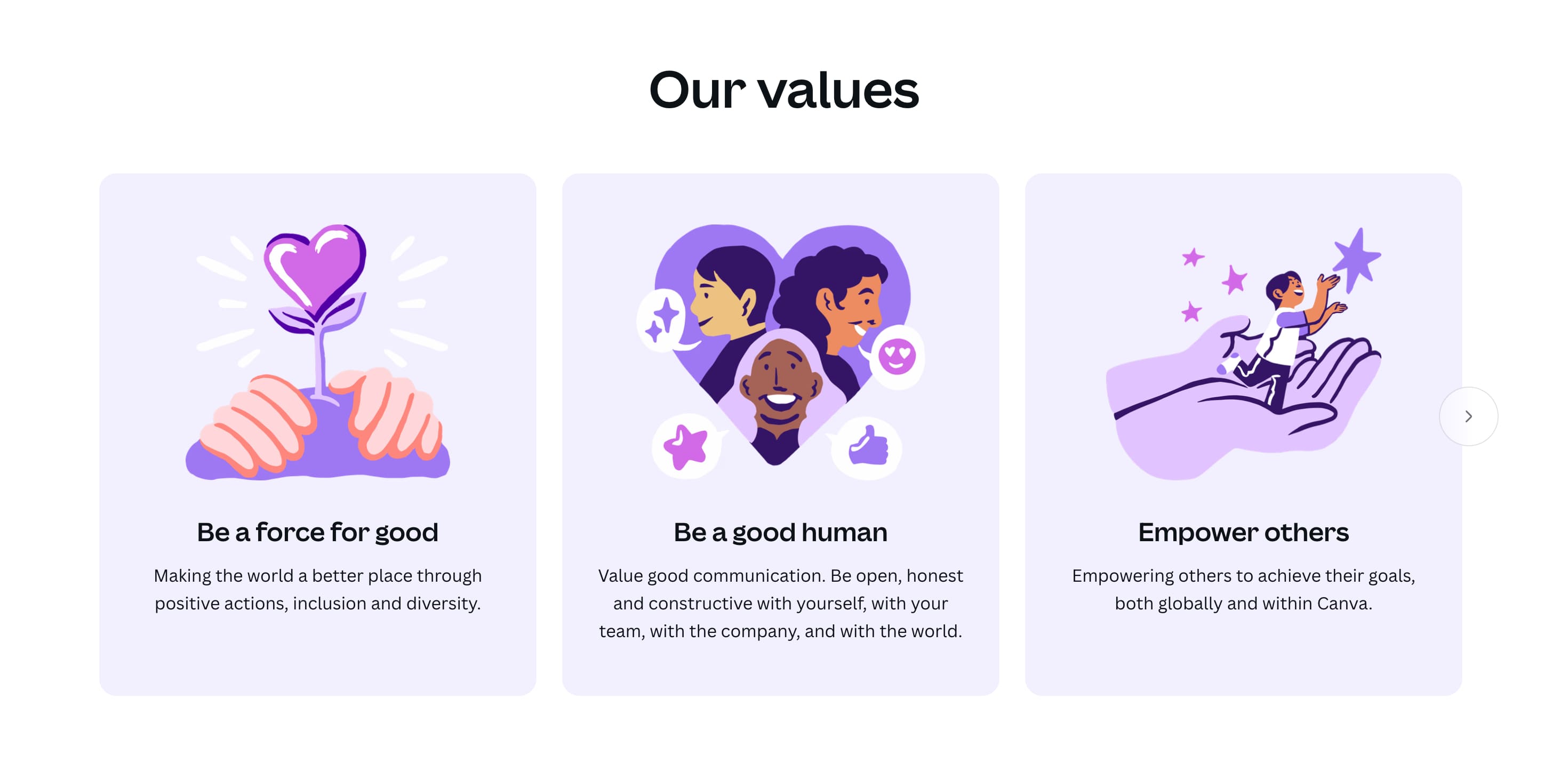
You can also showcase brand values and missions like Canva does:
Here are some more things to keep in mind to make your about page work:
- Show your team: Use real names, photos, and roles. Let people know who they’re buying from.
- Explain the “why” behind your product: What problem are you solving, and why does it matter to you?
- Skip the buzzwords: Be specific about your values and goals. Don’t say you “value innovation.” Show what that means for your users.
- Match your tone to your brand personality: A serious tone for a law firm. A bold, playful one for a DTC brand. Stay consistent.
3. Contact Page
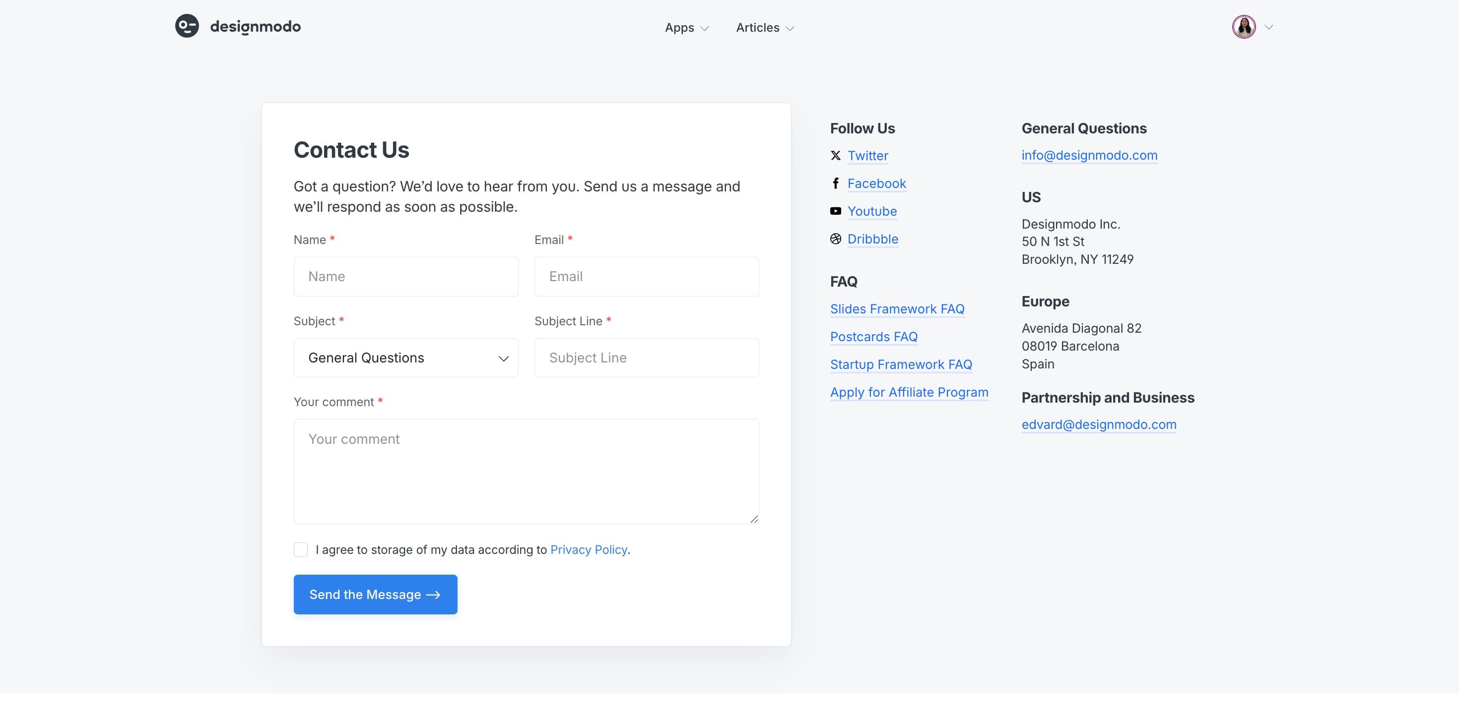
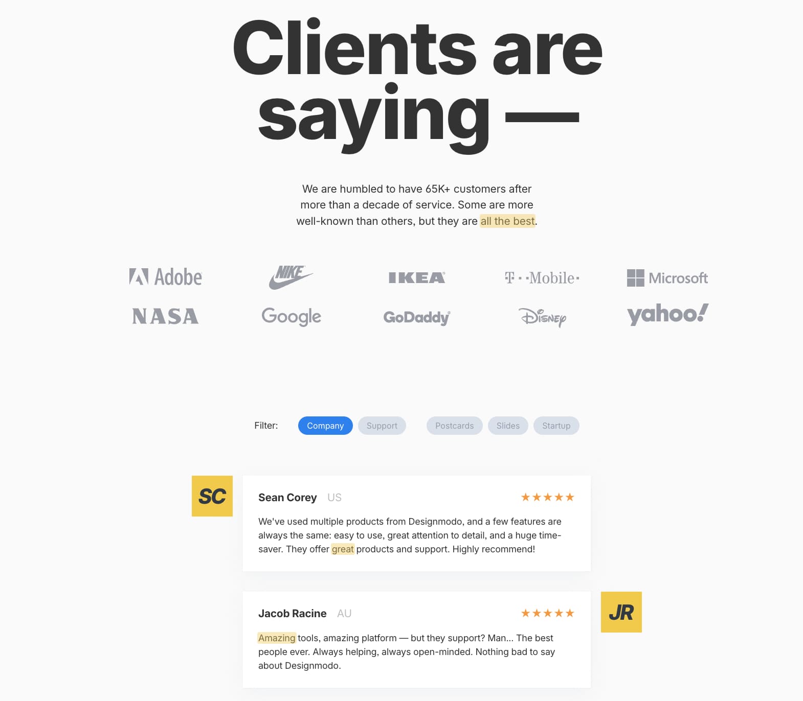
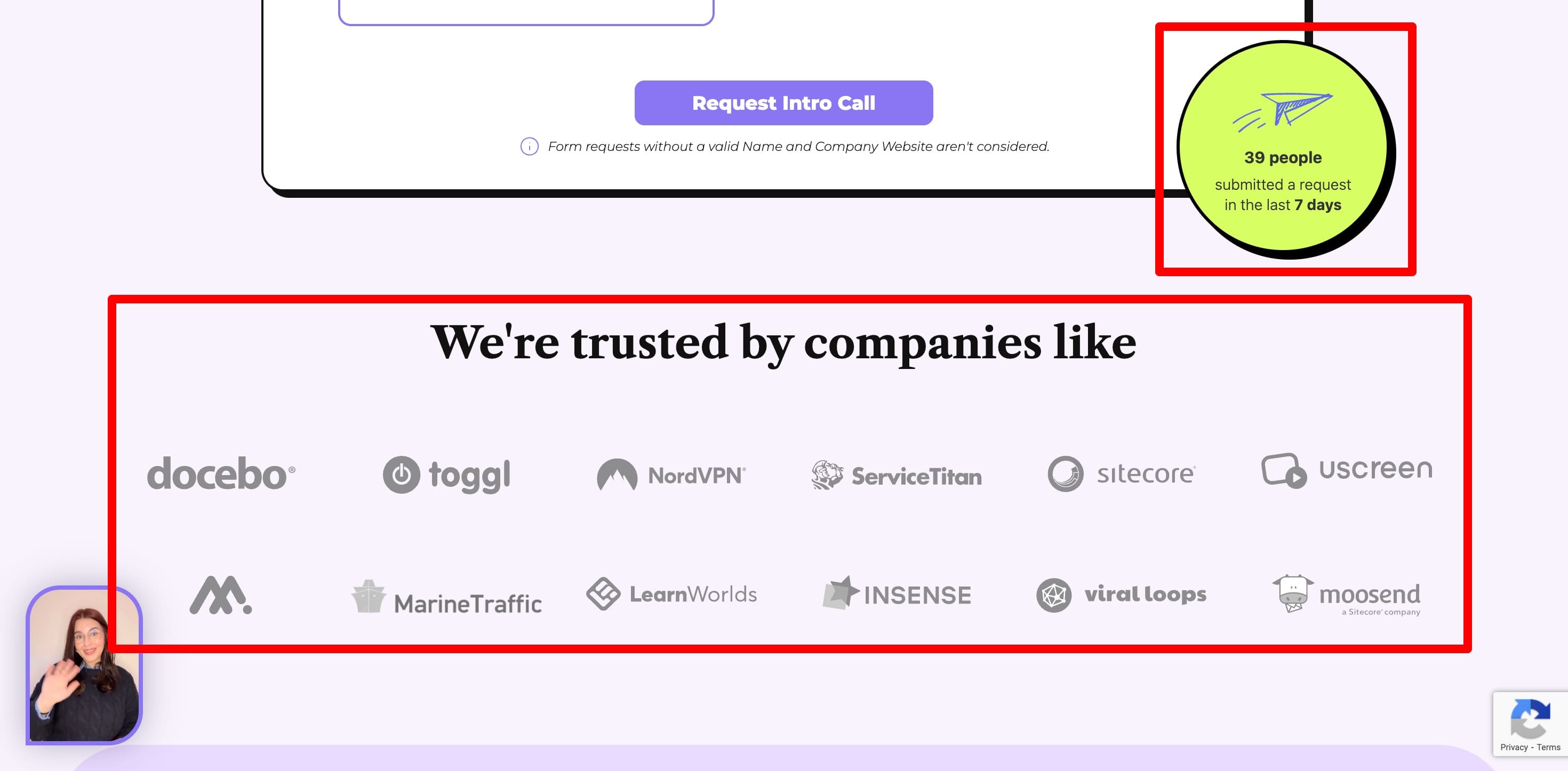
A good Contact page is more than just a form. It’s where trust is confirmed, doubts are cleared, and conversations begin. It shows users that there’s a real team behind the brand—reachable, responsive, and ready to help. And that alone can improve how people perceive your business.
Tip: Make contacting you extremely easy for users. Include multiple ways to reach out, such as a contact form, email, phone number (if you want to,) social media handles, and even address. This assures your website visitors that you’re always there to help them.
You can keep it on point like we’ve done. Or use it to build more credibility subtly by paying attention to these things:
- Set clear expectations: Tell users when they’ll hear back. Even a simple “We usually reply within 1 business day” goes a long way.
- Keep it skimmable: Group info by type (support, sales, press) so people don’t have to guess where to go.
- Use it to preempt questions: Add a mini FAQ or links to help center articles to reduce unnecessary inquiries.
- Brand it like the rest of your site: Don’t drop a generic template here. A well-branded Contact page shows you care about the details.
Many contact pages display a testimonial section (or additional credibility factors) just below the contact form to help clear last minute doubts.
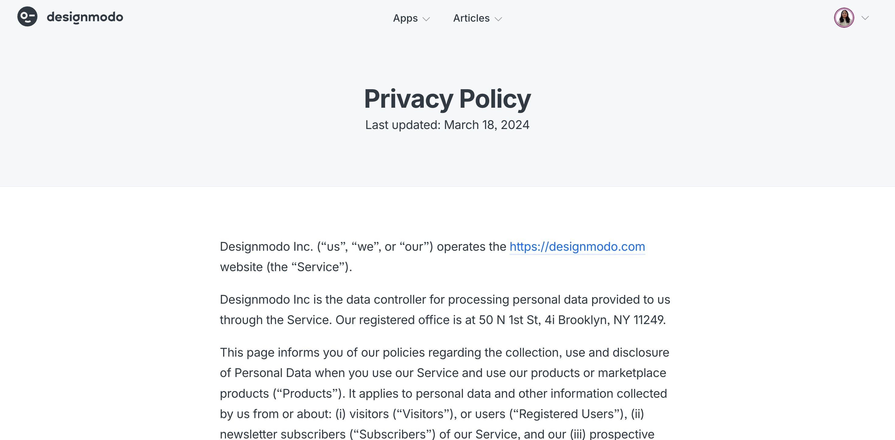
Legal pages aren’t exciting, and most people treat them like an afterthought. But they’re just as important as any other page on your site, especially if you want to operate legally and build trust.
Online businesses are expected to follow laws like GDPR, CCPA, and the ePrivacy Directive. These aren’t just suggestions but real legal requirements. If your site collects data, uses cookies, or has users from different countries, you must comply. Because different countries have their own regulations, if you don’t legally comply, you could be charged with fines or penalities.
As a rule: No matter what you sell or who your audience is, your site needs legal documentation.
Or at least these pages or sections within a page:
- Privacy Policy: This explains what data you collect, how you use it, and how users can manage or delete their data. It should cover cookies, email use, advertising, security measures, and user rights.
- Terms & Conditions: These are the rules for using your website. It usually includes things like intellectual property, acceptable use, liability limits, and how you handle account issues or disputes.
- Disclaimer: This protects you from legal responsibility for how users interpret your content or use your product. Especially important for blogs, health sites, finance platforms, and SaaS tools.
In some cases, you might also need extra documents like customer terms of service, data processing agreements, cookie policies, or legal tax disclosures, especially if you’re serving enterprise clients or a global audience.
5. Error 404 Page
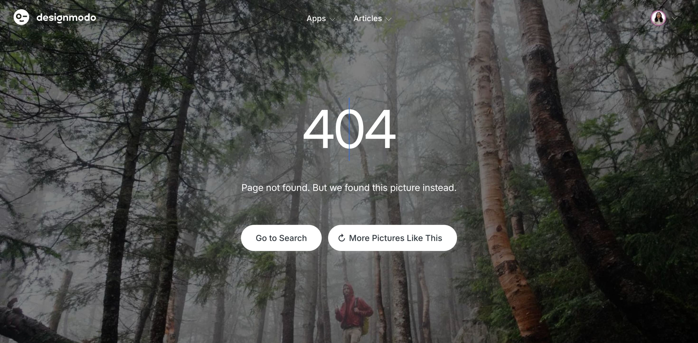
An error page, a 404, or “Not Found” page, shows up when someone tries to visit a page that doesn’t exist anymore. This usually happens when a link is broken, the URL is typed wrong, or the page has been moved or deleted.
It’s a common issue and also frustrates the users. So, if your error page is confusing or empty, most people will bounce and leave with a bad impression of your brand.
But if done right, an error page can actually work in your favor. It’s a chance to keep users on your site, reduce bounce rates, and even help you strengthen your relationships with them. Some companies use it to offer helpful links, while others turn it into a small moment of delight by adding a clever message or a fun visual to make users smile.
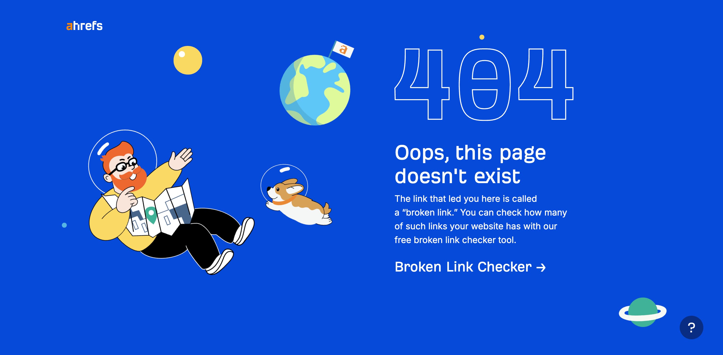
Ahrefs follows a smart approach, they connect 404 pages with one of their tools:
At the very least, your 404 page should include a clear message about what went wrong, a link back to the homepage, a site search bar, and helpful navigation like your main menu or key pages. You might also want to check our collection of 404 page examples for more ideas.
6. Sitemap Page
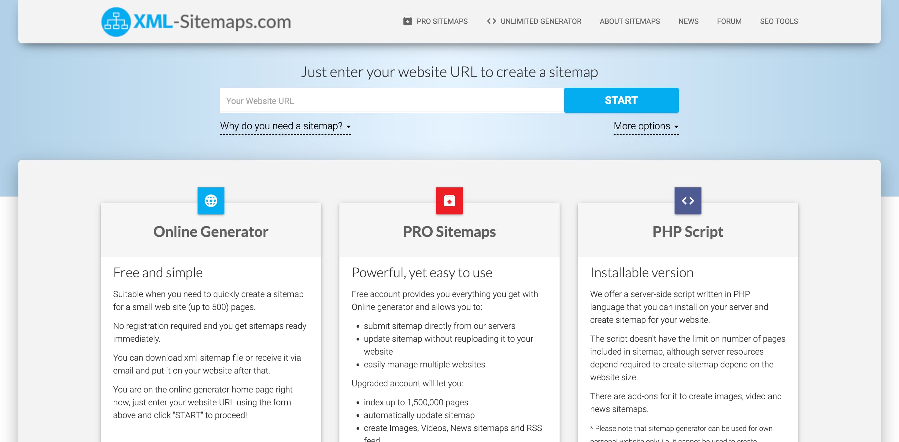
The sitemap page helps Google and other crawlers find, crawl, and index your content, which directly impacts how visible your website is in search results. It’s like a table of contents that lists all your important pages and tells search engines which ones matter most.
A sitemap is especially useful for new websites, large sites with thousands of pages, or projects that don’t have many external backlinks yet. Adding a sitemap from day one is a smart SEO move. To make it work well:
- Choose the right sitemap type: standard XML, video, news, or image.
- Prioritize the most important pages.
- Use a dynamic sitemap that updates automatically as your site grows.
- Don’t include noindex URLs.
- Break it down by category if your site is massive.
- Keep each file under 50MB.
- Link to your sitemap from the homepage.
5 Optional Website Pages Based on Your Needs
The above six pages are critical for a seamless website structure, but you can also add extra pages based on your industry. For example, if you sell three primary services, you’d want to design three service pages for each of them. If you’re an individual service provider, a portfolio page is necessary to help you showcase your work effectively.
Let’s also look at some optional pages that might be good to have:
7. Online Store Page
H&M shop page example
For eCommerce brands or service-based businesses, the store page is where you list your products or services to drive conversions. Unlike the homepage, it focuses entirely on what you sell and how users can purchase. It’s also a great place to run promotions, build trust with shoppers, and gather insights about what your audience is interested in.
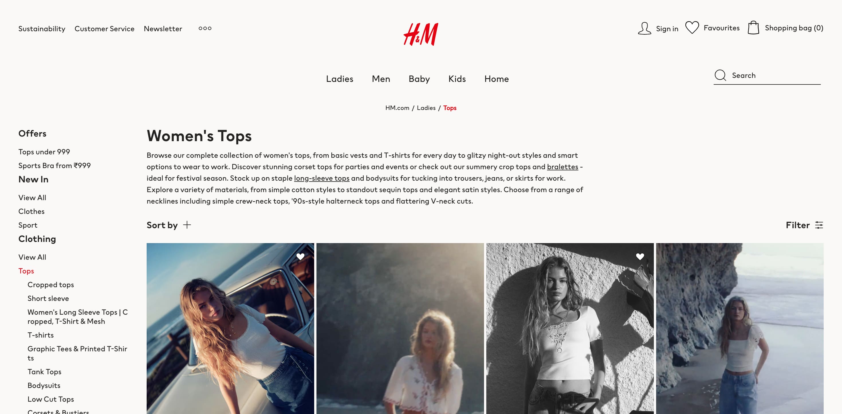
8. Products or Services Page
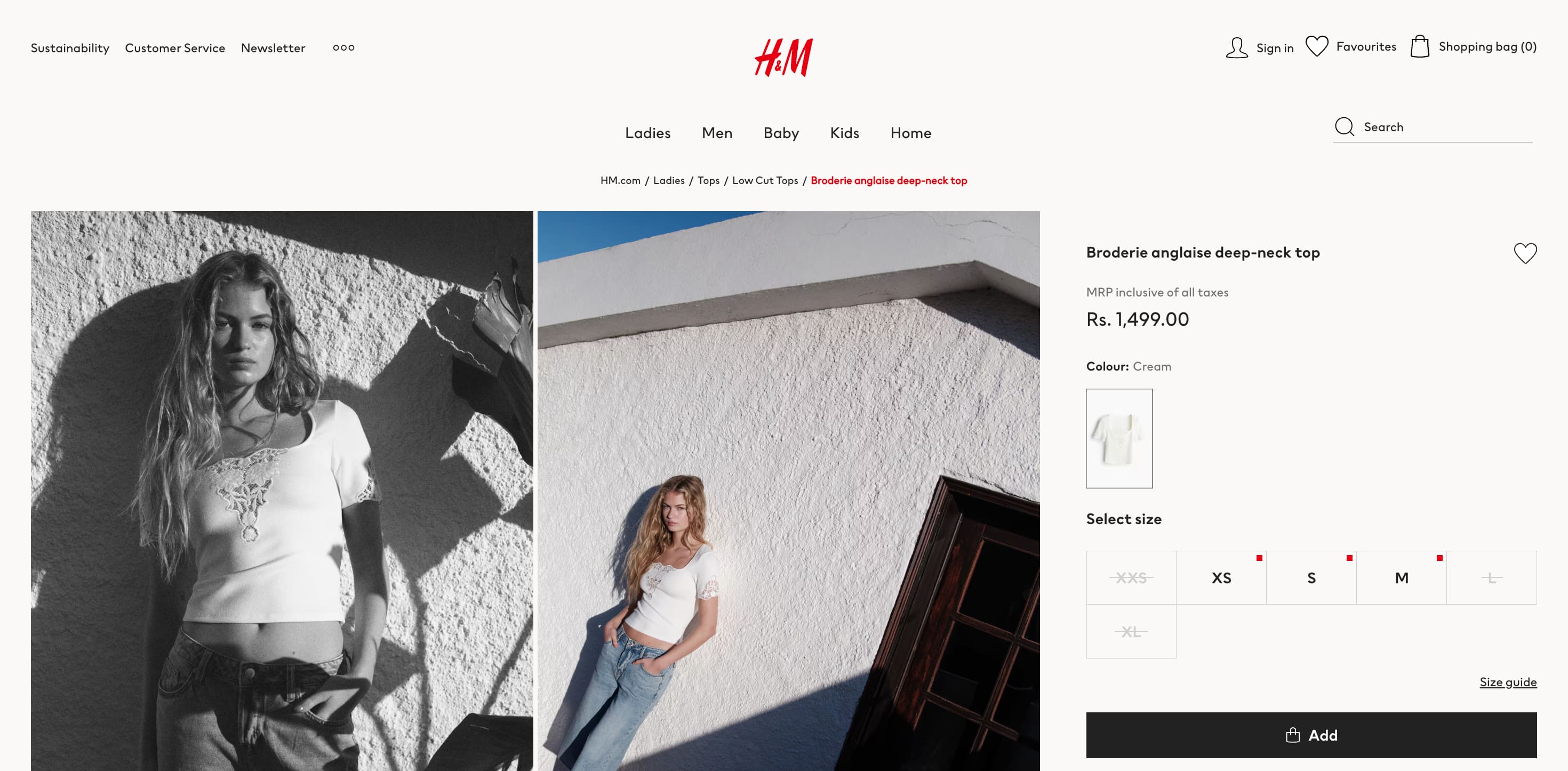
H&M product listing page example
This page explains a particular offering in more detail. This is especially useful if you’re not selling multiple products, in which case, you can easily create a template and customize for each offering. You can include short descriptions, benefits, pricing, and links to purchase.
9. Blog Page
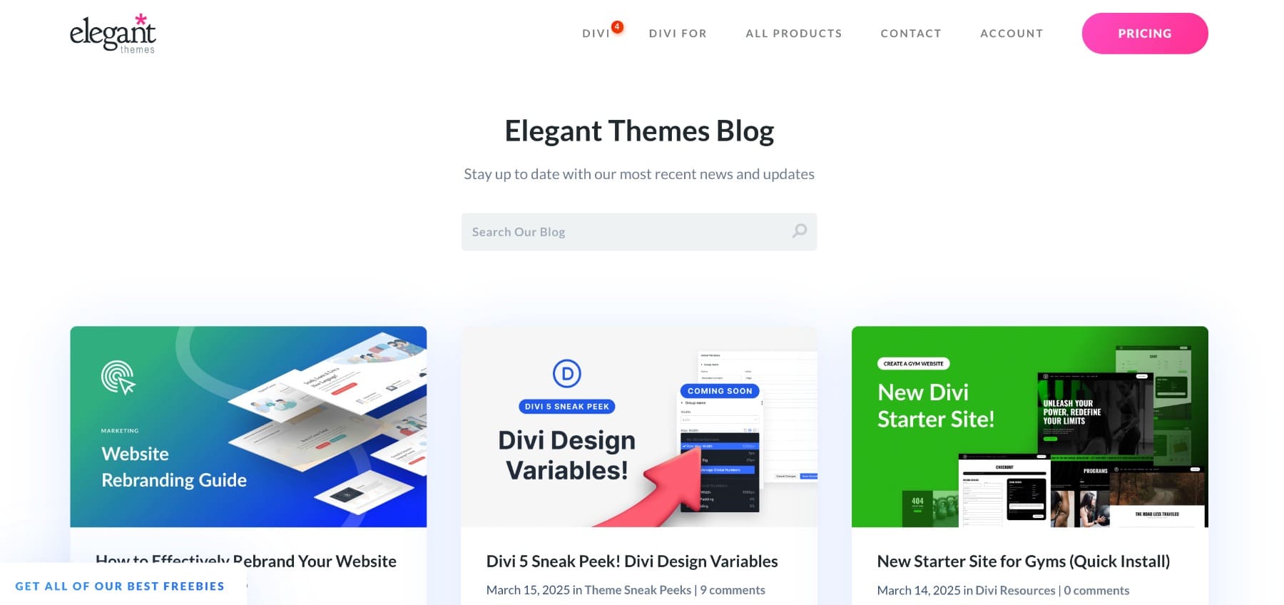
Elegant Themes blog listing page example
A blog helps you share valuable content with your audience, improve your SEO, and build authority in your niche. It’s where you can post tutorials, updates, case studies, or insights—anything that shows your expertise and keeps people engaged over time. Don’t confuse blog listing pages with magazine, they’re used for different reasons. Read our blog to find out.
10. Portfolio Page
Portfolio page example from James Williams web design portfolio
Ideal for creatives, freelancers, and service providers, a portfolio showcases your best work to build credibility and trust. It gives potential clients a clear view of your skills and style and often plays a key role in helping them decide to reach out or hire you.
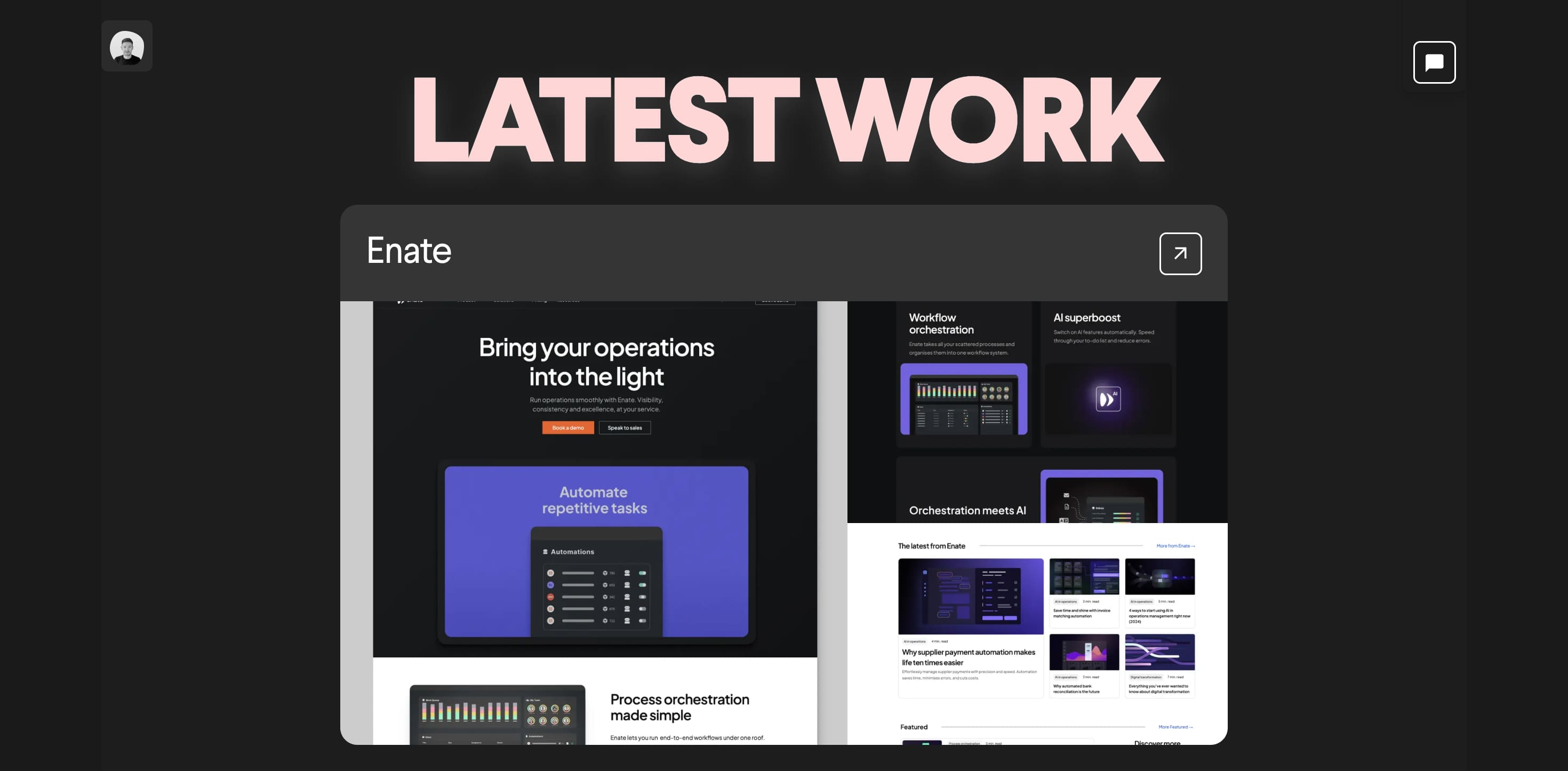
11. Why Us Page
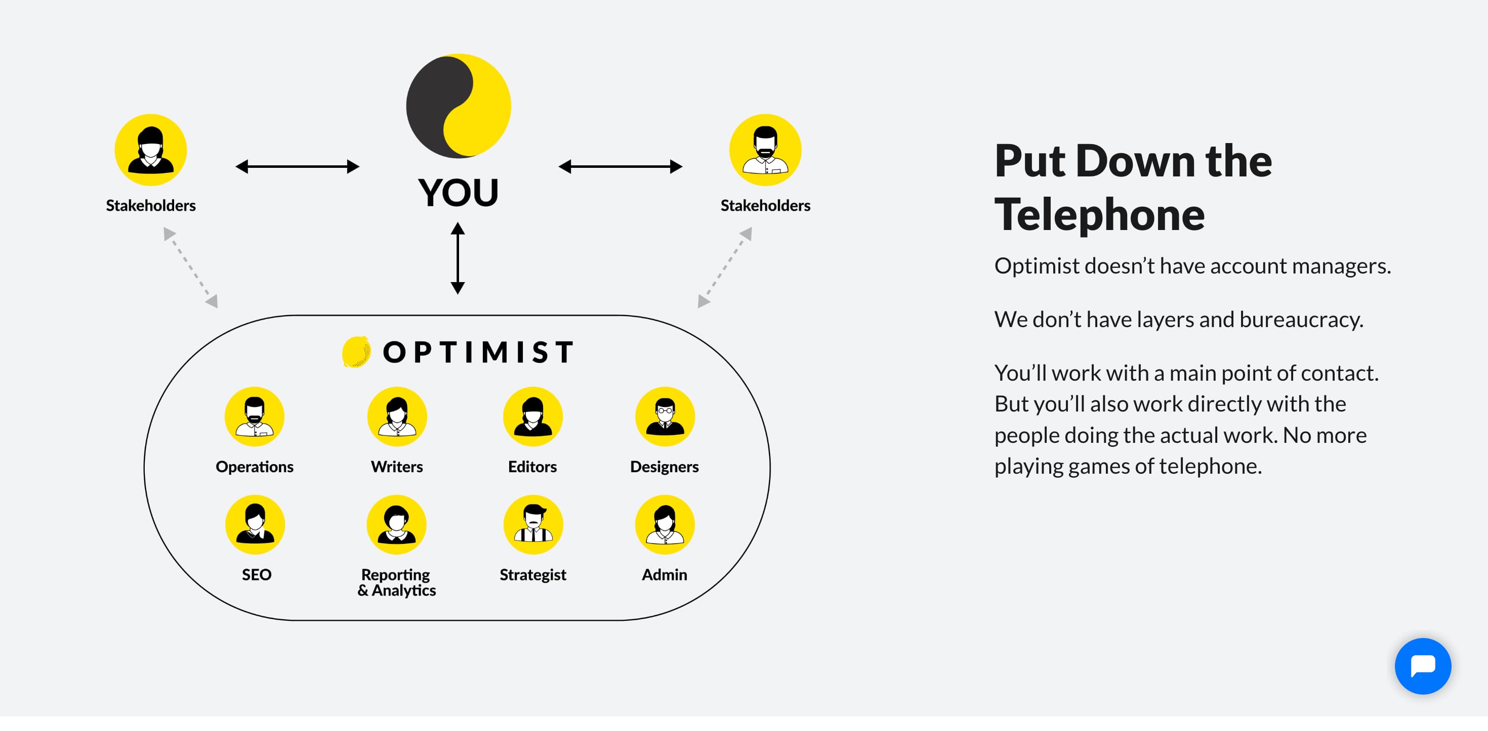
Why Us page example from Optimist content marketing agency
A Why Us page gives you the space to explain what sets you apart. It helps visitors understand your unique value, your approach, and why they should choose you over others. This is especially helpful in competitive industries where trust, expertise, and clear benefits can influence buying decisions. It’s often where emotional connection and conversion start to happen.
Design Stunning Pages With Startup For Free
Once you have planned your website structure, a question pops up: Where and how to design your web pages?
If you’re not a coder, your choices become limited and designing an interactive and modern pages seems like a difficult task. But it isn’t when you have access to a no-code landing page editor like Startup.
Startup is a drag-and-drop website editor that helps beginners and non-coders create professional, responsive websites without writing code. It offers pre-designed blocks for headers, features, pricing, and more, to make web design as simple as dragging elements onto a canvas.
You can customize pre-made layouts visually and export clean HTML code if needed. It’s a fast, beginner-friendly way to build landing pages, portfolios, or startup websites. Here’s how it works:
Start with core pages and then build onto your website structure slowly. Make sure each page you design clearly conveys what you’re trying to say effectively, gives readers what they’re looking for, and most importantly encourages them to complete your desired action.
That’s easy with Startup because we’ve designed content blocks optimized for conversions. But don’t just listen to us, sign up today and see it for yourself!
Get Started With Startup for Free