What Are Email Popups: 8 Effective Examples & Best Practices
Marketers have a love-and-hate relationship with email popups. They’re annoying, yet highly effective at converting website visitors into subscribers. Effective? Yes, but that comes with a big asterisk: only when done right.
Poorly timed or aggressive email popups can hurt user experience and lead to high bounce rates. However, if you’re strategic about how and where you place email popups, you’re guaranteed to have one of the best conversion rates.
In this guide, we’ll cover what an email popup is, effective strategies to optimize it for high CTRs, and several fantastic real-life examples from brands across niches to help you understand how they’re best used.
What are Email Popups?
An email popup is a graphical element of the user interface in the form of a window or banner that appears automatically when a specific trigger occurs, such as when the user visits a product page, spends time on a blog post, or clicks on a specific button.
You can implement popups of different types, such as a slider that appears on the sidebar as visitors scroll to allow them to continue exploring the web page.
Or a bit more aggressive (usually paired with an irresistible offer), one that interrupts visitors’ current activity and calls for immediate interaction.
With Postcards Email Builder you can create and edit email templates online without any coding skills! Includes more than 100 components to help you create custom emails templates faster than ever before.
Free Email BuilderFree Email Templates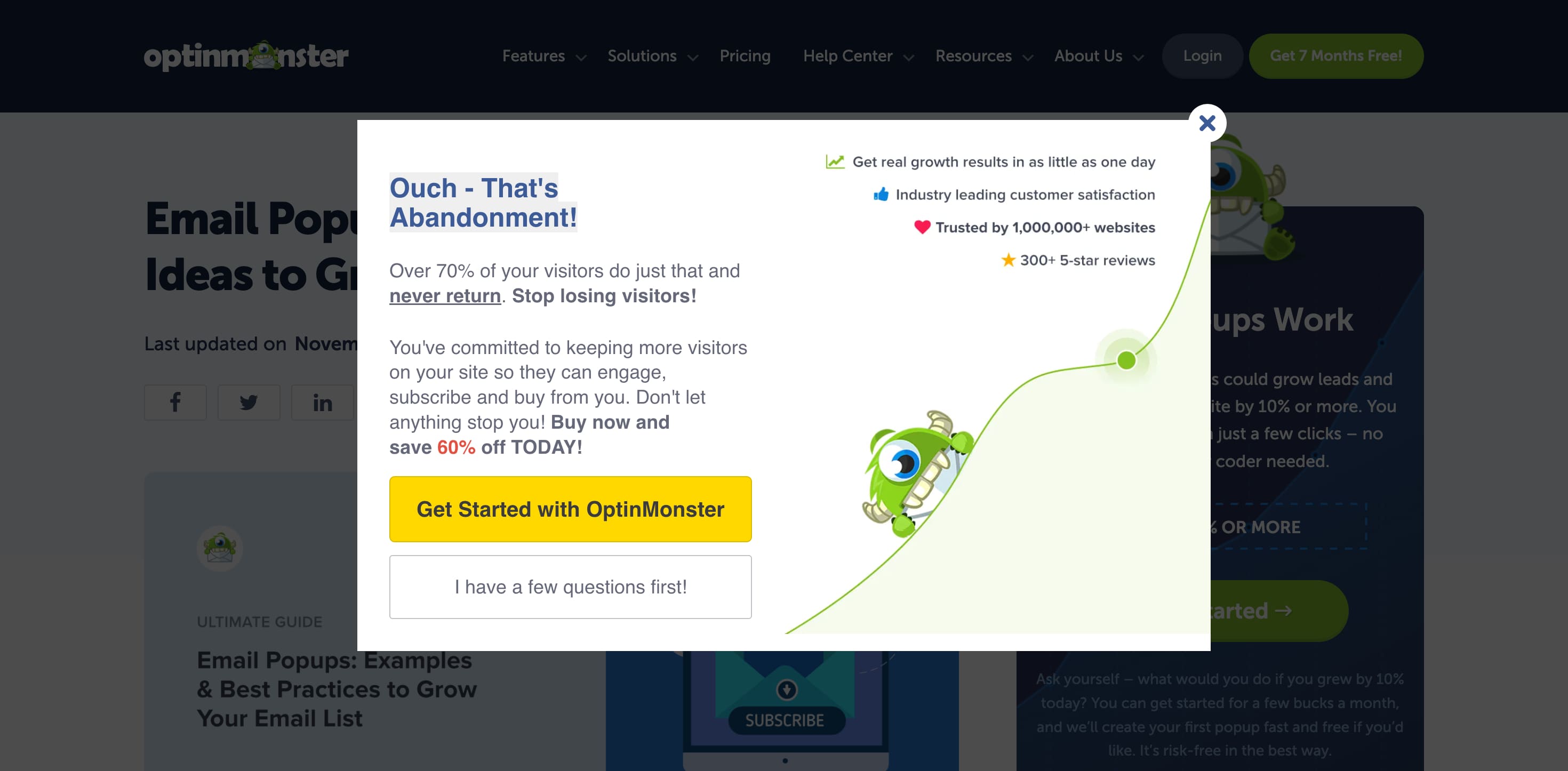
But it’s not always about conversions. You can implement email popups for different purposes. It might contain all sorts of information, visual media, and interactive components, including:
- Brand messages
- Notifications
- Sales event announcements
- Invitations
- Coupons
- Discount codes
- Sign-up forms
- Product shots
- Brand visual identity (logotype, mascot, typography)
- Countdown timer
As for style, email popups come in all shapes and sizes, from small and brief info boxes with code discounts to huge banners with product shots, brand messages, and a fully-fledged sign-up form with multiple fields.
The Purpose of Email Popups
According to Optinmonstor, almost 70% of website visitors never return—with an email popup, you can convert some of them into subscribers so you can nurture them further. Once you have them on your email list, you can:
- Promote content.
- Grab and direct the user’s attention to your company’s offer.
- Deliver the brand message.
- Share awareness of events, promos, and sales.
- Drive traffic to landing and product pages.
- Convert website visitors into leads.
- Bring new subscribers to a mailing list.
Depending on the purpose and marketing strategy, email popups can be triggered by different situations and user’s actions, making them fall into various categories. For instance, there are:
- Welcome Email Popups: Appear immediately when the user enters your website to capitalize on the first impression.
- Exit-Intent Email Popups: Appear when a user leaves the page to re-engage them with last-minute deals.
- Add-to-Cart Email Popups: These popups appear when a user adds a product to their shopping cart and nudges them to become a subscriber to get additional perks.
- Sidebar Email Popups: These appear as small boxes located in the left or right bottom corner. They do not interrupt users’ actions and move along with them unobtrusively, reminding them about the offer.
- Timed Email Popups: Appear only after the visitor has spent a certain period on your website, such as after reading 75% of the page.
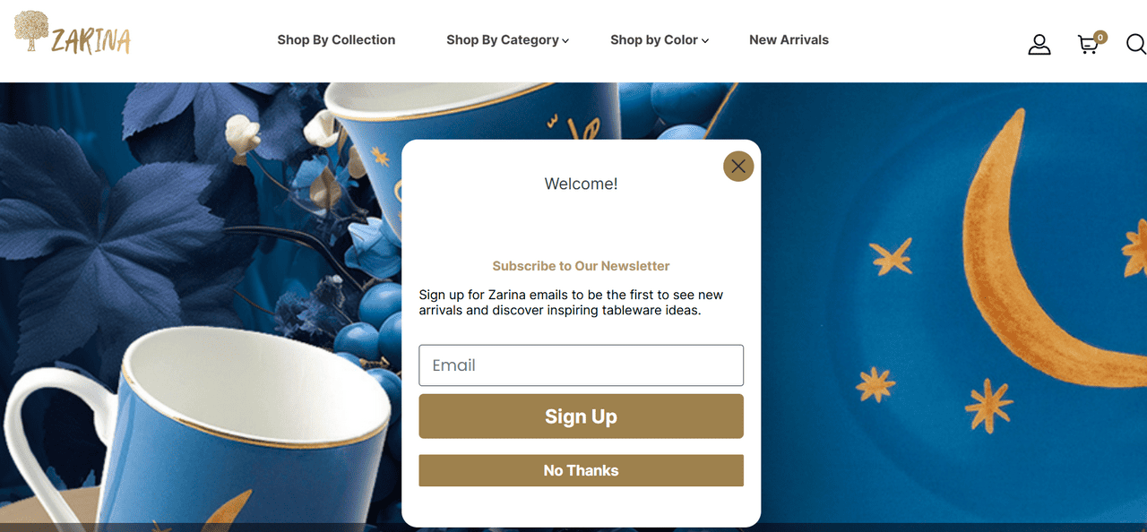
Welcome email popup example from Zarina Tableware
Why are Email Popups Important?
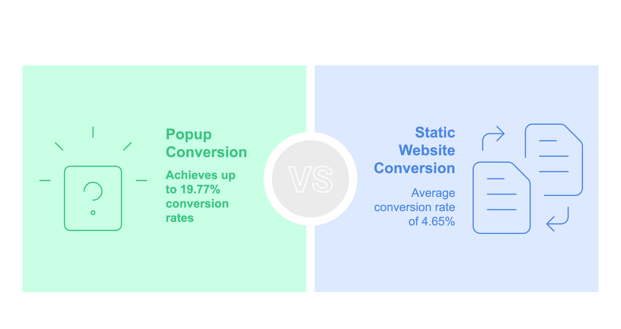
Email popups convert better than static sign-up forms on websites.
The 2025 Wisepops study shows that popup conversion rates can reach 19.77%. What’s even more impressive is that the average conversion rate is 4.65%, which is higher than that of a static website.
Here are some more interesting facts about email popups from the same study:
With Pulsetic you’ll be instantly notified the moment your website, API, or server becomes unavailable. Monitor uptime from multiple global locations and respond to incidents before your users are affected.
Create beautiful status pages in minutes to keep customers informed during outages and build trust with transparent communication.
Start Monitoring for Free- Mobile-only popups drive 38% more conversion than desktop-only sites. This makes sense as many users use phones, so make sure your popups are responsive.
- Multi-step popups are more rewarding than one-step campaigns. That’s because lengthy forms can cause visitors to hesitate.
- A/B testing helps increase CTRs by at least 5%.
- Discount codes are the top-converting incentives in email popups.
Email popups are easy to create, often free through email service providers, and don’t require technical skills. They’re flexible, mobile-friendly, and can be customized with visuals, forms, or personalized content. Most importantly, they grab immediate attention, helping companies grow their subscriber lists and boost ROI.
6 Steps to Craft Effective Email Popups Optimized for Maximum CTRs
While email popups are simple and cost-effective solutions, they should not be taken for granted. These powerful elements call for a company’s rapt attention and commitment. When done poorly, they can easily scare away even loyal customers and leave a bad overall impression, ruining the company’s reputation.
So, give your email popups enough attention. Here are some effective strategies that can help you avoid overwhelming visitors and give them a positive experience so they willingly become subscribers:
1. Analyze Your Target Audience
Start with a thorough understanding of your target audience. Ask yourself:
- What do they want?
- What do they like/dislike?
- What do they expect from you?
- How do they spend time on your website?
Analyze their activity, such as the pages they visit or the products they view. By knowing these, you’ll be able to design more relatable and targeted offers that your audience might be unable to resist.
2. Segment and Implement the Right Triggers
Not all of your website visitors are ready to convert. Some are learning about your brand, some are loyal customers, and some are just curious. Group your traffic based on similar characteristics after acquiring all the necessary information about website visitors’ behavior and preferences. By segmenting them, you’ll deliver the right message to the right person at the right time and place by choosing the right triggers.
The key is to implement the right triggers. As many users consider email popups intrusive, you don’t want to do anything that could disrupt their browsing experience. For example, a welcome email popup prompting a purchase might not be a good showcase for first-time visitors. They may not know about your brand, so they will be hesitant to buy.
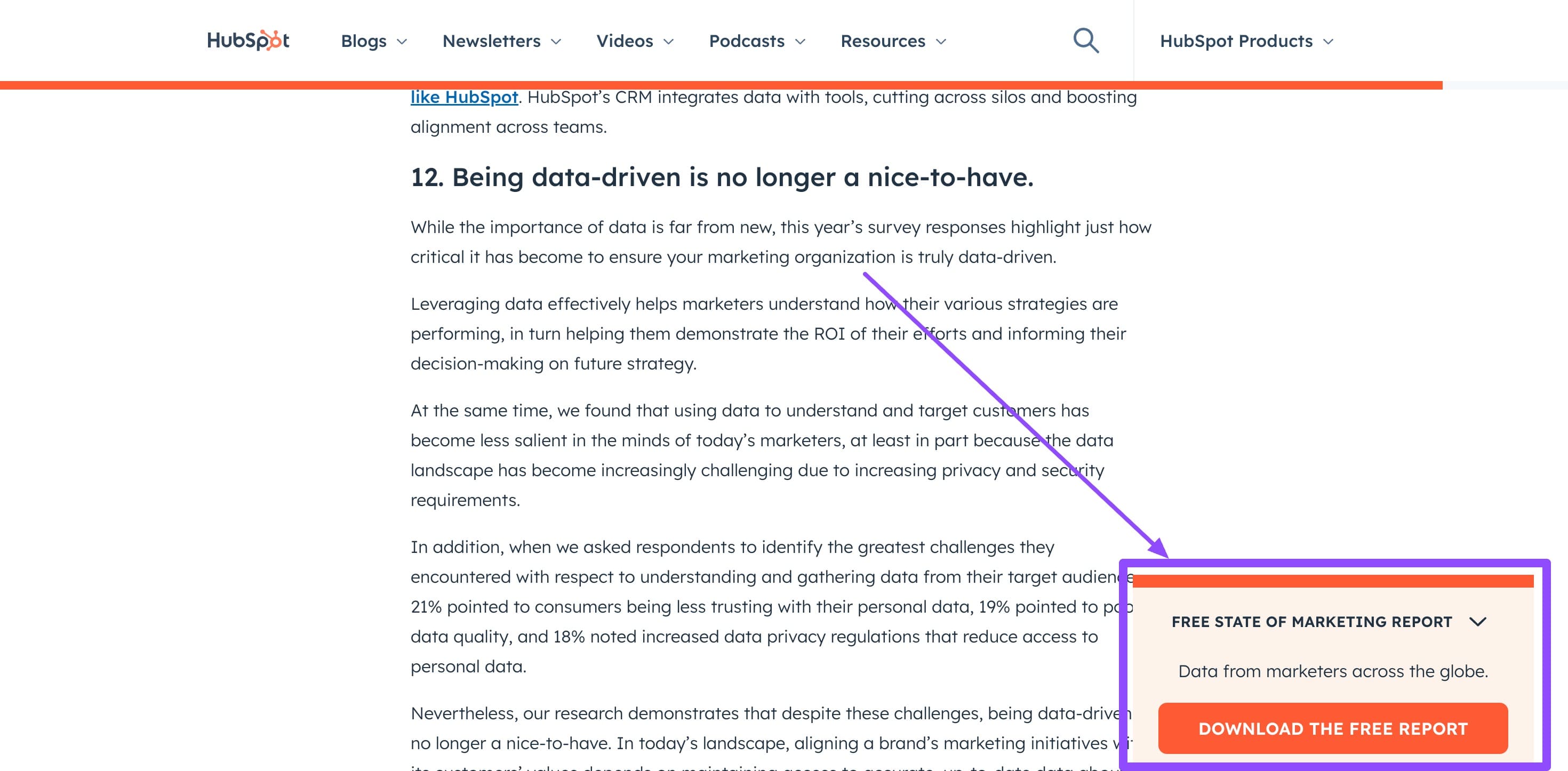
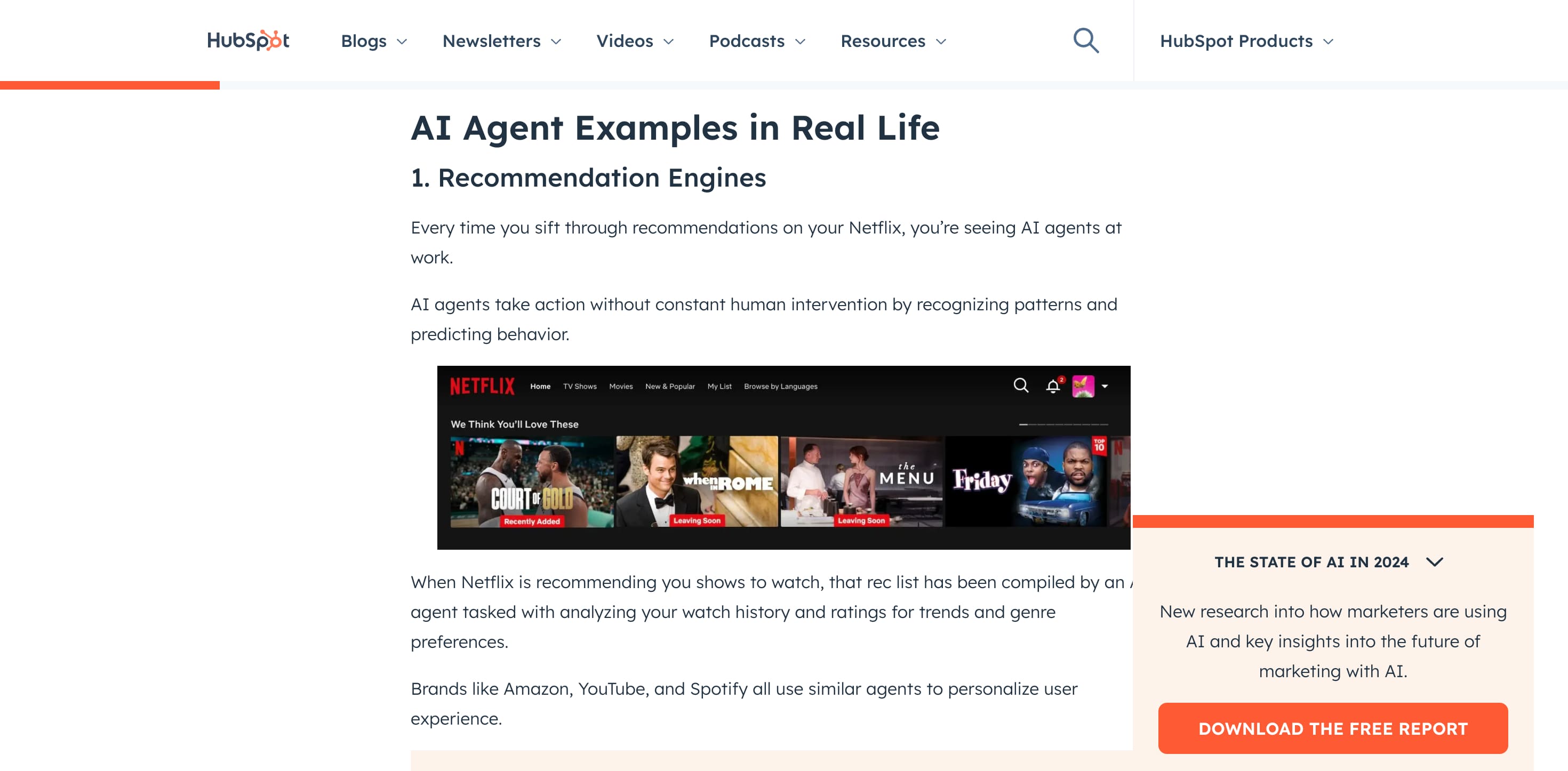
Only when email popups are relevant, on time, and unobtrusive can they add value, enrich the user experience, and help users achieve their goals. A good example of an email popup is a free, advanced email marketing strategy e-book users get after reading a guide on a similar topic. Check out the Hubspot blog to get more ideas:
3. Personalize Your Emails
Personalization does wonders in direct outreach and during the acquisition process. Customers love it when brands show they know them.
From creating email popups that meet customers’ needs and expectations to using their first names in emails, you ensure your newsletter content is relevant, compelling, timely, and valuable. This secures positive responses and drives much-needed engagement to convert visitors into subscribers, leaving a powerful impression from interaction.
Again, the key is understanding your audience deeply. Use social listening, analyze past behavior, and even your competitor’s audiences to nail personalization. Using demographics, preferences, and browsing history are also excellent sources to know about your audience and hyper-personalize email popup content and timing, making the user feel understood and valued by the company.
4. Craft Compelling Copy
Content is king and even more powerful when it comes to an email popup that deliberately halts a user’s website activity and draws overall attention. Its action should be justified—otherwise, users will leave and never return.
The best way to prove to your visitors that an email popup is worth their time and focus is to deliver value, which could be done through compelling, meaningful, and memorable copy. For example, Optinmonster’s exit-intent popup offers a discount coupon like most brands, but its copy and design attract attention immediately.
When crafting body content, remember that you must avoid overwhelming visitors apart from delivering value. A simple popup asking for too many details can also push subscribers away. Therefore, you should rely on your audience research to understand their expectations. Create content to address their pain points, offer clear benefits, and give them valid reasons to sign up.
5. Add Attention-Grabbing Visuals
Do you know that images in popups make them more successful than without them?
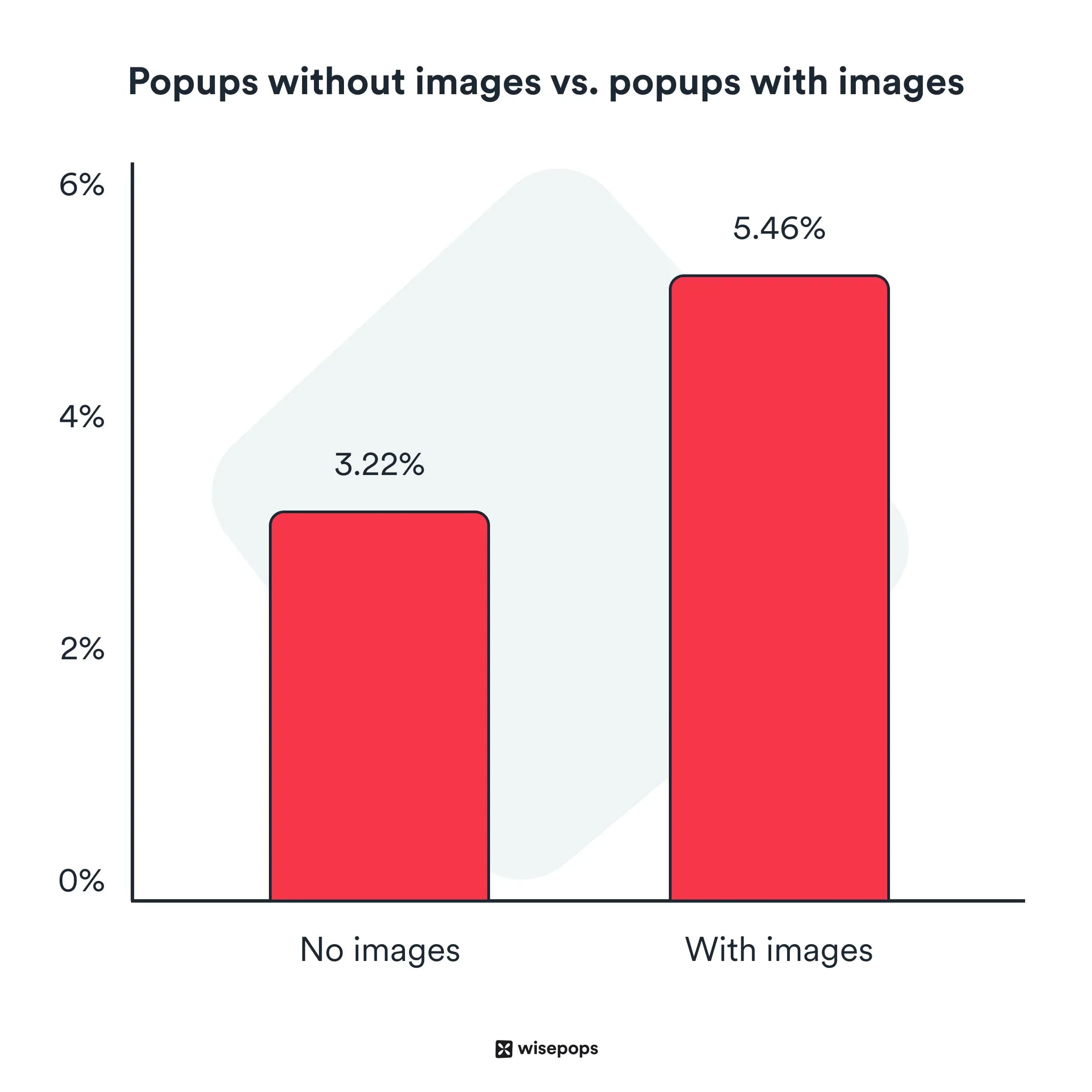
According to the Wisepops study, visual media naturally sparks curiosity, drives engagement, reiterates the benefits of a subscription, and makes the message more meaningful and memorable to viewers. This creates visual content imperative to crafting effective email popups.
Follow these simple tips to introduce images in your email popup and not overwhelm viewers with too much information.
- Balance between image and design (including colors, typography, and icons).
- Keep it simple by choosing basic structures and solutions.
- Use images that emphasize the message.
- Make it responsive, mobile-friendly, and accessible.
- Blend seamlessly with your brand’s theme and identity.
6. A/B Test Email Content
Split testing is a vital optimization strategy that ensures an email popup achieves the best outcome, whether it’s user engagement, conversion, or goal achievement. It provides evidence and actionable insights for accurate data-driven decisions based on real user interactions and responses and what works and what doesn’t.
When conducting A/B tests, consider various aspects of an email popup: copy, visuals, design, timing, location, offers, and CTAs. Even a tiny detail like wording, tone of voice, and typography can make a big difference.
Once you have an excellent email popup, the next step is to plan your email marketing campaigns. We’ve written a detailed guide on how to set up a high-converting email campaign, so check it out.
Did You Know? You can design stunning emails for free with Postcards drag-and-drop email editor. Here’s a step-by-step tutorial on how to create a newsletter with Postcards from scratch:
Once you have an email marketing strategy in place, start with creating an engaging welcome email with Postcards.
Get Started With Postcards for Free
8 Successful Examples of Creative Email Popups from Brands for Inspiration
I’ve also compiled some examples from top brands to help you get inspiration for your email popup design. I’ll also share what made each email stand out.
1. Brightland
Brightland uses a two-step popup that feels more personal and gives the user control—something you’ll notice more often on thoughtful e-commerce sites. Here’s how the personalization works:
First, it asks what kind of products you’re into and offers a discount based on your choice.
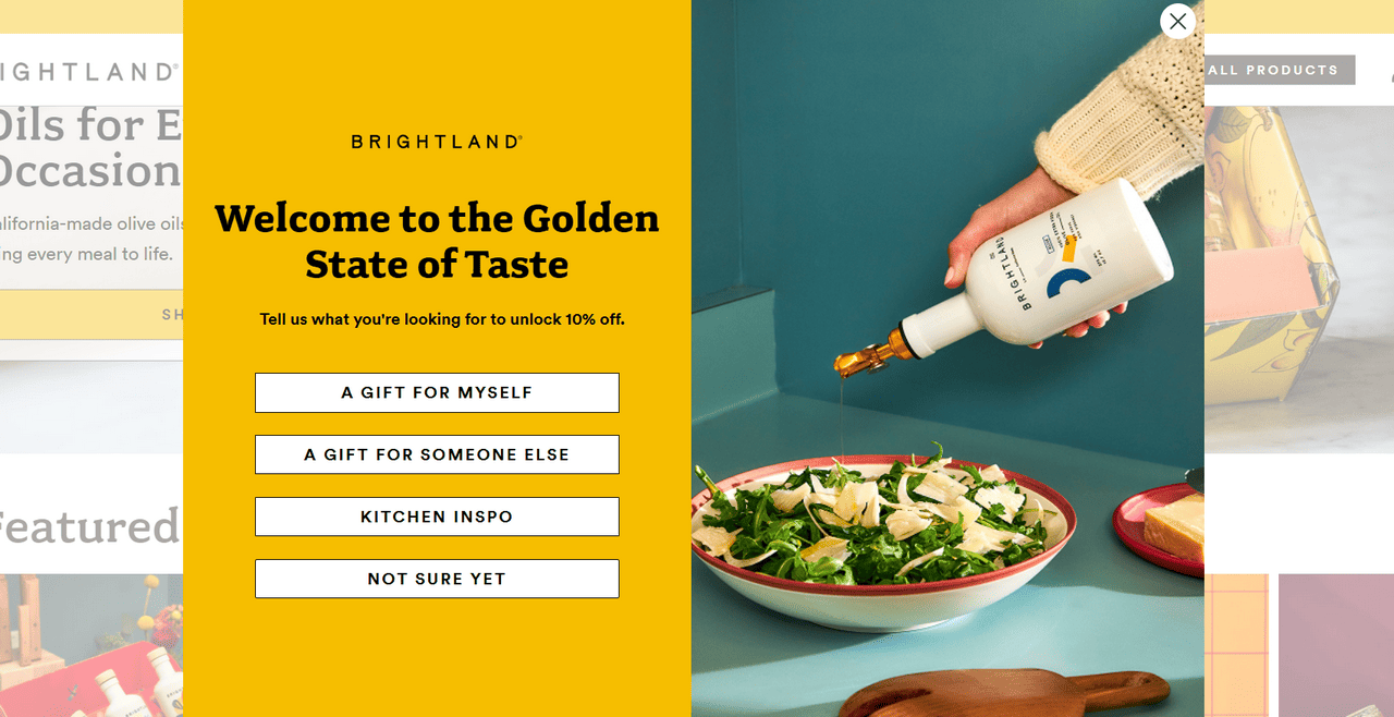
If you skip it, a second popup gently follows up with a general discount for signing up.
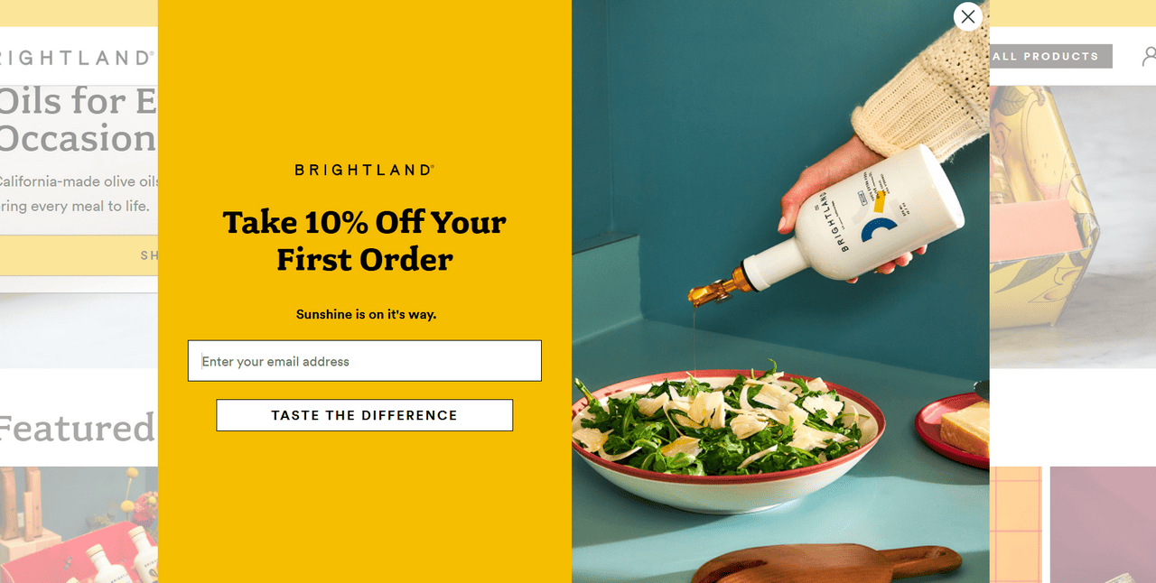
This simple approach works because it feels respectful and helpful—users can choose a more relevant offer. Another thing is the copy. It’s short, value-first, and doesn’t pressure you. The design uses a large popup that balances visuals, text, and buttons well to ensure the popup doesn’t appear overwhelming and makes the experience inviting.
2. Old Spice
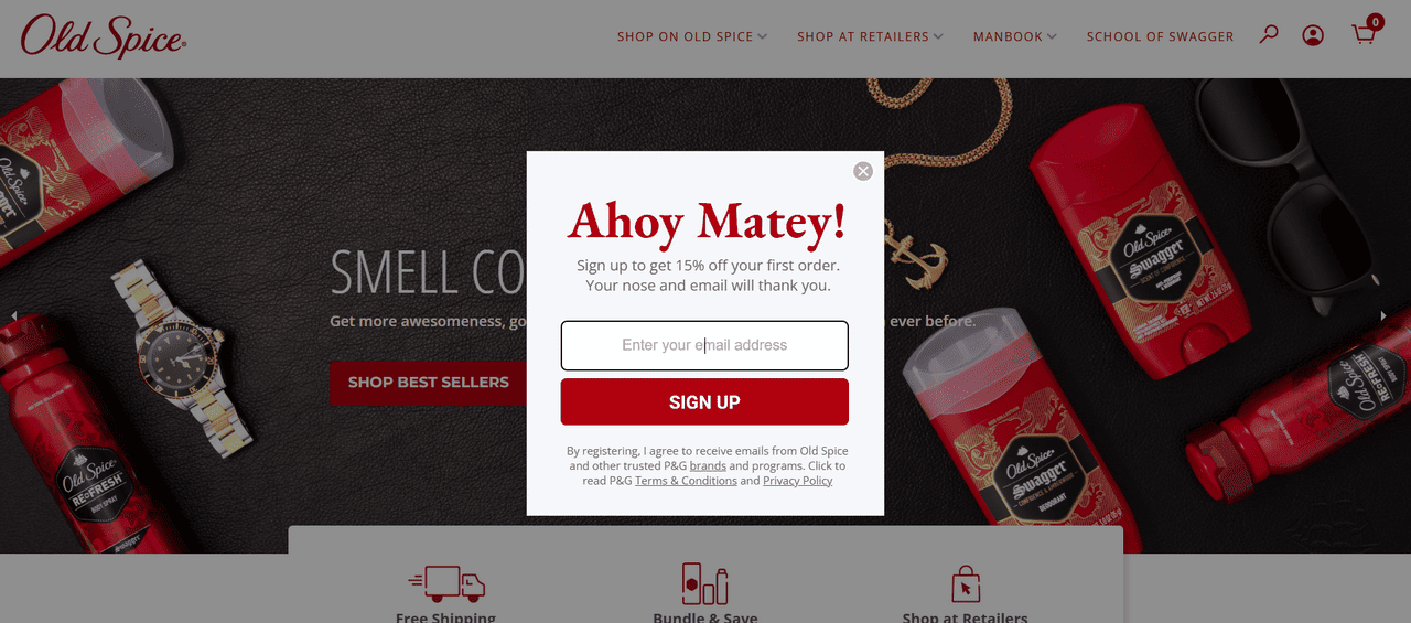
Old Spice’s email popup is a good example of an oldie-but-goodie email popup. It’s small, compact yet effective. Appearing right after the user starts to scroll the website, it naturally draws overall attention. The solution exemplifies a few key principles for getting subscribers on board:
- It prioritizes only crucial information. You might find only the brief welcome note, offer, CTA, and disclosure here.
- It gets down to business, stating offers and benefits right away.
- It uses a huge red CTA that is certainly hard to ignore.
- It uses a simple design yet is aligned with the brand identity and theme, making it look seamless.
Finally, it uses appropriate language. Note the headline and the message. They speak directly to the target audience.
3. Levi’s

Levi’s also believes in the email popup and its power to grab users’ attention and convince them to join the mailing list. It has been practicing this approach for years, getting on board thousands of subscribers.
Much like Old Spice, their email popup follows the traditional path and is a powerful example of using the right incentives. It immediately appears, greeting newcomers with a warm welcome offer. It caters to the audience’s needs by delivering actual value through pleasant discounts that they can use for their order. The best part is language localization—no matter where their audience is browsing from, they’re greeted in their language, which makes the connection stronger.
4. Osea
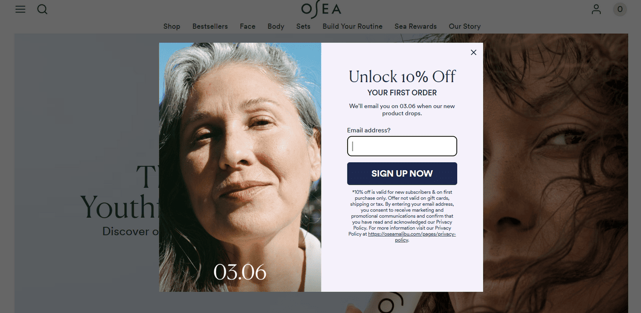
Osea uses a classic email popup but does it well. It doesn’t show up immediately—the popup waits until you scroll, making it feel more thoughtful. It appears in the center, dims the background, and grabs attention without being too loud.
The popup is split in half: one side shows a beautiful photo that instantly builds curiosity, and the other side gives an apparent reason to sign up. There’s a headline, an offer, and a CTA button—nothing confusing, just a quick way to join the list.
Here’s what I liked about Osea’s email popup:
- A big but balanced layout that doesn’t feel intrusive
- Strong visuals paired with a clear message
- Clean design with very little text, but still effective
5. Victoria’s Secret
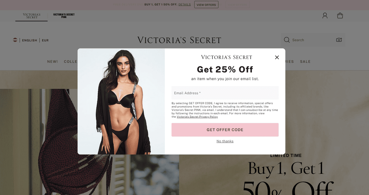
Nothing gets someone to share their email address more than a good incentive. The email marketing team behind Victoria’s Secret knows that well; therefore, their email popup stands out with an impressive 25% discount as a welcome bonus for new subscribers.
When visitors have shown interest in the brand by visiting a website’s inner category or product pages, an email popup appears correct to the point. It capitalizes on the visitor’s sheer interest and strives to address their pain.
As for design, it is cleverly crafted and striking. The window does not occupy much space, yet it draws attention with its iconic product shot, capitalizing on brand identity and values. The message is displayed with a CTA that is hard to miss.
6. CrunchLabs
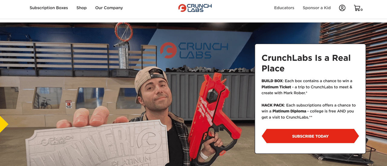
Email popups work no matter what niche you’re in. Consider CrunchLabs as proof that it can do magic for the techy STEM industry.
Like the previous example, their email popup appears only when visitors show interest by staying on the website longer and exploring its inner sections and products. Although it does not have an impressive discount, its meaningful pitch is enough to win over STEM enthusiasts and convert them into subscribers.
The team invites visitors to join their growing builders, hackers, and thinkers community. This appeal meets their target audience’s inner desire for creativity and belonging to something big, serious, and exclusive.
Also, note the design—it perfectly aligns with the brand identity and adds a seamless finishing touch to the user experience.
7. Drink Olipop
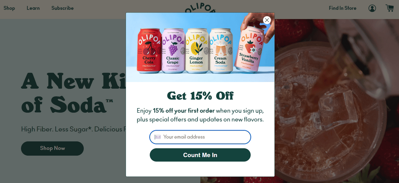
Drink Olipop also leverages one of the best ways to generate leads on a website through email popups. They build on their curiosity and short attention span by interrupting visitors immediately when they enter the website.
To avoid looking annoying, they have adopted several time-proven tricks:
- They don’t overwhelm visitors with too much information or visuals. They keep email popups simple and compact yet still informative.
- They employ the inverted pyramid principle to build anticipation and capitalize on visual impact.
- They leverage content related to their industry to target those readers directly with a dedicated buyer’s guide.
- They have included and highlighted a good discount worth the user’s attention and time.
8. Tommy Hilfiger
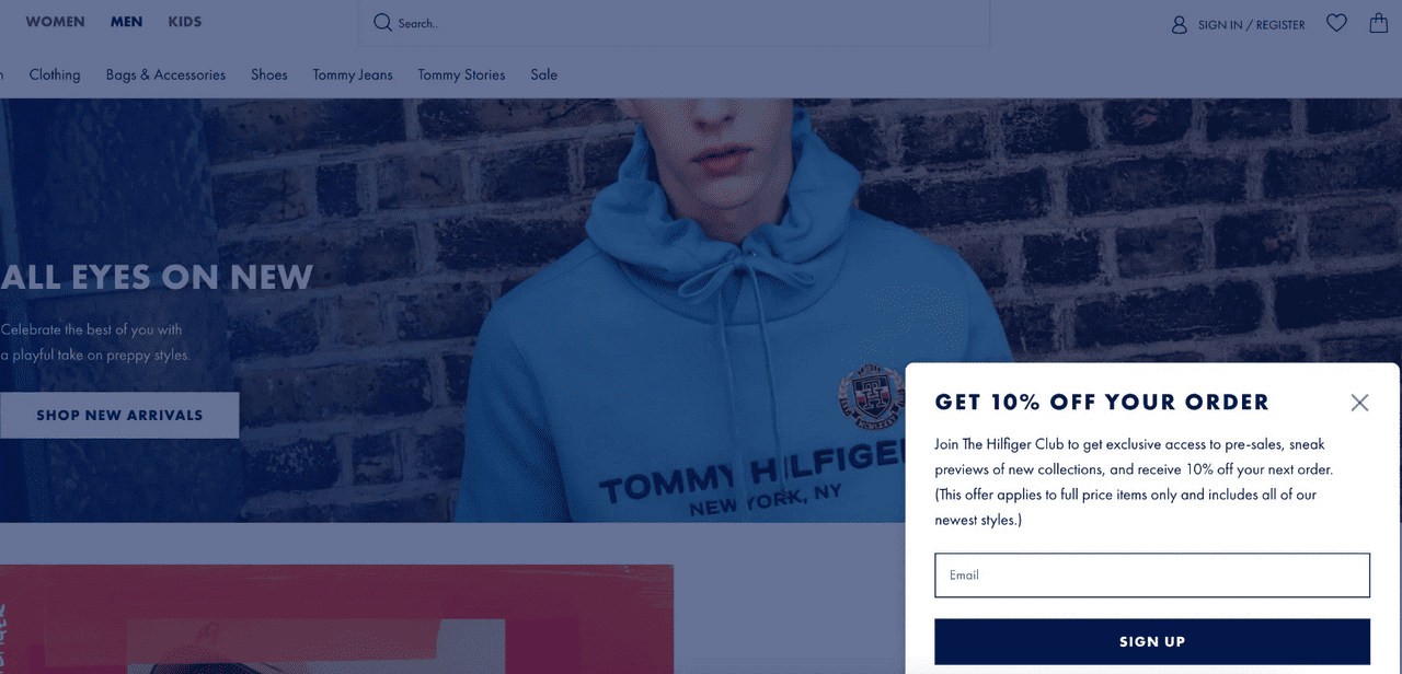
Unlike all of the above, Tommy Hilfiger takes a less intrusive approach to email popups. By placing them at the bottom in the right corner, they avoid being too intimidating and irritating for users.
Their fly-out, slide-in, small, compact window perfectly blends into the environment without disrupting the browsing experience. Users are not obliged to interact with it, so there’s no tension. This way, the team delivers the brand message unobtrusively, leaving a positive impression.
Final Takeaway: Find Your Sweet Spot
Some brands capitalize on curiosity and give exclusive offers right away, some keep popups unobtrusive, and most are worried about annoying their users so they don’t use them.
What’s your sweet spot? You can answer only after knowing what your audience wants. Analyze your audience, test different approaches, and see what works best for them.
Email popups are effective as long as you use them correctly, but remember not to overdo them. An enticing offer, relatable copy, and less resistance to completing the signup process will get you more signups than a flashy display.
Whenever you’re ready, you can get started with Postcards to design your email campaigns for free.