How to Build Websites for Apps: Your 2019 Step-by-Step Guide
Web designers: There’s some good news and some bad news.
The good news is this. There’s an ongoing and growing need for app presentation websites. The more the merrier, which means more for you to work on.
Not to rain on your parade, but more websites can eventually become too many. This can lead to visitor fatigue and early exits. It’s then up to you to find what makes app users tick so you can dip into your bag of tricks in your next website design.
But wait! There’s also some GREAT news. It takes but 5 simple steps to create an app website that’s eye-catching and engaging. It also can convert visitors into users.
The 5 Simple Steps to Building Astonishing App Websites
Step 1: Choose a mesmerizing color palette
Choosing a mesmerizing color palette doesn’t have to be a challenge.
- It has to feature colors that instantly attract attention
- It needs to be on-brand, and
- It needs to visually support your message
These examples demonstrate what that means.
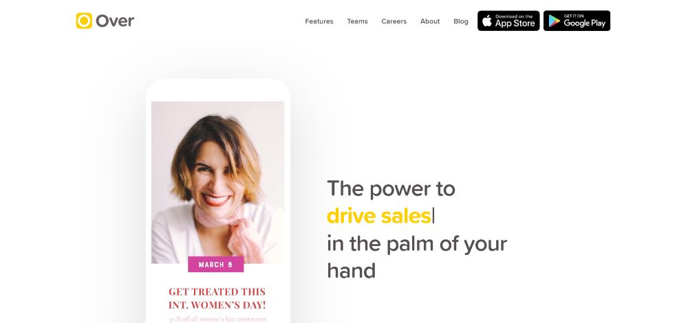
Over has BOLD color touches that immediately attract attention.
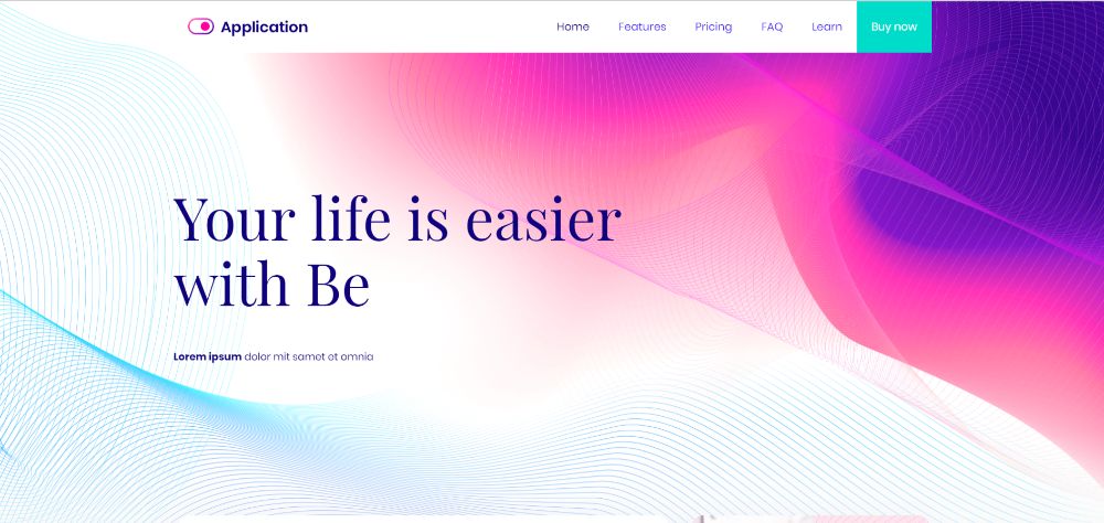
This Be Theme pre-built website is another great example of what an eye-grabbing color palette should look like.

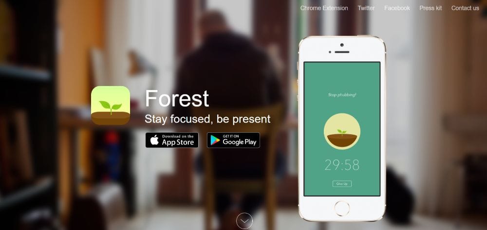
Forest does an excellent job at aligning the color palette with its brand—earth colors like greens and browns are abundant and visually memorable.
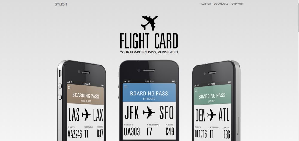
FlightCard’s use of a subtle, cold color palette perfectly reinforces their message: Boarding passes are now so ridiculously easy to use you barely have to pay any attention to them.
And, if you’re looking for a color palette that appeals to a larger audience, check out BeApp2. It’s a perfect example.
Step 2: Display crystal-clear product pics
People aren’t looking for a hint as to what the app looks like. They want to know EXACTLY, and they don’t want to have to use their imagination. They want to know if the app is easy to use or requires some serious learning. Above all, they want to be shown how this app is different from the other 392 that are currently on the market.
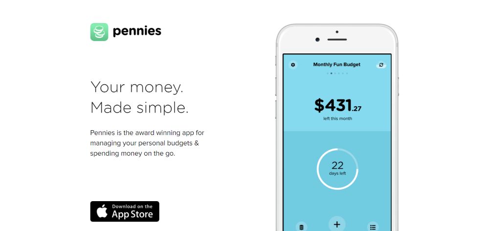
Pennies proudly displays what the app looks likes on a smartphone. Just by looking at these images, you can see how easy it is to use and how the color codes work as well.
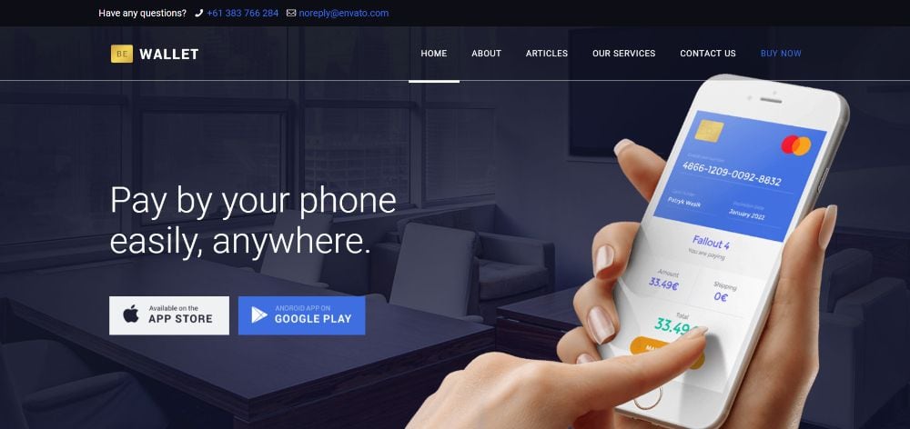
You can create a similar app website with BeWallet, a pre-built website that’s designed from scratch for financial apps. Financial apps are a veritable gold mine: there are SO many of them in dire need of a better website.
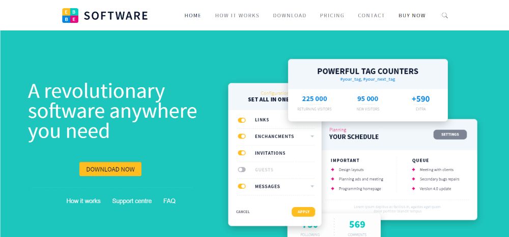
Or, you can choose a more general pre-built website like BeSoftware if you want to be able to display crystal-clear pics from inside the app.
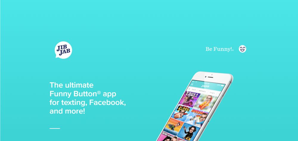
JibJab takes things a step further. It shows the before & after à a very persuasive and simple tactic to demonstrate what the app does.
Step 3: Show visitors how the app works
The closer visitors can get to imagining they’re actual users the better. These examples illustrate how you can put this powerful tactic to use.
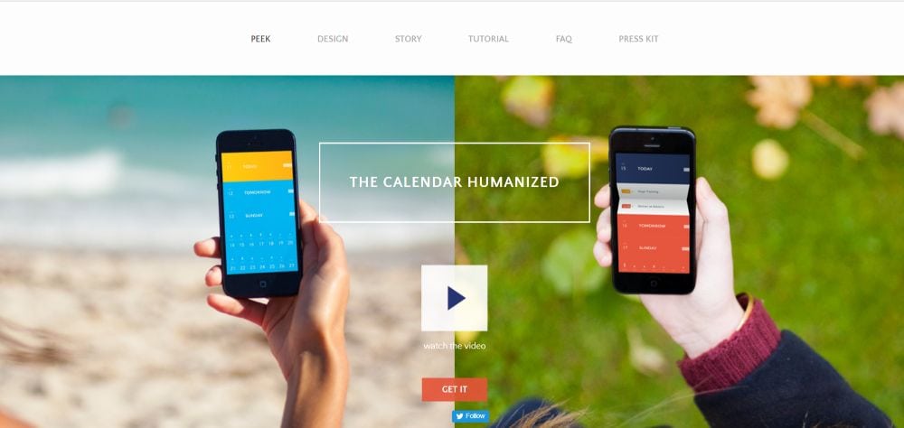
PeekCalendar uses a video in the hero section. It demonstrates how people use the app to better organize their daily life.
BeApp3 allows you to add product pics + video to show exactly how the app looks and how it works; a full app experience.
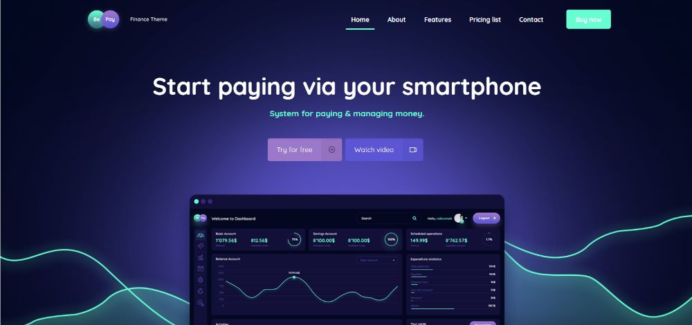
BePay has a Watch Video CTA button right above the fold visitors can click on to watch a product demo immediately.
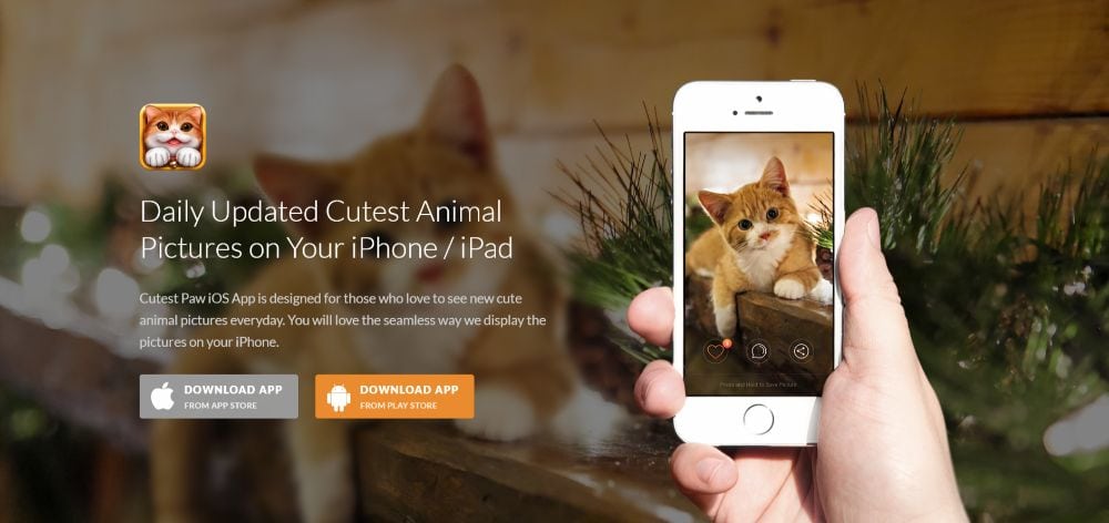
CutestPaw is a pet-lover’s dream app. The entire how-to is cleverly rolled up into a single image; a hero shot that shows how the app works AND how it appears on a smartphone.
Step 4: (Over)use “white” space
Too little white space isn’t much better than none at all. Whether there’s such a thing as too much white space is arguable. You can always err on the too much* side by providing just more than enough to highlight your main messages.
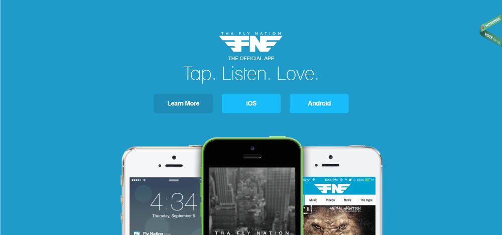
Tha Fly Nation has a clean, airy design that allows the eye to focus on the most important elements.
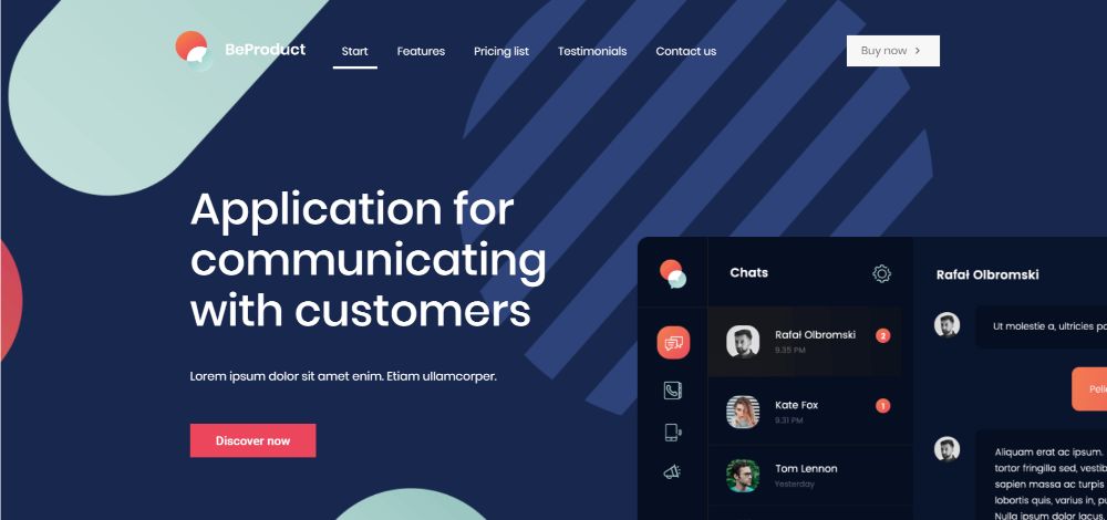
You can create a similar app website with the BeProduct4 or BeHosting2 pre-built websites. In these, white space is used to enhance the experience and emphasize the critical elements on the page.

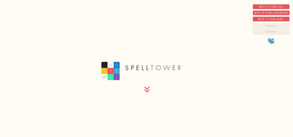
SpellTower is perhaps THE most extreme when it comes to white space. It’s part of their brand and it perfectly drives the message home. (*Definitely not too much.)
Step 5: Make your CTAs grab them by the eyeballs
Never, ever make a visitor have to search for your CTA button. Do you want to convert that visitor into a user? Then, you want to make that CTA button big and brighter than the sun.
Or at least so bold and bright they feel compelled to click.
Wire’s CTA button clearly stands out above the fold: it’s big and bold enough to draw visitors’ attention the second they’ve read the headline, and it’s centered on the page, where it acts like a “gate” that needs to be clicked to move forward.

BeERP uses exactly the same bright-green button for the main CTA (the one you want your visitors to click), with a secondary less bold button on the right.

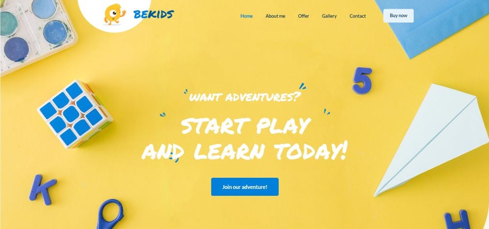
One way to direct attention to your CTA is to have it match other page elements. A great example is BeKids, where the blue of the CTA button matches visual elements in the hero section.
Conclusion
These are the steps you can take to create an eye-catching app website that’s built for conversion. They are surefire ones. They’re designed to get and keep visitors’ attention with stunning visuals. Don’t forget a judicious use of white space.
They also ensure your website presentation will be geared towards your audience. It will be making the right people want to use the app.
Are you juggling multiple projects and confronted with tight deadlines? Then, you could be a little hesitant to take the time to create an app website from scratch.
You have the option to use a pre-built website that’s designed especially for apps. It’s a great way to go. Check out Be Theme’s gallery of 450+ customizable pre-built websites to see for yourself. They are functional, they are visually impressive, and they have interactive elements, stunning effects, and intuitive navigation.
Pick one, personalize it to fit your app, and you’re good to go!