How to Choose a Typeface
Something I hear from a lot of people is that, when choosing typefaces, they go straight to the popular ones because it’s a lot simpler for them. It’s possible that the process of choosing typefaces is complicated and frustrating for a lot of people, so I figure it might be helpful to write up a guide on the best way to do it without exploding. Let us start.
You already know how to choose a typeface
If you’re reading this post then it’s probably safe to assume that you’re someone interested in creating things, or how people create things, or how various forms of art function in general. Typography is an art form like any other medium: it’s composed of various works meant to create ideas that provoke feelings and emotion, contemplation, or discussion.
Therefore, choosing typefaces is similar to choosing photos or colors or pencil thickness: it involves understanding what kind of ideas and emotions you want to provoke, and finding the typeface that you feel gives off those feelings and ideas most effectively. If you have a good understanding of the ideas you want to communicate, congratulations! You’re already ~40% there.
What does a typeface do?
Typography may be an art, but what makes it unique is that its primary purpose (arguably) is to be readable. The primary way that we engage with typography is through reading it.
Reading doesn’t imply that you have to understand what you’re reading, nor does it imply you have to read it the way you’re reading this paragraph, traditionally. It’s important to view the act of reading as abstract and fluid. There are many, many ways that we’re capable of ‘reading’ typography. Playing with and studying the nature of reading is incredibly valuable. When I talk about “readability,” I usually refer to a specific area of the spectrum of reading: the traditional way that we read sentences and paragraphs. This is usually what most people focus on.
How do you want people to read your typography? This is a question you should probably ask yourself. One thing that may be helpful to understand is the idea of approachability, or friendliness. Some typefaces are intimidating and striking, while others are calming or inoffensive. Do you want something that will evoke intense feelings and ideas, or would you rather something that’s easy on the eyes? Thinking about how friendly a typeface feels, can help you narrow down to what’s best for you.
With Postcards Email Builder you can create and edit email templates online without any coding skills! Includes more than 100 components to help you create custom emails templates faster than ever before.
Free Email BuilderFree Email TemplatesWhat kinds of typefaces are there?
Many people like to separate typefaces between serif and sans-serif, but there are different kinds of serifs and sans-serifs (and scripts!), and their distinctions are important. Knowing the traditional type categories are can bring you a long way in understanding how typefaces work.
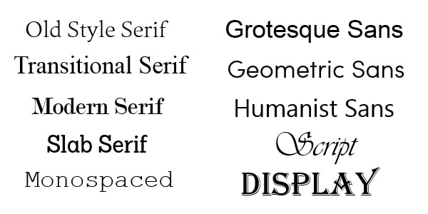
Some basic ideas to get you started: books generally use transitional or modern serifs, as serifs in general are good for big paragraphs with small sizes. Transitionals and Old Styles are usually very similar and not too exciting but very readable (in the traditional sense) and effective for purely functional uses, or establishing a sense of moderation. Slab Serifs are mostly used for display: headlines or important signs or logos, rather than text. Monospaced fonts are used for programming development environments. Humanist types tend to be the most friendly out of the sans-serifs, and geometric the least approachable, but the most interesting and exciting.
Grotesque types lie within a middle ground, where they’re approachable but also carry a sense of authority. Display typefaces are called such because they don’t conform to normal letterform convention. Script typefaces are more diverse these days, and many lie out of the “wedding card” design.
Understand that categories are rough and fragile, and anything I said can certainly be contradicted by certain typefaces. No model is perfect!
What’s the difference between a font and a typeface?
“Font” refers the ‘software,’ or the ‘package’ containing a letterset. “Typeface” refers to the design of the letterset. You buy or sell fonts, whereas you admire, or dislike typefaces.
How much will a font cost me?
Before we start here, I must note that I’m mostly directing this at the enthusiast with financial limitations. If you’re part of a studio with the money to buy fonts, than pricing probably isn’t a big factor in your purchasing decision, and that is perfectly okay. Now that that’s settled…
Fonts can either be bought in packages or individual styles; they usually carry around 5 or more styles. An example of a style is like “Futura Bold.” Another style would be “Futura Light,” or “Futura Condensed.” All these styles, hypothetically, would be part of the Futura font.
With Startup App and Slides App you can build unlimited websites using the online website editor which includes ready-made designed and coded elements, templates and themes.
Try Startup App Try Slides AppOther ProductsThere are a few key things you should understand about buying fonts,
- Fonts are really, really expensive, and it sucks.
- There are many high-quality fonts that are moderately priced, and you can find them, if you to pay attention. A moderately priced font would be anything under $25 per style.
- Any font that is over $50/style is a waste of your time. I can guarantee you, with the upmost certainty, that you can find a typeface that will satisfy you for under $50 per style. Hell, maybe under $30 per style. There is no typeface that is worth you spending $50 a style. If you somehow find yourself with a typeface that you think is perfect, and you’re considering paying more than $50 for a style each, I would recommend that you make sure it is the most magnificent, absolutely unique and irreplaceable piece of work you have ever seen, and if not, you can probably find a very good alternative for considerably less.
- There are type designers who separate pay models between commercial and personal use, which is something I like. For example, I’m personally a fan of Swedish designer Måns Grebäck, particularly his calligraphic typefaces like Recorda Script and Ventography. And one thing he does is separate commercial pricing, where his one style typefaces are usually over the $50 point I set, and personal use, where that same typeface would be about $5. It shows some consideration for those interested in typography but who don’t carry studio money, and I appreciate it. I don’t see this model often, but note that it could be helpful to you.
Where can I find (cheap) typefaces?
These are the major stores that I use regularly:
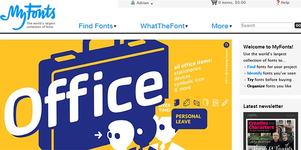
MyFonts
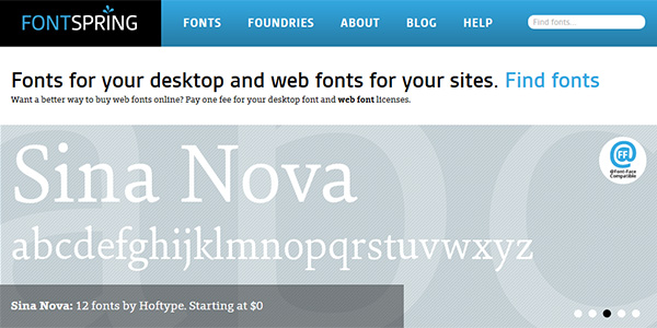
FontSpring – Prioritizes cheap fonts
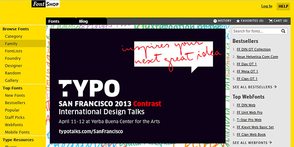
FontShop – Runs a great blog, some apps, and a catalogue
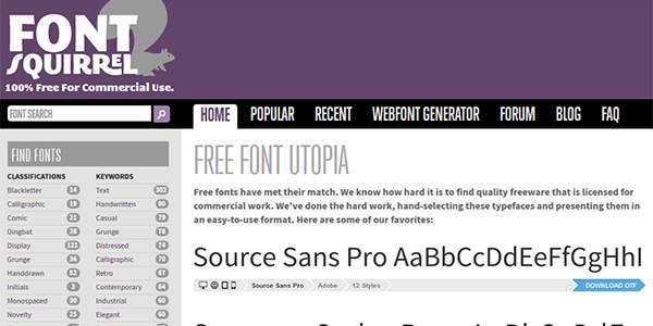
FontSquirrel – All free! But they don’t update too often
The only free font site I use is FontSquirrel; I avoid places like DaFont.com or FreeFonts.com or whatever variation of those. Generally, you should avoid any store that doesn’t feature proper type categories like the ones I described above, as it’s likely their fonts are very low quality (bad kerning and spacing, weird sizing), and they make searching for fonts confusing and difficult. What’s the difference between a “futuristic” font and a “techno” font? A “cartoon” font and a “comic” font? I don’t know. Generally you’ll see that the categories are based on confused popular misconceptions, and will make your searching process confusing and inconsistent.
I primarily use MyFonts.com because it has the largest range of fonts. Nearly every typeface I’ve seen I could find on the site. If you want free fonts, you can go to a site like FontSquirrel, but what I would recommend instead is to just go into MyFonts’ search engine, and set the price parameter to “is 0$,” like this. The site’s search options are fantastic, so take advantage of them!
There is no cheat sheet to typefaces
That sounds kind of defeatist but there isn’t really a better way to put it. Typography is an artistic tool, and it’s too broad to briefly define how to use it within a column or two. What’s important, more than anything, is that you regularly engage with typography. Think about the typefaces you see while you walk downtown, through your subways and in your coffee shops: the signs and the posters, the graffiti and shop logos. The books you read the sites you see on the Internet. If you pay attention to your surroundings, you’ll begin to realize that typography, and examples of good typography, are literally everywhere you look.
Sites like FontsInUse are invaluable — visit them regularly. When Christian or Nataly Birch compile web designs here on Designmodo, visit those sites, and learn to make opinions on different uses of type design. Note the styles and uses that you like. Develop a personal taste, which will allow you to make better decisions when it’s time for you to choose something that you want. Reading this column might help too ;).
I hope this guide was helpful. If you have any of your own tips or tricks about choosing typefaces, I’d love to hear them.
