Sans Serif Fonts: Most Popular Typefaces, Best for Webfonts
As San Serif typefaces have only been around for about 100 years, it is necessary for designers or enthusiasts to have an understanding how it all came about. Based on known historical accounts, officially, modern sans serif has been created on 1816 by William Caslon IV at the English Type foundry. The English Egyptian Typeface is designed only in capital letters in 28 points. Nevertheless, Caslon was not fully convinced on the success of the English Egyptian. Design-wise, the very first sans-serif type bears no value.
Then came; Akzidenz Grotesk created in Berlin at the German Berthold type foundry. The history and overall design of Akzidenz Grotesk was far more interesting and became an instant hit. Soon enough, many other type foundries are designing sans serif typefaces similar to that of Akzidenz Grotesk. It was initially used as a display face but a lower case has been included to make it more suitable for text.
Why grotesk / grotesque?
When the first typefaces of this sort came about in the 1830, people first considered them as blatantly grotesque and due to their controversial appeal; they are a rarity in texts and other printed forms with an exception of advertising. The typeface remained till new art and industrial trends appeared especially with the blossoming of the German Bauhaus. A unique typographic expression became essential to firmly establish this new revolution in art and industrial design.
Why sans Serif?
The main appeal of Sans Serif would not be understood until the early 20th century. The idea of things being beautiful only if it bears significance or purpose has become the reason why a simplistic typeface would become a preferred type during these periods since there is no reason to artificially embellish the type.
German influences
It seems the prevalence of sans serif, from the Akzidenz Grotesk would not push through without the Bauhaus ideology which began and evolved in Germany. One of the more popular sans serif styles to have come up on 1928 was Futura. It bears a strict, geometric form and carries no embellishing and lightly conforms to the shapes of historical forms. It was disputed by some, but nevertheless, Futura was definitely refreshing and new.
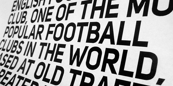
Even if Futura was a revolution on its own, its influence and usage in the world of typography and design wasn’t as resonating as with Helvetica who took the reins as the standard to the masses on what sans serif should look like. Helvetica bears the same essential features of a sans serif typeface- simple, lack of embellishment, and no-nonsense. This 1957 typeface creation, along with other iterations of Akzidenz Grotesk such as Univers have become reactions to the geometry offered by Futura.
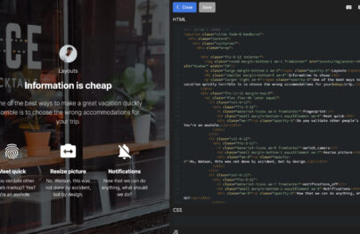
With Postcards Email Builder you can create and edit email templates online without any coding skills! Includes more than 100 components to help you create custom emails templates faster than ever before.
Free Email BuilderFree Email TemplatesThe Humanist (d) evolution
For some, the history of sans serif was a mere history of copying, plagiarism and watering down of true innovative sans serifs, particularly of Akzidenz Grotesk. Nevertheless, it is important to give credit to these unique changes as they have big influence to how people perceive text, read advertising and how the represented the design condition during the decades when they were created.
The serif typeface has seen incredible development from the classical fonts to the more modern typefaces that we see today. With the artificiality of Futura to the more neutral appeal of Helvetica, the sans serif has become more liberal and the humanist trend has become a popular derivative.
The movement of humanistic Sans serif can be traced from the 1976 typeface called Frutiger that carries similar Helvetica forms but with anti-geometric forms. The changes were subtle but are necessary to remove the severity common in old sans serif styles. The result of the humanist sans serif was friendlier and warmer, distinct from Futura and Helvetica.
From Frutiger, the seeds of more humanistic forms have sprouted such as the Meta in 1984 with narrower strokes and elongated shapes. The purpose of creating these elongates shapes was purely practical in nature. Erick Spiekermann who created Meta wanted to economize the font while keeping them readable even in smaller sizes or type conditions.
Most Usable Sans Serif Fonts
Maven Pro

Maven Pro is an original Sans Serif free font that was improved with geometric shapes. It exudes an image of modernity, stylishness, and elegance. Created by Joe Prince, it features three ultra light weights.
Supria Sans
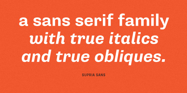
Supria Sans is a universal type family that includes 36 fonts. Here you will find a curvy italic version for setting up the feminine atmosphere and a sharp oblique version for blending in more conventional and casual interfaces.
With Pulsetic you’ll be instantly notified the moment your website, API, or server becomes unavailable. Monitor uptime from multiple global locations and respond to incidents before your users are affected.
Create beautiful status pages in minutes to keep customers informed during outages and build trust with transparent communication.
Start Monitoring for FreeIt offers two widths, six weights, and three styles. As for OpenType features, it comes with an extended set of characters to support both Eastern and Western European languages.
Supria Sans Condensed
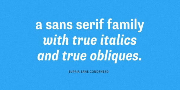
Supra Sans Condensed is a slightly improved version of the previous font that possesses the same huge potential. However, it has narrower lines, and, as a result, boasts of a more delicate appearance. It has six weights and three styles that let you choose your level of delicacy and subtlety. It plays perfectly well with its companion.
Graublau Sans Pro
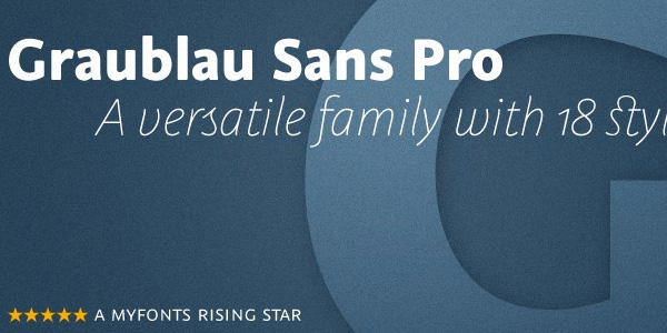
Delivered with over 1000 glyphs per style, seven weights, and six additional display styles, Graublau Sans Pro is a versatile font family that fits various tasks. Each style bears its nature and spirit. Thus, regular versions with clean appearance are appropriate to neutral and casual designs while italic versions with handwritten traits are suitable for artistic and exquisite projects.
Proxima Nova
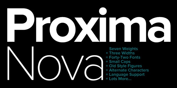
Comes with such characteristics as
- seven weights;
- three widths;
- old style figures;
- alternate characters;
- multi-language support.
Proximus Nova looks attention-grabbing in various options. Much like the previous font, it also has the power to satisfy different typography tasks. Thus, you can use it to add subtlety to the interface, or vice versa employ bold version to make the presence of a title felt.
Brandon Grotesque
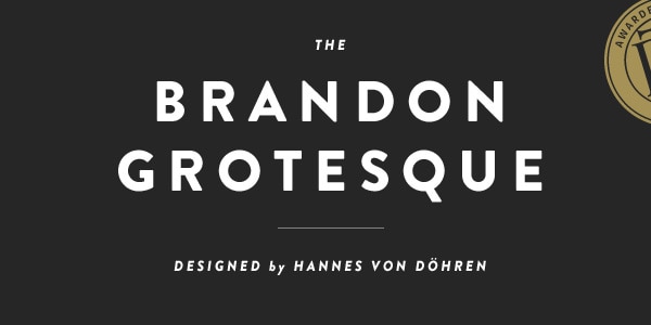
Brandon Grotesque is well-suited to numerous original designs. Although it has a subtle nostalgic vibe, yet this old-timey feeling enhanced by Art Deco nature sets it apart from others and makes it look visually-interesting.
The author has skillfully improved geometric shapes giving the font a more legible and elegant appearance. As usual, you can use it for showing copy in different European languages.
Museo Sans
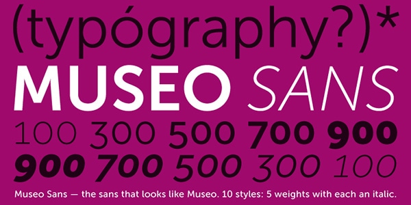
Museo Sans is a low-contrast type that gets its beauty from geometric shapes. It is legible and can be used both for demonstrating text and giving titles more visual weight. It consists of
- ligatures;
- old-style figures;
- numerators;
- denominators;
- superiors and inferiors.
It also has automatic fractions, works well with a case sensitive forms and supports Central European languages.
Futura
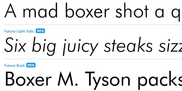
Futura is one of the most popular fonts in its kind. It is a modern geometric sans-serif font that run the show in the middle of the twentieth century and was skillfully revamped to meet current trends. It will overwhelm you with its versatility. It includes ten styles from light italic to extra black condensed italic. Each character is composed of even weights, perfect circles, and isosceles triangles.
Halis Grotesque
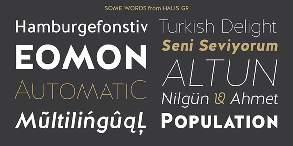
Halis grotesque has eight weights that are divided between normal and italic versions. It provides users with an optimal readability even in small size thanks to relatively wide spaces between characters. It ships with
- small capitals;
- old-style figures;
- scientific inferiors;
- numerators;
- superscripts;
- stylistic alternates.
Although it is claimed to be grotesque, yet in fact, it has a clean and fresh appearance that is suitable for the majority of projects.
Intro
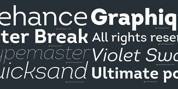
Intro boasts of being legible in any size and style whether used in print media or web-based UIs. It offers 50 type variations with optimized kerning and geometric nature. It includes all the sorts of characters and symbols to work with various languages, and is best suited to give titles a top priority.
Neue Helvetica
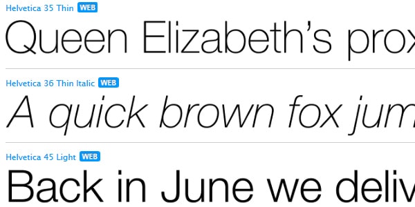
Neue Helvetica offers over 50 different font weights from fragile Ultra Light to massive and robust Black. It is versatile, universal, and quite neutral. Currently, it is one of the most popular choices among graphic designers. The license lets you use it in the web, desktop, apps and ebooks.
Swiss 721
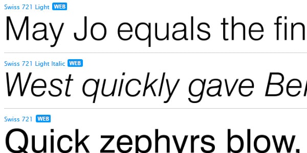
Swiss 721 is considered to be one of the best sellers. And it is not surprising, it was created in the best traditions of sans serif. It is neutral with a sense of classy elegance. It includes all the necessary glyphs for displaying text in different European languages.
Avenir
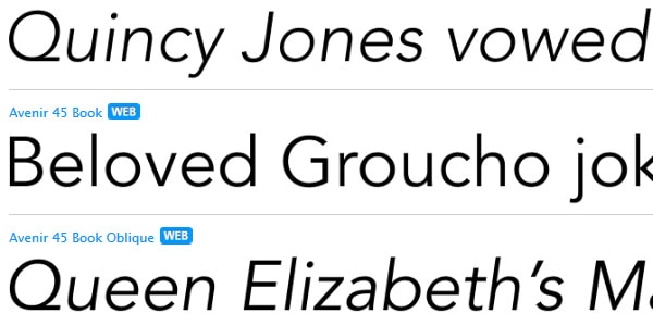
Being created in later 80s, Avenir is still a number one priority among designers. It is a linear sans serif that was inspired by beauty and versatility of Futura and Erbar. However, it has some stylistic nuances that differ it from those two and give it a certain charm. It makes any text look readable and easily scannable. It is delivered in six weights ranging from light to black.
Geogrotesque
Geogrotesque is centered around geometric shapes that produce a high-tech vibe. Thanks to smooth round shapes that mark each other symbol the typeface creates a warm experience and has a friendly appearance. It comprises
- 14 styles;
- seven weights;
- alternative OpenType format;
- italic version.
It fits to be used in print media, various publications, and graphic designs.
News Gothic
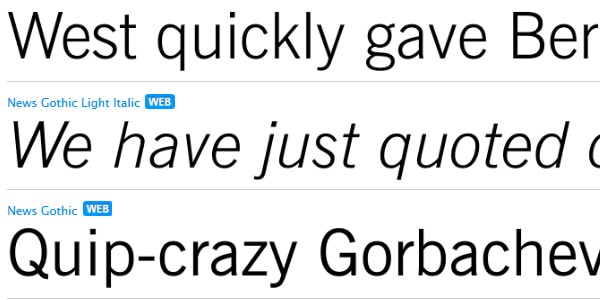
News Gothic is a classic sans serif font that first appeared at the beginning of the twentieth century. It was skillfully digitized and converted into a type family that is capable of fulfilling numerous regular tasks, starting from prettifying headlines in posters and ending up with giving titles in websites more prominent look. It offers 15 styles and is available in two basic formats.
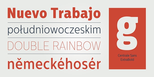
Centrale Sans Condensed
Centrale Sans Condensed is a refreshing and more elegant and delicate option of its sibling, Centrale Sans. It includes nine standard weights available for upright and italic versions. Although it can be used only in desktop and web based projects, yet, it has some extra features taken from OpenType fonts such as tabular figures, stylistic alternatives, discretionary ligatures.
Nexa
Nexa is a conventional web font that offers excellent legibility regardless of size. It has styles and weights for regular and italic version, resulting in 16 different variants. It is an excellent instrument for giving headlines more dominant position. Moreover, in standard version it can be also used to display simple text.
Univers
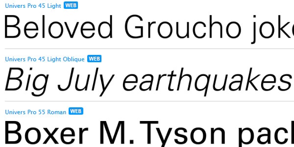
Driven by Swiss principles for designs such as minimalism, conservatism in resources and cleanness, Adrian Frutiger has created Universe. The typeface is claimed to give us a uniform series and strict discipline among the glyphs. It offers a wide range of styles from light to dark, from Condensed to Extended.
Neo Sans
Neo Sans is the typeface that perfectly collaborates with basic decorative means, such as gradients or embossed effect. It looks a bit futuristic yet modern. It is marked by monoline forms, open letter shapes, smooth curves and vigilant execution. It comes in six weights plus extra ones for italic version. It is well suited to display both texts and titles.
Pluto
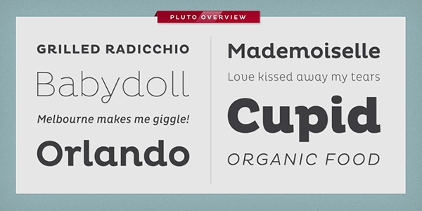
Pluto is an expressive font without being distracting. It has some subtle nuances that make it an ideal match for projects oriented to the feminine audience. It helps to establish friendly and cozy atmosphere. In tandem with its companion, the family consists of 64 fonts at all, covering styles for italics and uprights. It can be used for a long copy since it behaves perfectly well in small size thanks to relatively large X-height.
PF Din Text Pro
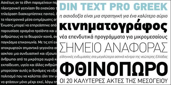
PF Din Text Pro is applicable for any designs whether it is a web-based project or print/logo design. It is appropriate for titles of all sizes as well as for a copy of any length. It is believed to be the most sophisticated, elegant and elaborate set of DIN typefaces. The whole type system embraces
- Normal, Condensed and Compressed styles;
- more than 40 weights ranging from ultra narrow Hairline to ultra bold Extra Black;
- true-italics version.
and supports Cyrillic, Greek, Romanian, Baltic, Turkish and other languages.
ITC Avant Garde Gothic
ITC Avant Garde Gothic is a full-fledged font with a complex personality that successfully mixes two styles together. It is delivered in 5 weights with additional oblique, all the popular ligatures and a bunch of alternate characters. In the extra light, it looks delicate and exquisite, while in bold oblique it looks heavy and massive.
Museo Sans Rounded
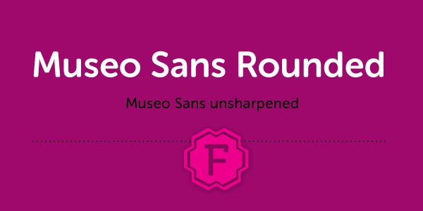
Museo Sans Rounded. The last word in the title is the key one. The font boasts of smooth shapes where circle plays the vital role. It has 12 options that differ one from each other in style and weight. It adds elegance and subtlety to any lettering.
Centrale Sans
Unlike the previous example, Centrale Sans has a more brutal appearance opting in favor of sharp edges and rude geometric shapes. The principal ingredients of this font are legibility and simplicity that result in universal and neutral look suitable for various sorts of designs. It works equally good for demonstrating headlines and copy. It comes in 18 styles starting from Hairline and ending with ExtraBold.
Interval Sans Pro
Interval Sans Pro has a tech vibe that benefits various complex corporate projects with a casual atmosphere. It includes 28 styles including both uprights and italics and offers additional support for non-Latin languages. Each glyph is easy to perceive and pleasant to an eye.
Gill Sans
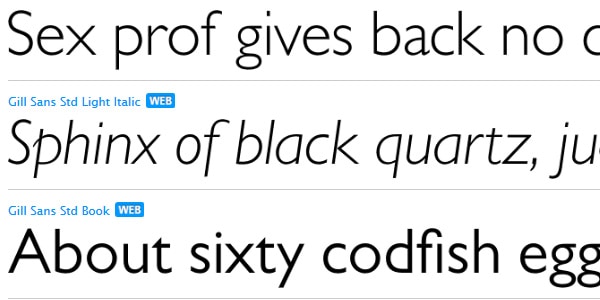
Gill Sans has a long history that began in the early 30s. It includes a ton of various styles and weights that make it a universal typeface. You can find here inventive shadowed version, elegant Light Italic, gross ExtraBold, friendly Infant, playful Light Inclined and others. The font supports almost all the languages.
Uni Sans
Uni Sans is defined by optimized kerning, well-finished geometric designs and legibility. It is neutral without looking boring and fussy. There are seven weights for uprights and seven weights for italics, from Thin to Heavy. It is available in OpenType and TrueType file formats.
Code Pro
Code Pro is characterized by a careful and professional execution that makes it a reliable instrument for carrying out various typographic tasks. It is clean and legible. It can look elegant in thin version and heavy in Bold one. It has several modern nuances that distinguish it from Futura and Avant Garde, fonts that provide the author with an inspiration and foundation.
Soin Sans
Soin Sans is personified by a neo-grotesque appeal spiced up with rough geometric feeling and humanist proportion. It fits asymmetrical designs and projects with open space. It has eight weights, stylistic alternates features, basic glyph set and numerals. It is delivered in OTF and TTF file formats.
Gram
Gram lends itself to display both long copy and headlines. Straight architecture of the font makes it a quite neutral and universal, allowing it to blend into any environment. It has only four standard weights such as thin, light, regular and bold plus the same set for oblique version. It looks soft and smooth and is ideal for use in print, web or app projects for beauty salons, shops, cosmetics and other spheres.
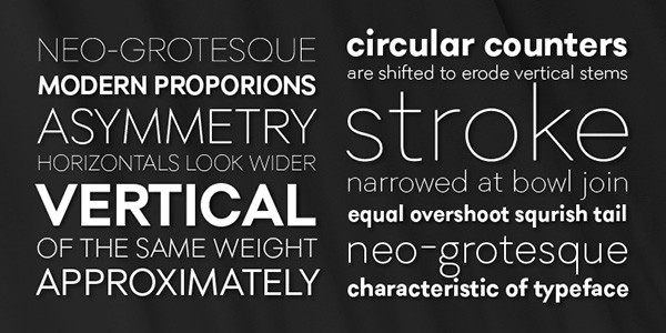
Establishing categories for Sans Serif Fonts
From the 1800 till today, the sans serif typefaces have seen changes radical, subtle or purely utilitarian in nature. Nowadays, standards to classify the typeface are used to effectively describe their form.
- Grotesque carries contrasting strokes and thickness with a square, horizontal curve.
- Transitional sans serif is a modern iteration where Helvetica belongs. It is the most common type of sans serif and has a straight look and fewer lines.
- Humanist sans serif is more calligraphic in nature such as Verdana and Calibri and appears to have more legibility in form.
- Geometric sans serif like Futura and Spartan are geometric in nature and are very modern. Since they have boxy forms, they are least used in texts.
Sans Serif continues to grow, and probably, new value will be found in creating and transforming existing forms to create new ones.