Free Fonts You’ll Want to Use Now, Trends and Examples
Every new year comes with lists of new design trends and techniques you’ll be using in the months to come. But what about typography?
While type trends are often parts of these lists, there aren’t as many devoted to fonts that will make your life easier. Designmodo is here to solve that problem. Here, we’ve compiled a list of 19 go-to new free fonts that you’ll want to use in design projects this year.
While some of these options are free fonts, others are premium typeface options (everyone needs a few go-to premium type families). There’s also a mix of new and classic fonts to choose from.
Free Fonts Type Trends at a Glance
There are a few things we’re already starting to notice when it comes to typography this year. Many of the options in this list have these trending styles in mind.
- San serif stacked typography with three- to five- lines of text.
- Use of more serif font options.
- Retro and outline/inline styles with a classic vibe.
- Elaborate swashes and flourishes for short text.
- Thick lines and bold letterforms.
Coves
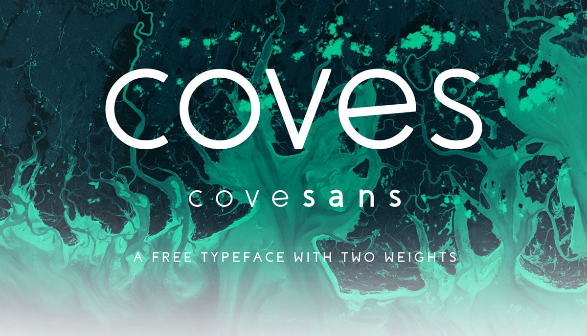
Coves is a sans-serif font with a nice round shape and a full set of upper- and lowercase characters that are highly readable a small and large sizes and in stacked applications. The rounded edges give this font a special touch that’s just a hint of difference.
Download it free (for personal use) from the designer on Behance.
With Postcards Email Builder you can create and edit email templates online without any coding skills! Includes more than 100 components to help you create custom emails templates faster than ever before.
Free Email BuilderFree Email TemplatesUnivers
Univers is an “oldie but goodie.” This typeface is so usable that it fits into almost any design aesthetic with ease. The simple shapes of this sans serif also make it ideal for oversized or stacked typography.
This premium font is available from MyFonts.
Morganite
Morganite is an amazingly complex free sans-serif font. The uppercase character set is lovely for display and while lowercase letters have a “crunched” feel, they can work nicely for short text elements. For a typeface with such a high x-height, it is quite readable. Find from the designer on Behance.
The Laker Font
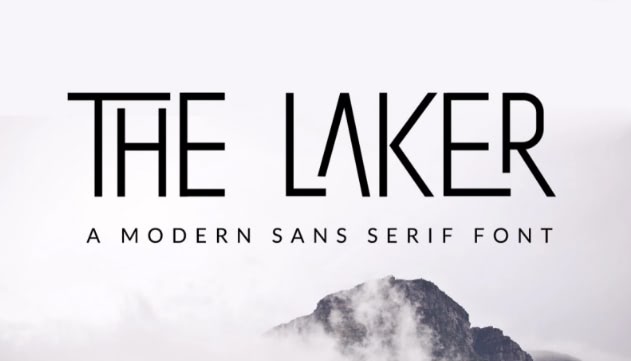
The Laker Font is a san serif type style that provides a refreshing and clean look. Its unique aesthetics and elegant presence evoke feelings of tranquility and sophistication, a fitting combination for your highly anticipated branding projects.
Download it now Laker Font in Freepik’s asset library.
Lato
Lato is one of those fonts that never gets old. Semi-rounded details of the letters give Lato a feeling of warmth, while the strong structure provides stability and seriousness. “Male and female, serious but friendly.
With the feeling of the Summer,” according to designer Łukasz Dziedzic. This is a popular typeface, thanks to its inclusion in Google Fonts.
Evolve Sans
Evolve Sans includes 10 fonts in multiple weights and a futuristic alternate that’s fun for specific characters or uses. The thin versions are only heavy enough for oversized applications, but the regular and bold weights are exceptional for almost all display text.
With Pulsetic you’ll be instantly notified the moment your website, API, or server becomes unavailable. Monitor uptime from multiple global locations and respond to incidents before your users are affected.
Create beautiful status pages in minutes to keep customers informed during outages and build trust with transparent communication.
Start Monitoring for FreeQuick
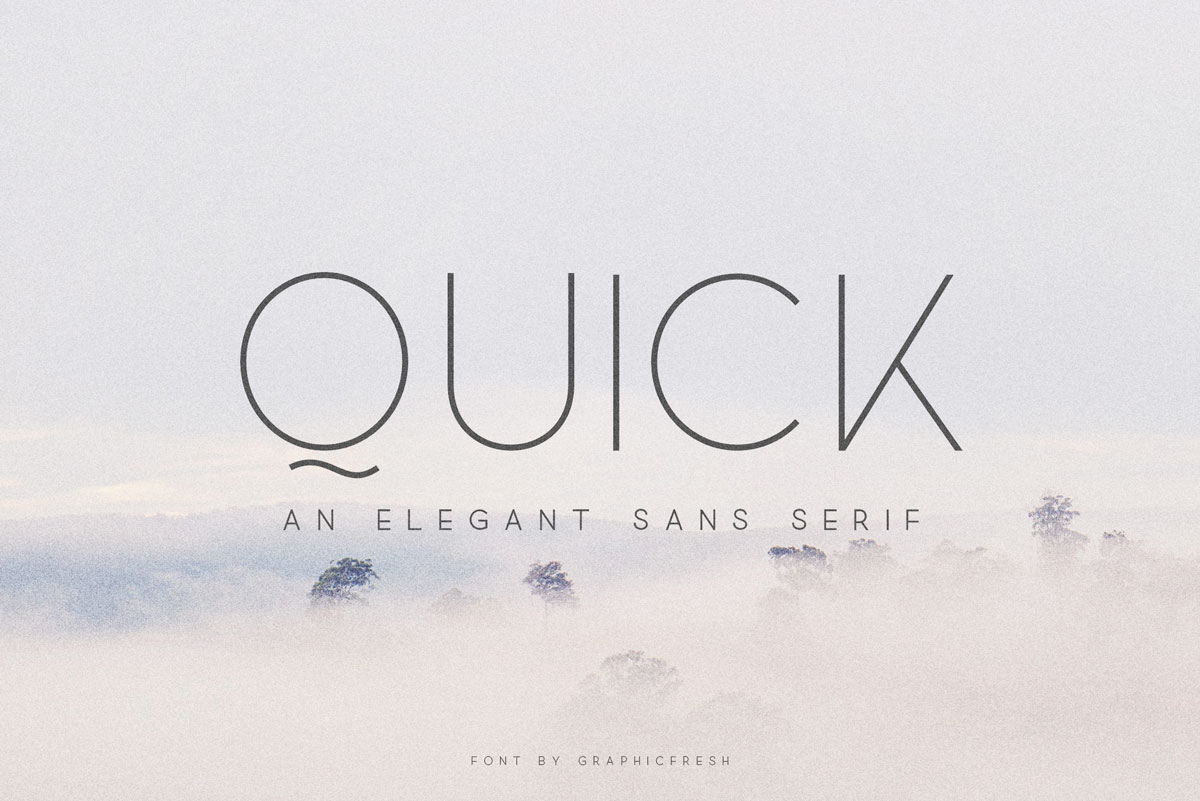
Quick is an elegant, thin-line sans serif. Used for oversized and display, this font can be quite impactful. This font includes multilingual support and includes a full character set. Download it from GraphicFresh.
Mosk
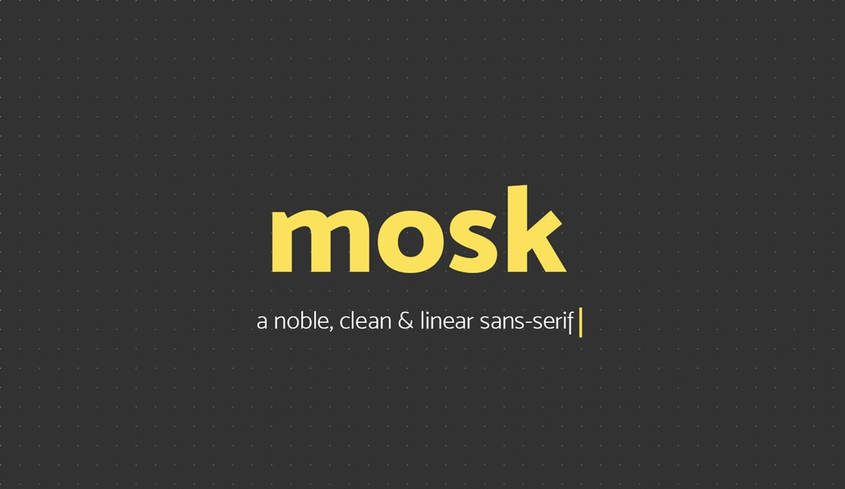
Mosk is a powerful sans-serif font with nine styles and plenty of weights so it can be an all-in-one font solution. The angled letterforms and clean lines make It great for stacking, body text and display. Download it from the designer on Behance.
Burgess
Burgess is a highly readable serif with plenty of options in the full font family. The bold and semibold variations look great in display while regular is ideal for smaller text elements. The premium font is available from the Colophon Foundry.
GT Super
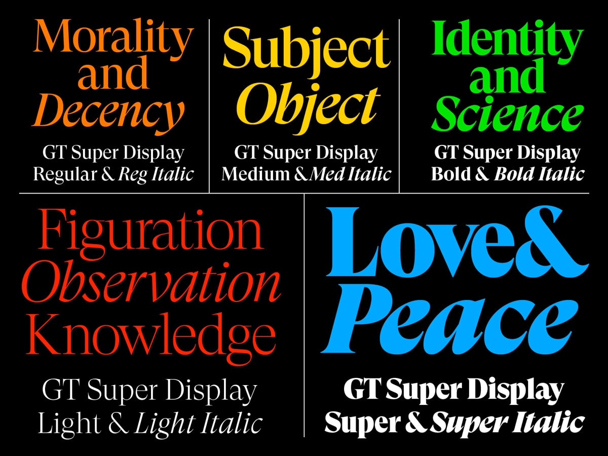
GT Super is a modern-style serif with plenty of versatility. It’s readable and airy with multiple weights, making it an ideal all-purpose solution. (Plus, it looks great on screens and in print.)
From the designers: “GT Super is the result of an extensive investigation into display serif typefaces from the 1970s and 80s. It focuses on the expressive and idiosyncratic nature of calligraphic motions, compelled into stable, typographic shapes.” This premium font is available from Grillitype.
Playfair Display
Playfair Display is a versatile serif typeface with thick and thin styles. While it is best suited for larger lettering, it maintains readability even at smaller sizes. Get it free from Google Fonts.
Giveny
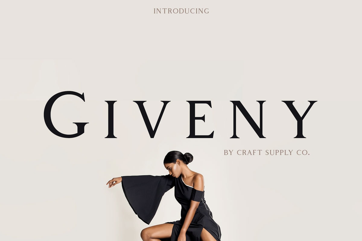
Giveny is a classically-style serif in an all uppercase style. Use it for display to add the right feel to projects that need a special something. Download it from the designers on Behance.
Monkstead
Monkstead is a fun retro style that can be used filled or as an outline. It has five styles and is made in the vein of vintage logos and posters. Get the free version (round style) from the designer on Dribbble. https://dribbble.com/shots/4808005-Monkstead-Font-round-style-for-free
Circus Display
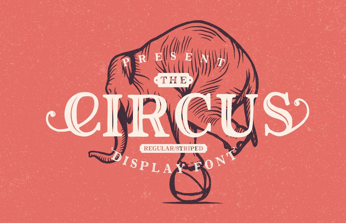
The Circus Display font is a versatile font with a retro style and fun swashes and tails. If you need an interesting display option, this might be it. From the designer: “This rough typeface has a strong charisma, appealing to the audience.
Coming in two different styles (regular and striped), it gives a chance to freely edit the degree of its ‘vintageness.’” Download this free font from PixelBuddha.
Bobby Jones
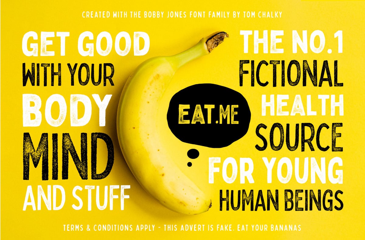
Bobby Jones is a fun – and funky – font with a rounded style, rough and soft options, and an outline style. While this typeface has a quirky nature, it also has a cool retro feel. Download it free (for personal use only) from PixelSurplus.
Elephant
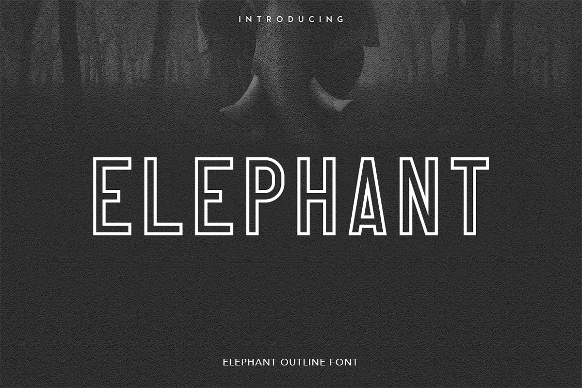
Elephant is an elegant outline style sans serif that’s made to pair with images and other creative materials. The lines are thick and crisp, and the design is simple and engaging with just the right angles and weight. Download it from the designer on Behance for free.
Puzzled
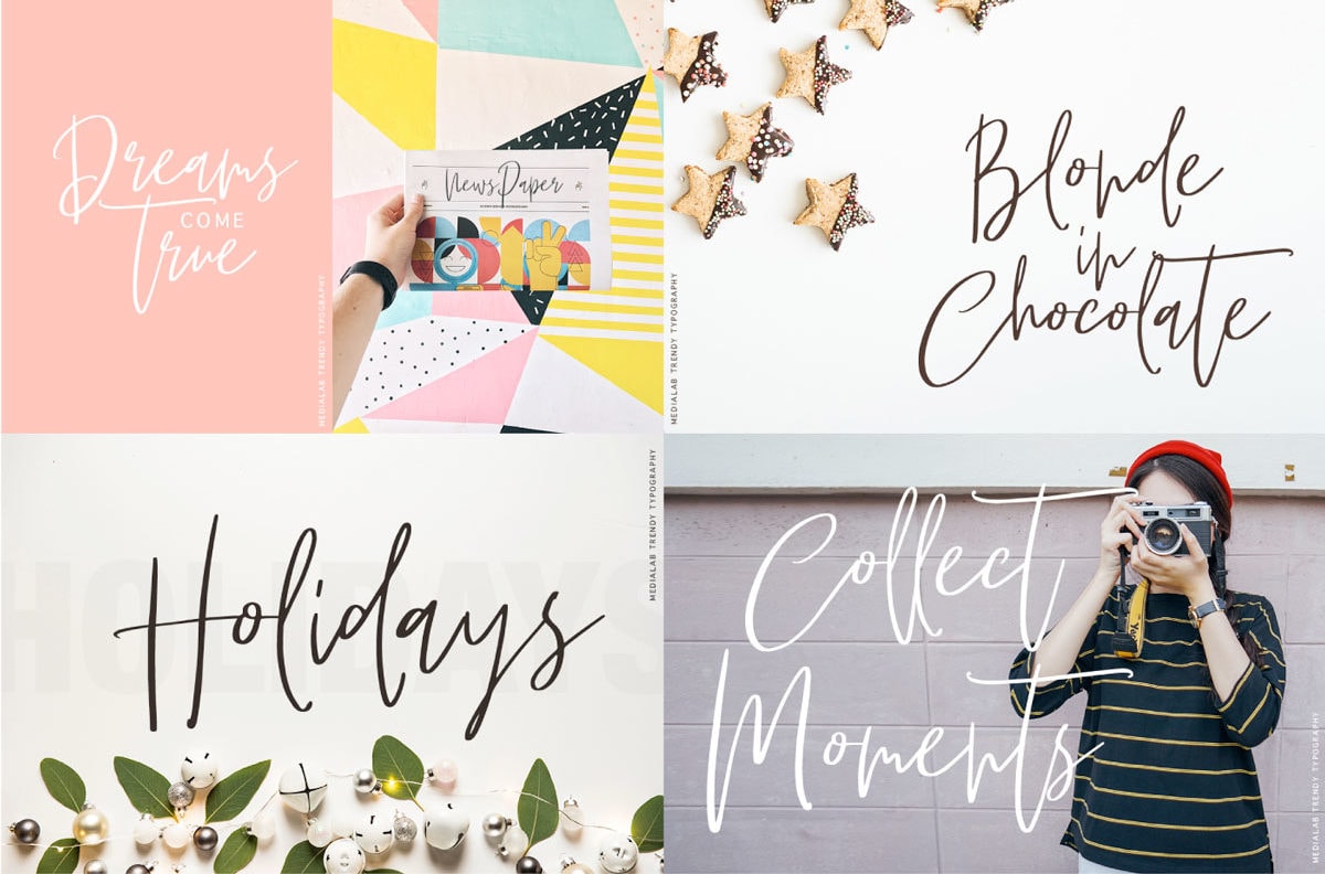
Puzzled is a trendy script with long tails and elaborate lines. While the font has a more feminine feel, it can work in a number of applications. The most effective uses would include simple text elements with a few characters to best make use of elaborate stylings. Download it free from PixelSurplus.
Peace Sans
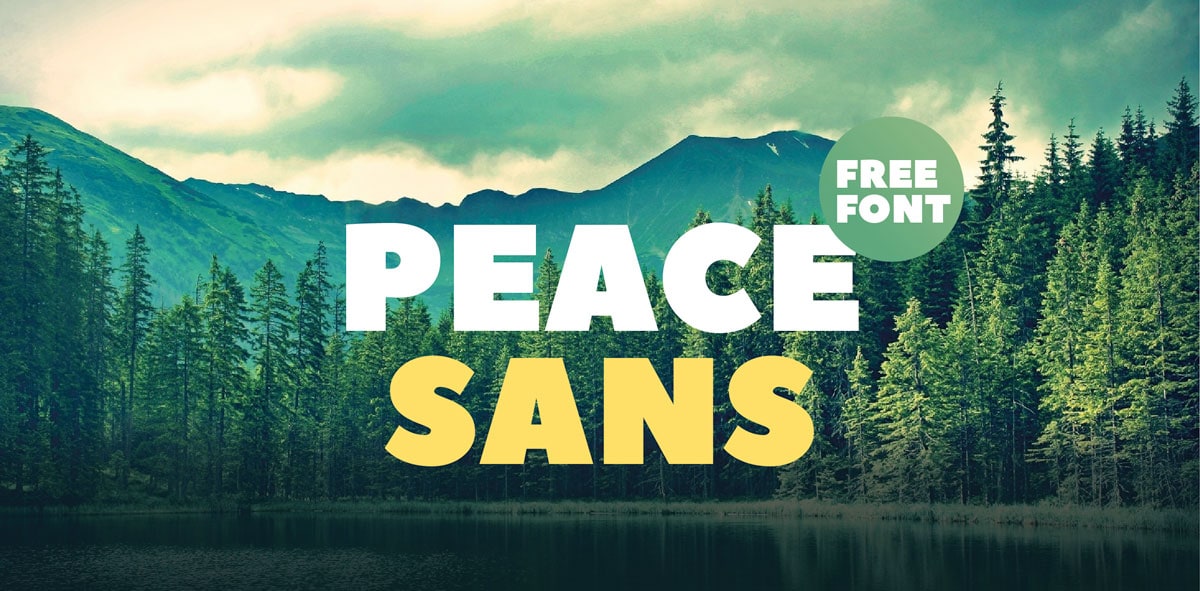
Peace Sans is bold and easy on the eyes. The free font is quite versatile and has a design that looks like a much more premium option. It comes with glyphs support as well. Download it free on Behance.
Wanderlust
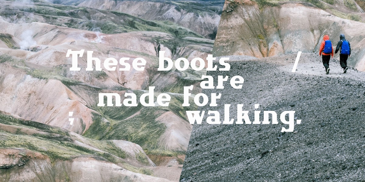
Wanderlust is bold and unusual and will add an element of intrigue to display text.
From the designer:
“Due to a round and edged slab serif combination, Wanderlust has a quite unique style that draws inspiration from landscape and mountain characteristics as well as rural wooden architecture hikes could come across.”
Download it free on Behance.
Adelle
Adelle might be one of the most versatile fonts on this list. (Maybe we saved the best for last?)
The typeface includes bold lines and has a lot of personality.
Here’s more from the creator:
“The unobtrusive appearance, excellent texture, and slightly dark color allow it to behave flawlessly in continuous text, even in the most unforgiving applications. As it becomes larger in print, the Adelle fonts show personality through a series of measured particularities which make it easy to remember and identify.”
The full premium family is available from TypeTogether.
These years were very rich in new fonts and the choice is very large since the topic of typography has been rapidly developing this year and free fonts have become an integral part of every website or even offline project. All font sets are very professionally pressed.
It should be noted that the progress of the fonts has become clear after responsive design entered more and more into our browsers. Experts estimate that 95% of a site created in the responsive design should be the text, and 5% – everything else. Of course, in this case, fonts are just a vital part of every site.
Many free fonts can be used as web fonts or @font-face, which means that the content can be given a beautiful and readable typographic look.
Download the fonts for free, do not forget to use them in design, and write beautiful texts using these fonts.
More Free Fonts Released in Previous Years
Venera

Joe Prince skillfully manipulates with smooth lines and shapes. As a result, Venera has a marvelous futuristic vibe and a splendid gentle look. It comes in five weights from thin to bold and boasts of full language support because of a provided extended set of characters.
Mission Script

Mission Script is a beautiful calligraphy typeface with lots of charm created by James T. Edmondson. It is marked by subtle brush strokes and is suited to various female projects or UI with delicate traits. It is condensed and casual with OpenType features such as standard ligatures and stylistic ones, and a wide language support.
Maven Pro

Maven Pro is an original Sans Serif free font that was improved with geometric shapes. It exudes an image of modernity, stylishness, and elegance. Created by Joe Prince, it features three ultra-light weights. The extensive glyph coverage lets it collaborate with a ton of projects.
Edmondsans

Edmondsans is another display font in our collection whose roots you can trace in the traditional Sans-Serif type family. It looks soft, sleek and formal. It ships with
- three weights (Regular, Medium, and Bold);
- non-lining figures;
- small caps;
- a mini set of alternatives for adding piquancy to titles.
Abraham Lincoln

Abraham Lincoln by Francis MacLeod is characterized by its fine proportions, long sleek lines, precise forms, and skinny appearance. It is enriched with nice sturdy serifs that help to convey the importance and give of status. Being inspired not only by the 16th President of the USA but also by advertisements of that era, the type allows viewers to indulge in nostalgia.
Geared

Geared by Ben Dalrymple is an eye-catching condensed Slab-Serif type that is defined by grunge touches. It has a bold look, urban vibe, and brutal nature. Delivered in four standard weights (Thin, Regular, Bold and Extra Bold) it pleases owners with
- an extensive set of characters;
- carefully crafted numerals;
- a bulk of glyphs;
- support of Central European languages.
Dude

Dude by Dan Gneiding easily lightens up the atmosphere with its cheerful mood and Cowboy spirit. Although there is only one weight, yet, in fact, the artist has done a grand job by crafting a dozen various styles that differ in stylistic alternates. Inspired by country music legends, each option has its temperament.
Sail Away

Sail Away by Oscar Rubio is a casual type that is revamped with tiny hand-written details. These tiny finishing touches in tandem with doubled lines create the entire buzz, giving the font a top-notch look. It speaks only Roman languages; nevertheless, it is quite sufficient for lots of projects. It is equipped with
- uppercase and lowercase letters;
- basic numerals;
- the glyphs for syntax;
- and an extra set of symbols such as an asterisk or copyright mark.
Bira

Bira by Mans Greback draws users’ attention right away. It pulls its identity from brush strokes and smooth forms. It has a strong human nature and retro appeal. With the font, you are able to write in uppercase and lowercase, use digits and basic punctuation marks. It is free only for personal projects and available only in one weight and one style.
Daiichi

Daiichi by Michael Muranaka plays heavily on ultra-thin lines and smooth geometric shapes. This elegant techno font is supplied with uppercase and lowercase Latin alphabet, numerals and a ton of symbols including punctuation marks, math operations and some others.
Razor

Razor by Jeff Schreiber combines a techno vibe and futuristic atmosphere competently and naturally. It is also inspired by the dynamic and energetic 80s so it reflects that period as well. It is delivered in
- one style;
- three weights (Regular, Bold, and Italic);
- uppercase letters;
- numbers;
- four formats such as TTF, OTF, SVG, and WOFF.
It looks exceptionally good in a big size and shiny neon coloring.
CROISSANT

Croissant by Eduardo Tunni is a Google Web Font that is reinforced by wonderful finishing nuances and curls. As a result, you can grab a font with an exquisite French handwritten feel. Due to long outstrokes, lowercase letters are beautifully connected while uppercase letters magnetize with soft terminals. It works well with the West and Central European languages.
Metropolis

Metropolis by Josip Kelava owes its matchless look to posters made in Art Deco and the double line technique. Artist has managed to embrace the 20s and correctly express that time. The font looks urban, artistic, and sophisticated. It is suitable for writing in both the Latin alphabet and the Cyrillic alphabet. It also includes digits and several essential punctuation marks.
Barkentina

Barkentina
Kiril Zlatkov strongly relies on a space between characters, so that the font is defined by legibility and clarity regardless of size. He gently used serifs to preserve the balance between artistic and casual looks. The typeface has
- OpenType features;
- Latin alphabet;
- Cyrillic alphabet;
- numerals;
- accented symbols;
- syntax signs and much more.
Futuracha

Futuracha by Holy leaves a lasting impression. It has an original and pioneering appearance that is concentrated on the era of Art Deco style. It is destined to prettify headlines and titles giving them an impeccable delicate artistic flavor. It is equipped with Greek and Latin characters, numerals and a dozen punctuation signs.
Manteka

Unlike the previous lavish example, is a functional, multipurpose, and formal typeface that is created to show texts of different lengths, including headings. It is available in one style and one weight. There are common characters, numerals, and symbols.
Shelton Slab

Shelton Slab by Hannes Von Dohren sets itself apart from the others with its unbalanced cowboy-themed look. Letters differ one from each other, so the typeface has a playful note as well as goes perfectly well with natural textures like wood. It supports Central and Eastern European languages, and comprises contextual alternates features, arrows, and some other basic glyphs.
Moby

Moby is an original display typeface that easily establishes a techno atmosphere. The artist skillfully avoids sharp edges and corners to make it smooth and serene. It comes in two traditional formats (TTF and OTF) and a ton of glyphs to compose multilingual texts.
Polaris

Much like the previous example oozes high-tech charm though it looks less soft and divine. However, it is more generic: it is applicable to various kinds of artworks, posters, t-shirt prints ,and website designs. It includes characters from the Latin alphabet, numerals and some other standard glyphs such as backslash or hyphen.
Multicolore

Multicolore was created with vibrant color palettes in mind. The typeface is certainly one of a kind: it easily brings titles into focus and charges UI with energy. However, it is not a classic font that can be used like that. To derive benefits from it, you need to use a vector editing program like Illustrator or Photoshop since it is available in EPS format. You are welcome to experiment with layer styles, and coloring and add some extra details to maximize an effect.
Dooodleista

Dooodleista by Filiz Sahin is a carefully handcrafted doodle-like font with a splash of sparkling personality. It meets the cheerful mood and radiates fun. Each letter is composed of ultra-thin and a bit quirky lines. There is a basic set of glyphs to generate content in English.
COCO

Coco by Henrick Lorandez is an excellent solution for strengthening the looks of stylish magazine covers, fashion posters, or just web UIs with refined and chic designs. Although it is a traditional sans-serif typeface, it is provided with intricate and a bit ornate letterforms. There are
- eight weights ranging from Regular to Bold Italic;
- more than two hundred glyphs, including capitals, numerals, and special symbols.
new theory

New Theory is an authentic, rustic and extremely original type. It lets recreate rock paintings or just artworks that require an old-timey feeling. It can be used for showcasing titles and short copy. Comes with pretty limited support of languages it works great only with the English alphabet.
Johanna

Adria Gomez has created an outstanding grotesque type that brings a creative touch to any title. It has intricate visual forms that can be adapted to various needs, except for a long copy. It is also modular. You will find here six options and a general collection of Roman characters and numerals.
Silverfake

Silverfake designed by Alexey Frolov is a modern slab serif font with piquancy. It benefits both contemporary and retro-style projects thanks to its dual nature. What’s more, it has comprehensive glyph coverage including capital letters of the Latin and Cyrillic alphabet, some common symbols, and alternate letters.
Nexa

Next is a huge type of family that can easily meet various requirements. Regardless of size it clearly conveys the message to the readers. It counts sixteen fonts, covering eight uprights and eight italics, and has almost five hundred glyphs to support numerous languages. It is suitable for websites and app UIs.
Sreda

Comes with optimized kerning and straight lines, Sreda is a generic slab serif typeface with a warm contemporary feel designed by Elena Kowalski. The key feature of this type is that it speaks Western and Central European languages, Turkish, Baltic, and Cyrillic-based languages. Moreover, there are also symbols for syntax and numerals.
Casper Typeface

Casper Typeface is a holistic and modern font that is based on harmonious combinations of geometric forms. Ships with almost six hundred glyphs it lets you use the Latin alphabet, Cyrillic alphabet, digits, alternate characters, signs and even arrows.
Tikal Sans

Tikal Sans is created for text and display size. This ambitious sans-serif font is marked by a large X-height. It is also surrounded by a Mayan aura, yet it looks friendly and even a bit formal. It consists of twenty weights and 415 glyphs, in which you can find contextual alternate letters, basic symbols, punctuation and traditional numerals. Two versions are available free of charge: Medium and Medium Italic.
Sofia Pro Condensed

Sofia Pro Condensed is designed to accompany the original typeface Sofia. However, it looks more rounded, modern and elegant. With more than five hundred symbols in the set, it gives you an opportunity to manipulate with
- case-sensitive forms;
- small caps;
- contextual alternatives;
- stylistic alternates;
- fractions;
- tabular figures and much more.
Che’s Bone

Che’s Bone breaks the monotony of subtle and delicate typefaces. It boasts of skinny forms, bone-themed decorative elements, and rounded corners. Vigilantly crafted by hand, it will add a human feel and playfulness to any artwork. It works great with wood and paper textures.
MOCHA

Mocha Script by Thomas Ramey naturally stands out from any background with its exquisite and polished appearance. If you want to create a continuous streamflow of characters that mimic human script, then this calligraphy font is right for you. It offers uppercase and lowercase letters as well as digits and some punctuation marks.
Cuprum

Cuprum is a representative of a small sans serif type family that is delivered in four styles (two uprights – Regular and Bold, and two cursives – Italic and Italic Bold). The glyph coverage allows use for composing content in Baltic, Turkish, Central and Western European, Cyrillic and Roman languages. It is compatible with PCs and Macs.
Ledger Regular

Ledger Regular is a flexible and multi-purposeful Google Web font that focuses on quality and readability. Denis Masharov strikes an optimal contrast and maintains harmony between all the constituents. As a result, letterforms give off elegance and subtlety. There is an extended set of Latin and Cyrillic letters.
Forum

Forum by Denis Masharov radiates sophistication and is marked by distinctive traits inherent to the Victorian era. It is based on classic proportions and solid architecture that skillfully balance semicircular arches, horizontal cornices, and climbing pilasters. The typeface is written in Latin and Cyrillic as well as includes numerals and standard symbols for formatting.
Prosto

Prosto is intended to strengthen the readability of the content, making the text quickly and easily scannable. It is simple, plain and neutral. As for the main characteristics,
- it has a TTF format;
- it collaborates with PC and Mac;
- it supports numerous languages;
- it has more than four hundred glyphs embracing all the common syntax symbols, West European diacritics and even Baltic Latin.
Source Sans Pro

Source Sans Pro by Paul D. Hunt offers artists to take advantage of six professionally designed weights starting from subtle and fragile Extra Light and ending with an overwhelming Black. The font is available for use in both PC and websites. The language support also surprises you: Roman, Greek, and Cyrillic writing systems were taken into account.
Flex Display

Flex Display is provided with alternates, popular glyphs, and essential symbols. The display font oozes freshness and delicacy as well as magnetizes with ultra-skinny visual forms. The italic variant can be used as a graceful script that adds a human touch. It also works well in website designs. You are welcome to use it in personal and commercial projects.
Poly

Nicolas Silva intends to design a universal and legible serif font that will be suitable for both texts and headlines. As a result, Poly has letterforms that demonstrate a medium contrast, an optimal balance between the X-height and character width, and lovely tiny wedges. This Unicode typeface family possesses all the OpenType features from case-sensitive forms to superiors and scientific signs. It works just with Latin script and its derivatives.
Noticia Text

Noticia Text by JM Sole is a rare slab serif type for titles and paragraphs. It enables one to write in four styles Regular, Italic, Bold, and Bold Italic, and uses almost seven hundred glyphs thereby supporting a great deal of foreign languages. A set of normal characters and accented characters are presented in both uppercase and lowercase.
Jockey

Jockey by TypeTogether is a Google web font that was greatly inspired by posters for horse race tracks of the 30s. It is a refreshing take on a classic sans-serif typeface. There are a ton of glyphs that are designed to be written in different Roman languages.
Bree Serif

Bree Serif is an upright italic version of the award-winning font called Bree. It is aimed to develop a friendly atmosphere in any UI. It is versatile, fancy and tasteful. Being available via Google Web Font gallery it comprises all the glyphs from accented letters in uppercase and lowercase to numerals to let users work with Roman scripts on the Internet.
Hagin

Hagin charms with a gorgeous ‘old-school’ style. It has two weights (Regular and Bold) and symbols to speak both Latin and Cyrillic languages. It is an ideal instrument for beautifying graphic and web designs.
Prociono

Prociono by Barry Schwartz is a refined serif font that is quite neutral and essential. Thanks to black letters it is able to give some weight to the selected part of content. It supports Western and Central European languages because of an extended set of glyphs and accented characters.
Abril Fatface

Abril Fatface is made with editorial designs in mind. It is a bit funky and playful. The broad range of styles allows it to be used both for displaying titles and texts. Inspired by traditional slab serif typefaces of the 19th century and Roman scotch scripts, it can express a vast gamut of emotions.
Adelle

Adelle gives an impression of a flexible and versatile font that is designed in the best traditions of slab serif typefaces. It consists of more than a dozen styles, yet only Bold, Regular, and Italic are available free. These versions include
- standard caps;
- lowercase numbers;
- extensive language support.
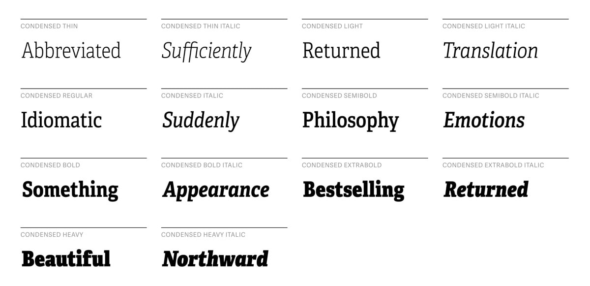
Intro

Intro is a huge type family of twenty-six styles and weights. Well-finished geometric forms paired with manual kerning and well-thought-out proportions deliver messages in a pleasant way. It consists of 376 characters and is available in two formats (OpenType and TrueType).
Archive

Archive by Slava Kirilenko skillfully plays with various geometric forms and smooth edges. The font is contemporary and meets cosmic themes with ease. The glyph coverage lets us employ
- Latin alphabet in uppercase;
- Cyrillic alphabet in uppercase;
- Greek letters;
- accented letters;
- numerals;
- and of course, a small set of symbols for formatting.
Since letters in lowercase are overlooked, the type is destined to exhibit headlines.
Exo

Exo by Natanael Gama is a modern take on standard geometric sans serif fonts. Thanks to its unique yet generic letterforms it works great for businesslike projects, corporate websites, and original prints. It can be used to add either techno or futuristic vibe to designs. You will find nine weights, several styles, and a whole slew of glyphs.
Novecento sans

Novecento Sans is a part of a big typeface family. Jan Tonellato has done a massive job by crafting 32 styles, 16 stylistic OpenType features, and almost six hundred glyphs. It can speak in 76 different languages starting from English and ending with Ukrainian. Use it for headings, logos, and even long copy.
Static

Slava Kirilenko effectively uses round shapes and letter spacing to design this primitive yet sleek and beautiful typeface. It comes in
- two weights;
- two italic versions;
- four options.
As for glyph coverage, the demo version is a bit poor. There is only the Latin alphabet in uppercase and lowercase, numerals and a handful of punctuation marks.
Rex

Rex by fontfabric naturally directs visitors’ attention to headlines. It is original, inventive, and artistic. It has three weights: Light, Bold, and Inline that dramatically distinguish one from another. There are caps and small caps that also look different. It can be used for composing letterings in both Roman and Cyrillic scripts.
47 – Typeface

47- Typeface by Hendricks Rolandez is characterized by a sparkling personality. It conveys a vintage vibe bolstered by its grotesque nature. Though, unfortunately, it includes just twenty-six letters of the English alphabet and ten numbers, you can choose from two styles (Italic or Bold).
Acorn

Acorn feels less constrained in contrast to many geometric typefaces in this collection. It ditches grids and opts for strange shapes and doodle style. It offers two weights: skinny Light and heavy Bold. While the first option comprises just three hundred glyphs, becoming a choice for titles, the second one offers seven hundred symbols, becoming a viable instrument for showing content.
Stroke

Stroke meets the eye with its serene and polished appearance. It is an excellent tool to add some spice to long copy, or just bring subtlety to the headlines or slogans. Both weights (Light and Bold) are aesthetically pleasing and legible. The font consists of the Latin alphabet in lowercase and uppercase, numerals and a bunch of punctuation marks.
Uralita

Uralita by Ruben Prol will force titles to speak pretty loud. Thanks to its artistic nature and calligraphy structure it easily intensifies any lettering as well as instills a sense of sophistication into the design. Getting its original and refreshing appearance from ancient stone inscriptions, it looks ingenious and a bit ambiguous. You can manipulate with two weights (Fine and Regular), basic letters, numbers, accents, and alternates.
Pilaca

Pilaca by Pier Paolo impresses on the viewers a sense of high technology and the digital era. It is bold, heavy, and quite rough. Due to its high density, the readability suffers, so it is more suitable for showcasing headlines. The author has incorporated the English alphabet, numerals, and vital symbols.
Alphageometry

Alphageometry is a powerful decorative typeface with huge potential. Since it was constructed on the top of a rigid grid structure, it is marked by a consistency in style. It also features some lovely variations in lowercase letters. However, as befits such ornamental and lavish products, it is not a classic font. To turn it to your advantage, you need to generate text piece by piece using an image editor program. There are three styles: Normal, Oblique, and Two-tone Normal.
Hagin Serif

Hagin Serif by Type Foundry sticks with a clean look. The latter is obtained by a clever combination of geometric shapes and tiny details that decorate the tops and bottoms of characters. It is approved for displaying titles in various European languages and Cyrillic script. Bold or Light – there are two choices.
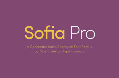
Sofia Pro

Sofia Pro by Mostardesign ships with more than five hundred glyphs to support a great deal of languages. It has
- sensitive forms;
- small caps;
- fractions;
- contextual alternatives, and much more.
Elegant letterforms convey modernism and stylishness that are appropriate for displaying texts and titles.
Jenna Sue

Jenna Sue by Jenna Sue Design is a perfect tool for establishing non-verbal communication in a friendly and informal tone. It is a cute hand-drawing typeface with charming details. It mimics human letters effortlessly. It comprises only the essentials: more than one hundred glyphs for composing a copy of various lengths.
Tetra

Tetra by Alexey Frolov is an original take on plain sans serif typefaces. The font is pretty decorative and possesses charisma. Due to its hybrid nature, it fits very well with modern and vintage designs. It is equipped with just one style, Regular, and letters of Roman and Cyrillic writing systems in uppercase.
Stiff Staff

Stiff Staff by Borislav Petrov is a fancy and figured font for dressing up headlines. It is bolstered by well-thought-out spacing and optimal kerning. Its sharp asymmetrical zigzag forms in tandem with bold lines produce a powerful impression. It is designed to deliver messages in Roman and Cyrillic languages in small caps.
Corki

Corki by Typedepot possesses an allure that won’t leave viewers indifferent. It is enhanced with some tiny yet well-elaborated details. The team has recently updated the font having included the Cyrillic alphabet. There are four styles (Normal, Rounded, Tuscan and Tuscan Rounded), uppercase and lowercase letters, numerals, and a bunch of graphical stuff such as old-fashioned ribbons or arrows.
Ananda Namaste

Ananda Namaste is crafted in the spirit of Asian cultures. It is a professionally imitated Hindi font that stands out from the crowd. It ships with the Roman alphabet, numerals, and common glyphs. There are three styles that can be used for different purposes.
Deftone Stylus

Deftone Stylus is a typical brush script with wonderful swashes that save titles from looking dull and gloomy. The artist has carefully designed each character. You will be delighted by the glyph coverage that consists of custom OpenType features, fractions, numeric ordinals, accented symbols and much more.
AleksandraC Vintage

AleksandraC Vintage by Aleksander Shevchuk has a diverse nature that causes different emotions. There are two options: an old one for nostalgic designs, and the modern one for contemporary UIs. You will find here the English alphabet in capitals and small caps.
Teléfono

Telefono is an extremely decorative typeface. Arnold Hoepker was inspired by the 20s so that the font establishes a fascinating atmosphere of posters made in Art Deco style. It is an ideal solution for printed media that needs to add spice and focus users’ attention on vital information. Roman alphabet, numerals and a slew of accented letters are available in the product.
Typography is an art combining perspective, technique and ingenuity. A great design comes with great typography. Whether you are creating for web or print, designing brochures or user interfaces, developing a brand identity, or creating a logo, one of the key elements of a successful project is the typeface you are using. In fact, the combination of fonts, color choices, and design options is what separates success from failure. An overlooked detail is enough to flush all the creative effort you’ve devoted to building an outstanding product. Thankfully, there are a lot of resources to guide you in your pursuit of great typography.
Start with Emil Ruder’s amazing “Typographie: A Manual of Design,” or Ellen Lupton‘s “Thinking with Type: A Critical Guide for Designers, Writers, Editors, & Students” or predict the future of typography with Henrik Kubel and Scott Williams in “New Perspectives in Typography,” a stunning showcase of some of the best contemporary type design. And if you are looking for raw inspiration, here are the 50 bestselling fonts of 2016.
And there are so many great options to choose from. Whether you are a fan of a simple sans serif, a more traditional modern serif, or something with long tails and flourishes, we have a great list of options to try in the coming year.
When it comes to typefaces, personal preference has a lot to do with it. So while this list contains plenty of variation – some popular choices and some lesser-known typefaces – the goal is to help you find a little new type inspiration.
Whether you are a fan of Google Fonts or prefer a downloadable option, there are plenty of great typefaces out there that you can use royalty-free. (Adobe’s Typekit also includes a nice selection for Creative Cloud subscribers – you can debate whether these options are “free” or not.)
The Google options are particularly nice because they are tested and work exceptionally well across platforms and devices (as you might expect), and the platform is easy to use.
Maven Pro
Maven Pro is an original Sans Serif free font that was improved with geometric shapes. It exudes an image of modernity, stylishness, and elegance. Created by Joe Prince, it features three ultra-light weights. The extensive glyph coverage lets it collaborate with a ton of projects.
Conclusion
Now you can convey your message in a more elegant way. This can be achieved through the use of proper typography. The accuracy, precision, and balance of geometric forms can give letters the style and sharpness they deserve. Typography is an essential part of professional designers and for those who want to make it big in the promotion market. Among other things, effective fonts manage to achieve three necessary objectives of web designing.
They are Look, Appearance, and Outcome which keeps them apart from the normal wave. An effective logo demands simplicity, distinctiveness, versatility, and appropriateness. Some information about the most popular free fonts used by professional designers might help you in the long run of graphic design. Fonts like Helvetica are used by professionals as well as by non-professionals. The characters are spaced too tightly and depend on the situation to be used.
Trajan finds its way into many Hollywood movie posters and anything remotely to do with religion, law, marriage, class, or the past. Garamond is a great font for magazines, textbooks, websites, and long bodies of text and was recently named the second-best font after Helvetica. Futura is based on geometric shapes and comes up often in large displays, logos, corporate typefaces, and books where small text is needed. Bickham Script Pro is a font used mainly for formal occasions.
Bodoni has a narrow underlying structure with flat, unbracketed serifs. This free font gets its important for headlines, decorative text, and logos. The Frutiger font is designed so that each individual character is quickly and easily recognized. Such distinctness makes it good for signage and display work. Fonts being the most important part of every web Project need a watchful selection before applying them to your design as with many selective collection font posts around, it often leads to big confusion as to which typefaces are really useful for your project or how to choose your font from the list of hundred fonts.
Here is our list of free fonts for this year, what are your preferred fonts and font families this year?