Designing Content Upgrade Signup Forms that Grab Attention
The best email opt-in forms use a lead magnet to draw attention and gather emails. You can spend weeks tweaking a signup form but the biggest factor is usually the content offer.
There’s a special type of lead magnet called a content upgrade which gets placed on a relevant piece of content. This usually converts much higher and it’s a great way to add value to your subscribers.
In this post I’ll explain the basics of an e-mail opt-in content upgrade, how you can design one yourself, and some examples you can study to get the ball rolling.
Intro To Content Upgrades
The idea behind a content upgrade is simple: you offer something valuable to visitors in exchange for their email.
This valuable item could be a free PDF guide, icon set, photography pack, or really anything. But this technique works best on specific posts where your free resource actually upgrades the existing content.
So for example, if you write a post about “best icon design styles” you might add a small opt-in form at the bottom of the article offering a freebie icon set. When the user enters their e-mail to sign up they get a link to download the icon pack & they get added to your list.
With Postcards Email Builder you can create and edit email templates online without any coding skills! Includes more than 100 components to help you create custom emails templates faster than ever before.
Free Email BuilderFree Email TemplatesThis resource is relevant to the content and valuable to the reader. It’s a fantastic example and just one of many you could run.
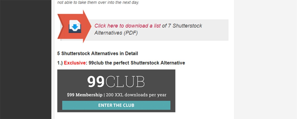
Backlink expert Brian Dean has this tactic scattered on many of his Backlinko posts and they work well. He suggests thinking outside the typical “norms” you see in most blogs.
Try to offer genuine value to your readers and make it almost impossible for them to pass over your freebie.
No matter what you offer the end result is always the same. You want to add more subscribers to your email list. And the way you’re trying to gain those subscribers is always through some type of content upgrade.
You just need to decide what sort of upgrade you can push that’ll encourage more signups. That’s the secret sauce to any great content upgrade field.
What To Offer
If you’re stuck for ideas you should find posts that get the most traffic and design around those.
Dig through your analytics and find your top performing pages. Think about what sort of resource(s) you could offer on that page that might convert.
With Startup App and Slides App you can build unlimited websites using the online website editor which includes ready-made designed and coded elements, templates and themes.
Try Startup App Try Slides AppOther ProductsOne thing people don’t want is something unrelated to the content. If people land on your post about React.js they probably don’t want a PDF on the 10 upcoming design trends for this year.
Instead they might want a PDF on React.js trends, or the best learning resources, or maybe a look over the history of React.js as a PDF/infographic.
The sky’s the limit on what you can offer. Just make sure it’s fairly short and genuinely relevant to the content.
Here are some ideas to get you started:
- A small how-to or PDF guide
- Free resources like photos, icons, code snippets
- Extra tips/tricks on the subject
- Behind-the-scenes tips from experts in the industry
- A detailed “getting started” guide or case study
Picking a resource to offer is just the first step, but it’s an important one. If the freebie sucks then you haven’t really upgraded your content at all!
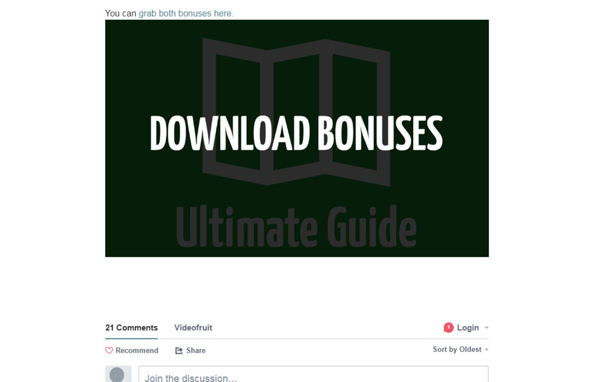
This example is a post about floating sidebars in web design. The author has a content upgrade with a swipe file of copy, code, and resources for anyone building floating sidebars. This relates directly to the post and it probably wasn’t too difficult to compile these resources either.
Don’t spend too much time thinking up ideas but make sure you settle on one you like. From there you can develop the resource and edit your blog post with an opt-in form.
And if you’re really stuck on ideas then read through this article to get the juices flowing.
Marketing Your Upgrade
How you showcase the upgrade is yet another crucial aspect of the opn-in form. You might be offering the coolest PDF guide in the world. But if nobody knows what it is then why would they want it?
Written copy sells and it’s always something you need to consider. Sometimes you can get away with smaller text-based forms or simple CTA buttons. The only way to know is through A/B testing so try a lot of different styles to see what works.
And try adding multiple opt-in fields within the post. You could have one near the beginning, another fixed in the middle, and one at the very end of the article. This way readers continually see what you’re offering and hopefully it draws their attention.
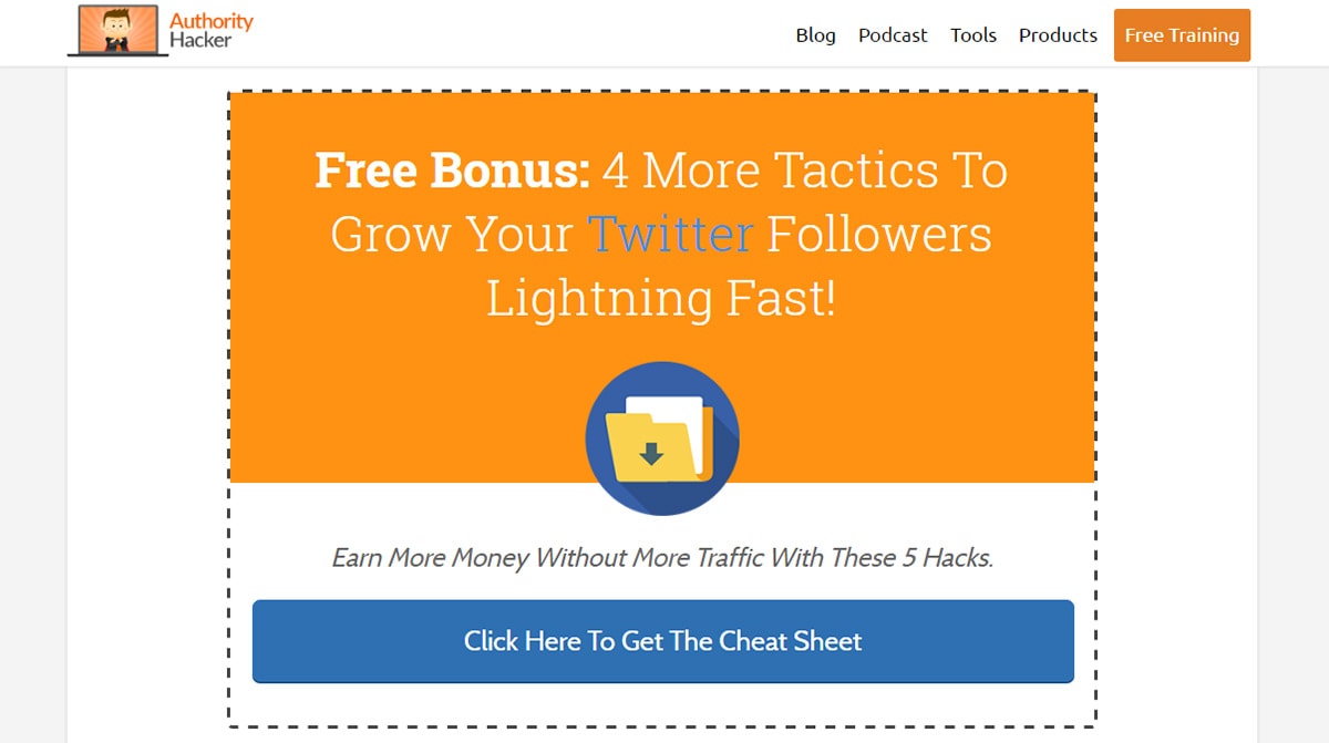
The example above from Authority Hacker doesn’t use any special graphics or previews. It just has large text with bright colors to grab your attention.
This is certainly a way to go if you can’t find any graphics to use. But you might see better results if you can get screenshots from your resource added to the form.
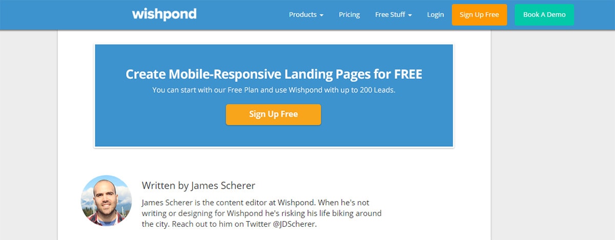
A much simpler example can be seen at the bottom of this post by Wishpond. It just has a blue CTA button with a bit of white text.
Each piece of content has a unique target audience so you’ll want to design your opt-ins for those readers. There isn’t really a “right” way to do this.
I recommend studying your favorite blogs and keep a sharp eye for these content upgrades. They’re hard to miss and the ones you do miss probably aren’t that good.
Read their copy and see how they push their upgrade. Does it make you want to sign up? Is there incentive?
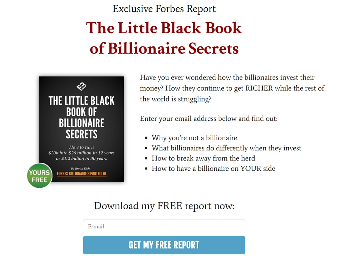
This Forbes post just has a simple text link near the bottom of the article. No button, no graphics, nothing. Just a link pushing an e-book on the billionaire’s secrets of wealth, a very magnetic link which ultimately leads to this lander.
Follow whatever marketing strategies work best for your resource. Be willing to test and don’t get stuck with one specific method.
The more marketing techniques you try the more likely you are to find one that converts well.
Visuals Sell
Along with amazing sales copy you should also try adding visuals to the top-in form.
These can be simple graphics, mockups, photographs, or pretty much anything that represents your freebie. It doesn’t matter what you’re giving away as long as it’s clearly noticeable.
Take for example this opt-in field in the sidebar of Michael Hyatt’s website.
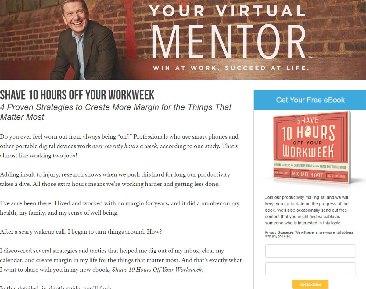
It specifically targets the headline of the post by promoting a free e-book on shaving 10 hours off your workweek. The book cover mockup is placed into the form to draw attention.
You can find tons of free ebook mockup PSDs in Google which you can modify for your opt-in field. Just take the front cover design and paste it onto these skewed mockups. A gorgeous eye-catching visual ready in minutes.
But visuals aren’t just pictures or graphics. You also want to think about your opt-in field colors, fonts, and related aesthetics like spacing.
According to Brian Dean’s post a yellow opt-in box near the top works very well. This color draws attention and if you’re offering something cool it will get people interested.
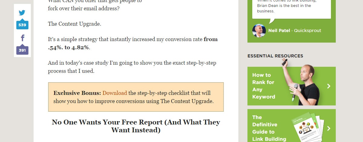
But just because one visual technique works on Brian’s blog doesn’t mean it’ll work for you.
Testing is the name of the game so don’t get discouraged if you can’t find a winning design right away. Just be consistent and keep trying.
A great content upgrade doesn’t always sell itself so you’ll need to push for growth. But it also doesn’t take much to get people interested. Place yourself in the shoes of a typical visitor and design your opt-in form with the goal of getting their attention.
Moving Forward
Content upgrades should become a staple for any site with a newsletter. They do take patience to set up and you’ll need to put in effort creating a valuable asset.
But if you already have a large blog with a sizable audience then you’ll have content ready to optimize. Hopefully the tips & examples in this post can get you started on the right foot.
And if you want to learn more about marketing to increase signups you should skim through our related posts on this topic:
- Why Good Design Gets Better Marketing Results
- Best Designed Sign In/Signup Web Forms and Buttons
- Why Web Designers are Choosing the Emotional Approach to Attract More Clients
