25 Delightful Flat Design 2.0 Websites for Inspiration
Bigger. Better. More intricate details. These days, flat design has progressed into something a little less… flat.
In an on-point description of the newest iteration, Ryan Allen calls it “Flat Design 2.0.” His article for Dapper Gentlemen lays out what flat design was before, what it is now, and even sheds some light on why.
Flat design remains a popular technique today because its simplicity aids responsive design — but over the last few years has undergone some refreshing changes.
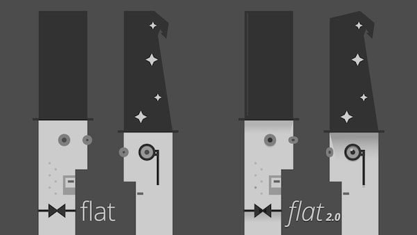
As you can see in Ryan Allen’s fantastic illustration above, the most notable change between the original flat and flat 2.0 is the additional details. Highlights, gradient shadows, dropshadows, elements with more values. Flat design is no longer an antithesis of everything skeuomorphic.
Many of the original features, however, remained unchanged. Flat 2.0 still retains its minimalistic simplicity, though slightly less so. Its bright and fun use of color is still prominent. And its unadorned typography aimed at legibility is still seen.
With Postcards Email Builder you can create and edit email templates online without any coding skills! Includes more than 100 components to help you create custom emails templates faster than ever before.
Free Email BuilderFree Email TemplatesBut instead of talking about the differences, we’ll go ahead and show you. If you’d like to learn the techniques behind 9 other modern design trends (complete with 165 hand-picked examples), check out the free e-book Web Design Book of Trends 2015-2016.
Cybeer Bar
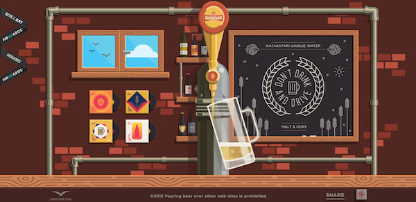
Cybeer Bar is a great place to start: they stay true to the basic, simplistic style of flat design, but take it to an extreme with an intense layer of detail. The wood panel of the bar says it all — only two colors and clearly distinct, almost blocky shapes, but with meticulous application for elaborate detail.
Christmas with Joy
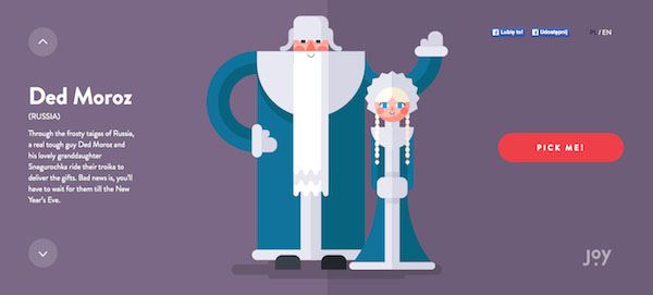
Christmas with Joy uses flat design illustrations to showcase cutesy versions of popular Christmas characters around the world. Notice the smooth shapes and distinct shading.
Dropbox Guidelines
The sketches on the Dropbox Guidelines site flirt with realism, but are still simple enough to be considered flat, especially when joined with the bright blues and reds, and the simple typography.
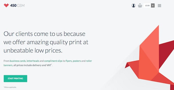
450 GSM
With Pulsetic you’ll be instantly notified the moment your website, API, or server becomes unavailable. Monitor uptime from multiple global locations and respond to incidents before your users are affected.
Create beautiful status pages in minutes to keep customers informed during outages and build trust with transparent communication.
Start Monitoring for FreeThe 450 GSM site could still be considered as original flat design, if not for the slight shadow beneath the bird. Fun fact: this site was actually built with the Startup Design Framework, which makes it easy to create beautiful sites quickly.
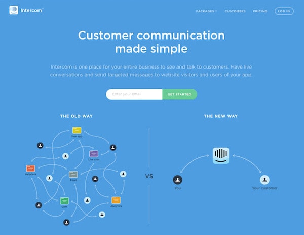
Intercom
The bright blue background, stylistic icons, and unobtrusive typography make Intercom a poster site for flat design. Notice the rounded edges on the icons, buttons, and boxes.
Agency Survival Kit
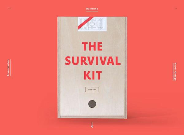
While the minimalism and pastel red are typical of original flat, the texture of the book and mild shadows make Agency Survival Kit part of the 2.0 movement.
Hell‘o Baby
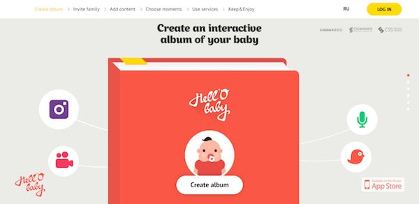
Despite the flashy font at the top, the color choices, rounded edges, and oversimplified icons are all classic flat elements.
Helbak
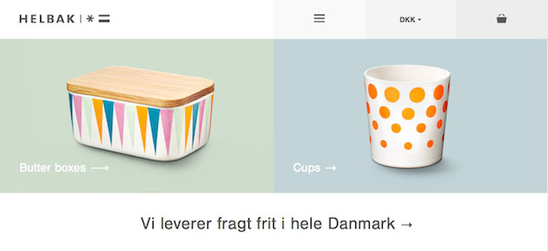
Looking closely at the product pictures, you’ll notice a shadow effect over a pastel-colored background, adding flat elements to the site for this Scandinavian ceramist, whose work is already characteristic of flat design to begin with.
Paye Ton Caps
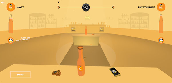
The graphics for this French online game are pure flat 2.0, with their homely style and obtuse shading.
CSS Conference EU
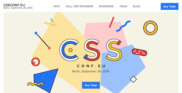
The traditional flat color palette combines with some ornate details to make the CSS Conference EU site a representation of modern flat design.
Take It
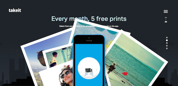
Using layers, the site for the Take It app combines real photography with the flat style. Notice the city background done in the typical flat style.
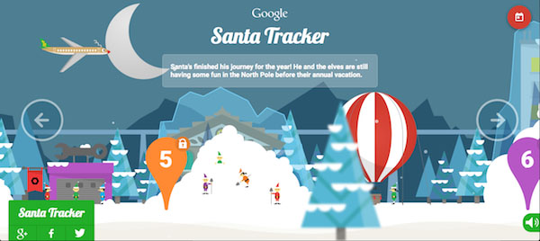
Google Santa Tracker
Flat design works well with Christmas themes, it appears. Google Santa Tracker proves that flat design isn’t always minimal — not only is the screen busy with individual elements, the constant animation of the snow and background vehicles make this a page that’s entertaining to watch. Notice the blurred out tree in the foreground to give a 3D effect, especially with the parallax scroll.
For Better Coffee
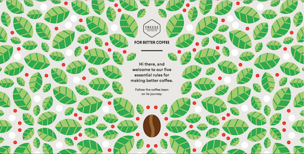
While lacking shading elements, the multitude of details and clear distinctions between colors allow this creative scrolling site to be classified as flat design 2.0.
Dots
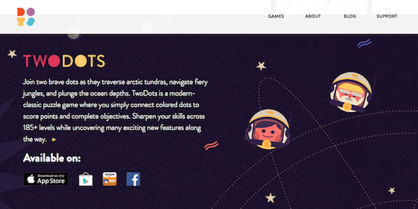
The official site for the Dots games made a wise choice with flat design 2.0, as the style enhances its joyful gaming atmosphere and facilitates the site’s fun web animations.
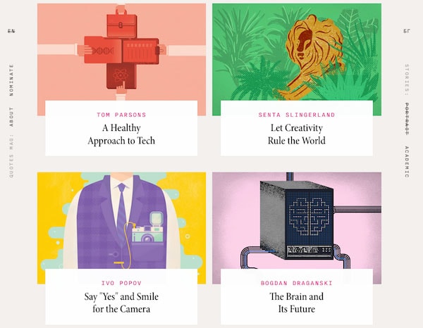
Quotes Magazine
The serif font and heavy texture, while not pure flat elements, give Quotes Magazine a more refined feel to enhance the bright colors and catchy visuals.
Who Is This F*cking Bear?
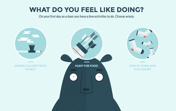
Who Is This F*cking Bear combines the conventional elements of flat design (rounded edges, basic shapes) with dreary colors (accented by the occasional orange flourish) and a high level of detail (take a close look at the bear’s fur).
Stash Flat Icons
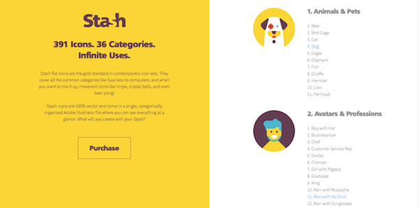
A site done in flat design to promote flat design icons, Stash Flat Icons showcase bright colors and plain typography, not to mention the character style of icons in flat 2.0.
Acapo

Not every flat site needs to have cartoons or goofy humor. This intellectual property law firm uses pastel colors, a minimalist design, and an easy-to-read font to demonstrate their professionalism but also their warmth.
Liberio
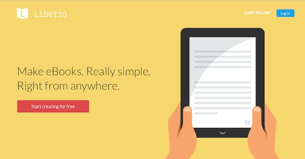
Liberio is another textbook flat design site, from the bright colors, to the modest font (except for the company name), to the smooth and overly simplified image of a tablet.
Kaipoche
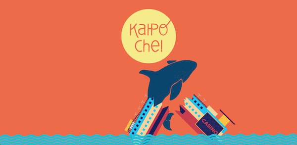
The warm colors and cartoonish style really complement the fun vibes of this scroll-animated site for a kite-flying festival.
Team Treehouse
Leaning more towards the old-fashioned interpretation of flat design, Team Treehouse shows off the increased detailing of 2.0 in its modern icons.
SCEATT
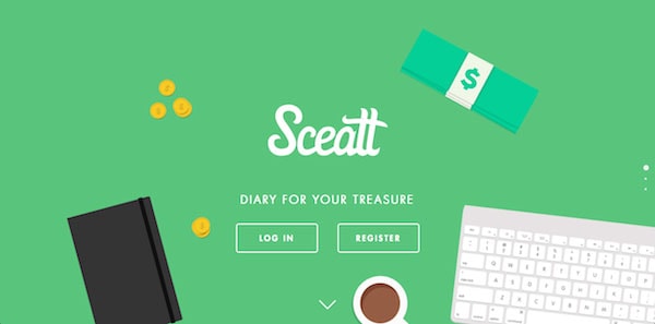
You may not usually see financial sites adopt such a light-hearted style, but both SCEATT’s casual tone and marketing as an easy-to-use app make flat an appropriate choice.
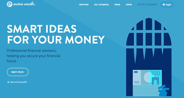
Evolve Wealth
As with SCEATT above, Evolve Wealth sets itself apart from other financial companies with the warm atmosphere and humor of flat design.
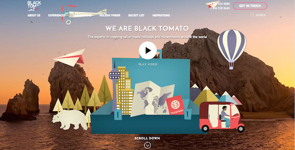
Black Tomato
Another site that combines photography and graphics, the two images on Black Tomato’s home page play off each other — the contrast of a gorgeous, HD photo and heavily stylized, cartoonish graphics accent the best points of both.
Lander
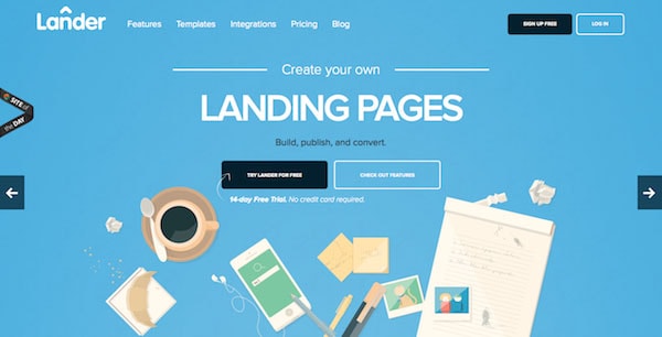
The graphic on the bottom of Lander’s page demonstrates the modern take on flat design. While retaining the blocky style, the level of detail is stepped up, as is evident by the etchings on the pad, the glare off the photos, and the shading on the crumbled paper.
Conclusion
The new flat design is a welcome new style, bringing more options to what designers can do, without sacrificing the delightful characteristics that made flat design popular to begin with. We look forward to seeing how flat evolves in the future.
For a more in-depth analysis of modern web design techniques — including the most dominant traits, how to implement them, online designing resources, and 165 hand-picked examples — check out the free ebook Web Design Book of Trends 2015-2016.
