Best Status Website Badge Examples: How to Customize the Design
Do you know that visibility of system status is one of Jakob Nielsen’s 10 heuristics for user interface design? According to the most famous and respected web usability consultant and human-computer interaction researcher, who holds 79 patents on making the Internet easier to use, system status should be presented in every web platform regardless of its niche, scale, age, and market.
A decade ago, this recommendation was met with a particular cold and only big names followed this advice. Today, it is a well-established standard for businesses in the digital expanses. Recent studies show that transparency is a top factor in creating a great user experience. It ensures the brand’s strong reputation, reinforces healthy relationships with the clientele, generates leads, and prolongs the life of the product and organization.
Visibility of system status is primarily realized through status website badges, which signal the operational state right away, and public status pages, where the online audience may get acquainted with such vital information as system metrics, maintenance calendars, and incident data.
While the latter is on everyone’s lips, the status website badge feels like uncharted territory. However, it is not. It goes along with the status page and reinforces its presence from the very beginning. Let us dive deeper into status website badges and consider some excellent status website badge examples to see how SaaS companies have brought this solution to life.
What Is a Status Website Badge?
As the incident management team puts it, the status badge is a visual cue intended to attract visitors’ attention and provide a piece of vital information about a dynamic component.
In a web platform, it is a visual or textual representation of the website’s health, also known as system status. Much like the deploy status page that shows the current situation automatically, it also stays in sync with the monitoring tool and is updated to show the current situation.
With Postcards Email Builder you can create and edit email templates online without any coding skills! Includes more than 100 components to help you create custom emails templates faster than ever before.
Free Email BuilderFree Email TemplatesDepending on the niche, the scale of the business, and information that the target audience finds valuable, it may indicate the product’s status, a specific feature, service, or all system’s units and functions at once.
Generally, a status badge reflects three general conditions:
- The system is OK, and all services and tools work fine.
- The system malfunctions or an incident has occurred, and resolution is in progress.
- The system, service, or feature is down or unavailable.
However, sometimes you can see these states as well:
- Degraded Performance
- Partial Outage
- Major Outage
Each state has a representation. Some incident management teams opt in favor of labels (you can see a badge with the “System is OK” or “System is down” title). Whereas others prefer color-coded indication that implies using green for a healthy state, orange for the resolution being in progress, and red for inaccessibility of the system.
The latter option is more popular for these reasons:
- It is comprehensible by all visitors regardless of their language and culture.
- It instantly catches attention; according to studies about eye movement, numbers and graphics efficiently stand out from the text, becoming the first ones to grab the user’s attention.
- It is easy to bring to life.
- It is scalable, responsive, and accessible.
- It is neat and clean and occupies just a tiny fraction of precious space.
As a rule, status badges are read-only indicators or labels. However, some teams make them interactive by turning them into buttons or adding small tooltips to the icons or labels to describe the situation briefly. Sometimes teams get two approaches together by indicating the system’s health through a well-designed tandem of label and symbol.
It is common to add a status badge in the footer. However, some platforms, whose target audience heavily relies on a system’s health, may feature it in the header to minimize users’ efforts to get the crucial information. Status badges are linked with status pages so that online visitors can quickly navigate to the report and familiarize themselves with the issue, overall situation, and resolution details.
Status website badge on Pulsetic
With Pulsetic you’ll be instantly notified the moment your website, API, or server becomes unavailable. Monitor uptime from multiple global locations and respond to incidents before your users are affected.
Create beautiful status pages in minutes to keep customers informed during outages and build trust with transparent communication.
Start Monitoring for FreeImportance of a Status Badge on a Website
A lot has been said about the importance of incorporating public status pages in the web platforms; however, what about this tiny component that usually occupies a decent place in the footer?
As successful companies and professional marketers agree, it also comes of massive significance to the present-day digital business, especially those who are up to strong relationships with the customers and prospects.
Akin to The Google Partners Badge that showed how the company is progressing on meeting the Partner requirements, thereby instilling trust in the company, the status website badge bolsters confidence and improves the company’s reputation.
It also offers some other serious benefits that may help the company secure its position in the market. For instance:
- It builds trust.
- It increases the credibility of the platform.
- It improves the reputation of the brand.
- It qualifies the brand.
- It separates the company from the competition.
- It contributes to the incident management process.
- It eliminates confusion and obscurity.
- It reduces support tickets.
- It reduces the tension of communication silos saving the support team from trivial requests.
- It frees time for the team.
- It keeps customers in the loop.
- It is an integral part of an effective problem-solving environment and intuitive user experience.
Visual indicators are nothing new in the UI landscape, and status website badges are no exception. They are native to the digital crowd. Plus, they are simple yet effective devices to deliver the right message. Therefore, they consider being great tools to communicate information and avoid confusion that may occur during incidents and maintenance modes.
Best Practices of Good Visual Indicators in Websites
Before moving to the routine of creating and adding status badges to your website, it is crucial to understand the basics of implementing visual indicators in web design. Consider these best practices:
- Classify status indicators into levels. In general, this practice implies such states as high, medium, and low; however, when it comes to the system’s health, these states are normal operations, degraded operations, partial outage, outage, and scheduled maintenance.
- If you want to implement color indication, stick to these standards:
- Green – No known issues and scheduled maintenance.
- Orange – Investigation is in progress.
- Red – Outage or unavailability of the system.
- If you use labels, you may go for these options: “System is down” or “Operational system is go.”
- Stick to stereotypes and well-established principles in design.
- Use the highest-attention color to represent the consolidated indicator. As a rule, it is red.
- Do A/B tests of different status indicator variants to find the best option for your audience.
- If you use labels, make sure they stand out from the crowd. Underline them or set them in eye-catching color.
- Stay consistent with the design.
Last but not least, do not use status indicators if status information is not important enough to highlight to avoid cognitive overload.
How to Create a Status Badge and Add It to a Website
A status website badge can be presented in two options. First, it can be a visual indicator made as a circle or any other geometric shape or graphical elements like an icon or pictogram. Second, it can be brought to life as a label. Depending on your target audience’s preferences, you may choose one or another option. It should always speak to the target market and resonate with prospects and visitors.
Displaying a status website badge does not cause problems, especially for the tech department: whether it is a circle with three states or a label. Either can be easily realized through Cascading Style Sheets. The main problem is creating a real-time connection between the graphical representation and the system’s health state. Therefore, it can be tricky and challenging, especially for non-tech-savvy entrepreneurs.
The way out is to use online tools to create and add status website badges to the platforms. Consider Pulsetic as a case in point. It is a popular website uptime monitoring service where small- and mid-sized companies track the system’s health and report to their stakeholders about the overall operational state and vital metrics through public status pages. It is also a reliable instrument for creating and adding status website badges.
The routine of creating and adding a status badge to a website through Pulsetic is straightforward: everyone can handle it. It is broken into several steps:
- Set up an account in Pulsetic. The platform offers a free plan so that you can give it a test drive. If you decide on the platform, you may enjoy one of the most cost-effective prices in this niche.
- Set up a status page. It is easily done through the intuitive interface and dashboard, including only necessary features.
- Go to the menu on the left and select the Status Badge. You will see a customization page.
- Use the customization page to design and edit a badge to make it fit the platform. Pulsetic offers a variety of design options so that you may easily create a fully customized version. For starters, you may decide on the type of the badge: it can be a button, icon, or label. Then, you can choose a font family and set weight and style for characters, modify the color of text, inner text, and symbol, and assign a color for the frame background. On top of that, you might add custom text for each of three general states (operational, unavailable, and investigation) and declare custom CSS styles.
- Copy the code to the clipboard and paste it onto your website.
After that, you can edit the status website badge on Pulsetic and see changes on your website right after saving them.
G2 reviewers have awarded Pulsetic an impressive 4.8-star rating, highlighting its standout performance in comparison to its competitors.
For those who need visual guidance through this routine, you should check the video tutorial created by the team, How to Create an Uptime Status Badge and Insert It to Your Site.
Video tutorial on how to create and add status website badge to the website
Status Website Badge Examples
We have handpicked eight real-life status website badge examples to demonstrate that this approach brings necessary value to the target audience and stakeholders and helps the business stay in the game.
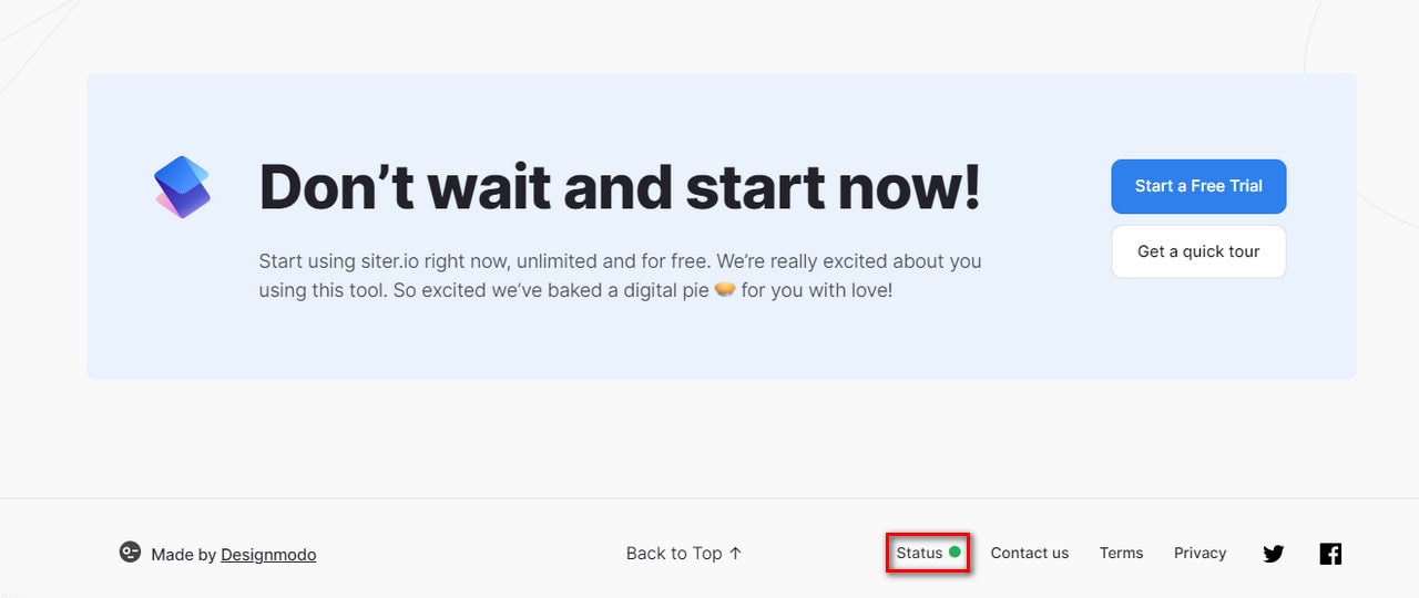
Siter is a popular online tool for designing websites without any coding skills. The team provides a comprehensive yet relatively intuitive builder with numerous features to track. They offer a free domain, team collaboration from across the Globe, and Cloud storage. All these features are crucial for their clients. Therefore, the status page and status website badge were skillfully implemented on the platform.
The status website badge occupies its place on the footer. It is a color-coded indication that everyone understands perfectly well. Along with that, it has an accompanying title that clarifies its purpose. Simple, yet effective.
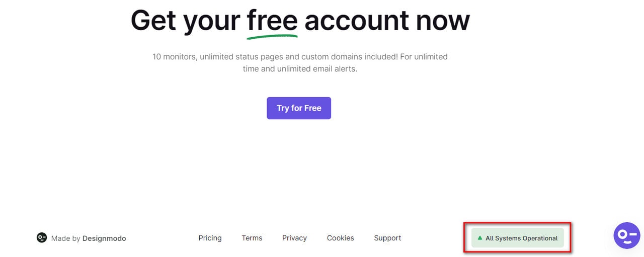
Talking about simplicity and effectiveness, Pulsetic provides us with another excellent status website badge example.
The platform is famous for its reliable instruments for monitoring website uptime from data centers scattered throughout the World, sending downtime alerts through various channels, and building status pages.
As a valid player in the niche of digital tracking devices, it is no surprise that the team has introduced a status website badge on the platform. Their prospects and clients expect to see it there. Plus, it provides much-needed information for stakeholders about the overall system’s health right away.
Note the design of the status website badge. Unlike the previous example, the team has opted in favor of the label and graphical representation put together. This way, visitors can quickly scan it and get much-needed data.
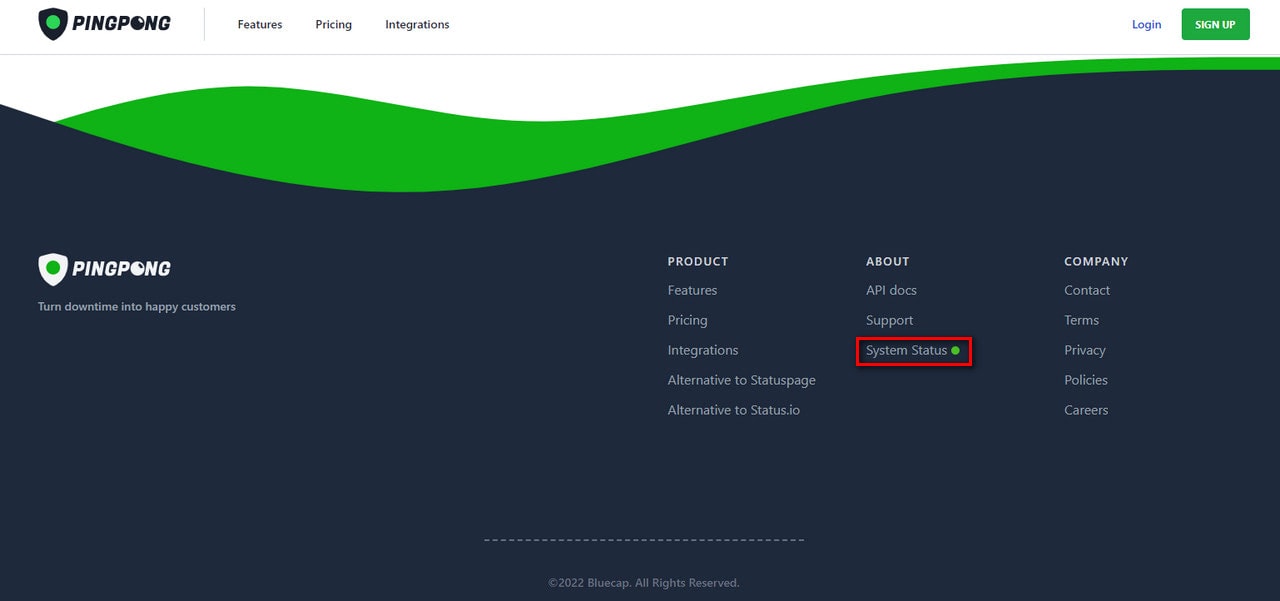
Pingpong Website
Pingpong also works in the niche of monitoring platforms. Although it does not have such a comprehensive set of instruments, it keeps its target audience updated about the operational status because this type of information matters to them.
Their status website badge meets all the criteria, playing its role perfectly well. Despite being a part of the footer navigation, it instantly catches an eye thanks to a smartly selected range of colors. On top of that, it has an accompanying label that says “status” to eliminate confusion and misunderstandings.
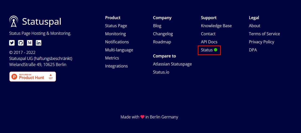
Statuspal
Statuspal offers essential monitoring tools to communicate incidents and maintenance. The key feature of this platform lies in hosted solutions so that clients can create status pages quickly and efficiently.
Notifying clients about the outages and scheduled maintenance is crucial to stay in the game, to say nothing about easing the tension and avoiding the hustle and bustle of communication silos. Therefore, the team has provided a comprehensive status page and, most importantly, introduced the status website badge.
The latter is made in the same fashion as in the case of Pingpong. It is a title with a graphical indicator whose design benefits from well-established principles. The team uses these notions:
- Green color is for no known issues
- Orange color is for maintenance mode
- Red color is for downtime
Placed in the footer, it carries out its duty pretty well, delivering the system status without much hustle and bustle.
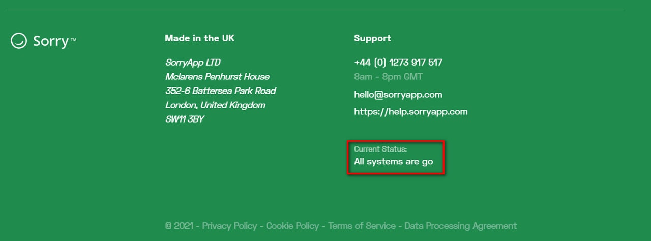
SorryApp
Have you ever wondered what it would be like if you had placed the huge status website badge at the top of the page? Check out SorryApp, it could look like this.
Although this is just an illustration with an operational status, however, you might see the flaws in this approach. First, it is too overwhelming for the stakeholders. Second, it contradicts with basic marketing rules that imply using hero area for promoting the product or company. So, after all, it is not a good idea.
However, still the platform needs this element. Therefore, the team has worked into design a label-based operational status right at the bottom. It instantly catches an eye thanks to clever styles and provides necessary value to the stakeholders.
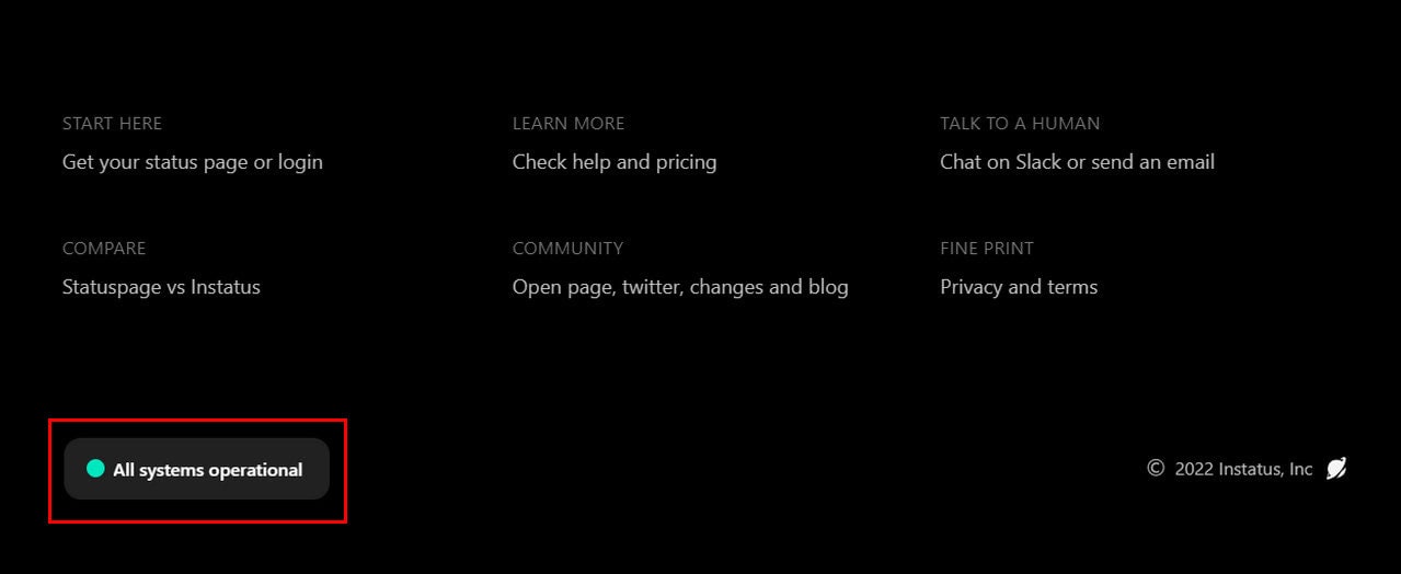
Instatus
Instatus offers just one feature – building hosted status pages for companies. As befits services in this sector, the team does not stay ignorant to the expectations of their clients and potential leads. They inform them about the system’s operational status through all possible means, thereby providing us with another excellent status website badge example (see status page examples).
The status website badge stays in stark contrast to everything we have already seen. It is made as a vast button that features the title and a supporting graphical element. On top of that, it perfectly complements the techy environment reinforcing the general atmosphere and improving the user experience. The component is hard to miss.
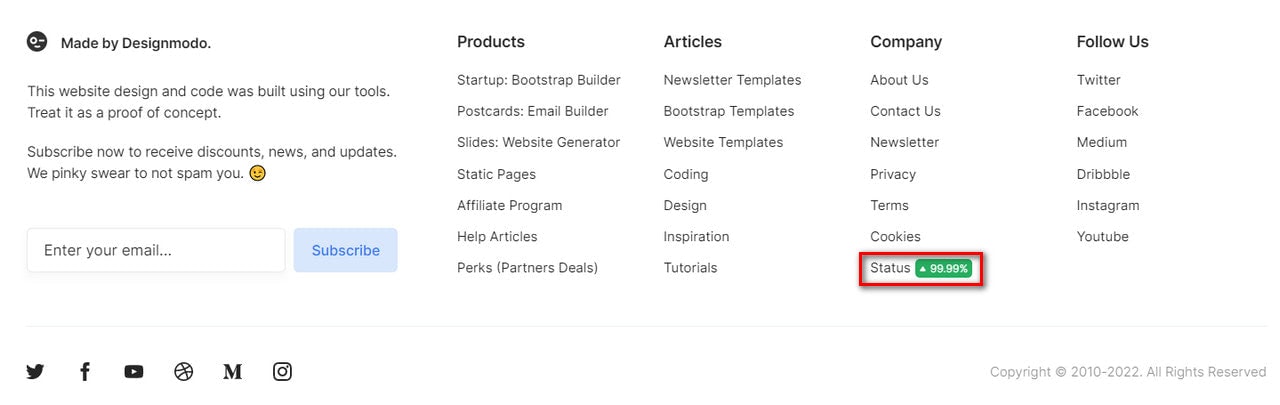
From single-feature platforms to multifunctional services, let us explore some fantastic status website badge examples in platforms with an impressive portfolio and a versatile target audience. Consider Designmodo, one of those successful companies with a range of products under its hood.
The company offers an online Bootstrap builder, professional email builder, website generator, and creator of static pages. All these products work in the digital expanses, covering more than 30,000 customers.
Therefore, it is no surprise that the team has incorporated the comprehensive status page and added the status website badge to the footer to keep their clients on track. The latter shows the operational status and uptime to communicate the essential information instantly and clarify the confusion.
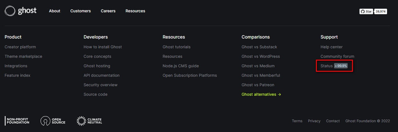
Ghost.org
Ghost is also a company with a range of products in its portfolio. It offers tools to build websites and create newsletters and paid subscriptions. Plus, it has a marketplace.
Providing the relevant information about the system’s health is crucial to ensure their clients cling to their platform. The competition is tough in this sector. Therefore, they have added a status page and a status website badge to the homepage.
Like Designmodo, the team also shows the operational status and uptime killing two birds with one stone. However, they do not use color identification; therefore, at some point, this information blends into the surrounding, making it difficult to get information right away.
Conclusion
Recent studies show that current expectations of the digital market are increasingly high. People demand companies not only raise their bar of quality in products and interactions through all possible distribution channels but, most importantly, ensure transparency in their platforms and avoid confusion in communication.
To reach this standard, companies implement various approaches in their web projects, and one of them is creating a public status page, where users may familiarize themselves with vital metrics like uptime and maintenance schedule at any given time, and a status website badge that delivers information about operational status right away.
The sad truth is that many startups and young entrepreneurs ignore this approach, especially the tiny indicators in the footer. However, little things make a huge difference, especially when it comes to providing a user experience for customers and visitors. They demonstrate the much-needed transparency and help avoid confusion and misunderstanding, keeping visitors in the loop and maintaining the company’s hardly-earned reputation.
Follow our guide and get some real insights from status website badge examples provided by successful companies and big names to implement them in your project and stay in the game by meeting the expectations of today’s market.


