Create a Full-Screen Navigation Menu in CSS3 & jQuery
Difficulty: Intermediate
Estimated Completion Time: 30 minutes
In this tutorial, we are going to create a Full-Screen Navigation Menu using HTML, CSS3 and a little bit of jQuery. For this tutorial, we’re going to use Google Fonts, specifically Montserrat. Make sure you include it.
Like always, the first step is to create the HTML structure. Here’s what we need:
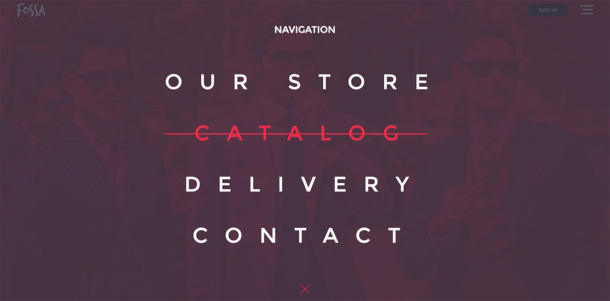
- A navigation bar where we’ll put a logo on the left, and two buttons on the right, a sign in button and a menu button which will activate the full-screen overlay a when user clicks it.
- Full screen overlay menu, where we’ll have the menu and a close button.
Here is the markup:
<!-- Navbar -->
<div class="navbar">
  <img class="logo" src="images/logo.png" alt="Foss Logo"/>

  <div class="navbar-buttons">
    <button class="button" type="button" name="button">SIGN IN</button>
    <span><img class="open-menu" src="images/menu.svg" alt="Open Menu"/></span>
  </div>
</div>

<!-- Overlay Navigation Menu -->
<div class="overlay">
  <h2 class="nav-title">Navigation</h2>
  <nav class="overlay-menu">
    <ul>
      <li><a href="#">Our Store</a></li>
      <li><a href="#">Catalog</a></li>
      <li><a href="#">Delivery</a></li>
      <li><a href="#">Contact</a></li>
      <li><img class="close-menu" src="images/close.svg" alt="Close Menu"/></li>
    </ul>
  </nav>
</div>
Great! Now that we’ve set up our html strcture, let’s go to the next stept and make it look awesome!
CSS
First, style the body and the navigation bar. We’ll give some basic styling to the body and add a cool background image.
With Postcards Email Builder you can create and edit email templates online without any coding skills! Includes more than 100 components to help you create custom emails templates faster than ever before.
Free Email BuilderFree Email Templates
* {
  box-sizing: border-box;
}

html, body {
  height: 100%;
  width: 100%;
  margin: 0;
  background: url('images/bg-final.jpg') no-repeat;
  background-position: 50% 10%;
  background-size: cover;
  font-family: 'Montserrat', sans-serif;
}
Awesome! Now let’s style the navigation bar. We’ll make it 90px height and 100% width, we’ll also set it to display flex and set the justify-contentproperty to space-between, allowing two elements to be one on the left side and one on the right side. And let’s not forget to style the sign in button.
.navbar {
  height: 90px;
  width: 100%;
  display: flex;
  justify-content: space-between;
  align-items: center;
  padding: 0 40px;
}

.navbar-buttons {
  position: relative;
  width: 155px;
  display: flex;
  justify-content: space-between;
  align-items: center;
}

/* Sing In Button */
.button {
  background-color: rgba(44, 45, 47, 0.749);
  width: 97px;
  height: 30px;
  font-size: 12px;
  color: #fff;
  border: none;
  border-radius: 20px;
  cursor: pointer;
}
Cool! Here comes the challenging part: where we style the overlay menu.
.overlay {
  position: fixed;
  background: rgba(51, 55, 69, 0.80);
  top: 0;
  left: 0;
  width: 100%;
  height: 100%;
  opacity: 0;
  visibility: hidden;
  transition: opacity .35s, visibility .35s, height .35s;
  overflow: hidden;
}

.overlay.open {
  opacity: 1;
  visibility: visible;
  height: 100%;
}
We need to overflow: hidden the .overlay div and need to make it’s position: fixed. Here we will add transitions so the overlay comes with a nice effect.
Since we want it to take up the whole screen, the position will be fixed with a width and height of 100% and setting the top and left positions to 0 ensures that it takes up the whole space.
The next two lines are the only ones that change between states. .overlay is set to visibility: hidden and opacity: 0, and when the .open class is applied, it becomes visible with full opacity.
Cool! Now let’s style the navigation title and menu items with some basic styles.
.overlay .nav-title {
  font-size: 22px;
  color: #fff;
  font-weight: bold;
  text-transform: uppercase;
  text-align: center;
  position: absolute;
  left: 50%;
  transform: translate(-50%);
  top: 8%;
}

.overlay nav {
  position: relative;
  height: 50%;
  top: 50%;
  transform: translateY(-50%);
  font-size: 50px;
  font-weight: 400;
  text-transform: uppercase;
  text-align: center;
  letter-spacing: 40px;
}
.overlay ul {
  list-style: none;
  padding: 0;
  margin: 0 auto;
  display: inline-block;
  position: relative;
  height: 100%;
}
.overlay ul li {
  display: block;
  position: relative;
  opacity: 0;
  margin-bottom: 50px;
}
.overlay ul li a {
  display: block;
  position: relative;
  color: #FFF;
  text-decoration: none;
  overflow: hidden;
}
Let’s also add some cool hover effects to menu items and all of the buttons that we have on the page. Let’s make the menu item have a line over it on hover, focus and active. We’ll use the power of pseudo elements for this:
.overlay ul li a:after {
  content: '';
  position: absolute;
  top: 50%;
  left: 43.5%;
  width: 0%;
  transform: translateX(-50%);
  height: 3px;
  background: #FFF;
  transition: .35s;
}

.overlay ul li a:hover,
.overlay ul li a:focus,
.overlay ul li a:active {
  color: #ea2e49;
}
.overlay ul li a:hover:after,
.overlay ul li a:focus:after,
.overlay ul li a:active:after {
  width: 100%;
  background: #ea2e49;
}
And let’s make this menu to have a fade in from right effect when .open class is applied.
With Pulsetic you’ll be instantly notified the moment your website, API, or server becomes unavailable. Monitor uptime from multiple global locations and respond to incidents before your users are affected.
Create beautiful status pages in minutes to keep customers informed during outages and build trust with transparent communication.
Start Monitoring for Free
.overlay.open li {
  animation: fadeInRight .5s ease forwards;
  animation-delay: .35s;
}
.overlay.open li:nth-of-type(2) {
  animation-delay: .4s;
}
.overlay.open li:nth-of-type(3) {
  animation-delay: .45s;
}
.overlay.open li:nth-of-type(4) {
  animation-delay: .50s;
}

@keyframes fadeInRight {
  0% {
    opacity: 0;
    left: 20%;
  }
  100% {
    opacity: 1;
    left: 0;
  }
}
Great! This will look so cool. Now let’s make the other buttons animate on hover, too.
button:focus {
  outline:0;
}

.open-menu,
.close-menu,
.button {
  cursor: pointer;
  transition: transform 0.30s;
}
.open-menu:hover,
.close-menu:hover,
.button:hover {
  transform: scale(1.1);
}
Awesome! Now the buttons from navigation bar and the close button will scale a bit when the user hovers over it.
Last thing we need to do regarding CSS is to make it responsive.

@media (max-width: 670px) {
  .overlay nav {
    font-size: 30px;
  }
}
@media (max-width: 550px) {
  .overlay nav {
    font-size: 20px;
  }
}
jQuery
We’re done with CSS. Now we to need add a click event to open the overlay menu. We’ll use jQuery because is perfect for this type of actions. Here’s how to do that.
$(document).ready(function() {
  $('.open-menu').on('click', function() {
     $('.overlay').addClass('open');
  });

  $('.close-menu').on('click', function() {
    $('.overlay').removeClass('open');
  });
});


Awesome! We’re done! I hope this simple bit of code inspires you to create more of your own full-screen overlay styles. Take a look at the demo and let me know what you think in the comments.


