How to Choose the Right Email Template Size
You spend time making your email look great—the layout, the images, the copy —and then it lands in someone’s inbox, all messed up. The text is squished, the banner looks off, or part of it doesn’t even show.
It’s annoying, right?
Most of the time, it’s not your design skills causing the problem. It’s the size of your email template.
The correct width, height, and file size make all the difference. It’s what keeps your email looking sharp and working on every device.
In this guide, I’ll explain what the right email size looks like, how to avoid layout issues, and a few simple tricks to make your emails look clean across email clients on desktop and mobile.
Why Email Template Size Is Important
70% of people delete an email in under three seconds if it’s not formatted right. Emails that are too large, because of bulky images, long HTML code, or too many design elements, load poorly, which makes them look unprofessional and easier to dismiss.
You’ve probably done it yourself, too. That’s why the size of your email template matters.
With Postcards Email Builder you can create and edit email templates online without any coding skills! Includes more than 100 components to help you create custom emails templates faster than ever before.
Free Email BuilderFree Email TemplatesWhen it’s too wide, your reader ends up zooming and scrolling. When it’s too narrow, everything feels squeezed and messy.
Email Template Dimensions: Width, Height & File Size
Every email needs the right balance between width, height, and overall file size because these determine how your design appears across different devices.
So, let’s understand these three dimensions.
Email Template Width
Most emails work best at around 600 pixels wide. That size has been the standard for years because it displays well across almost every email client.
You can go a little wider, up to 640 pixels, which is still safe.
Some designers even push to 700 or 800 pixels, but that needs testing.
A few email platforms, like Outlook and Yahoo, can still cut off or misalign wider layouts. Gmail used to ignore background colors in wide templates too, though that’s less common now.
For mobile, keep things narrow.
With Pulsetic you’ll be instantly notified the moment your website, API, or server becomes unavailable. Monitor uptime from multiple global locations and respond to incidents before your users are affected.
Create beautiful status pages in minutes to keep customers informed during outages and build trust with transparent communication.
Start Monitoring for FreeA 320-pixel width fits most phones in portrait mode. You can stretch to 480 pixels if the email looks better horizontally, but most people won’t turn their phones just to read.
Email Template Height
Email height is flexible. There’s no fixed limit like there is with width. The only real restriction is file size. The longer your email, the heavier the file becomes.
In most cases, 1,500 to 2,000 pixels in height is ideal. That gives you enough space to include all your content without making readers scroll too much.
You can stretch it to around 3,000 pixels if you have more to share, but longer emails usually get fewer people reading to the end.
That’s why, to keep readers engaged, place your most important content at the top. The first 300 to 400 pixels are known as the above-the-fold area. That’s where you should include the main content with the key call-to-action.
Email Template Weight
The size of your email holds more value than most of you realize. If your email file is larger than 102 KB, Gmail will clip it.
To avoid clipping and loading delays, keep your total email size under 102 KB. If you can, aim for around 75 KB. It’s a safe target that still allows for good visuals.
A few ways to stay within that limit:
- Compress all images before uploading.
- Use JPEGs for photos and keep PNGs or GIFs to a minimum.
- Limit the number of large visuals or animations.
- Use simple, clean HTML and avoid unnecessary CSS code.
- Stick to web-safe fonts instead of uploading custom ones.
Large emails not only risk clipping but also load more slowly and can hurt deliverability.
Once you’ve set your overall layout, the next step is to size each part of the email properly. Let’s see how to do it:
Email Header Size
The header is the first thing people see when they open your email. It’s where you show who you are. It has your logo, your brand name, and sometimes a few navigation links to your website or main product pages.
So, keep its width between 600 and 800 pixels to match the rest of your email layout. That size displays well on most devices.
For height, it depends on how much you include:
- 50–70 px if you only use a logo.
- 100–150 px if you add a logo plus your brand name or a short line of text.
- 150–200 px if you include a logo with a menu bar.
Try not to go above 200 pixels in height. A taller header can push your main content too far down, forcing readers to scroll before they see your message.
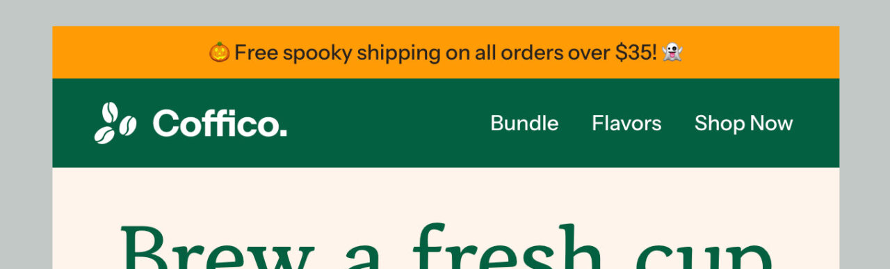
Look at this Header from Coffico. It has a height of 70 px.
See the full template and edit in Postcards
Font Size
Readable text matters more than fancy design. So, your font size should be big enough to read easily on both desktop and mobile without making the email feel crowded.
Here’s a simple guide:
- Keep the body text around 14–16 px
- Keep the headings and subheadings 18–22 px.
Use clean, easy-to-read fonts. Avoid thin or overly decorative styles, as they may look stylish but be hard to read.
Email Content Block Sizes
The content blocks share your message, show images, and add your call-to-action buttons. Each block has its own purpose.
Your content blocks should match the width of your email, usually 600–680 pixels. If you’re using two columns, each one will be about 300 pixels wide.
When it comes to height, short and focused works best; keep each content block around 200–300 pixels. That’s enough space for an image, a short paragraph, and a button without feeling crowded.
If your email has several blocks, aim for a total height of 800-1,200 pixels. That keeps everything easy to scroll through in a few swipes, even on mobile.
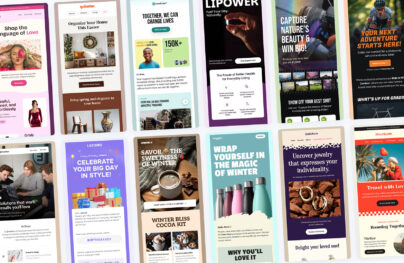
In the Brello email template, there are two content blocks.
The first one has a height of 710px, and the second one below has a height of 671px.
See the full template and edit it in Postcards
The banner is placed right under the header or sometimes at the bottom as a closing call-to-action. It’s where you grab attention fast, show your main offer, and lead readers to click through.
So, keep your email banner size the same width as the rest of your email, around 600–700 pixels on desktop and 320–385 pixels on mobile.
That makes it responsive and consistent across email clients.
But the right height depends on how much you include:
- 90–200 px works well for simple banners with only a message or logo.
- 200–400 px is ideal for most marketing banners with an image, short copy, and a button.
In rare cases, long banners may reach up to 700×1,700 px, but that’s usually for design-heavy or full-image layouts.
The Riverlands email banner has a height of 730px. But it looks good because the whole email is minimal, with small content blocks.
See the full template and edit it in Postcards
CTA (Call-to-Action) buttons guide readers to take action, like visiting your website, signing up, or making a purchase.
The ideal size for these buttons is 200–300 px wide and 50–75 px high. For mobile, make the button full-width so it’s easier to tap.
Leave plenty of white space around the button to make it stand out and prevent misclicks.
Keep your CTA around 10–15 characters and use clear, action-focused words like “Shop Now,” “Learn More,” or “Get Started.”
Let’s understand this with an example.
The CTA button in the Bloom email template is 213 x 58 px. The size provides a clear view, making it stand out and easy to spot in the email layout.
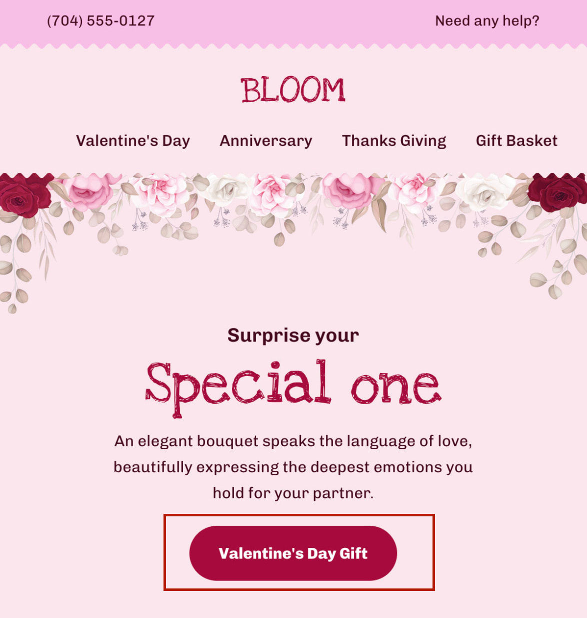
See the tull template and edit it in Postcards
Email Image and GIF Size
Images and GIFs make your emails more engaging, but they may slow down your email if they’re too big. So, keep them clear and lightweight.
For regular images, stick to around 600–800 px wide. That keeps them sharp on most screens without stretching or clipping. Use a 72 dpi resolution, and optimize for retina displays so they look good on high-resolution devices.
You should keep the following in mind:
- Ideal image size: about 200 KB
- Maximum: 1 MB (only if it’s essential and high quality)
- GIFs: aim for under 500 KB, and never exceed 1 MB
The footer is the last section of your email. It’s where you add contact details, social media links, and the unsubscribe option.
Some brands also include a short legal note or a link to their privacy policy.
So an ideal footer size that can fit all of this is around 600–680 pixels wide (to match your email width) and about 100 pixels high. That’s enough for your logo, address, and a few links.
If you want to include social icons, you can stretch them up to 250–300 pixels in height, but no more.
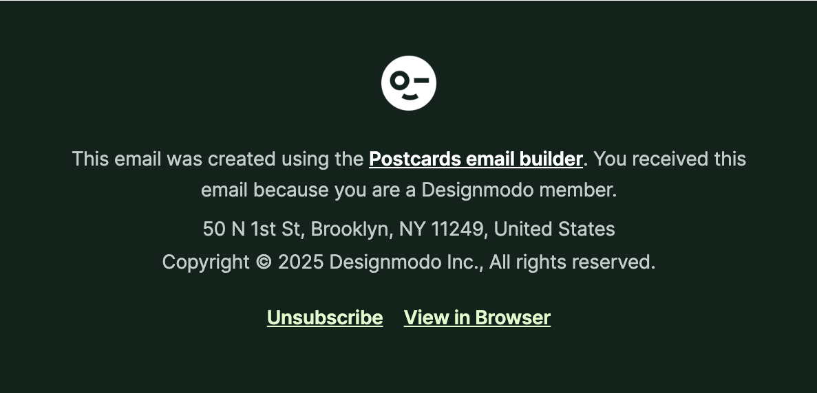
This footer from Designmodo’s monthly newsletter is 600 x 290.41 px.
Postcards Makes Email Design Easy For You
Pixels, layouts, sizes—that’s too much to handle. With Designmodo email templates, you can skip all that. We have ready-made email templates built with the most appropriate widths, heights, and balance, already tested to look great on every client and screen.
All you’ve to do is drag, drop, and edit blocks in minutes. No code, no broken layouts, no “why does this look weird in Outlook” moments.
FAQs
What’s the Best Image Format to Use in Email Templates?
Use JPEG for photos and PNG for graphics or logos with transparency. Both display well in most email clients.
How Do I Make Sure My Email Looks Centered On All Screens?
Build with a fixed 600 px container and center it with padding or alignment in your email builder. Avoid full-width layouts unless they’re responsive.
Can I Use Any Font I Want In My Emails?
Not all fonts work in emails. Most email clients only show basic fonts like Arial, Verdana, or Times New Roman. You can use web fonts such as Google Fonts, but they don’t always display everywhere.
To be safe, always add a backup font. That way, if your main one doesn’t load, the text still looks clean and readable.