Ideal Email Banner Size with the Best Examples & Tips for 2026
When someone opens your email, a banner is the first thing they see. It sets the tone and gives a quick visual cue of your brand. But if you didn’t position it the right way or if the email banner size is either too large or too small, you may lose that attention before users even start reading.
So in this article, we’re going to break down what the ideal email banner size looks like and how to make sure your emails look great across all devices.
An email banner is a visual you see at the top of an email. The purpose of this banner is to grab your visitors’ attention and give a quick idea of what the email is about, even before they start reading.
You can include your company’s logo, any compelling offer like “50% off today!”, or a simple navigation menu (along with the logo).
But let’s not confuse the email banner with the email signature banner. If you Google email banner, you will see lots of results for email signatures, but they’re totally different. An email signature banner is a type of email banner, but not the only email banner (more on this later).
The size of your banner can affect how your email looks and how people experience it. If your banner is too large, it may load slowly on mobile devices. And if you’re wondering, does this even matter? So yes, it does because 41% of people check their emails on smartphones.
With Postcards Email Builder you can create and edit email templates online without any coding skills! Includes more than 100 components to help you create custom emails templates faster than ever before.
Free Email BuilderFree Email TemplatesYour banner often carries the key message or call to action. If it’s not sized correctly, that message can either stay hidden under layout issues or be overshadowed by a cluttered design.
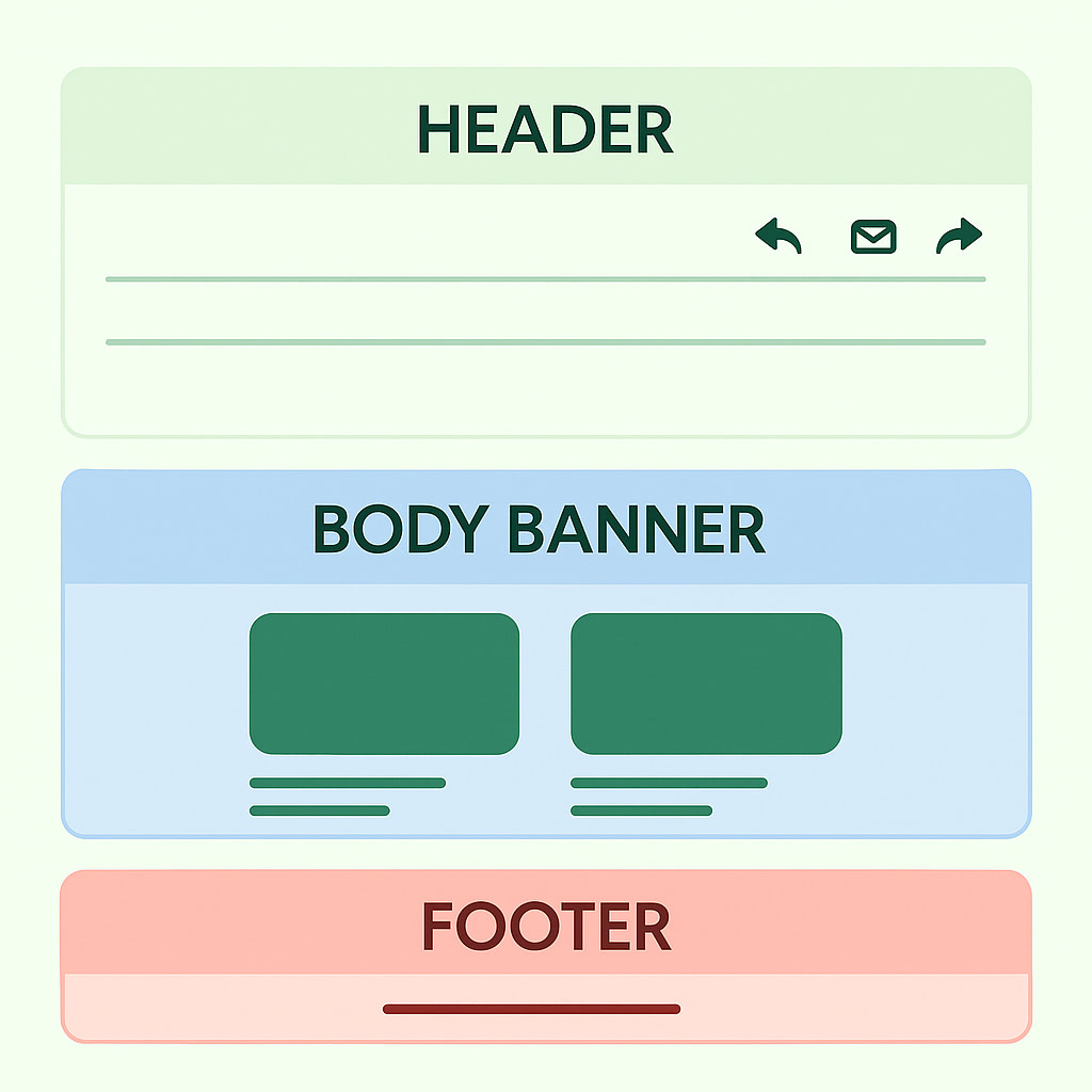
Here’s a good example of a well-sized email banner that looks good on both mobile devices and desktop:
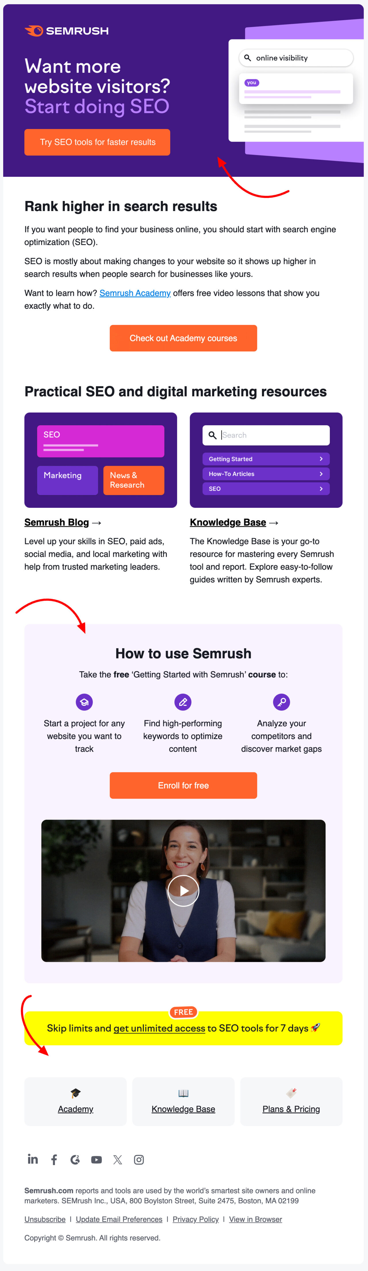
Source: Semrush
All three banners: the header, body, and footer, look great because the branding is super consistent and easy on the eyes. But look at how they’re sized and spaced.
The header banner is wide and clearly communicates the main message with a bold CTA. Then the body banner is smaller but still prominent. It breaks up the content and highlights how to use the tool without overwhelming us. And the footer banner doesn’t take up too much space, but it still draws attention with direct links to main pages and clear copy.
There are three main types of email banners:
1. Email header banner
2. Email body banner
With Pulsetic you’ll be instantly notified the moment your website, API, or server becomes unavailable. Monitor uptime from multiple global locations and respond to incidents before your users are affected.
Create beautiful status pages in minutes to keep customers informed during outages and build trust with transparent communication.
Start Monitoring for Free3. Email signature banner
Let’s explore these types in more detail and see what the ideal email banner sizes are.
You see the email header banner at the top of the email. It’s the first thing your reader sees, so it sets the overall tone for the rest of the message. It can include your branding, a headline, or a main promotion.
Ideal Size For Desktop Screens:
- Recommended width: 650px to 700px
- Recommended height: 90px to 200px
Ideal Size For Mobile Screens:
- Recommended width: 350px
- Recommended height: up to 100px
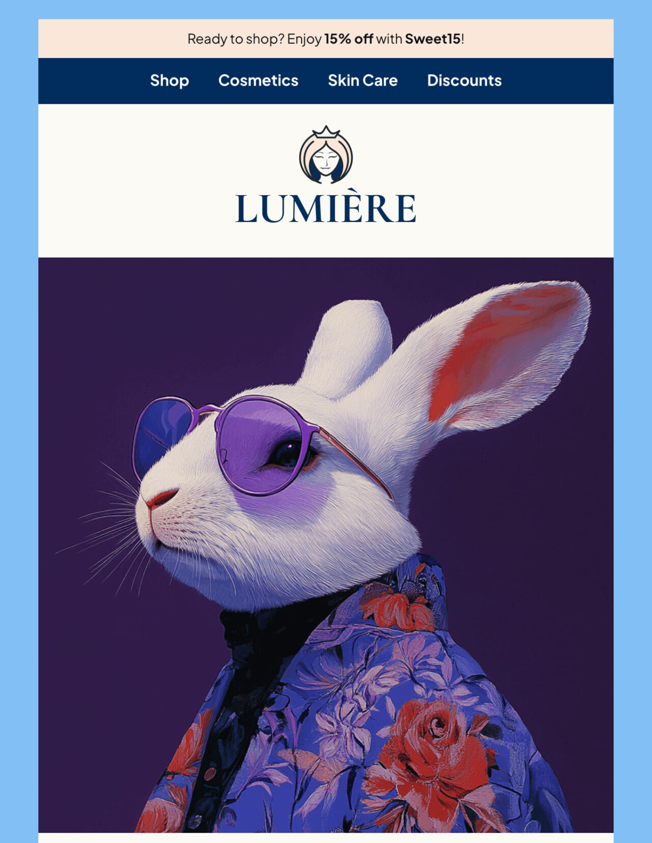
See the full version of Lumiére’s email
In the example above, the banner header speaks for itself because it looks simple and clear. It contains a navigation menu with links to direct pages and a logo below the main bar. This gives it an easy-to-access appearance as your email visitors can directly access their desired pages (shops, cosmetics, skincare, discounts) on the go.
The email body banner is in the middle of the email. Depending on your needs, it can contain short blocks of text or images to draw attention to exclusive offers or features.
Ideal Size For Desktop Screens:
- Recommended width: 650px to 700px
- Recommended height: 350px to 500px
Ideal Size For Mobile Screens:
- Recommended width: 350px
- Recommended height: 200px
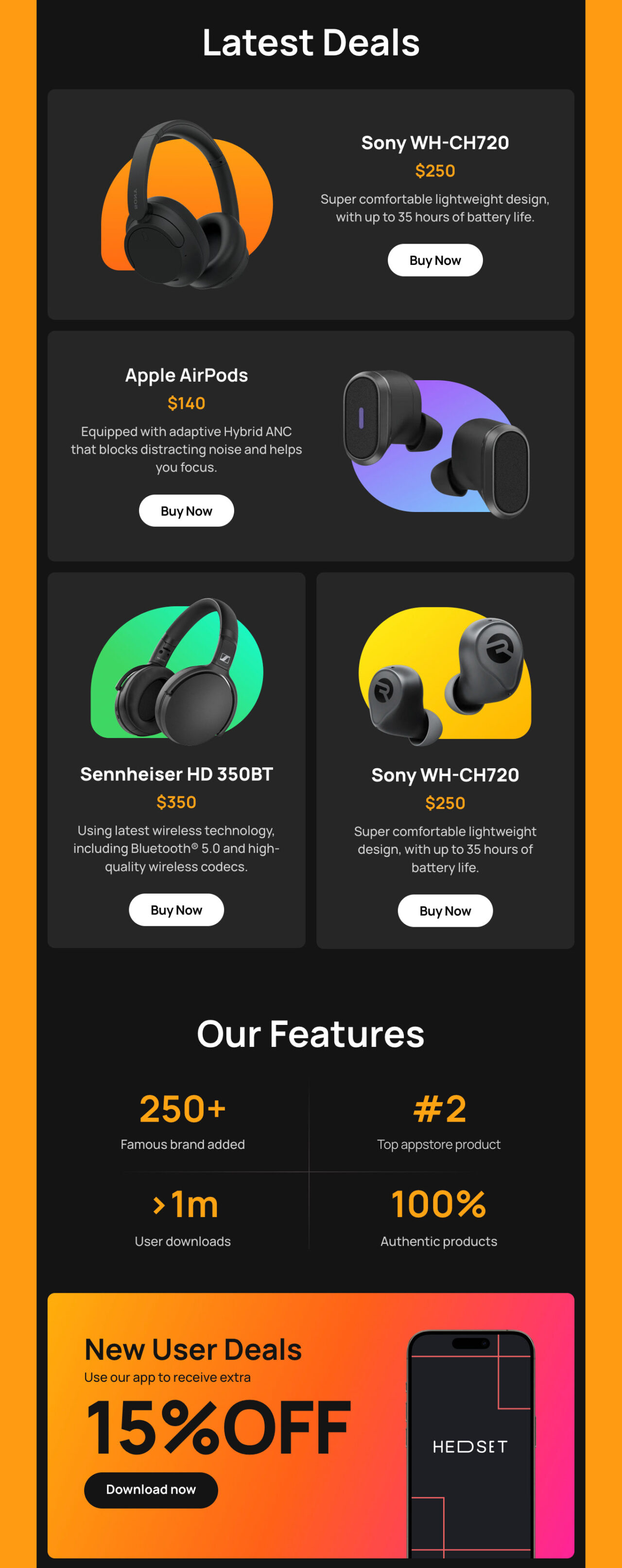
See the full version of Hedset’s email
If you look at the body in the example above, you can see four different banners in the middle (two horizontally shaped and two vertically). Each product is shown with a clear image, short description, and bold pricing, which helps us quickly see what’s on offer. So overall, it’s a user-friendly design that makes shopping fast and enjoyable.
The email signature banner goes at the bottom of the email. This one is smaller and more subtle. Here you can add your contact details, social media links, a tagline, and any final CTAs you prefer.
Ideal Size For Desktop Screens:
- Recommended width: 650px to 700px
- Recommended height: up to 150px
Ideal Size For Mobile Screens:
- Recommended width: 350px
- Recommended height: 100px
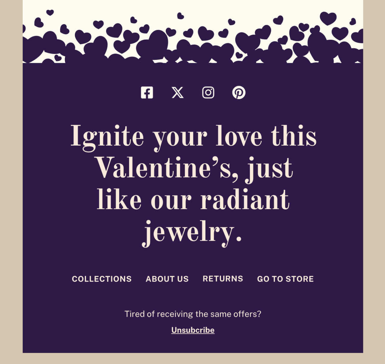
See the full version of GoldAura’s email
This email signature banner example above ties everything together with an emotional message that fits the Valentine’s theme. The bold headline “Ignite your love this Valentine’s, just like our radiant jewelry” is romantic and memorable. The deep purple background contrasts nicely with the rest of the email. And it also includes links to key pages like Collections, About Us, Returns, and Store, so we can easily explore more or get support.
Although a lot of people overlook this, we want to make it clear: the file format of your email banner can affect how fast your email loads and how sharp your images look in someone’s inbox.
Here are three standard formats to choose from:
JPEG: Suitable for banners with photos, product images, or rich color and detail. It keeps the file size small, which means your email will load faster.
PNG: Suitable for sharp graphics, logos, clean lines, or minimal designs. It delivers crisp and clear visuals.
GIF: Best for animated banners. They’re great for showing off a deal or adding a bit of motion to your email.
It’s not a piece of cake to design an optimally sized email banner. You may run into issues (especially if you’re a one-person team). So here are a few common mishaps to watch out for:
Too Much Text
Don’t add too much text. Your banner isn’t a full paragraph; it’s more like a headline with key visuals, so keep it short and clear. A few words are enough to get your message across.
Poor Image Quality
A blurry and extra-stretched image makes your email look unprofessional. So always use an appropriate image size and format to keep your banner sharp.
Clashing Colors or Fonts
Try not to use too many fonts or color combinations. Stick to a simple, clean design that matches your brand. This way, your subscribers will find the main message easy to read and understand.
Here are a few examples of good-looking email banners:
1. Pretty Little Marketer (plm)
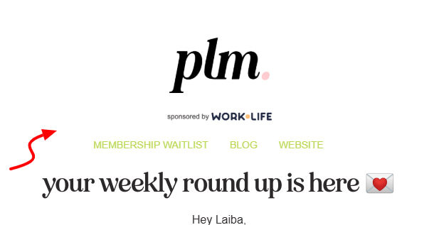
The email from Pretty Little Marketer has only three things in the email header banner, which looks quite simple and perfect, not too many colors, images, or text. It has a bold logo, links to main pages (website, membership, and their blog), and a clean title that sets the tone for the email. So it gives a personal and welcoming touch.
2. Creative Market
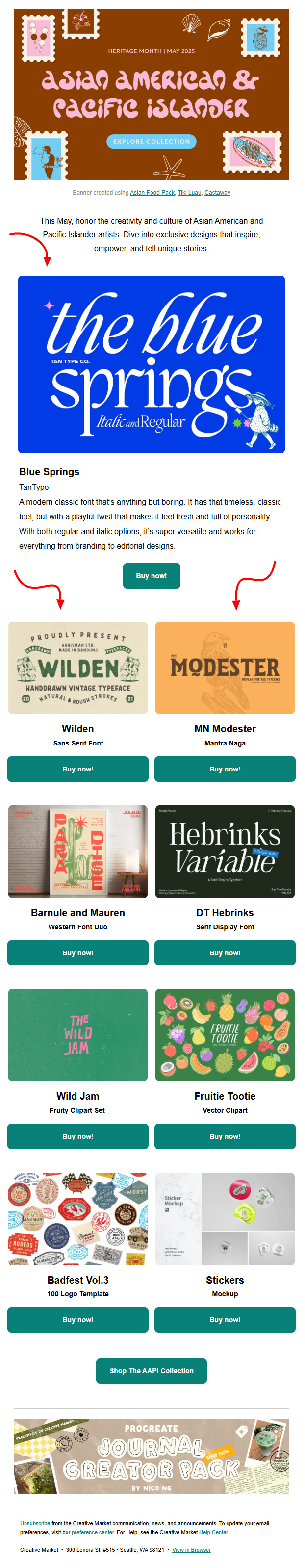
Source: Creative Market
This email beautifully shows different font styles. Each font is shown in a designed image, so we can see how it would look in use. And all fonts include a clear Buy Now button so we can shop whichever we like without exploring the entire catalog just to find our favorite one.
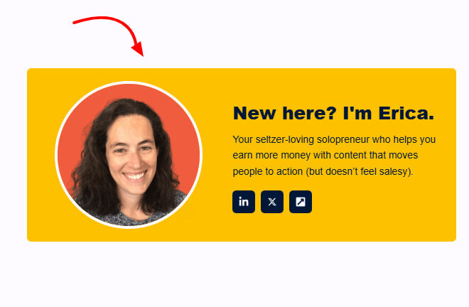
3. Cut The Fluff
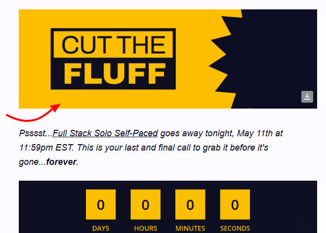
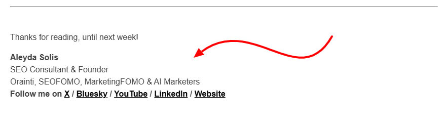
This email from Cut The Fluff has a clear and clean email header above and an email signature banner below. In the header section, it only has the logo, which in fact reflects their overall message, as the email was about improving our writing by cutting anything that doesn’t add value. And the email signature banner has the author’s image, a short bio about her, and social links to her profiles.
4. SEOFOMO
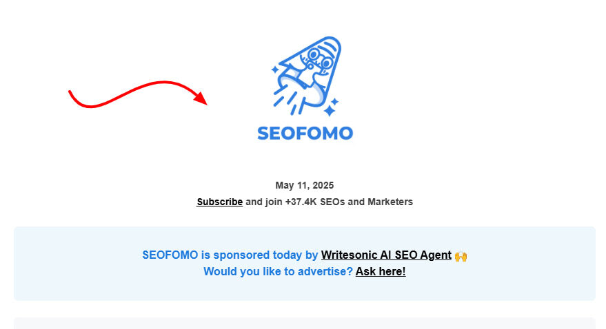
This email is slightly different from others. It has a slim header banner that shows who sponsored the email and if anyone wants to sponsor next, where they should contact. Above this banner, the email has the SEOFOMO logo and nothing else. Similarly, the signature banner (footer) below is also simple. It only includes the sender’s name, company info, and role.
So, overall, this email has a lot of white space and a minimal design, which makes the email easy to skim through.
Now that you know everything about email banners, we’ll walk you through a step-by-step guide to create your dream email banners with Postcards, the Designmodo product. And the best part is you don’t need to be an email specialist or coder to create a beautiful interface.
Step 1: Log in to Postcards
Log in to your Designmodo account or sign up to create one. Once you’re in, go to the Postcards Email Builder App and create a New Email to start your project.
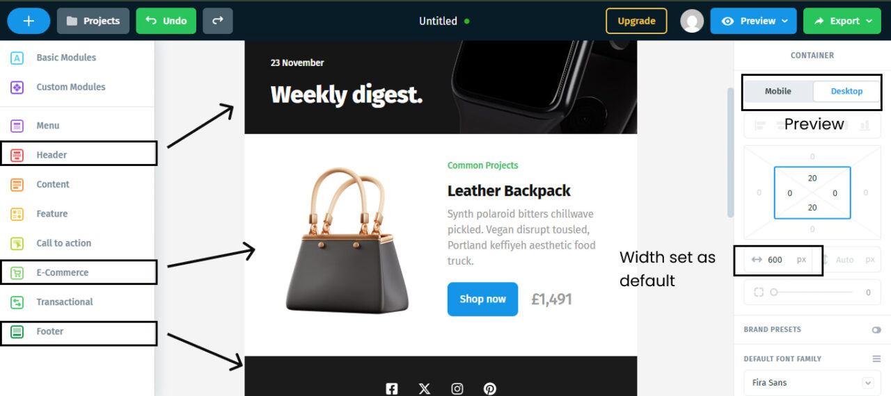
Postcards come with ready-made content blocks including header banners, body sections, and footers. To add a banner, go to the left panel, find a Header or Content block with an image/banner layout, and drag it into your email canvas.
The containers of these blocks are already set to a width of 600 pixels, so you don’t have to worry about email banner dimensions. All banners are responsive by default, which means they’ll look great on both desktop and mobile (you can preview while editing).
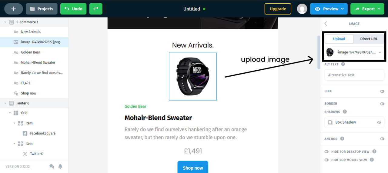
Click on the image area to upload your own banner image.
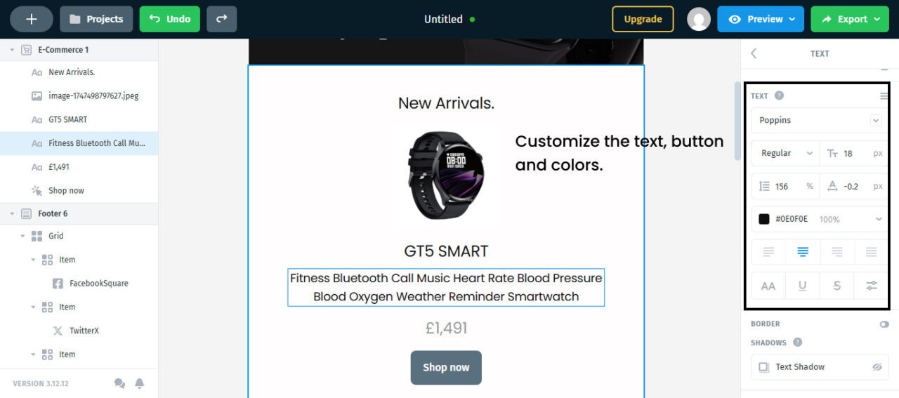
You can also edit the text, buttons, and colors right inside the editor to match your brand style.
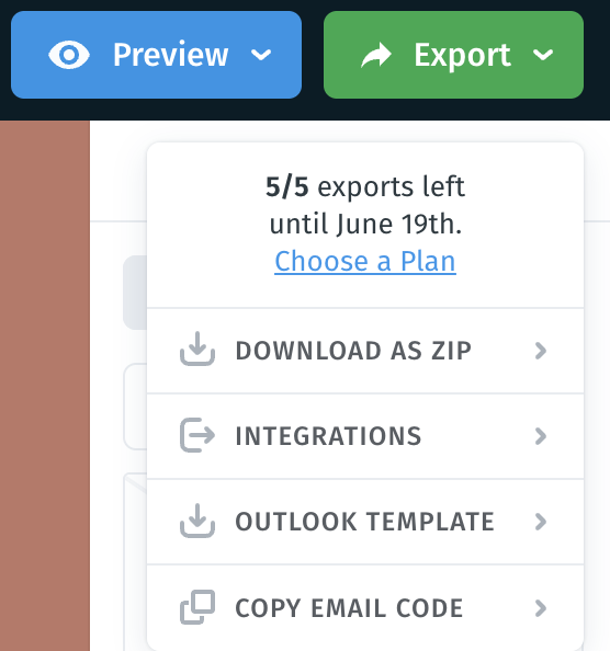
Click the Preview button to see how your banner looks on desktop and mobile. If everything looks good, click on the Export button and save it however you like. We have four different options for easy usage. You can either download it as a zip file or an Outlook template, integrate it with other tools, or copy email code directly.
Don’t let the wrong banner size hold your emails back. When you use the right dimensions, you make a strong first impression and your design looks great on every device. And we at Designmodo have made it easier for you.
Start using our best practices in your next campaign with Designmodo’s Postcards. Because when your banner is the right size, everything else clicks into place. So start designing today!
FAQs
Not necessarily. While large banners may seem eye-catching, they can slow down load times and disrupt your email’s layout. So, a well-sized banner that fits your design is far more effective and user-friendly.
Follow these practices:
- Keep lines between 45 and 75 characters for readability across devices.
- Use responsive design, brand-consistent visuals, and strong CTA buttons with plenty of white space.
- Always preview across multiple email clients before finalizing your designs.
The most popular banner size is 600-pixel width on desktop and 320 pixels on mobile. But email builder tools like Postcards can automatically adjust this size to fit across devices.