Tools for Identifying Fonts and Creating a Palette
Typography is a big part of web (or any) design project.
It can be a fun, but also challenging process for those who are uncomfortable with the basics of typography.
But it is pretty easy to learn a few basics about type to get you headed in the right direction. Developing a font palette for almost any project can be almost as simple as learning to identify font styles, slant and mood. Once you know the basics, you will more easily understand how to identify fonts visually or with the help of an online tool and create perfect project palettes.
Identifying Fonts Visually
Some of the best typographers and typography nuts can just look at a typeface and determine what family it comes from. This is not an essential skill for web designers and developers.
What is important is that you can pick out a typeface based on category or style and understand enough about it to determine what kind of mood it might convey. It is important that typefaces match the tone and style for each project. (You can learn even more about the different type categories in this previous post.)
There are a few key items to look at when you are trying to visually identify a typeface.
With Postcards Email Builder you can create and edit email templates online without any coding skills! Includes more than 100 components to help you create custom emails templates faster than ever before.
Free Email BuilderFree Email Templates
Do letters have small strokes at the end?
Any horizontal stokes at the ends of letters signify the use of a serif typeface. The lack of additional stokes means the typeface is a sans serif. Sans serifs are commonly used in web design.

Are letters simple and easy to read or more elaborate?
Elaborate detailing of letters could mean you are looking at an Old English typestyle. (Think of the nameplates at the tops of newspapers or lettering from old movies.) Other sometimes elaborate type styles include cursives, which look more like handwriting, or novelty type families.

Do letterforms contain a single or multiple stroke weights?
Transitional serifs, such as Times New Roman, are letterforms where every stroke is of an equal weight. Transitional serifs are the most popular of the serif category for web applications because the unvarying stroke weight is easy to read at a number of sizes and on a variety of backgrounds. Letters that have varying stroke weights are called modern serifs; they are most commonly used in print applications.

Do letters resemble printed type or do they mirror handwriting?
Both serif and sans serif typefaces typically look like type – letters that are created by a computer or typewriter. Letters that are made to look like they were written by hand fall into the script or cursive categories. These typefaces are often used for emphasis and not for large blocks of text in web design.
With Startup App and Slides App you can build unlimited websites using the online website editor which includes ready-made designed and coded elements, templates and themes.
Try Startup App Try Slides AppOther Products
Are letters slanted?
Look at the slant of letters. Are letters italic or is the slant because of the aforementioned handwriting style. Keep slant in mind because it is important in terms of pairing fonts.

Do letters look completely unconventional and nothing like traditional type?
Any lettering that does not fall into another category is considered a novelty typeface. These are often odd or custom letterforms that have a specific purpose. Novelty typefaces can be striking and effective but should be used sparingly.
Four Tools to Identify Fonts
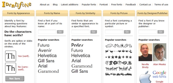
Identifont: By answering a few questions, the online tool can help you figure out what font you are looking at.
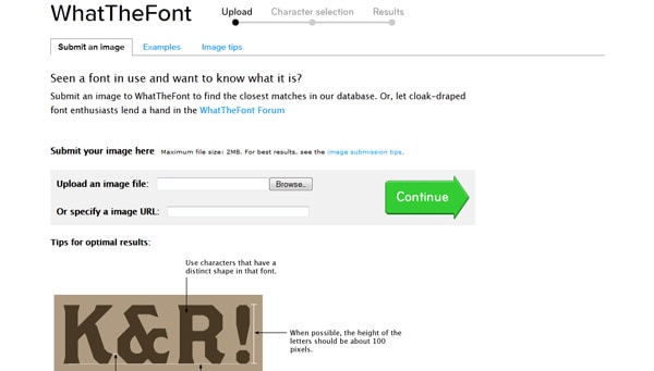
What the Font: Upload an image file containing a font and the database will return a list of possibilities.
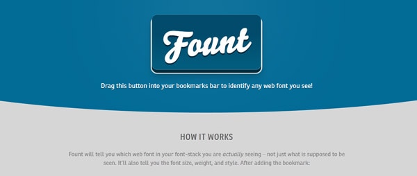
Fount: This nifty little widget allows you to click on fonts on websites and tell you what you are seeing. It is fairly specific including font name, size, weight and style.
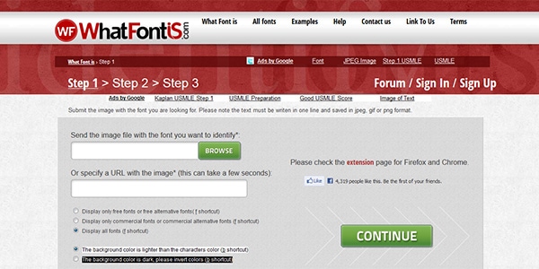
What Font is: With WhatFontis, a free online font finder, you are only three steps away to find the name of the font that you just can’t stand not knowing about.
Font Pairing
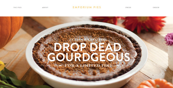
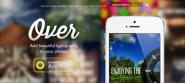
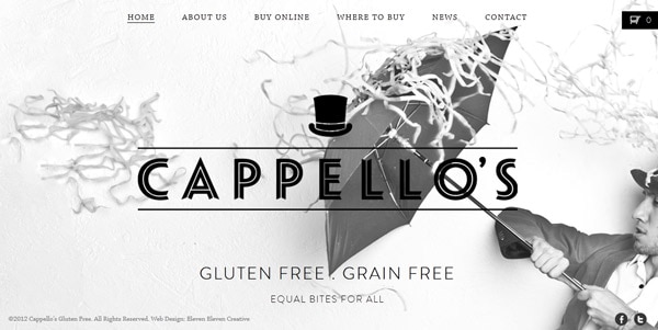
Paring fonts for any project is a fine art. Too few fonts can be boring. Too many fonts can be overwhelming.
But what is the right number? That can vary by project. Beginners may want to stick with as few as two type families for projects; more experienced designers with an eye for typography may use as many as 10.
Start by selecting font families that offer multiple options as weights, such as bold, black, condensed and italic. Having all the extra options makes pairing a breeze. Fonts of the same family always match and will work together.
Consider the effect you want to achieve with type – harmony, contrast, trust, sales. Put together typefaces that work accordingly.
To create harmony, use fonts with similar attributes. For contrast, use typefaces that seem to be in opposition of one another.
Regardless of the feel you are trying to create, consider how you will establish contrast – bold vs. light, sans serif, vs. serif, traditional style vs. novelty. Contrasting typefaces will create visual interest.
Also think about the shape and slant of letters. Are Os in the type family rounded or more ovular? Do letters stand straight up and down or do they have a slant to them? Do styles use serifs; are they angled, fancy, or square? Stick to typefaces that exhibit similar properties for a more unified look.
Here’s another tip: Fonts created by a single designer often have an innate sense of togetherness. When shopping for typefaces, take note of who created each style.
4 Font Pairing Tools
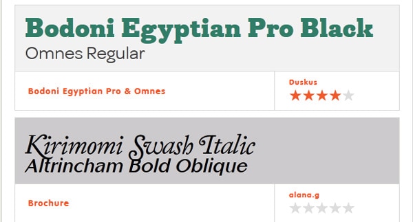
FontFuse: Create your own font pairings using web fonts in real time. You can then share your pairings for feedback or check out pairings that others have created.
Google Web Fonts: Take a look at more than 500 different font families by the letter, word, sentence or paragraph.
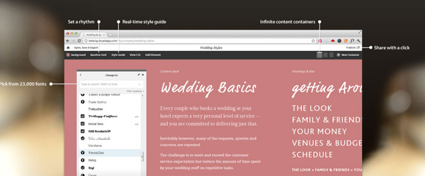
Typecast: With just a few clicks you can set type in your browsers and check it for readability, rendering and look. The tool makes it easy to combine, compare and share different font combinations and create the HTML and CSS you need to move it to your site.
