UX Tools: Implementing Doors Diagram
After “How To Improve Your Website’s UX With Doors Diagram” you learned what Doors Diagram is and how to use it. This is the second part of the topic explaining why to use this design tool, covering this approach in more detail and showing some UX research while implementing Doors Diagram on Medium.com.
Why is Doors Diagram Helpful?
As a design tool, Doors Diagram helps to faster and easier determine what obstacles are for users on their way to successfully navigate a website design. It illustrates the process of user navigation indicating a starting point, obstacles and a final goal as well as counting all the necessary movements.
As a result every obstacle (bugs, mistakes, broken or lost elements, etc.) defines a problem your website faces. There are four types of obstacles:
- A locked door (an element exists, but doesn’t function; alternative routes are possible)
- Misleadng information (an element exists, but doesn’t perform it’s functions though does perform somewhat else)
- An invisible door (an element is not reachable, but functions though is idle)
- A deadend (no elements, no functions, no further aisles)

A door is locked when an element is broken implying its presence or absence leads to not executing its functions. Examples:
- Text that looks and is developed like a link but doesn’t open a page
- An active right arrow is supposed to open a next article (similar to what it did on previous pages) but it does nothing now
- A generally accepted logic (i.e. derived from benchmarks or guidelines) suggests to have a pager or an automatic loader when reaching the end of the page or a simple “show more” link to see more search results if results are limited in quantity per one page, but all “show more” elements are missing

With Postcards Email Builder you can create and edit email templates online without any coding skills! Includes more than 100 components to help you create custom emails templates faster than ever before.
Free Email BuilderFree Email TemplatesA door has misleading information when an element is supposed to be here and to act respectively but it executes differently. Examples:
- The phrase “read more” is supposed to be a link, but it is just plain text
- “Submit” is the only button below the form, but when all forms are filled the button is inactive, despite no visible errors

A door is not visible when an element is here and it works. Moreover it works properly and does what it is supposed to do. But it is hidden so users can’t find it. Examples:
- A website has its About or FAQ pages, but from some pages, i.e. profile or settings pages, there’s no link to desired pages
- A required link is presented but unlike other links placed near here it is not underlined and doesn’t vary from common text

A door is a deadend when an element is terminal but a final goal is still not reached. In this case there are no other alternatives to achieve the goal other than to start over. Examples:
- A 404 page that has no link to the main page or any other possible ways to navigate users further
- A subscription form provides no feedback when a user put the email address and press the “subscribe” button (since the user’s final goal was to subscribe the user doesn’t know whether it’s reached or not)
Sometimes it is hard to define which obstacle a problem refers to. Blurred boundaries are not that critical since the main purpose of finding out obstacles is to come up with a solution. To identify whether an element is a locked door or a door that has misleading information is not an end in itself. It is much more important to know that such an odd door exists and how to repair it.
Clearing Obstacles
The evident outcomes of drawing Doors Diagram are uncovered ways to remove obstacles. In most cases locked doors are solved by restoring elements’ functions, misleading information — by re-balancing elements and their functions, invisible doors — by placing elements properly, and deadends — by placing an element with required functions that allow further navigation toward a final goal.
There are illustrations of all four types of obstacles and how they could be cleared below by implementing Doors Diagram to Medium, a blog-publishing platform.
With Startup App and Slides App you can build unlimited websites using the online website editor which includes ready-made designed and coded elements, templates and themes.
Try Startup App Try Slides AppOther Products1. Door is Locked
Medium’s search page shows an example how a “broken” absent element stops a user’s journey or redirect it with a waste of user’s time. Let’s try searching for “robots.”
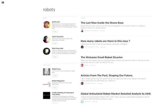
Here we have search results containing three people, three collections and 10 stories. I barely believe that the entire Medium library of posts contains only 10 posts on this topic. At least a quick Google search proves there are many more than 10. So a common user scenario implies there’s an option to view more search results at the end of the search page. But this element is absent.
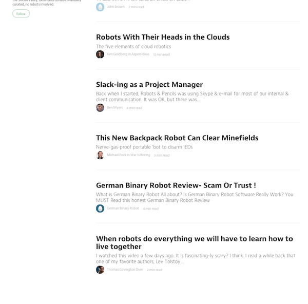
This direction is locked and the user needs to find another way to get more stories on robots (i.e. go into collections or read one suggested story to read what next).
What to improve: Put a button or any other element that will navigate users further and let them load more search results.
2. Misleading Information
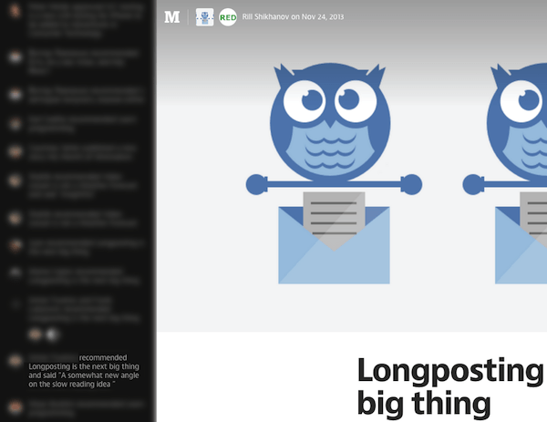
Medium’s notification bar shows elements that act inappropriately. There are different types of notifications: Someone wrote a story, someone recommended your story, someone recommended a story to you and said something when recommending, someone left a note on your story and others. Clicking on notifications like “someone wrote a story” and “someone recommended your story” leads on this story. And clicking on “someone left a note on your story” leads directly to the note (comment) while clicking on “someone recommended you story and said something” doesn’t lead to the note.
It leads the story. Though it clearly says that there was a note left by other user. So the user assumes to click and read exactly this text, but fails. The note is visible when hovering over the commenter avatar. Nevertheless if there were other recommendations and that comments were invisible due to the date range there’s no chance to view it on the story page.
Not that crucial, but still misleading. The user makes an odd movement with no results.
What to improve: First, view all recommenders, especially those that said something. To clear the obstacle,a page could show the note like a pop-up sign in form.
3. Invisible Door
Meidum’s “TOP 100” page shows an element that is not reachable, still there are ways for users to reach destinations, but with extra movements. Consider the user’s final goal is to find something interesting to read. A starting point will be the “TOP 100” page. There are stories listed from 1 to 100 that are ranked to be best (most read or recommended or manually picked by editors).
The easiest and shortest way for the user is to scroll and find a desired story title. Unfortunately nothing catching is found first.
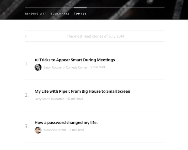
The user scrolls and reads other titles, then presses Ctrl-F (or Cmd-F) to search for keywords. In the end, the user finds nothing interesting and the list ends. Where to go next?
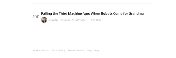
A nice solution would be to navigate users further from this point and to suggest next or previous months after the last title. Right there are no further options. The user can return to the top of the page and swipe. This is a one more door (scroll up or a hot key combination) to move into. In other words, there is a door that lead to other months, but it’s hidden and users can’t find it to keep moving toward a final goal.
This Doors Diagram’s corridor could be an uncertain cycle, which either leads to a final goal (the user has finally found the right story) or never leads with a deadend (the user can’t find it while swiping TOP 100 pages from month to month), but let’s assume that in a month or two of pages the user reaches the destination.
What to improve: Place the same header with previous/next buttons on the top of the page, or a suggestion to read or buttons to keep users on the journey.
4. Deadend
While Medium hasn’t produced an option for all collection curators to mark stories as featured, the empty page illustrates a deadend of the user’s journey.

If a user is a collection curator and while editing the collection added a new section called “Featured” it’s not clear at all why it doesn’t appear when editing is finished. Moreover the user can’t understand how to mark stories as featured. This is a deadend.
There is an answer and a possible way to continue the journey — when a right toolbar is opened there’s a line below “Looking for help? Visit the help center for more info on how to create a collection,” which is a link to a story including “feature stories coming soon.”
What to improve: Instead of showing “This collection does not have featured posts yet ” to the collection curator, it is better to put a door to let this user move forward. It could be text like “You can’t mark stories as featured right now, but it’s coming soon. Read more.” on the same page or a direct link right near the “Featured” segment when the curator edits the collection.
Conclusion
To successfully implement Doors Diagram you have to remember about the following three actions:
- Be your user: Set a user’s starting points and destinations. Draw the navigation and follow it step by step. Do not skip any possible bottlenecks.
- Know common user scenarios to keep off misleading information: Clarify all of a user’s expectation. Find out points where the user should be led and where it’s better to explain than to leave it for user’s understanding.
- Keep the user moving to avoid deadends: Always insert a reference or a link leading to the explanation why a user can’t do this right now or that this feature will be available soon (or after a certain condition, i.e. commenting on Dribbble).
Every website has a lot of corridors where users navigate. And Doors Diagram is a tool not only to detect any obstacles on their navigation and clear them, but to build and optimize the whole journey.