Case Studies: Redesigning a Logo Can Be Tricky
The logo is definitely the most important part of any brand. Its aim is to reveal the qualities of a product or of a society and to communicate what the company mission is.
Logos should not be too processed or intricate because they need to be effective and striking in order to evoke impressions in customers’ minds.
Logo creation is not easy and there are no perfect rules to create the best design. While creating a brand-image, there are many aspects to take into consideration, such as the kind of message that is going to be transmitted, the history of the society and the target audience.
Years after a logo is produced, some companies need to rebrand themselves or make changes in their trademark-images. Some of the reasons that lead people to this choice may be the extreme attempt to rise from an economic crisis or maybe the will to get a wider consumer base.
Just as logo creation is a difficult process, logo updates are not free of risks.
Sometimes, even brands with great logos make mistakes while trying to refresh them. Here, we will look at some cases of logo changes (of course we’ll look at positive and negative examples). We recommend you to read the Origami Inspired Logo Designs.
With Postcards Email Builder you can create and edit email templates online without any coding skills! Includes more than 100 components to help you create custom emails templates faster than ever before.
Free Email BuilderFree Email TemplatesGAP – Bad Result
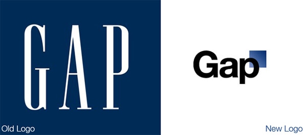
One of the most negative logo changes came in 2010, when Gap replaced its old logo, which was created in 1969, with a more modern one. The new logo was characterized by the company name, in a sans-serif font with a blue box put above the “p.” Gap’s idea was to create an image which could help give a younger look to the company and that could be used for promotional campaigns on social networks. However, the result was completely unexpected; many loyal customers expressed their dissatisfaction through the Gap Facebook page to the point that the company decided to revoke the new design.
This entire situation was probably caused by the fact that Gap didn’t realize the fondness people had for the old logo, which was printed on t-shirts, shopping bags and other places. Thanks this example of a poor redesign, it is possible to realize that when modifying logos you don’t only have to follow the trends but must consider the possible effects of changes on your audience. Sometimes, drastic changes are not the best choices.
MASTERCARD – Bad Result
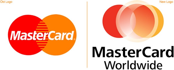
The next example we are going to see is the one of Mastercard. The famous brand had a logo that everyone knew and that was easy to recognize in each part of the world. It was composed by two parts — first was a background, which consisted in red and orange circles that merged in the middle. The second was the company name, Mastercard. In December 2006, the company introduced a new logo. It was still composed by the two main circles, but the colors came with shades and with an object similar to a bubble in the center of the image. Moreover, the brand name, was juxtaposed by the word “Worldwide” in order to express to the public their intention to expand to newer markets.
The new logo was certainly more modern, but it was characterized by too many colors which seemed faded. Mastercard recognized that the new picture was not impressive and decided not to use it. From this example, it is possible to understand that it’s not always painless to pass from a simple and plain logo to a more complex and processed one.
Most successful logo redesigns, such as those of Starbucks or KFC, were characterized by a transformation toward linearity and neatness. Sometimes, as Mies Van der Rohe said, “less is more.”
SPOTIFY – Good Result

With Pulsetic you’ll be instantly notified the moment your website, API, or server becomes unavailable. Monitor uptime from multiple global locations and respond to incidents before your users are affected.
Create beautiful status pages in minutes to keep customers informed during outages and build trust with transparent communication.
Start Monitoring for FreeLet’s continue with an example of a good process of logo redesign with Spotify, a music streaming service.
The old logo seemed to be playful, not serious and it saw the presence of a sparkling font. Conversely, the new logo features the same colors and name but has a completely different style. It is more ordered and less vivacious, all the letters are aligned, and there isn’t any shadow effect. (This last point contributes to give a two-dimensional look.)
The changes were appreciated by Spotify users who happily accepted the new logo. One reason for this positive attitude, was that the company didn’t try to create a more complex brand-image, but it followed a process of simplification. Unnecessary elements were cut off and fewer details were inserted in the new image. Another key point for the success was that Spotify undertook a process of logo redesign because it really needed it, and not just because they wanted to give a fashionable look to the company. In that period (and still today), their purpose was to expand their business and it was important for them to appear professional. From this example, you can see that a logo rebrand should not be the aim of some actions but it should be the mean to reach a particular target.
WENDY’S – Good Result
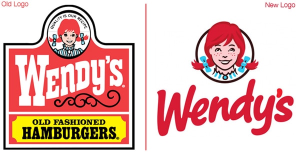
Let’s have a look at another example of positive changes for the logo of a famous fast food company, Wendy’s — the third largest fast food chain in the world.
After 29 years without even a small change, in 2012 Wendy’s decided to undergo a process of reinvention. The new logo didn’t reproduce a wild west style sign anymore but was still characterized by the presence of the freckled girl, Wendy, and company name.
The lack of the sign structure evokes feelings of freedom, while the use of a sans-serif font gives a more contemporary look to the brand. This last element was probably one of the main ideas which lead the process of rebranding. Wendy’s decided to change the logo and to modify all the product-packages, it wasn’t in a positive economic situation. The fast food chain tried to use graphic aspects to express a new fresh personality and boost sales. And, according to Wendy’s management, using the new logo corresponded to a reported increase ins sales.
The Wendy’s redesign shows that having a precise goal in mind is important to realize an effective process of rebranding.


