Mega Navigation Menu Design Trends in Modern Websites
We’ve all seen mega navigations and fullscreen dropdowns online. They’re common across the web and especially useful on sites with tons of links.
But designing a mega nav that works can be a real pain. There are no strict guidelines for these menus so you have to study what others are doing and try to make something that’ll fit with your project.
Learn here: How to Create a CSS3 Mega Drop-Down Menu
Let’s look into some mega navigation trends and see how they take traditional dropdown menus and push them a step further.
Deep Level Categories
The most valuable design style for a mega nav is the column structure.
This lets you designate “categories” for links and create deeper links without using multiple flyout menus. A mega navigation dropdown can span the entire page so you can usually fit at least 3-4 columns in one dropdown.
With Postcards Email Builder you can create and edit email templates online without any coding skills! Includes more than 100 components to help you create custom emails templates faster than ever before.
Free Email BuilderFree Email Templates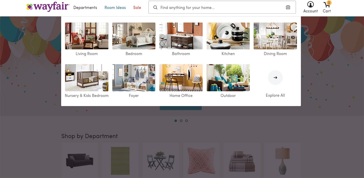
Take a look at Wayfair which uses a very unique type of dropdown menu with search. They have a link for “departments” where you can browse by category and even sub-category such as bedrooms > nightstands.
Next to this link is a dropdown for “room ideas” where you can browse based on the room. This dropdown features images next to the links so you have a much easier time browsing through choices.
It doesn’t take long to realize they’re breaking navigation items into categories. These follow a similar trend and Wayfair’s man navigation only needs two main links for this to work!
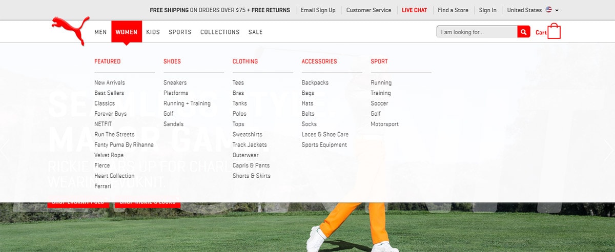
Alternatively another ecommerce shop Puma has a similar columnar structure.
But they break down categories based on demographics and items, then inside each meganav you find columns for each item type(featured products, clothing, sports, etc).
Notice the columns have their own headers and these stand out from the rest of the links. It creates a true column structure because you can glance through column headers first and browse sub-links from there.
With Pulsetic you’ll be instantly notified the moment your website, API, or server becomes unavailable. Monitor uptime from multiple global locations and respond to incidents before your users are affected.
Create beautiful status pages in minutes to keep customers informed during outages and build trust with transparent communication.
Start Monitoring for FreeSimilar effect on Lucky Brand but with a twist in the design.
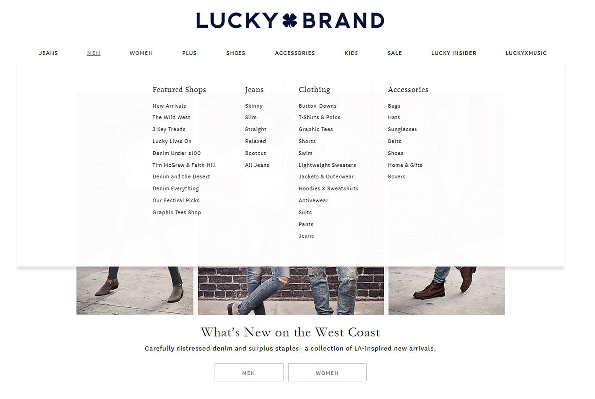
All of their columns have the same color schemes but they use different typography. This can make quick browsing tougher but it’s still just as usable.
Lucky’s animation effects are a nice touch as well so that’s definitely something to consider.
But if you’re struggling with a mega navigation hierarchy try organizing your links into deeper categories first.
Full-Width Dropdowns
This trend isn’t used on every site but I do see it a lot more nowadays.
Huge mega navigation menus can span the entire width of the page to create more room for desktop & laptop users. Mobile users typically have hidden menus so they never really see the full effect anyways.
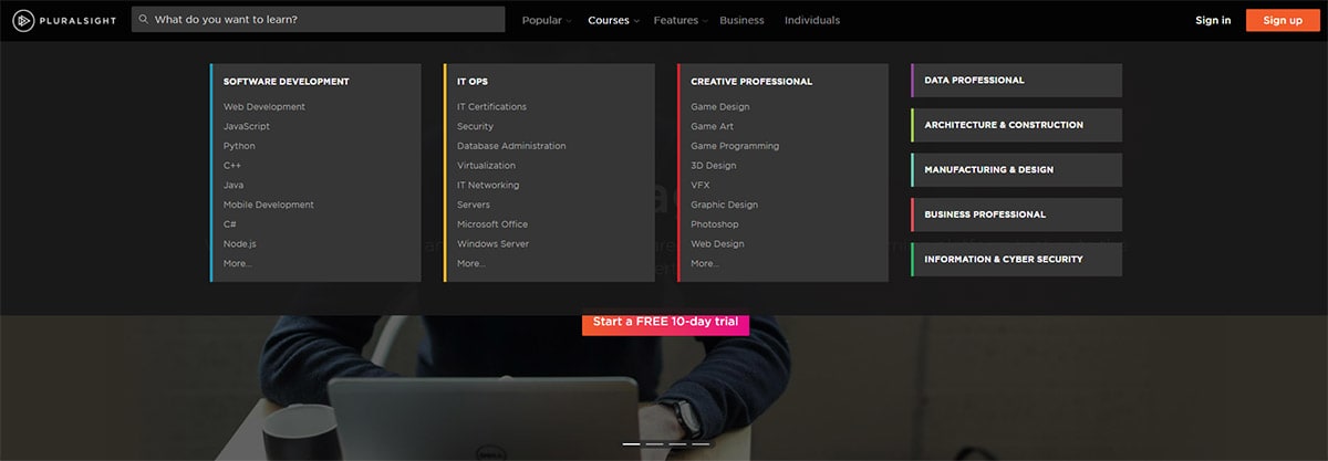
The navigation for Pluralsight is an excellent example featuring a fullscreen mega menu. The content stays fixed at the same width as the page itself, but the menu does span the entirety of the screen.
It’s a cool effect because it creates more room in the menu. Or it at least gives the visual illusion of more room.
And if you’re running a huge navigation for larger monitors why not go the whole way?
Digital Spy has something very similar and their navs include category breaks too.
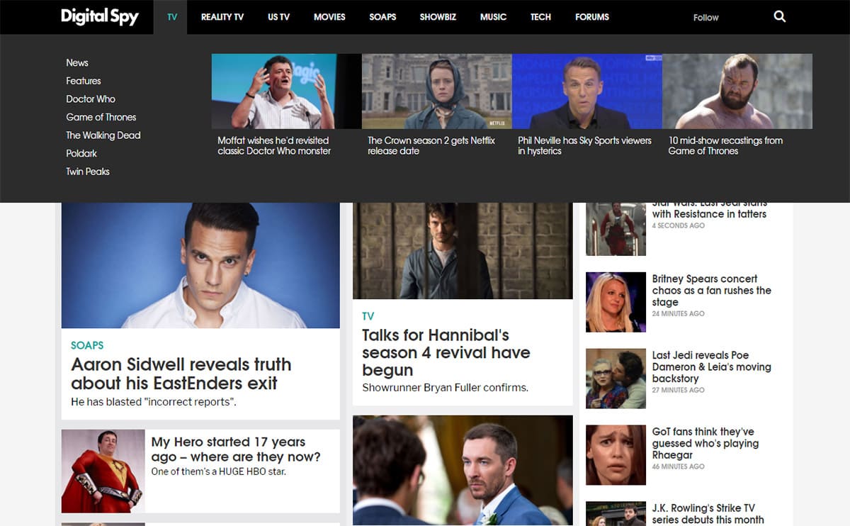
There’s an even split between “normal” dropdown links and thumbnail links going directly to articles.
But again the content remains fixed at the same width as the page while the menu spans the entirety of the screen.
Fantastic effect if you can get it working.
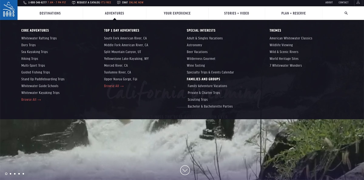
You can even combine the column structure and the fullscreen effect into one design.
This is what you see on the OARS website and it’s a gorgeous example of great design + great UX.
Mixing Images & Text
I encourage adding more images to all websites whenever possible. Visuals help to break up all the text we see on a regular basis.
Mega nav menus work best on larger screens so it’s safe to say there’s room for images. The Sears website breaks up their nav into multilevel categories with both links and images.
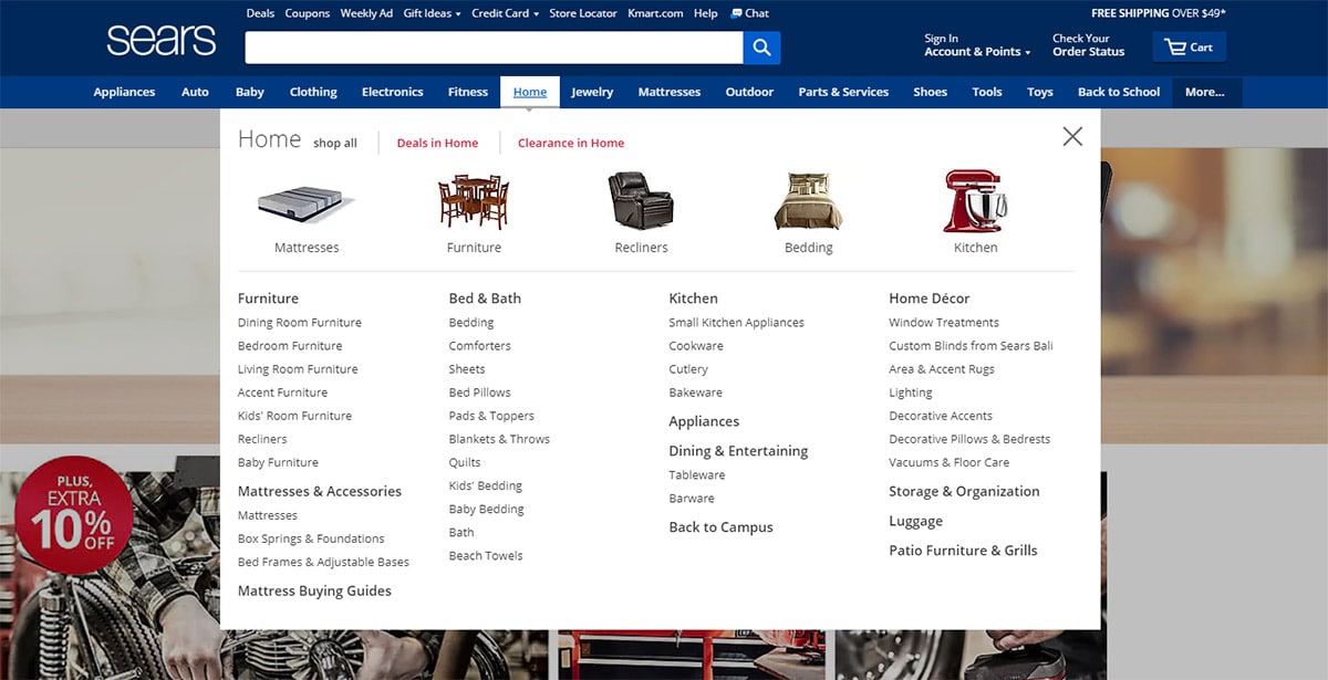
Some of the top categories have images for kitchen appliances, mattresses, and home furniture. But the deeper categories include direct links to things like cutlery and tableware.
Remember you can make a mega navigation pretty tall and still make it usable. So there’s room for a row of images and a row of text links for almost any nav.
But you could also go the route of a smaller menu like with PlayStation’s dropdowns.
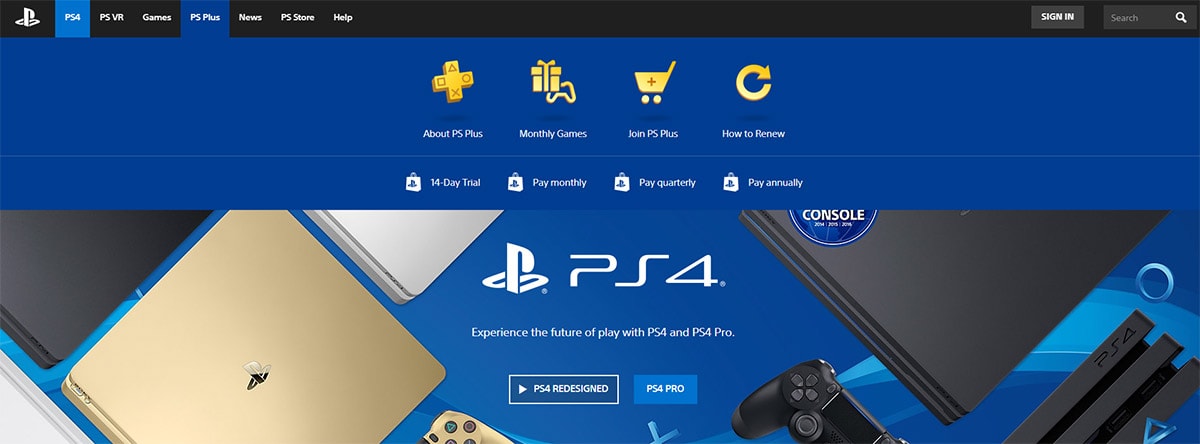
Their navs also include a good mix of images with text, many of which are labels for individual pages.
If you have the time to design custom icons you could try this for your own site. Include an icon next to each major link so you have visuals plus text for navigation.
Alternate Dropdown Techniques
Be willing to experiment with your mega navigations. There are no strict rules for this and great UX comes from testing to see what works.
Some websites really push the boundaries of dropdowns with custom animations, multiple columns, and even flyout menus that appear out of mega navs. If the menu is usable and works then it’s a job well done.
But you can always push a little further if you’re willing to try.
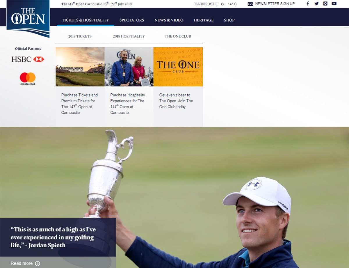
The Open has a typical mega nav menu which expands while hovering. But it uses one alternate technique which pushes down the entire page to make room for the new menu.
Most mega navs appear on top of the page but this one animates down while moving all the page content lower.
Certainly not a perfect idea for every website but it’s unique. And if it works for The Open’s site then it could work for others.
Just depends if you’d want to try it out and maybe run some A/B tests on usability.
Another example is on the Waterworks site where the dropdowns do not appear unless you click.
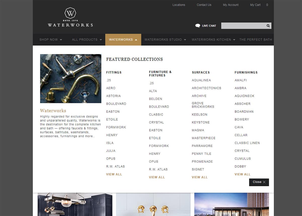
Again these look and feel just like traditional mega navigation menus. But they deviate from the norm(hovering) by targeting a different user event(clicking).
It has a small “close” button in the corner so there’s an easy way to close it too. But this probably won’t work for every site and it’d be most valuable for very tall dropdowns.
Keep all of these trends in mind as you move forward with mega nav ideas in your own projects.
Mega navigation menus are constantly advancing with new design styles and techniques. Studying other examples is great for getting started, but really try to think up your own ideas to push your menus even further.