UX Design Tips For Dropdown Navigation Menus
Dropdown menus have come a long way thanks to modern JavaScript and CSS3 effects. But not all dropdowns are created equal, and some UX strategies work better than others.
In this guide I’ll cover a handful of design techniques for building usable dropdown navigation menus. This includes multi-level dropdowns and mega menus which all rely on the same core design principles.
It’s a good idea to include markers for links that have sub-menus attached. These small visual indicators let users know where links are placed and how to access them.
And these rules apply to all menus whether you’re designing with 1 tier or 4 tiers of links.
Markers can range from arrows to dots or squares or anything noticeable. Most users are smart enough to pick up what the symbol means, so long as it’s universal.
With Postcards Email Builder you can create and edit email templates online without any coding skills! Includes more than 100 components to help you create custom emails templates faster than ever before.
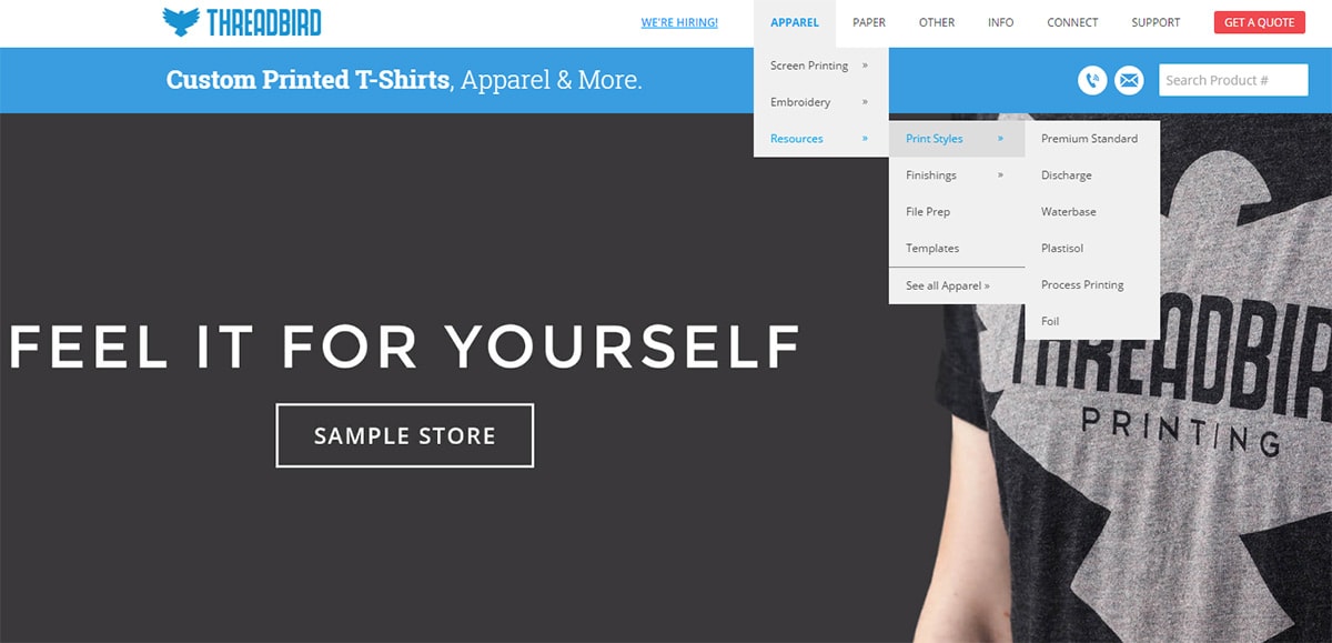
Free Email BuilderFree Email TemplatesThe Threadbird navigation is a fantastic example of this effect in action.
Some of their links have sub-menus while others don’t. In fact some of their links have sub-sub-menus which you can only discern by their unique marker next to each link.
Threadbird uses the right-pointing double angle quotation mark, simplified to raquo. Web designers prefer this symbol over a single arrow because it’s bulkier and easier to notice at a distance. Plus it holds its shape well even at smaller sizes.
You can find a similar design on the TutsPlus navigation. They use downward-pointing arrows for dropdowns and right-pointing arrows(closing point brackets) for the flyout menus.

One thing I don’t like in this design is the sub-menu arrow style. The arrow icons only appear while hovering a menu item, even though all the other links have submenus too. Good design practices would encourage keeping these arrows visible at all times.
But I do like the simplicity of the TutsPlus design. It’s a perfect example of how tiny little markers can go a long way towards better usability.
Space With Link Padding
It drives me crazy when I see designers misusing space in their navigation.
With Pulsetic you’ll be instantly notified the moment your website, API, or server becomes unavailable. Monitor uptime from multiple global locations and respond to incidents before your users are affected.
Create beautiful status pages in minutes to keep customers informed during outages and build trust with transparent communication.
Start Monitoring for FreeThe majority of dropdown menus with search have a bit of space between links. But there’s a huge difference between margins and padding.
With margins you need to click/tap on the actual link text. The clickable area is only as large as the text itself. But with padding you can make the entire area clickable meaning the user has a much larger target. In the context of menu links I’d argue larger is always better.
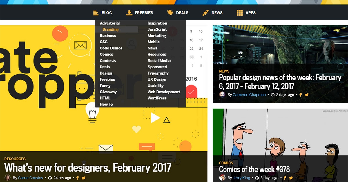
Webdesigner Depot has a cool animated dropdown menu courtesy of their recent redesign. When you hover the “blog” link you’ll get a two-column dropdown menu. If you hover any of these links you’ll notice they use padding to create space.
This means you can click in the white space around the link text which makes navigating the site a lot easier.
Most dropdown menus fall into one of two types: padding for spacing or margins for spacing.
You can tell by hovering the space around the link to see if your cursor turns into a clickable glove. Here’s an example of a site that doesn’t use padding.
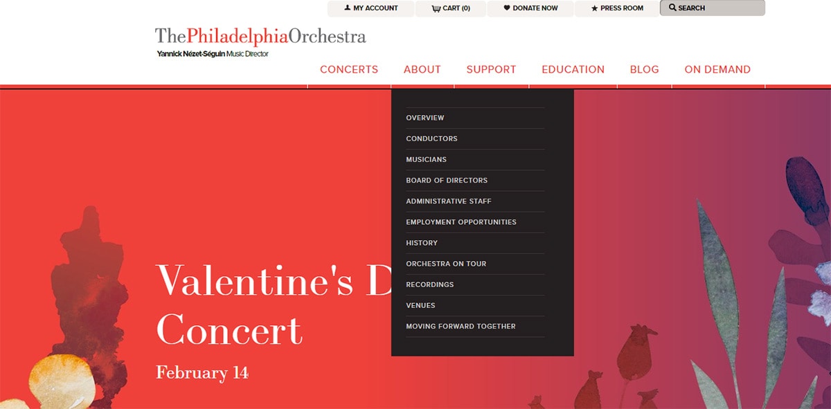
The Philadelphia Orchestra has a fantastic website. Clean, usable, and easy to read.
But when you hover any of the dropdown links you’ll notice only the text is clickable. Worst of all their dropdown menus are pretty wide, but the link text is fairly short.
I can’t imagine a scenario where margins would be better than padding. By making the links block-level elements they can span 100% of the dropdown menu. This means the user could click anywhere in that link’s box and still visit the page.
To me the choice is obvious. If you can increase the click/tap area of links in your dropdown menus then you’ll greatly improve the navigation experience.
Clear Hover States
Designing an “active” class for hovered menus keeps attention where it belongs. Most designers use the CSS :hover pseudo-class which works great for actively-hovered links.
But it’s also a good idea to keep the main link highlighted when the user is hovering submenu links. This denotes a clear path of activity where anyone can glance at the menu and quickly determine which primary link is active & which sub-menu link is hovered.
You can design hover states with many techniques like font color changes, BG color changes, text underlines, highlights, box shadows, whatever. The goal is to keep the parent link activated even when it’s not being directly hovered.
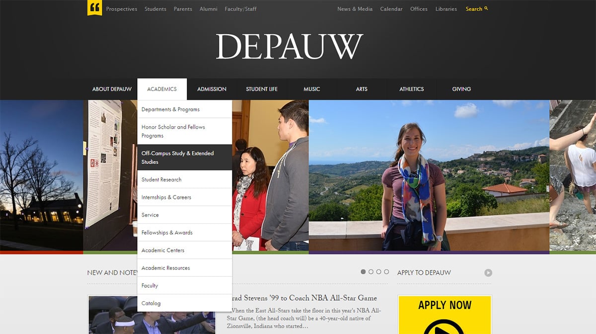
DePauw University uses very simple contrasting colors between white and black. The default navigation uses white text on a dark background. When hovering a link you’ll notice that these colors reverse.
But when you hover a primary link with a sub-menu you’ll also notice it stays lit up the whole time. You can hover any internal link and still get that main highlight effect.
Each design can have its own styles so you don’t need to go black & white like DePauw. But the active styles should be noticeably different than the default links.
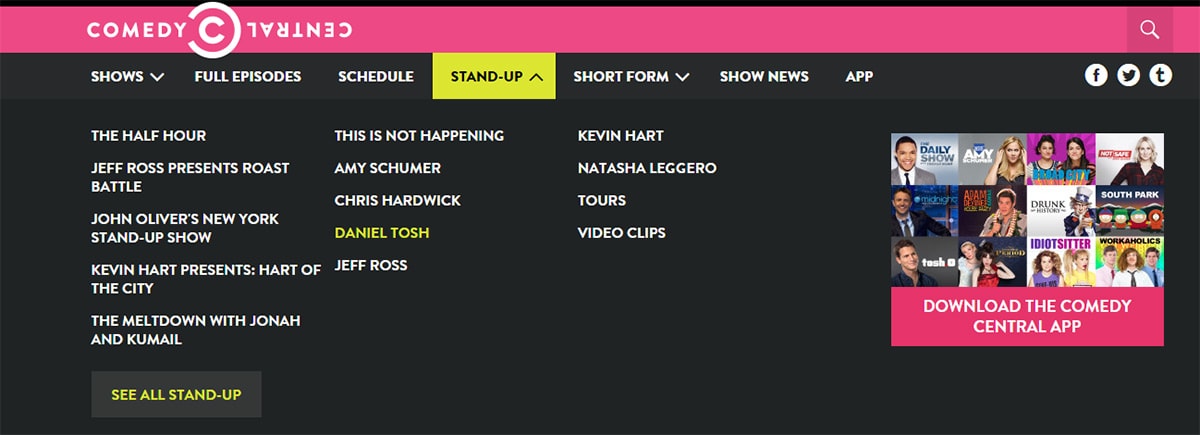
On Comedy Central’s website you’ll find the same effect. But instead of a white highlight color they use a lime green/yellow.
You can build a working dropdown menu without this active highlight effect. But UX designers know that just because something works doesn’t mean it’s working optimally.
I think all dropdown menus should keep an active highlight over the parent link. This also includes sub-sub-menus that go 2-3 layers deep.
Quick Dropdown Animations
CSS3 mixed with jQuery can make some powerful animations for the web. Dropdown menus thrive on animation whether they’re sliding or fading into view.
But animation should always serve a purpose. UI/UX designers need to use animation practically. It should bring the interface to life but shouldn’t slow down the user experience in the process.
The best dropdown animations can be summarized with two words: quick yet noticeable.
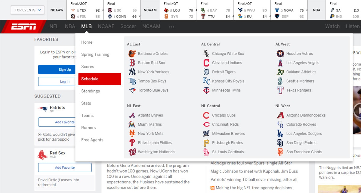
Take a peek at the ESPN top navigation. You can hover any sports division to get a dropdown menu of teams and related links.
This dropdown clearly slides into view from top to bottom. However it does this quickly so you’re not stuck waiting 2-3 seconds before you can interact with the links.
Generally I recommend keeping menu animations at 1.5 seconds or less. This rule of thumb only applies to menu animations because they’re interactive elements. But you can easily extend animations for other page items up to 3-5 seconds(or more) if it makes sense.
Ironically the CSS MenuMaker website has a stunning top menu design. The dropdowns have callout arrows like speech bubbles to denote which primary link it belongs to.
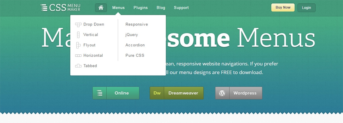
But in the context of animation these dropdowns are swift. I’d estimate their animations run for 300 milliseconds quickly fading in & out of view.
But they only animate when focus moves elsewhere, so once they’re visible the links do feel solid.
That’s the key to a great dropdown menu animation. It should have that magical sense we all love in animation, but the animated element should also feel like a solid part of the page.
Closing
A quality dropdown menu considers both form and function. Yes it should look nice, but it should also function well and create a fantastic experience for the visitor.
These tips are some that I live by in my design work. They’re all pretty simple to add into your dropdown menus with very little code. And if you’re looking for more examples of great nav menus take a peek through our inspiration section.