Elegance and Refinement of Mobile Interfaces based on Blurred Backgrounds
Being a basic photo effect for a long time, blurred backgrounds only recently have become a quite popular tool among web designers that had noticed its remarkable ability to help elements to stand out. Such approach rather readily, unobtrusively and quite naturally gives due prominence to content, icons and graphics that are placed on a fore even despite of their sizes. It helps you to kill 2 birds with one stone. Firstly, you can add some extra-ordinariness to your project, and secondly, you will be able to take care of a proper contrast that is quite essential for small mobile screens, effectively enhancing readability.
The obscured background also offers other potential benefits. For example, you can easily minimize your color palette, and focuses only on one primary color; especially it concerns white tone that looks absolutely fantastic and clean on such backdrops. As for graphics, you can use both solid and outline components that nicely interact with such images. Typography also falls under its overwhelming influence, so that even ultra-narrow font will look legible.
Today we have presented you a fresh list of startling mobile app interfaces that considers various examples and implementations of this strong effect.
Mobile Interfaces Examples based on Blurred Backgrounds
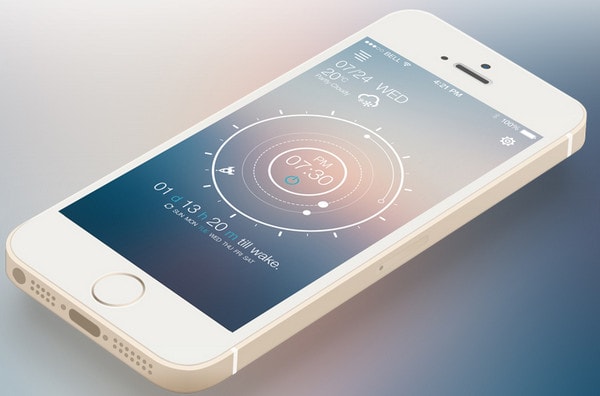
Solar alarm-work in progress by Rocket Child – The concept has a lovely vibrant and circular vibe. The designer beautifully mixes together unfocused background with light touches and neat outline components. The design looks absolutely harmonious and sophisticated.
Fitness App by buatoom presents a lovely combination of slightly blurred background and widgets based on a semitransparent canvas with nice glassy touches. The greenish landscape image adds a note of naturalness.
With Postcards Email Builder you can create and edit email templates online without any coding skills! Includes more than 100 components to help you create custom emails templates faster than ever before.
Free Email BuilderFree Email Templates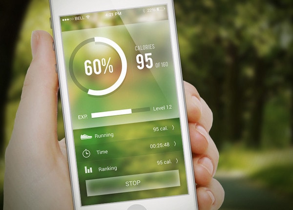
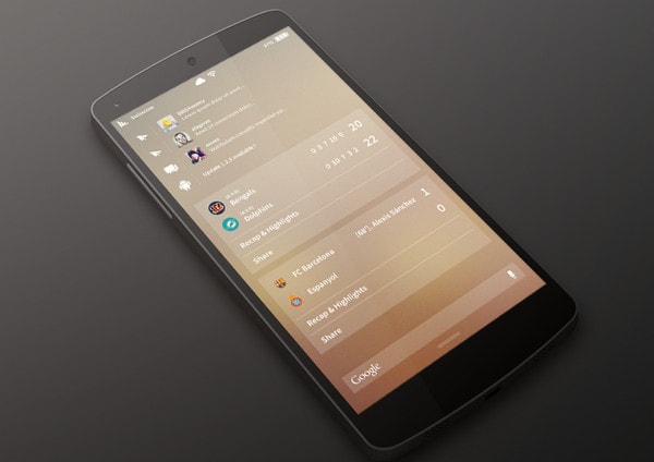
Notification Panel by Mathieu Croset – The designer skillfully leverages a warm coloring in order to give the interface more positive appearance. Much like the previous example, the designer also resorts to the same powerful combination of blurred background and elegant widgets with low opacity.
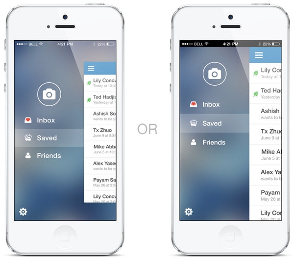
Which Menu? by Jon Sutherland – The shot depicts 2 variations on menu style that both are based on a blurred background. The greyish backdrop nicely collaborates with white bold type and sleek glyphs.
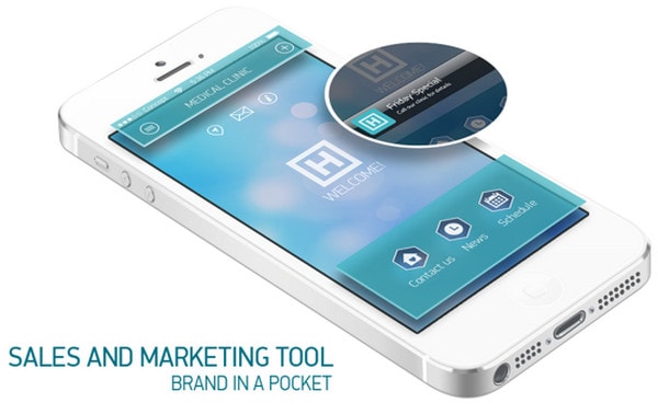
My Doctor App by Boris Ryabinin has a smooth stylish look that is achieved mainly due to bluish blurred background with a lovely bokeh effect in tandem with solid turquoise functional panels.
List Design by Cătălin Mălăescu is based on a vibrant image background that is wisely defocused in order to give the foreground elements more prominent look. Thus, all content and UI elements got a quite legible outward.
With Startup App and Slides App you can build unlimited websites using the online website editor which includes ready-made designed and coded elements, templates and themes.
Try Startup App Try Slides AppOther Products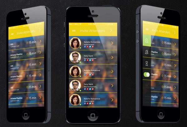
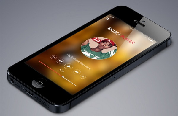
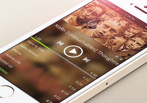
IOS 7 Music app mockup by Rashed kabir – The concept has a beautiful minimal appearance that is quite appropriate for such purposes. The warm heavily blurred background plays as a sound foundation for music player, central visual component and of course, type.
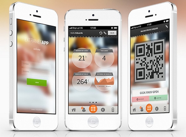
Extranet App for tutors has a wonderful glossy atmosphere that is effectively bolstered by slightly vague background and numerous smooth components. Such an ideal combination gives the interface an elegant appearance.
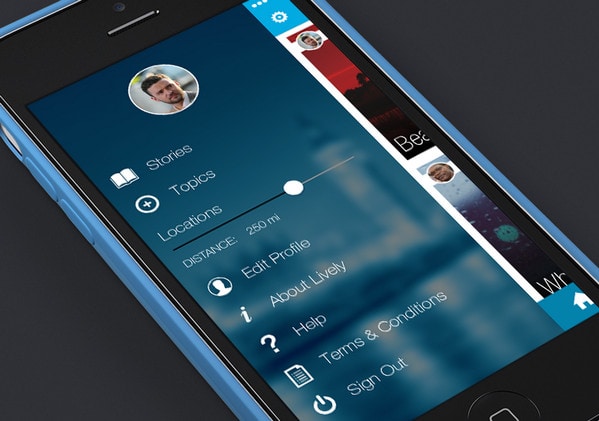
Lively App Settings by Karl Thyer – The interface demonstrates a crisp refined side menu with general settings that are built using an urban blurred image background, sharp white icons and clean typography.
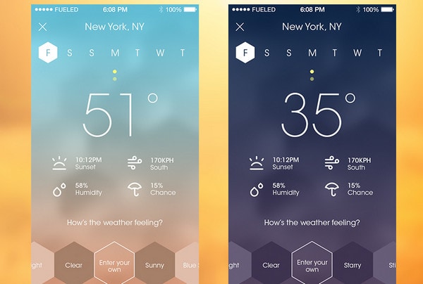
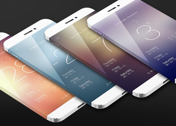
Weather! by Fueled is a subtle forecast application concept that clearly exudes an image of sophistication and originality. There are 2 design variations that both ably utilize unfocused background for effective content emphasizing. The ultra-narrow type along with outline icons ideally fit into design.
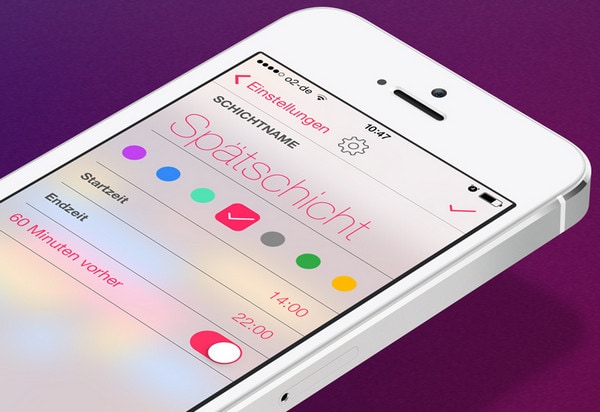
Copy Shift Settings Screen by Georg Bednorz – The designer does a great job of leveraging a kaleidoscope of garish colors, making the interface look pleasant and positively energetic. The whitish illegible background with colorful bokeh effect nicely echoes with vibrant foreground elements.
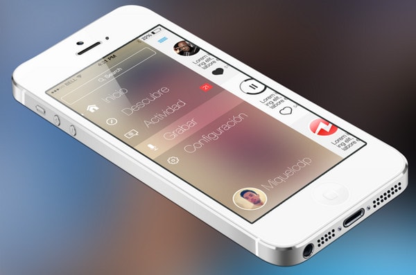
uWhisp iOS7 by Miquel Las Heras – The concept conveys a quite warm atmosphere. The designer keeps things simple and understandable, leveraging a smooth polished patchy backdrop, large font and intelligible icons.
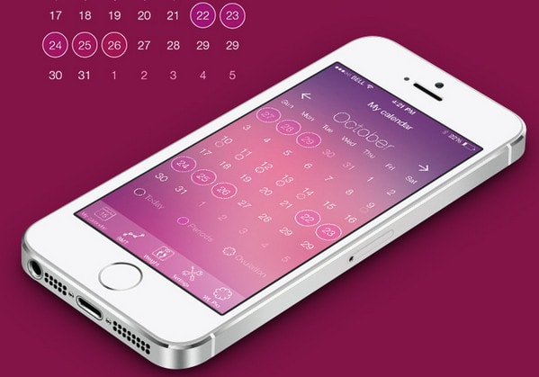
Concept WomenLog ios7 by Ksenia Butyrina – The design speaks completely through color palette that brings its sophisticated womanish vibe. The designer capably utilizes trendy shades of Radiant Orchid, soft undertones, elegant type and outline components, making the theme look complete.
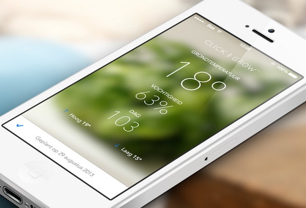
Click & Grow webapp by Bas van der Ploeg – The interface looks harmonious and balanced; the blurred image with natural notes effectively livens up the content that is presented by means of tiny subtle font.
Wear Preview #1 by Matt Whiteley – The designer takes a more traditional solution to its design, leveraging a striking contrast between black and white colors. Thus as usual, the background got darker appearance whereas content along with icons look prominent due to light tones.
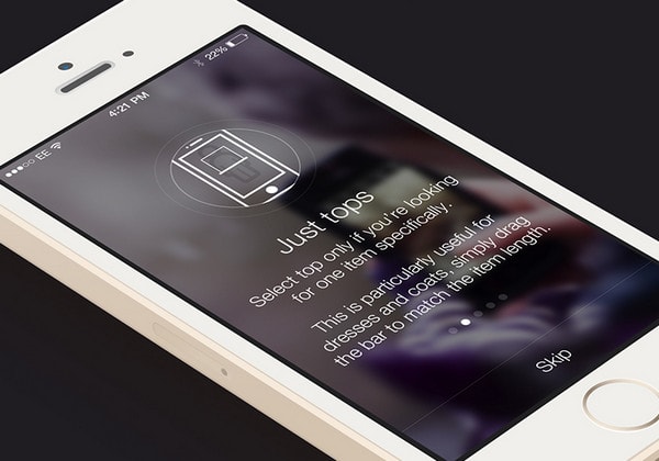
navigation menu by Al Rayhan has a sleek appearance that is full of aesthetics. Grey coloring perfectly complements a light type and line style glyphs.
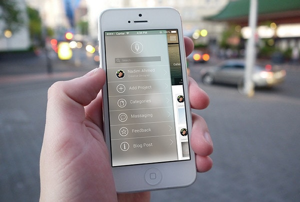
App Login by Al Rayhan – The login screen is based on a minimal coloring that efficiently encourages users to sign in. The shades of brown and grey laconically interact with each other, giving the interface a quite pleasant appeal.
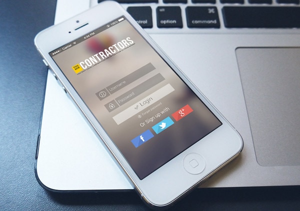
iPhone Weather App by Greg Dlubacz – Polished, bright and elegant – these characteristics are inherent to this concept. The designer offers several options, providing users with various interfaces that will reflect their mood.
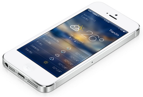
ios 7 Weather by Chunli Liu – The design immediately gives you a sense of what is going on outside, providing a quite informative interface. The slightly blurred background with landscape scene adds to the concept a note of naturalness.
Spotify Redesign Concept by Elvira Arkanov – The concept features a quite common approach of representing control center of media player. Thus, the blurred background helps to effectively highlight essential components.
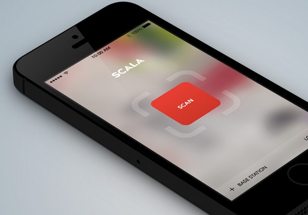
Tag scanner app by Algert Sula effectively concentrates users’ attention on central button that is supported by minimal layout and obscure backdrop.
Reflection
Blurred background, whether it is an almost unfocused image or vice versa slightly illegible picture, manages to effectively pop off foreground elements, beneficially stressing text and even tiny graphics. It is a perfect match for creating bold contrast and adding a note of refinement and subtlety.
What do you think about this trendy approach? Does it look appropriate on small mobile screens? Does it contribute to better user experience? Do you know any other benefits of using blurred backgrounds?
