Getting Started With Chrome and Firefox Developer Tools
Chrome and Firefox are modern web browsers that have built-in tools to help developers edit pages and fix problems directly in the browser.
Chrome has its developer tools and Firefox has its developer tools.
Both have many overlapping features and some unique features.
In this article, we’ll cover the most common features to help you get started.
How to open the developer tools
Chrome tools
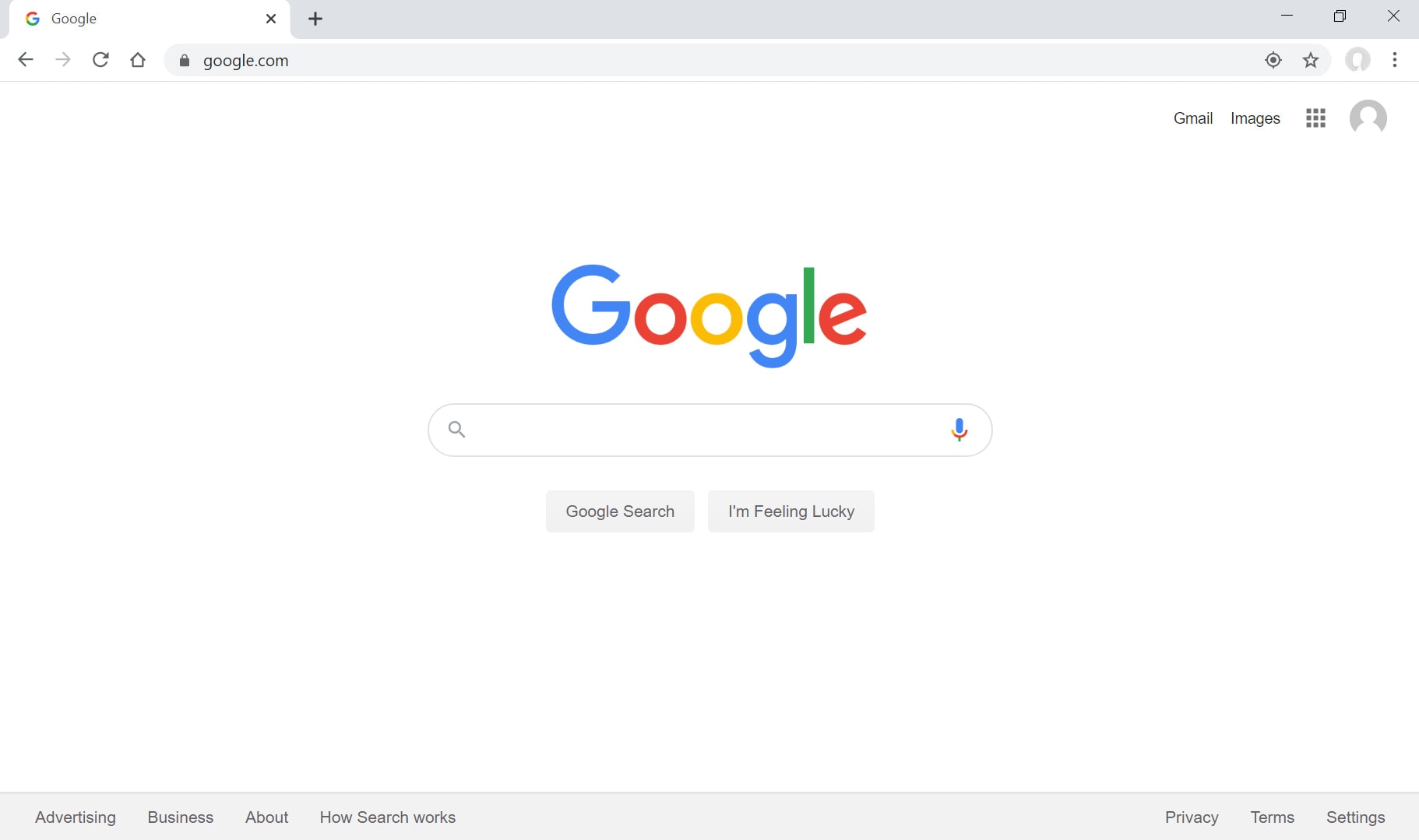
When you open Chrome, you’ll see this screen:
Press “Control + shift + i” to open the inspector/developer tools or right-click anywhere in the web page and press “Inspect”:
With Postcards Email Builder you can create and edit email templates online without any coding skills! Includes more than 100 components to help you create custom emails templates faster than ever before.
Free Email BuilderFree Email Templates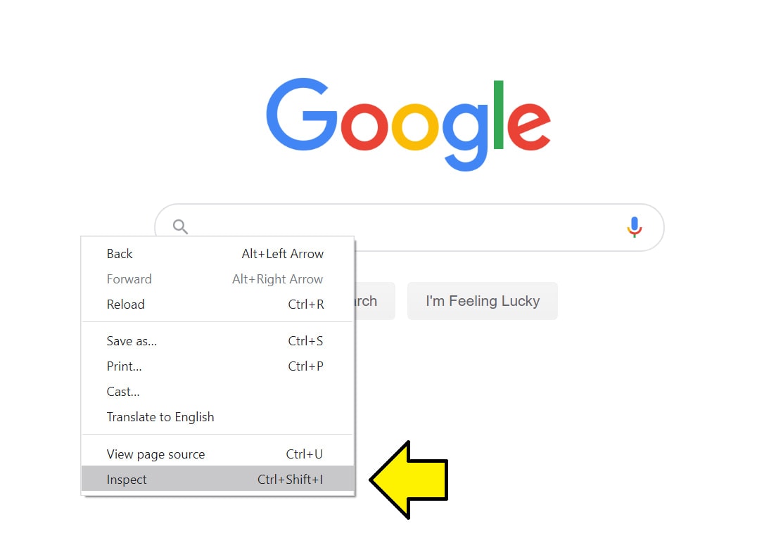
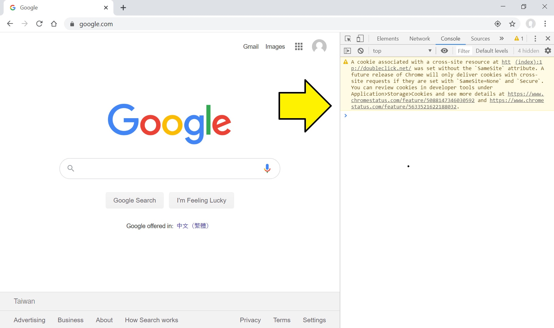
That will open up the developer tools:
Firefox tools
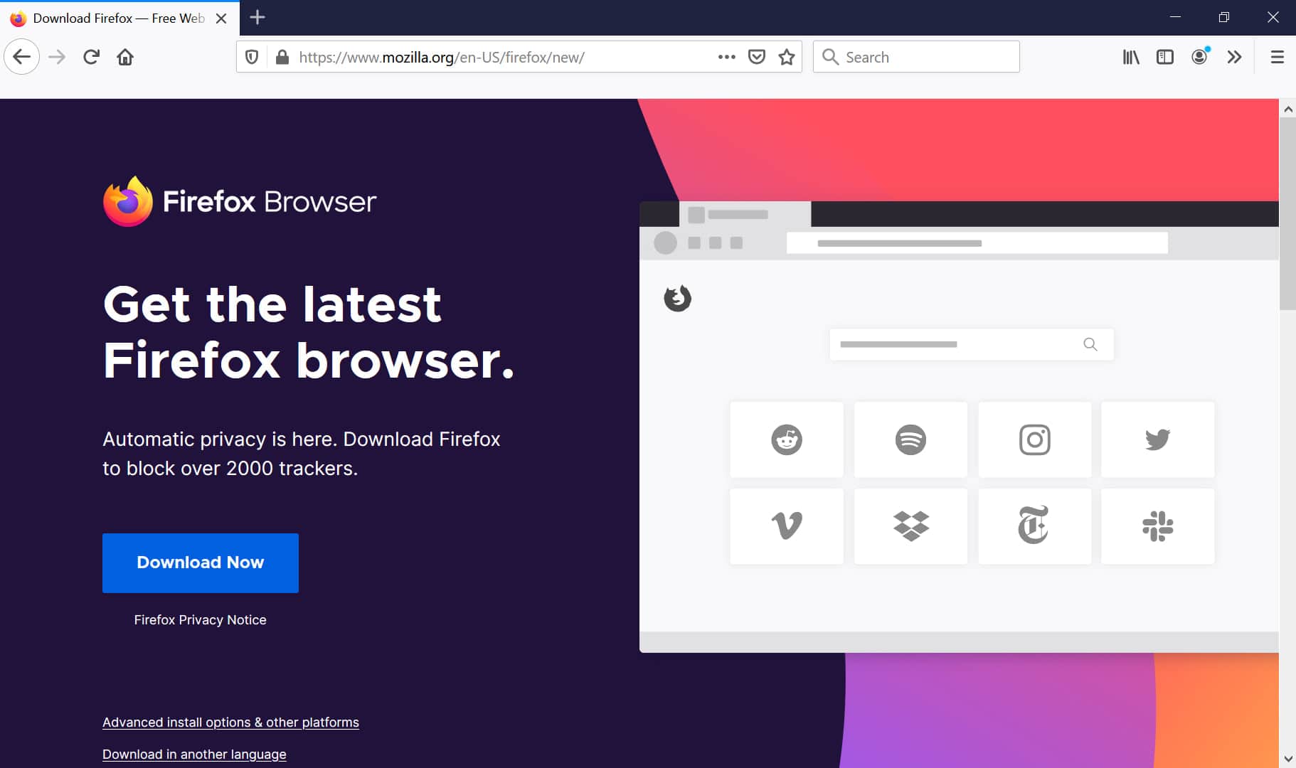
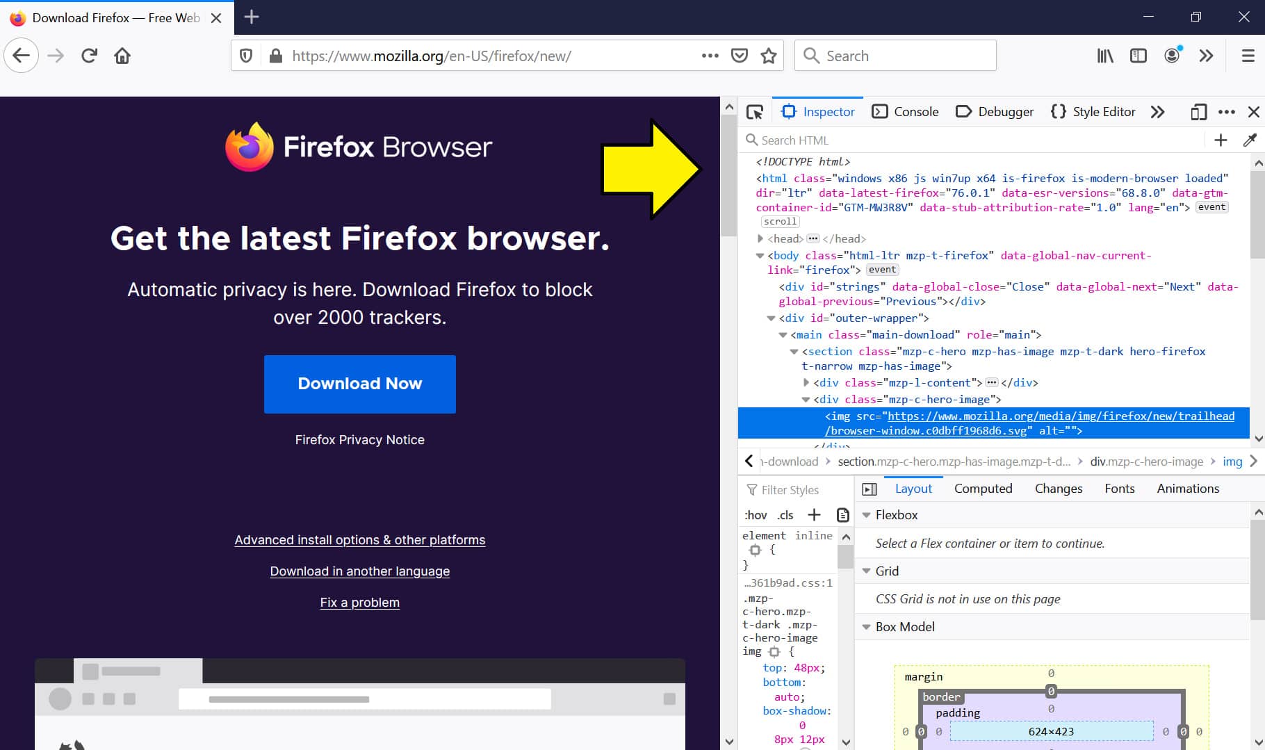
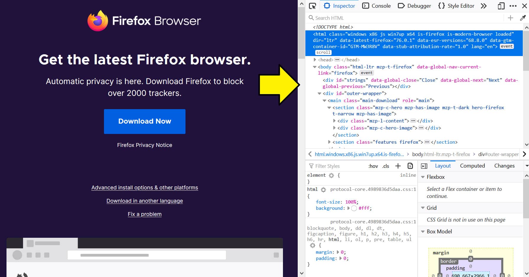
When you open up Firefox, you’ll see this screen:
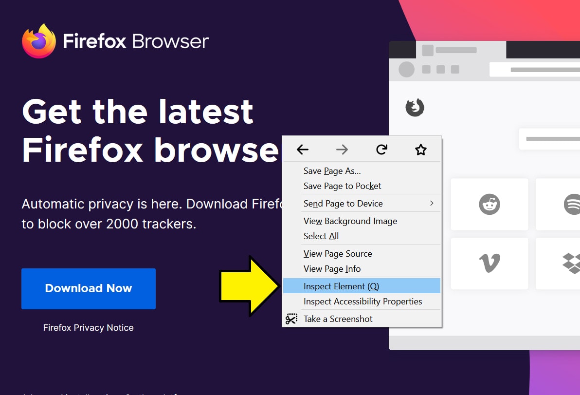
Press “Control + shift + i” to open the inspector/developer tools or right-click anywhere in the web page and press “Inspect Element”:
That will open up the developer tools:
Available panels
Chrome panels
The available panels in Chrome can be found in the top bar of the developer tools.
They are:
- Elements – View and change the DOM and CSS.
- Console – View messages and run JavaScript from the Console.
- Sources – Debug JavaScript, persist changes made in DevTools across page reloads, save and run snippets of JavaScript, and save changes that you make in DevTools to disk.
- Network – View and debug network activity.
- Performance – Find ways to improve load and runtime performance.
- Memory – Profile memory usage and track down leaks.
For a full list of the available panels, visit this link.
Elements and console are the most commonly used panels and the ones we’ll cover in this article.
With Pulsetic you’ll be instantly notified the moment your website, API, or server becomes unavailable. Monitor uptime from multiple global locations and respond to incidents before your users are affected.
Create beautiful status pages in minutes to keep customers informed during outages and build trust with transparent communication.
Start Monitoring for FreeFirefox panels
The available panels in Firefox can be found in the top bar of the developer tools.
They are:
- Inspector – Use the Page Inspector to examine and modify the HTML and CSS of a page.
- Console – View messages and run JavaScript from the Console.
- Debugger – The JavaScript Debugger enables you to step through JavaScript code and examine or modify its state to help track down bugs.
- Network – The Network Monitor shows you all the network requests Firefox makes, how long each request takes, and details of each request.
- Performance – The Performance tool gives you insight into your site’s general responsiveness, JavaScript and layout performance.
- Accessibility – The Accessibility Inspector provides a means to access important information exposed to assistive technologies on the current page via the accessibility tree, allowing you to check what’s missing or otherwise needs attention.
For a full list of the available panels, visit this link.
Inspector and console are the most commonly used panels and the ones we’ll cover in this article.
How to move the interface
Chrome interface
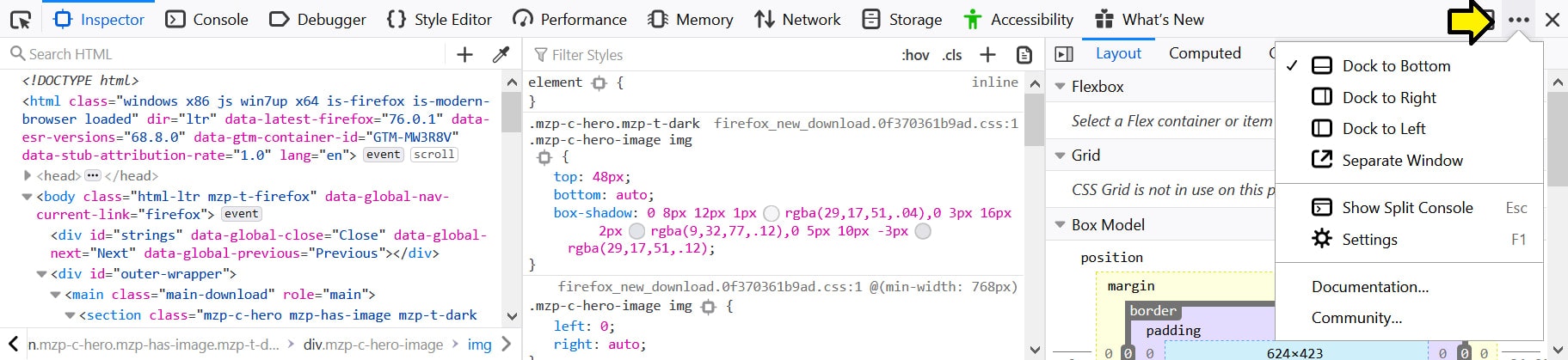
To move the Chrome dev tools, press the three dots on the right side of the top bar:
There are four options: dock to left, dock to right, dock to bottom, and open in a separate window.
Firefox interface
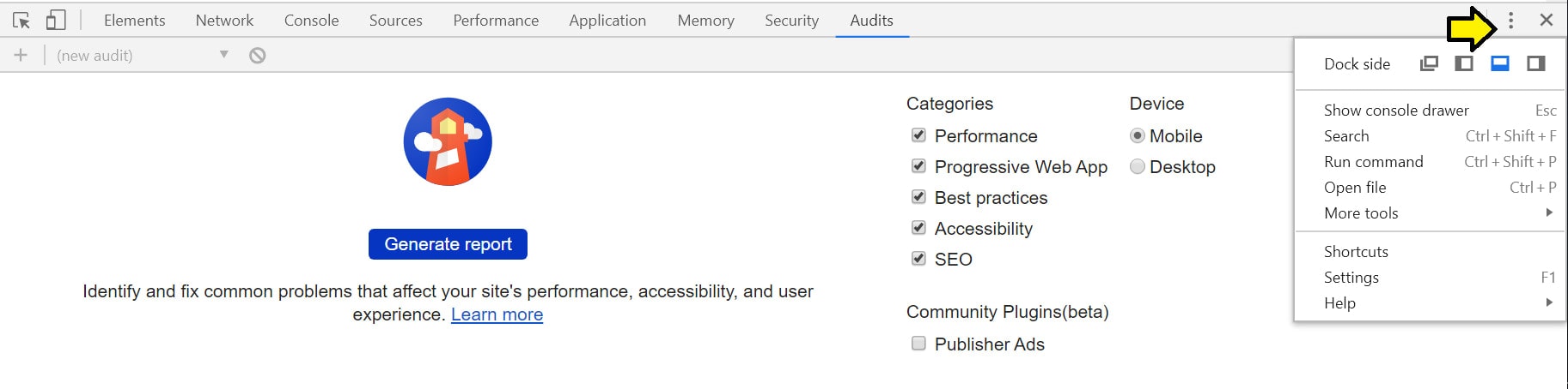
To move the Firefox dev tools, press the three dots on the right side of the top bar:
There are four options: dock to left, dock to right, dock to bottom, and open in a separate window.
View web page on different screen sizes
Both Chrome and Firefox have options for viewing the web page in different screen sizes. This helps developers and designers see what the website style looks like on different screen sizes and devices.
Chrome screen size
To activate the responsive view in Chrome, press the “Toggle device toolbar” on the left side of the top bar.
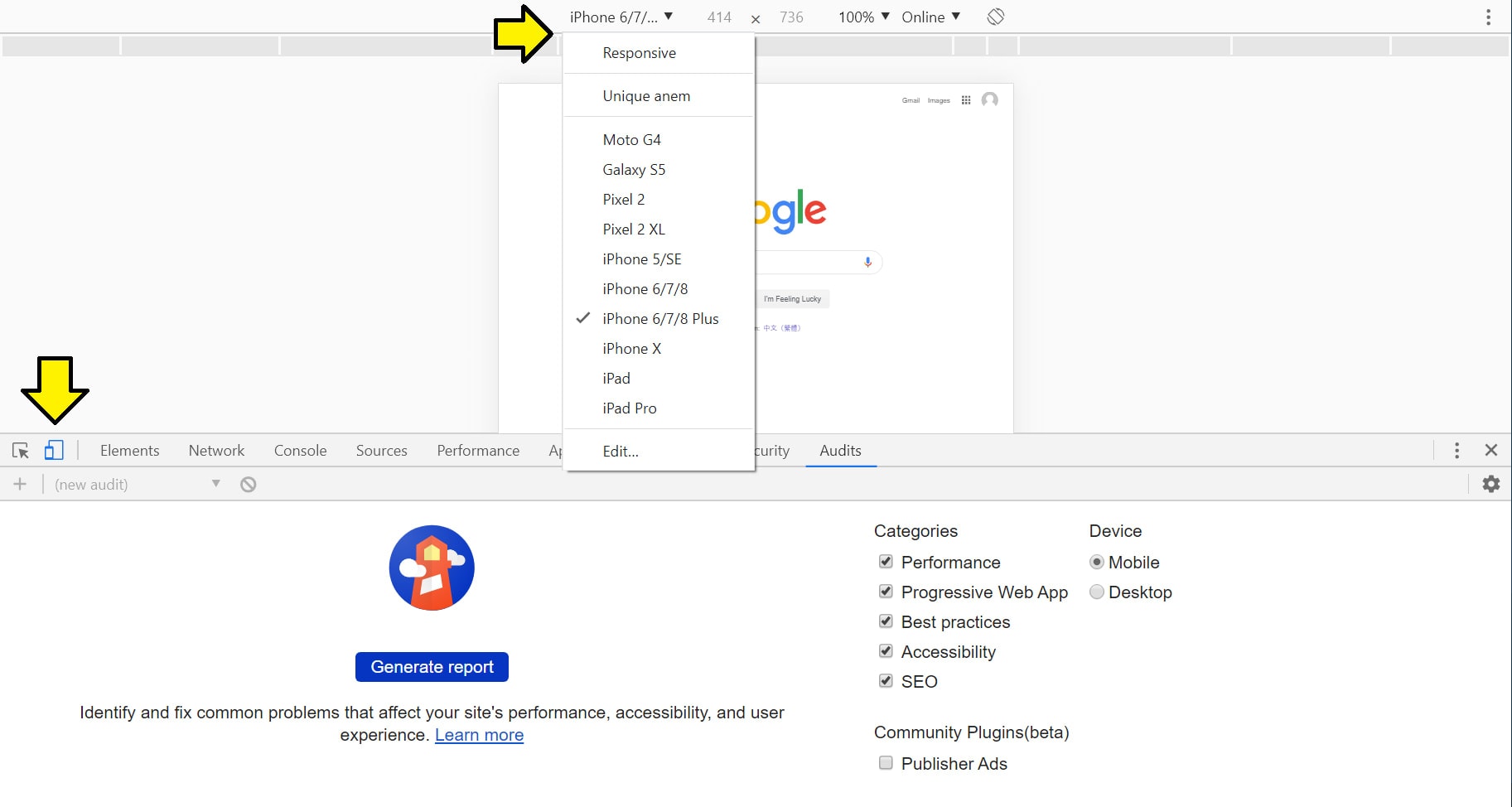
You have more options to adjust the size, select a pre-defined screen size, adjust the zoom, rotate the device, and more.
For more information about Chrome’s responsive design mode, visit this link.
Firefox screen size
To activate the responsive view in Firefox, press “Responsive design mode” on the right side of the top bar.
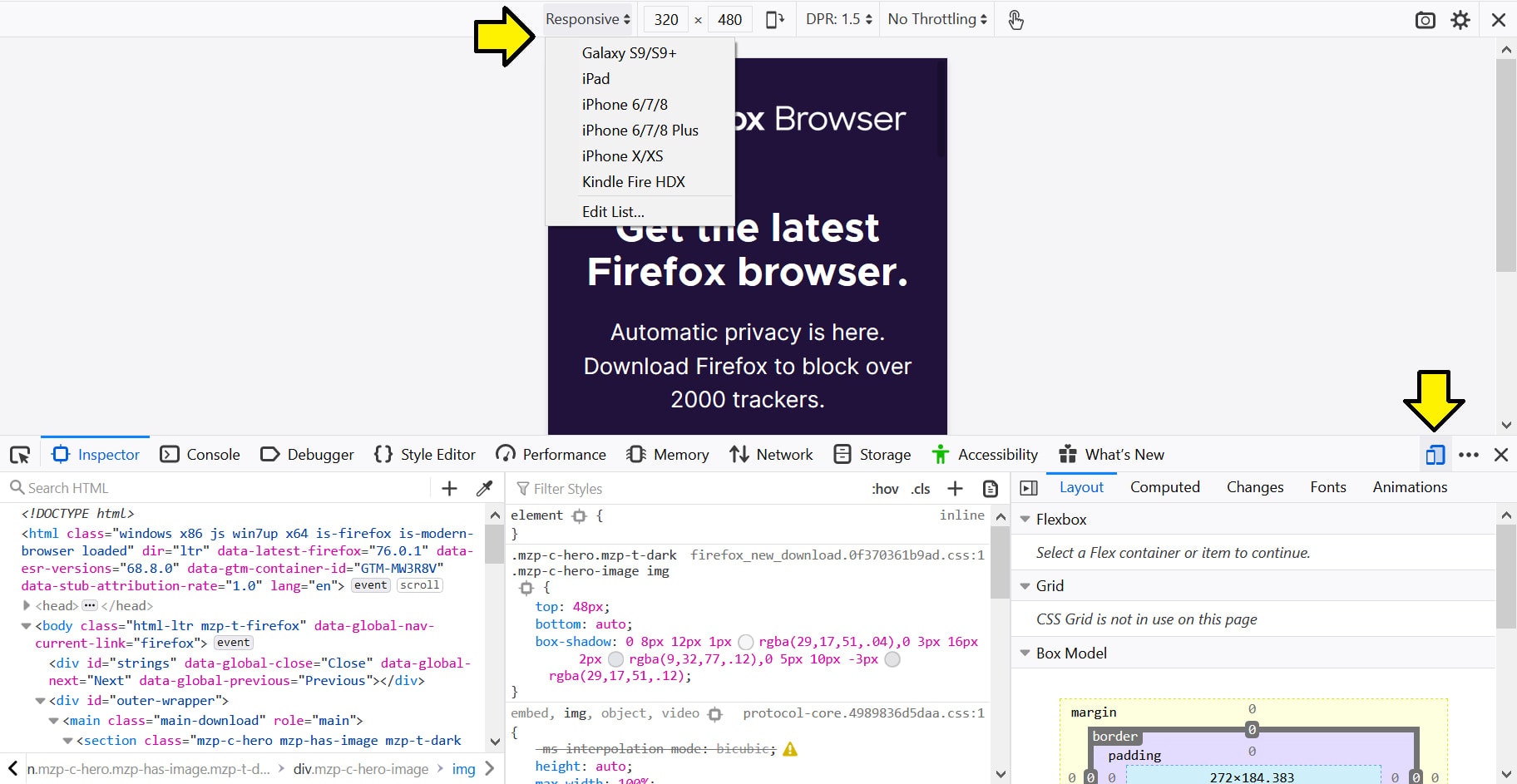
You have more options to adjust the screen, activate throttling, rotate the screen, and more.
For more information about Firefox’s responsive design mode, visit this link.
Elements panel
The elements panel is the most commonly used feature in these tools. This is where you can manipulate the DOM which changes the web page itself.
If you want to see what the web page looks like with different styles, or different content, or different elements, or anything related, you can make those changes directly in the elements panel. The changes will be reflected on the web page.
This allows developers and designers to edit their website directly in the browser without having to change their source code.
Source code
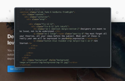
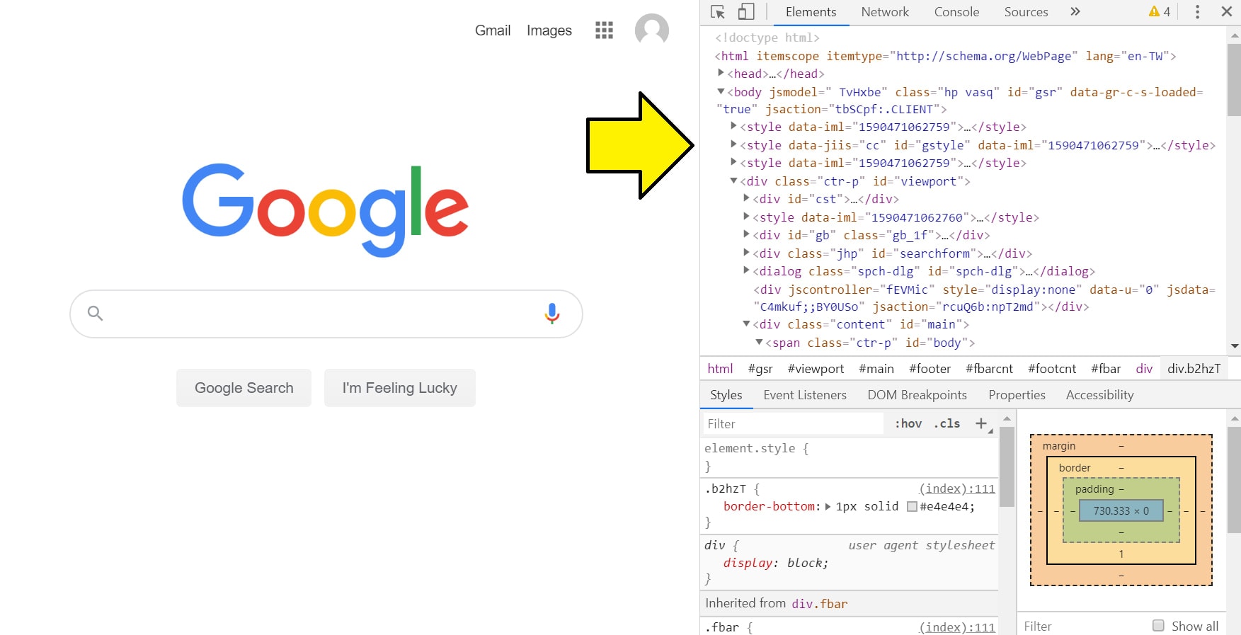
The source code is the HTML code that renders the web page.
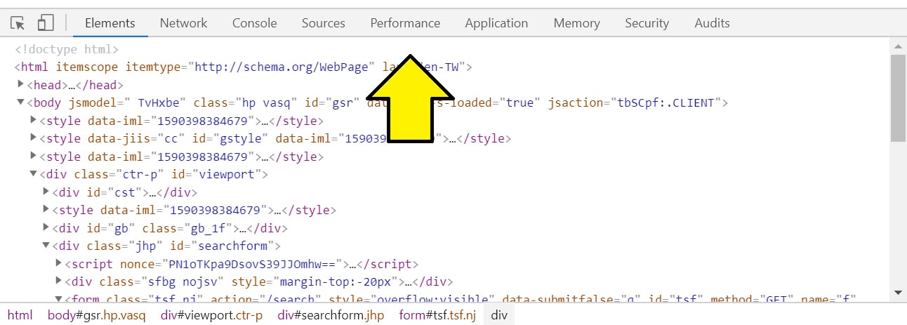
In Chrome, it looks like:
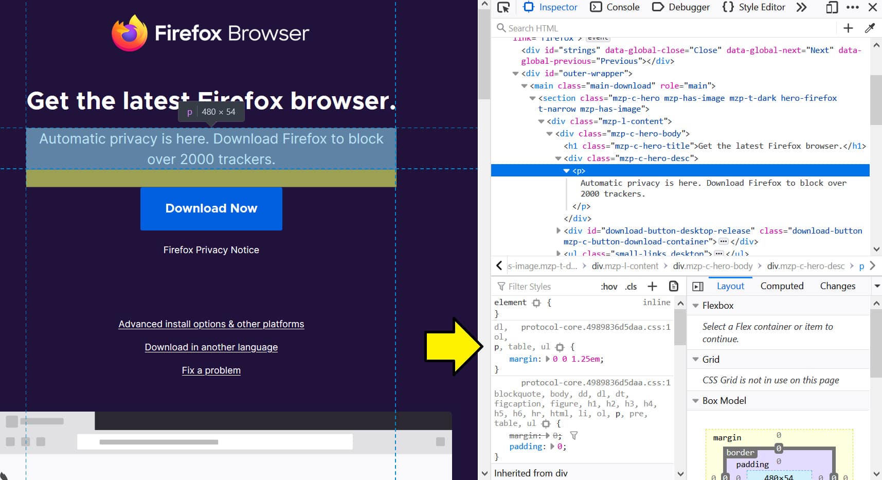
In Firefox, it looks like:
Styles
The styles part of the elements panel is where all of the CSS is defined on the HTML element.
You can edit the styles directly in this section which will update the changes on the web page but won’t update the changes in the original file.
In Chrome, it looks like:
In Firefox, it looks like:
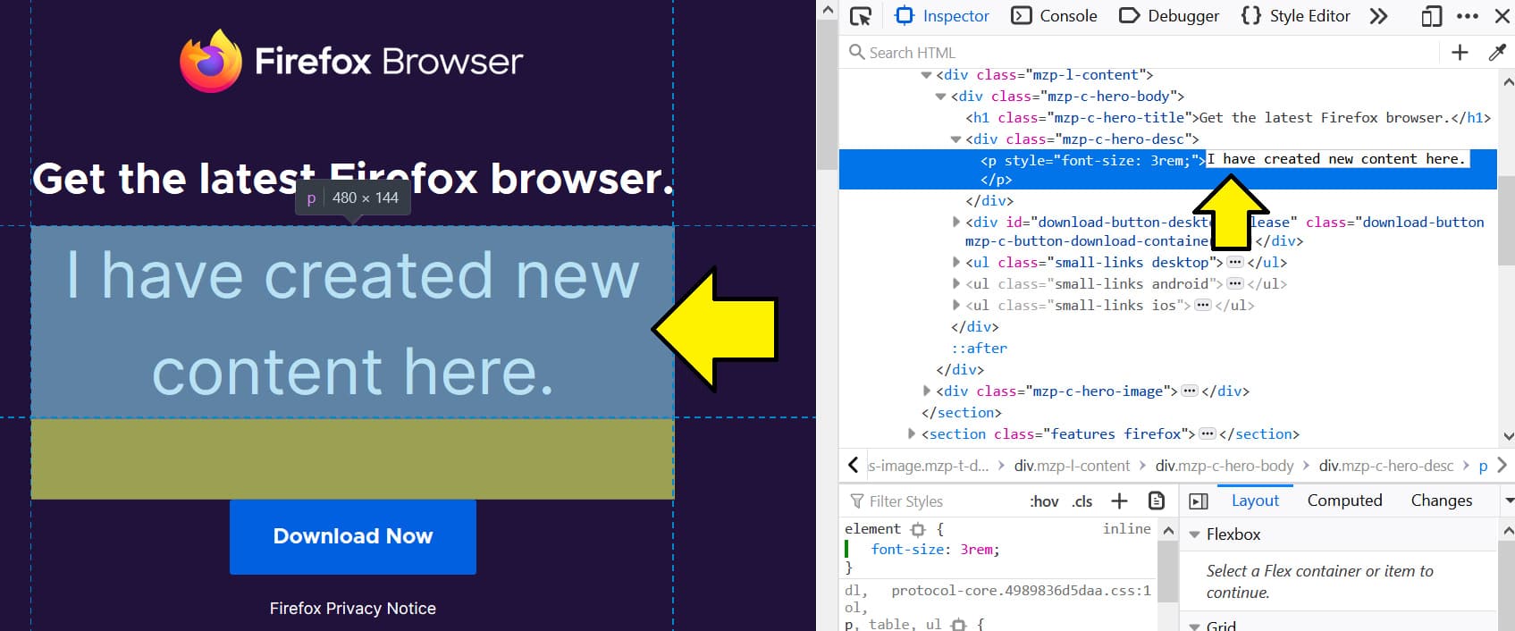
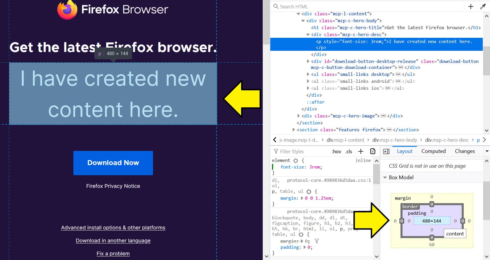
You can edit the styles of the selected element by writing new CSS code in any of the CSS selectors.
In the image below, I’ve added a new font-size style to the selected paragraph element which updates the look on the web page.
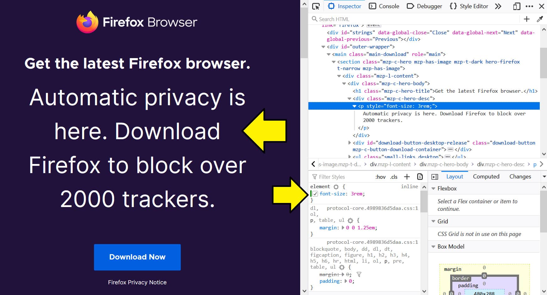
You update the styles in the same way with Chrome and Firefox.
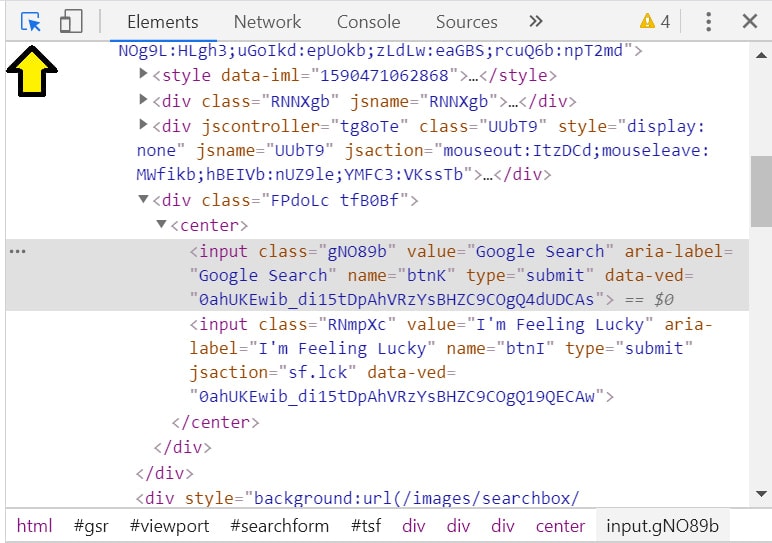
Highlighting and selecting an element
To select a particular element, you can press the element selector icon or press “control + shift + c” to activate it.
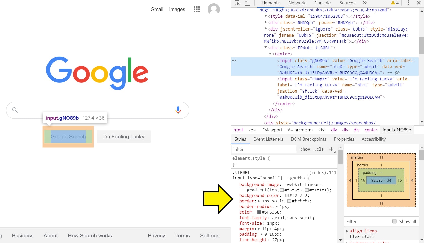
In Chrome, it looks like:
In Firefox, it looks like:
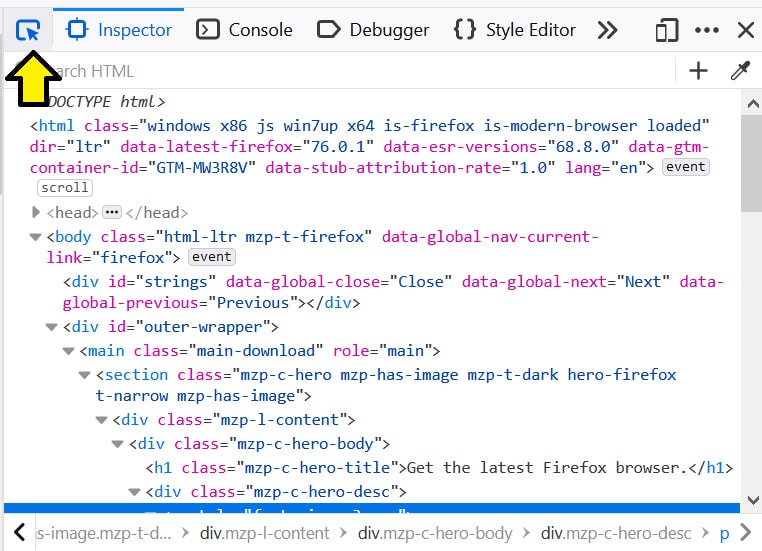
When this selector is activated, elements you hover over will be highlighted. If you click that element, the element will be selected in the inspector/elements panel.
It’ll look like this:
Both Chrome and Firefox work in the same way.
Changing classes and attributes
If you want to see what an element looks like or does with a different class or attribute, you can do this in the elements/inspector panel.
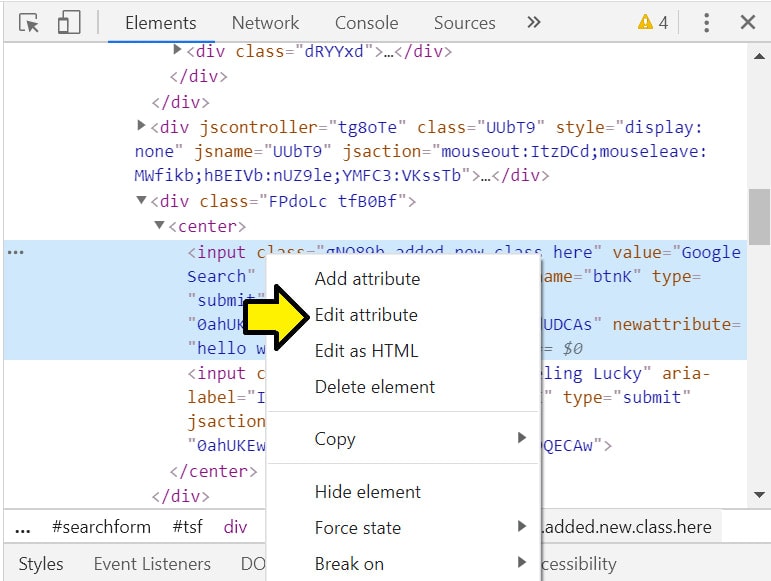
In Chrome, if you right-click an element, you’ll see options to “Edit as HTML” or “Add attribute.”
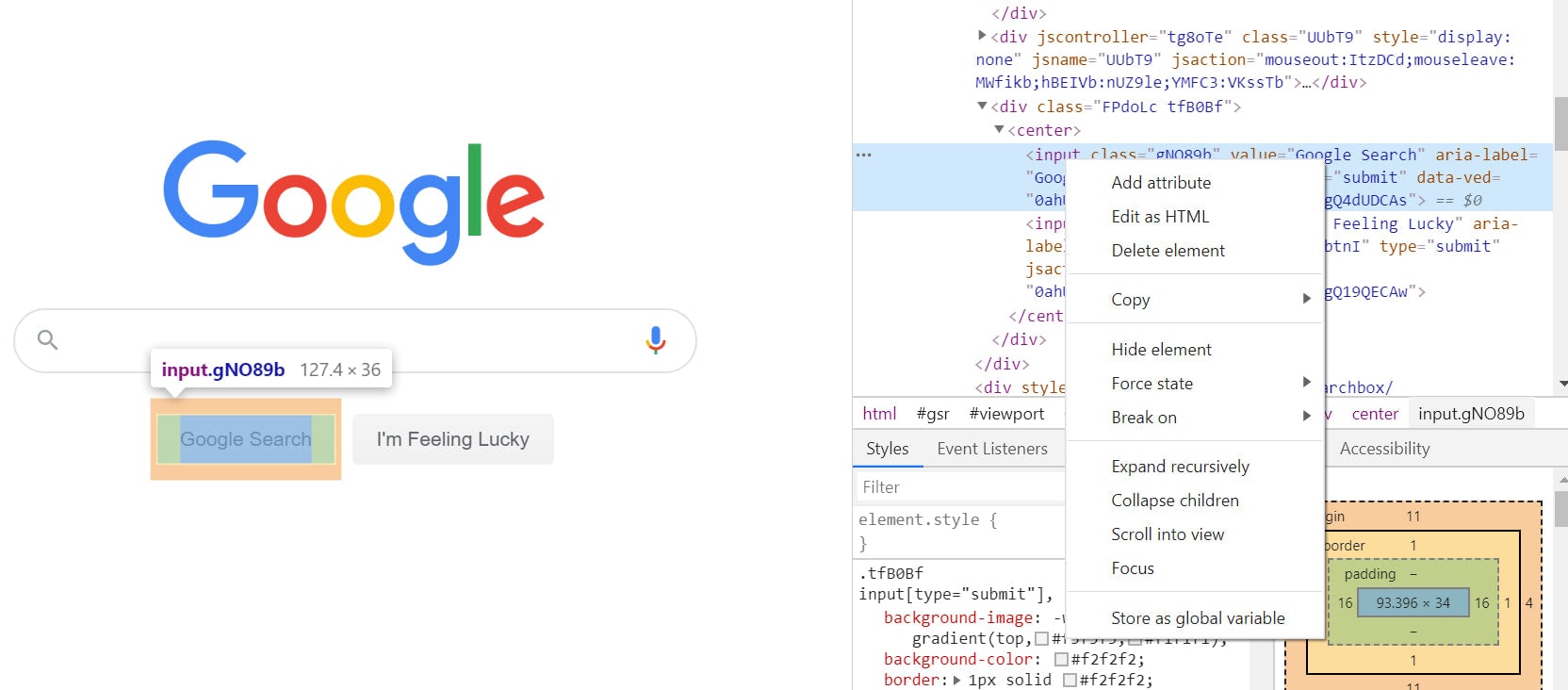
If you press “Add attribute,” you’ll be able to type in an attribute like a text field.
You can then press “Enter” or click outside the element to add those changes.
If you press “Edit as HTML,” the element will be converted into a textarea where you can edit the code like in a text editor.
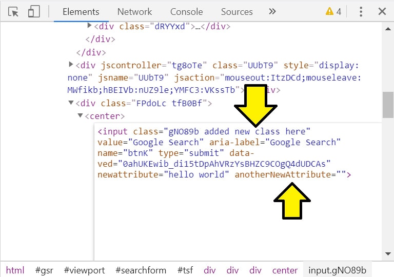
In the image above, I’ve typed in new classes to the class attribute and added another attribute like I could in a text editor.
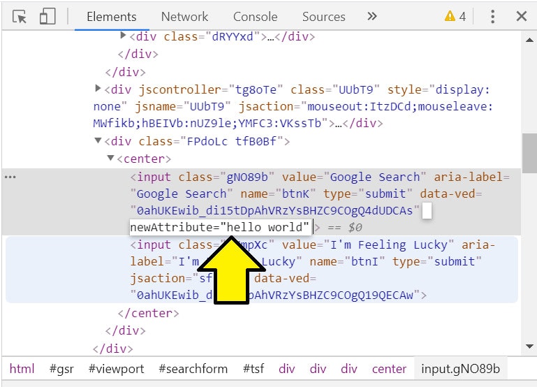
You can also right-click directly on an attribute and edit the attribute by itself.
This will open an input field on just the selected attribute.
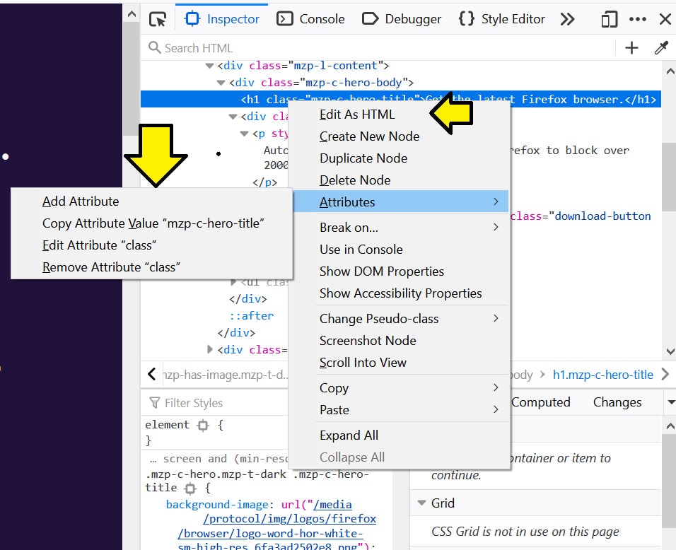
In Firefox, it works similarly, only the options look different when you right-click on an element.
Editing the contents of the HTML
If you want to see what the web page looks like with different content like a different heading, you can edit the content directly in the elements/inspector panel.
In Firefox and Chrome, you just have to double click the text in the element and that will open an input field with the content of the element.
You can then enter new values and press “Enter” or click outside the element to update the content value of the element.
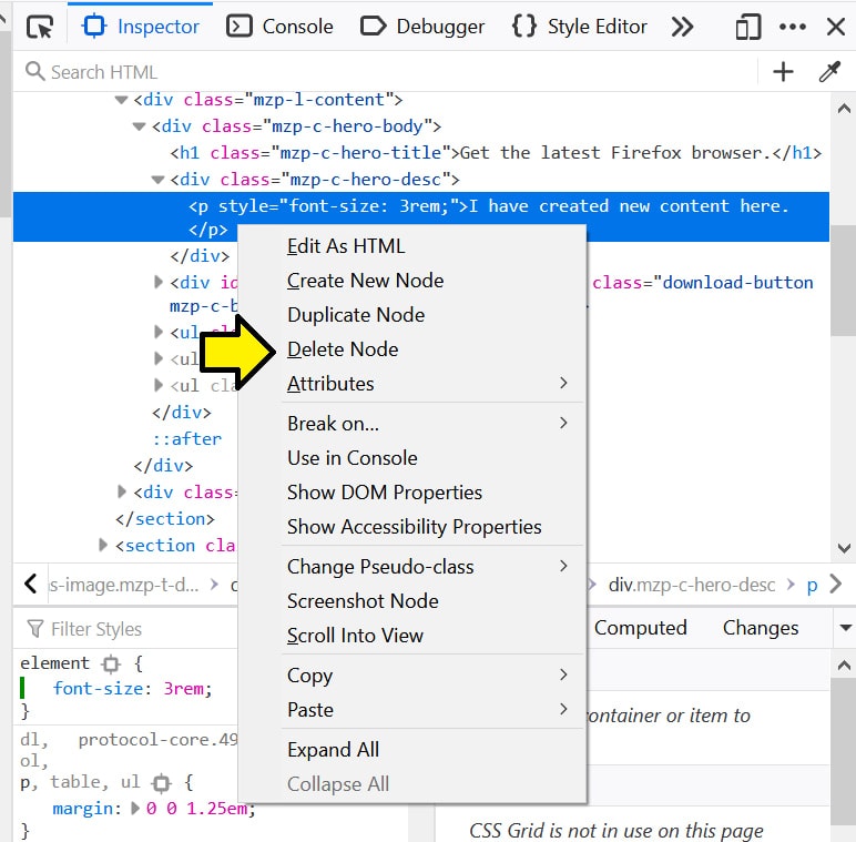
Removing and hiding DOM elements
If you want to delete or hide elements from the page, you can do that in the elements/inspector panel.
In Chrome, right-click the element you wish to hide or delete and there will be options to do so.
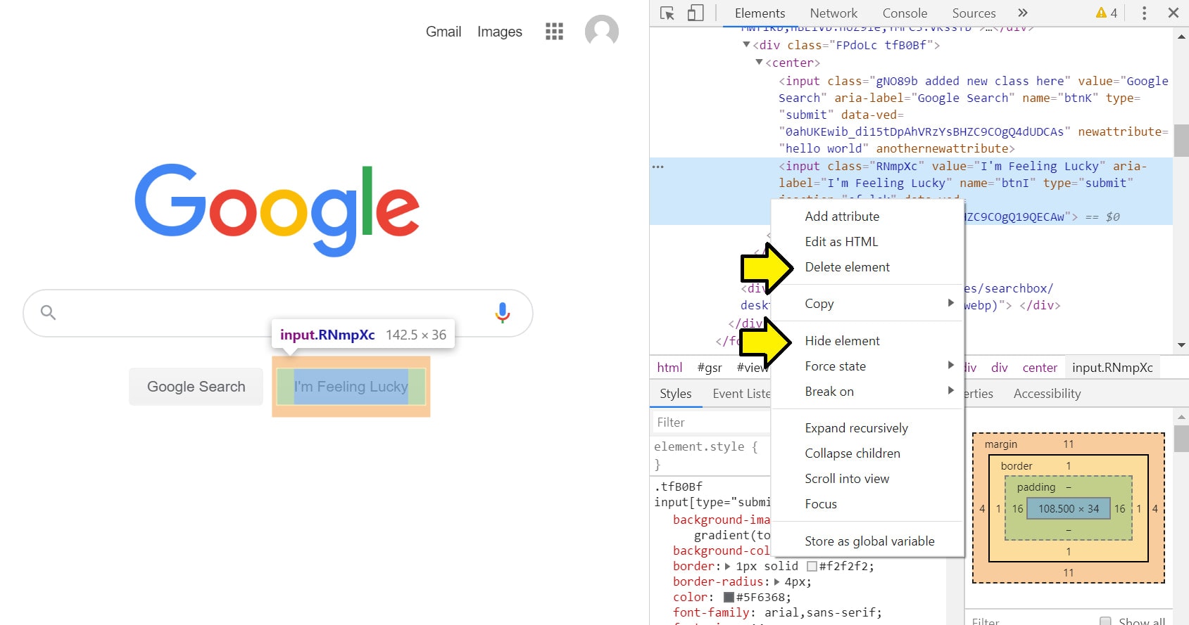
You can also press the “Delete” key on your keyboard to delete the selected element.
A deleted element will be removed from the DOM and the page will render like it was never there.
A hidden element will only be hidden and the page will still be rendered in the same way, except with that element hidden.
In Firefox, the option is called “Delete node” and there is no option to hide an element.
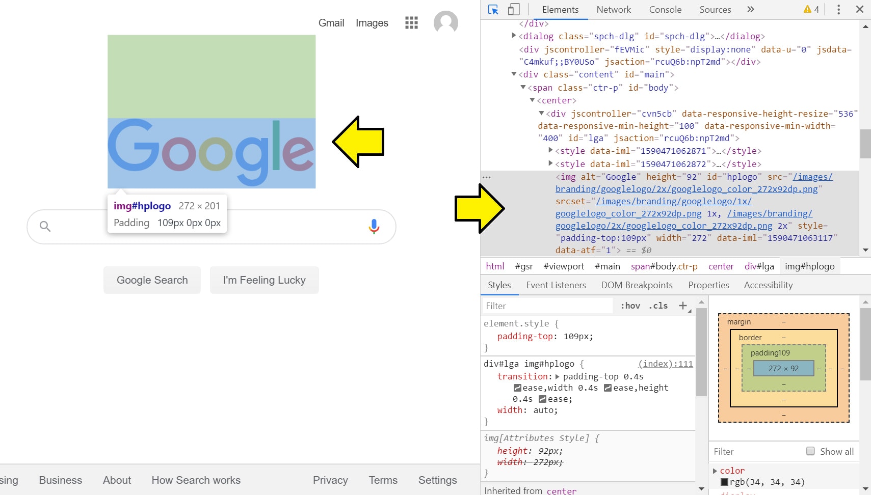
Viewing the box model of an element
The box model is an essential concept in the world of web development layouts. The development tools allow you to see the width, height, border, padding, and margin of your element.
This is located in the styles section of the panel.
In Chrome, it looks like this:
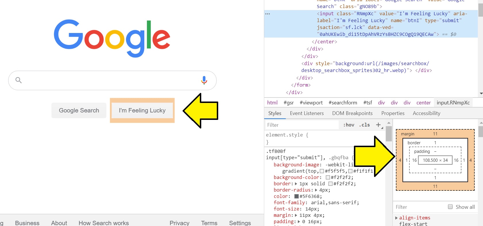
When you hover over a part of the box model, that part of the element will get highlighted on the web page. This helps with figuring out how your HTML renders in your layout.
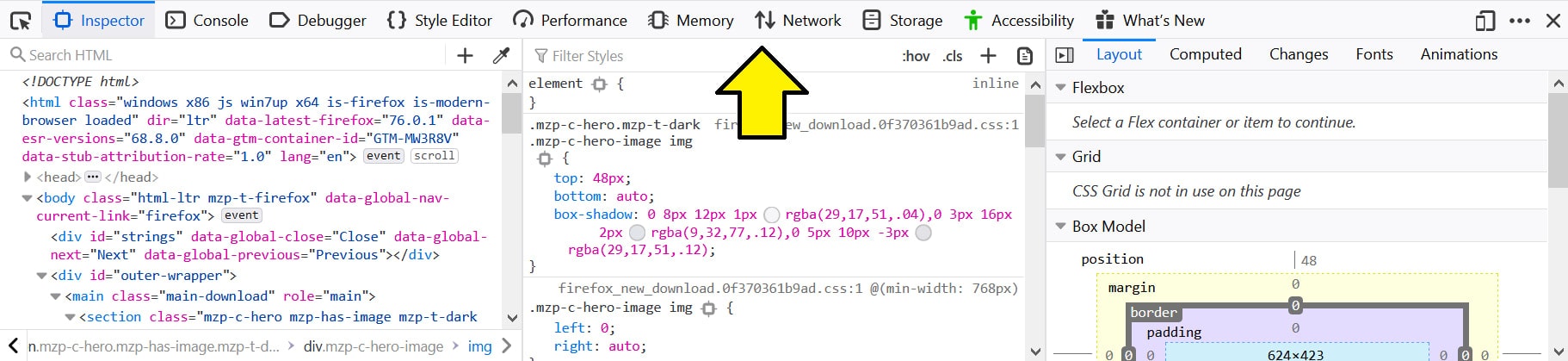
On Firefox, it’s located in the same area as Chrome:
Searching for styles using the filter
If you want to search for particular styles in your code, you can do this by typing in the styles you want in the filter section.
The filter search area is located in the same area as Chrome and Firefox.
It looks like this:
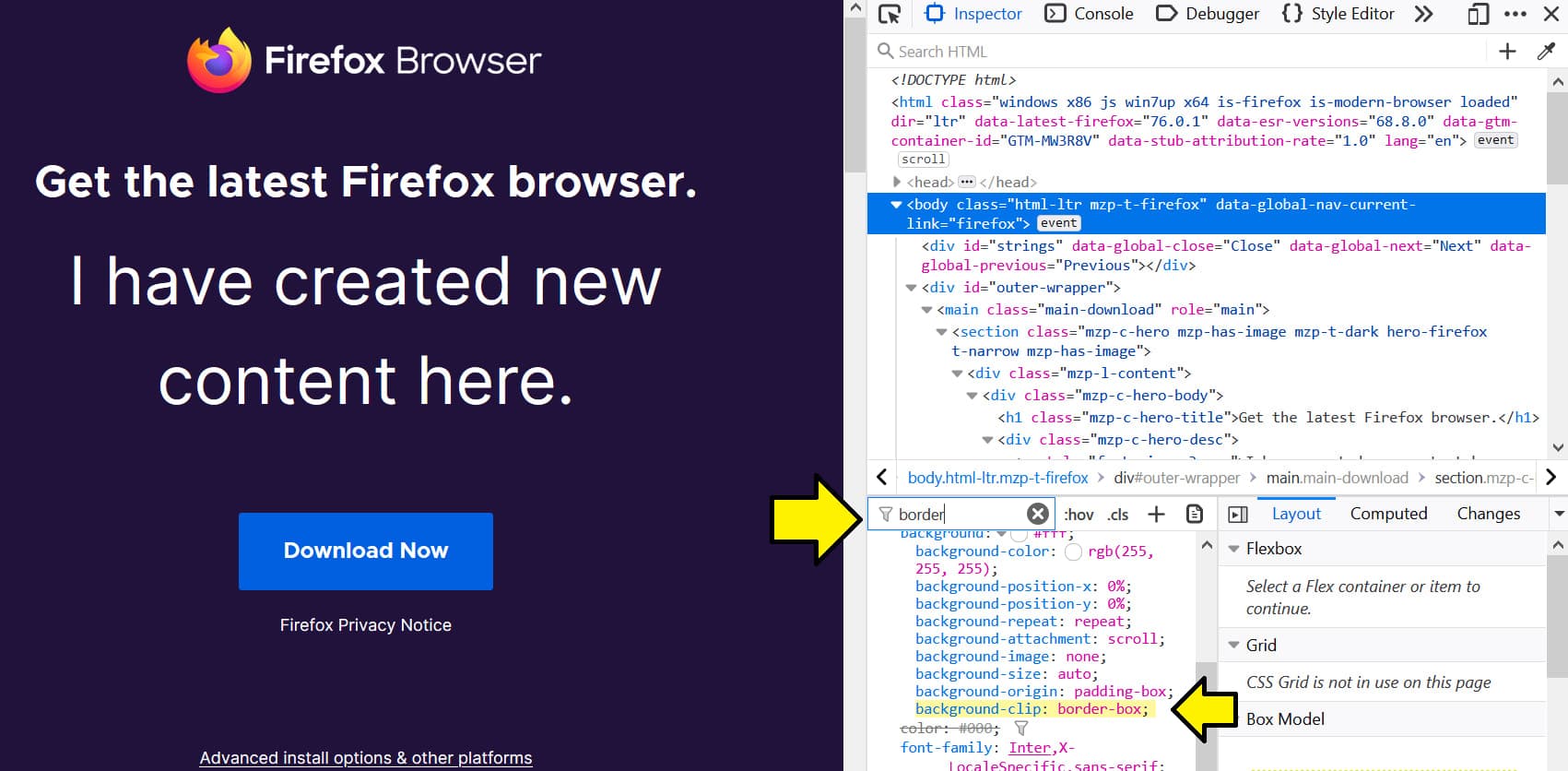
The filter will only search within the hierarchy of the selected element.
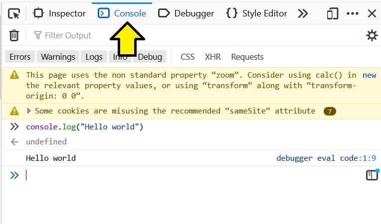
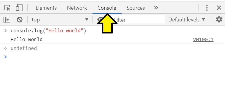
Console panel
The console panel has two main purposes: displaying logged events and running Javascript.
This panel helps developers debug their applications because logs from their code will be printed in the console panel.
You can also run Javascript directly in the browser which allows you to do things like manipulating the DOM in the browser.
Writing Javascript
If you want to write Javascript code, you can do so in the console panel.
Just select the console panel and start writing Javascript.
In Firefox, it looks like this:
In Chrome, it looks like this:
Selecting HTML elements
If you want to select HTML elements to do things with them, you can do so in the console.
The console has access to the document object so you can run commands like querySelector.
If you have an element with an ID of “test,” you can select this element in the console like this:
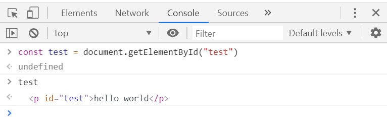
In this code, I’ve created a variable called test and set it as the return value from document.getElementById(“test”).
The undefined is just what the console prints from the result of an expression. Since there is no result from the previous line of code, undefined is printed.
I then typed test which prints the value of test.
Both Chrome and Firefox work in the same way.
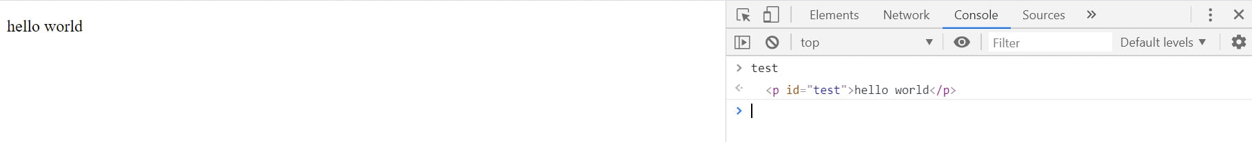
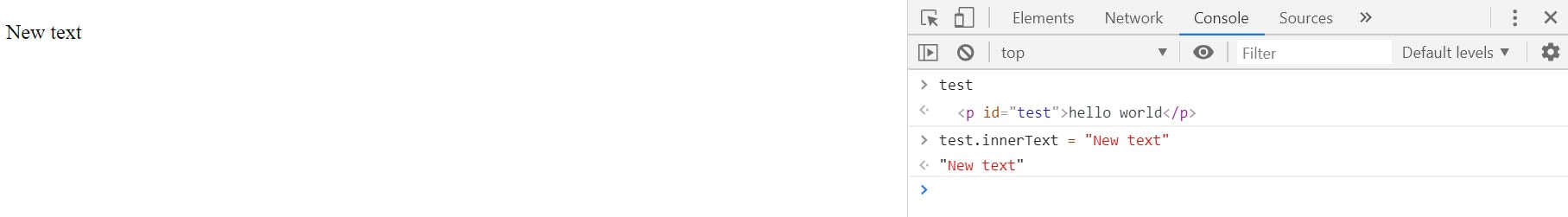
Manipulating the DOM
If you know the code to manipulate the DOM, it works the same way in the console as with any other environment.
If I want to change the inner text of the test variable, I would do it as follow.
Before:
After:
Logging from your code to the console
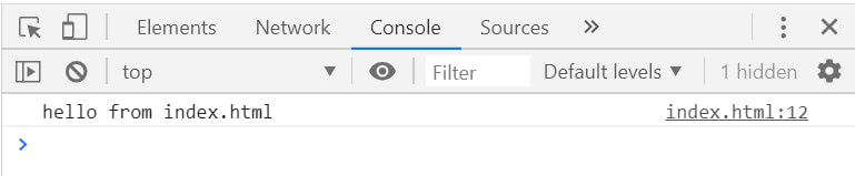
Logging information from your code to be read in the console is a reliable way of debugging your application.
If I have an HTML file that has a script section that looks like this:
<script>
  const hello_world = "hello from index.html";
  console.log(hello_world);
</script>
If I open this file in my browser, the console will look like this:
For a full list of the available console methods, visit this link.
More resources
The developer tools created by Google and Mozilla are deep and vast. There are many tools and options available for anyone who needs help debugging their web page or application.
Here are some more resources for the developer tools:
- A list of cool Chrome DevTools Tips and Tricks
- 14 Must Know Chrome Dev Tools Tricks
- 5 Tips and Tricks for Firefox DevTools
- Tips – Firefox Developer Tools