SaaS Interface Design: Examples, Trends & Best Practices
Designing a SaaS product for the web is no easy task. It requires not just an idea, but a clear plan of how it’ll work and which features you’ll support.
This also means a lot of UX planning from the early wireframing to detailed mockups.
I’ve put together some common trends I see in SaaS websites and have compiled them all here with examples. I’m hoping these can offer some ideas and inspiration for anyone designing their own SaaS websites.
Every major SaaS app needs to have some large global navigation. This is where you’ll keep links to all your tools, features, and individual charts/data.
Users don’t want to dig around endlessly just to find what they’re looking for. But at the same time you may have dozens of custom features and it’s not easy cramming them all into one navigation.
With Postcards Email Builder you can create and edit email templates online without any coding skills! Includes more than 100 components to help you create custom emails templates faster than ever before.
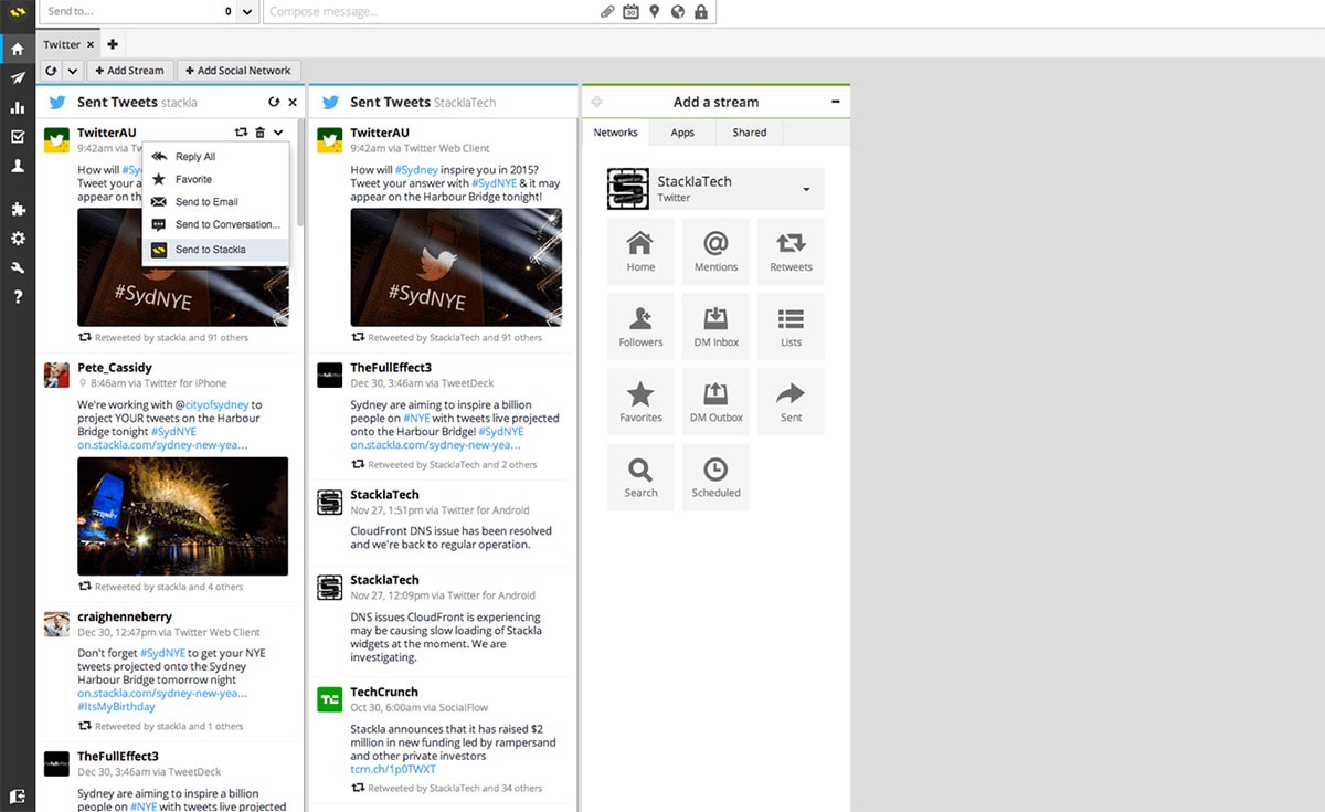
Free Email BuilderFree Email TemplatesI like the Hootsuite dashboard because they use icons within a vertical navigation menu. This stays fixed and always in view so it’s super easy to manage without much effort.
The only downside is that icons don’t clearly explain what a page does. So users are left clicking through icons until they learn how the interface works.
This isn’t inherently bad because it does save space on the page. It just means a SaaS app with this navigation style may take a little longer to learn.
One other site that has a similar vertical dashboard nav is FreshBooks. However they include labels next to the icons so you can easily tell what each link is for.
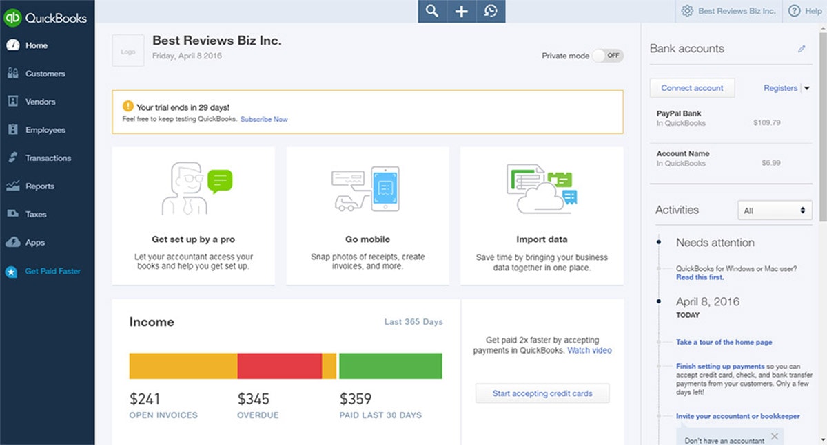
This absolutely makes navigation easier, but it also takes up more space.
It’s always a trade-off with global navigation menus because you want them to hold as many links as possible. They should be truly “global” across the entire SaaS interface.
But at the same time you want them usable so you can’t cram too much. I think FreshBooks has a really nice ratio and it’s one of the cleanest dashboards I’ve seen.
With Pulsetic you’ll be instantly notified the moment your website, API, or server becomes unavailable. Monitor uptime from multiple global locations and respond to incidents before your users are affected.
Create beautiful status pages in minutes to keep customers informed during outages and build trust with transparent communication.
Start Monitoring for Free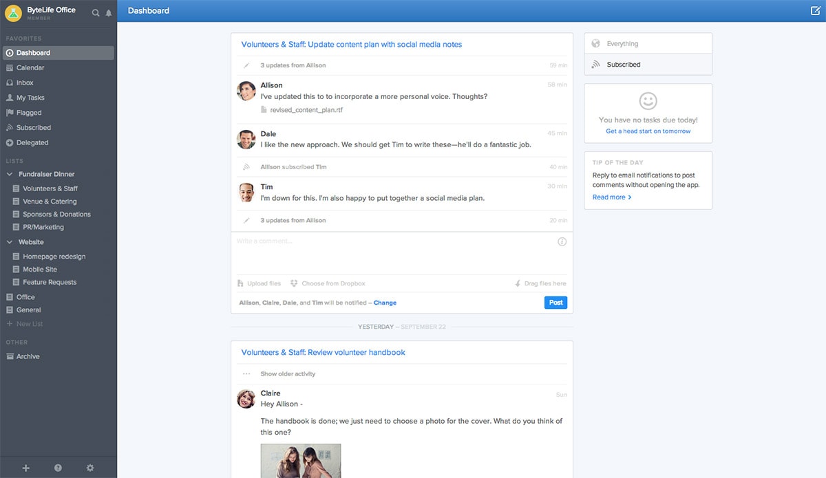
One other design I like is the Flow dashboard. It’s super clean and has a navigation alongside both the top and the side of the page(only on certain pages).
This gives more room for users to access all pages globally and it doesn’t feel too crowded. Project information has dropdown menus to open/close as needed so users can take even more control over the interface.
None of these designs are perfect but they showcase how much should go into a global navigation.
If you’re not sure where to start I recommend mapping your content so you have a plan for all your SaaS pages in advance.
Dynamic Sorting Options
Almost every web application involves some type of data or search feature. And both of these work much better if you can limit the searched data based on relevant information.
That’s why dynamic sorting is a must-have for all of these pages. I specifically think of apps like BuzzSumo where you’re looking through social shares over certain time periods across different websites, and with different sorting options like # of shares.
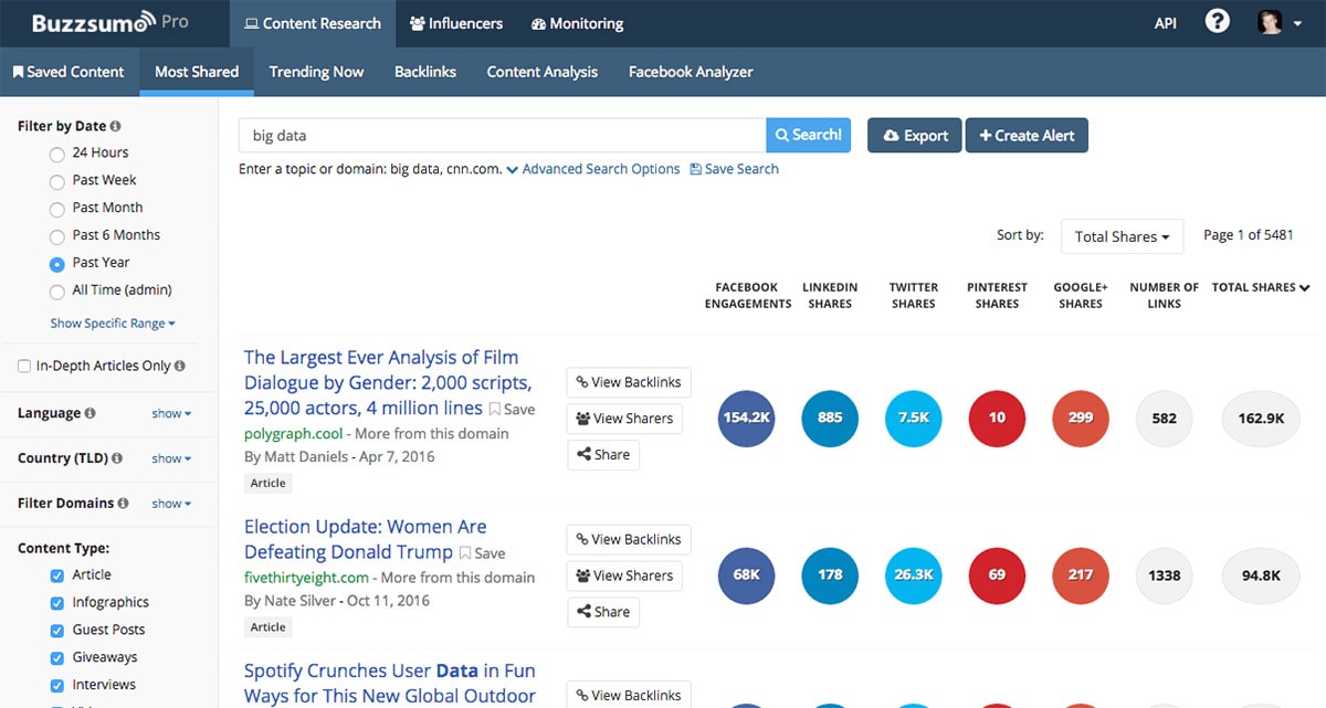
Their vertical nav panel is used solely for these sorting options when you’re viewing search result pages. Notice the top nav is really how you move through the other areas, generally a requirement when you have a large SaaS product.
Each sorting option is hidden underneath a dropdown menu so you can expand or hide the sorting options at will.
The team at BuzzSumo is even expanding their app lineup to include a new product BloomBerry. This one pulls common questions based on a primary topic or seed keyword.
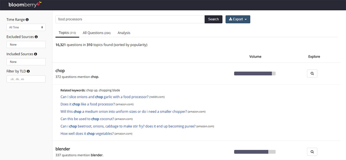
It has a very similar interface where the top horizontal navigation includes links to related pages and the vertical nav is for sorting & customization.
Right now the app is still in beta so it’s not fully completed. I imagine over the coming months/years this interface will include far more features and get a lot more complex.
But even in its infancy you can see how this UI is designed around usability for searching & sorting above all else.
Clear Visual Data
Some of the biggest SaaS apps that I use share data and curate information into one dashboard.
This is immensely helpful and it’s one of the main reasons people build SaaS products to begin with. If your product idea includes lots of custom data then you’ll want a design that clearly visualizes this data.
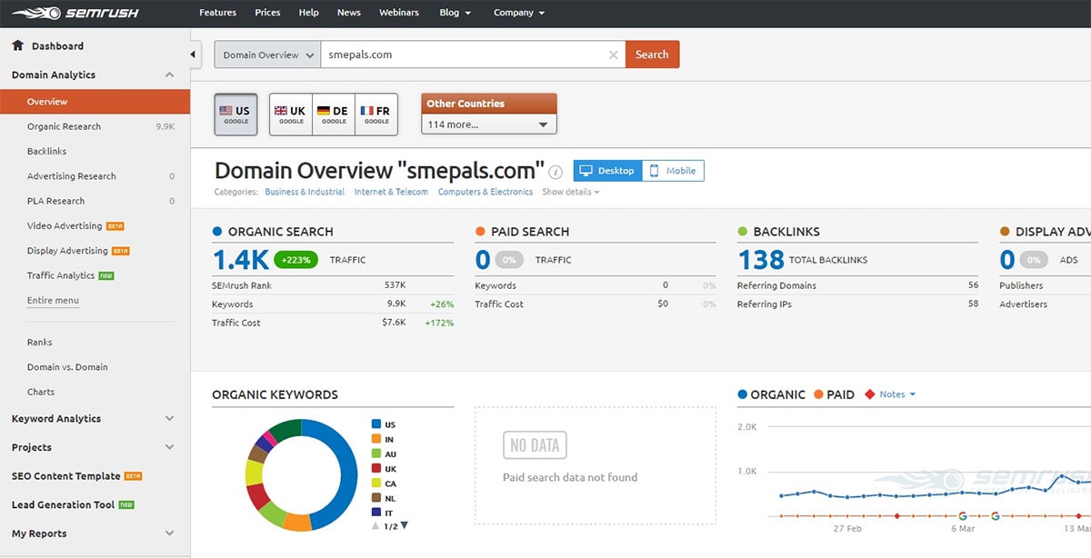
SEMrush is a great example because they have so much data to go through. You’ll find at least a dozen different charts for any website you look up in their index.
Traffic stats, keyword volume, competitor graphs, top keyword performance, and even rich snippet data all comes with visuals.
The key is that SEMrush segments these graphs onto different pages. The “overall” dashboard view for a website is packed with data. But as you get deeper into the interface you’ll notice each page only shows visual data relevant to the topic(ranking increases, competitor research, etc).
There’s another great example of this in the Ahrefs dashboard.
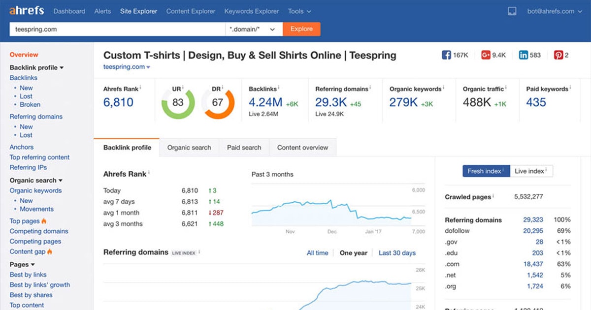
This is a very close competitor to SEMrush so they both have similar types of data to share. But Ahrefs focuses more on backlinks and link quality so the visuals primarily focus on total backlinks, graphs of links over time, and other related metrics.
Getting deeper into the interface there is a lot of raw data in tables. This is generally the easiest way to consume that kind of data, so remember that visuals aren’t perfect for every single page.
But they should be used in the dashboard when possible because they make data far easier to consume at a glance.
Tight Interface Designs
This may be a divisive topic but I think SaaS UIs feel easier when they’re more cramped rather than spaced out.
Users just want stuff that works with easy-to-access features. This doesn’t mean you need to make the interface so cramped that it’s unusable. Rather you should aim for a balance of fitting as much onto the page as possible while still keeping it clean.
There are some different techniques you can use but here are my suggestions:
- Side and top navigation menus
- Multiple dashboard panels on one page
- Graphs, charts, and icons segmented on each page
- Alternate text sizes based on the significance of the content
One look at the VWO dashboard and you can tell there’s a lot going on.
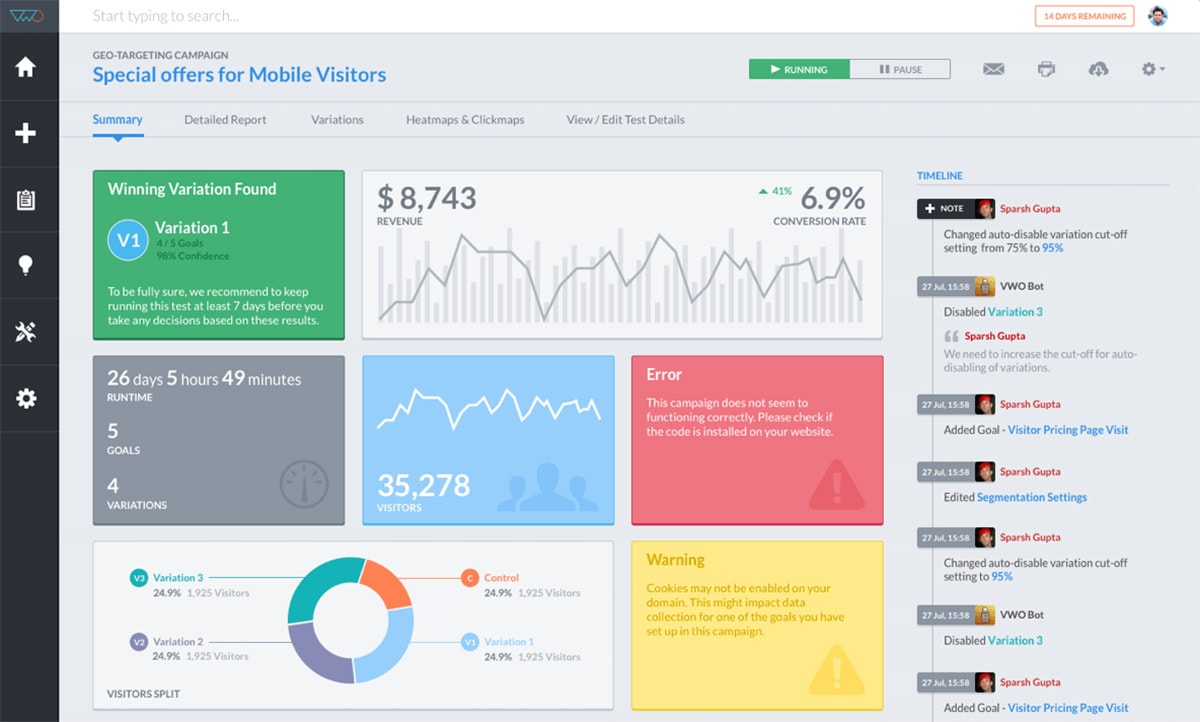
At first this may be off-putting so new users can struggle to get started. But the more you use the application the easier it becomes and the clearer it is to mess with.
That’s why I like these kinds of dashboards because you have everything right at your fingertips. Nothing is perfect but the best you can do is give users everything they’d want all within arm’s reach.
Another great example is the ManageWP page with a dashboard full of charts, tables, and raw data. Plus the links are clearly accessible and there’s even two different menus: a link menu and a sorting/options menu.
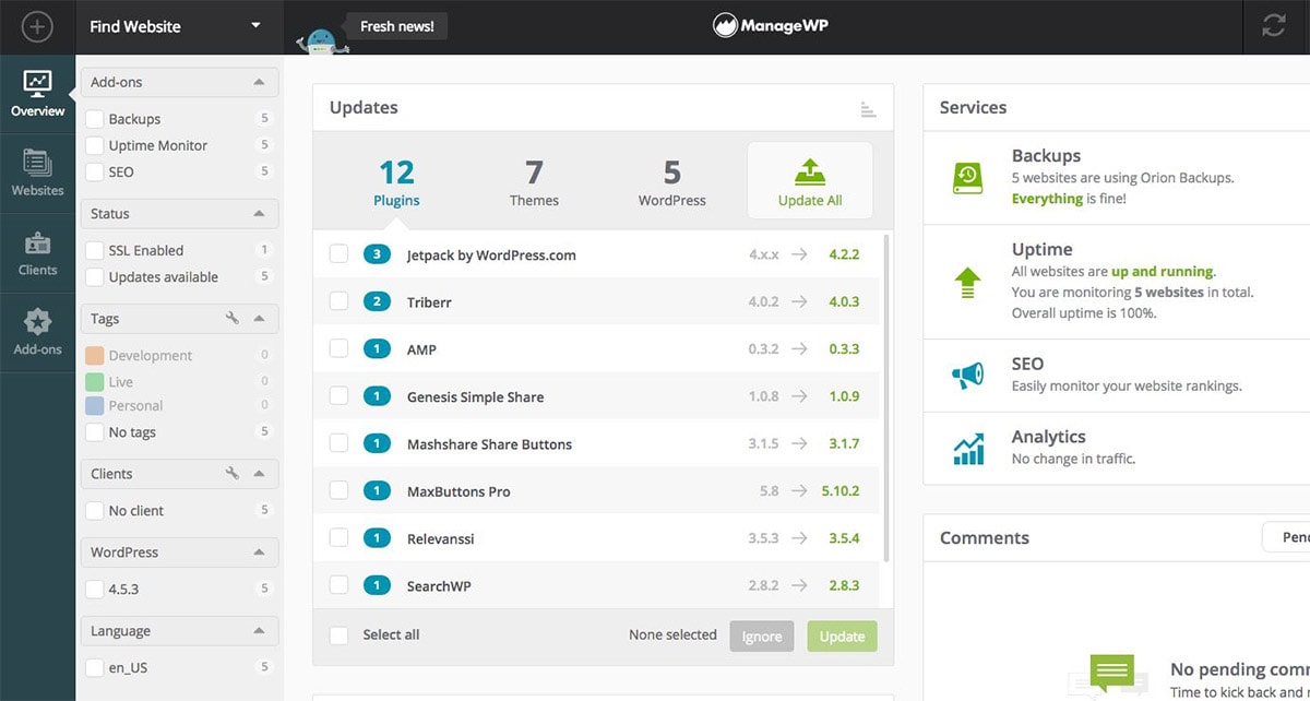
When your SaaS product is this technical you really need to find a way to fit it all in. No it probably won’t be pretty, but there’s also no better way to encourage user interaction while also keeping the site usable.
Moving Forward
Every step of the design process will be tough for a SaaS app.
But the more you work at it more you’ll learn what fits best, what doesn’t, and where to put your energy. I hope this post can at least offer some guidance for your design and get you thinking about the user experience too.
If you want some related reading on SaaS app design then these posts are worth skimming as well.
- 8 Elements That Make A Great SaaS Website
- 13 Examples Of Beautifully Strategic SaaS Website Design
- Modern UI/UX for SaaS applications in 2015 and Beyond
