How to Use Size & Space in Interaction Design
While he never lived to see the Internet, engineering psychologist Paul Fitts nonetheless had a huge influence on digital design with his 1954 proposal now known as Fitts’s Law. We can describe Fitts’s Law as:
“…a model of human movement in HCI and ergonomics which predicts that the time required to rapidly move to a target area is a function of the distance to and the size of the target.”
What this means to digital designers, in layman’s terms, is that the larger and closer a target, the faster and easier it is to select the target. Fitts proved his idea mathematically, and the law is still popular today in digital design (just play this quick game and you’ll understand immediately).
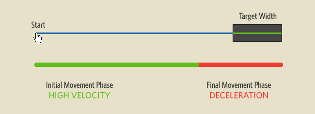
Source: Visualizing Fitts’s Law
Of course, that doesn’t mean you should fill your page with enormous buttons squeezed next to each other. As interaction designer Anastasios Karafillis points out, Fitts’s Law must be executed with subtlety. Interaction design is meant for people, which means that you need consistency, enjoyment, accessibility, and discoverability — none of which can just be calculated with clicks or pixels.
With Postcards Email Builder you can create and edit email templates online without any coding skills! Includes more than 100 components to help you create custom emails templates faster than ever before.
Free Email BuilderFree Email TemplatesWe’ll start by deconstructing Fitts’s Law down into its central components (so you can treat Fitts’s Law as a design tool rather than rule set in stone). Afterwards, we’ll examine Netflix as a case study of best practices.
Minimize Physical Exertion
Fitts’s Law originated as a way to analyze physical exertion, and it wasn’t until later that his principles were reinterpreted to apply to web design. However, with their physical gesturing, mobile devices are actually more attuned to what Fitts was actually studying. Whether you interpret his studies loosely for web design or literally for mobile design, in both cases, Fitts’s Law states that less exertion leads to a better UX.
Mobile design has a lot more muscle and fatigue concerns than web design, so it’s important to keep them in mind to completely optimize your UX. Justin Smith, UX Architect for Cartoon Network, explains that the problem is further complicated by the different screen sizes each having their own different issues. But if you’ve been paying attention to the points of Fitts’s Law, you’ll have no problem applying them to the muscle movements of mobile devices.
For 3.5” screens, it’s important to keep in mind:
- Place key functions in the bottom left corner (vertical orientation) — Based on the way users hold their phones (and assuming right-handed people are prominent), the bottom left corner to center are the easiest to reach with the dominant thumb. Additionally, the upper left corner is the hardest to reach, so should have lesser-used or high-risk targets.
- Place key functions in the left and right edges (horizontal orientation) — For horizontally oriented apps, the easiest places to reach for your thumbs will be the sides, with the top and bottom center being the hardest.
Smaller screens tend to put more strain on the hand muscles, but 7” devices, while bigger and heavier, are easier to manipulate. One point to keep in mind with 7” screens is that, in the vertical orientation, most people will hold it at the the top. This makes the top two corners the best places for actionable targets.
For example, when you want to remove a field in the relationship management tool RelateIQ, the modal window actually prompts you to type in “DELETE THIS FIELD”. From our experience with the tool, this dramatically decreases the likelihood of deleting due to the effort required.
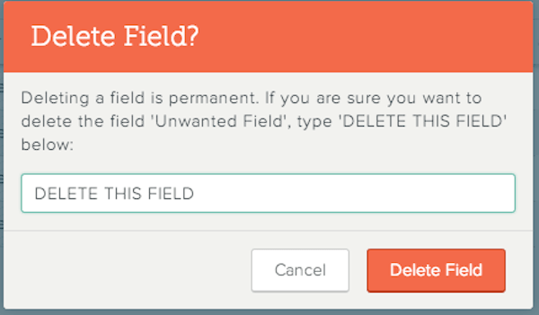
Source: RelateIQ
With Pulsetic you’ll be instantly notified the moment your website, API, or server becomes unavailable. Monitor uptime from multiple global locations and respond to incidents before your users are affected.
Create beautiful status pages in minutes to keep customers informed during outages and build trust with transparent communication.
Start Monitoring for FreeCompare that to the Cancel function, a low-consequence function that’s easily clickable.
Second, complicated gestures and input methods can actually improve UX in some cases, when used properly.
Take DeviantArt’s favoriting method: if a user clicks on a picture and drags slightly, the Favorite toolbar drops down on screen, allowing the user to simply “drop” the picture in. While most other sites have clickable options for their Favoriting system, the advantage to this one is that it hides the controls interface until needed, saving valuable screen real estate on a site that relies heavily on displaying as many graphics as possible.
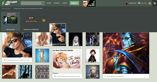
Source: DeviantArt
Optimize for Proximity
Have you ever wanted to go to a cool event, but then bailed when you found out how far away it was? Your users do this every day with your website or app, though on a much smaller scale.
If Fitts’s Law teaches us nothing else, it’s that you want to reduce the cursor movement as much as possible. Jason Gross, Designer for Healthx, reminds us that grouping items with similar functions together is standard design practice, but this idea can be taken a step further.
By anticipating functions used sequentially, an interaction designer can further minimize the distance the cursor must travel. In addition, the placement on the screen can play a large role in cursor movement, as we can assume the cursor usually starts near the top of the screen. Look at the below example from FreshBooks:
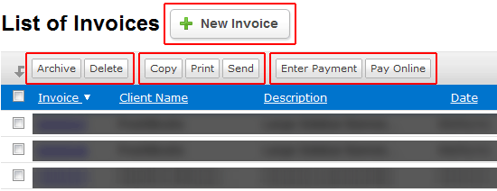
Source: Improving Usability with Fitts’s Law
The most used button, New Invoice, is located at the very top (and is larger than the others, reiterating the point about size from the last section). Reinforcing the Gestalt Principle that closely grouped items are perceived as similar, you can also see how related functions (sometimes done sequentially) like Copy, Print, and Send are tightly grouped.
Of course, you don’t want to sacrifice your product’s overall structure and cohesiveness just to save your user a centimeter or two of cursor movement. More important than a quick cursor movement is an interface with a logical and consistent structure.
Facebook is an example of a design that does not fear space. As you can see below, there’s plenty of space located between the chat sidebar and activity stream. If we were designing based on frequency of use, we could place the chat and activity stream next to each other. But that would disrupt the functional consistency — adding space between unrelated groups helps users create a mental map of information and tools. That’s why it’s more important that similar actions within a group (like Comment or Like) are placed closer together.
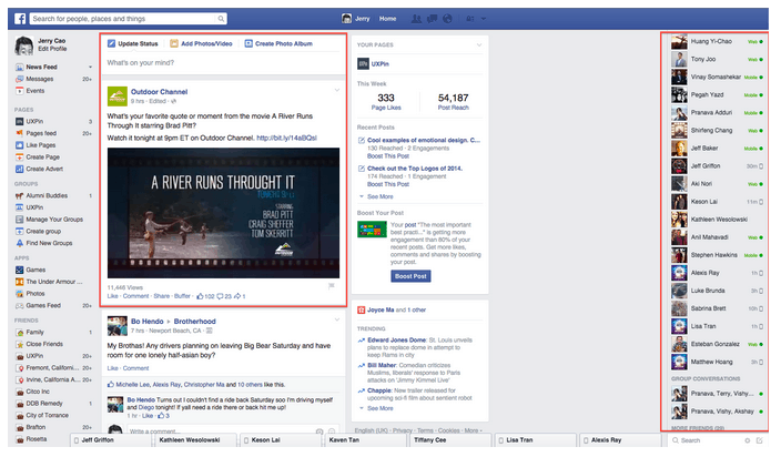
Source: Facebook
To clean up the interface, many sites use the familiar dropdown menu. By the standards of Fitts’s Law, the dropdown menu is inefficient since it only increases cursor movement; but from an organizational perspective, dropdowns make sense as they consolidate and organize information in a way that users can easily understand. That’s why most sites, like Jawbone (below), still use them. Notice how they’ve also grouped similar actions together, but created distance between unrelated groups like browsing products and signing into your account.
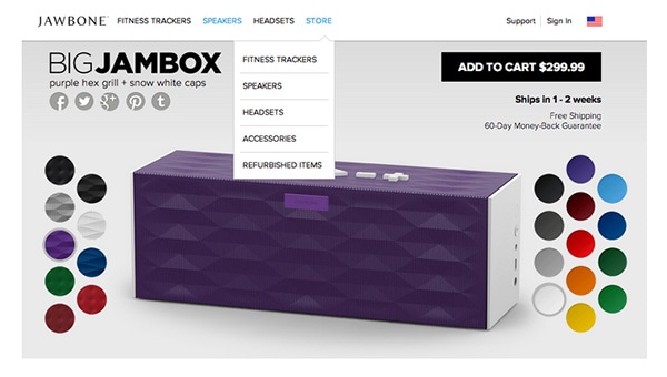
Source: Jawbone
As we discussed in Web UI Patterns 2014, you also want to create space and friction for actions that can have irreversible consequences. Just imagine what a disaster it would be if the buttons for the cabin lights, radio, and ejector seat were all next to each other on an airplane. This is why, for instance, Gmail updated their design so that it now autosaves drafts (before the Save Draft and Send buttons were next to each other, so you can imagine the fun that caused).
Create Generous Clicking Space
The loosest interpretation of Fitts’s Law is to make your key elements larger so that it’s easier for your users to click them. As we discussed in the free e-book Interaction Design Best Practices Vol. 1, this is mostly an oversimplification.
There are at least two universal truths an interaction designer can take from this:
- Make top-priority buttons larger — Whether relatively larger in comparison to the rest of the page, or just plain large, an increase in size will attract attention, show significance, and make it physically easier for your user to choose the target.
- Make the clickable area of a button as large as possible — In other words, make the whole button clickable, not just the text within the button. You can in the example from MailChimp below that the entire region is clickable, not just the text.

Source: MailChimp
These guidelines are especially applicable to call-to-action buttons, which presumably are a design priority for any business. But size can be a double-edged sword, so exercise some caution.
The drawbacks to relying on excessive size are:
- Taking up too much screen real estate
- Throwing off the balance of the entire page
- Creating clutter
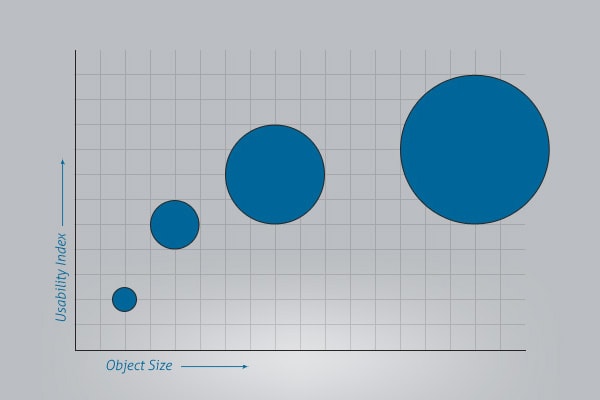
When determining size, it’s important to remember that increasing a button’s size does not increase its usability linearly.
Source: Improving Usability with Fitts’s Law
This means that if you increase the size of a small button, you’ll give it more impact; but if you increase the size of an already large button, the impact will be minimal. All that will happen is you’ll end up with an obnoxiously large button.
Fitts’s Law Done Right: Netflix
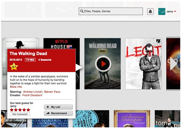
Source: Netflix
Sizing and spacing of interface elements must be determined by their importance to accomplishing user goals. In the above example from Netflix, the primary function is watching videos. As you hover over your show or film of choice, a large play button appears. Secondary elements like film info, adding films to favorites, and creating reviews are de-prioritized.
As Richard Rose of Fresh Consulting explains, important tasks must be placed in highly visible areas and every click must serve a purpose. Let’s explore the visual prioritization based on Rose’s analysis:
- Play Button — This is the most important function of the entire site, so it makes sense that it’s the largest element.
- Title & Cast Information — This information helps users decide what to watch, so it’s still somewhat important. Therefore, the mouse hover triggers a modal window displaying this information.
- Ratings Stars & My List — Since these aren’t primary functions, these are smaller and placed further away.
- Search Bar — Its medium size and mid-range proximity is more about sticking to familiar UI patterns (where search bars are in the top right) than following Fitts’s Law.
- Account Settings — Similar to the Search Bar, the size and location are just following UI patterns. Again, this shows that Fitts’s Law is a tool and not the only way of treating space and objects.
Takeaway
Tiny distances on a small screen may seem like a minor concern, but they add up fast — especially with actions that are performed repeatedly.
As we described in Interaction Design Best Practices Vol. 1, good interaction design is being able to identify these “micromoments” that fall under people’s radars. Your users may not know the extra time you spent optimizing the position and size of the high-priority items (without completely neglecting the lesser-used ones), but they will appreciate the product, as a whole, much more.