17 of the Best Sporting Websites & Apps
Over the last few years I’ve been fortunate enough to work on website & app design for some exciting sports brands. I’ve gotten to know the market pretty well and have spent considerable time researching sports websites & apps. During my research in the area of sports websites I discovered a great many EPL soccer sites, NFL and NBA sites all use the same style of template – so many of those websites look the same and appear to be pretty dated. There are teams/clubs who have broken away from this and brought in different agencies to create their digital offering.
Export Figma Designs to Live Website – No-Code
I’ve put together a list of some of my favorite sites and apps in terms of layout, typography, photography, impact, usability and general usefulness – hopefully there are even a few you’ve not yet seen!
The type of sports websites & apps I will focus on are information critical sports websites e.g. club, team or an athletes personal websites where fans get regular information, news, tickets etc. & ecommerce sports websites.
With Postcards Email Builder you can create and edit email templates online without any coding skills! Includes more than 100 components to help you create custom emails templates faster than ever before.
Free Email BuilderFree Email TemplatesThere are many visually impressive brand awareness, full screen video, all singing & dancing showpiece websites on the web at the moment from the likes of Reebok & Nike. I’ve stayed away from these pieces for this article – there are already a few popular design magazines that have covered these kinds of websites.
Sport Websites and Apps Examples
Manchester City Football Club
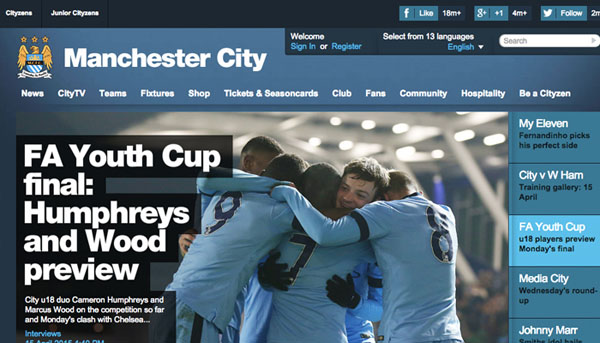
The Manchester City Football Club website has been around a couple of years now, but it’s still one of the few professional football websites that has no advertising, thanks to extremely wealthy club owners! The website itself is beautiful, bold and clear and very strongly branded. It’s obvious right from the first page that the club owners have invested heavily on there website in terms of look and feel and functionality.
Arsenal Football Club
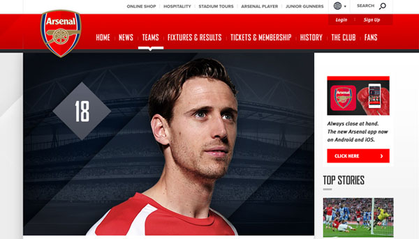
Arguably the most impressive football club website about at the moment in terms of craft, usability and content. The design is device responsive and feels fresh. The content is arranged fantastically and the website looks great on any screen size. I love the typography used though out – it makes the site a joy to read and use (even for fans of Chelsea and Tottenham Hotspur :)
FIFA Official app
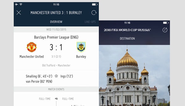
Beautiful typography and a nice clean UI separate this from the bulk of sports apps available at the moment. Everything about the app from the large clear type, large full bleed images and clean iconography make this a pleasure to use. It has a similar feel in terms of typography and white space to the Arsenal website which is no bad thing! – A great little app (helps if you follow football though.)
Formula 1 official website
With Pulsetic you’ll be instantly notified the moment your website, API, or server becomes unavailable. Monitor uptime from multiple global locations and respond to incidents before your users are affected.
Create beautiful status pages in minutes to keep customers informed during outages and build trust with transparent communication.
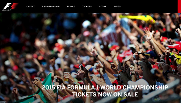
Start Monitoring for FreeThe redesign of the official F1 website looks great, is responsive and has a wealth of great information displayed in visually interesting and interactive ways. There are also plenty of animated elements to create an overall engaging and fun experience. The individual news items look great with large full bleed images at the top of each article. My one slight criticism would be the body copy size could do with being a point or so larger.
Adidas website
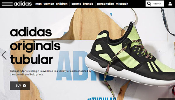
You can always rely on Adidas to have a great looking website with a ton of stunning imagery. A great source for design inspiration if only to check out the various sections banners – you can learn a lot about how to effectively promote & display a product in a way that draws the eye but doesn’t distract.
Lecoqsportif
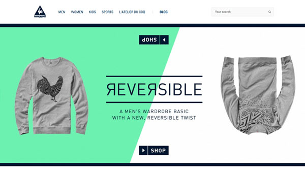
Sports brand le coq sportif have a fantastic looking website with a very modern, flat and clean style. In fact, this is possibly the most minimalistic website on this list. The fundamentals of good web design are evident when casting on eye over the homepage – solid grid structure, clean & readable typography and consistent quality style of photography throughout.
Fight4pride.ca
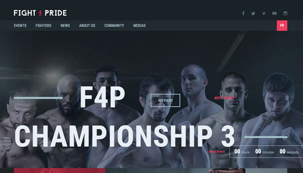
Lovely combination of bold, clear typography, moodily shot photography and a dark color palette ensure the fight4pride website really stands out. The website makes fantastic use of animation upon interaction which really adds to the absorbing atmosphere.
It’s easy to see there has been some real synergy between designer & developer to create this engaging and attractive experience.
BBC Sport app
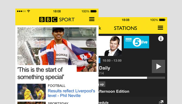
Quite simply an essential part of any UK sports fans daily viewing. The BBC are world renowned for their dedication, care and for constantly improving their digital offering. The app is, as you would expect from the BBC: clean, stripped back, usable and a nice user experience.
Amir Khan World
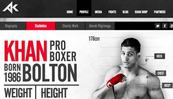
The official website of boxer Amir Kahn takes a leaf from the Arsenal website with its color palette, bold typography, clean look n feel and quality photography. The website has won various other awards and its obvious to see why – everything from Amir’s own brand logo to the interactive and animated stats page ooze quality & passion.
Nike Move
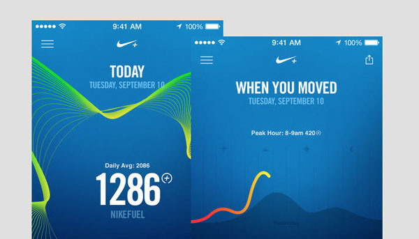
Nike have got the market sewn up when it comes to glossy, slick, visually stunning websites & apps – so there was a lot to pick from! For me however, the Nike Move app and website not only look great, but work great too. The app displays back the users activity data in a simple, colorful and fun way. The UI utilizes a bright, friendly reduced color palette and great combination of fonts.
Puma
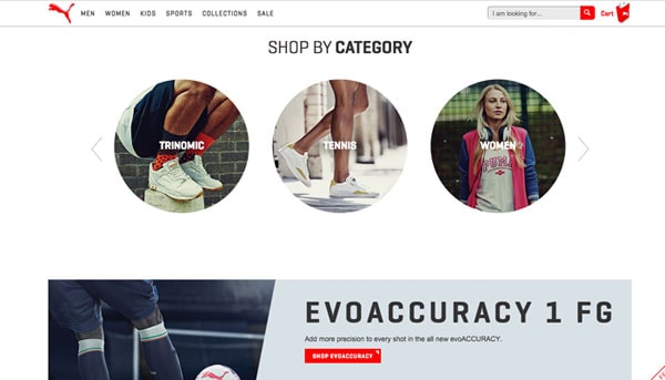
Along with Nike & Adidas, Puma are definitely vying for the top spot when it comes to big budget sports brands that do digital perfectly. Puma have a strong portfolio of websites & apps, but for me the Puma.com site does it right with cool, stylish photography, clean typography and plenty of nice interactive products to play around with.
Makurasport
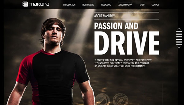
The Makura Sport website is an excellent example of vertically scrolling parallax effects combined with great photography and clear, cold typography. There isn’t a massive amount of content, but what is there, although unconventional, is still easy to navigate and great to look at.
Suunto
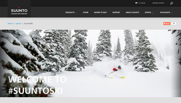
Suunto sell a range of outdoor & sports devices including compasses and watches. The website is clean, bold and features large detailed product shots and detailed illustrations throughout. As you would expect the website is responsive and works particularly well on smartphone size screens with very little loss of quality or diminished user experience.
Showtime Sports
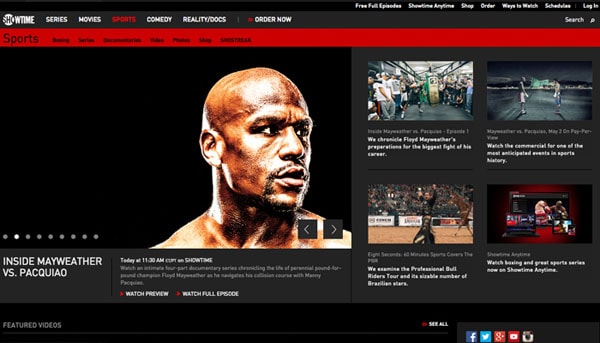
Quite simply a stunning site filled with great content. I’m still a sucker for a dark UI and this website gets it just right. It’s easy to see how a fully responsive dark website with a lot of content could be overpowering, but the balance is great here. A very small criticism would be the body copy would do with being slightly larger. Otherwise a great piece of work.
Life Fitness Sochi2014
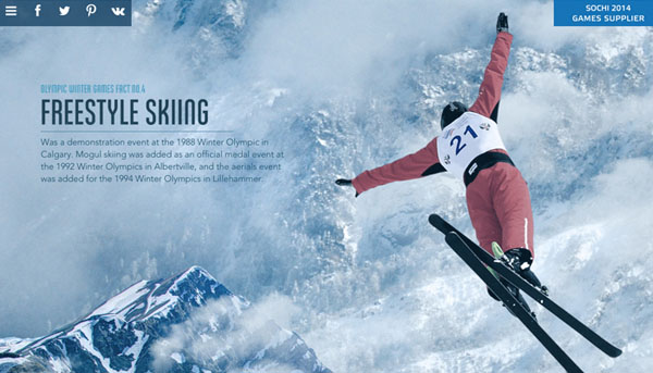
Not a new site, but still worthy of inclusion on this list. The Life Fitness Sochi 2014 website contains some excellent animation and vertical scrolling effects. There are some excellent interactive elements on closer inspection (try rolling over the female sprinter underneath the main banner.) This is a fun piece and shows what you can do with a great library of visual assets to begin with.
Nike+
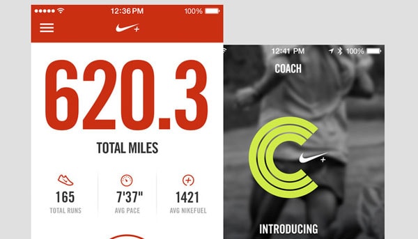
The second entry on the list, the Nike+ website & app look & work great. The app has a bold and simple UI, which is ideal for use on the move. The app is intended for use while you are running/moving, so the bold large typography & clear icons ensure you don’t have to think too much about the data you are viewing.
Freeletics
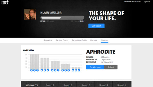
Another fitness app & website. This one is hugely popular thanks to the combination of ease of use, simple bold visuals and a large community. The bold choice of headline font, reduced color palette & moody images create an engaging, confident & engaging first impression. Both the website & app UI feel well put together, slick & nice to use.
I hope you were inspired as much as I was by some of the apps and websites on this list. If there are any I’ve missed please feel free to post them in the comments section below.
