When Should You Rethink Using Time-sensitive Images on Your Website?
There are two ways we can classify a website’s content in terms of time.
Evergreen content is content that’s just as relevant and useful today as it is years from now. Time-sensitive content, on the other hand, has a very short shelf life — ranging from a few days to a few months.
There are certainly benefits to including both kinds of content on your website. However, you’ll want to be extra careful when it comes to using time-sensitive images.
Below, we’re going to look at some reasons why it might not be a good idea to use time-sensitive imagery on your site.
When NOT to Use Time-sensitive Imagery on Your Website
While evergreen content and imagery are certainly beneficial in terms of SEO, building brand authority, and future-proofing a website, time-sensitive content has value, too.
Time-sensitive content can help brands:
With Postcards Email Builder you can create and edit email templates online without any coding skills! Includes more than 100 components to help you create custom emails templates faster than ever before.
Free Email BuilderFree Email Templates- Attract more website traffic than usual during a given timeframe.
- Drive higher engagement with content created specifically for the event.
- Make the website feel more alive as there’s someone clearly working behind the scenes to keep content relevant and timely.
- Get people riled up about a special event, upcoming holiday, or shared cause.
- Inspire prospects to become customers and customers to become loyal advocates.
However, this all depends on what exactly the time-sensitive element is. There’s a huge difference between depicting something like a Black Friday sale and announcing COVID-19-related changes.
When it comes to your images, how do you know whether it’s worth putting time and effort into updating them to reflect recent goings-on? Here are 5 times when it’s probably not a good idea.
1. When it’s for just a few days.
It’s important to ask yourself if something that lasts only a few days is worth taking the time to swap out images on your website.
Here are some things to consider:
- Do you have substantial enough traffic that will see the time-sensitive imagery?
- If not, are you willing to invest money and time in Google ads, social media campaigns, or email marketing to boost traffic levels for that timeframe?
- And will the newly uploaded imagery increase engagement, leads, or sales as a result or will it be a superficial win?
An industry conference or a Black Friday sale are good examples of brief events worth swapping your website images for.
But it’s not because of the types of events they are. It’s because, despite only lasting a few days, you need to generate awareness for weeks and maybe even months leading up to them.
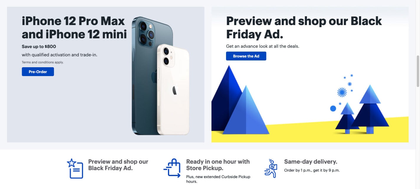
Just as Best Buy started doing in early November 2020, weeks before Black Friday:
The same goes for brands selling access to high-ticket items, like conferences and courses.
With Startup App and Slides App you can build unlimited websites using the online website editor which includes ready-made designed and coded elements, templates and themes.
Try Startup App Try Slides AppOther ProductsTake, Social Media Examiner, for instance. In November 2020, the top banner on the site was dedicated to a course starting January 4:
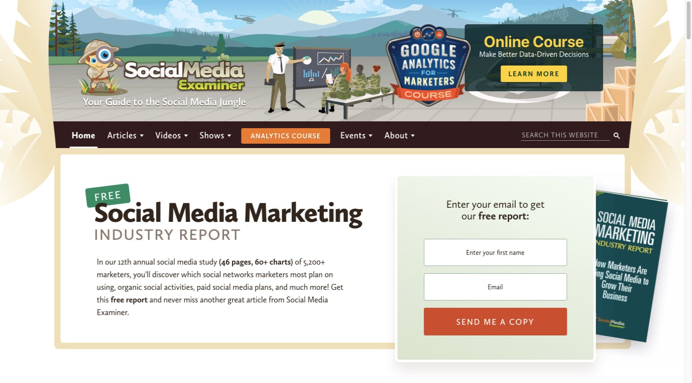
Brands need to promote events like these far in advance because it’s usually not a straight-forward sale. It’s like anything else in lead generation. It takes time to build awareness and to convince people to pay the high-ticket prices for access..
So, while these events might be brief, they get more airtime on your site, which makes the switch-up worthwhile. That said, for anything that doesn’t have a big payoff for you, it’s probably not worth taking up prime real estate on your site for it.
2. When it’s only relevant to a segment of your audience.
As a designer, you work really hard to create websites that resonate with the people visiting them. You choose colors, fonts, and photos that make the digital environment a welcoming one.
But not every website caters to a segmented audience, which means the design needs to have broad appeal.
Take a site like HubSpot, for instance.
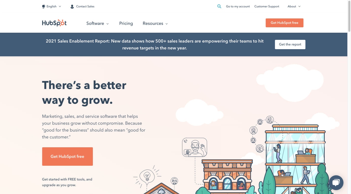
Do you think that every visitor, prospect, or customer would be happy to see:
- Christmas-specific images and messages?
- A banner congratulating the Olympic Gold medalist in speed skating who’s also the local hometown hero?
- A vector image that says “We Voted!” the day of the U.S. elections?
When the content is too demographic specific, and the site serves a much broader audience, it’s best to keep those images off your site.
It’s not just international-serving websites that this effects. For example, Healthworks is a group of fitness clubs serving the Greater Boston area:
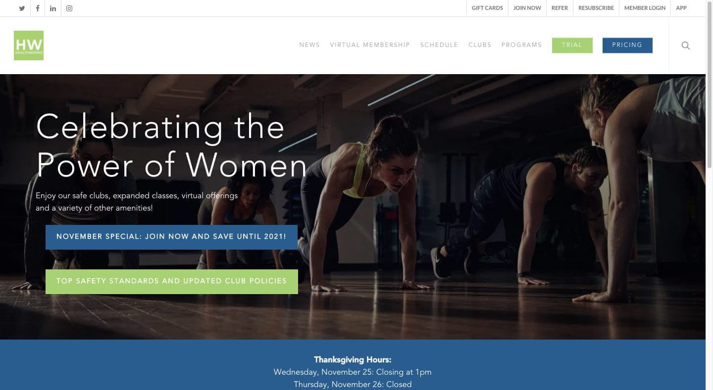
Aside from a link to their COVID-19 safety policies, the website keeps things neutral. Holidays, local events, and social activism have no place in the imagery.
3. When the stock photo selection is limited.
There’s nothing wrong with using stock photos in web design. But it does become a problem when what you’re looking for isn’t available.
So, you either have to choose from a limited selection of acceptable images, which puts you at risk of using the same exact image as everyone else. Or you have to use something abstract because no one’s created any images for the time-sensitive matter you want to depict yet.
If you think about very early on in the COVID-19 pandemic, this was a problem. It’s not like images related to viruses, people wearing masks, or social distancing were popular before 2020.
A search for “COVID-19” on Shutterstock today yields over 13,000 results:
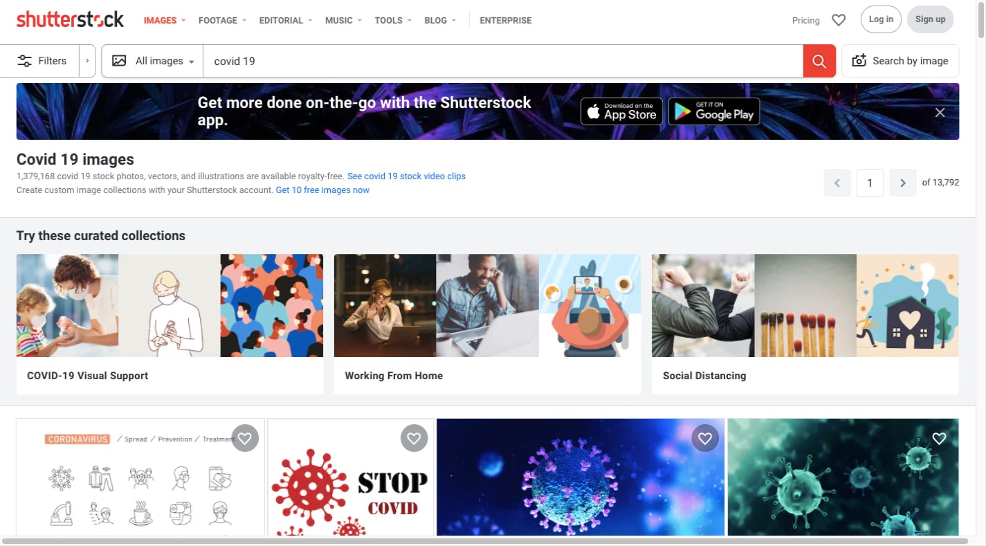
If you’re set on using images that reflect the current social or political landscape and you can’t find them on stock sites (not the quality you want anyway), then you’ll need to create your own.
Or, better yet, you can do as Old Navy did in May 2020 and leverage user-generated content from social media:
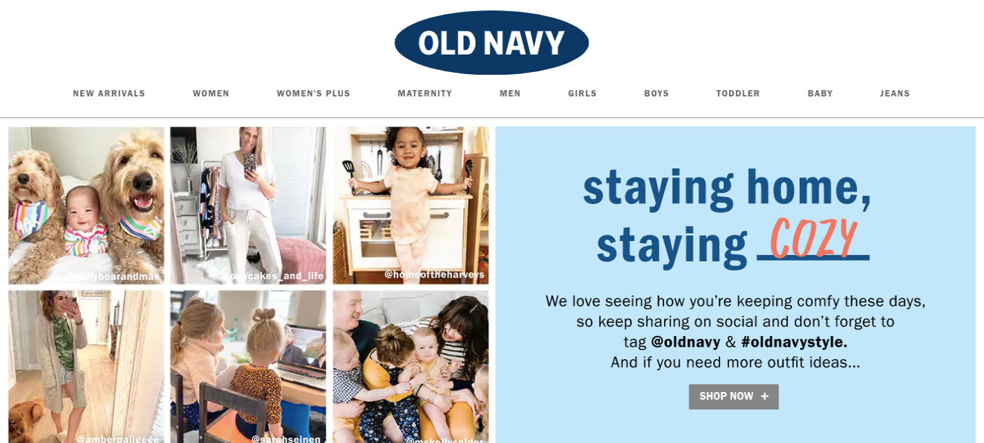
Not only is this a creative way of getting around a lack of stock content, but it’s a uniquely positive spin on it, too.
4. When it’s too controversial.
Web design is all about emotion. Images, in particular, play a big part in influencing how visitors and customers feel about your brand and what it’s selling.
As a result, you’re very careful about choosing website images that elicit the right types of emotions. This is no different.
What you’re going to have to do is ask yourself whether the usage of a controversial or emotionally charged image is worth the response.
Take the Black Lives Matter movement, for instance.
When Nike featured Colin Kaepernick in its ad campaign in 2018, people lashed out. They boycotted the brand and some people destroyed their Nike gear. But Nike came out on top, earning $6 billion in response to that campaign.
You really need to know who your audience is before you insert your brand into emotionally charged moments and conversations. Because, let’s face it, not every brand can withstand the backlash and a loss of profits that results from an ill-timed or placed image.
Are you confident in the response you’d receive if you used a controversial image and message on your website or ad campaigns? If not, you might want to keep your site and the brand’s calls for social activism separate.
As we’ve already seen, the HubSpot website is all business. However, if you go over to the HubSpot Twitter feed, you’ll likely see something that touches on a sensitive matter. Like this post related to Black Lives Matter and Black Friday:
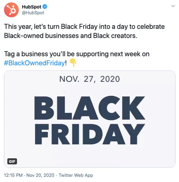
This is a good example of how to use a conversational platform to share a conversation-starting image or GIF. It also does a good job of keeping the focus on the positive and to keep from stoking the flames.
5. When it’s completely off brand.
One of the reasons the Nike campaign worked was because it was on brand and something its customer base was familiar with.
But when you’re dealing with time-sensitive and generally sensitive topics, you better make sure there’s an authentic connection to it. Otherwise, the inclusion of such images will come off as nothing more than virtue signaling.
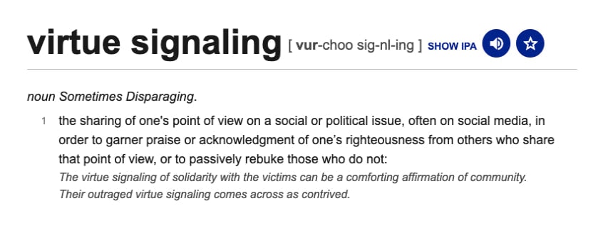
This one isn’t just problematic when it feels like you’re thrusting the website and brand into a completely unrelated conversation or movement.
It’s also an issue when you overdo it.
For example, many websites in 2020 used notification banners or created new pages to educate customers on COVID-19-related changes. That’s a perfectly acceptable reason to have something related to the pandemic on a site.
What you don’t see these sites doing, however, is including photos that make no sense for the brand or their customers.
For instance, how do you think HelloFresh customers would feel if the homepage had a photo of someone opening a package at home, while wearing gloves and spraying down their newly received goods with disinfectant?
It might be a realistic depiction of what they’d do during a pandemic, but is it what they want to see right now?
Something like that is probably not the empathetic design choice you hoped it would be. Remember: You want visitors to walk away feeling positive, not reminded of the current circumstances or pain they’re trying to avoid.
That’s why companies like HelloFresh stick to using on-brand photos that put the focus on their products:
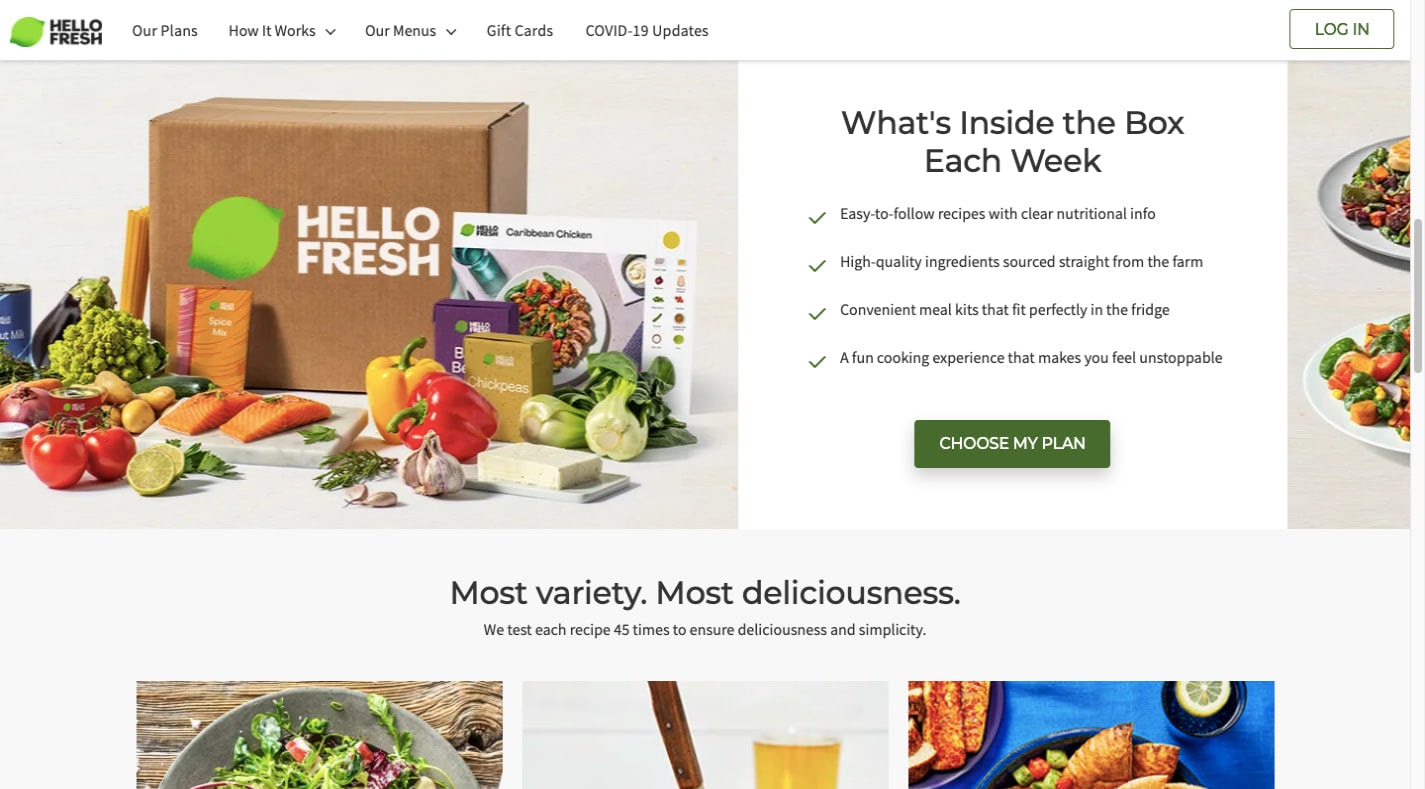
There’s nothing wrong with not jumping on the bandwagon. Unless you have something important and relevant to add to the matter, stick to what works.
Wrap-Up
The point of this post isn’t to discourage you from using time-sensitive imagery. As you can see, there are a number of cases when it’s perfectly acceptable to do so and can help you create a stronger bond between your brand and its customers as a result.
That said, before you go using time-sensitive images on your site, do a careful assessment of:
- What the time-sensitive element is
- What kinds of images you want to use
- Why you want to use them
- How well they fit with your brand identity
- How they’re going to affect your website visitors
If everything checks out and you believe it’ll be well received by your visitors and customers, then by all means proceed. And if you want a quick and pain-free way of switching out the images on your site (or even your newsletter), Designmodo will help you get the job done.
