Well-Groomed Vibrant Calendar Widget Designs for Mobile Apps
Calendars are not only integral parts of many different applications but they are also standalone widgets that normally adorn the home screen of your mobile device. There are bunch of programs that are aimed to feature well-organized and properly crafted schedule of events. Despite of being quite small and unidirectional, calendars have a quite large functional that effectively deals with everyday issues.
Today we are going to touch on a designing side of the matter. Although, it would seem that after installing a calendar widget – everything you will get is a simple solid grid that demonstrates an ordered set of numeric values spiced up with basic neutral colors- you will be very surprised because modern calendar layouts look stylish, sophisticated and exquisite, effectively occupying its own niche and successfully compete with other advanced widgets in design.
The list below comprises fresh and unique calendar widget designs.
Examples of Calendar Designs for Mobile Apps
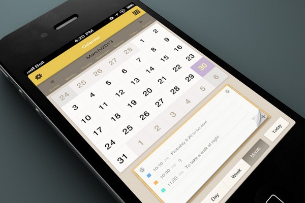
Calendar by Сrab has a clean and neat appearance. The designer utilizes both flat and skeuomorphic graphics to add diversity, depth and, of course, realism to the widget.
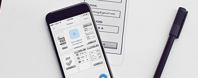
Mobile App Slider by Kenny Sing. The designer also resorts to 3-dimensional effects, properly leveraging shadows and lights in order to make the bottom part look truly realistic. The idea is ably bolstered by smooth wooden textures that are applied to the top bar and to the neat polished background.
With Postcards Email Builder you can create and edit email templates online without any coding skills! Includes more than 100 components to help you create custom emails templates faster than ever before.
Free Email BuilderFree Email Templates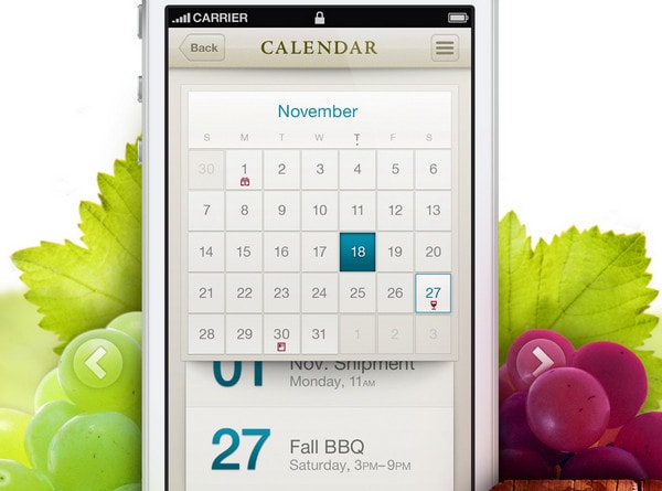
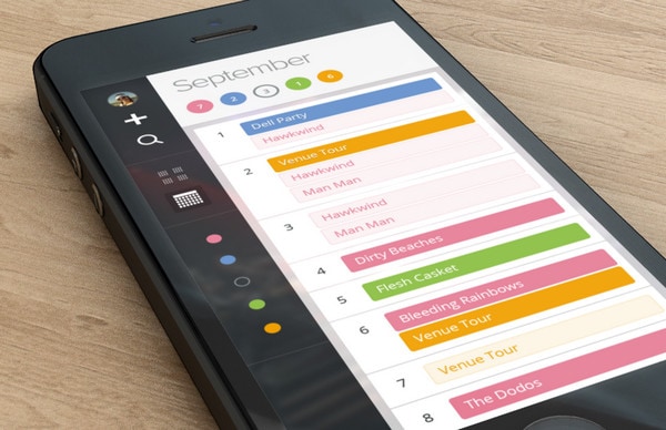
Booking Calendar: Month by Ethan Leon screams flat style that effectively pulls the design together. The app reveals data line by line; each line is nicely brightened by a distinctive vibrant color. The latter is used to instantly give the notion about the type of event.
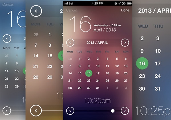
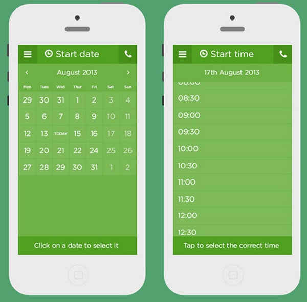
iOS7 Inspired Date & Time Picker by Handsome. The calendar widget looks absolutely fantastic, sophisticated and elegant. The first thing that strikes the eye is a proper balance and sharp contrast between the deep heavily blurred background, neat casual type and regular icons made in a snowy white.
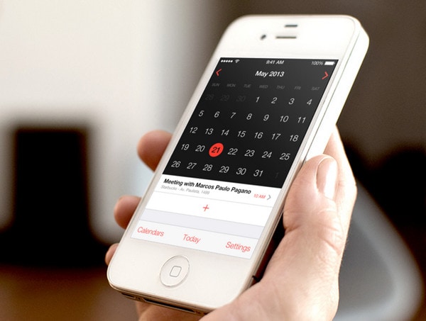
Calendar by Marcos Paulo Pagano. Black, white and red create the powerful combination, especially when the designer mixes them with a delicate flat style. Thus the calendar is turned out to have a lovely businesslike appeal that conveys quite strong feelings.
Planning App by Chris Rowe Jr is marked by a modest vintage color scheme that gives the UI its unique and memorable appearance. The huge icons and tiny font in conjunction with muted green and red perfectly complete the theme.
With Startup App and Slides App you can build unlimited websites using the online website editor which includes ready-made designed and coded elements, templates and themes.
Try Startup App Try Slides AppOther Products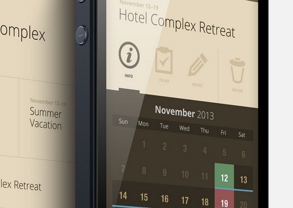
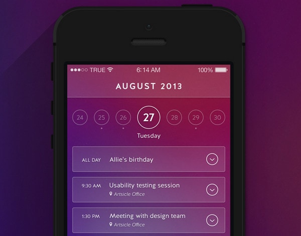
Day View – Calendar by Veera Watchara. This is another calendar widget that is based on a modern and stylish blurred background. The latter fascinates by its garish pink colors that ideally complement white foreground elements. The transparent blocks and outline circular components look simply amazing.
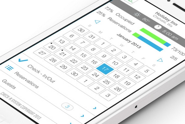
iOS Hotel Check-In App by Vimal Patel. The hotel app includes a neatly organized calendar widget based on a light color palette. The white pristine background ably complements grey outline elements and regular type. The blue and green effectively establish focal points.
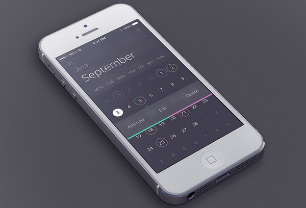
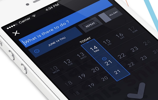
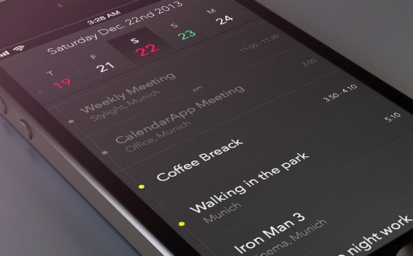
Calendar app by Jakub Antalík. Unlike the previous example, the designer manages to create a sophisticated and tidy calendar widget based on a dark color scheme. The designer implements flat style to enormously reinforce the theme.
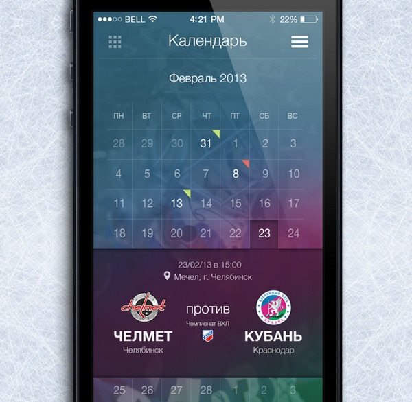
Calendar Matches Hc Kuban by Maxim Sorokin is another wonderful concept in our collection that utilizes defiant gradient and blurred effect to make the design stand out. As usual, white color is selected as secondary one in order to naturally provide a clear contrast that is necessary for emphasizing the content.
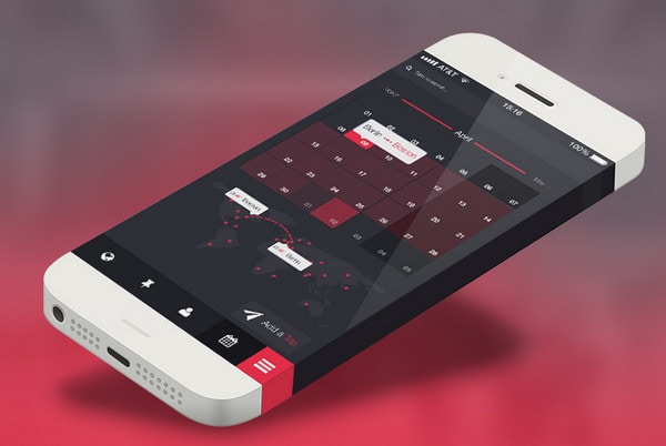
Your trip app by NIMIUS. The designer quite successfully implements a dark coloring, and makes the calendar look enthralling and eye-catching. Here, red and black play a role of primary colors whereas the white is used for highlighting.
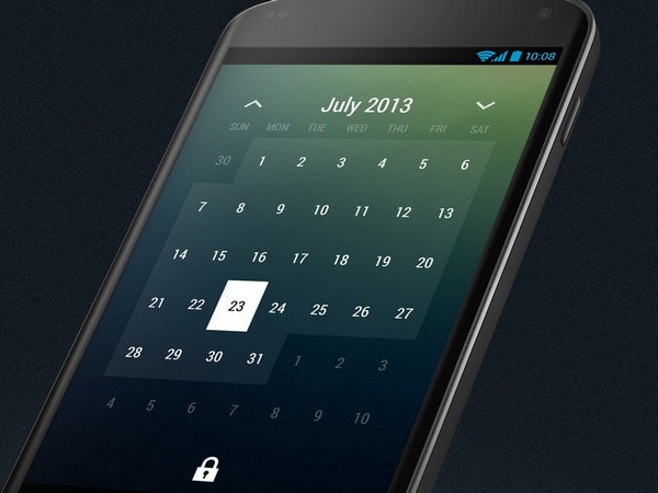
Month Calendar Widget by Roman Nurik. The key feature of this design is the ably executed semi-transparent layers that give the calendar its topnotch appearance. Although the calendar takes up almost the whole screen, the designer still managed to provide users with extra space.
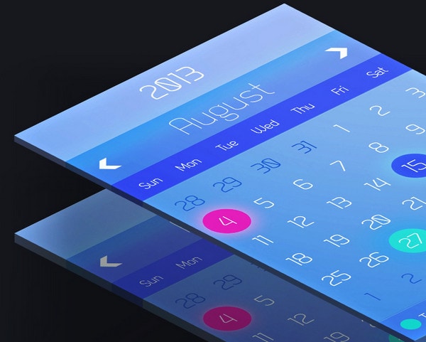
Calendar Design by Mani Baskar. This concept is inspired by gaudy colors inherent to iOS7. The designer makes use of various shades of blue in order to add to the interface complexity. The neon pink and green effectively stand out from the backdrop.
Simple Calendar App by Brian Miller has a minimalistic and simplistic feel. The interface looks clean, open and roomy. The huge numeric value in the heart of the screen instantly grabs attention.
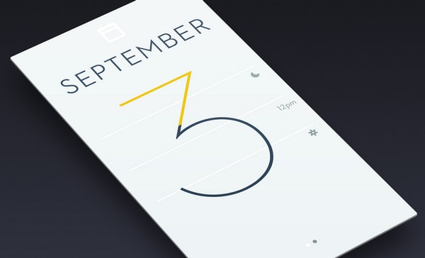
Date Select wip by Michael Sambora. Blue and black perfectly interact with each other. The black solid background adds seriousness to the theme, while blue elements, especially one that has transparent backdrop and outline style, bring a note of refinement.
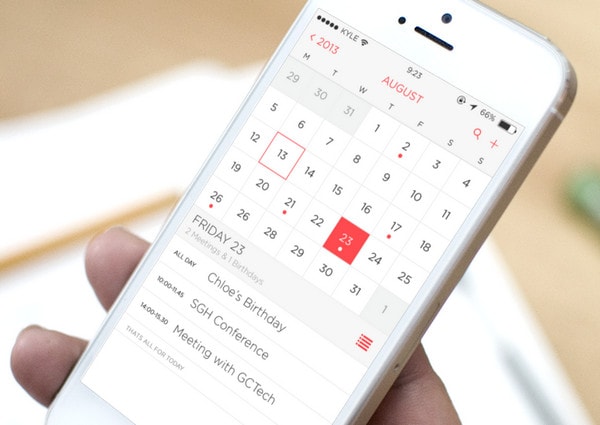
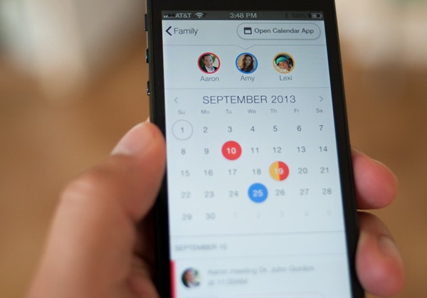
iOS 7 Calendar App Redesign by Kyle Craven. Simple, comfy and definitely clean these words can easily characterize this sleek calendar UI. The light interface is beautifully bolstered by gentle red color that unobtrusively brings the eye up to the selected areas.
Calendar by Samuel Nudds. The minimal coloring is another good approach of creating a spectacular elegant design that will pleasantly demonstrate calendar features. The two-tone interface effectively livens up the content and doesn’t distract onlooker’s eye.
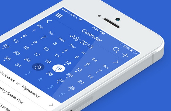
Stealth Healthcare App by Bobby Ghoshal has a beautiful circular vibe. The smooth lines and bright secondary colors are the hallmarks of this design.
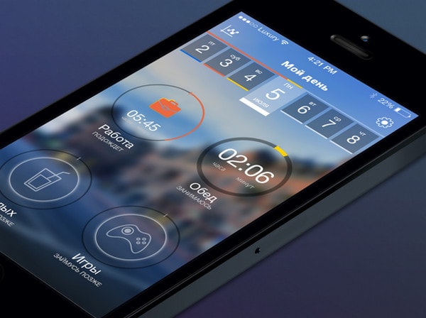
My Day by Sergey Skidan. The UI effectively exemplifies how metro style can easily set the design off. The slightly unfocused background provides a sound foundation for rectangular and circular components with bright accents.
Zipcar App Redesigned by Aaron Buckley. The concept looks organic and balanced. There are no rich decorations or motley gradients; there is only a plain one-colored background that is aimed to strongly support the content and add readability.
«CalendarApp» by Tobias Negele. The interface features a common details’ layout that inherent to any calendar widget. The chocolate tone nicely co-works with the rest colors, and makes the UI look soft and gentle.
Reflection
It would seem that habitual calendar widget that is generally based on an elementary rigid grid that time to time is supplemented by optional stripe horizontal layout can’t amaze us by its appearance. Fortunately, we were wrong; the modern designers easily transform any regular unremarkable date-oriented program into something exquisite and stylish.
