Understanding Color Psychology for Impactful Web Design
It’s no secret that color psychology is used extensively in all aspects of design. From the colors used on day-to-day grocery items, to brand logos and website design, color is an important element that can convey a specific message to users.
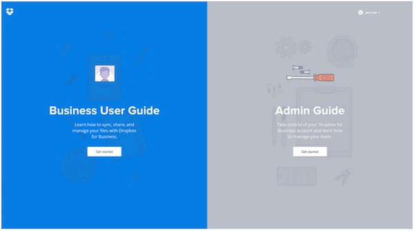
Photo credit: Dropbox
According to Kissmetrics, when we view a color, our eyes send a message to a region of the brain called the hypothalamus. In turn, this sends further signals to the pituitary gland and then onto the thyroid glands. This then signals the release of hormones which cause fluctuations in our mood, emotion and as a result, our behavior.
Science tells us then that color evokes emotion which can result in negative, positive or mismatched feelings. Kissmetrics goes on to say that it takes just 90 seconds for a site visitor to form a judgement or opinion. Further to that, “62-90% of that interaction is determined by the color of a product alone.”
As described in the free e-book Web Design for the Human Eye, color plays an undeniable role in creating a strong first impression on users.
With Postcards Email Builder you can create and edit email templates online without any coding skills! Includes more than 100 components to help you create custom emails templates faster than ever before.
Free Email BuilderFree Email TemplatesWhat Colors Mean
Every color means something to every person, although this meaning varies depending on our personal preferences and cultural background.
For a quick reference, take a look at the color chart below.
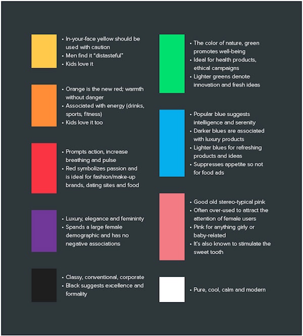
Photo credit: UXPin
Color psychology in design is not an exact science and studies have shown that it’s affected by individual perceptions. Societal considerations such as gender also have an impact on how the color is perceived. Further studies have found that it’s not always the color itself that make an impact, it’s also about how appropriate the user feels the color used is to the brand that’s using it.
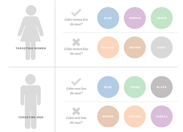
Image source: Kissmetrics
So, if you’re designing for women, then purple is a pretty good bet as it’s universally liked by women but disliked by men (generally speaking, of course). In the image below, this is used to good effect for L’Oreal Paris. As you can see, the header and footer are black, which denotes class and elegance, so that you get the overall feeling that the product isn’t cheap, but high-end.
With Pulsetic you’ll be instantly notified the moment your website, API, or server becomes unavailable. Monitor uptime from multiple global locations and respond to incidents before your users are affected.
Create beautiful status pages in minutes to keep customers informed during outages and build trust with transparent communication.
Start Monitoring for Free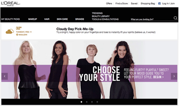
Image source: Kissmetrics
Additionally, white is used for the text, which denotes modernity and a sense of calm, while purple has been chosen to denote luxury, elegance and femininity – all of which are clearly appropriate for a site such as this.
(To learn more about minimalist design and using white space as a design tool, check out the free e-books The Elegance of Minimalism and The Zen of White Space in Web Design).
In the image below, for Women’s Health Magazine, the top banner is pink but otherwise the site is relatively devoid of color and relies instead on imagery and bold navigation. This is an interesting choice and one that could work against the site.
To begin with, pink is a very stereotypical color to use when a site is aimed at women, and it appeals to the sweet tooth, so the message of the site, in that it’s all about feminine health, could be lost due to this.
Once we delve further into the site, the header color is of course used on every page, but a quick visit to the Weight Loss section returns the below.
As you can see, this page is even more pink, which could prove to be counterproductive to the audience. However, the first image that we happen to see was on a slider, and this does change as you remain on the page.
Determining a Color Scheme
It’s unlikely that you’ll create a site that has just one color (unless you’re going purely monochromatic) so you should consider the overall color scheme and each individual color, as well as how well they work together. Also consider the impact on the user and how secondary colors fit with the primary color that you’re using.
With this in mind, you should take care when mixing colors together and to help you with this, you can be guided by three basic methods of color mixing.
#1: Triadic
This is the most basic and balanced method, which uses color vibrancy and complementation. Using the 12-step color wheel, you can select any three colors which are located 120 degrees away from each other for background, content and navigation.
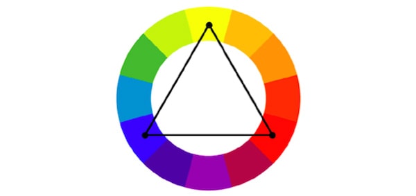
Photo credits: Ray Trygstad. Wikimedia Commons. Creative Commons. Edited from original.
#2: Compound (Split Complementary)
The second method is a little more difficult and you may have to experiment in order to get it right, but it can be very effective if it’s done well. This concept uses four colors – two contrasting pairs (near on the color wheel) and two complementary pairs (across on the color wheel).
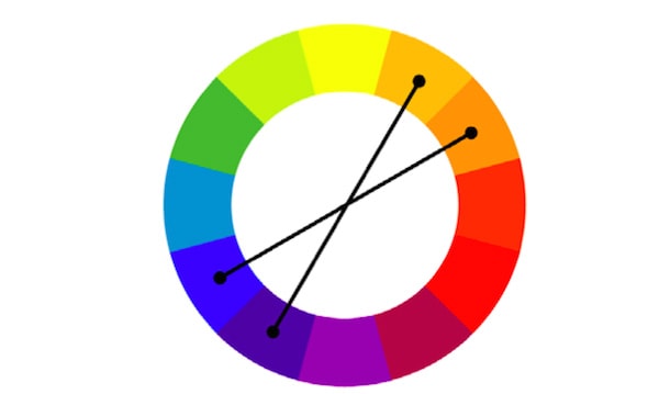
Photo credits: Ray Trygstad. Wikimedia Commons. Creative Commons. Edited from original.
#3: Analogous
This method focuses on complementary colors only and you should take care when deciding what you want the scheme to say to the user. As it highlights the vibrancy of the chosen colors, it can be too much as the colors are essentially exaggerated.
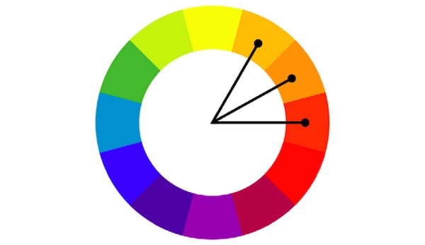
Photo credits: Ray Trygstad. Wikimedia Commons. Creative Commons. Edited from original.
So when considering the psychology of color, it’s important that you consider all of the colors as a whole, and how they will work together, rather than just picking one and hoping that it will work alongside others such as background, text and buttons.
Take a look at the page below and consider what it says to the user.

Image source: Codementor
- Background color – The black background denotes class, excellence, formality and “corporate”. Clearly, when considering a site that provides mentoring, excellence is something that you would want to convey. Formality suggests that it’s linked to learning while “corporate” suggests that users might not be learning to code as a hobby, but rather as something they would take forward in their career.
- Button colors: The site uses red buttons for the CTA buttons which stand out clearly against the black background in order to encourage sign ups. Black is used with a white border for less important buttons, in keeping with the overall scheme.
- Text color: For the text, white provides that all-important contrast, while still matching the color scheme. The icons outlined in white (and white ghost buttons) are placed right on the fold to encourage users to scroll down for more information if necessary.
Overall, the design works very well – we all know that black and white go well together and in this case, the site feels classy and relatively formal. The red, if overused, could take meaning away from the overall message, so instead it’s used very sparingly in order to stand out and make it clear that the desired action is to sign up to the service.
Colors to Avoid
Brown generally evokes a sense of nature in design and is the color most disliked by men, but it does work in some contexts, as it denotes dependability.
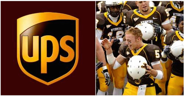
Image source: Color Matters
So brown works for UPS as it’s a company that wants to convey the strong message that it can be relied upon.
However, as a sports kit, it’s been described as the worst ever in college football thanks to the strip shown in the image, which belonged to the Wyoming College team. The interesting part is that brown is also thought to promote ‘ruggedness’ so you would think that it would work for that reason when paired with such an aggressive sport, but it doesn’t in this instance, perhaps because men don’t normally like brown.
When it comes to women, orange seems to be the least favorite color, so keep this in mind if you’re designing for a primarily female user base.
Of course, remember that these are just guidelines (they always depend on context) and it’s much more important that all your colors complement each other and create harmony.
Tools to Help You Choose the Right Colors
You can of course use ready-made color palettes to help you in your choices. When it comes to web UI design, you don’t need to reinvent the color wheel.
- Adobe Color CC – trusted provider for all Adobe users.
- Paletton – simple color picker for beginners.
- Flat UI Color Picker – for creating colorful flat designs
- Mudcube Color Sphere – offers a selection of themes and provides HEX numbers.
- Check My Colours – for check foreground and background color combinations and that it has the correct contrast for use by people with colorblindness.
- Color – allows you to pick a color by moving your mouse across the screen, set saturation and then get the HEX code.
Learning By Example
There are thousands of sites out there that use color to great effect, and plenty that don’t. The image below, however, won an awwwards Site of the Day distinction for color and it’s easy to see why.
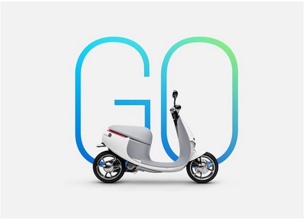
Image source: AWWWards
The background is a uniform light gray which matches nicely with the gray of the bike. The simple design, with the large lettering is highly effective and immediately conveys the sense that it’s a speedy little bike that you’ll enjoy riding. The use of the color gray allows the other colors to stand out too as it’s a neutral color which, as it gets lighter, illuminates the page and livens it. Gray also gives a sense of stability (great for a bike ad, then) while creating a sense of calm and composure.
The colors used in the word ‘Go’ are bright and lively, lending a sense of vibrancy and modernity to the design. It’s predominantly blue and since this is a color liked by both men and women, it ensures that the page is not gender-specific. Green is added sparingly, which suggests a sense of environmental responsibility. This in itself is pretty clever, as a bike this size will of course not guzzle gas and will be better for the environment than a car – this is of course something that we already know, but it’s good to have the message reinforced.
Overall, the page gives you a sense of how the scooter would be perfect for modern city living.
Final Considerations
Color is an important part of design but it’s also a vital aspect of the overall brand. The sense that the colors used convey must match the brand personality and add to the overall brand story and meaning. Often, the designer may have to work with existing artwork such as logos and will have to choose colors based on this. While this could be seen to be quite constricting, the availability of color palettes to help you should make the process somewhat easier.
To learn more about how to visual design to make the strongest first impression on users, check out the free 85-page e-book Web UI Design for the Human Eye. We analyze examples from over 33 companies including Tumblr, Etsy, Google, Facebook, Twitter, Medium, Intercom, and Bose.


