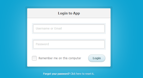
How to Create a CSS3 Login Form
Difficulty: Beginner
Estimated Completion Time: 30 Mins
Today, I will teach you how to create a beautiful CSS3 login page that can be integrated into your website, blog, app, etc. I have used this method of creating a login page to implement it into WordPress for my clients; Which gives them diversity among the other WordPress blogs out there.
Step 1 – The HTML of CSS3 Login Form
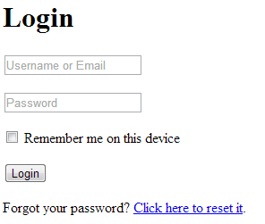
Before we begin creating the login page with the CSS, we will first need the HTML which will include everything from the buttons, links, fields, and the basic layout before we link the HTML to the CSS to complete the design.
Login
  <div class="container">
    <div class="login">
      <h1>Login to App</h1>
      <form method="post" action="">
        <p><input type="text" name="login" value="" placeholder="Username or Email"></p>
        <p><input type="password" name="password" value="" placeholder="Password"></p>
        <p class="remember_me">
          <label>
            <input type="checkbox" name="remember_me" id="remember_me">
            Remember me on this computer
          </label>
        </p>
        <p class="submit"><input type="submit" name="commit" value="Login"></p>
      </form>
    </div>

    <div class="login-help">
      <p>Forgot your password? <a href="#">Click here to reset it</a>.</p>
    </div>
  </div>
Step 2 – Beginning CSS
After the completion of the HTML we now need to begin the CSS part of the design. Firstly, we need to begin the layout of the login page. To begin, start by adding the code below. When adding this CSS be sure to leave space above the code to organize it accordingly. After, we can then add additional elements such as the design of the body.
.container {
  margin: 50px auto;
  width: 640px;
}

.login {
  position: relative;
  margin: 0 auto;
  padding: 20px 20px 20px;
  width: 310px;
}
Having added the code above, we have added the height and width of the login page form and have centered it to the center of the webpage. We can now begin my favorite part of design, the beauty. Writing the code below adds a border and a grey shade to the login page and you will begin seeing the design come into shape.
With Postcards Email Builder you can create and edit email templates online without any coding skills! Includes more than 100 components to help you create custom emails templates faster than ever before.
Free Email BuilderFree Email Templates
.login p.submit {
  text-align: right;
}

.login-help {
  margin: 20px 0;
  font-size: 11px;
  color: white;
  text-align: center;
  text-shadow: 0 1px #2a85a1;
}

.login-help a {
  color: #cce7fa;
  text-decoration: none;
}

.login-help a:hover {
  text-decoration: underline;
}

:-moz-placeholder {
  color: #c9c9c9 !important;
  font-size: 13px;
}

::-webkit-input-placeholder {
  color: #ccc;
  font-size: 13px;
}
Step 3 – The Design
We now have the base of the login form and we are now ready to start the actual design of it. The next part of this tutorial is all personal preference and can be customized to your liking. You can begin by adding the CSS code below; This will add an inner border and radius within the outside gray shade.
.container {
  margin: 50px auto;
  width: 640px;
}
.login:before {
  content: '';
  position: absolute;
  top: -8px;
  right: -8px;
  bottom: -8px;
  left: -8px;
  z-index: -1;
  background: rgba(0, 0, 0, 0.08);
  border-radius: 4px;
}

.login h1 {
  margin: -20px -20px 21px;
  line-height: 40px;
  font-size: 15px;
  font-weight: bold;
  color: #555;
  text-align: center;
  text-shadow: 0 1px white;
  background: #f3f3f3;
  border-bottom: 1px solid #cfcfcf;
  border-radius: 3px 3px 0 0;
  background-image: -webkit-linear-gradient(top, whiteffd, #eef2f5);
  background-image: -moz-linear-gradient(top, whiteffd, #eef2f5);
  background-image: -o-linear-gradient(top, whiteffd, #eef2f5);
  background-image: linear-gradient(to bottom, whiteffd, #eef2f5);
  -webkit-box-shadow: 0 1px whitesmoke;
  box-shadow: 0 1px whitesmoke;
}

.login p {
  margin: 20px 0 0;
}

.login p:first-child {
  margin-top: 0;
}

.login input[type=text], .login input[type=password] {
  width: 278px;
}

.login p.remember_me {
  float: left;
  line-height: 31px;
}

.login p.remember_me label {
  font-size: 12px;
  color: #777;
  cursor: pointer;
}

.login p.remember_me input {
  position: relative;
  bottom: 1px;
  margin-right: 4px;
  vertical-align: middle;
}
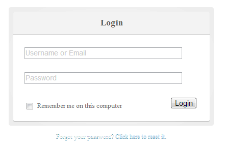
Step 4 – Finishing Form Design
Since we have finished up designing the borders and the basic design, we can now begin styling the form itself. Let’s start by adding the CSS below which will give username and password fields their design.
input {
  font-family: 'Lucida Grande', Tahoma, Verdana, sans-serif;
  font-size: 14px;
}

input[type=text], input[type=password] {
  margin: 5px;
  padding: 0 10px;
  width: 200px;
  height: 34px;
  color: #404040;
  background: white;
  border: 1px solid;
  border-color: #c4c4c4 #d1d1d1 #d4d4d4;
  border-radius: 2px;
  outline: 5px solid #eff4f7;
  -moz-outline-radius: 3px;
  -webkit-box-shadow: inset 0 1px 3px rgba(0, 0, 0, 0.12);
  box-shadow: inset 0 1px 3px rgba(0, 0, 0, 0.12);
}

input[type=text]:focus, input[type=password]:focus {
  border-color: #7dc9e2;
  outline-color: #dceefc;
  outline-offset: 0;
}

input[type=submit] {
  padding: 0 18px;
  height: 29px;
  font-size: 12px;
  font-weight: bold;
  color: #527881;
  text-shadow: 0 1px #e3f1f1;
  background: #cde5ef;
  border: 1px solid;
  border-color: #b4ccce #b3c0c8 #9eb9c2;
  border-radius: 16px;
  outline: 0;
  -webkit-box-sizing: content-box;
  -moz-box-sizing: content-box;
  box-sizing: content-box;
  background-image: -webkit-linear-gradient(top, #edf5f8, #cde5ef);
  background-image: -moz-linear-gradient(top, #edf5f8, #cde5ef);
  background-image: -o-linear-gradient(top, #edf5f8, #cde5ef);
  background-image: linear-gradient(to bottom, #edf5f8, #cde5ef);
  -webkit-box-shadow: inset 0 1px white, 0 1px 2px rgba(0, 0, 0, 0.15);
  box-shadow: inset 0 1px white, 0 1px 2px rgba(0, 0, 0, 0.15);
}
Now that we have added style to the fields, we might want to add style to submit button. The syntax for color in CSS can sometimes be a bit confusing at first. If you are a beginner with CSS you can use a CSS color generator found here.
input[type=submit]:active {
  background: #cde5ef;
  border-color: #9eb9c2 #b3c0c8 #b4ccce;
  -webkit-box-shadow: inset 0 0 3px rgba(0, 0, 0, 0.2);
  box-shadow: inset 0 0 3px rgba(0, 0, 0, 0.2);
}
Before we are completely finished with the design part of the form; we will need to add style to the checkbox for the web app to remember the user’s login information. You can complete this by adding the code below. I recommend adding it just below the body elements in the CSS file.
input[type=checkbox],
input[type=radio] {
border: 1px solid #c0c0c0;
margin: 0 0.1em 0 0;
padding: 0;
font-size: 16px;
line-height: 1em;
width: 1.25em;
height: 1.25em;
background: #fff;
background: -webkit-gradient(linear, 0% 0%, 0% 100%, from(#ededed), to(#fbfbfb));
-webkit-appearance: none;
-webkit-box-shadow: 1px 1px 1px #fff;
-webkit-border-radius: 0.25em;
vertical-align: text-top;
display: inline-block;
}
input[type=radio] {
-webkit-border-radius: 2em; /* Make radios round */
}
input[type=checkbox]:checked::after {
content:"✔";
display:block;
text-align: center;
font-size: 16px;
height: 16px;
line-height: 18px;
}
input[type=radio]:checked::after {
content:"â—";
display:block;
height: 16px;
line-height: 15px;
font-size: 20px;
text-align: center;
}
select {
border: 1px solid #D0D0D0;
background: url(https://www.quilor.com/i/select.png) no-repeat right center, -webkit-gradient(linear, 0% 0%, 0% 100%, from(#fbfbfb), to(#ededed));
background: -moz-linear-gradient(19% 75% 90deg,#ededed, #fbfbfb);
-webkit-box-shadow: 0 1px 2px rgba(0,0,0,.05);
-moz-box-shadow: 0 1px 2px rgba(0,0,0,.05);
-webkit-box-shadow: 0 1px 2px rgba(0,0,0,.05);
color: #444;
}
Step 5 – Styling the Background
We have now completed the overall design of the login form and we can now finish it off by adding a color to the background. Like I mentioned before, the design part of the creation is all personal preference and can be customized to your needs; Especially the background. Personally, I add my body style to the top of my CSS file for easy access.
body {
  font: 13px/20px "Lucida Grande", Tahoma, Verdana, sans-serif;
  color: #404040;
  background: #0ca3d2;
}
Download CSS3 Login Form

With Pulsetic you’ll be instantly notified the moment your website, API, or server becomes unavailable. Monitor uptime from multiple global locations and respond to incidents before your users are affected.
Create beautiful status pages in minutes to keep customers informed during outages and build trust with transparent communication.
Start Monitoring for Free


