10 Actionable Design Tips for Startups
Startups are popping up everywhere with an emphasis on the freedom for people to embody their ideas and let the world see it. However, most startups don’t have design founders or have inexperienced designers joining startups in hopes of hitting it big.
As a designer, I’ve made many mistakes and have seen other young designers doing the same. Based on my experience designing websites for startups and attending startup events and hackathons and observing the creative process, I have developed some tips for getting through the startup process.
Let’s look at 10 ways you can improve your designs in a current or future startup to build stronger brand, drive more visitors, achieve better conversion rates and generally succeed.
1. Simplify
Many startup websites are loaded with graphics, options and choices. Simplify your website’s user interface, get rid of unnecessary elements and leave the things that matter the most. “Less is more” is a great rule to follow.
Make your website easy to navigate, use simple copy for navigation, include search, clickable logo, everything that visitors are used to. Following some web conventions might be a good idea, too.
Main things to consider:
With Postcards Email Builder you can create and edit email templates online without any coding skills! Includes more than 100 components to help you create custom emails templates faster than ever before.
Free Email BuilderFree Email Templates- Visual hierarchy. Make sure to make strong visual hierarchy meaning that main headlines are way bigger than subheadlines and body text, primary buttons are bigger in size and more noticeable in color.
- Contrast. Spend time working with the contrast of the website, pick colors that work well together and make sure to make some things more prominent than others so people can easily distinguish elements and take action.
- Flow. Get rid of redundant steps like personal information collecting on sign up process, try to simplify the journey and reduce the need of user interaction. Reduce clicks, choices and information needed for the user to complete one or another scenario like signup, purchase or inviting a friend.
Mapbox
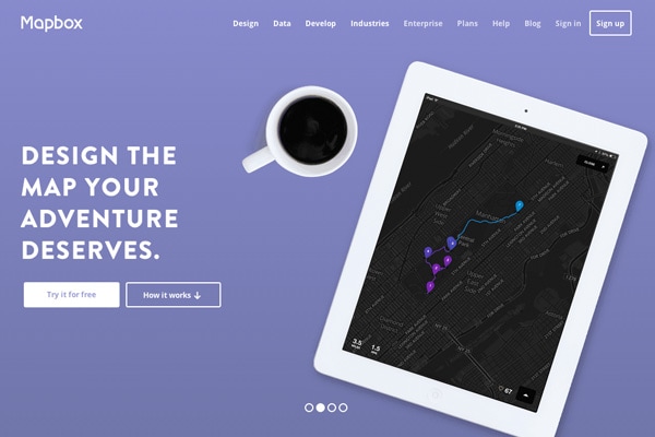
Mapbox uses a simple landing page structure. Product shot, strong message and obvious call to action buttons, with more emphasis on the “Try it for free” button.
2. Reduce Color
Colors are important in building a memorable and successful brand, however, many times designers use too many colors in startup website color palettes. Think of Coca-Cola, Starbucks, Facebook, Twitter; all of these brands can be easily recognized with one main color.
Your goal is to use one or two colors and neutral hues for copy and other graphic elements like boxes, lines, icons etc. Check Find Guidelines to learn more about building a web design guide and selecting primary, secondary and tertiary colors for your websites.
Canopy
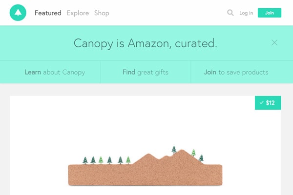
Canopy is a great example of a startup website with a strong focus on a single color that is being used for the logo, buttons and other design elements.
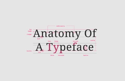
3. Use Only Two Fonts
Typography is an extremely important communication tool for most of the web. One of the most common mistakes that inexperienced designers tend to use is too many typefaces, which can lead to a messy and chaotic look and feel. Pick one typeface or a combination of two and stick to it. Your designs will look more clean and trustworthy.
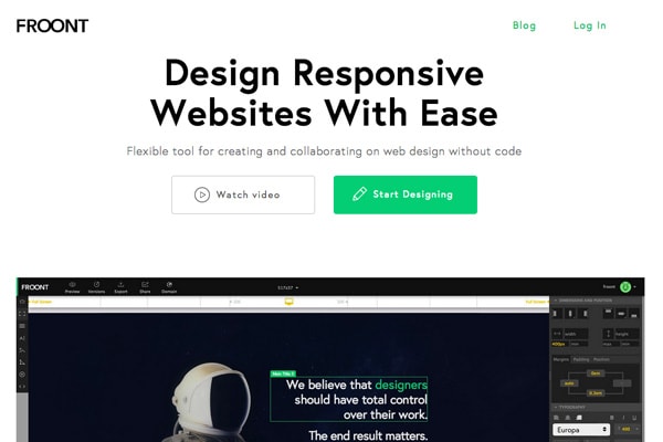
Froont
With Startup App and Slides App you can build unlimited websites using the online website editor which includes ready-made designed and coded elements, templates and themes.
Try Startup App Try Slides AppOther ProductsFroont effectively uses a single font for the main headline, sub text, buttons and main top navigation.
4. Improve Readability
Ninety-five percent of web design is typography. Typography is what people use to read, learn from and get the message across. It is necessary to get the copy right.
Things to note:
- Contrast. Make sure that your copy is darker than the background or other way around.
- Line-height. Set line-height from 1.5 to 1.75 to ensure that lines have enough space to breathe and are perceived as a clean layout.
- Hierarchy. Systematize your copy, most of the people now scan online so make it easier for them by using noticeable headlines, sub-headlines, bullet points.
Slack
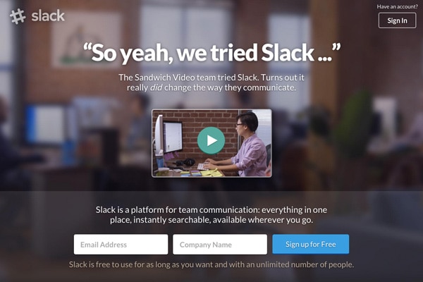
Slack is a perfect example of how to get your typography right. It is readable despite the fact that background is quite distracting, has hierarchy and subtle emphasis.
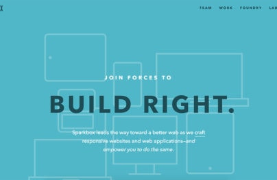
5. Mobile First
According to Business Insider, the number of people using mobile devices outpaced people on desktop computers in 2014. Responsive websites are the new standard. Think mobile-first, include the most important information on the mobile version and make sure to make it easy for visitors to take action by using simple form and large (easy to tap) call to action buttons so people can’t miss it.
For desktop versions, think of adding more to the overall experience, stunning imagery, more whitespace and credibility. Be creative, after all, you have more space for creativity on desktop.
Squarespace
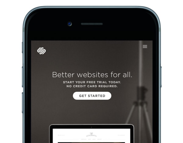
Squarespace has beautifully designed mobile landing page has all main elements, headline, sub-headline and obvious call to action button.
6. Run A/B Tests
Lean startup is all about building, testing, measuring and iterating. Never limit yourself to one version of your landing page or dashboard interface, make two or three versions and test with actual users. After you find a design winner, try to iterate parts of it to increase the conversion rate.
Main elements to test:
- Main message copy
- Call to action buttons
- Forms
- Images
Here are some tools that will help you run A/B tests: Unbounce, Google Analytics, Optimizely, KISSmetrics.
Unbounce
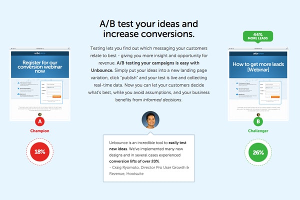
Unbounce allows you to easily test your designs and measure effectiveness.
7. Use Stunning Imagery
A picture is worth a thousand words, so save your words and use stunning images to capture attention. A common pitfall for designers is using stock photography that only kind of fits the idea and implement it right into the design.
Make sure you know your target audience, create a mood board of images you’re after and then spend some time researching stock photos that communicate emotionally.
Square
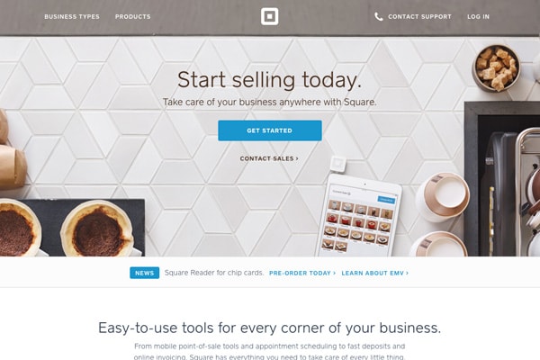
Square uses a clean composition of the product in use. The image creates welcoming environment and sets a positive mood.
Check out 16 Places to Find the Best Free Stock Photos. For premium stock photos I recommend the following marketplaces:
- Stocksy
- Offset
8. Create an Obvious Call to Action
Most startups are based on lean methodology, conversions are an extremely important factor and optimization for higher conversion rate should be your goal. Test your copy for call to action (CTA); whether it is to sign up for newsletter or test the product, it has to be obvious. Starting with the copy, ensure that message says exactly what you want users to do. Avoid slang in order to make things more understandable (e.g. don’t say “Jump In” instead of saying “Sign Up”); it may sound cool, but people might find it confusing.
Pixate
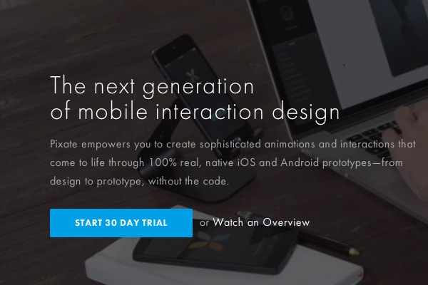
Pixate makes it obvious what to do. Notice how the CTA button pops out due to high contrast and a bold uppercase typeface.
Make it big. Call to action buttons have to be big in size and bold in color to attract the eye.
Make it exclusive. Incentivize your call to action, instead of asking for an email address, reward users with a free gift.
9. Think of the End User
Spend some time to get to know your end user, define your target audience and build a typical user profile or user persona. Design for your end user and focus bringing value for your customer. Always remember that you are designing for your customer not yourself.
- Benefits over features. A simple hack that will help is to depict benefits for the customer and show value instead of showing startup features and bragging how cool your company is.
- People don’t buy what you do; they buy why you do it. Watch Simon Sinek’s TED talk “How great leaders inspire action” to learn more about forming your company’s purpose and vision.
Project Fixup
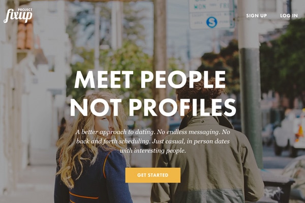
Project Fixup sells the benefit of meeting people instead of saying “dating platform.”
10. Add Some Fun
Making your design emotional. People interacting with your product need to feel happy and delighted.
“I’ve learned that people will forget what you said, people will forget what you did, but people will never forget how you made them feel.” ― Maya Angelou
The quote above proves that people need associate other people and emotions; the same applies to products and startups. Humor is what can make user’s day better. Referring to previous point, know who you’re talking to, speak the customer’s language, surprise and delight, understanding them and show what they want to see.
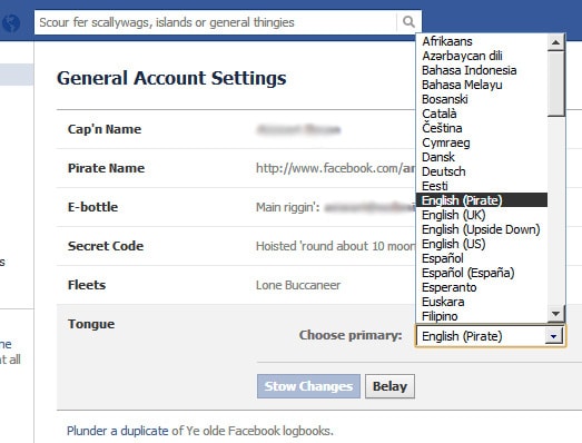
Facebook offers pirate and upside-down versions of English as language options.
Talk with users to find out what they like, where they spend their time most and what they would be interested in seeing so you can hit the target with design.
Conclusion
Startups are getting more publicity but only the ones that work hard and get the design part right will succeed. There is no rocket science, just common sense, research and best practices. Hopefully the tips above will help your startup design process.