Principles of Flat Design
Flat design – the design community just can’t stop talking about it.
And feelings are strong. Most designers either can’t get enough of this trend, or absolutely hate it.
I am somewhere in the middle. Good design is about creating something useful that works. If the answer is designed in the fashion of flatness, so be it. But the trend may not work for all projects, so it should not be forced.
So let’s examine what makes something flat. There are five pretty distinct characteristics. Here’s a look at each, plus an introduction to “almost” flat design.
No Added Effects
With Postcards Email Builder you can create and edit email templates online without any coding skills! Includes more than 100 components to help you create custom emails templates faster than ever before.
Free Email BuilderFree Email Templates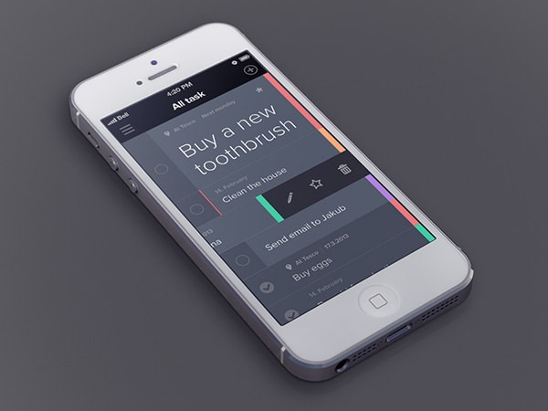
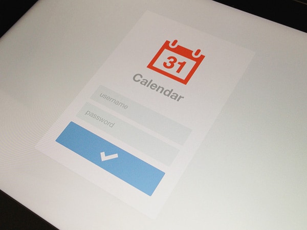
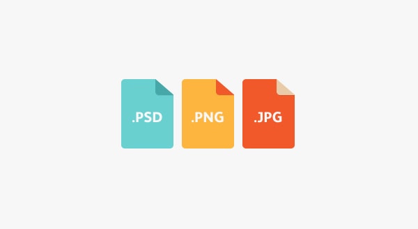
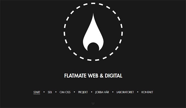
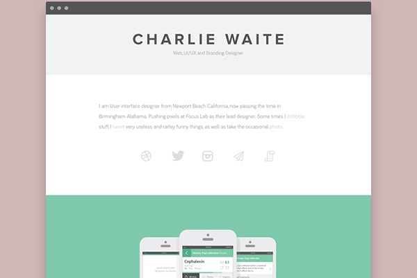
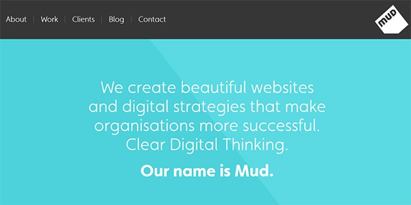
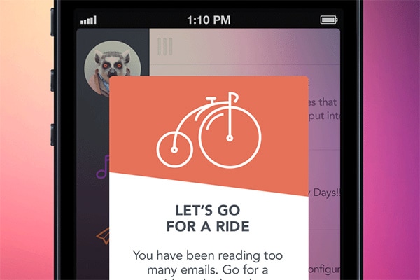
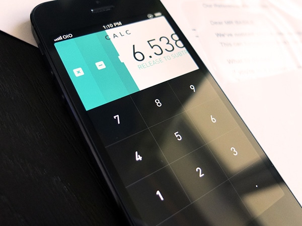
Flat design gets its name from the shapes used. Flat design employs a distinct two-dimensional style that is simply flat.
The concept works without embellishment – drop shadows, bevels, embossing, gradients or other tools that add depth. Every element or box, from image frames to buttons to navigational tools, is crisp and lacks feathered edges or shadows.
Nothing is added to make elements look more realistic, such as tricks designed to make items appear 3D in skeuomorphic design projects. Layers used in flat design mirror those in other projects, but the planes do not intersect leaving a distinct background image, foreground images or buttons, text and navigation.
So what makes it work? Flat design has a distinct look and feel without all the extras. It relies on a clear sense of hierarchy in the design and placement of elements to make successful projects easy for users to understand and interact with. While more and more websites are using flat design principles, it is maybe even more popular for app and mobile design. With small screens, there are fewer buttons and options, making a flat interface fairly easy to use.
Simple Elements
With Pulsetic you’ll be instantly notified the moment your website, API, or server becomes unavailable. Monitor uptime from multiple global locations and respond to incidents before your users are affected.
Create beautiful status pages in minutes to keep customers informed during outages and build trust with transparent communication.
Start Monitoring for Free
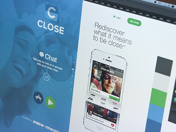
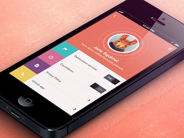
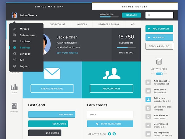
Flat design uses many simple user interface elements, such as buttons and icons. Designers often stick to simple shapes, such as rectangles, circles or squares and allow each shape to stand alone. Shape edges can be perfectly angular and square or include curvature.
Each UI element should be simple and easy to click or tap. Interaction should be intuitive for users without a lot of in-design explanation.
In addition to simple styling, go bold with color on clickable buttons to encourage use. But don’t confuse simple elements with simple design, flat design concepts can be just as complex as any other type of design scheme.
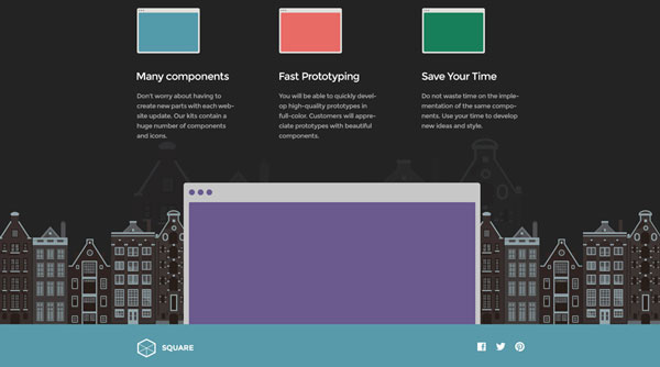
Need help getting started? Designmodo offers a variety of UI kits using flat styles – from the Square UI Free and Flat UI Free, a simple PSD/HTML UI kit with basic components, to Square UI and Flat UI Pro, a complete PSD/HTML UI pack for website and app design projects.
Focus on Typography

Because of the simple nature of element in flat design, typography is extremely important.
The tone of typefaces should match the overall design scheme – a highly embellished font might look odd against a super-simple design. Type should also be bold and worded simply and efficiently, in an effort for the final product to have a consistent tone visually and textually.
Consider a simple sans serif type family with plenty of variations and weights for the primary typography on a site using flat design. Add a touch of the unexpected with one novelty font as an art element, but be careful not to go overboard with use of the specialty typeface.
Type should also tell users how to use the design. Label buttons and other elements for increased ease of use and interactivity.
Focus on Color
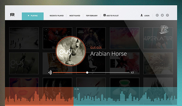
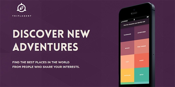
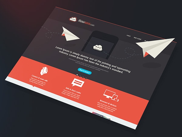
Color is a large part of flat design. Flat design color palettes are often much brighter and more colorful than those for other sites.
Color palettes for flat design projects often contain many more hues as well. While most color palettes focus on two or three colors at most, flat design palettes may use six to eight colors equally.
The hues tend to be vibrant – think about the purest colors from the color wheel – without tints or tones. Primary and secondary colors are popular. In addition certain types of colors are also used frequently; in this iteration of the flat design trend, retro colors – including salmon, purple, green and blue – are especially popular.
Minimalist Approach
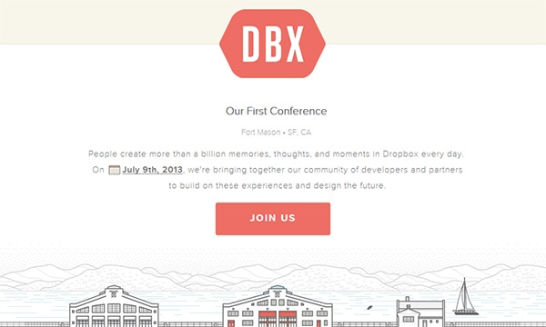
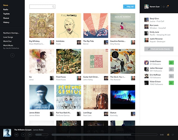
Flat design is simple by nature and works well with an overall minimalist design approach.
Avoid too many bells and whistles in the overall site design. Simple color and text may be enough. If you want to add visuals, opt for simple photography.
Some retail sites, such as Svpply (above), using flat design have done a good job placing items on a simple background to do this. (It should be noted that the photos do have some natural depth but still fit into the overall flatness of the design.)
“Almost” Flat Design
A style more designers tend to agree on is “almost” flat design.
In almost flat design, the basic theme of the flat style is used but some effects are added to the design scheme. Buttons, for example, may contain slight gradients or drop shadows. Designers typically pick one effect and use it exclusively in an almost flat project.
This style allows for a little more flexibility than some of the rigidness of the no effects thought behind flat design.
Designers like it because of the added depth and texture. Users like it because the style is a little less sharp and can help guide proper interaction. On the flip side, designers don’t like it because it marries two styles in a way that can lack definition of a true style.
More on Flat Design
Designmodo has been a leader in the flat design trend discussion. Read our previous articles for more on flat design.
- Pros and Cons of Flat Design
- Flat Design: Can you Benefit from the Trend?
- Flat Web Design: Beautiful Examples of Websites
- Beautiful Examples of Flat Icon Design
- Making it Work: Flat Design and Color Trends


