Design Trend: Ghost Buttons in Website Design
The biggest trend of 2014 is something I’m not sure we saw coming. And it’s all based on one of the smallest design components of almost any website – the button.
Ghost Buttons – those transparent, clickable items – are popping up everywhere. And taking the web design world by storm. Who thought something as simple as a button could change the way we look at web design?
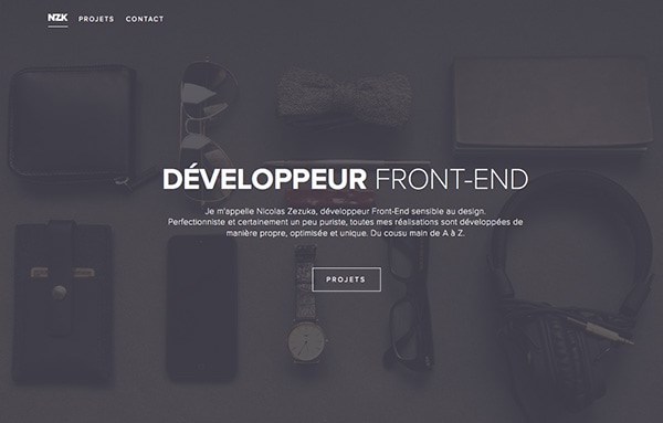
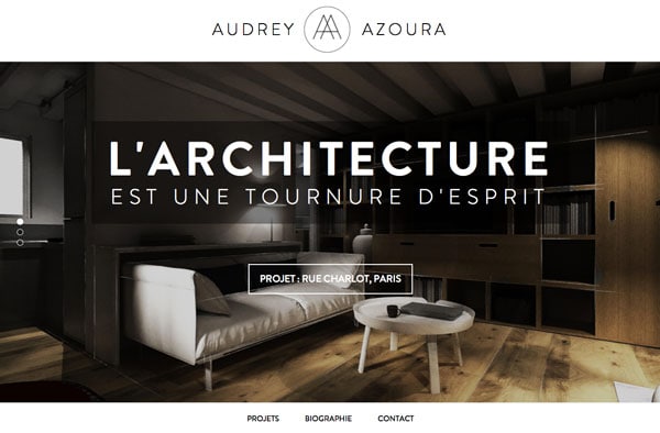
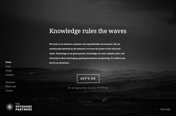
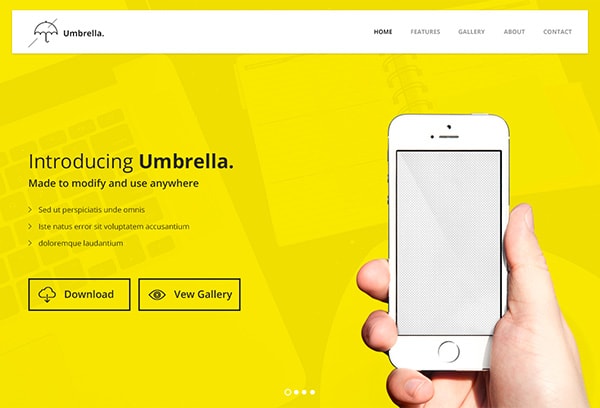
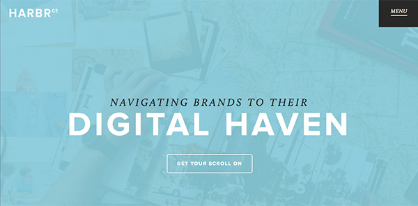
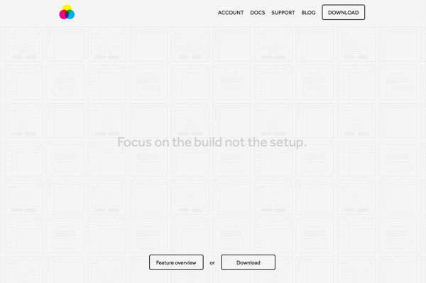
A ghost button is created as a basic, flat shape – square, rectangle, circle, diamond – with no fill and a simple outline. It is completely (or almost completely transparent) asides from the outline and text. (Hence the name “ghost.)
These buttons are often somewhat larger than traditional clickable buttons on websites and are placed in prominent locations, such as the center of the screen.
With Postcards Email Builder you can create and edit email templates online without any coding skills! Includes more than 100 components to help you create custom emails templates faster than ever before.
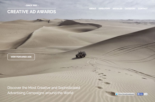
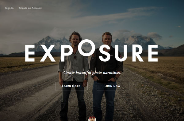
Free Email BuilderFree Email TemplatesGhost buttons can be found on a number of different types of websites (and mobile applications) and in a variety of design styles but are most commonly associated with one-page sites and those with minimalist or almost-flat design schemes. This style of button is also quite popular on pages that use full-screen photography, because this simple style of button is thought to not intrude into the image as much as a more traditional button.
Did you ever take a close look at the round buttons on your iPhone (running iOS 7)? Every one of the UI elements is a ghost button. Here’s what one Designmodo designer had to say about the emerging trend:
“The appearance of ghost buttons is somehow connected with the passion for making full screen backgrounds with 50 percent opacity, and making interfaces and forms over them. Here, an opportunity arises to distribute a person’s attention between the background photo, the product’s reflecting style, and at the same time the form with ghost elements, which doesn’t shut out loud about its presence, but is still visible.”
Elements of the Design
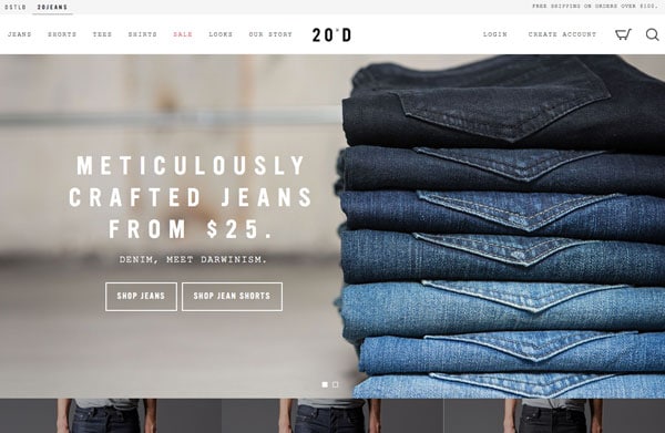

Ghost buttons typically have a common set of components. While this is not a complete set of rules for usage, many of these factors are in play when ghost buttons are used.
- The button is hollow
- It is surrounded by an outline, often only a couple of points thick
- It contains simple text
- The color is often white or black
- Buttons are often larger than traditional buttons
- Ghost buttons often are placed prominently on the page
- Ghost buttons can be placed alone or in small groupings of buttons
- The element is used with flat or almost-flat design schemes
- Small, geometric icons can be used inside of ghost buttons, but sparingly
With Startup App and Slides App you can build unlimited websites using the online website editor which includes ready-made designed and coded elements, templates and themes.
Try Startup App Try Slides AppOther ProductsSo what makes a ghost button work? Is this design trend something that you should incorporate into your next project?
Ghost buttons have a particularly clean look and feel. The simple nature of the button allows the primary design of the page to really stand out more. (It works especially nice on large images.)
Ghost buttons work with almost any design schema because they are transparent. This allows the button to essentially take on the properties of the surrounding design.
Ghost buttons are continuing the evolution of the “trend of 2013 – flat design.” The only way for a design trend such as this one to really stay popular and in the now is to continue to change and be adapted with new concepts. This is a nice evolution of that process.
Ghost buttons provide an element of visual surprise because the button is different than what a user may expect.
Ghost buttons are easy to design and create. Remember to keep it simple. Ghost buttons are supposed to be subtle, no flashiness here.
Ghost buttons create a focal point for calls-to-action without being obtrusive. In many site designs, ghost buttons are the only large element on the screen (this is often what makes the concept work so well). Because of this, it draws the eye and entices users to click or tap the button. And that’s exactly what any good user interface element should do.
Ghost buttons contribute to a design style that looks sophisticated. Simple is often classy when it comes to design.
While ghost buttons come with a lot of design pros, there are some cons to consider as well. Before using any new trend, make sure to weight both pros and cons to determine if this concept will work in your project.
Ghost buttons can fall too far into the background and frustrate users. Not all users may be design savvy; some may have trouble identifying an non-traditional button style and knowing how to use it.
Ghost buttons can be tricky to use over images with highly contrasting or varying colors. Typically these buttons are white or black. If you have an image with alternative black and white spaces, a ghost button can be near impossible to see or read.
Ghost buttons rely on size and placement for ease of use. Be cautious when placing the button so that it is easy to find and does not cover a key part of your image.
Ghost buttons can sometimes overpower the image they are paired with.
Ghost button text is more complicated than click here. The words used in these buttons needs to be clearly thought out out, edited and placed in context with the rest of the design.
Ghost buttons are everywhere right now. Do you want to look like you are just latching on to a trend? Make sure this design style really works for your project before opting in to what’s popular.
Remember, the key to any trend is to use it well. As a Designmodo said about the trend:
“I believe that each and any trend born in design could be thoughtfully used. The most important is not to be addicted to it, and choose the happy mean.”
That is the key to using ghost buttons or any other trend for that matter.
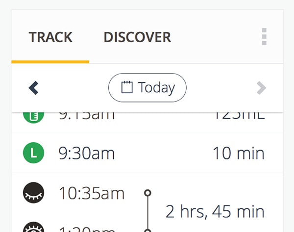
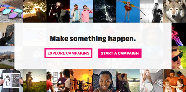
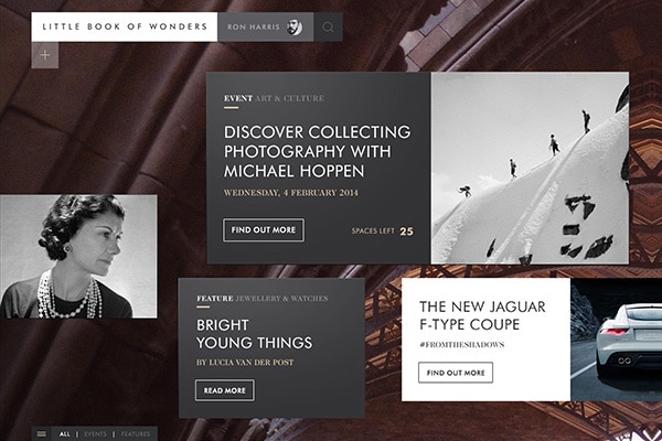
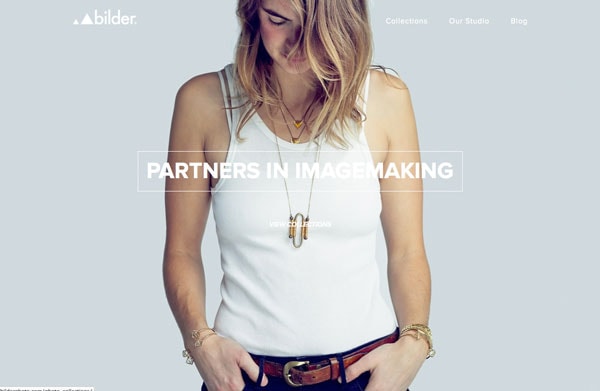
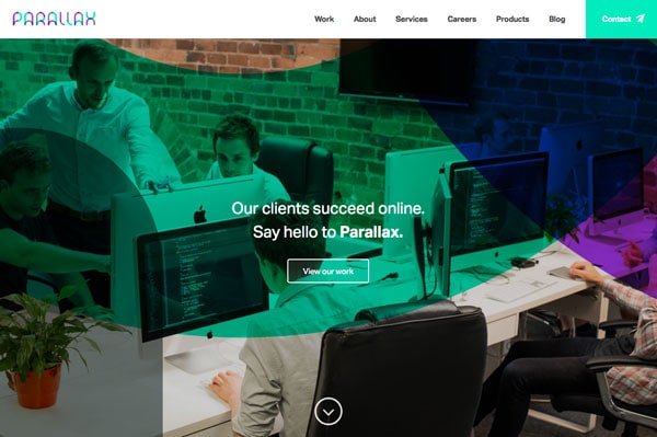
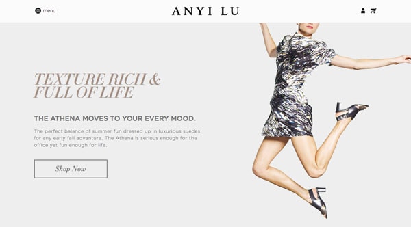
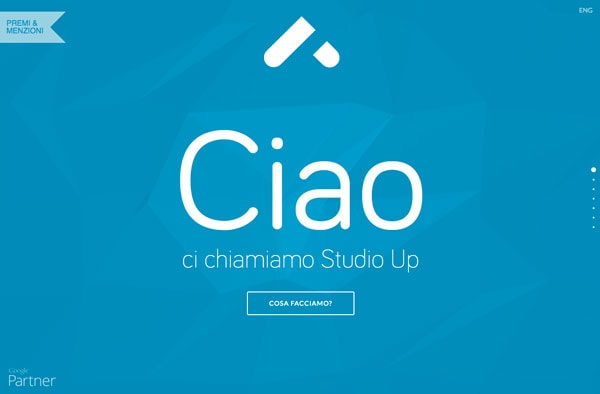
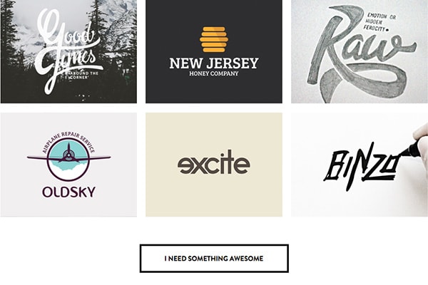
So we’ll leave you with a gallery of ghost buttons that will hopefully inspire your creativity. This collection is pulled from a variety of published websites and working projects and portfolio elements on sites such as Dribbble and Behance. (Click each image to learn more and see the original source.)
