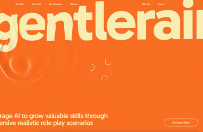
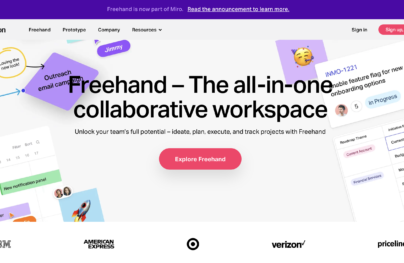
Make the Most of Your Design with a Hero Header
One of the biggest trends in web design right now is the use of big images. And not just large, but completely oversized images that seem to come to life on screen. When used at the top of a page, this is often referred to as a hero header.
How can you take advantage of the trend? What tools do you need to get started? Here, we’ll look at hero headers, tips for using them well, great examples of websites already on top of the trend and even a few freebies for you to download and play with.
What’s a Hero Header?
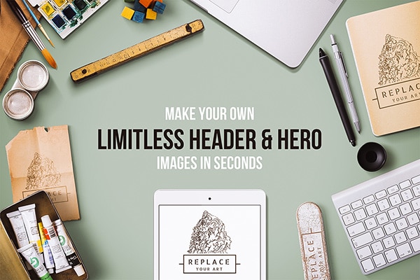
A hero header is the use of a hero image, text and navigation elements on your homepage or at the top of any webpage. Hero headers can be used in a variety of ways – as an image or image with text, image slider, fixed image, or video or animated image. The design can be realistic or drawn.
The hero image is the first thing you see on a website and is design to bring you into the page. It should have a strong focus and visual interest.
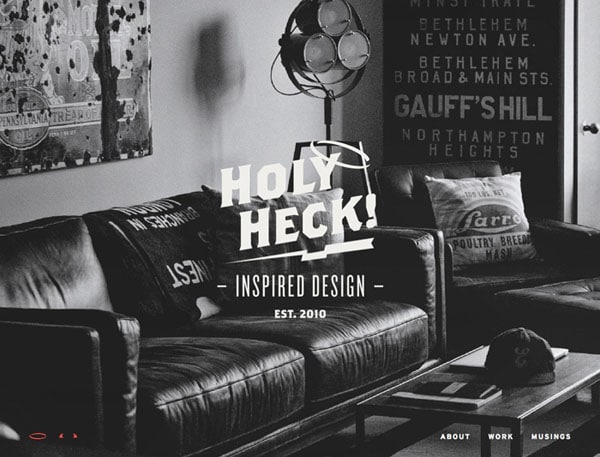
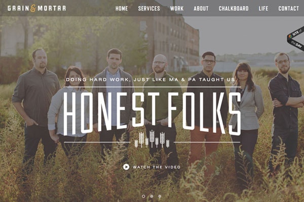
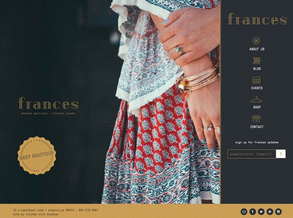
Hero headers place a strong focus on the visuals and often rely on simple typography, minimal color choices and user interface elements with basic shapes. Most of the design elements rest on top of the image, which is often strategically designed so that text fits in a specific position on the screen. Often branding, navigation and other tools are placed around the outside edges – typically top left and right corners – to keep the focus on the image itself.
With Postcards Email Builder you can create and edit email templates online without any coding skills! Includes more than 100 components to help you create custom emails templates faster than ever before.
Free Email BuilderFree Email TemplatesHero headers work in a wide variety of website designs and with almost any style of design. The visually pleasing trend really just requires one key thing – an amazing image.
Tips for Using Hero Headers
Once you’ve decided to use a hero header, there are few things to keep in mind when designing. The design needs to be clean and elements need to not get in the way of the main image, images or video. Creating separation of elements can be vital in this style of design. Here are a few things to keep in mind when designing with hero images:
- Include branding. Commonly this is positioned in the top left corner. Opt for a brand mark or logo in all white or black and not something with a lot of color.
- Go bold with titles and typography. With a large photo, but lettering will help grab the attention of users.
- Be subtle with typography when it comes to navigation elements and secondary type. Stick to one big image and one big piece of text; let everything else fall back in a design-sense.
- Be aware of color choices. If you are using a color image, stick to black and white for everything else. If the image is black and white, pick a simple or single-color palette for text.
- Place text so that it does not impede the visual flow of the image. Don’t cover faces or vital parts of the image.
- Consider type that’s both large and thin. (It’s trendy and rather easy to read.)
- Think about using ghost buttons for a degree of subtlety. (Learn more about them in a previous post.)
- Use fixed navigation. Make it easy for users to scroll and get around the page. Play with navigation that lives within the hero image and outside of it.
- Use tints and fades to help text pop off of the image. All text needs to be readable to be effective.
- Design the hero header at a depth and in a way that users know what to do next – click or scroll. Include visual cues. Remember a hero header does not have to fill a screen; it is just the topmost portion of it.
- Create a hero header that woks in a responsive web environment. Think about how it will render on smaller screens. What image and text will show?
Inspiring Examples
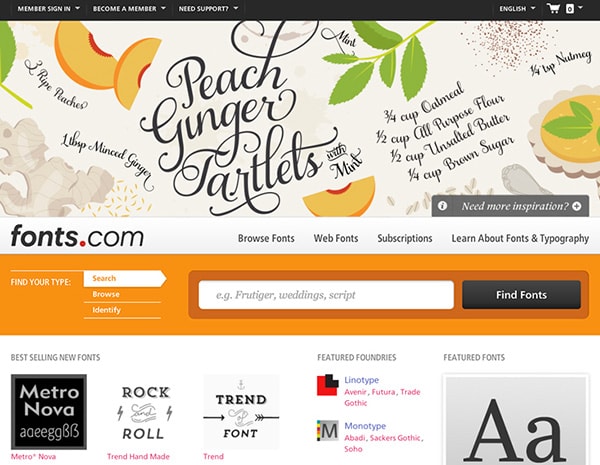
Examples of great hero headers can be found all over the web. This collection includes live websites and in-progress works.
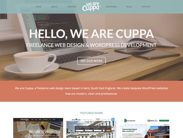
With Pulsetic you’ll be instantly notified the moment your website, API, or server becomes unavailable. Monitor uptime from multiple global locations and respond to incidents before your users are affected.
Create beautiful status pages in minutes to keep customers informed during outages and build trust with transparent communication.
Start Monitoring for FreeFreebies
If you are just starting with hero headers there are commonly two types of free resources to choose from – hero headers made from real images or three-dimensional renders or drawings. Depending on the project, either style can work nicely.
Things to look for when downloading a hero image are resolution (the image needs to be larger than your maximum screen width), ability to edit, file format and use of smart objects (if you want to move elements around). As with any free design element, make sure to check the license so you comply with terms. Freebies are often OK to use for personal projects but commercial projects require a fee; read all the details of any element before use.
2 Free Presentation Hero Headers
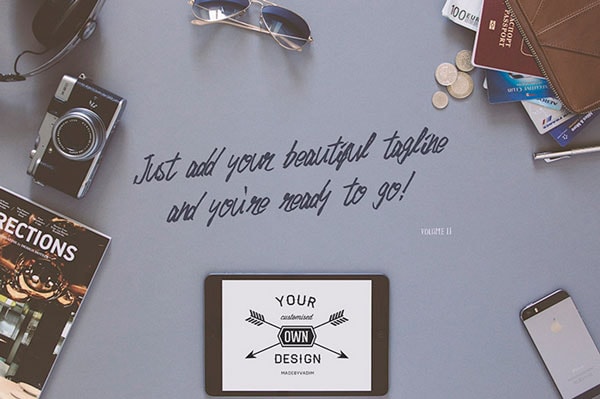
Flat Hero Header Kit

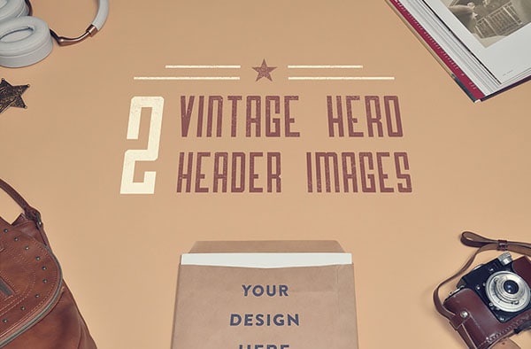
2 Vintage Hero Header Images
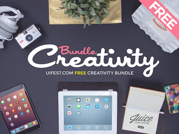
Creativity Bundle
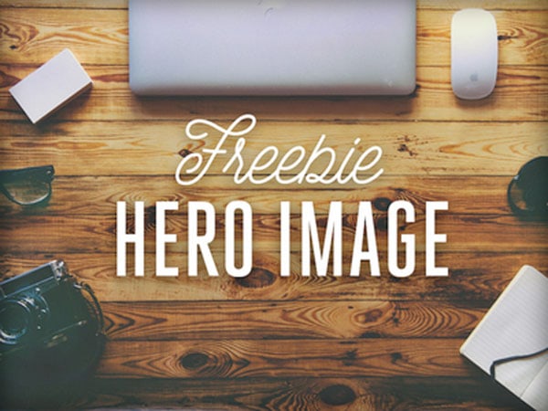
Freebie Hero Image
While there are a lot of freebies out there, there are quite a few high-quality paid hero header resources to choose from as well. You will likely get a few more options in a paid header pack. Happy shopping!
Conclusion
Hero headers are among some of the best and most visually appealing trends in web design that we have seen in a while. What’s great about this technique is that it works with practically anything. Want to design in a flat style or minimal style or with a retro feel? Use a hero header.
Are you using hero headers in your projects? Share them with us in the comments. We’d love to see the projects you are working on.
