Dominating Bold Type in Website Design: New Examples
What makes great website design great? Your answer will definitely vary: advanced animations, spectacular captivating photos, uncommon video intros, high-detailed artistic illustrations, flawless execution of popular styles, creative solutions and much more – all these aspects depend on kind and purpose of website itself, but there is undoubtedly one thing that you find in common and it is typography.
Without well-thought-out typography, in most cases website reminds just some semblance of textual data organization. As a rule, good website design with clear visual hierarchy and great readability properties is based on properly selected and beautifully executed typeface, where weight and size of a symbol play the same significant role as a font family. For example, if you want to dramatize tagline or simply make one word distinguish from another you just simply need to add boldness. Fat type, like no other, is capable of focusing users’ attention on chosen areas. It naturally makes words bigger, more potent, more distinctive, more dominating and certainly eye-catching.
Today we take a look at fresh collection of website designs that have skillfully implemented bold type in their interfaces.
Bold Typography in Website Design
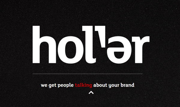
Holler abuses the use of extremely large and smooth type that occupies the whole landing page. Black and white color palette beautifully complements tagline.
Black in history has captivating and nicely animated huge slogan that utilizes type as a mask for showcasing various decolorized historical portraits.
With Postcards Email Builder you can create and edit email templates online without any coding skills! Includes more than 100 components to help you create custom emails templates faster than ever before.
Free Email BuilderFree Email Templates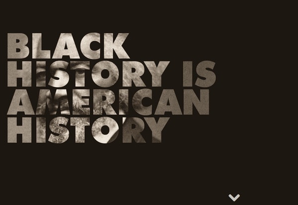
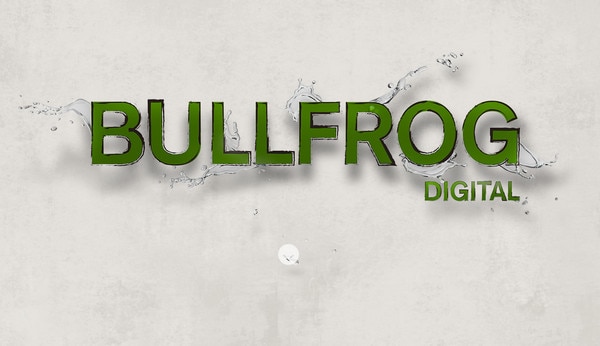
Bullfrog Digital has slightly perceptible organic vibe that is supported by green rough lettering with realistic water-themed photo manipulated background.
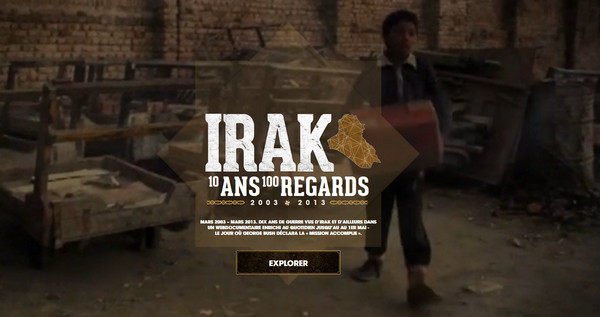
Irak puts emphasis on main tagline, featuring comparatively big and slightly elongated typeface with elegant grunge touch.
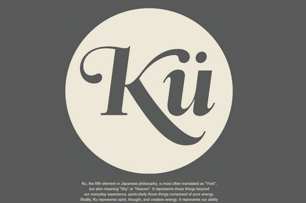
Kunstler bears truly conspicuous large slogan that symbolizes elements form Japanese philosophy. Smooth lines and intentionally limited two-color scheme make welcome section look neat and organized.
Dubbel frisss is a good example of website, based on really busy background. Despite of featuring a lot of graphical stuff, designer is capable of drawing users’ attention to large bright mottos with neon-like appeal.
With Pulsetic you’ll be instantly notified the moment your website, API, or server becomes unavailable. Monitor uptime from multiple global locations and respond to incidents before your users are affected.
Create beautiful status pages in minutes to keep customers informed during outages and build trust with transparent communication.
Start Monitoring for Free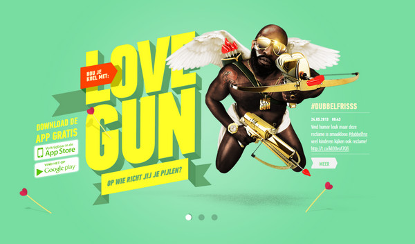
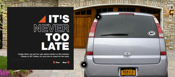
RIT Online effectively makes use of witty slogan that is perfectly executed via white color and casual type. Designer ably accentuates word “never” by making it empty.
Jean Paul Gaultier wonderfully adds a note of artistry by means of brightly illustrated rainy paints. Light textured background goes perfectly well with bluish watercolor touches.
Metropolis Creative clearly demonstrates benefits of an agency with a help of a distinctive catchphrases. Slightly blackout background and white clean font easily force text to stand out.
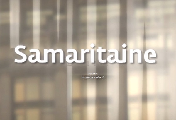
Samaritaine leverages set of beautiful typography. Whereas welcome page includes refined smooth fairly bold headline, slider section utilizes thin delicate type.
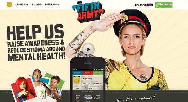
Fifth Army gets its charming retro appeal from vibrant color palette, messy background, realistic textures, and beautiful font. Designer sticks to bold weight, so that logo and sharp tagline look massive and potent.
The Defectors has strong urban and military atmosphere. Darkened background and prevailing dark green colors serve as the perfect backdrop for bold compactly arranged logo with sleek touch.
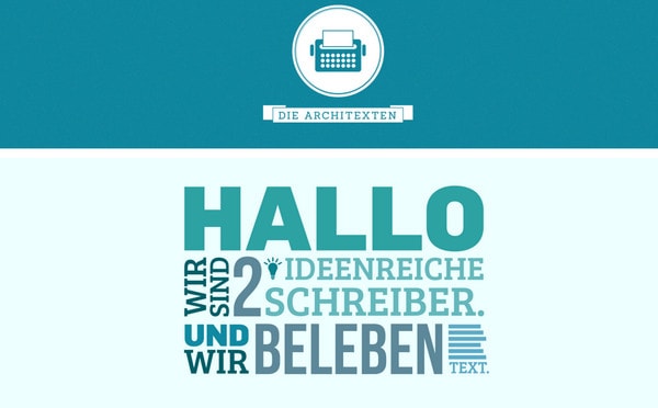
Die Architexten has polished modern appearance. Harmonious combination of different blue shades and compact arrangement of lettering of various sizes and weights in the center gives website accurate and clean look.
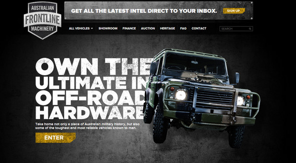
Australian Frontline Machinery utilizes rough sharp fat type with noticeable scuffs. Dark heavily scratched background, massive grunge touches and powerful image of SUV car – all together establishes manly and spunky atmosphere.
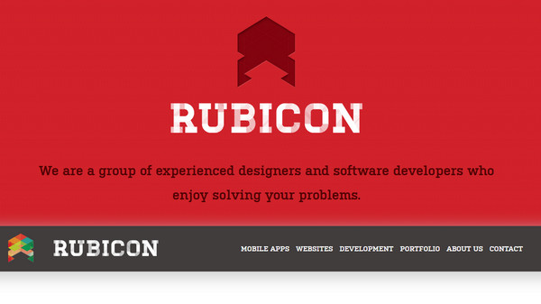
Rubicon World does a great job of creating harmonious layout. Website incorporates amazing semi-transparent font with partially built-in diagonal geometric pattern.
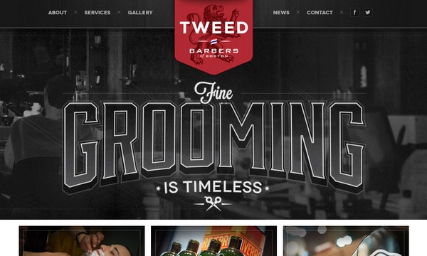
Tweed Barbers attracts users by means of extremely prominent headline on a home page, which includes enormous slightly doubled type with a strong 3-dimensional feeling.
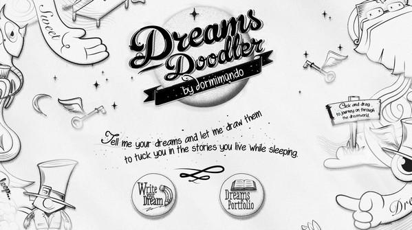
Dreams Doodler is based on marvelous monochromatic hand-drawn illustrations. Fairly bold type with an apparent tilt, which serves as a logotype, adds to website elegance and loveliness.
Gateway Church 2012 takes on infographic concept, showcasing statistical data via captivating charts. Second subpage exhibits unique hand-made lettering, where each character is formed of tiny words.
Web Akademie leverages sleek and calm typography with a plenty of smooth lines. Blurred background and small bokeh effect beautifully complement tagline.
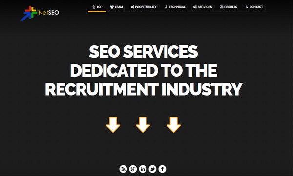
iNet Seo skillfully utilizes bold type in order to stress headlines of each section and draw attention to the main ideas.
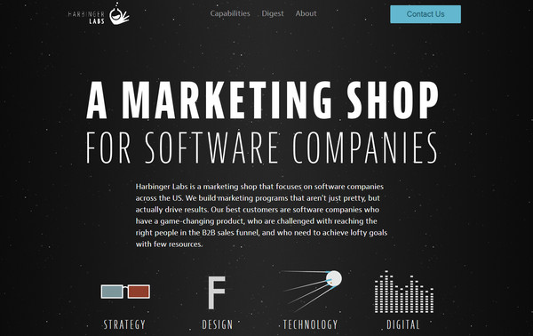
Harbinger Labs plainly states the idea behind a website, adding to the first line of a tagline significant weight. Design is also based on classic black-and-white color scheme, which easily separates text from the background.
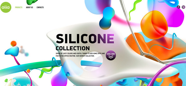
Aiia conveys vibrant 3-dimensional experience through spectacular futuristic background with smooth appeal. Black fat headline readily distracts onlookers’ attention to itself.
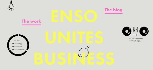
Enso has a truly eye-catching landing page that is spiced up with bright yellow and pink spots. Huge sprawling letters on flawlessly executed minimal layout with flat graphics looks simply captivating.
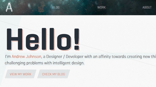
Aetherpoint intentionally puts emphasis on word “Hello” by adding extra weight, size and shadow to it, making welcome page more friendly and personal.
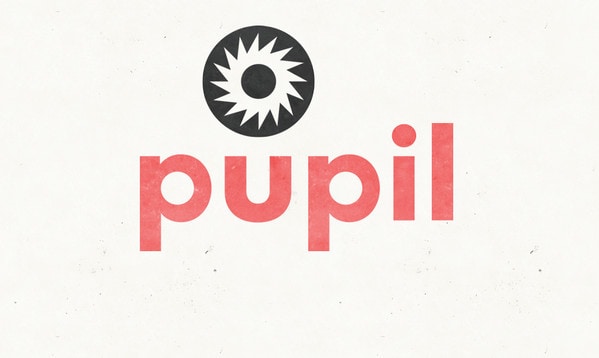
Pupil is mainly pulled by typography and monochromatic vector illustrations. Designer applies various types, using bold font to focus users’ attention on logo and inner captions.
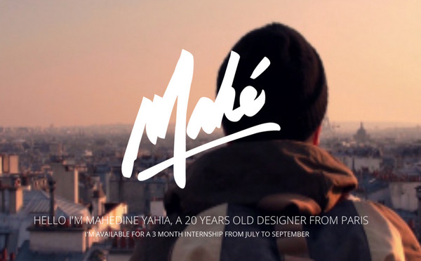
Mahedine Yahia is a great example of website design, where combination of regular white color and bold handwritten type easily and effectively underlines tagline.
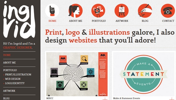
Ingrid Kool Clarke injects notes of jocosity and joviality by means of ambiguous relatively large type-based logo on the left.
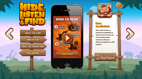
Hide, Find and Listen has lively childish appearance. Typographic logotype, which is suspended by ropes and painted in old-school gradient with rough lines, harmoniously fits into colorfully illustrated environment.
Reflection
Usually designers point out taglines, logos, slogans, titles of various widgets, headlines of subpages by means of typography with great weight, and this is not surprising, since one of the primary and practical purposes of incorporating fat type in website design is to give priority to selected phrase or singular but significant word.
Tell us what do you think about fat type? Has it run its course? Or vice versa it will be always relevant and in demand? How often do you incorporate bold type and for what purpose?


